5 Costly Green Decor Mistakes That Are Making Your Space Feel Anything But Calming, According to Designers
It's not as simple as picking something stylish and sticking it in your space. Here, the experts share the common pitfalls to avoid, and what to do instead

The Livingetc newsletters are your inside source for what’s shaping interiors now - and what’s next. Discover trend forecasts, smart style ideas, and curated shopping inspiration that brings design to life. Subscribe today and stay ahead of the curve.
You are now subscribed
Your newsletter sign-up was successful
Introducing touches of green can bring a refreshing, calming vibe to any home, and it's an increasingly popular choice for home decor. But whether you're decorating the entire home, or looking for ways to introduce smaller accents, it's easy to make green decor mistakes that undermine its soothing effect.
Sometimes when you're aiming for a lively, natural look, using green in the wrong way can result in a flat, mismatched space. These errors often stem from misconceptions about how green interacts with light, other colors, and various other design elements.
Understanding these pitfalls when curating your green room ideas is crucial for anyone looking to maximize the stylistic benefits of using green in their home decor. Below, we asked the experts for the biggest green decor mistakes, and how to avoid them. Here are five they shared.
Article continues below1. Mixing Too Many Greens Together
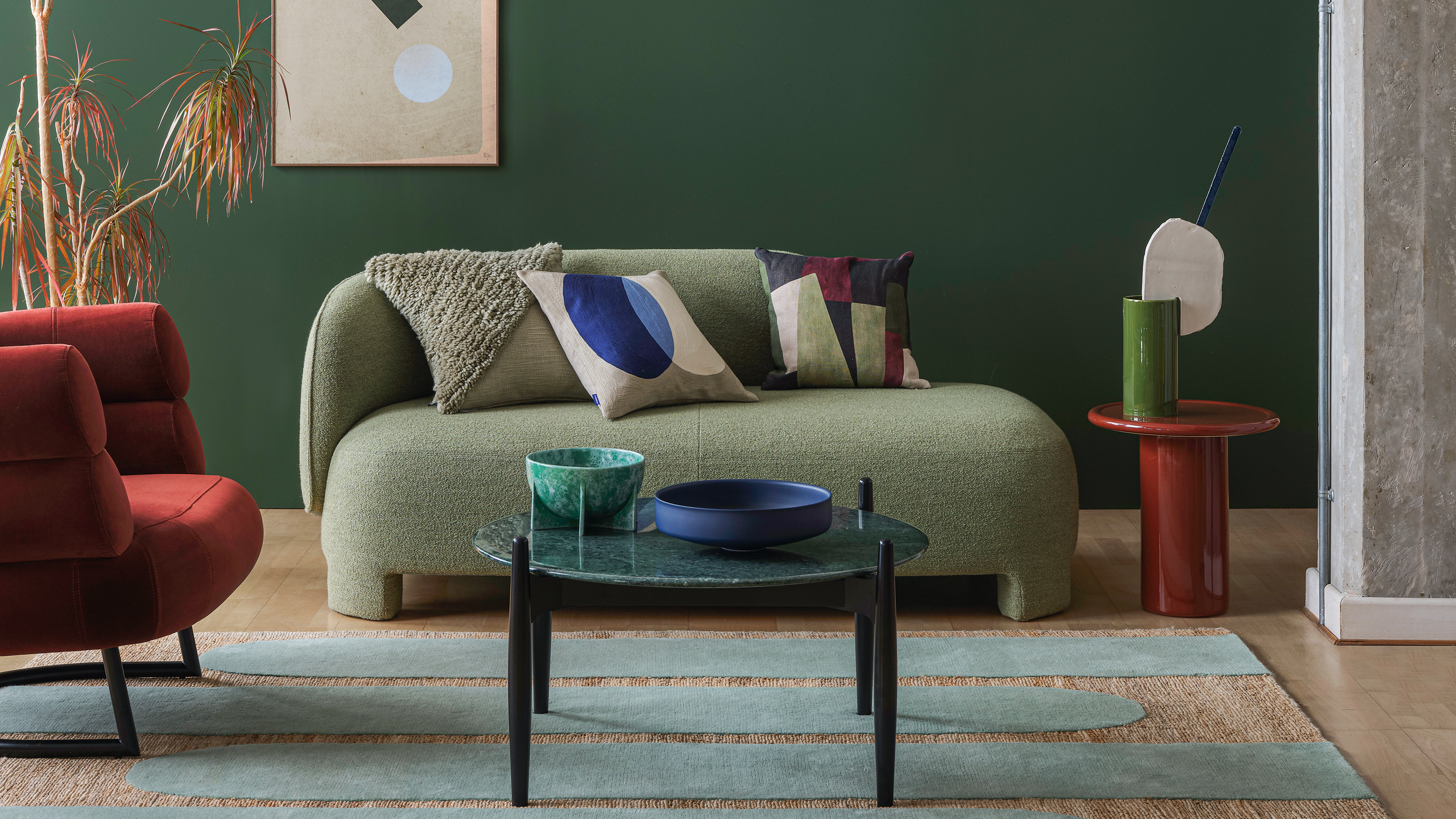
Do instead: pick one main shade of green, and layer one or two other shades as an accent
“One of the easiest mistakes is using too many shades of green in one room,” says Ana Coddington, the lead interior designer for Archival Designs. “Green is beautiful, so it’s tempting to add lots of different tones, but this can actually make a space feel chaotic instead of calming.”
For example, combining olive green paint with neon green and mint-colored decor might not give you the look you’re after. To keep things harmonious, choose one main shade and add just one or two complementary greens through your decor, like a deep forest green paired with soft sage. This keeps the space feeling cohesive and visually pleasing.
2. Forgetting to Consider the Room's Lighting
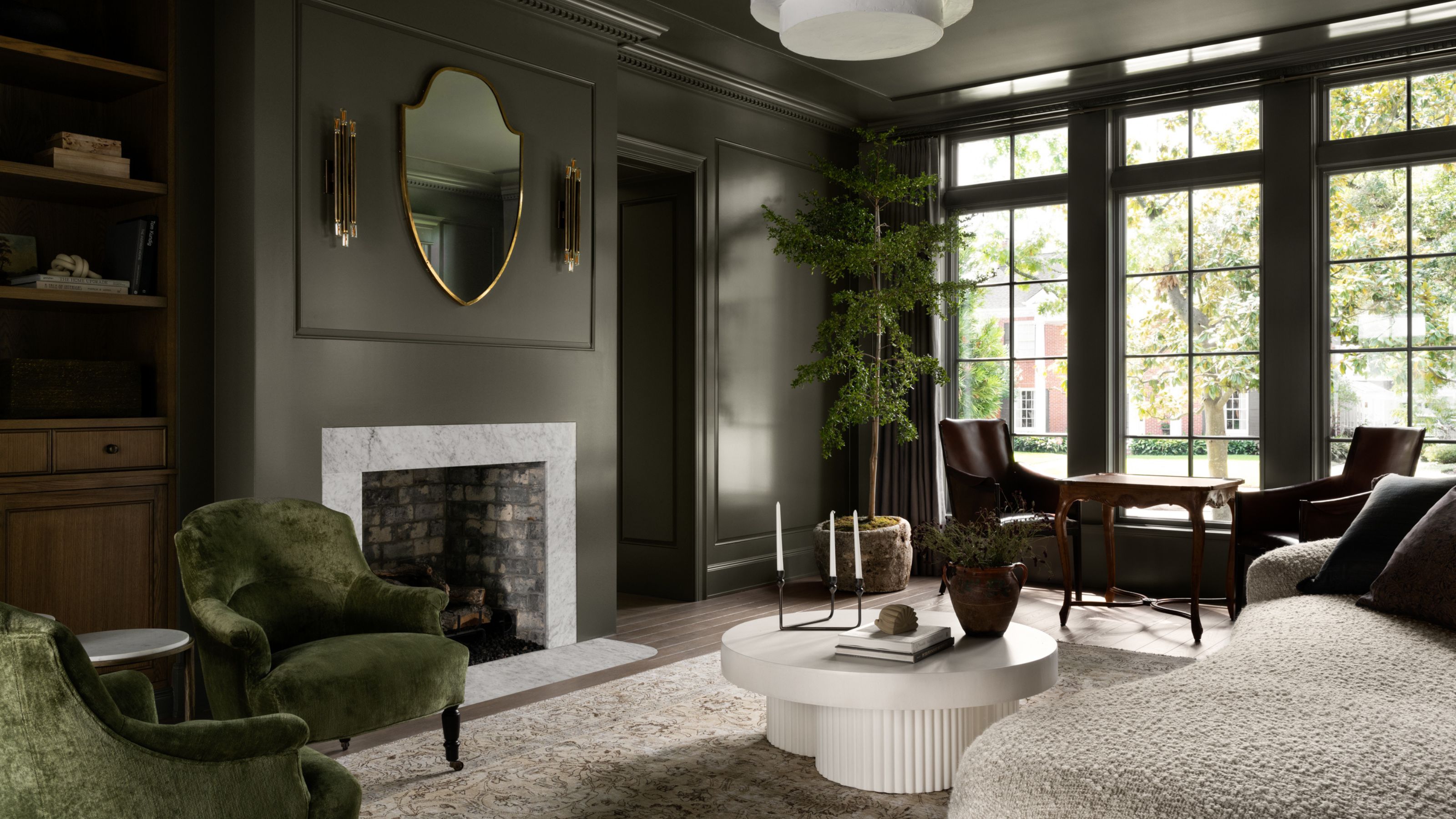
Do instead: pick green decor that will complement and react well with the amount of light in the space
According to designer Natalie Myers of Veneer Designs, lighting can change how green looks dramatically. A bold green may look fantastic in natural daylight but appear dull or too dark at night. “If you have a room with little sunlight, avoid using deep or dark shades of green as they can make the space feel even darker,” she says. “Instead, opt for lighter shades or use green accents through plants or artwork. This will bring a touch of green without overpowering the room.”
If you're going for paint, before you commit to a shade, use paint samples on your walls at different times of day and with your room’s artificial lighting. This way, you’ll see how the color shifts and ensure it gives you the right vibe, no matter the time or lighting. Similarly with other green decor, consider how the color may react in the space, and if there is instead somewhere better suited in your home to style it.
The Livingetc newsletters are your inside source for what’s shaping interiors now - and what’s next. Discover trend forecasts, smart style ideas, and curated shopping inspiration that brings design to life. Subscribe today and stay ahead of the curve.
3. Not Balancing Green with Enough Neutrals
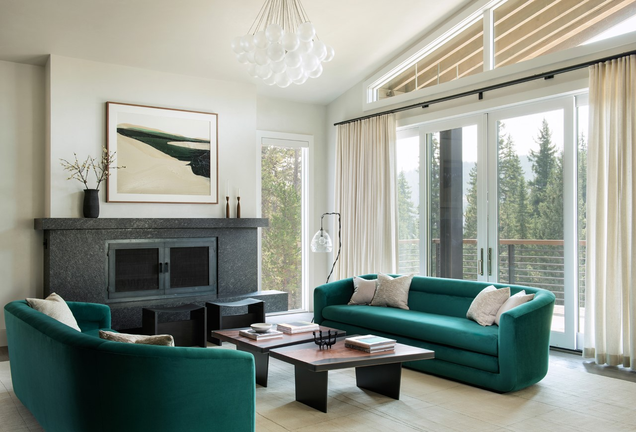
Do instead: balance a green accent with a neutral backdrop to help it shine not overshadow
Too much green can sometimes make a room feel like a mini jungle, or worse, sickly. To create a welcoming and relaxing feel, try balancing bold pieces of green decor with neutral colors like white, beige, or gray, as seen in the balanced green living room shown above.
These softer shades help tone down the green sofas, allowing them to be the stars without overwhelming the space. Think of the neutrals as the backdrop that lets the green decor shine, giving the room a cozy, well-rounded look.
4. Picking a Dark Green for a Small Space

Do instead: decorate smaller spaces with vibrant green accents
Dark green shades work well in some spaces but can feel heavy and overpowering in smaller or darker rooms where you want to create a feeling of light and airiness. If you're decorating a smaller or dimly lit space with green decor, Jacky Chou, principal designer and director at Archute, suggests trying lighter greens, like mint or pastel. These shades help to reflect light and keep the space feeling open.
That's not to say you can't use a dark green in these spaces, but consider using it as an accent in smaller doses. Green decor like throw pillows, artwork, and rugs are great ways to accentuate a space while adding light-toned elements and plenty of lighting to balance things out and keep the space bright.
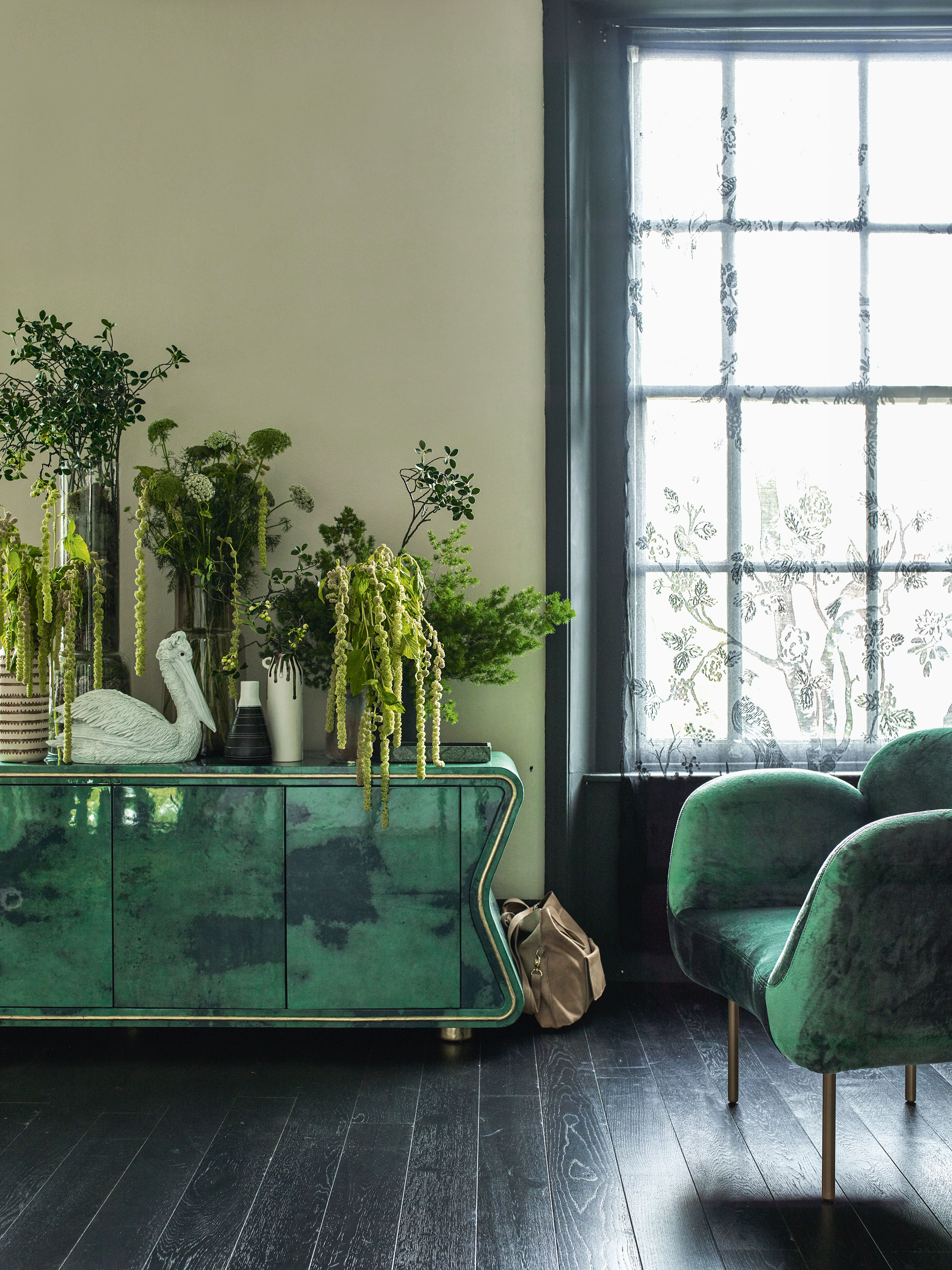
5. Choosing All Your Green Decor in One Texture
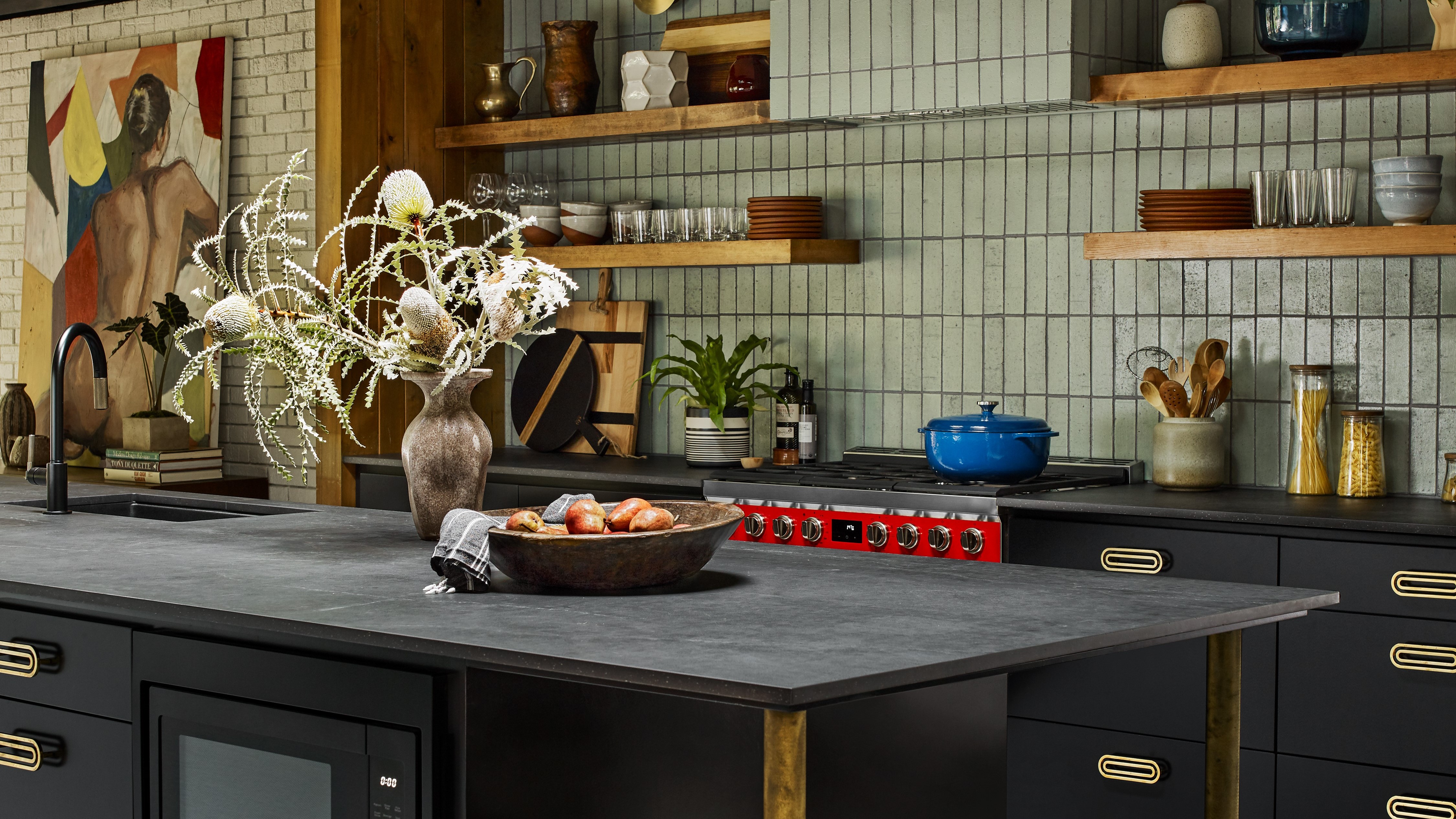
Do instead: mix and match glossy with flat, furry with fine, to ensure your space has dimension, even if all in the one shade
Green decor can look amazing, but if everything’s smooth or everything's glossy, it might come off as flat, which is a common green decor mistake. Adding texture is key to making the space more interesting!
Try mixing different textures —a soft velvet chair like this Vivienne armchair from Soho Home, a woven rug, or a shiny ceramic vase in green can all bring depth to the space. Texture not only makes the room visually engaging but also adds a cozy, inviting feel.
FAQs
Can you have too much green in a room?
Of course. If used too much, green like any other color can also bring negative traits. Too much green in a room or being surrounded by the wrong shade of green can in fact bring up feelings of boredom or stagnation.
Similarly, unless you're intentionally color-drenching your space in green decor and paint, choosing too much of one color can come across as too thematic, and will undermine the overall aesthetic of your room.
Your decor should reflect your personal style. It’s easy to get swept up in trends, but spaces with a personal touch feel more authentic. If you feel unsure on how much green to use when decorating your home, try incorporating green accents instead of full-on makeovers.
Green decor can be transformative if you sidestep these common mistakes. If you’re ready to bring a vibrant, natural feel to your home, let’s make sure your space reflects your taste, so you have a room you genuinely enjoy living in.

Seraphina is a contributing editor at Livingetc, writing Advice features on design, renovation and organisation. Seraphina is a qualified Interior Designer from KLC School of Design having worked at London-based interior design agencies Anouska Hempel and ND Studios. Seraphina has also completed her MA degree in Magazine Journalism at City, University of London, with previous experience including writing for Homes & Gardens, Women's Health, Food & Travel and Fabulous Magazine.