

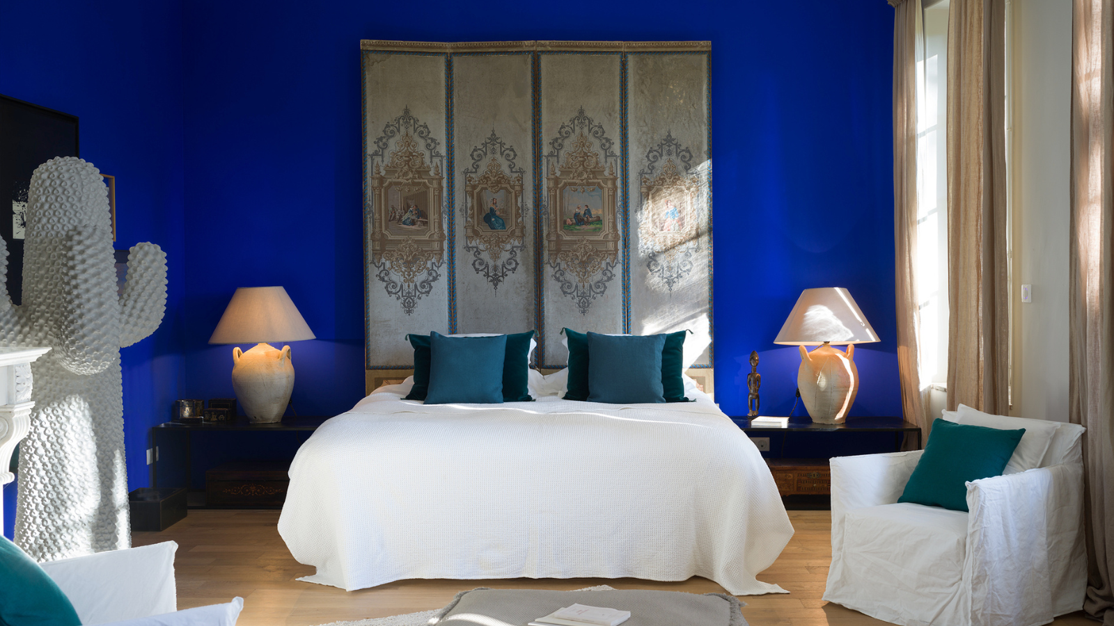
Dark, moody colors have been popular in this year's predictions for the new 'it' shade, as we continue to seek ways to introduce a bit of personality back into our spaces. Blue is a universally loved color that evokes serenity and peacefulness, but add some dramatic, dark undertones, and you've got yourself a space that oozes style — it's no wonder Farrow & Ball's 'Hague Blue' paint color is such a popular choice amongst designers.
The brand's ambassador and paint expert Patrick O'Donnell says it's one of the best Farrow & Ball paint colors; "Our ever-popular 'Hague Blue' is a moody shade that is a true treat in any room."
While colder shades of blue can lean too far towards the "millennial gray" territory, and dark, almost-black hues can be daunting to work with, the green and yellow undertones of 'Hague Blue' make it a color that, while deep, is still full of warmth and vibrancy.
So, if you're looking to refresh your space, adding a touch of drama that still feels totally liveable, could this be the best blue paint color for it? Below, we take a deep-dive, unearthing why designers love it so much, where to use Farrow & Ball's 'Hague Blue', and what to style it with.

What Makes Hague Blue So Popular?

Farrow & Ball explain on their website that this shade gets its name from the colored woodwork you often see used by the Dutch, and that, as such, it works particularly well as a trim color, "to ground skirtings or as an accent color on the walls."
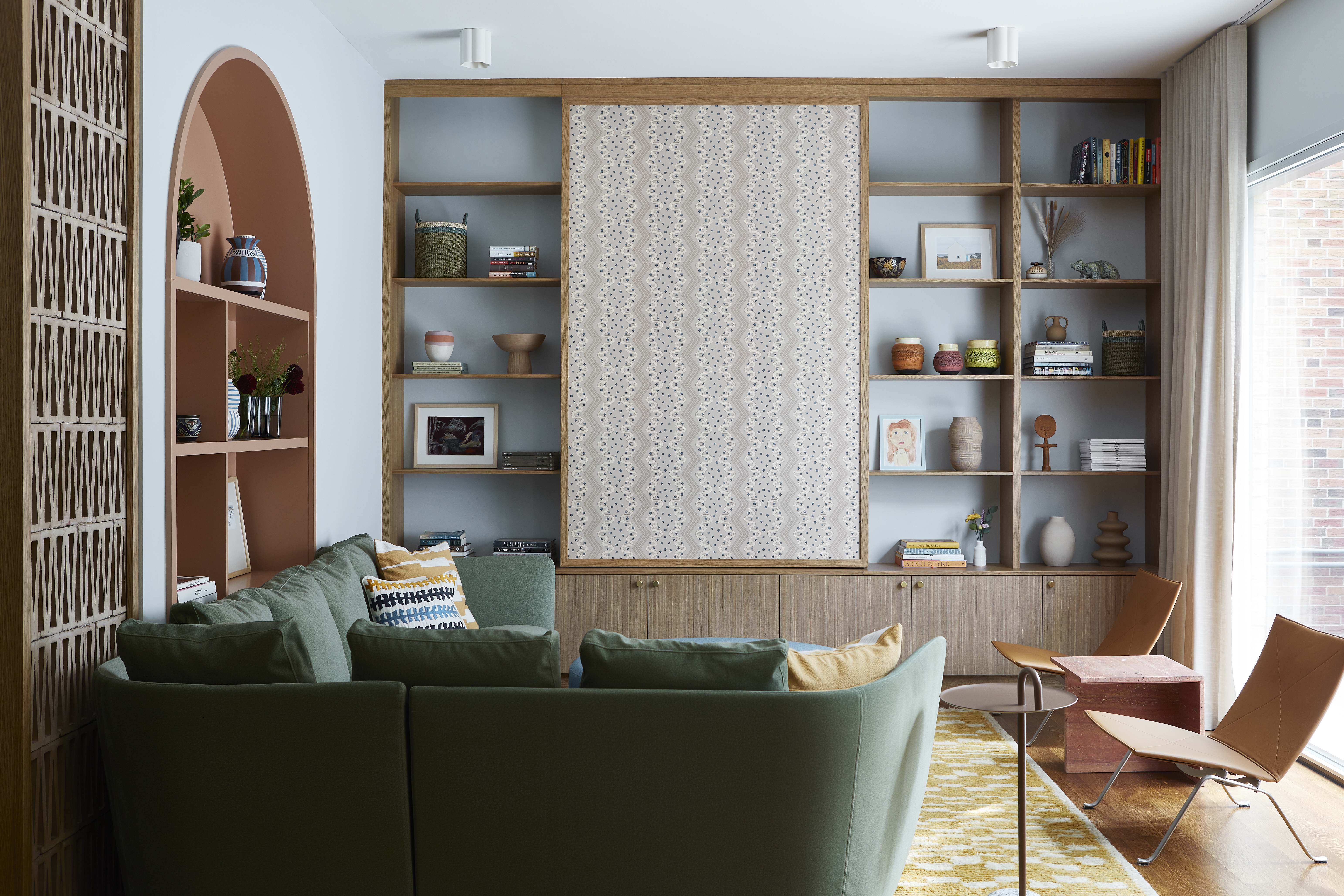
Its versatility, and therefore popularity, lies in the warmth that it brings to a room — the green undertones of this timeless blue mean it works just as well in living rooms filled with plenty of natural light, as it does in darker rooms that receive very little.
"It’s a versatile color that brings depth and warmth to the room, elevating it from functional to sophisticated," says interior designer Amy Jones, the owner and designer at Greta-Mae Interior Design, who has used Farrow & Ball's 'Hauge Blue' across numerous home projects, in bathrooms, bedrooms, and living spaces.
The Best Rooms to Use Farrow & Ball's 'Hague Blue'

As it's a darker and more moody blue, Patrick says you can use 'Hague Blue' in most spaces, and even "in north-facing rooms because of the underlying green note making it never feel too chilly." Even though it's quite a dark color, its warm undertones make the shade less overpowering, and easier to use even in a room that doesn't get a lot of sunlight.
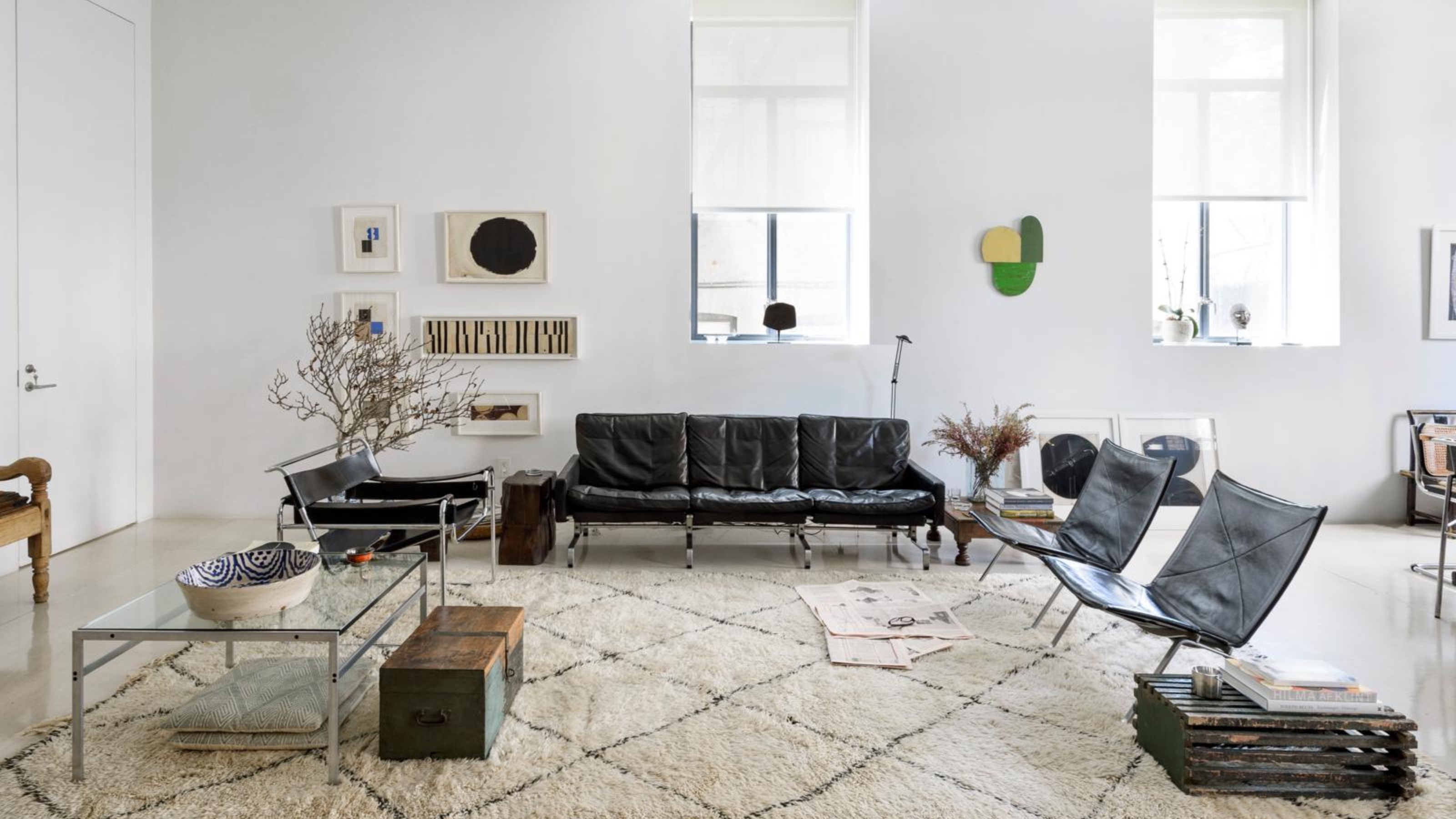
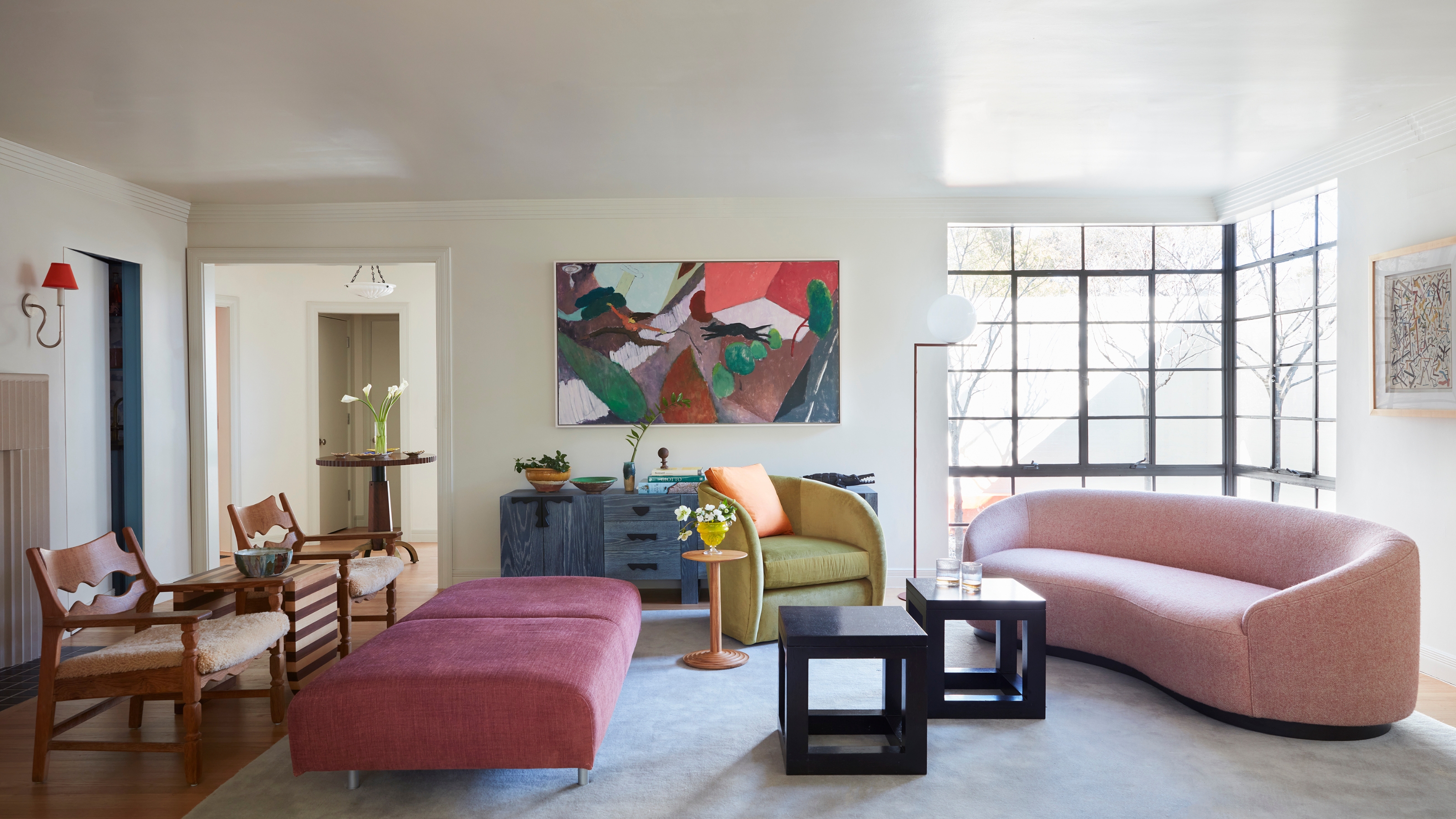
Just like navy blue, it's a fairly universal shade — there are plenty of navy blue living room ideas, navy blue kitchen cabinet ideas, and navy bedroom ideas, that would work using Farrow & Ball's 'Hague Blue'. It has that deep saturation that creates a sense of drama, while keeping blue's natural sense of tranquility and calm.
Other rooms you might want to consider using this darker shade of blue would be ones you want to create an eye-catching moment in. It's one of the best colors for entryways, powder rooms, and mudrooms which are generally smaller in size, and would make this shade really pop.
Amy Jones says, "We used 'Hague Blue' for the bathroom [shown above] because its classic, timeless quality beautifully complements the space. The rich, deep tone adds a sense of luxury, while creating a striking contrast to the crisp white sanitaryware."
Similar Paint Shades to Farrow & Ball's 'Hague Blue'

Price: $8.50
Size: 100ml Sample

Price: $3.95
Size: Peel-and-Stick Sample

Price: Free Color Chip
What Colors Go With Farrow & Ball's 'Hague Blue'?

When it comes to colors that complement Farrow & Ball's 'Hague Blue', Patrick recommends you "Always try pairing with an empathetic white, such as Old White, rather than a clean white, as it helps soften the contrast."
You want to mirror the warmth of 'Hague Blue' in its counterparts so that the color pairing melds together harmoniously, instead of creating too jarring of a contrast. Benjamin Moore's Swiss Coffee paint color is another yellow-tinted white that would be a beautiful complement to 'Hague Blue'.
As previously explained, this shade has the same dark yet warm undertones of navy blues and deep olive greens, which means it can actually act like a neutral in color schemes (just like navy blue can). That being said, and given blue's position on the color wheel — across from orange — anything that has a warmer tone will be complementary to 'Hague Blue'.
Below are a few shades to inspire you.
Colors that Go with 'Hague Blue'

Price: $8.50
Quantity: 100ml Sample

Price: $8.50
Quantity: 100ml Sample

Price: $5.95, Peel-and-Stick Sample
How to Style 'Hague Blue' in Your Home
This cozy paint color is a dramatic but easy pairing for many different design styles. Hague Blue's nod to navy makes it a traditional, almost vintage-inspired paint color that can create a real sense of nostalgia in a room.
"This shade offers a beautiful depth that serves as a perfect backdrop for layering patterns and textures which helps add character and warmth to our spaces," describes Amy.
If your style leans more contemporary, color-drenching is always a favorite way to truly dive into a dramatic yet chic look. Painting your walls and trim in this rich blue is the ultimate way to bring a room to life and really make a statement — but one that won't overwhelm.
If you want to start with something a bit more understated, try adding a few throw pillows on your sofa or place a vase painted in 'Hague Blue' (or a similar shade) on your fireplace mantel.
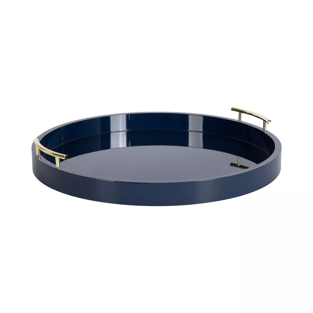
Shop 'Hague Blue'-Inspired Decor

Price: $99
Size: Medium, 11" H

Price: $54, Was: $69
Color: Steel Blue
Price: $79.99
Color: Navy blue
All this talk of Hague blue has me itching for a refresh. How will you decorate with this dramatic yet soothing shade of blue?

-
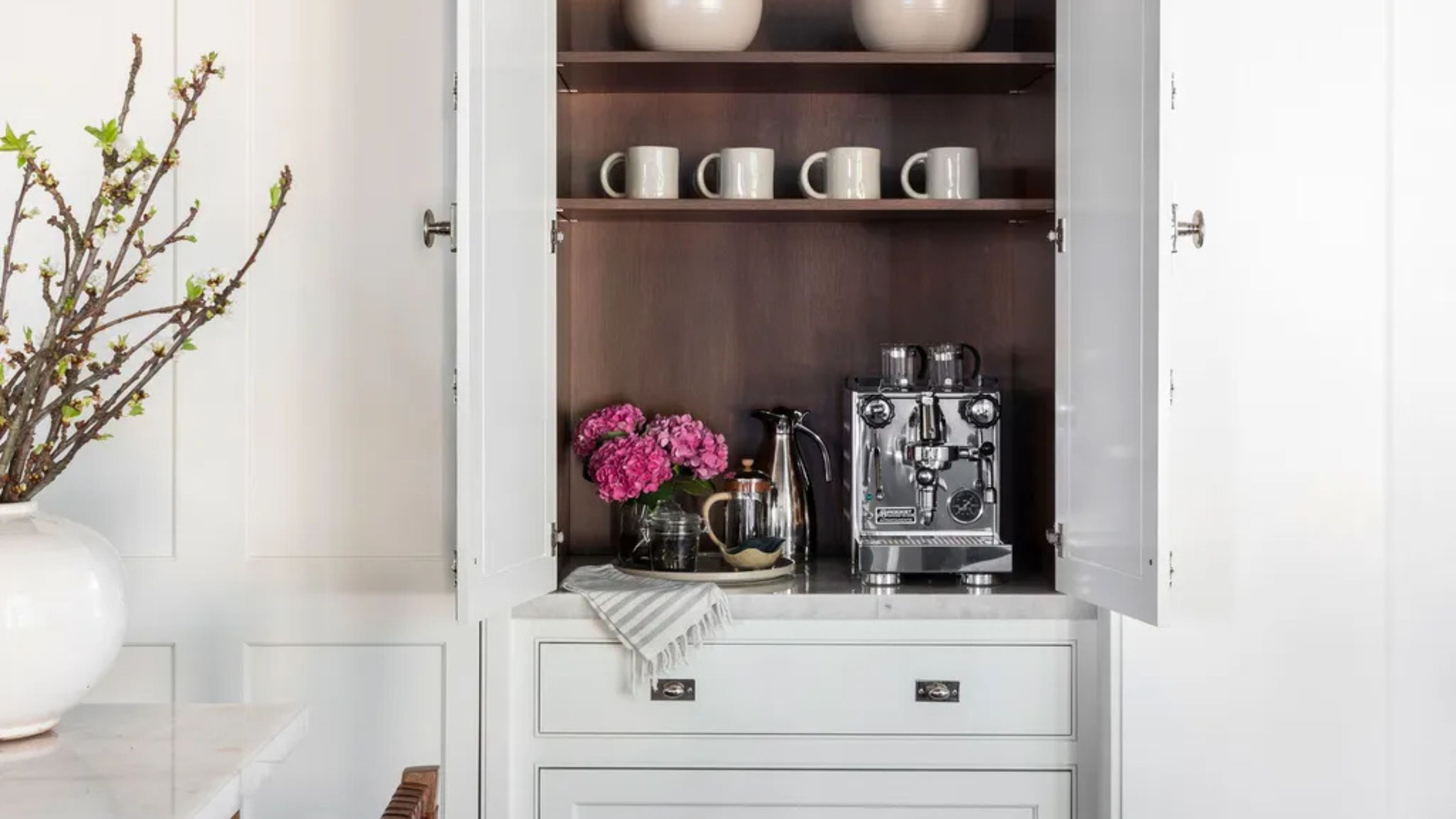 Turns Out the Coolest New Café is Actually In Your Kitchen — Here's How to Steal the Style of TikTok's Latest Trend
Goodbye, over-priced lattes. Hello, home-brewed coffee with friends. TikTok's 'Home Cafe' trend brings stylish cafe culture into the comfort of your own home
-
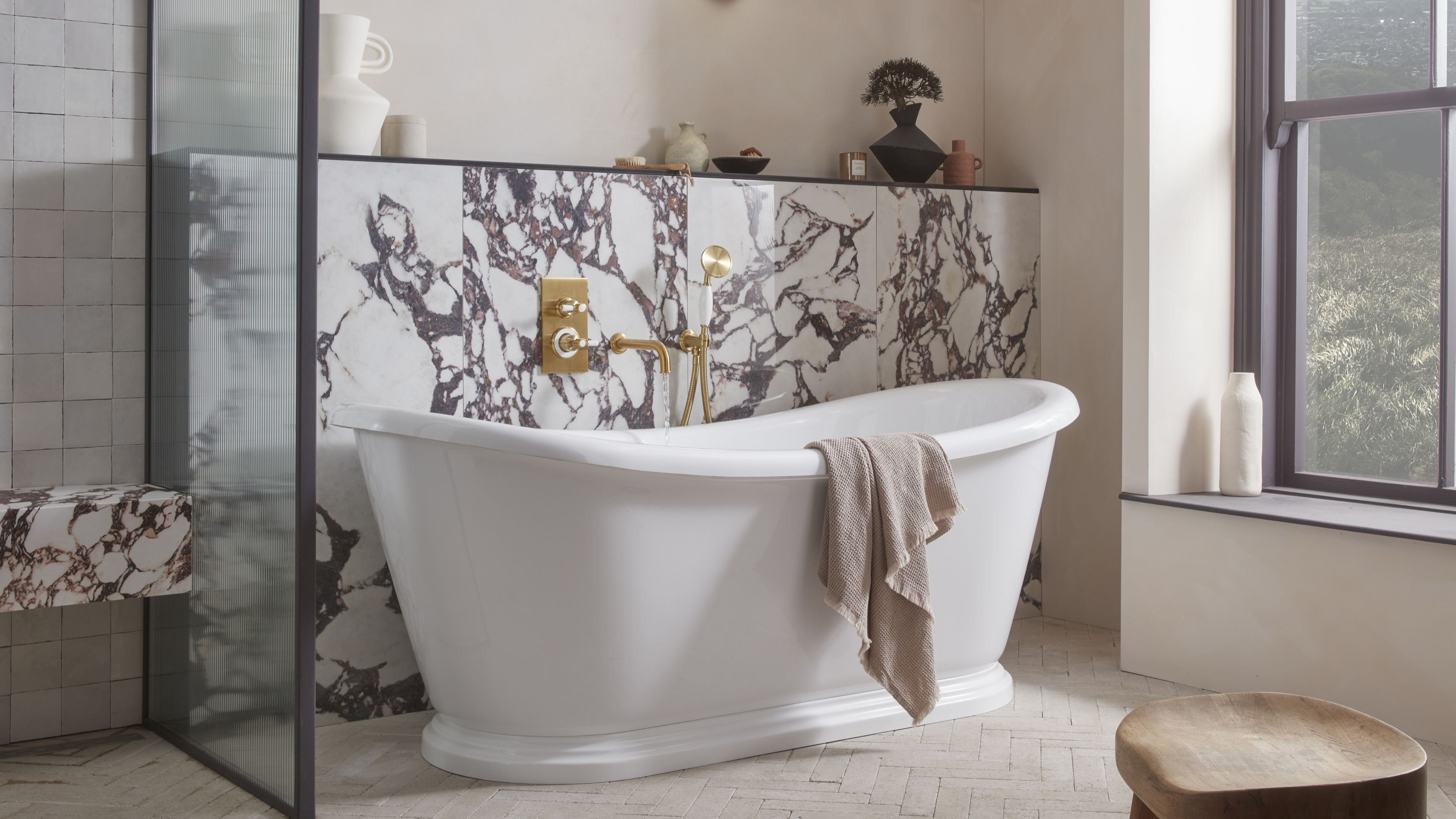 5 Bathroom Layouts That Look Dated in 2025 — Plus the Alternatives Designers Use Instead for a More Contemporary Space
For a bathroom that feels in line with the times, avoid these layouts and be more intentional with the placement and positioning of your features and fixtures


-
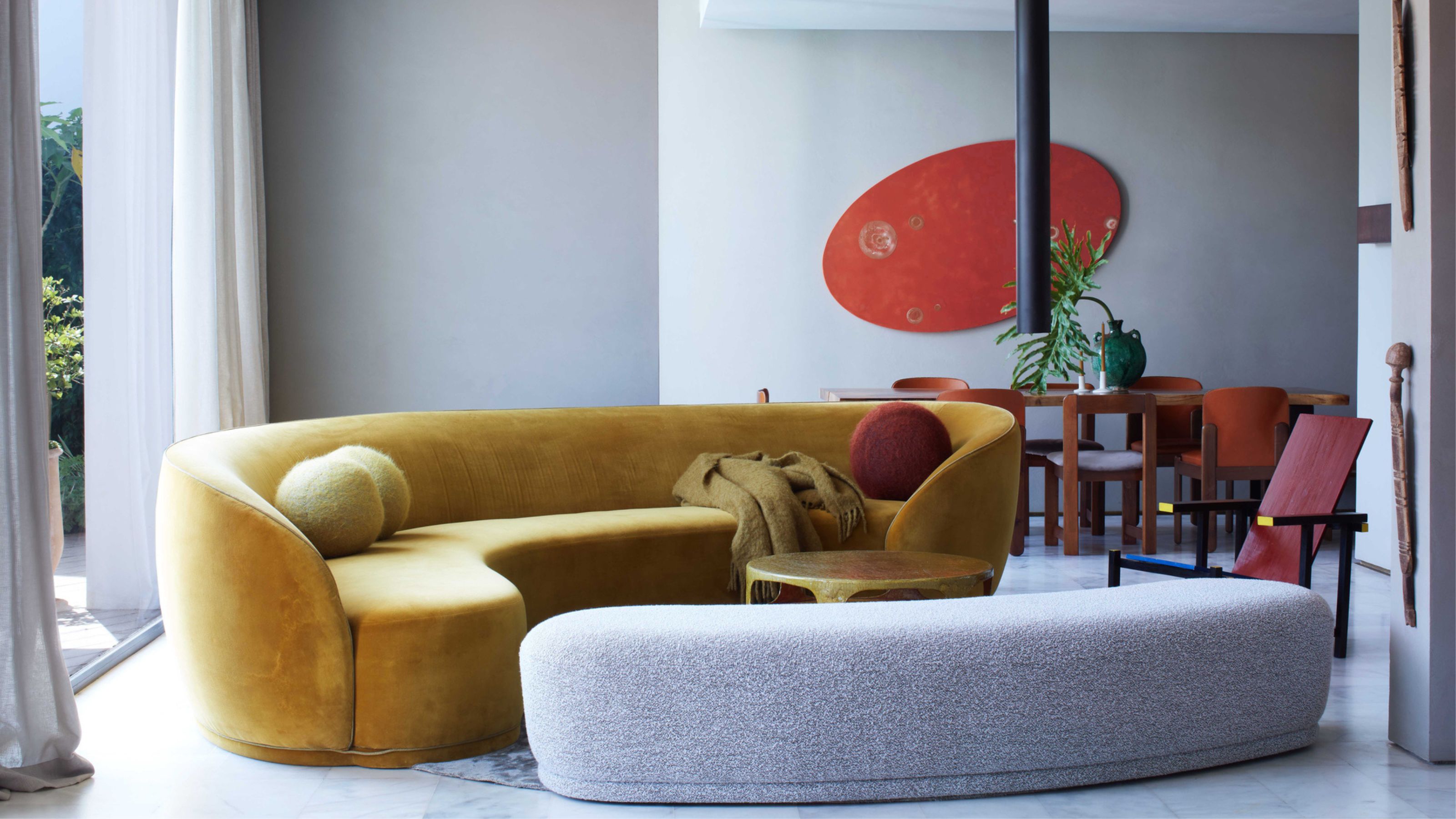 Here's Why Decorating With Mustard Yellow Helps Fill Your Interiors With a Sense of "Confident Calm"
There is so much more to decorating with this turmeric-tinted sauce-wiggled-on-a-hotdog not-quite-yellow shade than meets the eye
-
 5 Problems With Painting Your Walls White That No-One Ever Talks About (Until Now)
White is the easiest neutral to work with...right? Interior designers explain why this shade is actually more complex than it may seem
-
 5 Mistakes That Are Making the Blue Details in Your Room Feel Old-Fashioned — And How to Rectify Them
Blue is a timeless shade, no doubt, but use it in the wrong space or in the wrong way, and it can make a space feel, well... a bit blue
-
 5 of the Best Navy Blue Paint Colors That Designers Love — And How to Use Them
Navy blue has timeless appeal and can feel both modern yet classic, but what are the designers' favorite paints?
-
 Should Your Carpet Be A Darker Color Than Your Walls? How to Make This Bold Look Work
Not every room can get away with a carpet that is darker than the walls; Designers share when and where this combination works best
-
 What Actually Is Yves Klein Blue? A Short History of This Iconic Color, and How to Decorate With It
Explore “the most perfect expression of blue” and how to free this pigment in your home
-
 Do Pink and Green Go Together in Interiors? A Professional Color Consultant's Verdict
How to make pink and green color combinations work for more contemporary interior schemes
-
 The 'Grown-Up' Way to Decorate With Light Blue — This Shade Shouldn't Just "Be Resigned to the Baby's Room"
We explore how to bring the lighter intonations of blue into your home in a contemporary and thoughtful way


