5 Hardscaping Mistakes to Avoid That Are Making Your Yard Feel Uninviting
We asked professional landscape designers for their biggest mistake when it comes to patios, paths and more — here's what they told us

There's a vast amount of knowledge you need to learn before you can call yourself a master gardener, but part of the process of tending to a yard is trial and error. However, there are some places where making a mistake is harder to rectify.
When it comes to your backyard planting, positioning a plant in the wrong setting or choosing something that doesn't suit your hardiness zone can mean your green investments don't work out, but get something wrong with your "hardscaping" - basically anything to do with patios, walls, paths and everything, well, hard - and you're likely making a costly error.
And while many of these mistakes are practical in nature, we'll leave that up to your contractor to get right. What we want to know is what are the biggest hardscaping design mistakes that professionals see? So, we asked them. Here's what they said.
1. Not "greening" raised elements
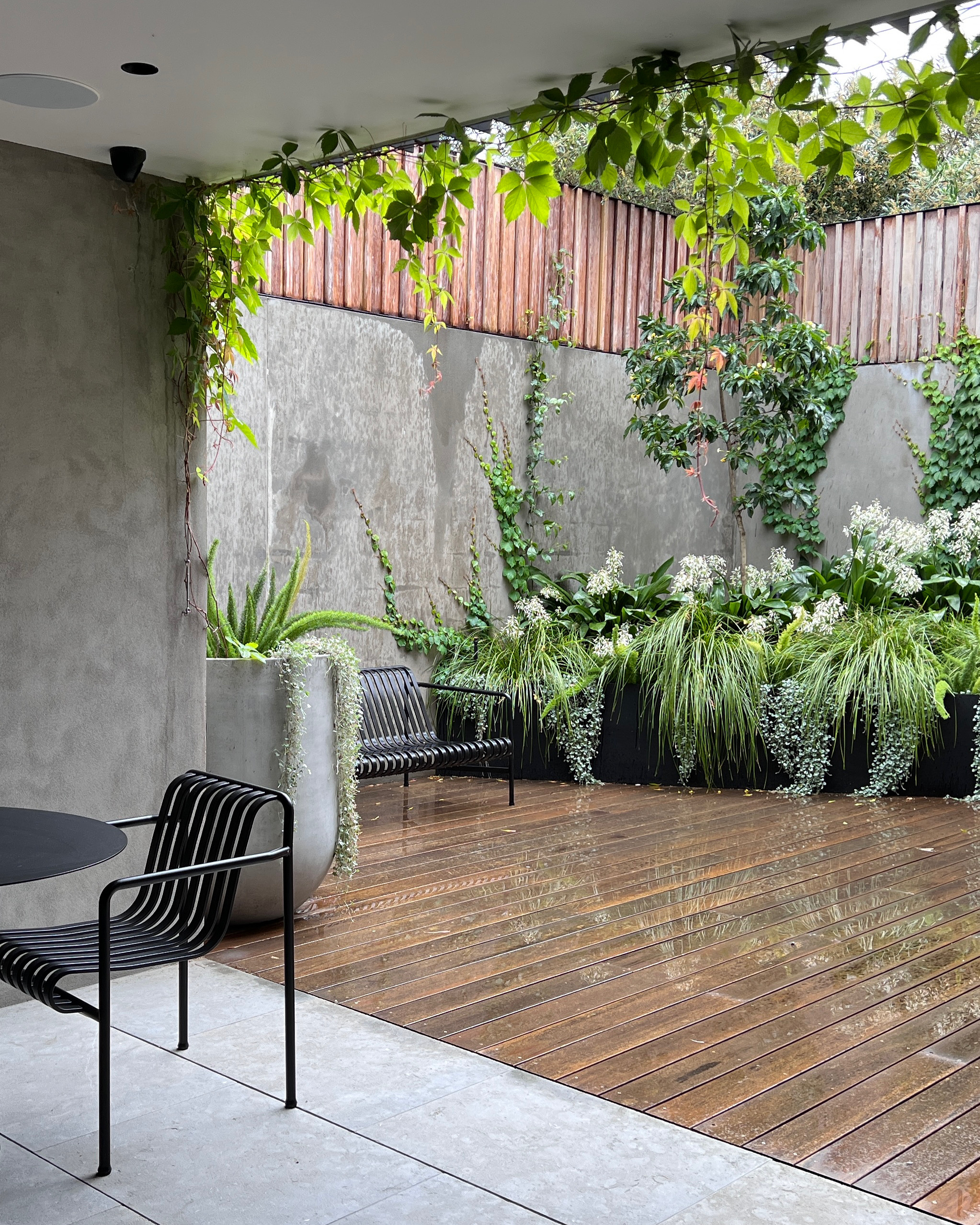
Hardscaping can be a really successful way to bring structure to a backyard, but it's a tool that needs to be used in harmony with planting. When they're considered too separately, that's when you start to make big design mistakes.
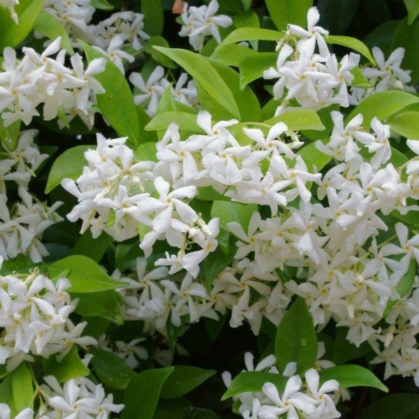
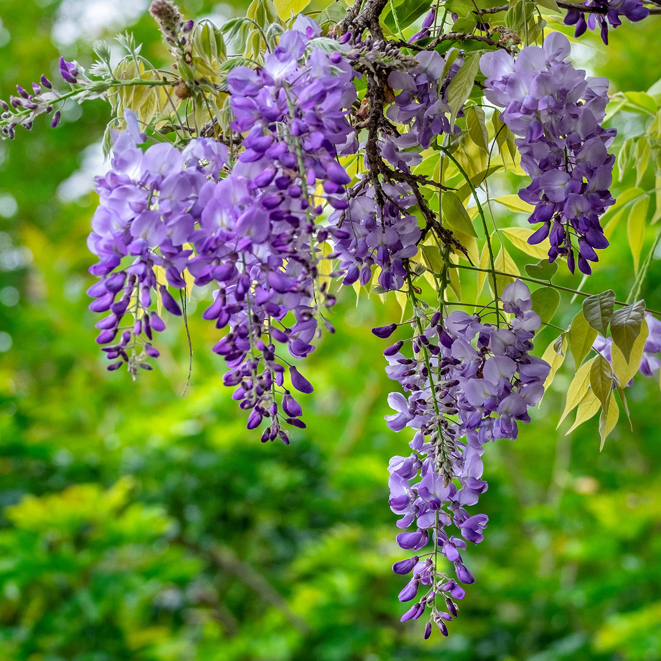
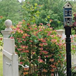
It's one of New York-based landscape designer Jonathan Fargion's greatest bugbears: 'bare retaining walls that have no plant accents,' he says, 'when they can be alive by applying vines for example.'
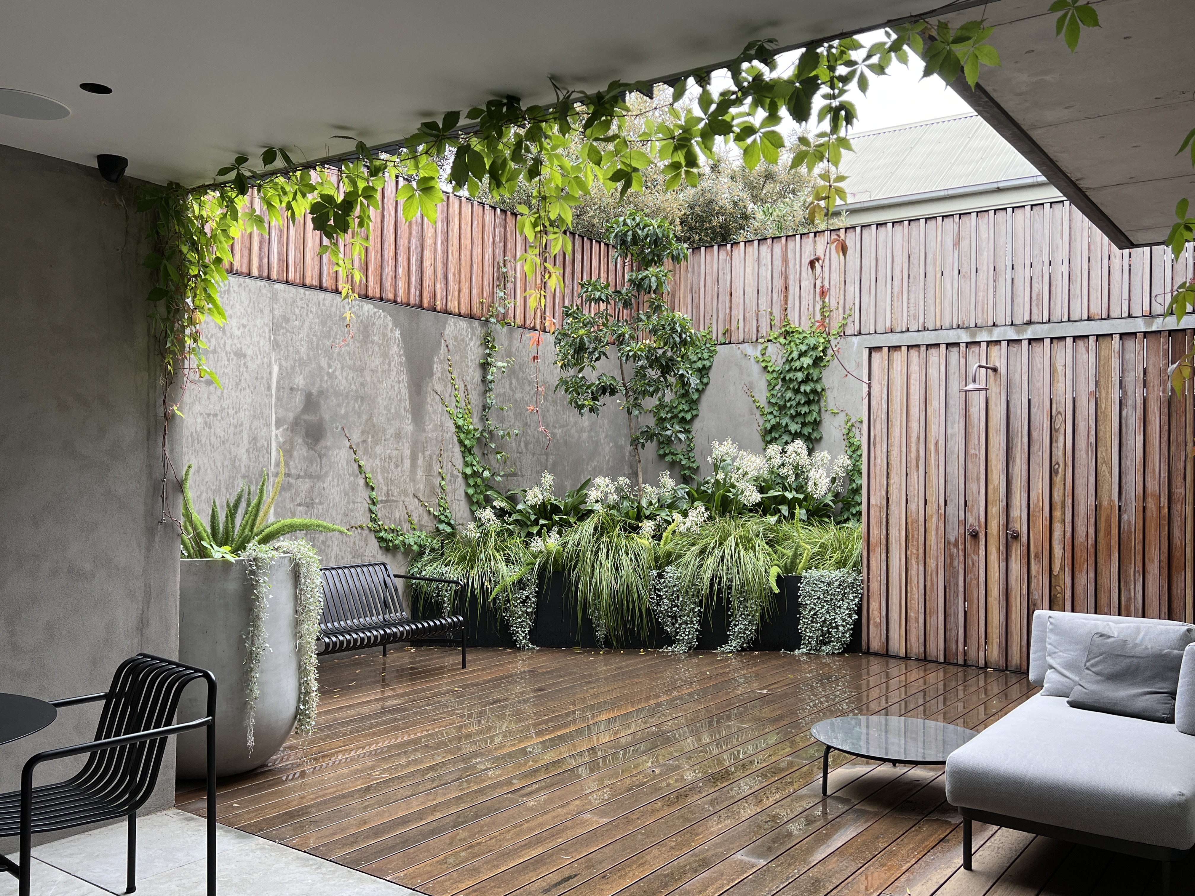
Whether it's retaining walls, raised planters or even privacy fences, hardscaping without plants factored in can feel harsh and uninviting for what should be your home's green space. For landscape designer Renata Fairhall, the planting is what made this courtyard garden feel less like a concrete jungle. 'We built a raised angled garden bed in the corner of the courtyard that was big enough for a feature tree to get height, climbers to green up the walls and cascading plants to soften the wall of the raised bed,' the designer explains.
2. Relying on weed fabric
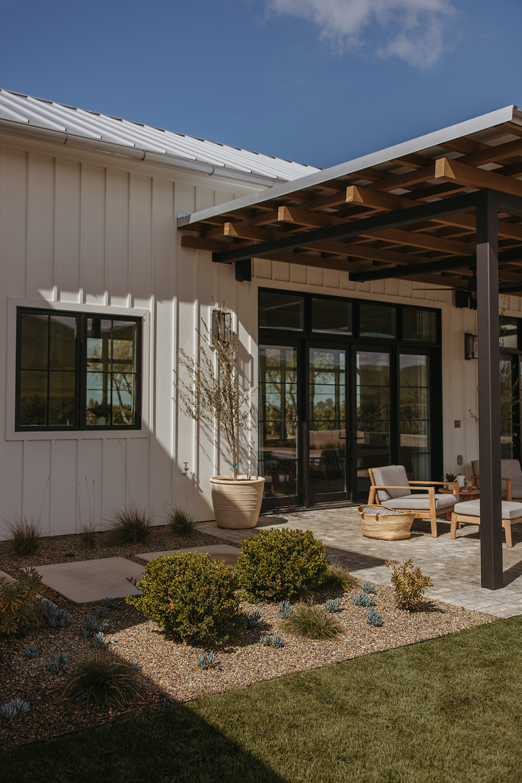
Gravel is one of the most popular hardscaping materials, but it's also prone to one particular problem: weeds. The general solution is to lay weed fabric before you apply your gravel landscaping, but it's not the best idea according to some designers.
'Some may disagree with this thought, but I am personally opposed to landscape fabric or weed mat,' says Devon Brown of Charter Oak Landscape Design. 'Some like to install it under gravel to eliminate weeds. However, I find that the weeds make their way through holes or seams, and the material makes itself visible at one point or another.'
What are the better solutions? Choosing a larger-sized hardscaping like river rock as an alternative to pea gravel will mean you're naturally more weed-free, as these larger pieces exert more pressure, stopping weeds making their way through. There are lots of natural ways to rid your gravel of weeds, too.
3. Creating vast expanses of hardscaping
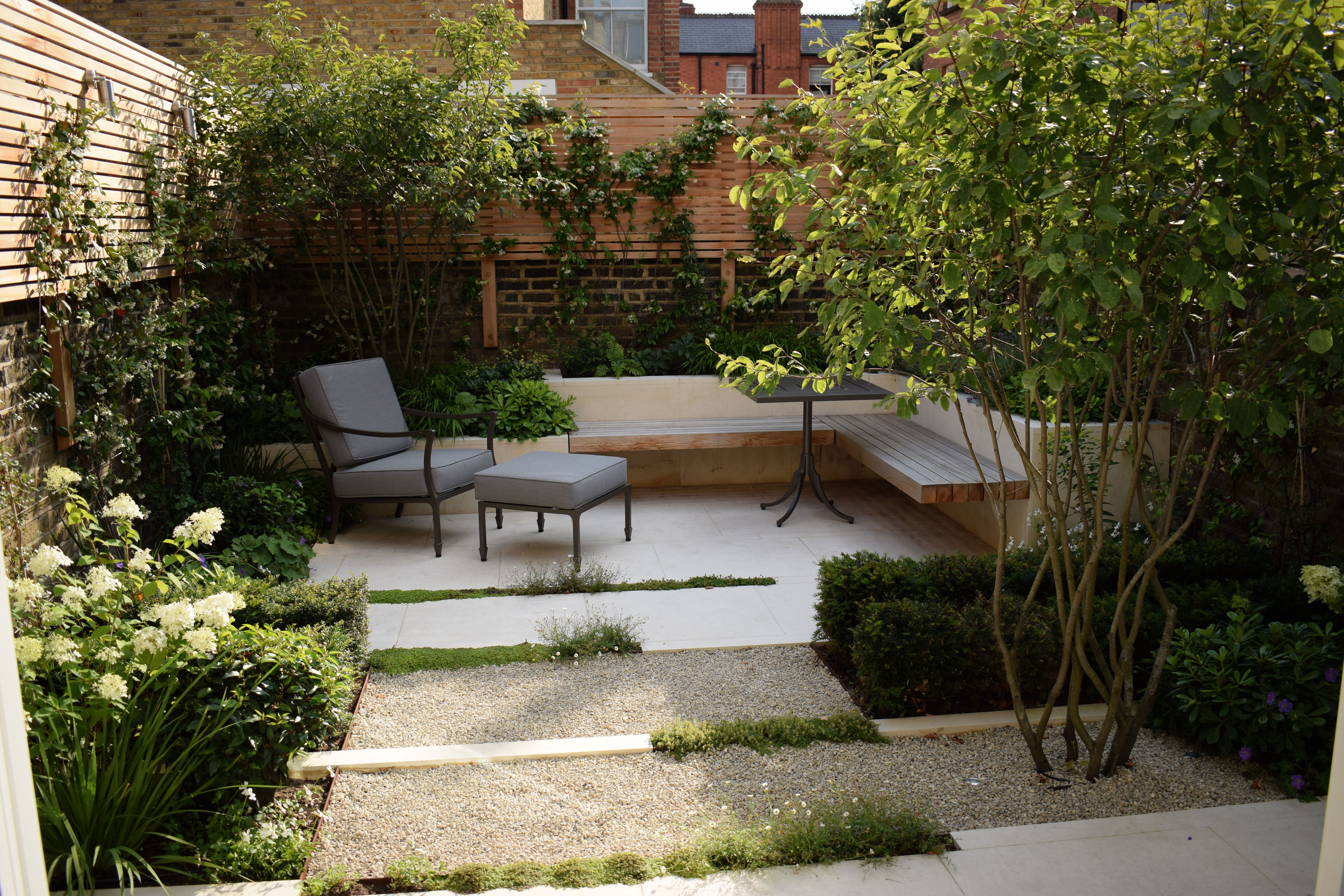
Huge swathes of patio aren't doing your garden any favors. You may think that keeping a space feeling minimalist is the best way your hardscaping can make your backyard feel larger, but without the diversity of texture, your outdoor space can feel plain and characterless.
Garden designer Charlotte Rowe uses a clever trick to break up hardscaping, that works particularly well in small backyards. 'With small courtyard, the key is to maximize the space in terms of layout but also to make the garden look bigger than it really is,' the designer explains. 'One way that we do this is to break up the space longitudinally using planted rills, hedging or using the paving plan as this helps to slow the movement of the eye down the space and fools the brain into thinking the garden is longer and larger than it is.'
4. Sticking within the lines
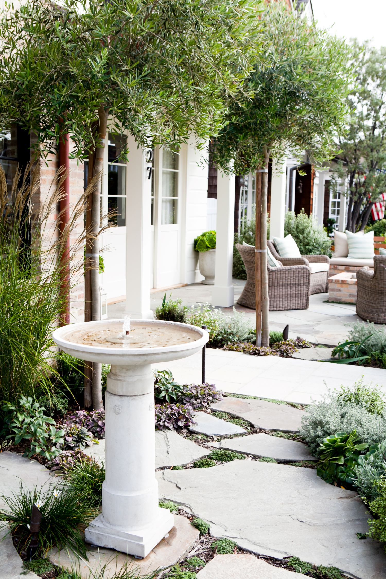
Traditional landscaping can feel a little boxy — defined by square patio pavers and linear walls. Of course, there are more curvaceous approaches to hardscaping in general, but this doesn't suit every space. Instead, the answer may be more about how you apply planting, and how you confine it (or don't) within your hardscaping.
'Don't feel as obligated to stay in the lines, so to speak,' says Devon Brown, founder of Charter Oak Landscape. 'I will often let the planting have a more organic layout with some specimens trickling out into the pathway or seating areas.'
5. Choosing artificial turf over hardscaping
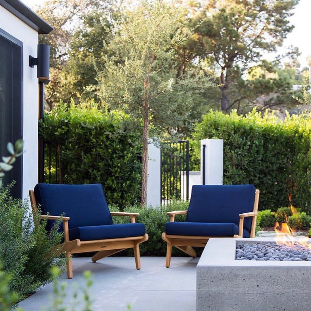
We get it, not everyone wants to have to deal with the rigmaroles of lawn care. Keeping a lawn looking healthy, green and weed-free is an ordeal all in itself, especially during the hotter seasons when water for irrigation is in shorter supply.
For many people, the answer is to turn to artificial turf. It looks like grass, after all, and provides a similar landscaping quality, without the upkeep and stress of real grass. However, it's not an idea that goes down well with a lot of landscape designers.
'I want to be clear: I am just not a fan of artificial turf,' says Andrea Scharff, founder of Andrea Scharff Landscape Design. 'It always looks fake and is hot in the summer, if not properly installed it can get pretty fragrant as well.'
So, what to do instead? 'Opt for gravel, sparser planting and drought tolerant ground covers instead,' Andrea suggests.
Be The First To Know
The Livingetc newsletters are your inside source for what’s shaping interiors now - and what’s next. Discover trend forecasts, smart style ideas, and curated shopping inspiration that brings design to life. Subscribe today and stay ahead of the curve.

Luke Arthur Wells is a freelance design writer, award-winning interiors blogger and stylist, known for neutral, textural spaces with a luxury twist. He's worked with some of the UK's top design brands, counting the likes of Tom Dixon Studio as regular collaborators and his work has been featured in print and online in publications ranging from Domino Magazine to The Sunday Times. He's a hands-on type of interiors expert too, contributing practical renovation advice and DIY tutorials to a number of magazines, as well as to his own readers and followers via his blog and social media. He might currently be renovating a small Victorian house in England, but he dreams of light, spacious, neutral homes on the West Coast.
-
 Turns Out, Sustainable Design Can Be Chic, and Net-a-Porter's 'Net Sustain' Curation Is Proof — Here's What I'm Shopping
From the Net Sustain collection, Mud Australia's homeware is not only design-oriented, but eco-focused, too
By Devin Toolen
-
 Before and After — How This Jewel-Box Bathroom Made the Most of Its Proportions With Maximalist Design and a 'Soaking Tub'
This design offers a masterclass on creating a luxurious bathroom that is equally playful and elegant.
By Maya Glantz
