Hidden colors: the secret trick designers use to put palettes together by Livingetc's color expert
By looking closely at the grains of wood in a room the colors to pair with it will reveal themselves to you, says Ruth Mottershead

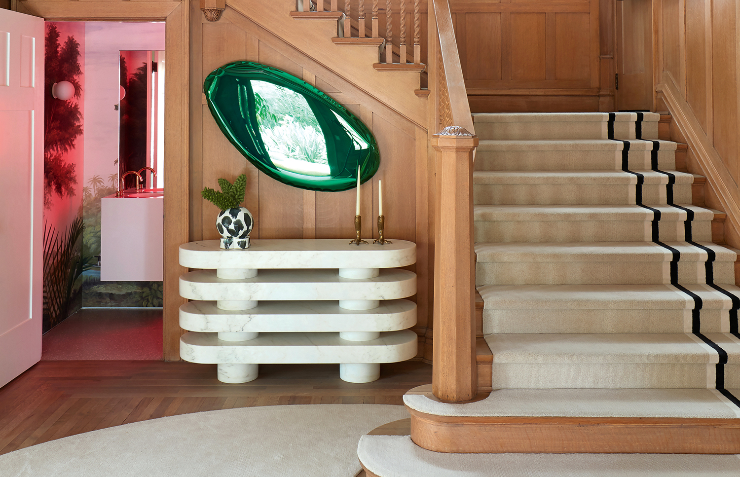
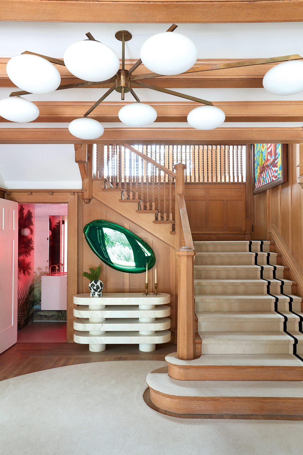
This entryway is a masterclass in using modern shapes and colors to create a grand first impression. It's clear that it was thought about from the vantage point of anyone who steps through the front door - the placement of each piece works perfectly with everyone else in the space to make a wonderful vignette.
It can be quite tricky when decorating in a space with so much wood to know which colors to choose. But designer Ghislane Vinas has put so much consideration into this entryway. The green mirror connects to the green of the mural in the powder room. The white console relates to the ceiling light and white stripe on the staircase carpet. The pink-y red light coming through from the cloakroom washes the whole space in a friendliness that might otherwise have not been there.
But hang on. Green. Red. Hints of white and gold. Is this a Christmas color palette that actually lasts all year? It's not not a Christmas palette, anyway, which is why we thought this was the perfect time of year to get our color expert Ruth Mottershead to dissect it right now. As the creative director of Little Greene she understands who to use colors to their best advantage, and so decodes all the little tricks that Ghislane has used so brilliantly here.
How to find the hidden colors, by Ruth Mottershead
It’s important to look for colors that are hidden within the grains of natural wood – they will chime out to you

Design by Ghislane Vinas, architecture by Chet Callahan of Chet Architecture
The slow realisation of a Christmas theme is an engaging and beautiful thing, leaving out any pastiche or affected joy. Red and green are of course a classic signature of Christmas – it is the glimpse through the open door to the restroom that provides the festive color palette within this scheme. In fact, the feeling of the space would be much more sober should the door be closed. The soft, neutral tones of the wood provide a backdrop for statement materials and colors.
The metallic green mirror, the aged gold candlesticks and the pink and green restroom all become ‘decorations’. Even the ribbon-like black stripe on the carpet on the staircase has a significant place in this scheme. It is a natural palette that feels decorated.
It’s important to look for colors that are hidden within the grains of natural wood. Here you can find pinks, greens and the occasional blue. Use a color card or fan deck to help look for these colors – they will chime out to you when held up against the wood. Warm tones such as strong yellow or orange combine beautifully with oak, and pink combines harmoniously with beech. Dark stained wood is a different matter: here, take the lead from the color scheme you wish to create, rather than the tones that come naturally.

Puck Absolute Matt Emulsion by Little Greene
The vibrant, unnatural green of the mirror strikes out at the organic nature of the woodwork. It demands your attention as much as if it were a brilliant orange or fiery red. Certainly this piece is a statement – it adds energy and dynamism to the room without being too showy.
Each of the green elements is not a single statement – they all support each other to create the overall finish. Although the green in the mirror talks to the green within the restroom and artwork, the tones differ. They relate simply due to their vibrancy and strength within the scheme. The mirror’s metallic nature means it offers tonal differentiation, adding depth and a sense of another place within its reflection. The artwork offers a transition elsewhere, perhaps somewhere more complex and sophisticated, while the restroom provides a step into another scene, too. They are both subtle points of escapism within the scheme.

Confetti Absolute Matte Emulsion by Little Greene
I see the two tones of pink in the powder room as different colors, one containing more yellow rather than violet. If they were the same color, the result would be soft and gentle rather than the element of tension we see here. The undertone of each color is hugely important: pairing colours with similar undertones leads to a harmonious result. Combining the same color in differing levels of strength also leads to a gentle result. Pairing colours with differing undertones creates contrast – always use colors of differing strength in this way to avoid clashing.
The use of a strong signature color, like the black accent in this scheme, needs to be executed with balance. We see just a small quantity on the carpet, which is then balanced by the vase. With just one of these elements, the scheme would be disjointed. Choose a small proportion of a strongly contrasting tone but ensure the colour is reflected elsewhere in the scheme.
The off-white of the entryway table relates strongly to the neutrality of the carpet. The console’s natural stone harmonises thanks to the complexity of its pigmentation. By its lightness of tone and more yellow coloring, it creates a natural bridge between the carpet and the white ceiling. For a grey cream like the console, look for a neutral tone with warm pigmentation of yellow or pink.
Be The First To Know
The Livingetc newsletters are your inside source for what’s shaping interiors now - and what’s next. Discover trend forecasts, smart style ideas, and curated shopping inspiration that brings design to life. Subscribe today and stay ahead of the curve.
Ruth Mottershead is the Creative Director of Little Greene, and one of the most renowned experts on exactly how to use color now. At Little Greene she has pioneered the way the brand thinks about color and pattern, creating new palettes, new pigments, and becoming the force behind sustainable paint offshoot Re:mix. She is also a regular contributor to Livingetc, as someone we turn to when we want to decode exactly how to put colors together.
-
 Call It High Tea, Call It Performance, Just Don’t Call It Quaint — How “Tea Time Divas” Have Reclaimed the Old-School Ritual
Inside the surreal, hyper-curated world of new-school high tea — where the tableware is art, pastries are props, and irony is part of the dress code
-
 If a Color Could Capture an Era, 'Eau de Nil' Would be "Pure 1930s" — Meet the Soft Egypt-Inspired Shade You Need to Know
Slightly more dusty than a mint, not quite as silky as a celadon, it's a shade-shifting hue, perhaps not dissimilar to the river it's named after