Horizontal or Vertical Tiles — Which Layout Works Better for a Small Bathroom?
The orientation you choose for subway tiles in your bathroom could be causing an optical illusion that makes your space feel smaller than it is
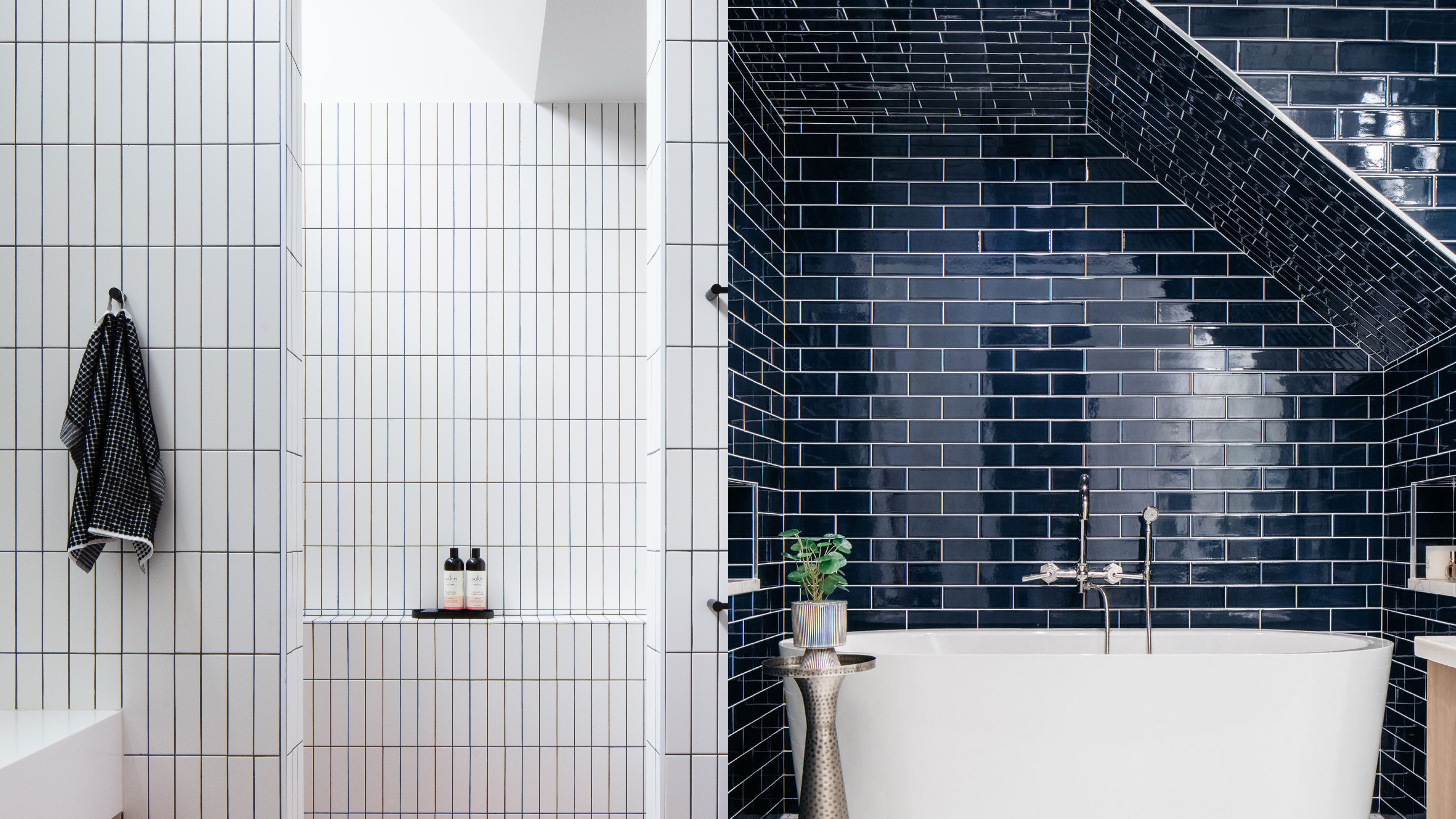

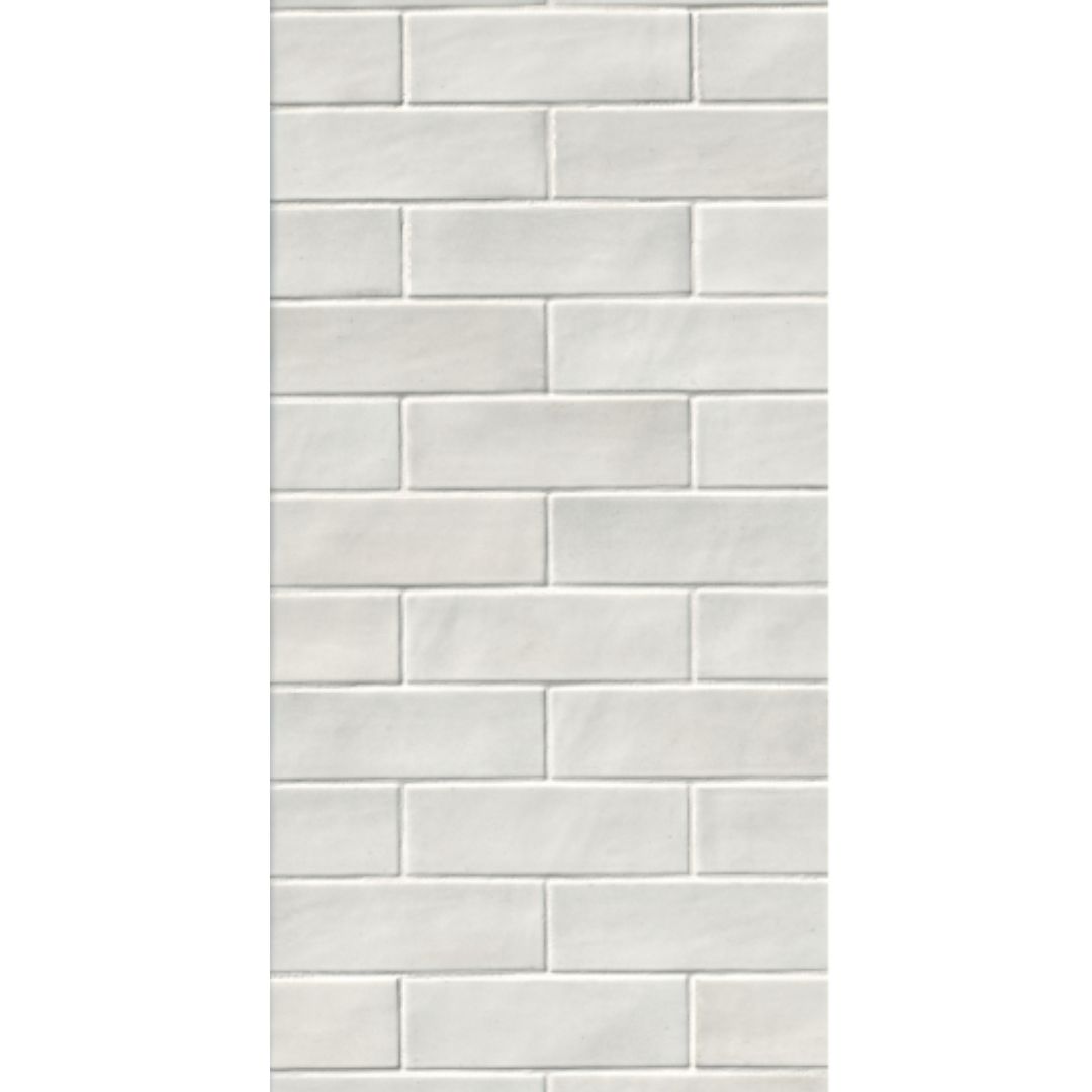
The way you position your bathroom tiles might feel like it's down to preference — and to some degree it is. However, the use of rectangular subway tiles means that when you factor in a contrasting grout, you're creating a pattern across your walls to some extent.
In a similar way to stripes in fashion, this can cause a visual effect that plays with your sense of proportion of a room — maybe making it look taller, maybe wider, depending on whether you choose horizontal or vertical tiles, and what your room's size and layout is.
So which bathroom tile idea is better for a small space? Well, the general rule of thumb is a vertical tile works great for a room with a low ceiling, a horizontal tile for one that's narrow. However, there's some important advice to consider alongside, as well as other options which offer the best of both worlds, as these experts explain.
Is it better to lay tiles vertically or horizontally?
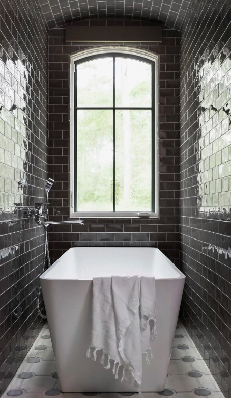
As per experts, you can alter or manipulate the way your bathroom looks with the layout of the tiles. And in saying that, both the formats work. "As a rule of thumb, vertical tiles will feel more modern, and horizontal tiles will feel relatively more traditional," says interior designer Sara Schroeder of Charles Cunniffe Architects in Aspen CO. "Vertical tiles work especially well in spaces that have lower ceilings when you would like to achieve the impression that they are higher."
Alternatively, if you have a very narrow, small bathroom layout, the horizontal tiles can make the space feel more expanded on both sides. The laying of tiles side by side in rows can draw the eye across the space, creating the perception of more room.
When should I use vertical tiles?
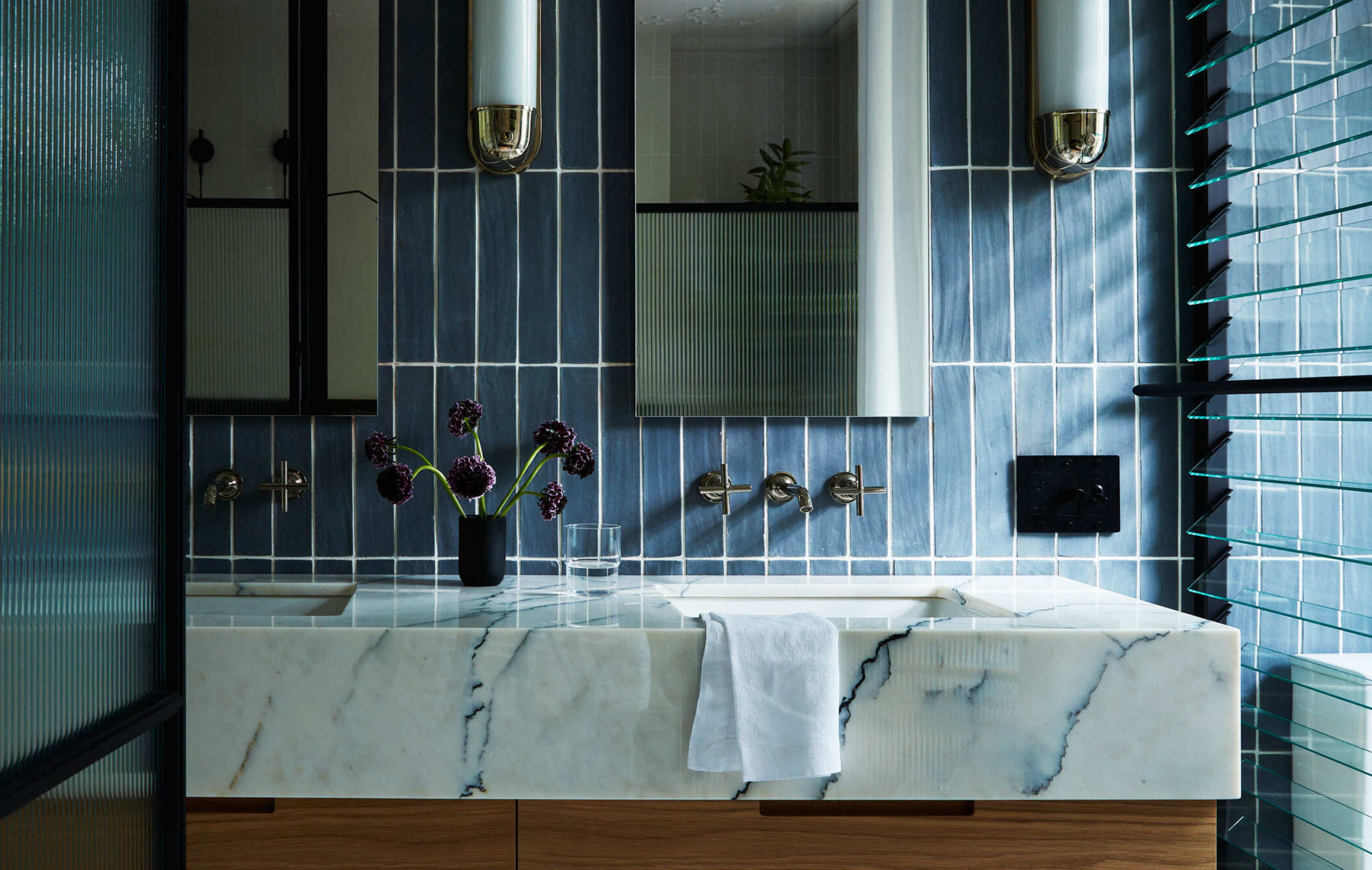
If you have a powder room or a small bathroom with a low ceiling, it's best to use vertical tiles as these will expand the space upwards.
"Running tiles vertically will add height to the room," advises Sarah Rosenhaus, principal and founder of Sarah Rosenhaus Interior Design. "A vertical pattern will draw the eyes up, giving the illusion of height."
One thing to note is that with tighter spaces, it is better to also think of the proportion of the tile to the room, and its grout lines. When you install tiles vertically, their joint lines tend to become more visible so it's best to use large format lines or neutral-toned grout lines, otherwise the room would look congested.
This format looks especially great with subway tiles, picket fence tiles, and vertical wavy tiles.
When should I use horizontal tiles?
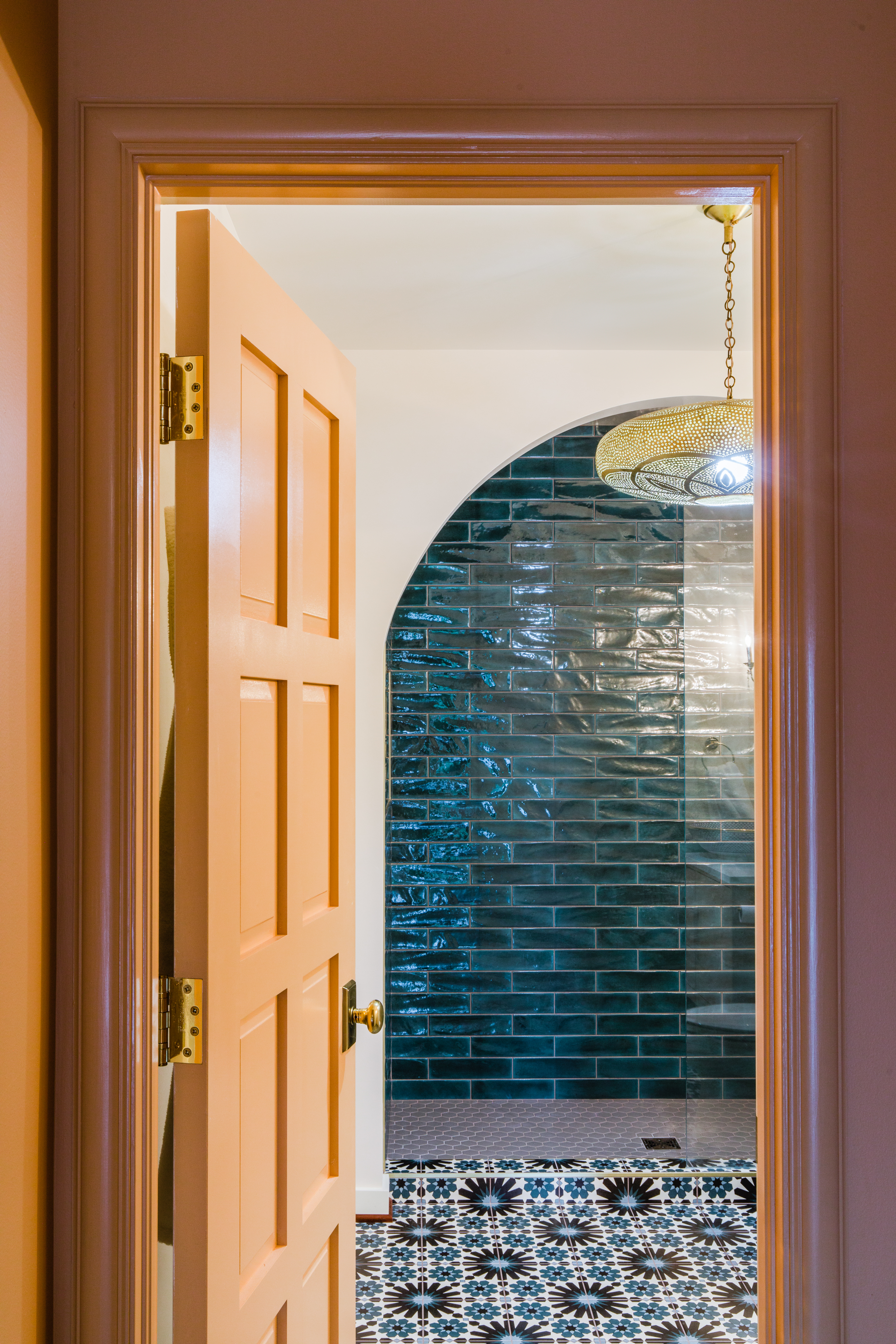
Choosing a horizontal format for small bathroom tiles would be ideal when you want to expand the space, width-wise. This specific layout will visually push the space and make it look wider and bigger.
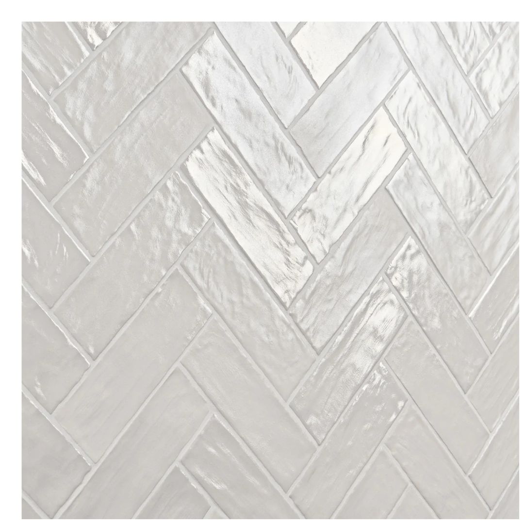
This format works well with most types of tiles, but particularly with brick, mosaic, and herringbone tiles. One thing to remember is "in small bathrooms, choosing large-format tiles will make the space feel larger, especially if you're laying them out horizontally," says Nishita Kamdar, principal architect at Studio Nishita Kamdar.
What color tiles work best in vertical and horizontal formats?
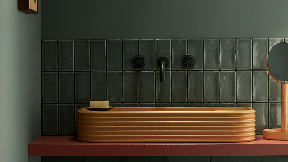
If you're interested in making a small bathroom look bigger, it may not even be a question of horizontal or vertical tiles but more the color and the grout lines.
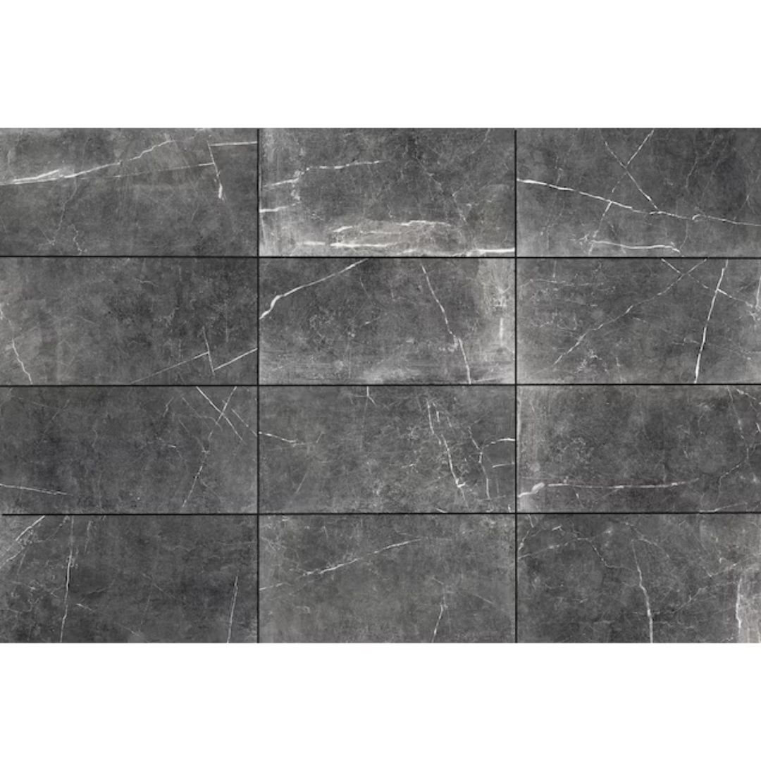
"It is a myth that dark colors will make a small bathroom look smaller," says Nishita. "The correct lighting and choice of tile will make even a small bathroom look dramatic. I prefer to not use very busy printed tiles in small spaces and instead use solid colors."
Using the same color grout as the tiles will also removes these prominent lines altgether, helping to reduce the effects of any optical illusions.
Should I use large or small format tiles?
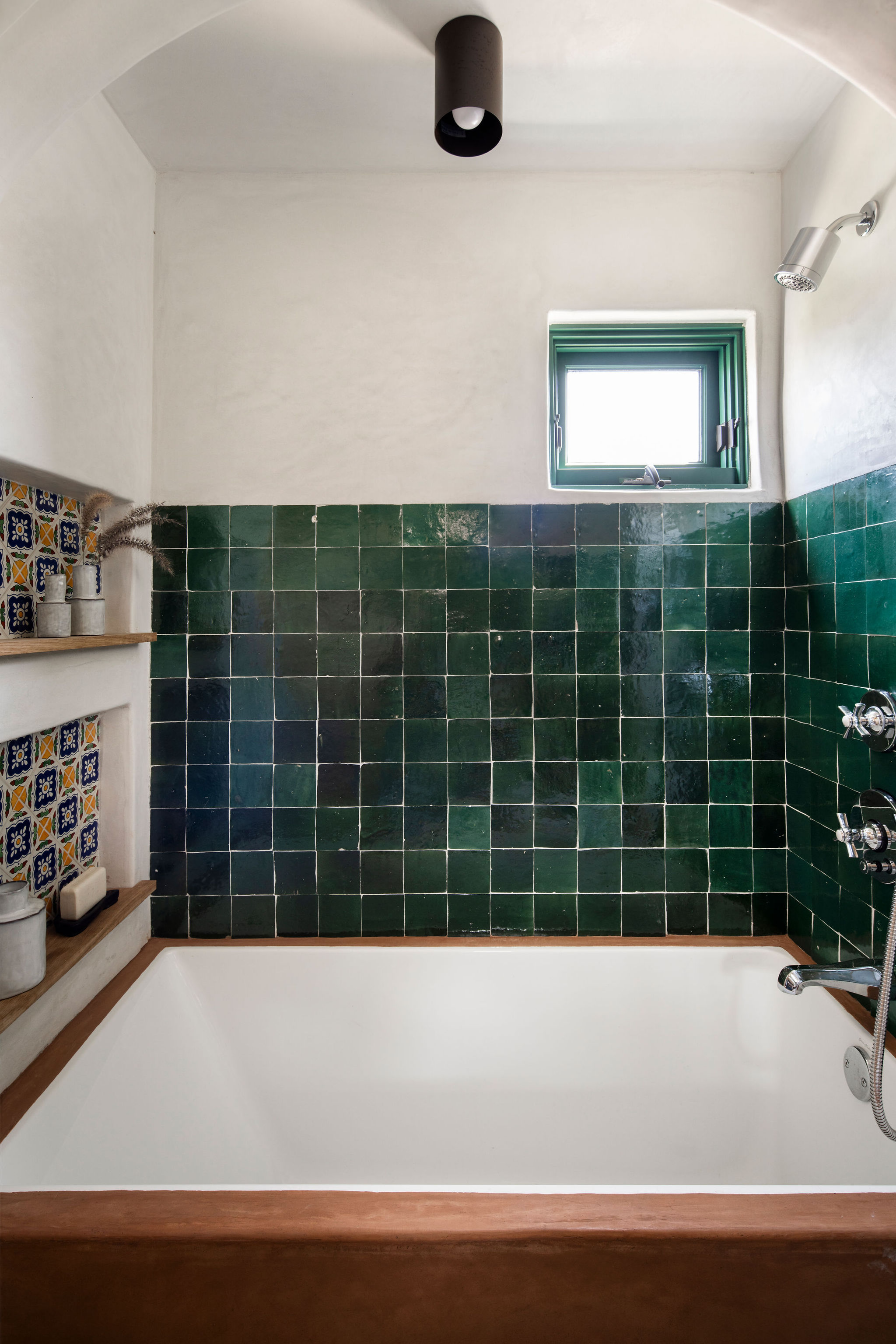
People are often duped into thinking a small bathroom or an ensuite calls for small tiles. In reality larger tiles expand the illusion as they require fewer grout lines making it appear more streamlined.
Mindy O’Connor, principal and founder of Melinda Kelson O'Connor Architecture & Interiors, argues the tile size poses a more important contributor to the illusion of a larger space.
"The direction of the tile layout itself can affect the appearance of size in a space, but it is more likely that the amount of tile and how it is being used on the walls will have a greater impact," she says.
"Large tiles are best but we would not recommend an overly large format tile for a small space," warns Sara Schroeder. "There is much more than your tile orientation to think about as you are selecting tile — including pattern (on each tile), layout (of the tiles together), tile quantity, texture, and accenting required to achieve your dream installation."
When selecting your tile, calculate how many tiles can fit across your space. Both vertical or horizontal tiles should accentuate unbroken space in order to appear larger. Mindy advises calculating your tile size precisely to ensure they fit perfectly. "Rather than fitting tile in every open spot, design millwork carefully to minimize broken spots or awkward leftover areas for tile," she explains. This will have a large effect on the feeling of openness and continuity in a room.
In conclusion, whether you choose horizontal or vertical tiles, both can be beneficial in a small bathroom. It depends on how you want to boost the space's visuals. For narrow spaces, it's best to go in for a horizontal format, but if you want to give the bathroom more height, choose vertical tiles.
Be The First To Know
The Livingetc newsletters are your inside source for what’s shaping interiors now - and what’s next. Discover trend forecasts, smart style ideas, and curated shopping inspiration that brings design to life. Subscribe today and stay ahead of the curve.

Aditi Sharma Maheshwari started her career at The Address (The Times of India), a tabloid on interiors and art. She wrote profiles of Indian artists, designers, and architects, and covered inspiring houses and commercial properties. After four years, she moved to ELLE DECOR as a senior features writer, where she contributed to the magazine and website, and also worked alongside the events team on India Design ID — the brand’s 10-day, annual design show. She wrote across topics: from designer interviews, and house tours, to new product launches, shopping pages, and reviews. After three years, she was hired as the senior editor at Houzz. The website content focused on practical advice on decorating the home and making design feel more approachable. She created fresh series on budget buys, design hacks, and DIYs, all backed with expert advice. Equipped with sizable knowledge of the industry and with a good network, she moved to Architectural Digest (Conde Nast) as the digital editor. The publication's focus was on high-end design, and her content highlighted A-listers, starchitects, and high-concept products, all customized for an audience that loves and invests in luxury. After a two-year stint, she moved to the UK and was hired at Livingetc as a design editor. She now freelances for a variety of interiors publications.
-
 My 10 Favorite Designs at Milan Design Week 2025 — Out of the Hundreds of Pieces I Saw
There is a new elegance, color, and shape being shown in Milan this week, and these are the pieces that caught my eye
By Pip Rich
-
 Iridescence Is Chrome’s More Playful, Hard-to-Define Cousin — And You're About to See It Everywhere
This kinetic finish signals a broader shift toward surfaces that move, shimmer, and surprise. Here's where to find it now
By Julia Demer
