How do I make a moodboard for a kitchen remodel? Designers on the 6 steps to success
Looking to renovate your kitchen this new year? Here's how to get to perfect the art of the moodboard to set you on your way

The Livingetc newsletters are your inside source for what’s shaping interiors now - and what’s next. Discover trend forecasts, smart style ideas, and curated shopping inspiration that brings design to life. Subscribe today and stay ahead of the curve.
You are now subscribed
Your newsletter sign-up was successful
If you want to remodel or build your kitchen, the first step is to find the right inspiration. This is where a moodboard comes in. So much more than just a few Pinterest pins, get it right and it gives you a vision you'll refer to time and time again.
They're particularly key in a modern kitchen. In this functional space, all elements flow together and look cohesive. This is where mood boarding comes in, which allows you to carefully plan all items in the kitchen, and see if they make a nice, cohesive whole and work together.
To help you with the process, we reached out to top kitchen experts and designers who offer useful advice on kitchen color ideas and more. Take a look and get designing.
Article continues belowHow do I make a mood board for a kitchen remodel
While deep in your kitchen remodeling project, it might feel like you're lost deciding on your kitchen color scheme, faucets, tile designs, and sinks. They all might feel like a jumble at the end of it, and you're lost thinking of what your original idea was.
This is where moodboarding comes in, which allows you to anchor your inspirations, and create a cohesive story out of it.
'Moodboards are one of the easiest ways to showcase your home interior inspiration and convey your design ideas,' says Tom Howley, design director at his eponymous kitchen brand. 'They act as a tool to build clear design stories and help manifest and express your vision, even if you can’t fully visualize the result.'
'To create a mood board, you want to gather as much inspiration as possible, and this includes images of kitchens, bars, stools, handles, worktops, etc that you like the style, material, and/or color of,' says William Durrant, owner of Herringbone Kitchens. 'Gathering ideas and inspiration from the moment you decide on a new kitchen is always a good idea. Instagram, Pinterest, or magazines are great ways to find and save inspiring images that will give you a better idea of how you imagine your kitchen to look and the styles that appeal to you. Don’t limit this to pictures of kitchens, though. Keep an open mind. You can find inspiration in colors, and shapes in all kinds of places.'
The Livingetc newsletters are your inside source for what’s shaping interiors now - and what’s next. Discover trend forecasts, smart style ideas, and curated shopping inspiration that brings design to life. Subscribe today and stay ahead of the curve.
1. Think of your personal style
What works best for you - a physical or digital board? Some people find that they need to be able to touch the kitchen tiles and brush their hands over paint swatches to feel the textures and visualize the colors. Others are perfectly fine with putting everything together on screen.
'Introduce images and ideas that thread from one image to the next, telling a story of the space you want to create,' says Tom. 'Visualise your dream home. Ask yourself what you are naturally drawn to - is there a color that instantly lifts your mood or a design element you know will enhance your family’s lifestyle? Keep these answers in mind when creating your mood board and only add images you love. Also, don’t forget to collect your real-world inspiration. All of us have a camera to hand, so whenever you see something that inspires, take a picture.'
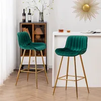
These bottle green kitchen countertop chairs or bar chairs can add a pop of hue to an otherwise muted room. These provide sturdy support, and add oodles of style to the home.
2. Start with the base color
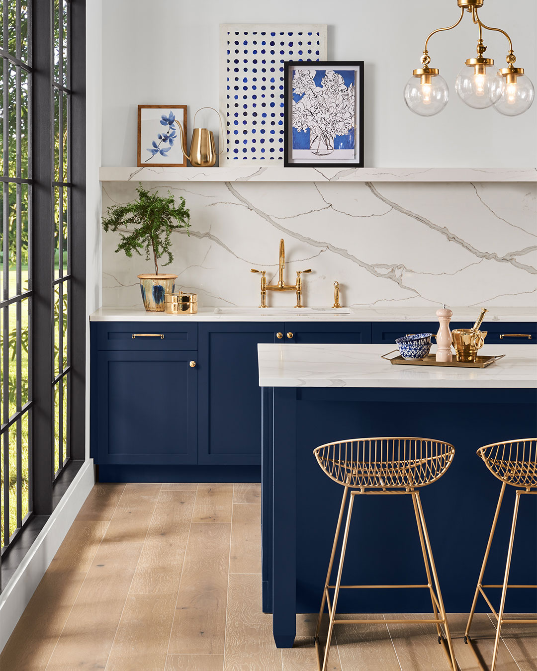
When planning the kitchen, don't let color be the last thing you think about. 'Using complimentary hues or materials to link living spaces together will help the design to flow,' says William. 'A well-placed island or peninsular can define separate spaces using the right hues. Artwork and lighting will also help to add your style and character to the space. For example, if you have some shades in your favorite artwork you can pull out specific ones to compliment, link, and pull together your space.'
'Pick out a suggestion of the colors from tiles and paints, and create a selection of items that work together and give you a natural flow within the room, from the flooring to the tiles to the accessories,' says Helen Parker, creative director of deVOL. 'It may be something as simple as an old pot that sets the whole color scheme rolling.'
3. Consider the hardware
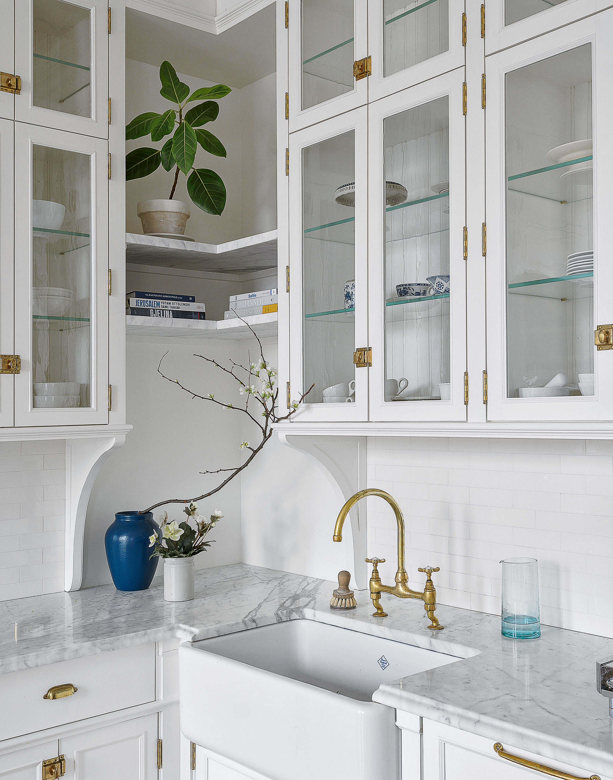
'When remodelling the kitchen, think about how it all ties together,' says William. 'We like mixing and matching until we get the right outcome so physically put colors, styles, materials, and sample hardware in front of you and test it out during the day and in the evening to see how it all looks. Details are important and bringing in elements is much easier if you see them in physical form. The more images and samples the better so you can whittle it down and offer a strong visual.'
We often get asked 'how do you design a kitchen that's better to cook in?' Well, ease of use is key. Think of what type of handles and drawer knobs you need; the finishing touches can completely transform the look and feel of a space. Make sure the hardware matches the cabinets and complements the sink and faucet. For instance, a white shaker cabinet will look great with silver or black handles or knobs.
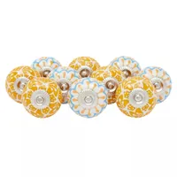
Ceramic Knobs for drawers from Target
These colorful knobs add a decorative touch to drawers and cabinets. Consider adding these little beauties if you want to add a subtle but noticeable color to the kitchen.
4. Focus on textures
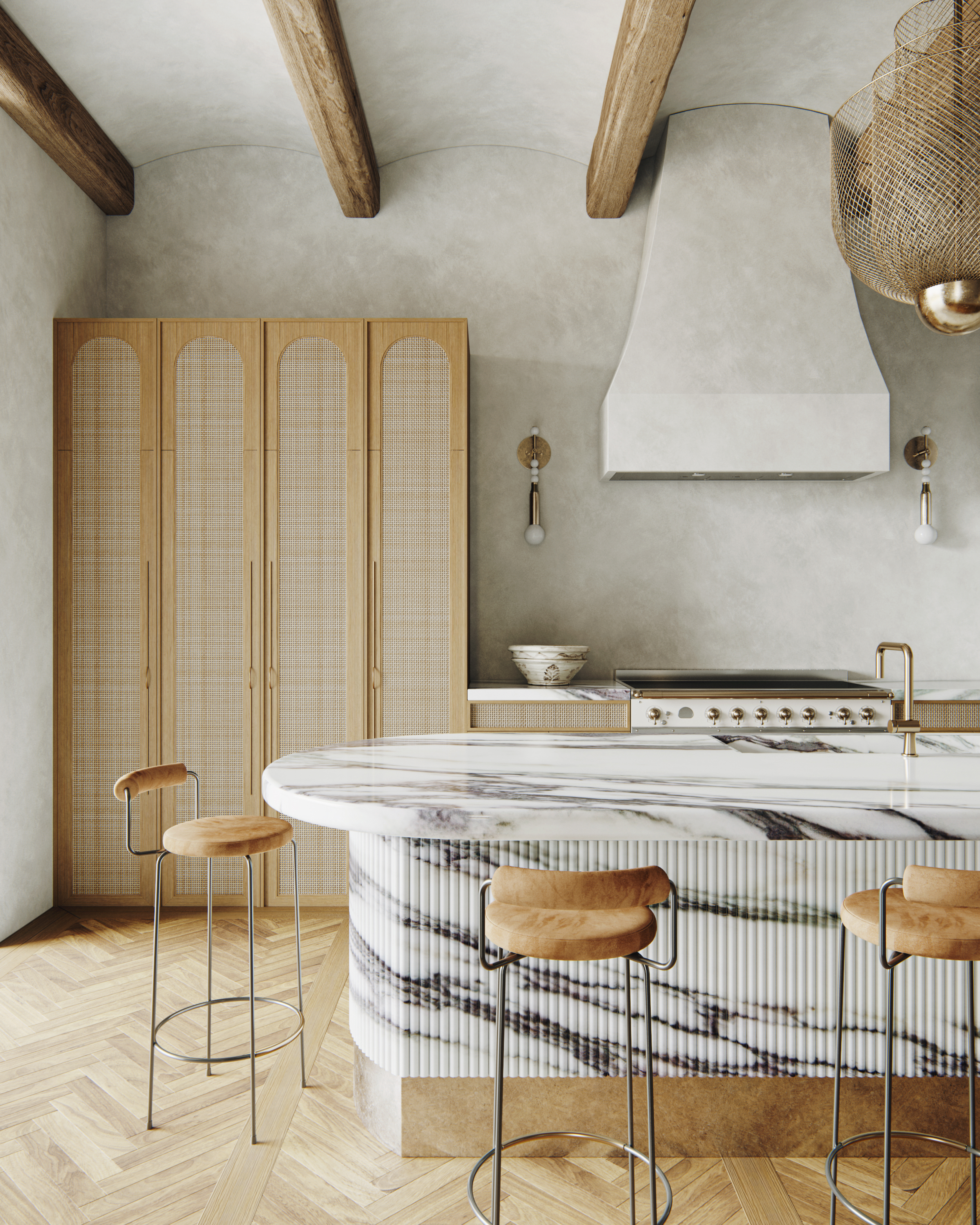
The right textures can breathe life into your kitchen, so choose kitchen flooring to countertop materials that define a style and give the space a sensorial feel. Think freshly-oiled oak countertops, sheer curtains, quartz counters, matte black cabinets, and more.
Another way to bring texture to the kitchen is through the walls. From faux brickwork and wood panels to lime wash paint and textured wallpaper, there are several ways to add a tactile feel to this room. Be careful about using too much, though. One wall should be enough as an accent wall. Otherwise, you risk making your kitchen feel too busy or cluttered.
5. Make a focal point
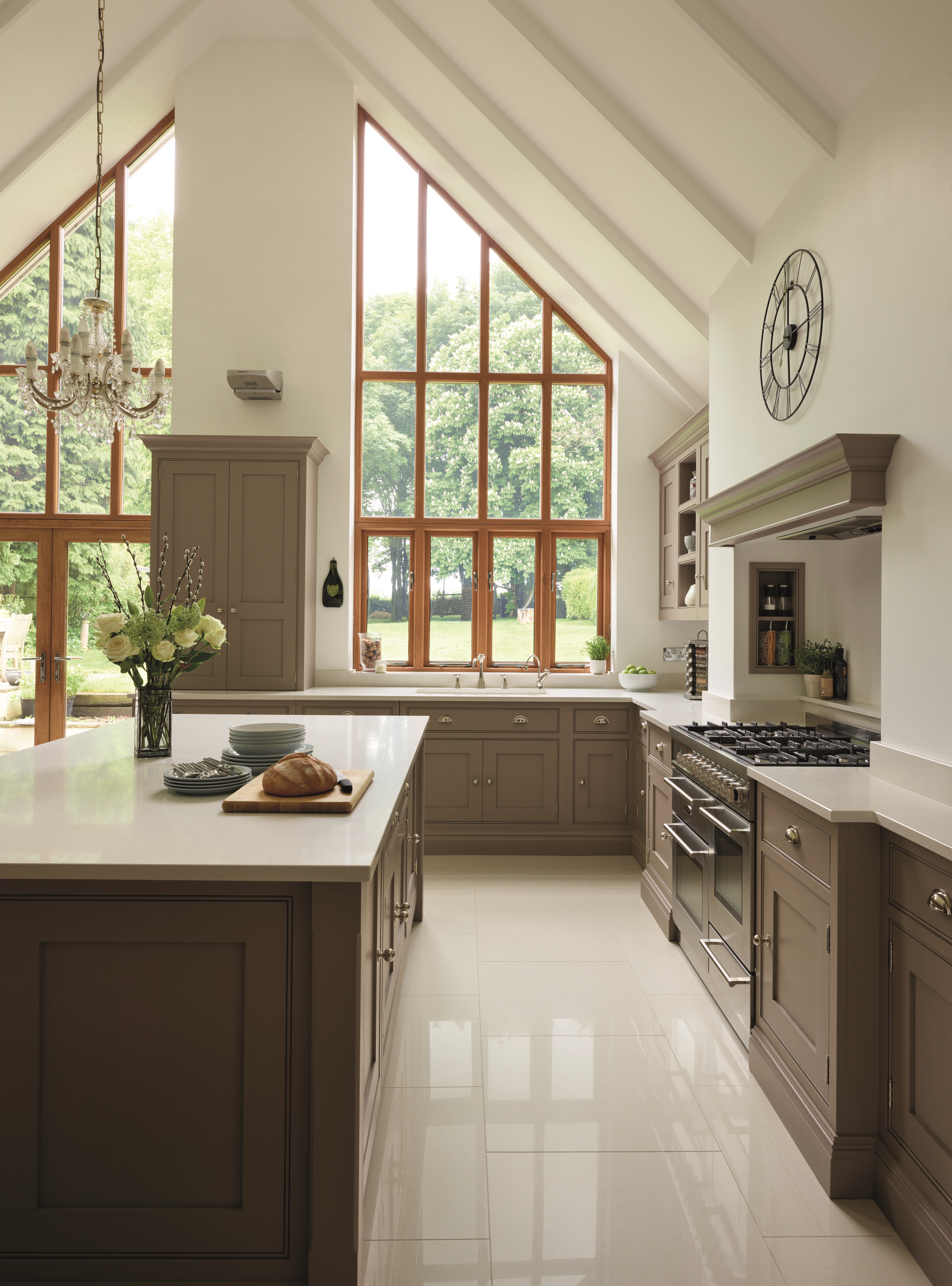
While making your moodboard, if you're still feeling a little lost and want to understand what that anchoring element would be, consider zeroing in on a focal point, and building around it. Pick a product that will serve as a visual and functional focal point for your space. This could be the kitchen countertop, the sink, the backsplash tiles, or even the accent wall.
'If you have an awkward architectural detail or feature you want to highlight in a space, make sure you reference these in your mood board or make them the focal point,' says Tom.
6. Finally, think of the budget
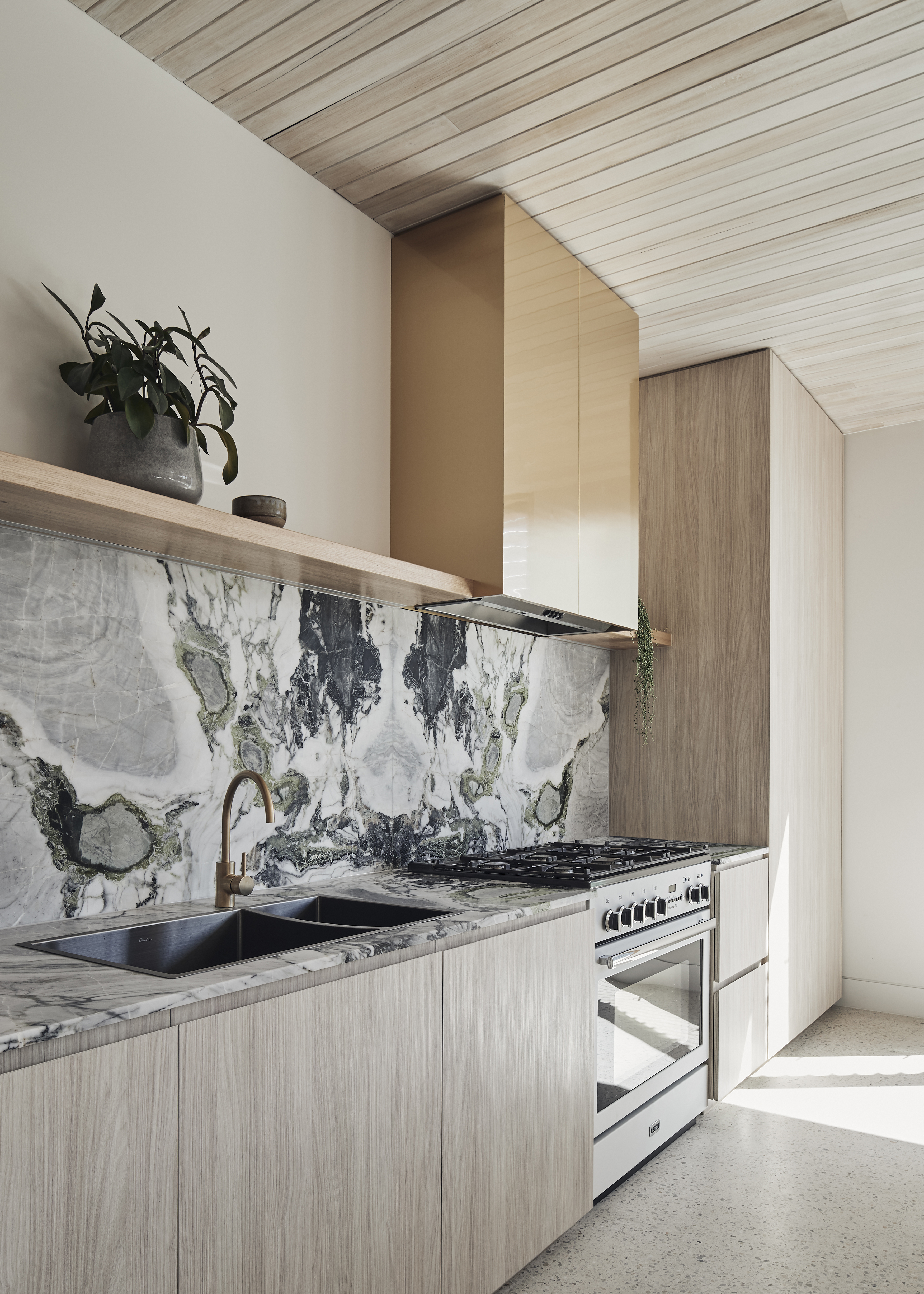
'Keep in mind your space and budgets,' says Tom. 'If you have a small galley kitchen style kitchen, try and find inspiration that displays this particular layout. This doesn’t mean you can’t implement kitchen design ideas from more extravagant spaces, just remember what can be achieved and what can’t.'

Aditi Sharma Maheshwari started her career at The Address (The Times of India), a tabloid on interiors and art. She wrote profiles of Indian artists, designers, and architects, and covered inspiring houses and commercial properties. After four years, she moved to ELLE DECOR as a senior features writer, where she contributed to the magazine and website, and also worked alongside the events team on India Design ID — the brand’s 10-day, annual design show. She wrote across topics: from designer interviews, and house tours, to new product launches, shopping pages, and reviews. After three years, she was hired as the senior editor at Houzz. The website content focused on practical advice on decorating the home and making design feel more approachable. She created fresh series on budget buys, design hacks, and DIYs, all backed with expert advice. Equipped with sizable knowledge of the industry and with a good network, she moved to Architectural Digest (Conde Nast) as the digital editor. The publication's focus was on high-end design, and her content highlighted A-listers, starchitects, and high-concept products, all customized for an audience that loves and invests in luxury. After a two-year stint, she moved to the UK and was hired at Livingetc as a design editor. She now freelances for a variety of interiors publications.
