How do you make a small entryway look bigger? This is how designers tackle tiny, dark spaces
Try these simple tricks from interior designers to make a small hallway feel bigger and brighter

Entryways aren't always the most inspiring part of a home. They're often small, and can lack in natural light, making them feel dark and dingy. Of course, with the right design interventions, you can make an entryway feel brighter, bigger and more inspiring, no matter its dimensions. But how exactly?
Your first instinct might be to paint the whole entryway bright white to try to make it as light and airy as possible. However, in a small space that's low on natural light, you might find that white walls take on a depressing greyness that only serves to highlight what your room lacks, rather than emphasizing its best qualities.
To make the right decisions for a small entrance, we asked interior designers for their best entryway ideas that will make these spaces offer a warmer welcome home.
1. Consider finishes that reflect the light
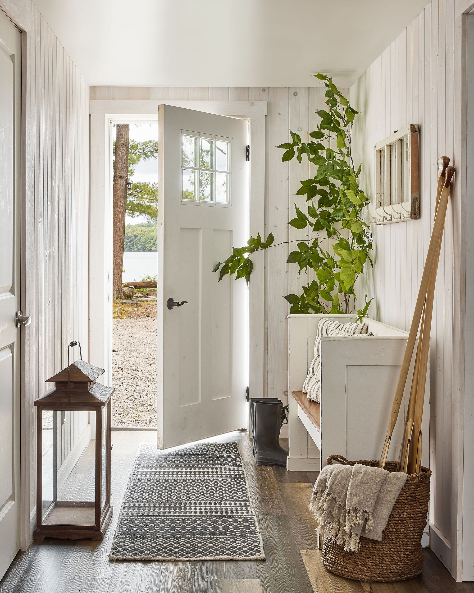
We've already talked about the perils of thinking painting everything white will solve your small entryway problems, but that doesn't mean that light finishes aren't the way forward, especially combined with some of the other tips we have to share. However, think about where a light finish will have the most effect, and where it will pick up the light and reflect it around the space most.
'When designing an entryway that may feel dark, I like to establish a lighter foundation, such as the floor,' says interior designer Becky Shea. 'Using a lighter tile helps to ground the room and naturally allows it to feel more inviting upon entry.'
2. Allow more natural light in
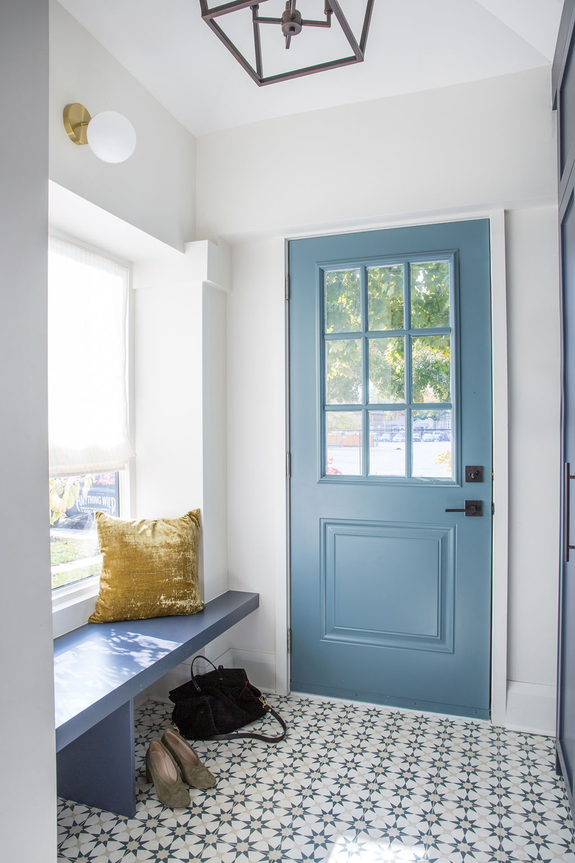
'Of course, if you have the option of windows, natural light is king to balance out a dark,' Becky adds. When you're simply re-decorating an entryway, there's not often much you can do to increase how much natural light it receives, but if you're up for changing doors, or potentially installing new windows, it's of course the most effective way to make an entryway brighter.
'If you can choose a front door with glass, or expand an existing window opening, natural light will always make a space feel more spacious,' interior designer Kathryn Findlay, founder of Studio Findlay, confirms. As well as changing a door, you could expand the door opening to include sidelights or a fan light for an extra boost of light from your entryway.
3. Don't let furniture dominate the space
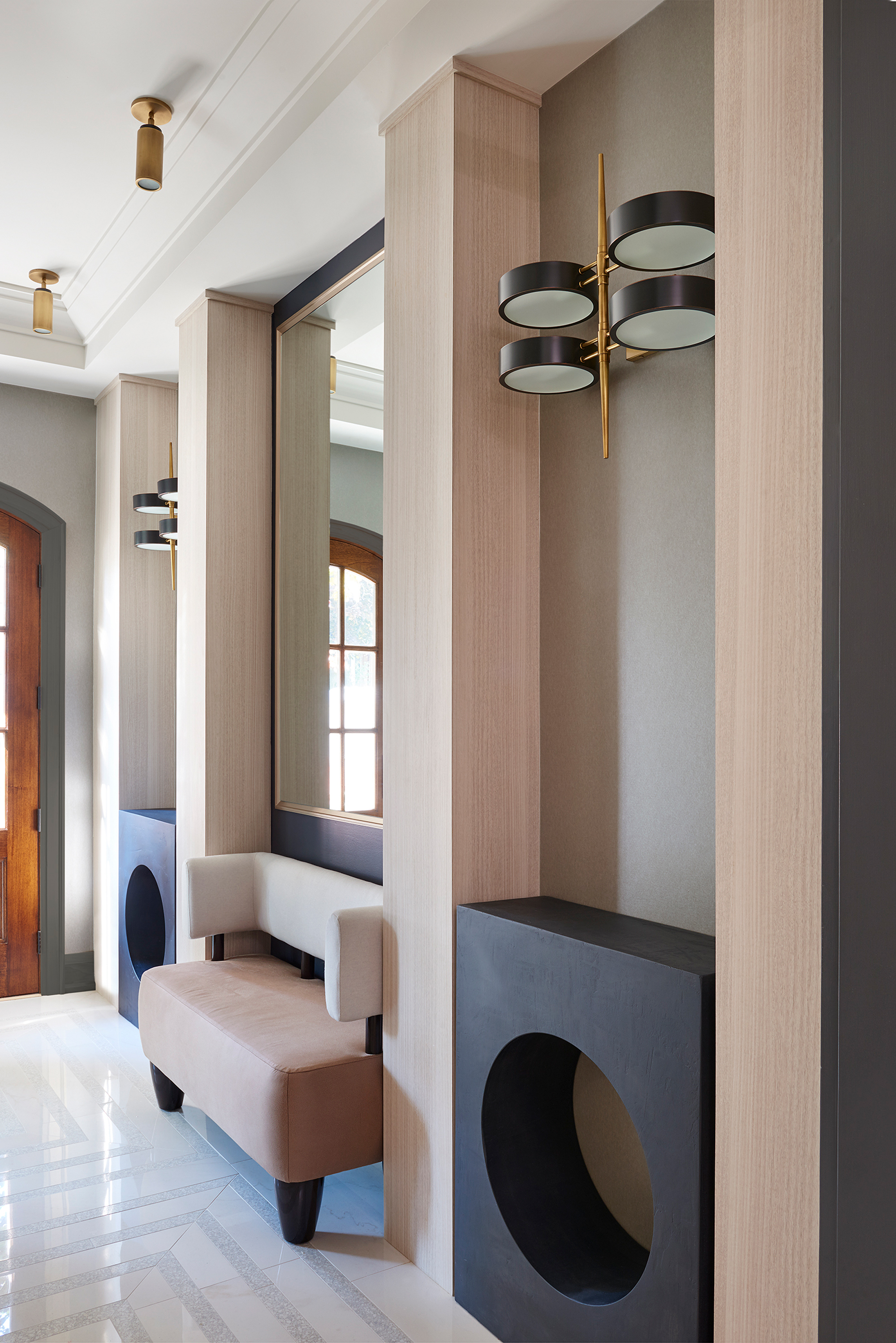
Designing an entryway is about striking the balance between furniture that's functional and that doesn't overwhelm the space.
'Space planning is the key to a successful outcome of any entryway,' says interior designer Stacey Cohen. 'Here, we kept the furniture narrow allowing enough room to be functional ensuring that it wasn’t overbearing.'
The type of furniture you choose can make an entryway feel bigger or smaller, so avoid pieces that are too large, and choose designs on legs to emphasize the proportions of the room. 'If you have space for an entry bench, keep it open underneath,' suggests Kathryn. 'This way, if you have shoes or bags, they can tuck neatly underneath, too.'
In a small entryway, consider keeping your scheme more minimal. Being too heavy-handed with your entryway table decor, for example, will make a space feel cluttered, busy and therefore smaller.
4. Add depth with texture
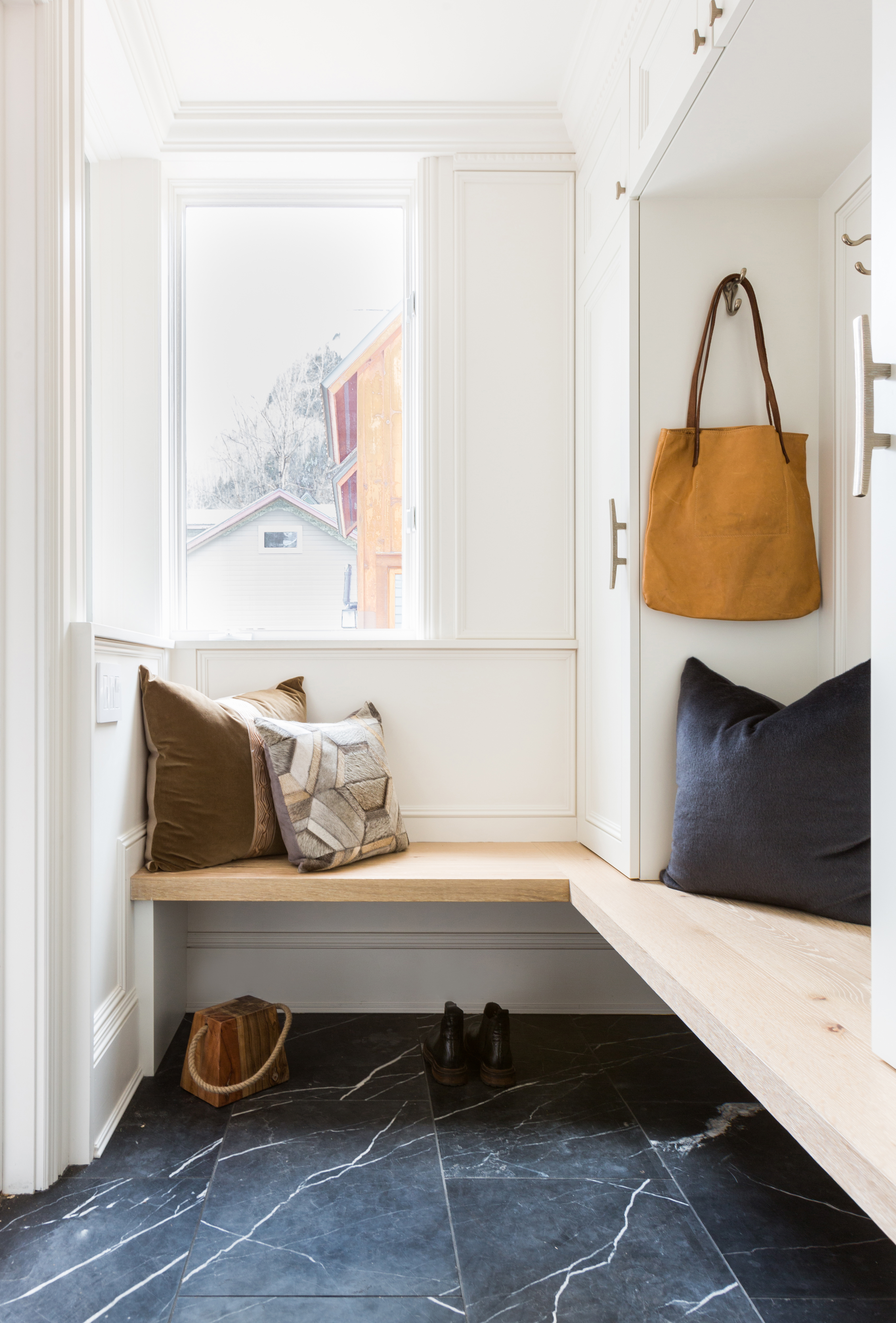
However, a scheme that's too minimalist will feel flat and one-dimensional, while entryway decor that has texture will add a depth that makes a room feel bigger. 'Even in a small space, a patterned floor tile or a runner, toss cushions or even foliage can ground you as you arrive and make a space intentionally designed and more curated,' says designer Kathryn Findlay.
'Adding living organisms like plants always elevates a space and gives a natural feeling of lighter and airier,' adds Becky Shea.
5. Consider your lighting scheme carefully
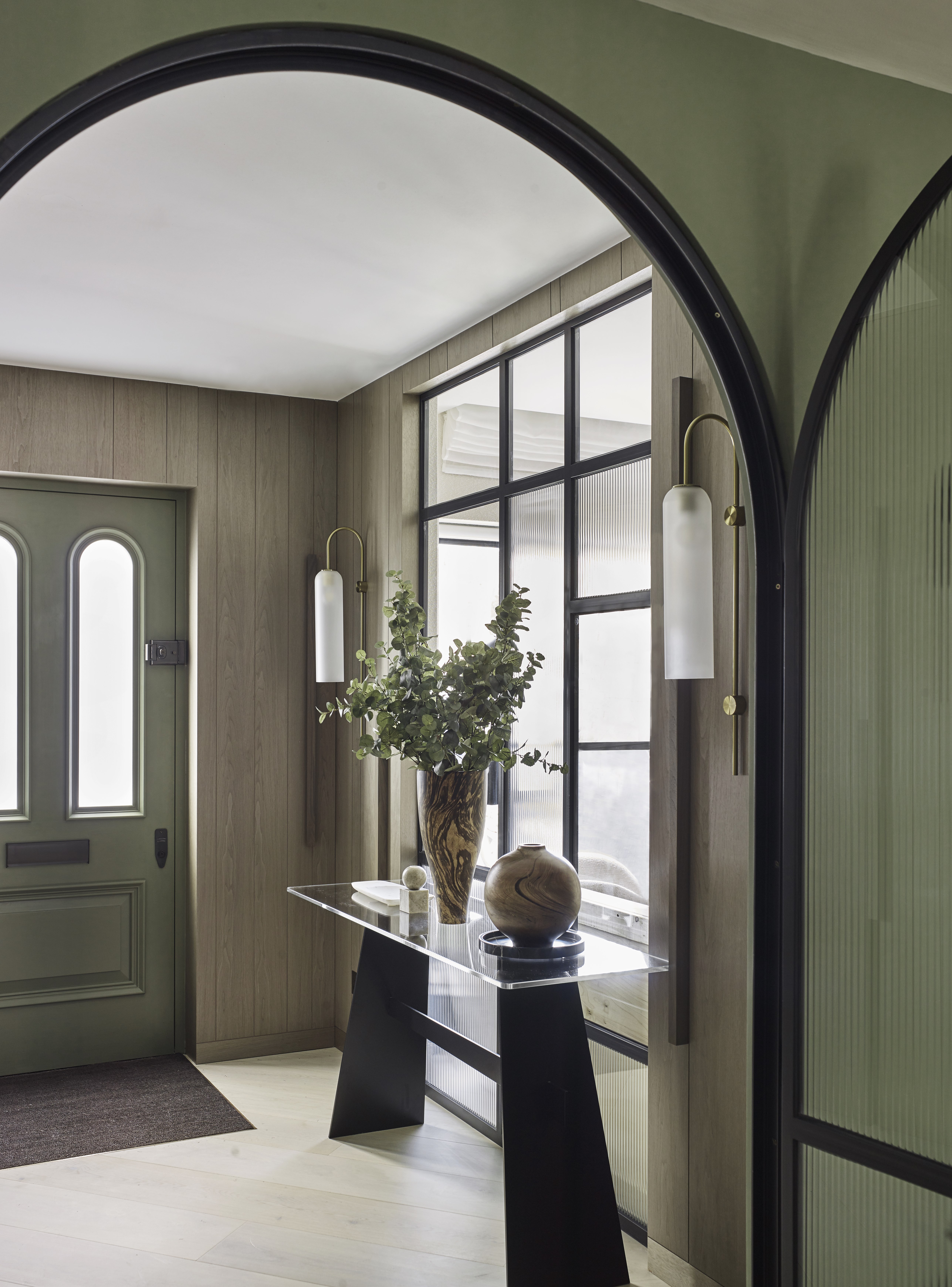
'Lighting should never be an afterthought,' Becky Shea tells us, and when it comes to a small, dark entryway, you might need to rely on your artificial lighting to help give the space a boost.
My top tip? Creating a rich, layered hallway lighting scheme is a must, but by using lighting fixtures which diffuse the light, you'll create a softer glow around the room that's more comparable to natural light. Choosing intense task lighting, exposed bulbs and clear glass shades can create harsh lighting that contrasts with your dark space, making it too bright in some spots, and too dark in others.
6. Hide away clutter with good storage
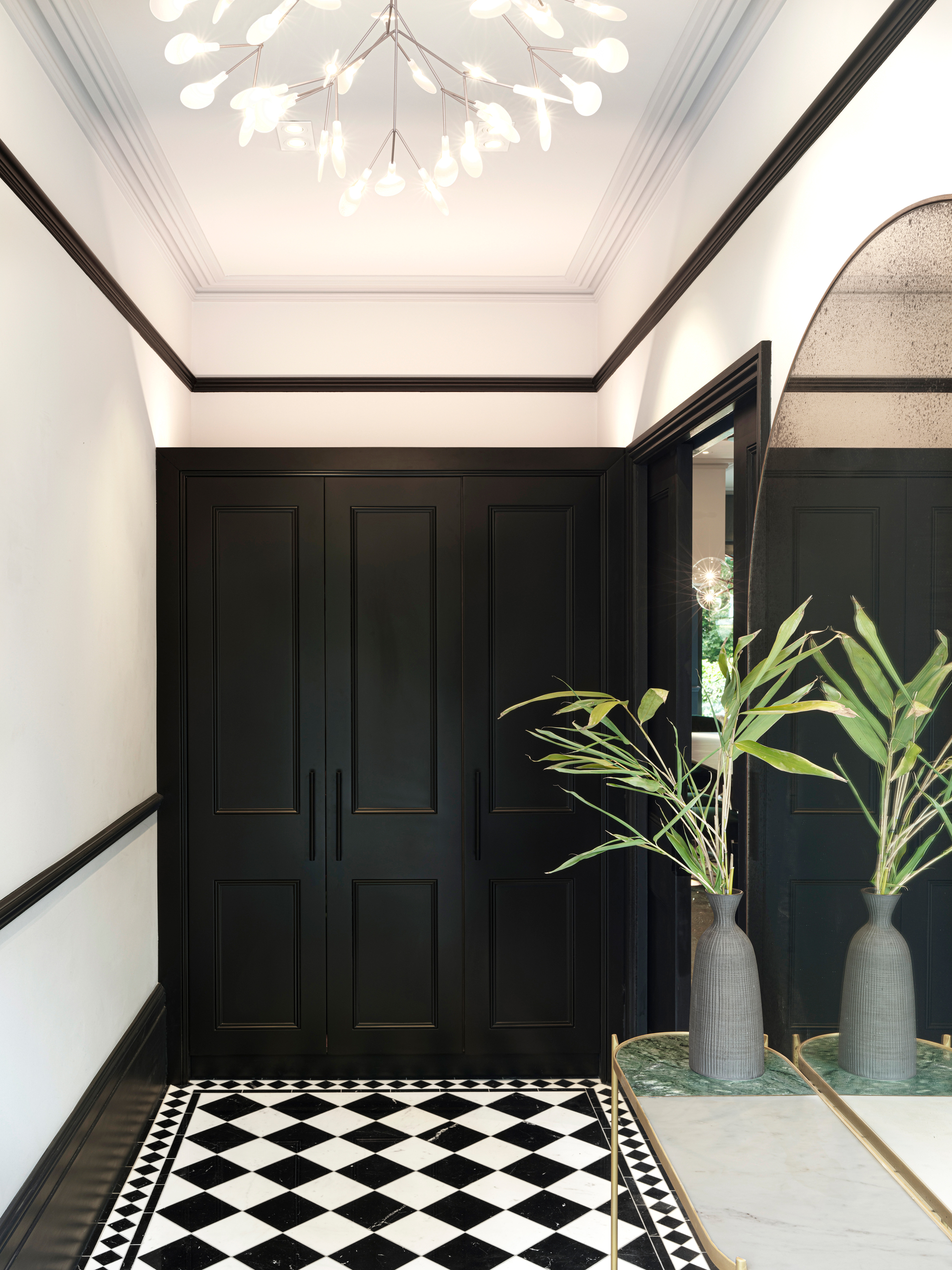
While freestanding storage can often make a small space look bigger than a built-in which disguises the true proportions of a room, sometimes a built-in can reduce the visual noise of a space, making for a clearer, less cluttered entryway that ends up feeling larger and more serene.
'If custom storage is an option, it’s worth the investment to keep your things tucked away and tidy,' echoes Kathryn Findlay. 'If it’s not, adding hooks and baskets as entryway storage can help minimize visual clutter, too.'
7. Position mirrors to maximize the sense of space
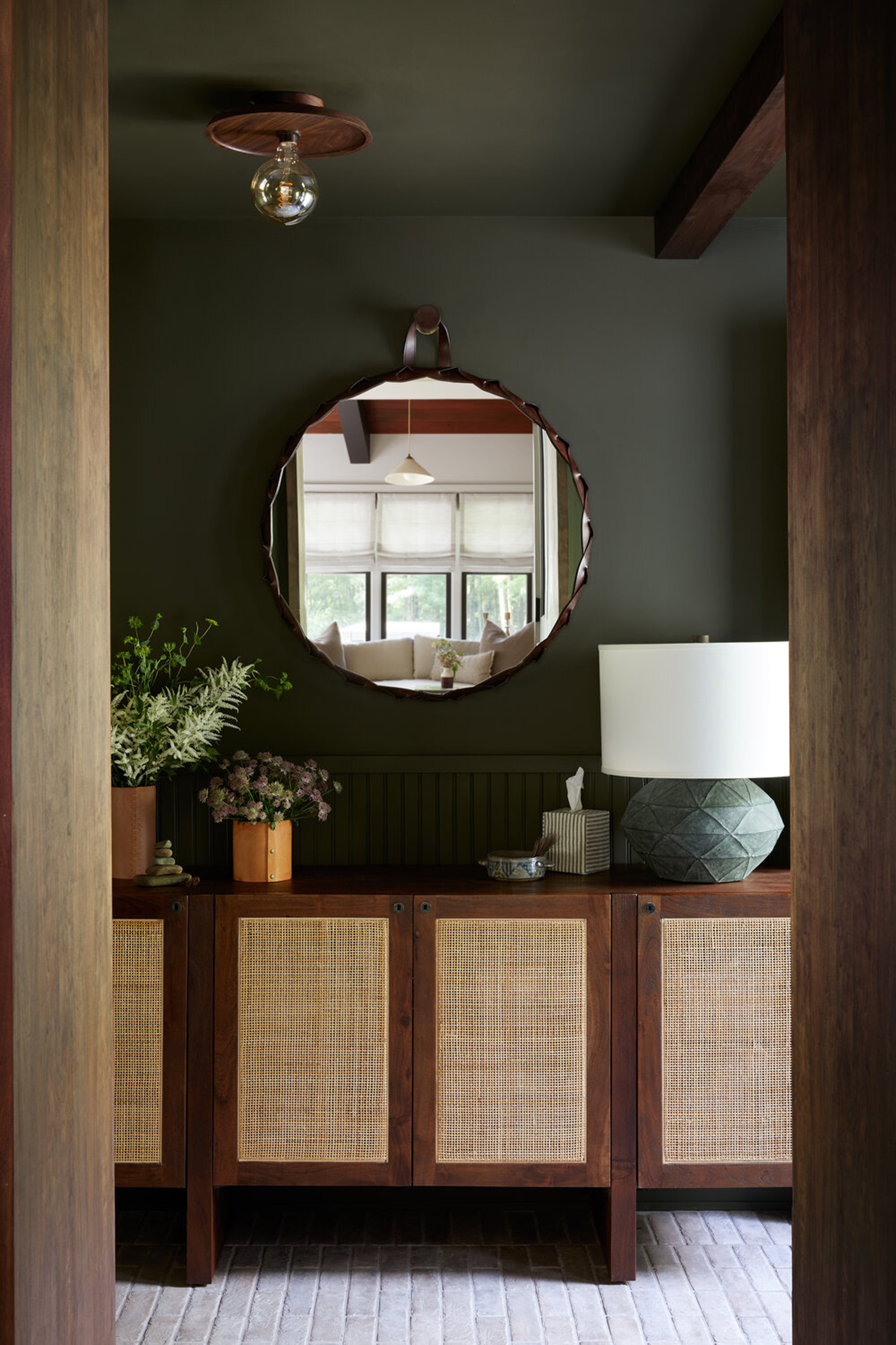
We all know by now that a mirror can make a small space look bigger, but positioning a mirror in the right position is key to getting the most from this visual trick.
Think about what the mirror reflects. If it's reflecting just the wall across from it in a narrow hallway or entryway, it won't really increase the sense of size. Positioning a mirror opposite a doorway, however, will not only reflect light from the adjoining room, but offer a glimpse of the space beyond which can make the proportions of your small entryway feel more impressive.
8. Borrow light from adjoining rooms
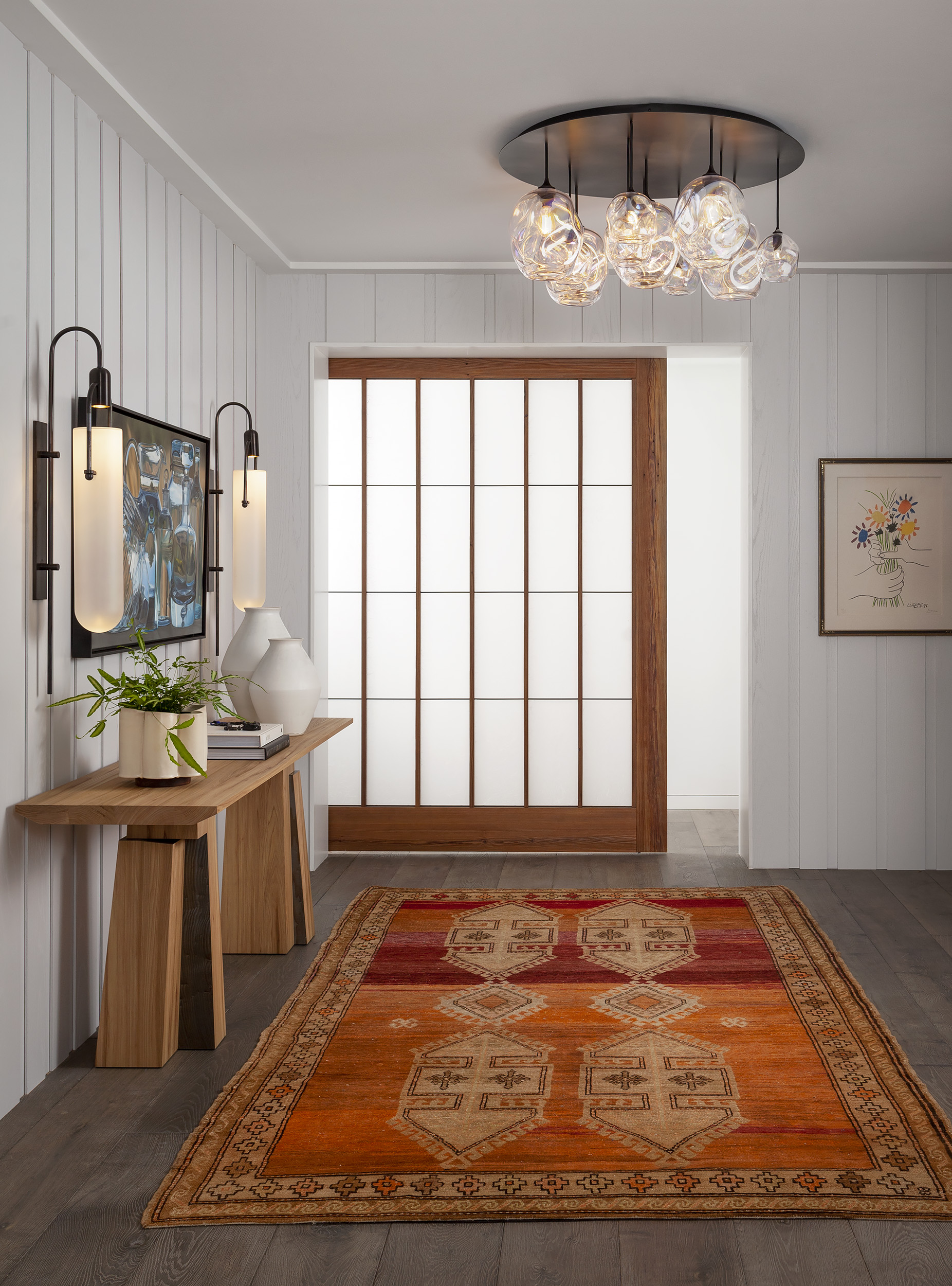
This idea of 'borrowing light' from neighboring rooms can be taken more seriously as part of your design, too. Replacing standard doors for glazed alternatives such as Crittall-style doors, or for space-saving options like pocket or barn doors, means a small entryway can benefit from the lighter, brighter rooms next door.
You could even go one step further and replace a wall with an expanse of glazing, making your dark entryway problems a thing of the past.
Should I paint a small entryway light to make it look bigger?
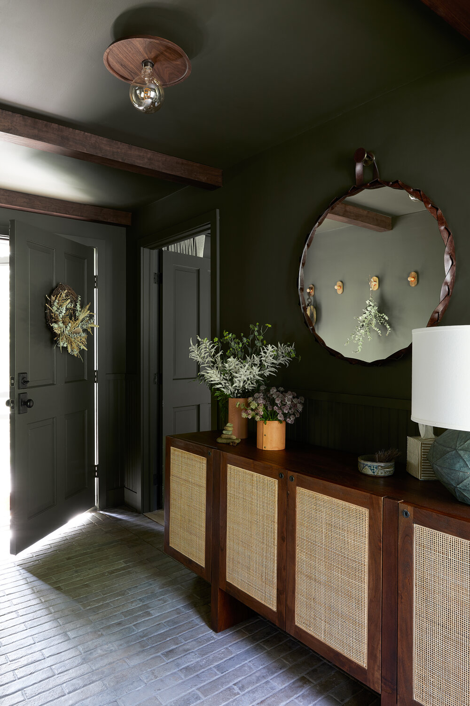
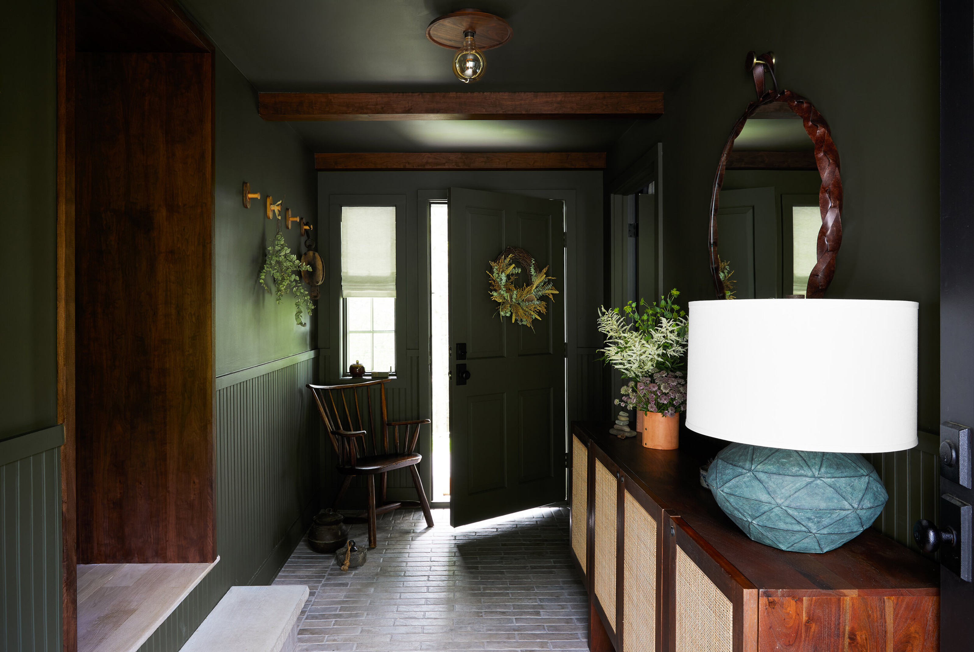
Not necessarily. Sometimes, going against the natural characteristics of a room is fighting a losing battle. Where you could make all your design decisions to simply try to make an entryway look bigger, you could make more meaningful choices that lean into your entryway's small stature for a more dramatic design, like this space by interior designer Becky Shea.
'This is our personal entryway in our home upstate and we leaned into a very natural, organic dark theme based on what was happening outdoors in the Catskill Mountains of New York,' Becky tells us. 'We used our Benjamin Moore paint fan to match colors with the environment outside, taking a walk through the woods and surrounding trails with the goal of bringing the feeling of outdoors inside.'
'We used local walnut and stained it to highlight its graining in a rich tone and paired them with lighter floors to balance out the palette, she explains. 'I believe that creating such bold contrast allows for a room to feel uniquely and intentionally designed.'
Be The First To Know
The Livingetc newsletters are your inside source for what’s shaping interiors now - and what’s next. Discover trend forecasts, smart style ideas, and curated shopping inspiration that brings design to life. Subscribe today and stay ahead of the curve.

Luke Arthur Wells is a freelance design writer, award-winning interiors blogger and stylist, known for neutral, textural spaces with a luxury twist. He's worked with some of the UK's top design brands, counting the likes of Tom Dixon Studio as regular collaborators and his work has been featured in print and online in publications ranging from Domino Magazine to The Sunday Times. He's a hands-on type of interiors expert too, contributing practical renovation advice and DIY tutorials to a number of magazines, as well as to his own readers and followers via his blog and social media. He might currently be renovating a small Victorian house in England, but he dreams of light, spacious, neutral homes on the West Coast.
-
 Italian Kitchen Trends — 5 Emerging Ideas From the Chicest Italian Designers That I Predict Will Go Global in 2025
Fresh from Milan Design Week, these are the exciting finishes, styles, and innovative materials I can't wait to see in more kitchens this year
By Faiza Saqib Published
-
 Small Patio Ideas — 8 Clever Ways to Style Up Even the Tiniest of Outdoor Spaces
If you're dreaming of turning your small patio into a dream space the right combination of practical and creative ideas will help you max up its potential
By Sarah Wilson Published