How do you mix and match wood furniture? Designers reveal the tricks behind this common design conundrum
Mixing different types of wood in furniture can be a hit and miss situation. Make your choices foolproof with these expert tips from interior designers

There’s an art to mixing and matching wood furniture. Interior designers make it look so irritatingly effortless, don’t they? Wood furniture has been steadfast in interiors for thousands of years, valued for its durability and aesthetic adaptability.
It continues to thrive today in interior design as environmental considerations stand firmly at the forefront of design practice. The natural material enriches interiors with warmth and familiarity and forges stronger proximity to our natural environment and all the benefits that come with it.
We’re unlikely to see a world without wood furniture, so learning how to artfully incorporate it into our homes is invaluable knowledge. You may be relieved to discover that combining wood tones is a common stumbling block and something many people hesitate to do. But what if there were some simple tricks that you could use to overcome this design conundrum? Luckily, there are!

Sophie is a home interiors writer and all-around design aficionado, currently studying interior design at London's KLC. For this article, she asked design experts for their tips on how to combine different kinds of wood furniture successfully in one scheme.
How to mix and match wood furniture
Like everything in interior design, it’s essential to maintain a coherent and continuous narrative. With wood, the trick is to look at it the same way you would color, paying attention to its tone and undertone.
Form and finish establish the style of the furniture piece. To boost your wood-mixing confidence, we picked apart some wood-heavy schemes by professional interior designers to expose their secrets to successfully combining wood furniture.
1. Identify the dominant wood feature
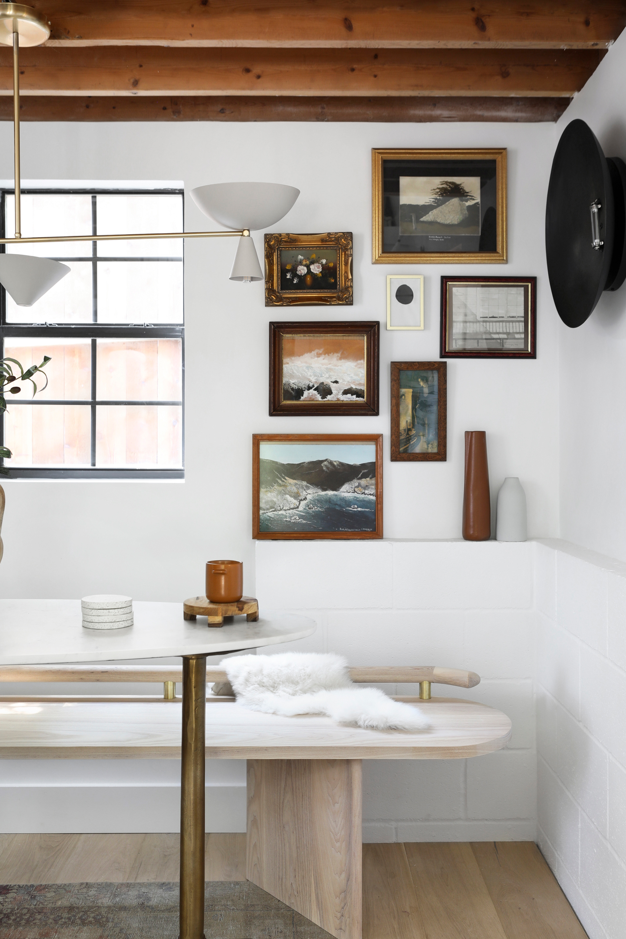
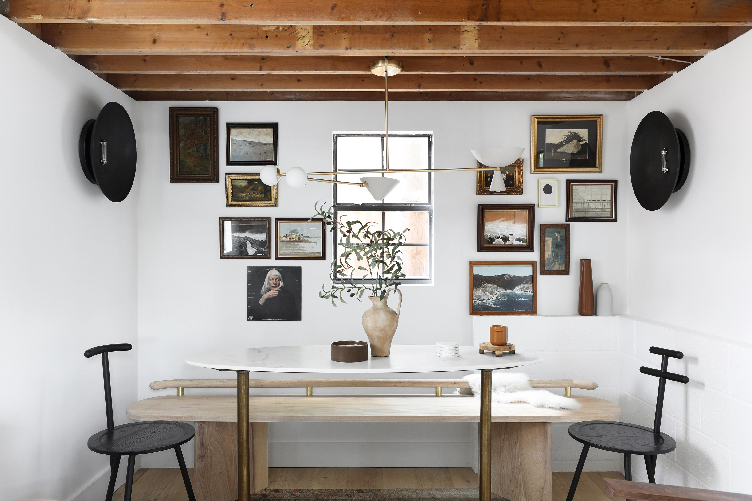
‘I start by identifying the dominant wood feature within the room to set the general mood,’ says Ginger Curtis, founder and principal designer of Urbanology Designs. The dominant wood feature is typically the largest element in a room, such as a floor, built-in cabinets, structural features like beams and ceiling cladding, or even a large piece of furniture, such as a dining table. The dominant shade will be your reference point when selecting wood furniture.
Sometimes there may not be one main feature but two or three, as is the case in Ginger's bungalow. Here, ‘the foundational elements of the room fall into a neutral and organic family,’ she explains. ‘So, for it to not fall flat or feel overly simplified, it works really well to mix wood tones because that acts as your color and contrast in the space while still holding true to an organic baseline.’
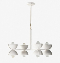
Ricardo Chandelier, Lulu & Georgia
Try this show-stopper of a chandelier over your dining table, the perfect neutral to match with wood furniture of any type
2. Match wood undertones
‘I then take inventory of the prevailing woods and group them by tone,’ comments Ginger. Just like when you’re putting together a color scheme, it’s important to pay attention to the undertone of the wood grain. Woods with warm undertones have a red, orange, or yellow tinge, whereas ‘cool’ woods look slightly grey, blue, or green. ‘I avoid woods that pull strong red and orange undertones because they can be harder to mix with other wood tones,’ she adds. For a cohesive design, stick to either a cool or warm color scheme in your palette.
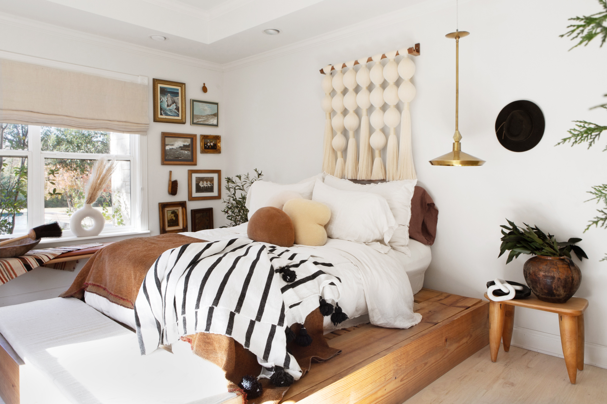
‘Keep repetition in mind and use each tone at least twice to keep the flow in the room,’ suggests Ginger. Like all furnishings, wood furniture will look out of place on its own. Notice how, in this bedroom, Ginger draws on the warm mid-tone wood of the platform bed, replicating it with the bedside table and picture frames and dispersing it evenly around the room. The same brown tone is also translated into textiles with a scatter cushion and throw.
3. Experiment with contrast
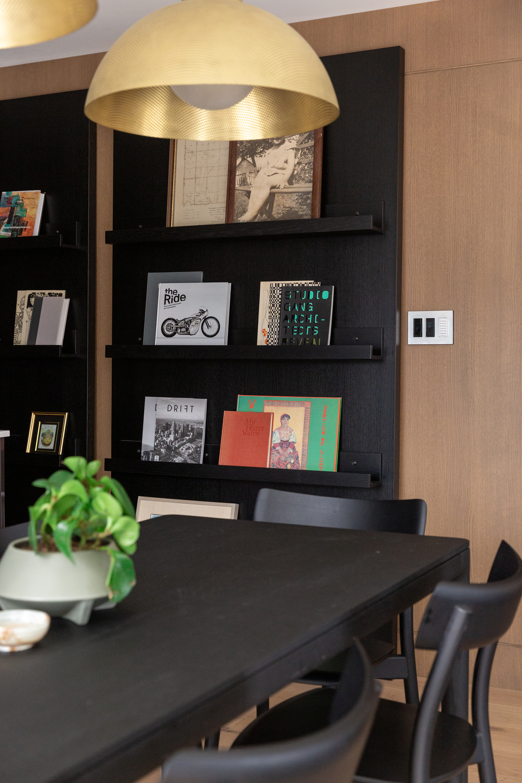
Tonal variety is the key to achieving depth, interest, and balance in a space. The opposing qualities of light and dark tones play off each other, contributing a sense of tension, movement, and excitement to a scheme.
‘One of the simplest ways to mix woods is to use contrasting tones,’ says Tara Marshall, founding partner of Fort Architecture. ‘Think of stains as if they are a paint swatch. The wood in a space (be that furniture or millwork) can vary from light to dark and still feel cohesive,’ she adds. For a balanced feel, follow color rules and aim for three different wood tones per room (light, medium, and dark); any more and the space will look busy.
In this open-plan living/dining area, inky black wood bookcases and dining furniture interrupt the flow of smooth, warm wood veneers gracing the floor and walls. As well as adding a sense of drama, the contrasting tones zone the room, establishing the dining area. ‘We would argue that the more contrast, the better,’ says Tara. This design presents a case in point.
4. Break up similar wood tones
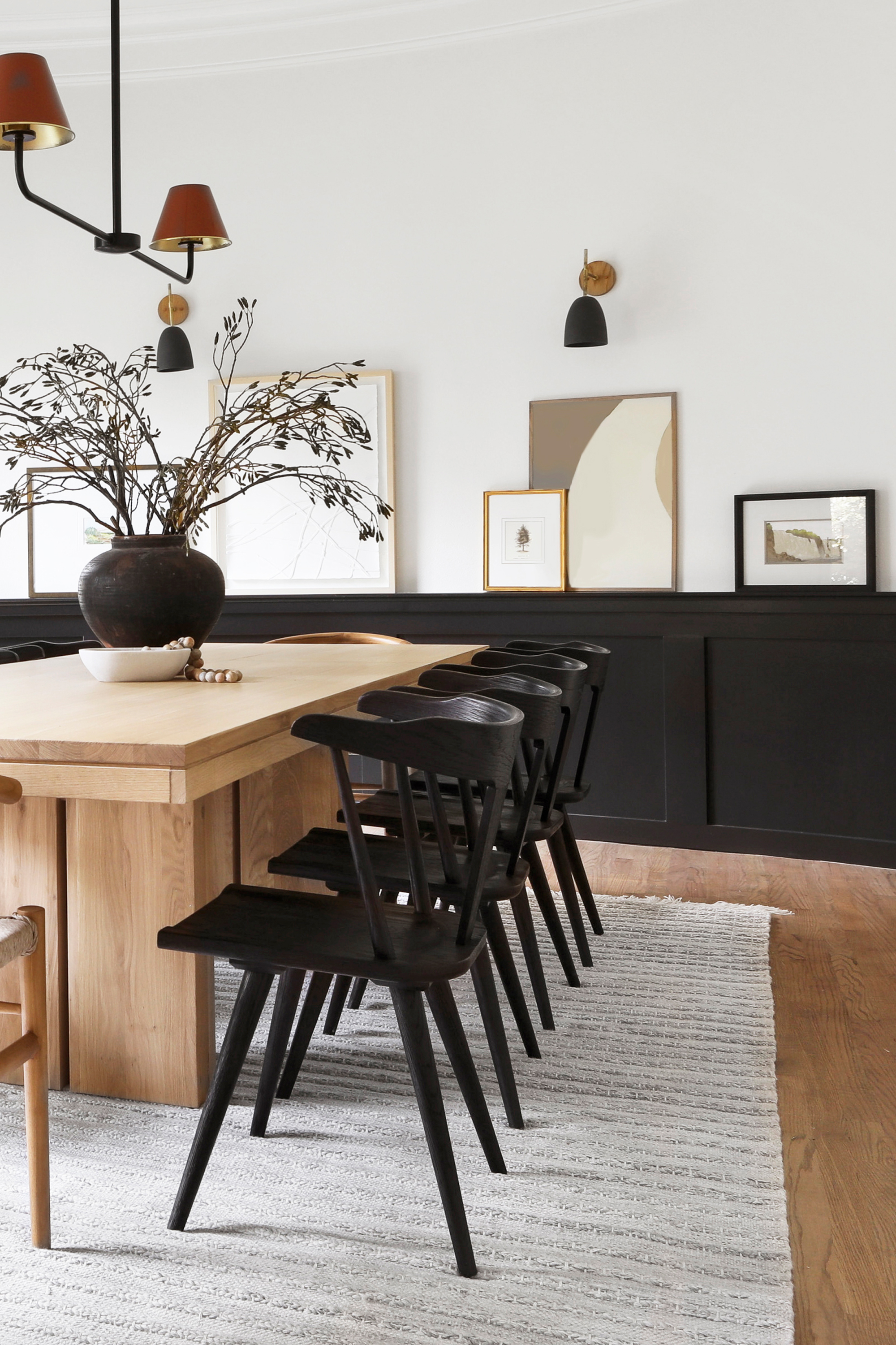
Too much of the same wood tone can look flat and feel overwhelming. ‘If you have two pieces of wood with the same tone next to each other, break them up with another piece,’ suggests Ginger. In this dining room, the wood tone of the table matched the flooring, making it look washed out and inconspicuous. By introducing a rug, Ginger created visual separation; suddenly, the table became a feature of the room, and the rug added beauty and balance to the design. The black wainscoting has a similar effect, providing a black backdrop against which the light wood tones of the table pop.
You can apply the same trick between furniture pieces. Notice how Ginger has paired contrasting black wood chairs with this dining table. Even without the rug, the dark tone of the chairs would function as a bridge between the table and the floor.
5. Stay true to your style
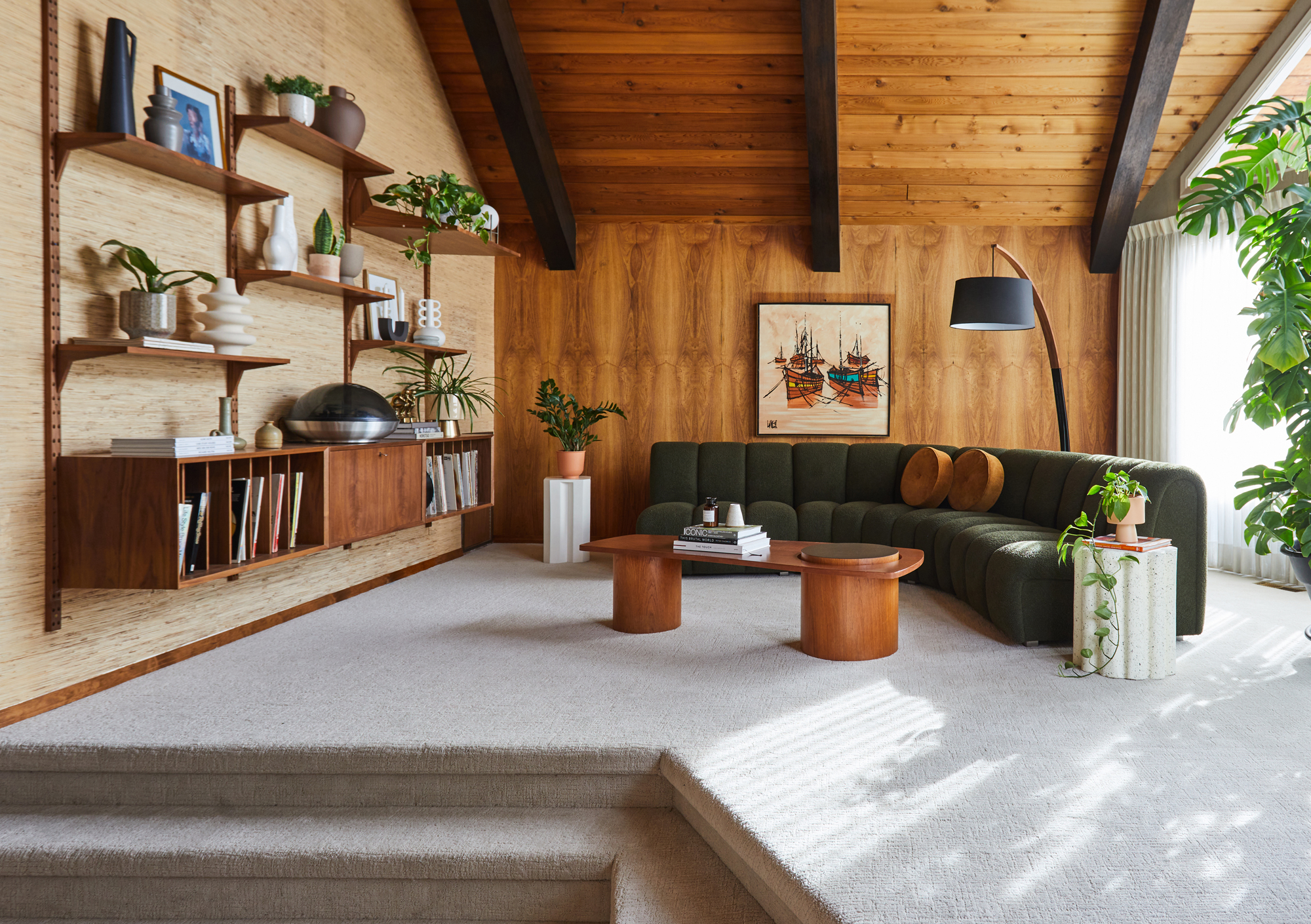
Pay attention to the form and finish of wood furniture, ensuring it aligns with the style of the room and/or property. For example, a light, rough, high-grain wood finish would suit a rustic, casual interior, whereas dark polished wood compliments a more formal, luxurious aesthetic.
In this mid-century home renovation by Fort Architecture, all the wood finishes and species selected were authentic to the period of the building to honor the property’s heritage. ‘The key to adding new wood into the project was to keep the color tones the same. We made sure that all the cabinetry we added into the project was reminiscent of the warm tones present in the original home,’ says Tara. Every design detail, from the material and shape of the furniture to the color palette of this earth tone living room, was carefully selected to be as true to the style as possible while also feeling fresh and contemporary.
Be The First To Know
The Livingetc newsletters are your inside source for what’s shaping interiors now - and what’s next. Discover trend forecasts, smart style ideas, and curated shopping inspiration that brings design to life. Subscribe today and stay ahead of the curve.

Sophie is a home interiors writer and all-around design aficionado. With a degree in History of Art and Spanish, she has a keen interest in the influence of art, history, and culture in design. Having lived in Buenos Aires for five years, Sophie is an experienced communicator in both English and Spanish with a professional background in public relations and marketing. Sophie is also an interior design student at KLC, paving the way to tell stories through interiors that inspire, serve and create experiences worth remembering. Sophie currently writes for Livingetc, Better Homes & Gardens, and Foter Magazine.
-
 Where Should The White Lotus Season Four Be Filmed? We've Done the Research and Have Narrowed Down the Options
Now that the third season has wrapped, the anticipation of what's in store for the next season begins... and more importantly, its location
By Olivia Wolfe
-
 5 Houseplant Humidity Myths That Might Be Wasting Your Time and Not Actually Helping Your Plants
Contrary to popular belief, these houseplant humidifying 'facts' aren't quite what they seem
By Amiya Baratan
