How high should you hang art above furniture? The magic number designers use for gauging picture perfect walls
This is the ideal height to hang art above your furniture, and the different factors that will affect it

You might have found the perfect piece for your room, but when it comes to putting it on the walls, let's just saying hanging art is an art in and of itself. The biggest question you'll find yourself asking: how high should it be hung above your furniture?
While there are some factors that will affect the height you should hang art, there are a few measurements to know. Largely, it all comes down to proportions, scale, and even just how it looks to the eye. Here are the interior design rules you need to know to answer this question.
How high should you hang art above furniture?

For an elegant living room, you want to make sure all decor elements look cohesive and well-placed.
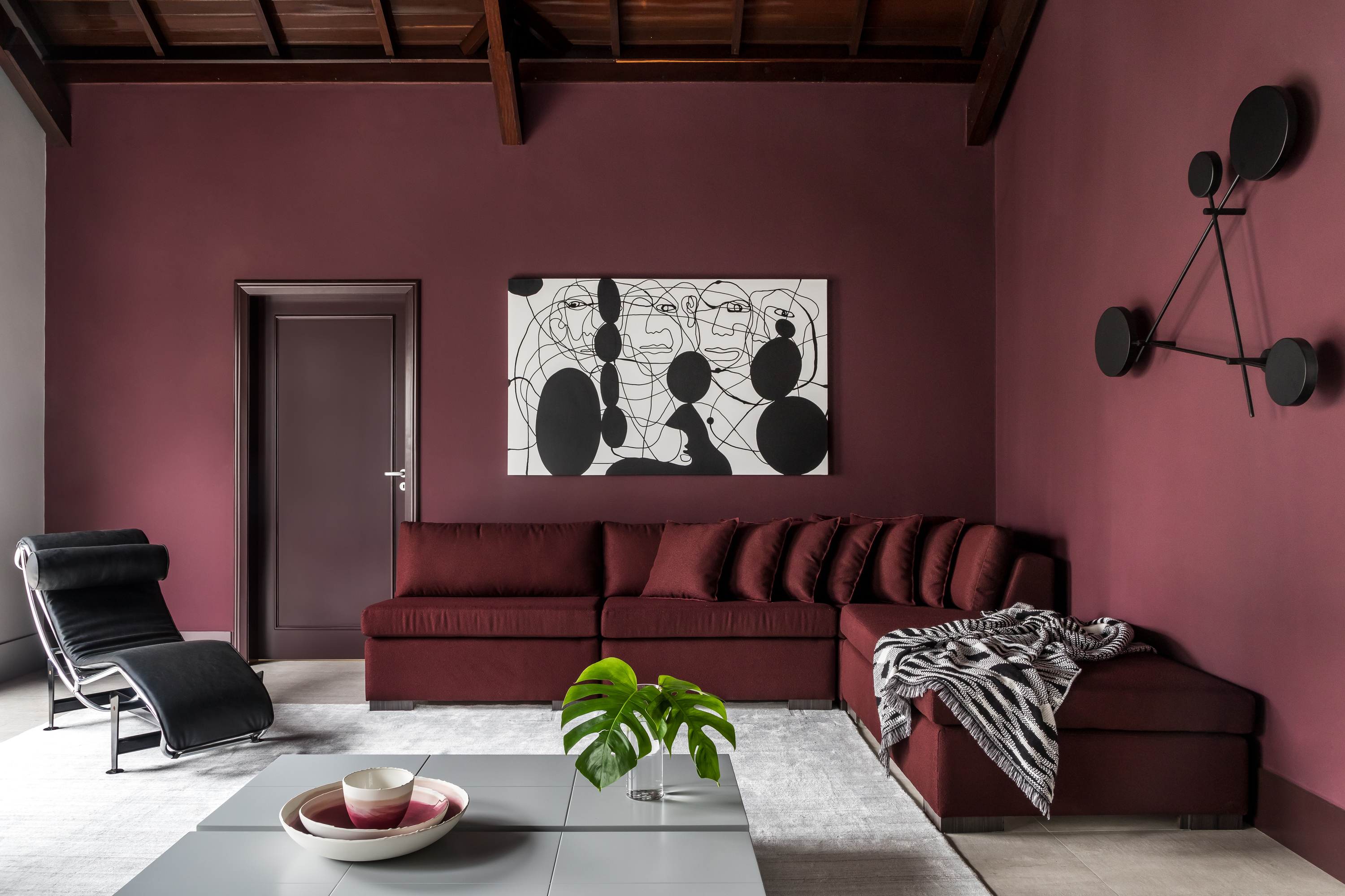
'The best height to hang art above a sofa depends on a variety of factors, such as how high your sofa is and also how large the art is,' says the Los Angeles-based Victoria Holly, principal and founder of Victoria Holly Interiors. 'The smaller the art, the higher you go. But usually, a good rule of thumb is 8-10" above the height point of your sofa (like the cushions if they exceed the sofa frame). Many people make the mistake of going too high on their artwork and having it closer to the ceiling than above their sofa, which creates a disconnect between the two.'
'If you are creating a gallery wall, you can play around with different heights between the pieces,' says Sarah Rosenhaus, principal, and founder of Sarah Rosenhaus Interior Design. 'Overall, you need to keep in mind the size of the piece and the ceiling height to determine what looks right.'
How do I choose the right artwork size compared to my furniture?

When curating the art, the living room furniture, and all other elements in the room, you want to make sure that the entire scheme comes together as a whole, and that one piece doesn't stick out like a sore thumb. While oversized seaters or artwork can create an impact, you want to make sure their overall scale still goes with the proportions of the room.
'I take an intuitive approach with each piece, experimenting to find the perfect placement that looks and feels right,' says Kashi Shikunova, director at Yam Studios. 'It's important to consider the proportion of the art above the height of the wall and the surrounding furniture. Often, I've noticed that people tend to hang art too high, resulting in an unbalanced look. To avoid this, I recommend having two people when hanging art: one to hold the art against the wall and the other to evaluate if it's positioned correctly. Sketching the setup to scale beforehand can also help plan the art hanging arrangement effectively.'
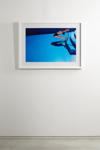
Choose this print to add color and curiosity to the living room. The work is printed on archival paper and framed in an Italian chestnut wood frame.

'The key is to create a sense of balance between the art and the sofa,' says Kashi. 'The size of the artwork will determine the appropriate height that feels natural. For larger pieces, it may work well to center them between the top of the sofa back and the ceiling. On the other hand, smaller pieces might be better positioned slightly lower. By considering the proportions and size of the artwork above the sofa, you can achieve a visually pleasing and harmonious arrangement.'
'When hanging the artwork, make sure the piece is not wider than the couch,' says Marie Flanigan, founder of Marie Flanigan Interiors. 'The correct scale is essential. Artwork should also be viewed at eye level, so try to hang as close to eye level as possible, while leaving space to clear the back of the couch. Lastly, consider what else will go on the wall and where before selecting the perfect piece.'
'If you're going to go smaller, it needs to be an impactful piece and you need to have something on the walls like living room wallpaper or paneling to help add some more visual interest to fill the space,' says Victoria. 'And if you're going larger, less is more. I like to never have my art exceed the length of my sofa and have artwork be at least 10" shorter than the sofa for the total length.'
'I like to hang art either centered above or off-center just so for something a little unexpected,' says Victoria. 'I kind of line it up with a third of the sofa or the inside of the third cushion if it's a three-seater sofa.'
Focus on the shape of the art and the furniture
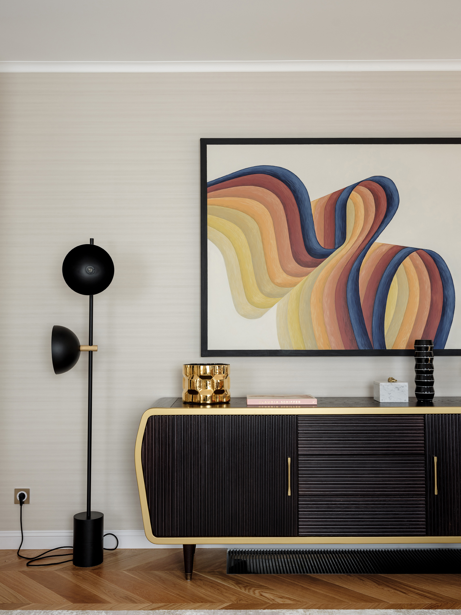
It all comes down to shapes! A small chair with long, horizontal artwork inside a compact living room or family room will look disproportionate. Similarly, a long, sectional sofa with a single, vertical painting will look absurd.
'The placement of art can vary depending on the shape of the furniture and the artwork itself,' says Kashi. 'Landscape-shaped artworks often look better when centered, while portrait-shaped artworks can create a striking effect when positioned off-center. To balance an off-center artwork, I often pair it with a tall vase or a light on the opposite side, which can result in a stunning arrangement. However, it's important to note that off-center placement works best when the furniture piece is noticeably wider than the artwork. If the artwork and furniture have similar widths, it's generally better to center them for a more harmonious look.'
'As a basic rule, art should be between ⅔ and ¾ the width of the furniture,' says Sarah. 'This applies to a single piece of art or a gallery wall. We suggest measuring your furniture before purchasing and ensuring your art accents the room and does not overtake it.'
For multiple artworks, create a sense of balance

A great living room accent wall idea is with multiple art pieces that represent a well-curated gallery look. But how can one ensure they all look curated?
‘Hanging a group of artworks together is a great way to bring interest to your walls and an eclectic mix of colors to a space,' says James Arkoulis, creative director at Howark Design. 'Try to focus on proportions when choosing pieces – lots of little artwork over a big sofa will look overly busy for example. Lay the pieces out on the floor before you start hanging them to see how they work together, it's much easier to make changes at this stage than when things are on the wall! Linking colors in the artworks with furnishing around them will help create a balanced look.'
'If you have one large piece of art, it should be centered above your sofa,' says Sarah. 'If you have a collection of art, you can play around with spacing and alignment more freely. You can also use a smaller piece of art and offset it by playing with negative space and its relationship with the wall and furniture.'
3M Command picture hanging strips, Amazon
Want to hang artwork without nails? Consider these 3M picture hanging strips that stick on the wall, leave no mark, and can hold up to 16 pounds of weight.
Be The First To Know
The Livingetc newsletters are your inside source for what’s shaping interiors now - and what’s next. Discover trend forecasts, smart style ideas, and curated shopping inspiration that brings design to life. Subscribe today and stay ahead of the curve.

Aditi Sharma Maheshwari started her career at The Address (The Times of India), a tabloid on interiors and art. She wrote profiles of Indian artists, designers, and architects, and covered inspiring houses and commercial properties. After four years, she moved to ELLE DECOR as a senior features writer, where she contributed to the magazine and website, and also worked alongside the events team on India Design ID — the brand’s 10-day, annual design show. She wrote across topics: from designer interviews, and house tours, to new product launches, shopping pages, and reviews. After three years, she was hired as the senior editor at Houzz. The website content focused on practical advice on decorating the home and making design feel more approachable. She created fresh series on budget buys, design hacks, and DIYs, all backed with expert advice. Equipped with sizable knowledge of the industry and with a good network, she moved to Architectural Digest (Conde Nast) as the digital editor. The publication's focus was on high-end design, and her content highlighted A-listers, starchitects, and high-concept products, all customized for an audience that loves and invests in luxury. After a two-year stint, she moved to the UK and was hired at Livingetc as a design editor. She now freelances for a variety of interiors publications.
-
 5 Things You Should Never Buy From a Thrift Store, According to People Who Know About Antiques
It may look like treasure, but it may also just be trash. Here is how to know what to avoid while thrifting, and what to look for instead
By Olivia Wolfe Published
-
 7 Pantry Organization Mistakes That Are an Organizer's Worst Nightmare
Get that Pinterest-perfect pantry by avoiding these certified organization faux pas
By Amiya Baratan Published
