How to achieve beautiful paint finishes according to interior designer, Nicola Harding
Beautiful paint finishes transform a room and are easier than you think
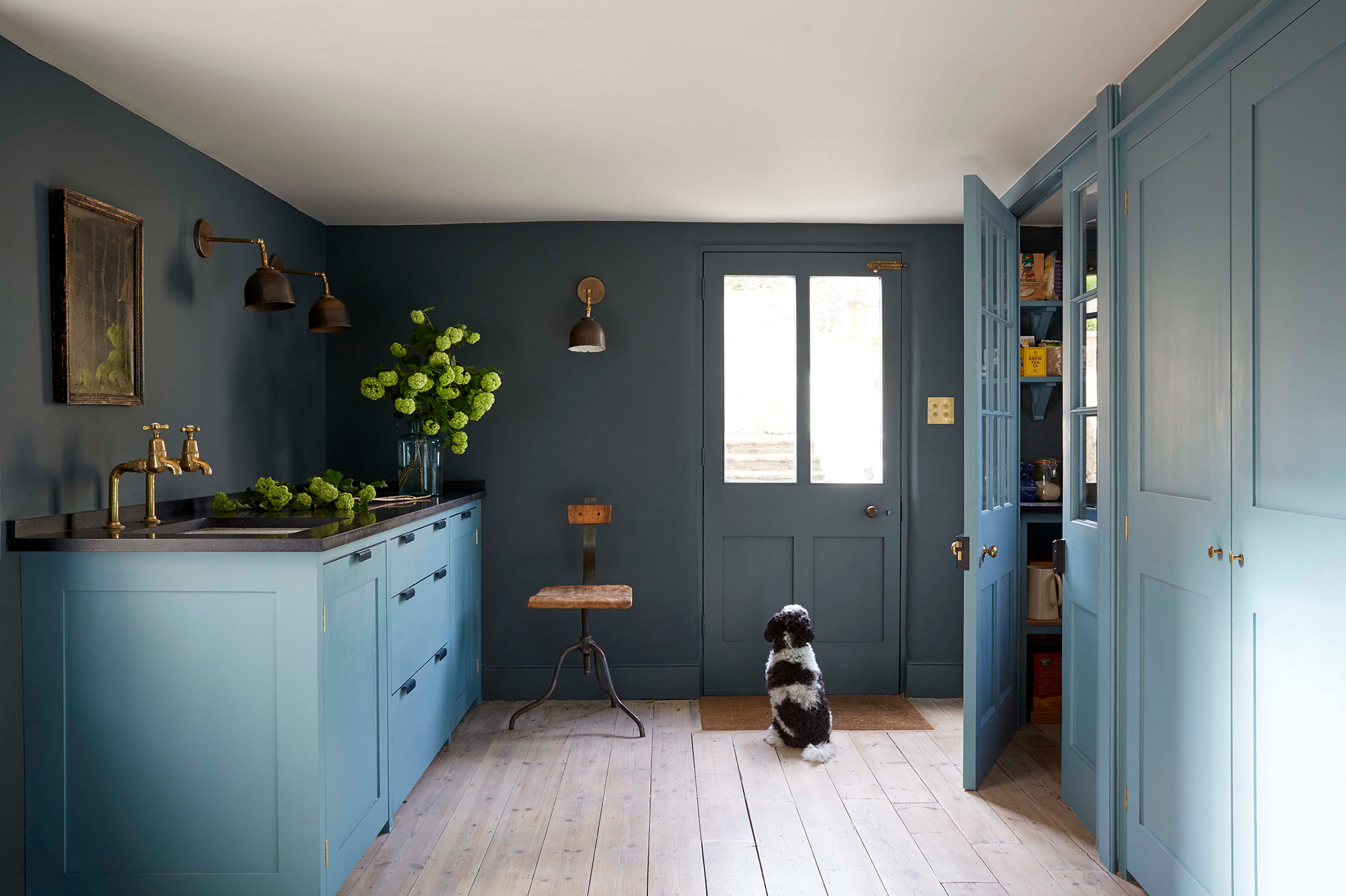
There are so many paint finishes and colours available, that choosing the right shades for a new room scheme can seem overwhelming.
Even once you've considered all the modern decorating ideas, and narrowed down your colour choices for your walls. There's still the ceilings, the woodwork and maybe even the floors to consider, not to mention whether to go for matt, gloss, limewash, chalk or any of the other myriad paint finishes.
To simplify the task, we've consulted interior designer, Nicola Harding of Nicola Harding & Co. Known for her beautiful schemes and exquisite creativity with colour, Nicola shares her knowledge on space-enhancing strategies and perfect paint finishes.
CHOOSE SOOTHING SHADES
I'm really fond of Pure & Original, a paint company that, as its name suggests, only uses natural ingredients. Its colours are also soothing to be around. I’m currently working on a project where we’ve painted the family room in a Pure & Original shade called Skin Powder. It’s a calming, nurturing colour – perfect for spaces where people will spend a lot of time.

Skin Powder fresco lime, £110 for 2.5 L, Pure & Original
VARY THE TONES
I also love Paint & Paper Library’s Architectural range. Each colour is formulated using different strengths of the same pigment and then numbered I, II, III, IV or V according to its tonal weight. This allows you to achieve subtle colour shifts within a space.
A post shared by Nicola Harding & Co (@nicolahardingandco)
A photo posted by on
In the kitchen at my current client’s home, we’ve painted the woodwork one of the darker shades of Wattle, the walls a paler shade of Wattle, then the ceiling and cornice paler again.

MIX FINISHES
It’s always interesting to play with finishes. In the hallway of my current project, we’ve painted the walls RougeII from Paint & Paper Library and the woodwork in Courtly Rose from Pure & Original. The full gloss finish of the woodwork really pops out against the velvety finish of the walls.

Courtly Rose Marrakech walls, £121 for 2.5 L, Pure & Original
GO FOR TEXTURE
Another of my go-to finishes is called Fresco by Pure & Original, which is like a limewash and gives an uneven texture. I’ve used this in my kitchen at home as it’s north-facing and doesn’t get a huge amount of natural light. If I’d used a flat paint, I think it would have felt a bit shady and sad, but having this uneven colour finish gives the walls texture.

Oxford Blue fresco lime, £110 for 2.5 L, Pure & Original
THINK ABOUT WINDOW FRAMES
When painting the woodwork around a window, think about the effect you want to create. For example, in the family room at my current client’s house, we’ve used Wattle II by Paint & Paper Library, which is a greeny shade of white that blends with the green outside and encourages the eye to travel outwards. In the orangery, we’ve painted the window woodwork in a dark chocolate colour that frames the garden beautifully.
A post shared by Nicola Harding & Co (@nicolahardingandco)
A photo posted by on
CONSIDER CONTRASTING COLOURS
If your skirtings and architraves aren’t in great condition or you live in a modern home and they’re less of a statement, you don’t want to create much contrast between the woodwork and the wall colour. But if it’s a period property with gorgeous skirtings and windows, pulling them out in a contrasting colour highlights them.
A post shared by Nicola Harding & Co (@nicolahardingandco)
A photo posted by on
THE 'FIFTH' WALL
Rather than automatically painting a ceiling white, I often wrap it in colour. For example, if you want a space to feel cosy, choose a darker colour for the ceiling. If you want it to appear lighter, go for a pale colour. If you would like a space to feel bigger, and when the ceiling is quite low, either continue the wall colour across the ceiling or choose a shade that doesn’t contrast much with the wall colour. This makes the space feel larger because you’re creating fewer junctions to stop the eye.
A post shared by Nicola Harding & Co (@nicolahardingandco)
A photo posted by on
FLATTER THE FLOOR
I love pale-coloured painted floors that bounce light into a space. Finding a really tough floor paint is tricky, but one of the best ones I’ve found is from Little Greene.

See more of Nicola's work at Nicola Harding & Co.
A post shared by Nicola Harding & Co (@nicolahardingandco)
A photo posted by on
Be The First To Know
The Livingetc newsletters are your inside source for what’s shaping interiors now - and what’s next. Discover trend forecasts, smart style ideas, and curated shopping inspiration that brings design to life. Subscribe today and stay ahead of the curve.
The homes media brand for early adopters, Livingetc shines a spotlight on the now and the next in design, obsessively covering interior trends, color advice, stylish homeware and modern homes. Celebrating the intersection between fashion and interiors. it's the brand that makes and breaks trends and it draws on its network on leading international luminaries to bring you the very best insight and ideas.
-
 Italian Kitchen Trends — 5 Emerging Ideas From the Chicest Italian Designers That I Predict Will Go Global in 2025
Fresh from Milan Design Week, these are the exciting finishes, styles, and innovative materials I can't wait to see in more kitchens this year
By Faiza Saqib Published
-
 Small Patio Ideas — 8 Clever Ways to Style Up Even the Tiniest of Outdoor Spaces
If you're dreaming of turning your small patio into a dream space the right combination of practical and creative ideas will help you max up its potential
By Sarah Wilson Published
-
 Florist Angela Maynard on how to care for dried flowers and how to style them in a modern home
Knowing how to care for dried flowers means you can have stylish arrangements that last for years. Author and florist Angela Maynard shares her tips
By Angela Maynard Last updated
-
 Christmas tree care – how to keep your Christmas tree alive and top tips for buying the best spruce
Follow these tips and your Christmas tree won't droop too soon...
By Jacky Parker Last updated
-
 11 beige living room ideas that prove beige can be far from boring
Beige living room ideas might sound not sound like the boldest of color schemes but this pared-back palette can be just as striking a brights
By Amy Moorea Wong Last updated
-
 How to use color in small living rooms – expert tips for getting the perfect scheme
Bringing color into small living rooms can be tricky, but with the right hues and our top tips, you can make the space look brighter, bigger and just better
By katesleeman Published
-
 How to choose cool colour combinations for your home
The right colour combinations will look good throughout your home. Dagny Thurmann-Moe of Koi Colour Studio shares the no-go palette pairings and power hues
By Livingetc Published
-
 Buying a used kitchen could be your savviest design idea - here's what you need to know
Buying an ex-display used kitchen is a way to a high-end home at High Street prices
By Jacky Parker Published
-
 Home decorating: Tricia Guild's guide to a confident scheme
Home decorating advice from legendary designer Tricia Guild OBE
By Livingetc Published
-
 The meaning of style, by interior designer Russell Sage
Acclaimed interior designer Russell Sage talks broken rules, secret ingredients and looking good in any light
By Russell Sage Published