

In a world of ever changing trends and concepts, styling your home can feel overwhelming. There is a certain pressure to exhibit your design flair and express your personality, all while proving, whether through the colors you use or you choice of furnishings, that you have have a deep understanding of the latest design language.
That's why neutral paint colors can often help make homeowners breathe a sigh of relief. They're easy to work with, yet still offer a breadth of choice in terms of undertones and subtle hints of color. This, added to the fact that they tend to resist changes in the trend cycle, makes them very appealing.
That said, it's still not as simple as picking out any shade that catches your eye. Neutral color schemes are just as affected by light levels as more vibrant hues, if not more. Plus, the role they can play in how a room feels is huge. With that in mind, we're here to guide you in how to choose the right neutral paint for your space, in every room of the home. Here's what you need to know.
Choosing a Neutral Paint for South-Facing Rooms

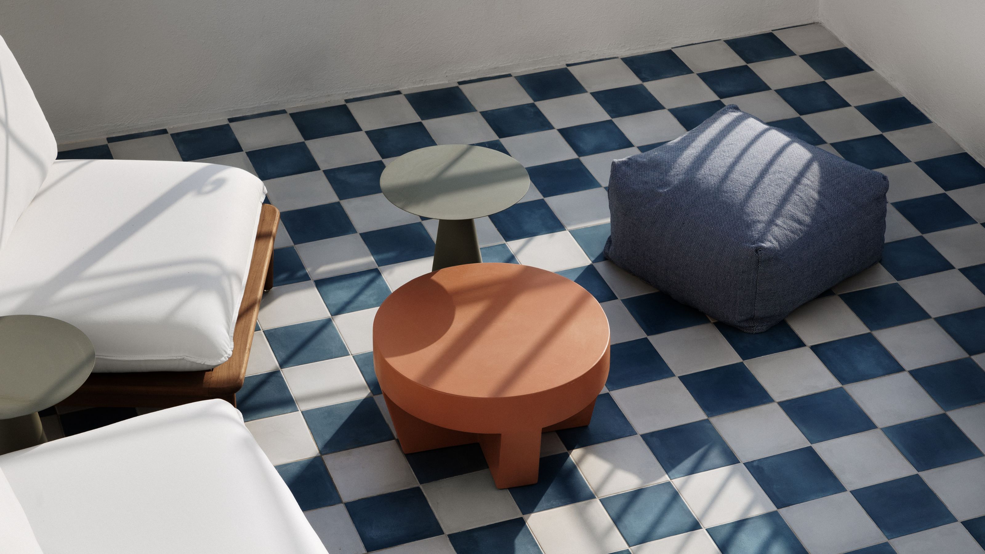
For south-facing rooms, cooler tones tend to work better.
When looking at any paint color ideas for your walls, the amount and type of natural light in the space is, arguably, the most important factor to consider. The transformative effect it has on the appearance of a shade cannot be overestimated.
At a very basic level, neutrals can be stripped back to four colors: white, gray, brown, and black. Sometimes beige gets a look-in, too. All of these can be combined or given a subtle lift through an injection of something a little brighter color, be that a warming red or a calming green.
When it comes to neutrals, it's easy to think that they are a little less reactive to natural light but nothing, in fact, could be further from the truth. Unlike more saturated hues, the subtle undertones within neutral colors rely even more heavily on the right light — something largely dictated by the orientation of a room.
"The light in the room can make or break your color choice," agrees Vanessa Carter, creative director and art advocate at Paint Vibe. When it comes to picking any color for south-facing rooms, care needs to be taken with warmer neutrals as bright sunshine can make those with pink and yellow undertones appear a little cloying.
"Cooler neutrals such as light gray or greige will help balance the warmth in these spaces," says Vanessa. "But test the paint in different spots throughout the day to see how it truly feels."
And then, of course, there's the issue of artificial light. "Warm light bulbs soften cool neutrals, while cool LEDs sharpen up warmer tones," adds Vanessa. So keep that in mind, too.

Price: $5.99/sample

Price: $8.50/sample

Price: $5/sample
Choosing a Neutral Paint for North-Facing Rooms

North-facing rooms can handle a warmer neutral paint shade.
Rooms with windows facing north usually receive a much cooler type of natural light — and less of it at that. To avoid them feeling gloomy, you need to be looking for neutrals with those cozy undertones, such as pink, red, and golden yellows.
"Think creamy beige or soft taupe — adds Vanessa. "These will make the room feel cozier." But don't feel restricted to pale shades only. Consider decorating with brown and similar earthy shades in north-facing spaces. Sometimes deeper neutrals with plenty of rich brown or terracotta in them can add a cocoon-like feel to a space.

Price: $5/sample

Price: $5.99/sample

Price: $8.50/sample
Considering the Level of Light

It's important to consider the amount of light in a room, at all times of the day.
So, that covers the type of light depending on the orientation of the room, but it's also important to consider the quantity of light in a space when choosing the best neutral paint.
"I tend to concern myself with the natural light and size of the space more than the orientation of the home when it comes to choosing a neutral paint color," says Lori Wilke, an interior designer at Roseberry Allen. "The play of light and shadows must be considered in most homes, regardless of orientation."
This is where knowing how to use paint samples becomes important. "I always test at least three colors (five is better) in the space," says interior designer Emily Brownell, founder of Gilded Hearth. "I don’t use those paste type products, but actual paint either on drywall samples or on the wall itself. Samples must be at least 1ft x 1ft squares or patches on every wall in the room. Then you set a timer to look at them four times a day — morning, noon, afternoon in daylight only, and at night when it’s only artificial interior lights on.
"This way you cover all the shades the color will go," she continues. "I think of it like red lipstick. The perfect shade on your best friend is likely not the perfect shade for you, but it’s hard to tell until you try."
Understanding the Importance of Color Temperature

Choosing the best neutral paint color means considering the space as a whole.
If you haven't yet taken the time to get accustomed to the concept of color temperature, you really need to look into cool light vs warm light, and the difference they make. And it's not just the undertones of paint shades you need to think about, the room as a whole.
"It is most important to determine if the other finishes in the home and its style lend themselves to a cooler or warmer vibe," explains Lori Wilke. "Cooler tones tend to suit more modern, contemporary, or very 'bright' homes. Warmer tones are a great companion to a traditional home with wood and natural elements."
When it comes to the paint shades themselves, "Neutral colors can be tricky," says Lori. "All colors have a temperature, some are cool and some are warm."
Cool neutrals usually have a little green, blue, or lilac in the mix, whereas warm neutrals are backed by yellow, orange, and red. The four main neutrals can all be found combined with both cool and warm pigments so make sure you consider how they will sit with the rest of your scheme.
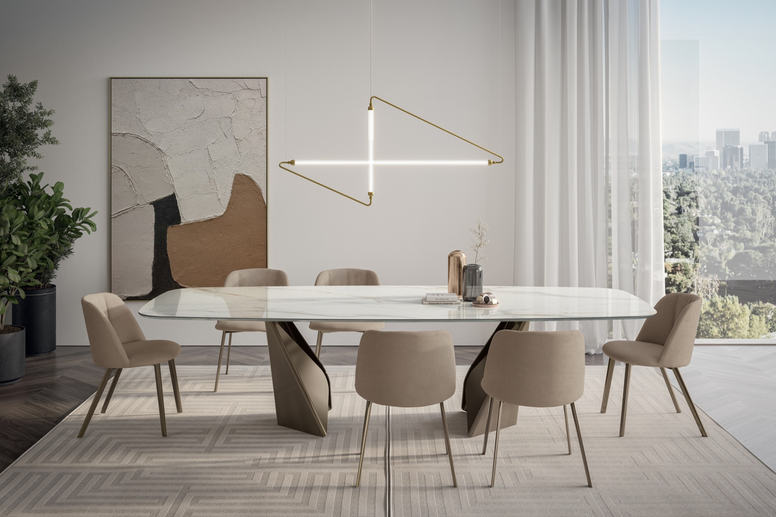
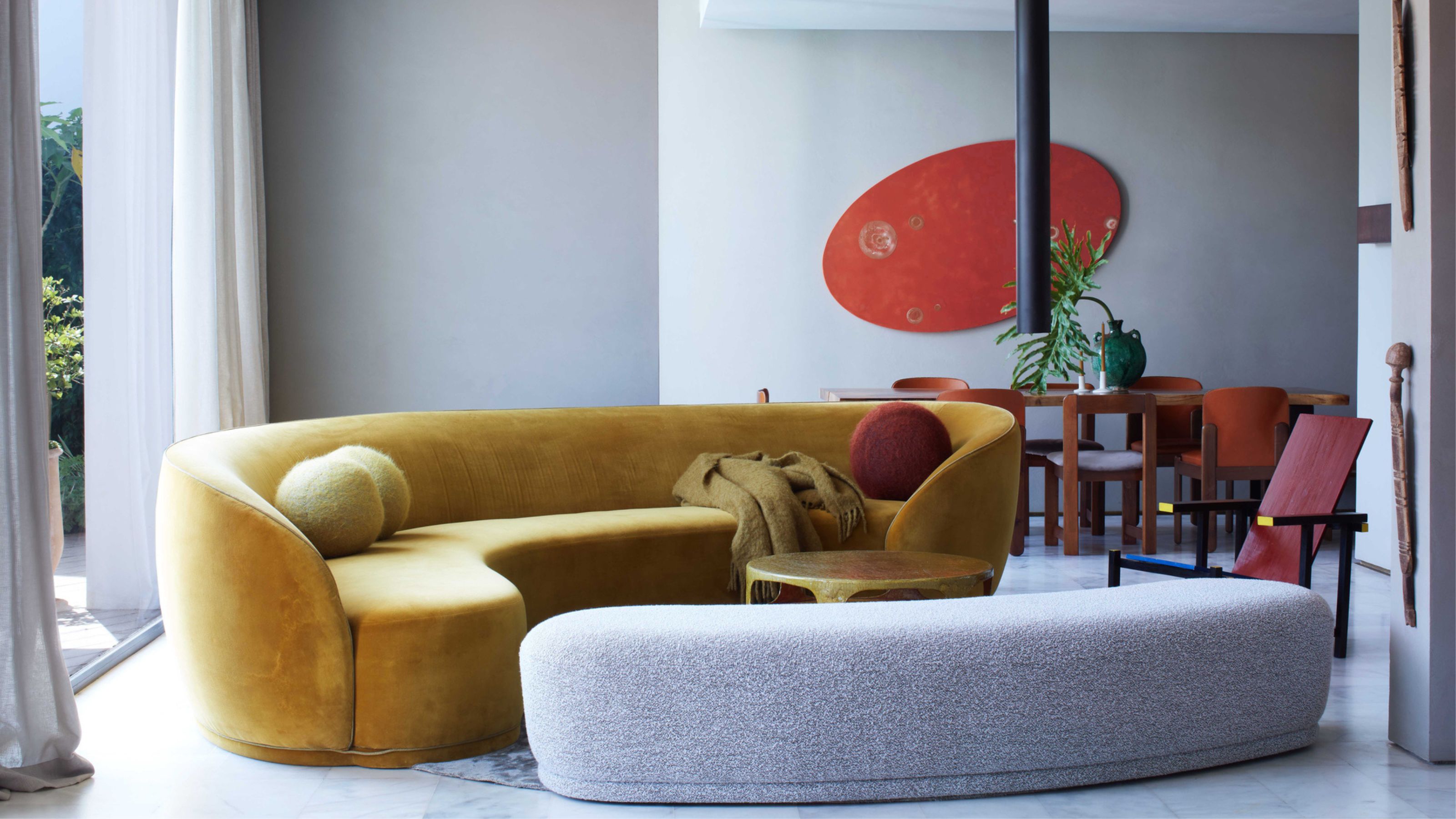
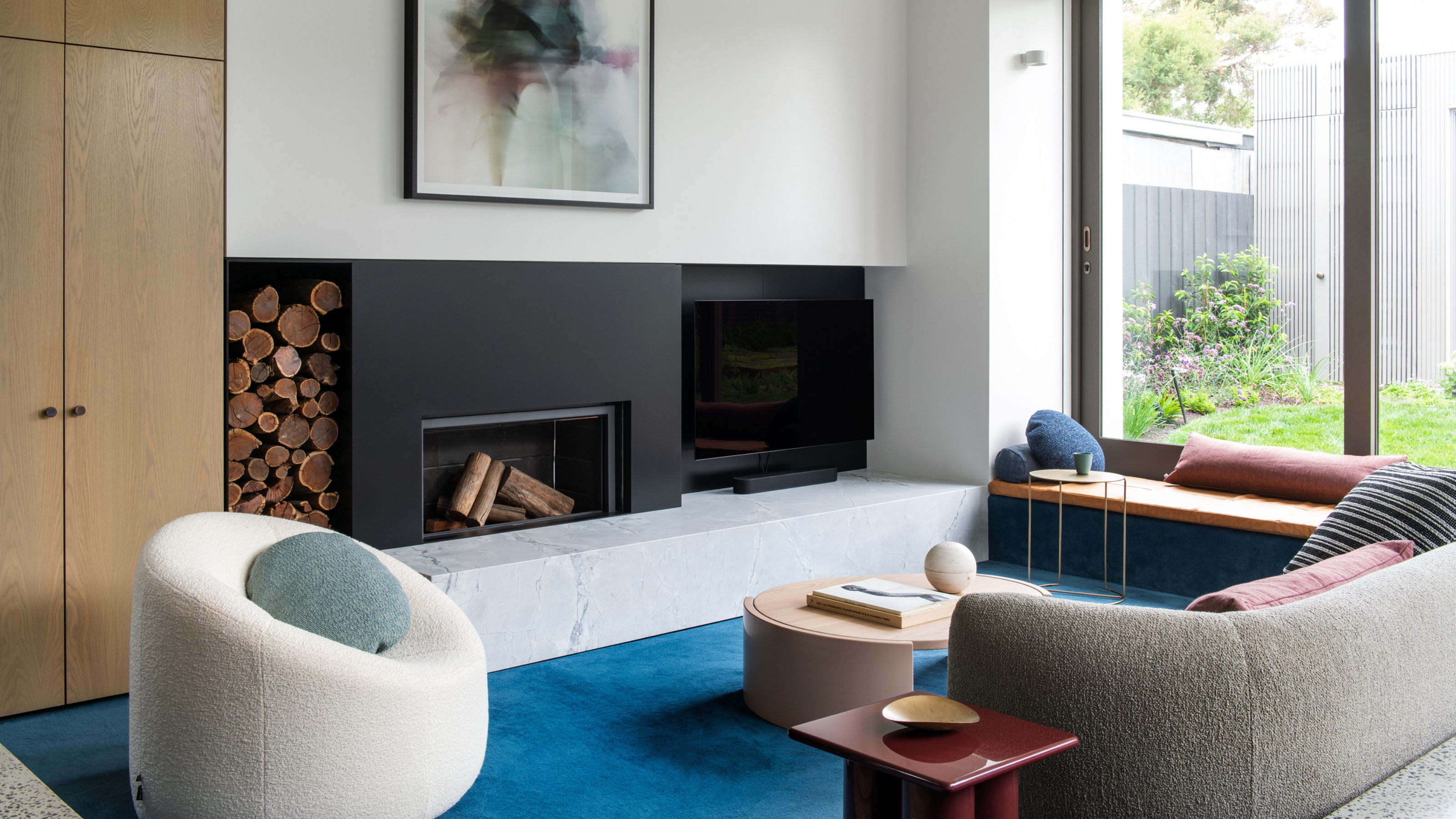
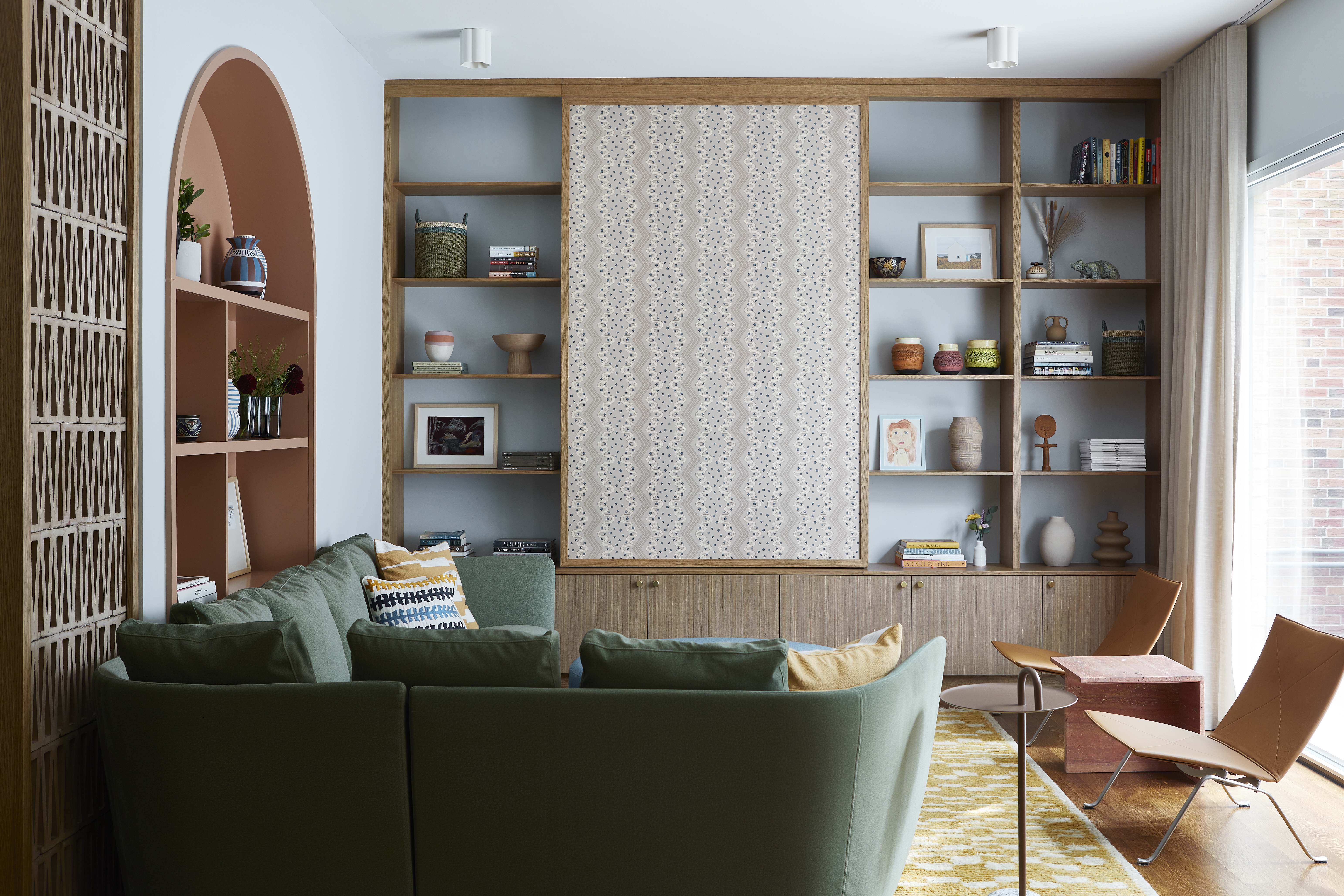
Choosing Neutral Paints for Living Rooms

Neutral living rooms are often more lively spaces, and can handle richer hues.
Each room in the house comes with its own purpose and use, and as such, needs to be decorated in a way that fosters the kind of ambience you want to create there. In the case of living rooms, they tend to be multifunctional, and used for everything from family movie nights to after-dinner drinks with friends.
So, when it comes to choosing neutral paint colors for living rooms (and what colors to add into neutral living rooms) you typically want to sway towards warmer neutrals, with earthy brown, pink, and red undertones, as they really help cozy up the space. (Of course, as we've already explained, you will also need to take into account how these colors will respond to the types and levels of light in the space.)
"Living rooms work well in rich neutrals, like greige or mocha," says Vanessa Carter. But there is no need to shy away from deeper neutrals here either, even in a living room with low natural light levels — sometimes embracing the dark and sinking into neutrals such as olive green or cocoa can add a sense of being cosseted within a space.

Price: $8.50/sample

Price: $5.99/sample

Price: £5/sample
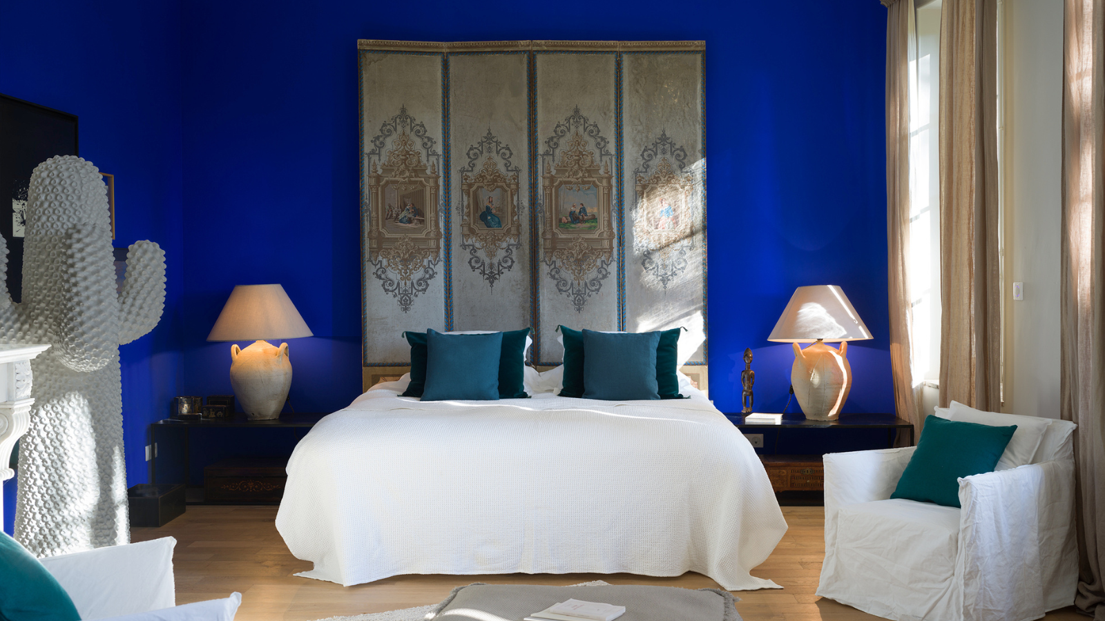
Choosing Neutral Paints for Bedrooms

In bedrooms, you want to pick neutral colors that feel soothing.
The bedroom is a room that should feel peaceful meaning the soft, muted tones that neutral bedroom ideas offer are perfect.
"Bedrooms call for serenity, so soft grays or warm taupes are ideal," advises Vanessa Carter — although, once again, this doesn't mean that you have to use shades that lie to the lighter end of the scale. Those with a little more richness in their undertones are good, too.
"Darker neutrals are good for rooms that call for relaxation," adds Lori Wilke. "Think those featuring brown and then layer in other neutrals — there is no need to stick to just one."

Price: $5.99/sample

Price: $8.50/sample

Price: $5/sample
Choosing Neutral Paints for Kitchens

Kitchens are working spaces, and can hold heavier shades of neutral paint.
Kitchen wall paint colors are notoriously difficult to get right due to the fact that there are so many other shades to take into consideration, on cabinets, countertops, within light fittings, and all the various accessories that we display in this space — cookbooks, favorite cookware, even floor tiles. This can make people wary of using anything but white on the walls, but this can feel a little sterile when there are so many other neutrals that work better.
"Lighter, brighter neutrals are going to make the room feel more active and are good choices in room like a kitchen or work space," advises Lori Wilke.
However, if you want to bring some warmth into the space, don't shy away from more pigmented neutrals. Taupe is great go-to, as is beige, even deeper neutrals such as dusky pink for kitchen cabinets, terracotta, and even khaki. Just be sure to balance them out with a lighter choice of flooring or cabinet fronts.
And always remember that neutrals combine well with other neutrals, meaning there is no need to choose just one. "Don’t be afraid to mix neutrals in a space, a kitchen, for instance, feels more natural with a variety of contrasting neutrals," adds Lori.

Price: $5/sample

Price: $8.50/sample

Price: $5.99/sample
Choosing a Neutral Paint for Small Rooms

Sometimes breaking the rules and opting for a darker neutral in smaller spaces make them feel more cozy.
In small spaces, neutrals really can come to the rescue, visually stretching the space while managing to be a little less obvious than pure white. But while there are colors that make living rooms look bigger, the shade really needs to be chosen in accordance with your room specifically and want you want from it. For example, in a small snug or reading nook, you may not necessarily want a neutral that makes it seem bigger.
"Brighter neutrals will can make a space feel more open, but I try not to live by rules when choosing colors," says Lori Wilkes. "I think deeper shades can be great in a large or small space but will most often give a more intimate feel to both."

-
 My 10 Favorite Designs at Milan Design Week 2025 — Out of the Hundreds of Pieces I Saw
There is a new elegance, color, and shape being shown in Milan this week, and these are the pieces that caught my eye
-
 Iridescence Is Chrome’s More Playful, Hard-to-Define Cousin — And You're About to See It Everywhere
This kinetic finish signals a broader shift toward surfaces that move, shimmer, and surprise. Here's where to find it now


-
 Here's Why Decorating With Mustard Yellow Helps Fill Your Interiors With a Sense of "Confident Calm"
There is so much more to decorating with this turmeric-tinted sauce-wiggled-on-a-hotdog not-quite-yellow shade than meets the eye
-
 5 Problems With Painting Your Walls White That No-One Ever Talks About (Until Now)
White is the easiest neutral to work with...right? Interior designers explain why this shade is actually more complex than it may seem
-
 5 Mistakes That Are Making the Blue Details in Your Room Feel Old-Fashioned — And How to Rectify Them
Blue is a timeless shade, no doubt, but use it in the wrong space or in the wrong way, and it can make a space feel, well... a bit blue
-
 5 of the Best Navy Blue Paint Colors That Designers Love — And How to Use Them
Navy blue has timeless appeal and can feel both modern yet classic, but what are the designers' favorite paints?
-
 Should Your Carpet Be A Darker Color Than Your Walls? How to Make This Bold Look Work
Not every room can get away with a carpet that is darker than the walls; Designers share when and where this combination works best
-
 What Actually Is Yves Klein Blue? A Short History of This Iconic Color, and How to Decorate With It
Explore “the most perfect expression of blue” and how to free this pigment in your home
-
 Do Pink and Green Go Together in Interiors? A Professional Color Consultant's Verdict
How to make pink and green color combinations work for more contemporary interior schemes
-
 The 'Grown-Up' Way to Decorate With Light Blue — This Shade Shouldn't Just "Be Resigned to the Baby's Room"
We explore how to bring the lighter intonations of blue into your home in a contemporary and thoughtful way


