'Make it happy and fresh!' Designers explain how to choose the perfect color scheme to elevate your backyard
Because choosing the right color scheme for your outdoor space is every bit as important as choosing one for your indoor space

How long do you spend choosing colors for your living room? Or your bedroom? Or kitchen? All the samples are ordered and hours are spent choosing between the blue with the slight grey undertone or the one with the green undertone. And then for months these swatches live on the walls so you can spend time with these colors before making the ultimate decision. Point being, we spend a lot of time choosing the colors for our indoor space, but do you take the same consideration with your outdoor spaces?
Choosing a color scheme for your backyard is what makes the space. Just like a paint color in your home, it dictates the vibe and style of the garden. And just as you would choose a color based on the size and aspect of your rooms, the same should be done when choosing colors for your yard.
We aren't just talking plants here either. The colors of the decor, furniture, flooring and fencing need to be considered too, and how these will work with the greenery you choose. See just as much to think about as when choosing a kitchen color. So we asked the experts – how do you choose a color scheme for your backyard that's going to suit your style and look gorgeous all year round?
How to choose a backyard color scheme
1. Think about the seasons when choosing plants
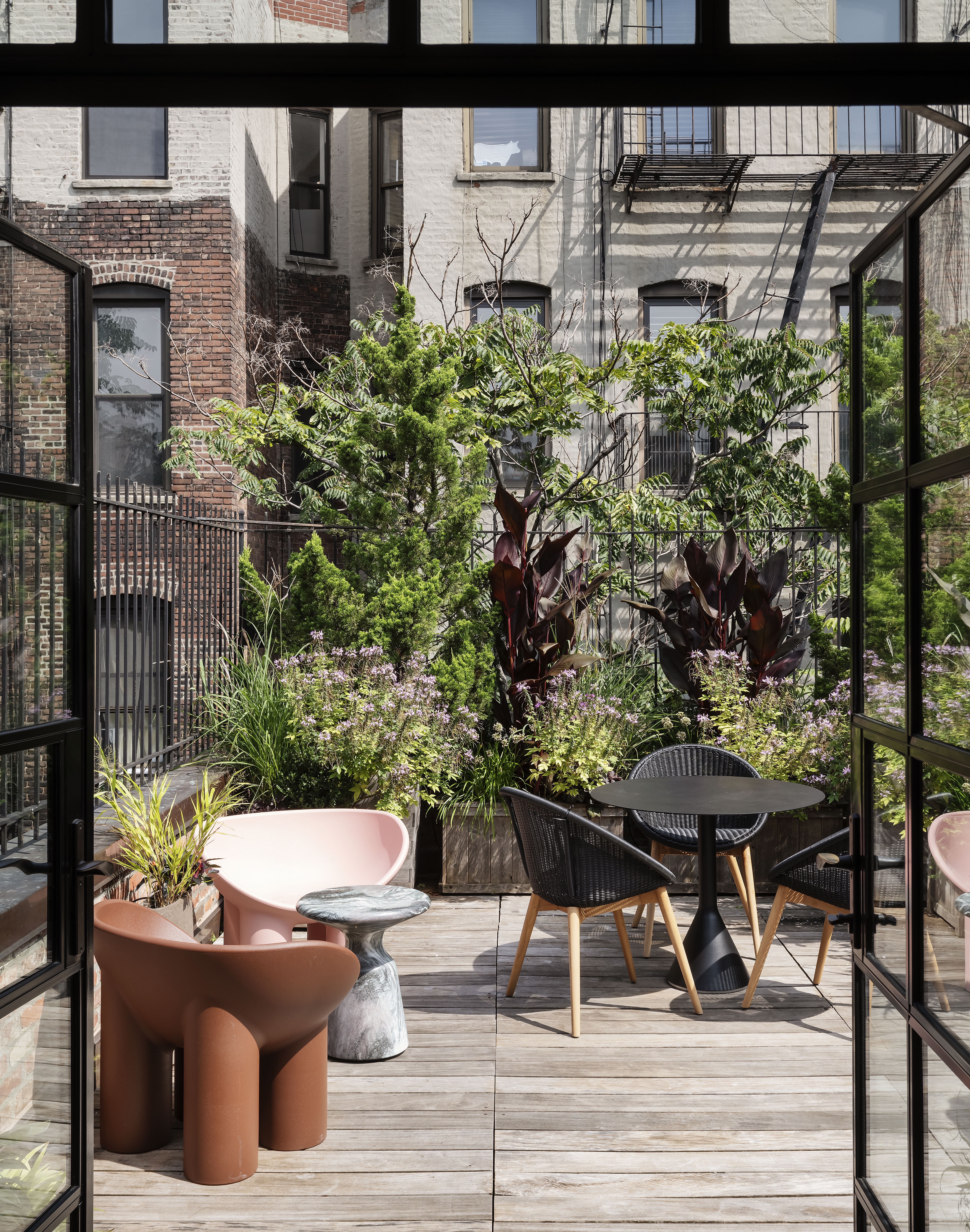
This is a big one when deciding on a garden color scheme. When you head down to the garden center the first weekend the weather starts to warm up and see all those beautiful colorful blooms, just remember in a few months those plants are likely to just be, well... green. And there's nothing wrong with greenery but do bear in mind that some colors won't be there all year round, and you might want to buy plants that bloom (or offer something interesting) at different times of the year.
And of course, consider your climate too, your color scheme is far more likely to thrive long-term if you pick plants that are suited to the weather where you live. Designer Gianpiero Gaglione says, 'My design approach is to complement my surroundings, so that the end result doesn’t look foreign or out of place, but rather that it was always meant to be like that. So when it comes to selecting colors for an outdoor space, it’s important to consider the seasonal environment you’re working with. For example, I currently live in LA and it’s typically sunny and fresh, so that would be a completely different feel to, say, fall in NYC.'
2. Pick a mood for your backyard color scheme

This is a great place to start when deciding on a backyard color scheme. Just as you would with an indoor room decide on the mood you want to create. We'd suggest looking at the vibe inside your home as a jumping off point.
The main thing to consider is, do you want to go warm or cool, bright or more pastel – this decision is what will set the tone for your backyard. 'Even with a set seasonal environment, you can choose to make the scheme happy and fresh, or muted and serious, or charming and inviting. Each of these moods is achievable through appropriate color and material selection,' says Gianpiero. The best outdoor furniture comes in an array of shades - you just need to edit.
'For example, a lighter fresher color palette, with pastels and upbeat colors will lift the mood and bring about a cheeriness to the space. Whereas, if you prefer to create a moodier, intimate space, you can use richer colors, like jewel tones, or also consider layering with richly textured materials, like velvet, cerused wood, or brass accents. By adding more layers, you can easily create a bohemian/maximalist aesthetic. However, if you prefer something a little more clean and chic, then keep the color palette simple and either within one tonal range (a range of cream/beige/tan for example) or black and white.'
3. Use the color wheel
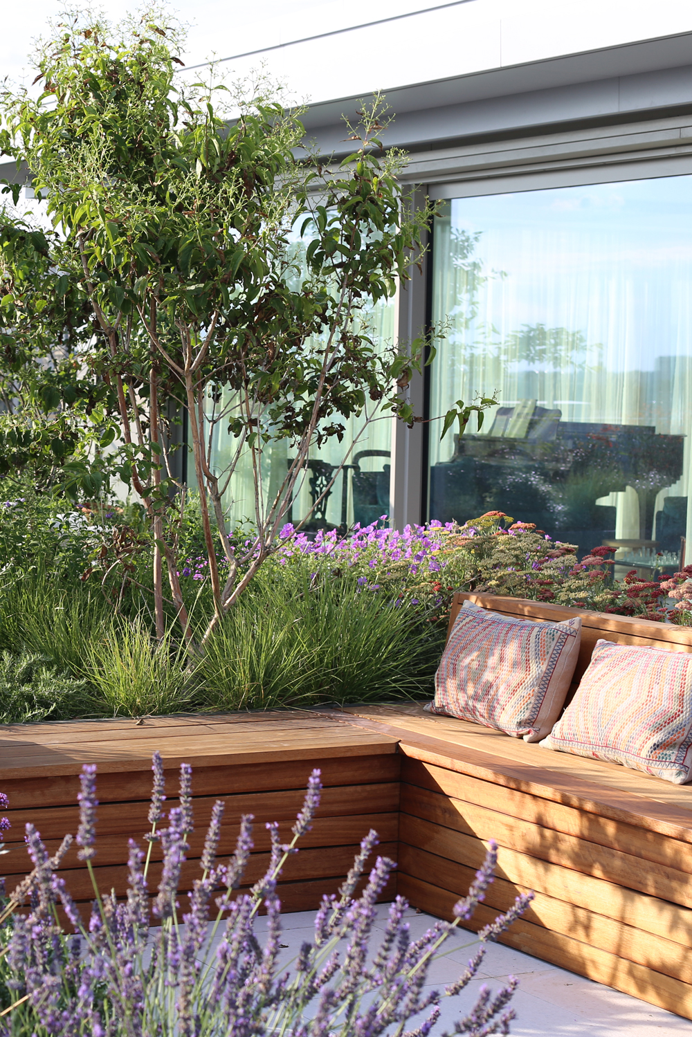
If you are wanting to plant a really colorful backyard, make use of the color wheel. It may be a very traditional way of coming up with a color scheme, but it does really help to bring together a color palette you know is going to work and plan out the look you are after.
The two main considerations are do you want to opt for harmonious colors or complimentary combinations?
Harmonious colors are ones that sit next to, or very close to each other on the color wheel. This color scheme creates a more subtle, tonal effect and tends to work better in more traditional, country-style gardens. Both hot and cool colors will work with this approach and the result will always be more subtle and paired back that a complimentary or contrasting color scheme. The best plants that work with these more tonal schemes are more billowing, blousy plants that will create almost a cloud of color when brought together – old roses, delphiniums, lavender, dahlias.
Complimentary color schemes use shades that sit opposite one another on the color wheel, so you will get a clash of color. If you are planning a modern garden this look may be better suited as it will have more of a dynamic, eye-catching effect. Purple and yellow, blues and oranges, pinks and greens make for punchy pairings.
4. Look at where the light and shade fall
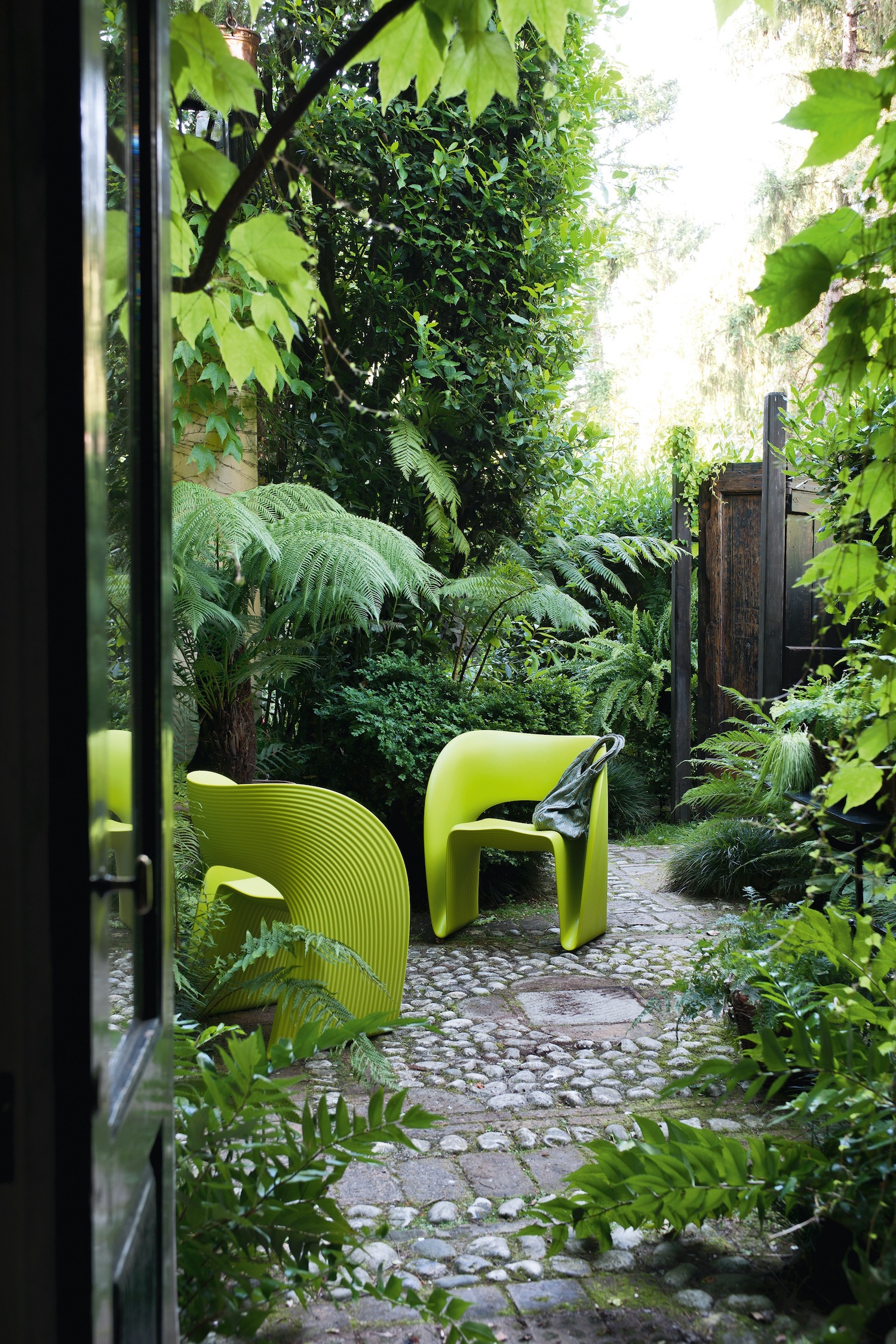
'Color schemes should compliment the existing architecture of the home and blend seamlessly with the interior aesthetic. Existing shadow and light should also be considered, as well as overhead tree canopies,' explains Jennifer Hayman, landscape designer and founder of JHDG.
'For example, a heavily shaded area might be better suited to a lighter stone, and a full sun area might require some anchoring with darker materials. Similarly, the planting palette should work within the light exposure. For example, avoid neutrals in a very sunny location as they will lose their definition and become washed out. Vibrant colors do best in sunny locations and cool tones do better in shadier locations.'
5. Let the surrounding landscape influence your color scheme
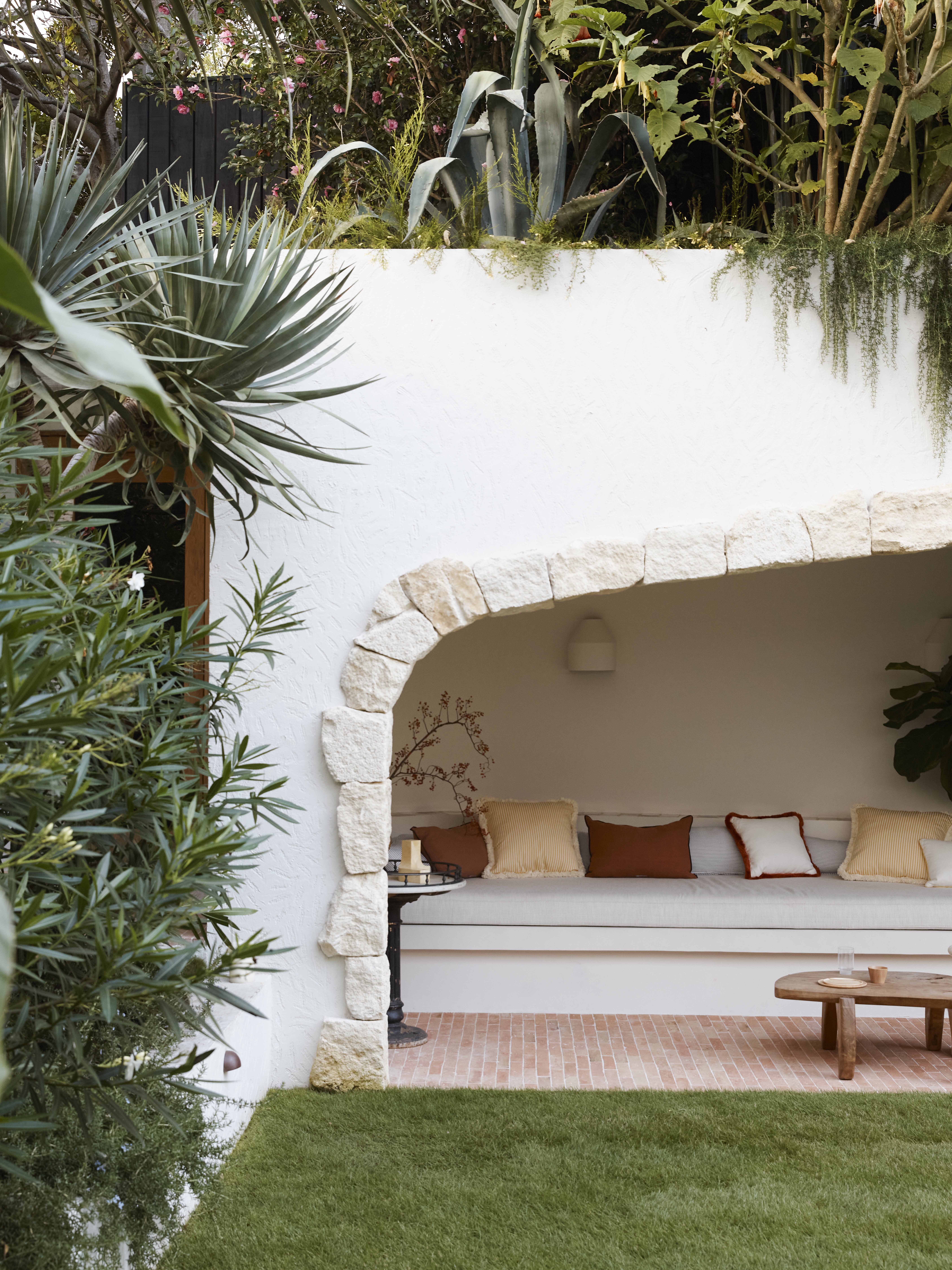
Another simple way to start off your backyard color scheme, look at the nature that already exists in and around your outdoor space. What are those colors doing? Be inspired by your backyards surroundings, and borrow shades (and planting ideas) from there. Not only will this ensure your garden feels really natural and in keeping, it's also far more likely it will thrive as the plants and flowers you choose will be suited to the climate.
'You can approach your backyard color scheme as you would an interior, only outdoors, the backdrop of nature’s vibrant greens replaces the walls,' suggests Dan Mazzarini, Principal and Creative Director of BHDM Design and ARCHIVE by Dan Mazzarini. 'Take inspiration from biophilic elements by curating spaces that complement the surrounding environment and let the materials themselves become the palette – think terracotta plant pots and stone table tops and moments of rust with olive accents.'
'When creating a color palette for a backyard, I'm always informed first by nature and then by the homes' architecture,' says designer Marie Flanigan. 'I typically look for ways to highlight the beauty of natural surroundings and then work to make sure any selections complement the home's aesthetic. I do believe you can have more artistic license in an outdoor space, so keep it fun and cohesive.'
Hugh Main Director of Spirit Level Designs agrees, 'I like a subtle mix of colors in a garden. To me, they create a more relaxed calm feel in the garden. When you look into a natural landscape, all the colors are similar. If it is a hot and sunny landscape, the palette is soft greys and silvers. When you look into a shady forest, the colors are deep lush greens. Let this influence you when working out your own garden, work out what is your natural environment, and let it guide you.'
6. Pick furniture that's going to compliment these colors too
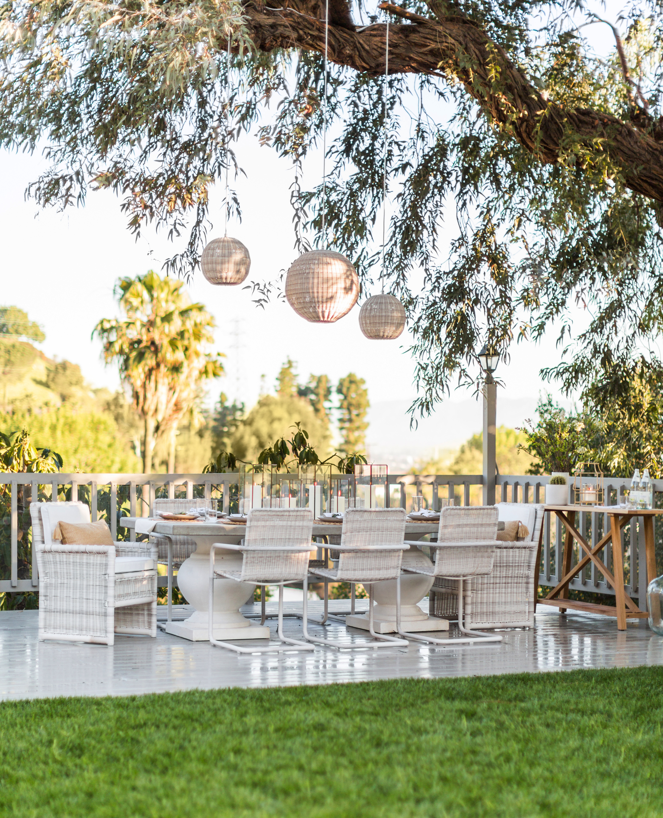
A lot of the focus so far has been on choosing plants but of course when it comes to planning a backyard color scheme, decor and furniture need to be considered too. Again, you have the option between contrasting the color scheme you have gone for with your planting, or sticking with a similar scheme.
In a modern garden that's really focused on the greenery and architectural planting, and there's not much color going on elsewhere, pops of bold color can look glorious. Especially if you go for cool, chunky shapes.
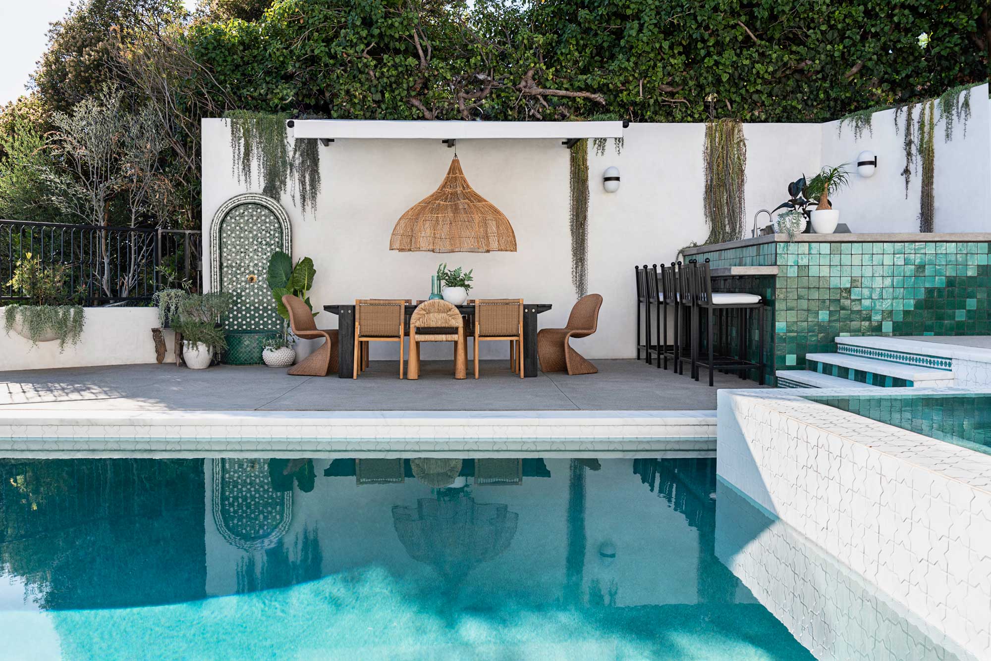
However, if there's a more varied scheme in your garden, we'd usually recommend picking garden furniture that's going to seamlessly merge into the surroundings – natural colors, natural materials, and subtle and slimline silhouettes. Just as can be found in this dreamy outdoor dining space.
'This outdoor living space is the epitome of whimsical and California-cool. It was essential to keep this Studio City oasis light, calm and fresh. The aesthetic was achieved through the use of light colors and natural materials like rattan, teak and a touch of stone. The large tree was the jumping off point for the design, so we added hanging lights and a beautiful, seated vignette,' explains Marie Flanigan.
'We were really inspired by the home’s surroundings. With so much beautiful foliage, we decided a neutral palette that enhanced the greenery was a must. Most of the palette is a soft white with touches of teak or rattan which allow the lush greens to really pop. I also love that a lot of the rattan is whitewashed, creating the illusion of patina, almost as if the table and chairs were part of the landscape.'
7. Use greens carefully

'I firmly believe that any color that works inside can work outside, and that outside spaces work beautifully as an extension of the style happening indoors. However, it is important to note what elements surround your outdoor space (that you may not have control over) and will also be in your field of vision when choosing colors,' says designer Jessie Lane.
'For my outdoor space, I knew I wanted to incorporate the green zellige tile I had been lusting over in inspiration pics, but had trouble deciding between emerald or mint. In the end, I used both and couldn't be happier. However, utilizing any kind of green in an outdoor space can be tricky, because it's imperative that it doesn't fight the natural green foliage outside. Because both tile colors I chose had more of a blue undertone, I worked with my landscaper to select plants that leaned blue-green instead of yellow-green.'
8. Reflect what colors are going on inside your home
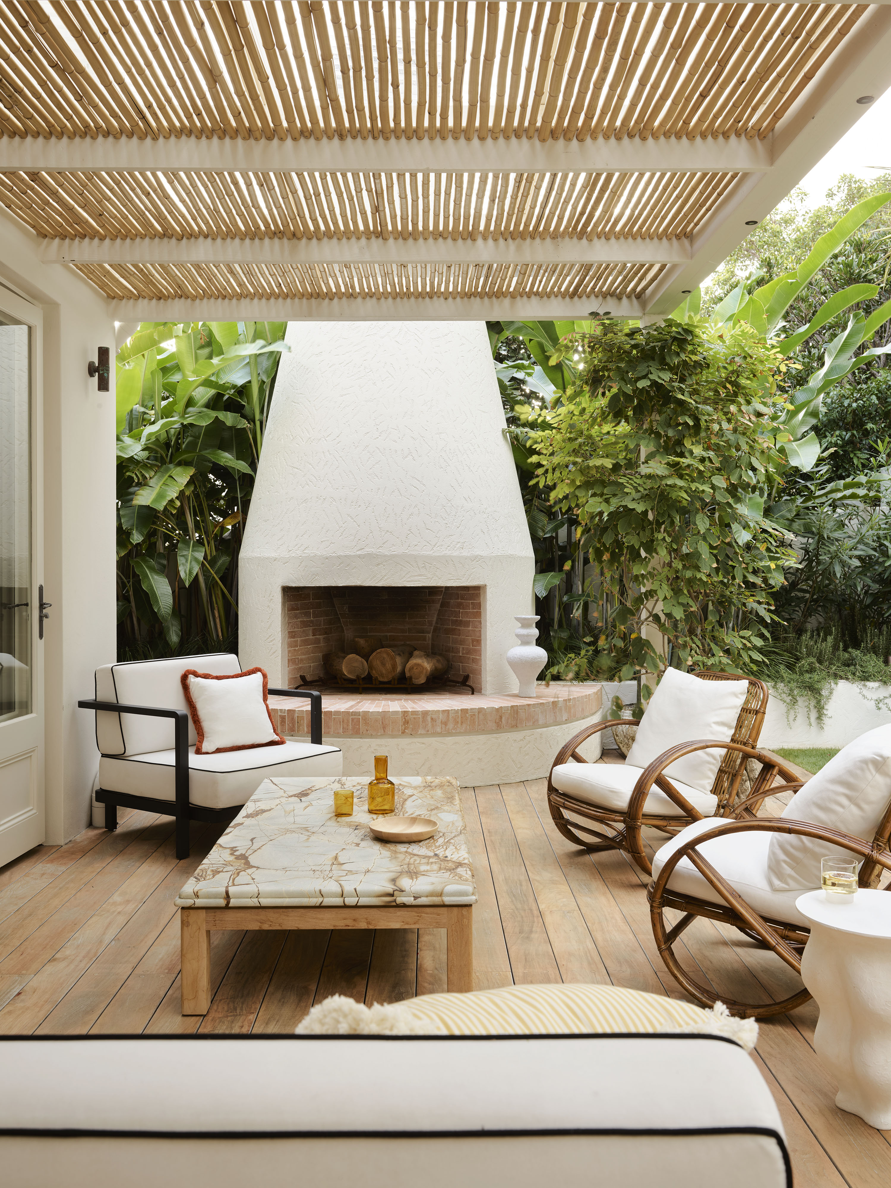
More often than not you want there to be this seamless flow between indoors and out. Your backyard should feel like an extension of your home, almost like an extra room that you can borrow space from when you need to. So it makes sense when deciding on a backyard color scheme to bring the colors you use inside your home out. Anthony Wyer, Founder and Creative Director, Wyer & Co advises to 'always begin with a cohesive material palette. We consider the flow between spaces both inside and out and treat the garden as a continuation of the same story. And select colors that complement or contrast the garden and what is in flower at the time.'
'If there are color schemes that you're drawn to with your indoor decor, there's no reason not to follow those same instincts in an outdoor space when it comes to choosing pieces like outdoor cushions, patio umbrellas, and decor,' suggests designer Kathy Kuo.
Patricia Benner, founder of Benner Landscape Design, agrees that 'Color schemes for a back garden can draw from the color and vibe of the materials on the house (house paint color, materials such as stone and wood). Also, clients’ tastes can guide the color choices. The majority of clients seem to favor cool colors: blues, greys, violets, and tertiary colors. Some clients love hot colors: yellows, oranges, reds. In a modernist house where the interiors are intended to reference the exterior spaces and vice versa, the color schemes in garden-adjacent rooms can guide the way.'
Gianpiero Gaglione recommends to take it even further, and look at colors you love to wear, as well as ones you use to decorate your home. 'When I worked with Kelly Wearstler, she would often give the advice to new clients that they should look inside their own closet to get an understanding of the colors they’re comfortable with,' he advises. 'It’s funny but some client's closets are entirely back and white, which is fine because at least they know what they like, whereas other clients might have a whole array of colors and patterns and for a designer, it’s hugely insightful to gain that insight.'
Outdoor furniture to buy in the sales right now
What are the best colors for a backyard?
I don't feel like there are any hard and fast rules about which colors to use in a backyard,' says designer Kathy Kuo. 'It's really about the colors that you love and that make you feel the most at peace and home in your outdoor space. If you're in a very hot climate, you may want to avoid super-dark colors for your outdoor cushions, just because it's going to absorb the heat more intensely, but other than that, trust your instincts to guide you and trust the natural elements to inspire you!'
'Personally, I love all shades of white and warm neutrals for outdoor furniture. The look of a teak wood outdoor sofa with an ecrus cushion is just perfection to me on a warm summer day, especially if there's a pool nearby! For pops of color I'm drawn to navy blue and sage green.' she adds.
Jennifer Hayman agrees that neutral is usually best when it comes to a backyard color scheme. Keep furniture in calming greys, whites and beige and let the greenery be the focus. 'For hardscape materials, we find that neutral palettes of warm beiges and greys offer a strong base and allow the different shades of green to naturally take center stage,' she suggests.
'My favorite color scheme that is accessible for all types of backyards includes a lighter grey stone that feels naturally calmer and has an almost floating like nature, anchored with darker accents such as wood fences stained a charcoal, inlay of different materials and layered gardens of green, chartreuse and whites.'
Be The First To Know
The Livingetc newsletters are your inside source for what’s shaping interiors now - and what’s next. Discover trend forecasts, smart style ideas, and curated shopping inspiration that brings design to life. Subscribe today and stay ahead of the curve.

Formerly the Digital Editor of Livingetc, Hebe is currently the Head of Interiors at sister site Homes & Gardens; she has a background in lifestyle and interior journalism and a passion for renovating small spaces. You'll usually find her attempting DIY, whether it's spray painting her whole kitchen, don't try that at home, or ever-changing the wallpaper in her entryway. She loves being able to help others make decisions when decorating their own homes. A couple of years ago she moved from renting to owning her first teeny tiny Edwardian flat in London with her whippet Willow (who yes she chose to match her interiors...) and is already on the lookout for her next project.
-
 Straight from Salone: Five Emerging Trends I Found That'll Shape Interiors For the Year Ahead
From reflective silver to fluidity, here's my perspective on the key themes and new moods coming through from Milan Design Week
By Sarah Spiteri Published
-
 9 Bathroom Storage Mistakes You're Probably Making That Make Using This Space Much Harder — And What to Do Instead
Discover which mistakes are to blame for your overcrowded and cluttered bathroom
By Seraphina Kyprios Published
