How to design a bathroom in an awkward space - the expert guide to getting the layout right
Knowing how to design a bathroom in an awkward space just needs some clever decor tricks say the experts
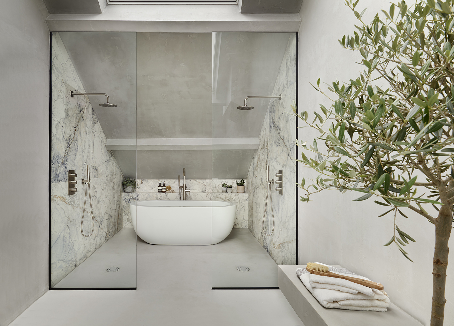
If you've ever wondered how to design a bathroom in an awkward space then you're not alone. A common problem for renovators is working out how to fit everything from a bath tub to a walk-in shower into a room that may not be a perfect rectangle.
When it comes to modern bathroom ideas, odd corners are often an issue. The spaces have been tucked around other rooms, around important pipework, or into parts of the home no other room would want to be in.
That was an issue for this bathroom renovation where owner Jessica Abiagom-Page found herself utilizing a leftover bit of the home to create a spa bathroom. 'On the sale particulars this space was described as storage,' Jessica says. 'But actually it was a generous 21 feet x 8 feet room, albeit windowless, on the fourth floor. I immediately envisioned a master en-suite and began planning how to turn it from odd loft-style storage to luxury bathroom. My husband, Craig, is a skilled joiner and, with help from his team, executed my complex plans.'
Time spent planning is never wasted; a lesson we learned the hard way on previous projects. When you’re dealing with unusual architecture, it’s even more important to plot out every millimetre and consider all the options.
How to design a bathroom in an awkward space
Design by Jessica Abiagom-Page
1. Start with a detailed plan
You could say this for any project, but when it comes to small bathroom ideas, or awkward spaces, a meticulous outline is essential. 'Time spent planning is never wasted; a lesson we learned the hard way on previous projects,' Jessica says. 'When you’re dealing with unusual architecture, it’s even more important to plot out every inch and consider all the options.'
2. Consult an expert engineer
Design by Jessica Abiagom-Page
Unlike in a living room, say, when the majority of questions tend to revolve around paint choices and furniture placement, bathrooms need a bit more indepth expertise. Often, en suite ideas can be enhanced with a bit of professional wisdom from someone who understands the requirements of pipework and the limitations of a house.
'Alongside the steeply pitched roof and lack of windows, the space was also hindered by a disused chimney breast, adding extra angles that made the footprint feel even narrower,' Jessica says. 'Living in a conservation area, removing the chimney stack externally was off limits, but we could take out the chimney breast beneath. A structural engineer advised on the best route and ensured building regulation compliance. We left a small section of the chimney breast, supported by steels, to safely carry the weight from above but it shows how small structural alterations can have a huge impact. Not only could we accommodate everything on our wish-list, including twin showers and a double basin, but it also allowed a more spacious layout.' Those bathroom sink ideas you've been harboring might be in reach after all.
3. Prioritize light
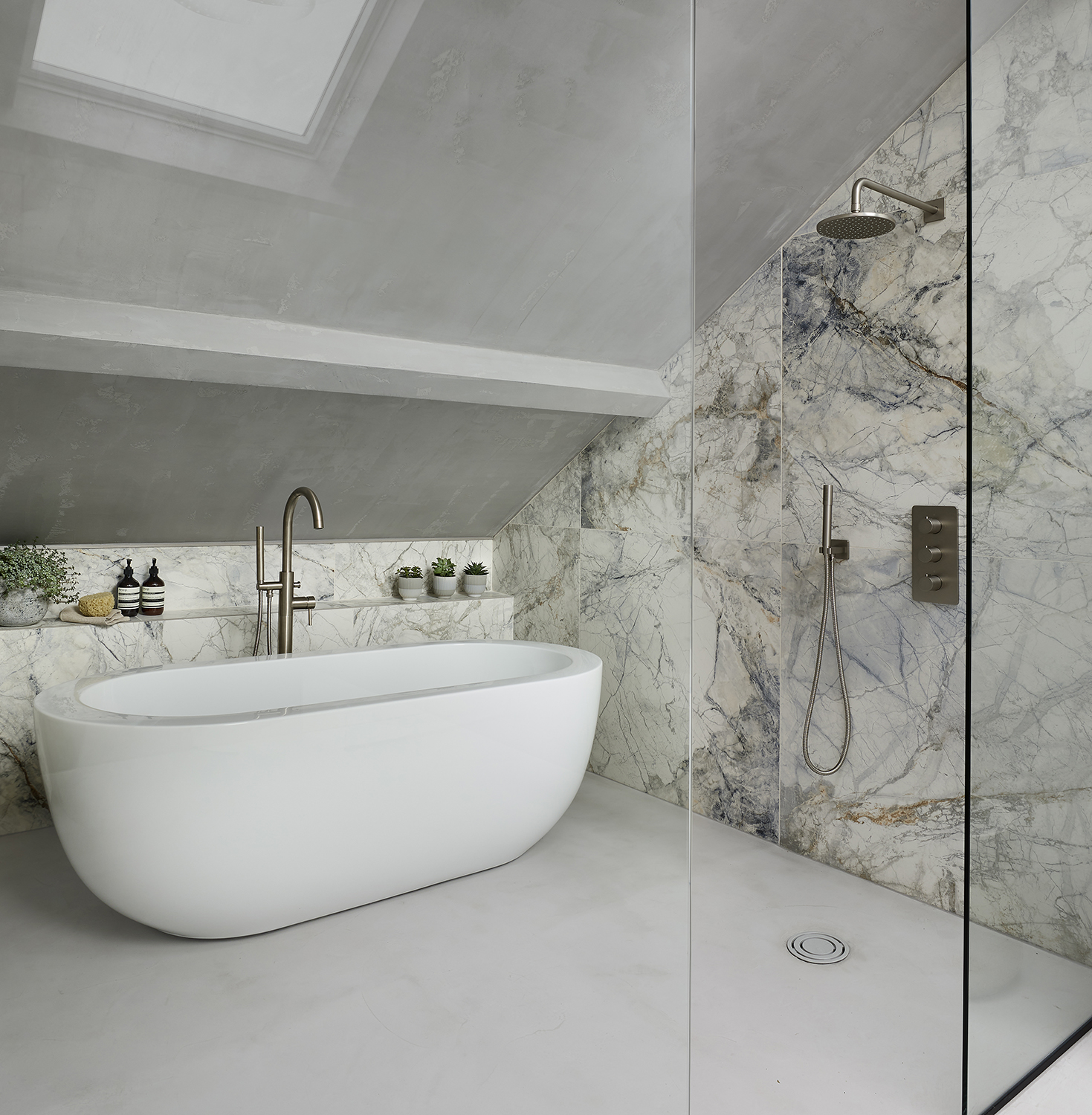
Bathrooms are not known for their natural light, but adding in as much as is possible will help the room feel less awkward, opening it up to the eye. 'The next game-changer was adding outsized skylights,' Jessica says. 'Going as large as possible helped to draw the eye up and made a feature of the high-pitch (12 foot) ceiling, rather than trying to disguise it.'
4. Choose a minimal palette
Design by Jessica Abiagom-Page
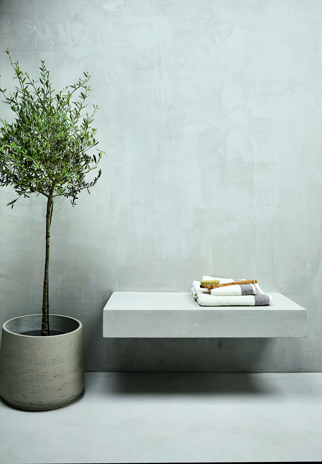
We spend a lot of time thinking about bathroom color ideas but, when wondering how to design a bathroom in an awkward space, simpler is often better. 'When choosing materials, reducing the palette to just a few finishes served to blur out some of the angles and distract from the fact that, being Victorian, the ceiling beams are neither straight nor symmetrical,' Jessica says. 'I’m obsessed with the finish of polished concrete but its weight made it unviable on the fourth floor. Microcement is applied in layers like plaster, and has a similar industrial look and water-resistance but is significantly lighter. Carrying the microcement seamlessly over the floor, walls and ceiling, has a further space-boosting effect and feels spa-like and serene.' Employing the principles of minimalism in interior design can work wonders.
5. Use functional pieces as decorative items

Because there is only so much that can fit into an awkward bathroom, and some things you definitely need to include, as with small bathroom layout ideas each functional piece needs to double up with decorative value, too.
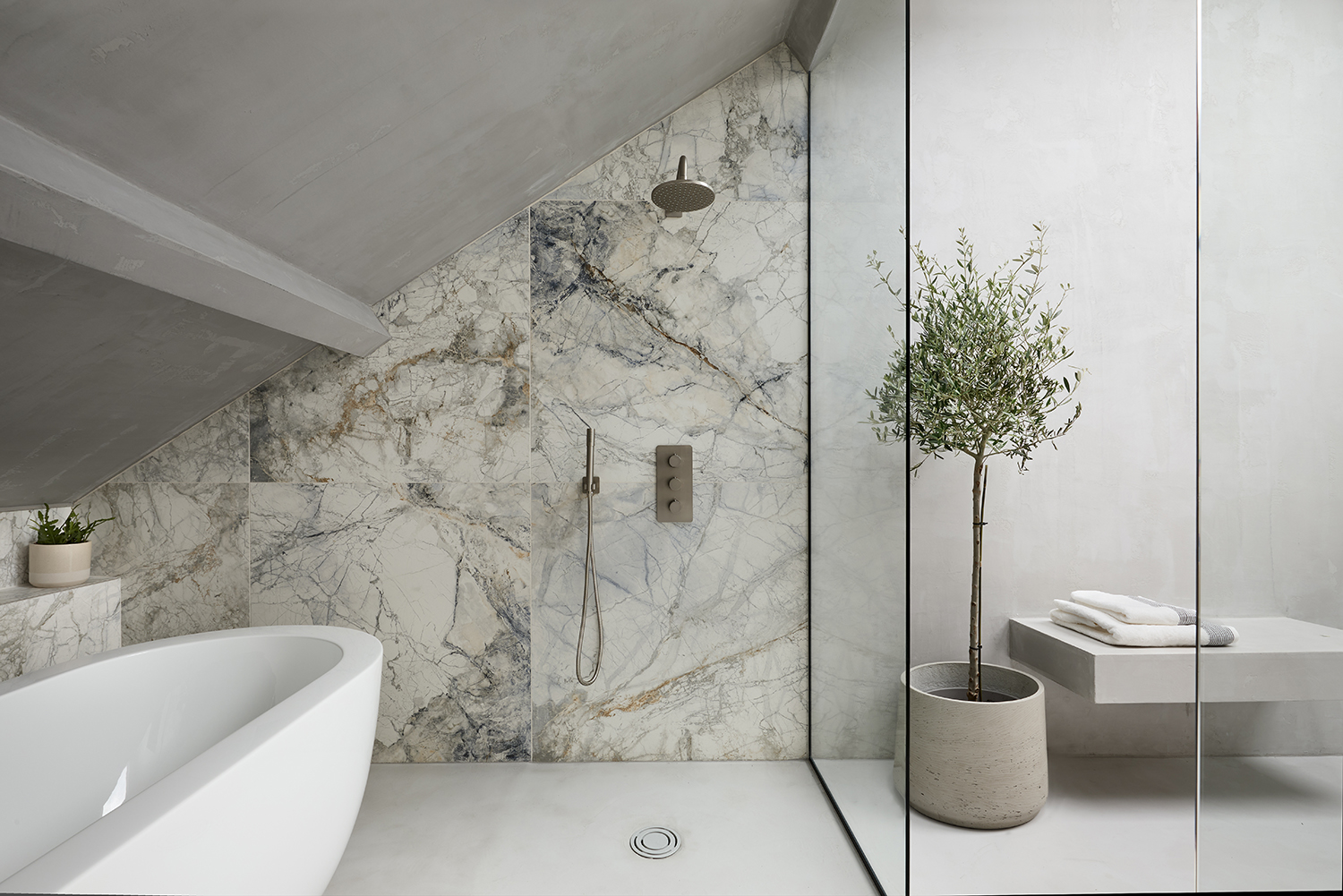
'The walk-through shower screens help break up the space, making the long, narrow room feel a little less so,' Jessica says. 'Switching to tiles – a striking marble-look porcelain from Mandarin Stone – clearly defines the shower area and beautifully frames the freestanding bath behind. We chose BC Design’s chunky Ovali bath to match the thick lines of the concrete basin and cantilevered seat, aiming to draw attention but not too much. There are lots of interesting details, but everything sits harmoniously so the overall effect is calm, not chaotic. The narrow awkwardness of the original space is long forgotten, and we now love our little retreat at the top of the house.'
6. Choose large-format tiles
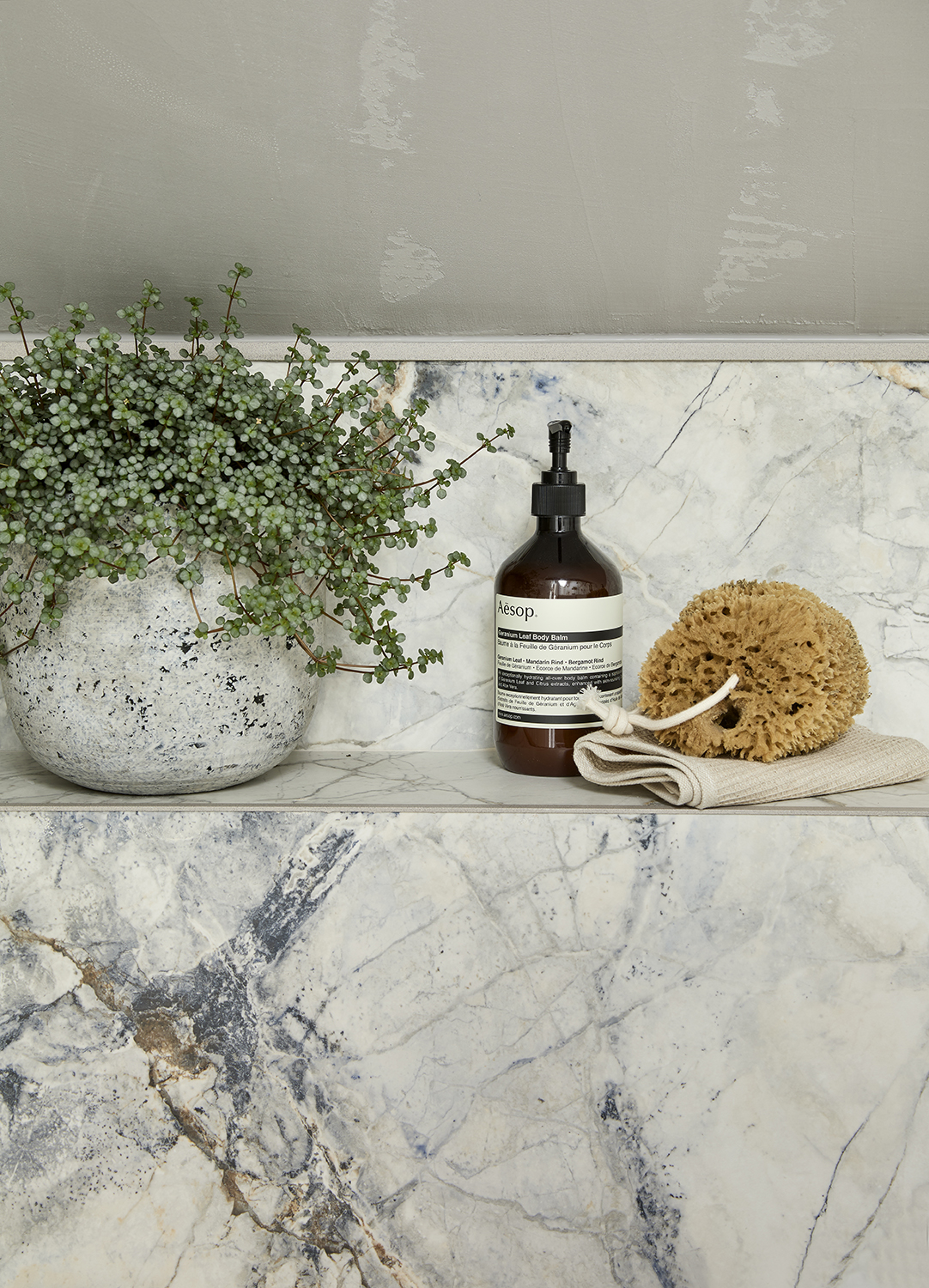
When it comes to bathroom tile ideas, larger tiles can help to reduce the busyness of a space. With its crisp white base and beautiful blue-grey veining, Mandarin Stone’s Arena porcelain tiles faithfully mimic Brazilian Invisible Blue marble but are low maintenance and harder wearing. The large format tiles reduce grout-lines which have the overall effect of calming the space down, and enhance the authentic, slab-like finish.
7. Have bespoke mirrors made
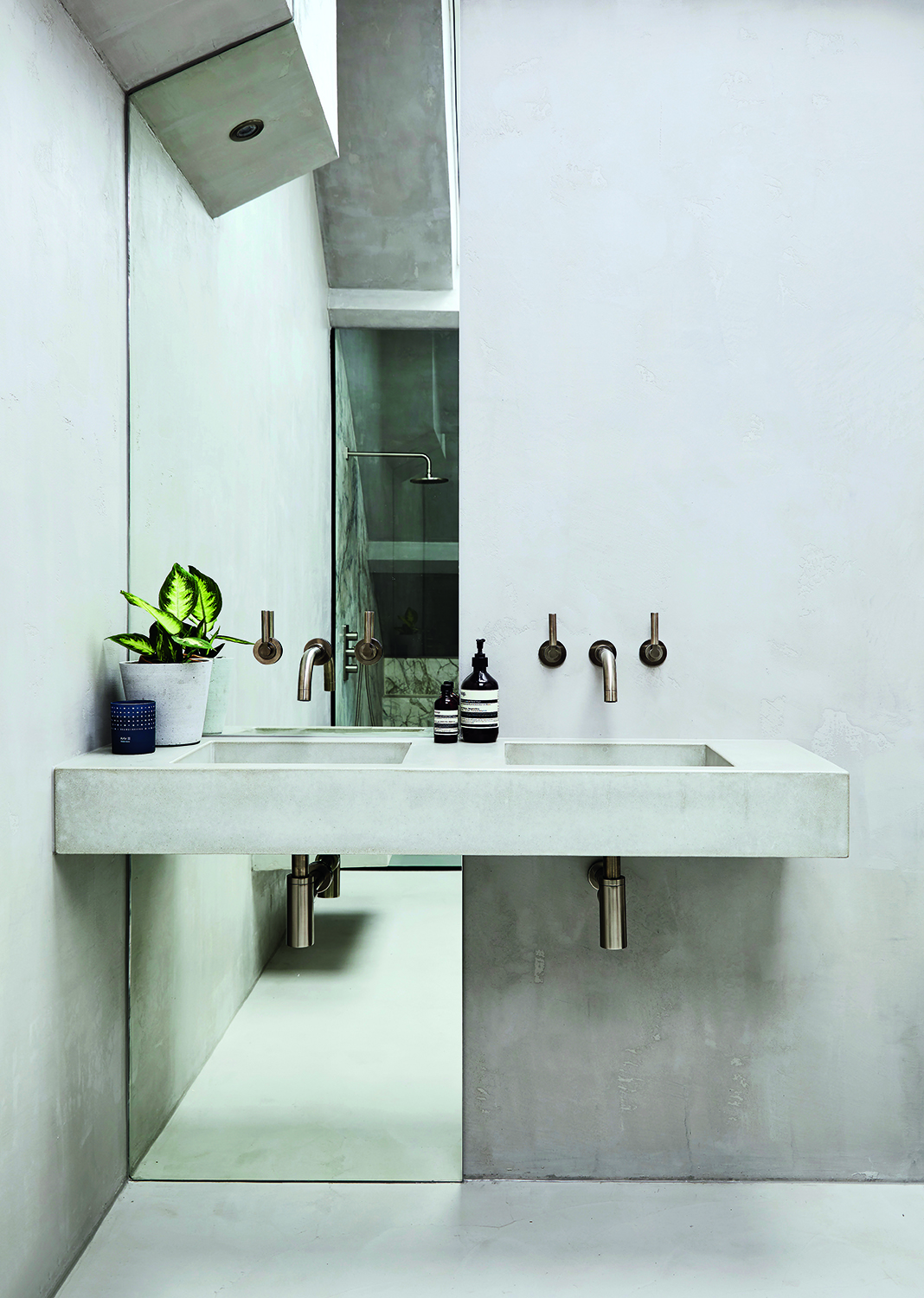
Design by Jessica Abiagom-Page
A bespoke floor-to-ceiling mirror in one corner has a widening effect and helps reflect light from the skylights above into the space. Custom cut around the remainder of the old chimney breast, and bisected by a chunky double basin, the mirror is a simple but clever move that really lifts this side of the room and gives it more presence.
Be The First To Know
The Livingetc newsletters are your inside source for what’s shaping interiors now - and what’s next. Discover trend forecasts, smart style ideas, and curated shopping inspiration that brings design to life. Subscribe today and stay ahead of the curve.
Linda is a freelance journalist who has specialized in homes and interiors for more than two decades, and now writes full-time for titles like Homes & Gardens, Livingetc, Ideal Home, and Homebuilding & Renovating. She lives in Devon with her cabinetmaker husband, two daughters, and far too many pets, and is currently honing her DIY and decorating skills on their fourth (and hopefully final) major home renovation.
-
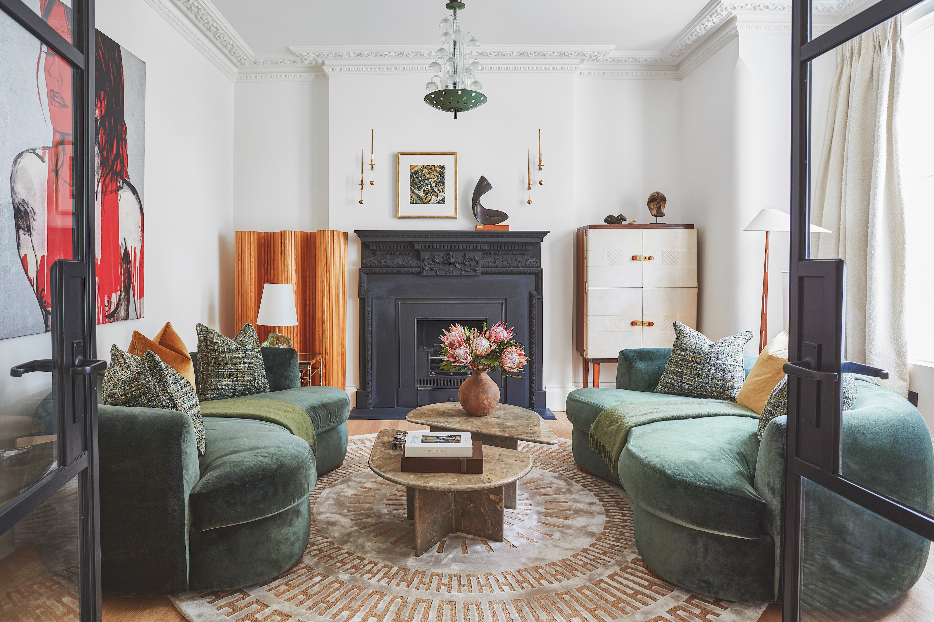 The 'New British' Style? This Victorian London Home Embraces Its Owners' Global Background
Warm timber details, confident color pops, and an uninterrupted connection to the garden are the hallmarks of this relaxed yet design-forward family home
By Emma J Page
-
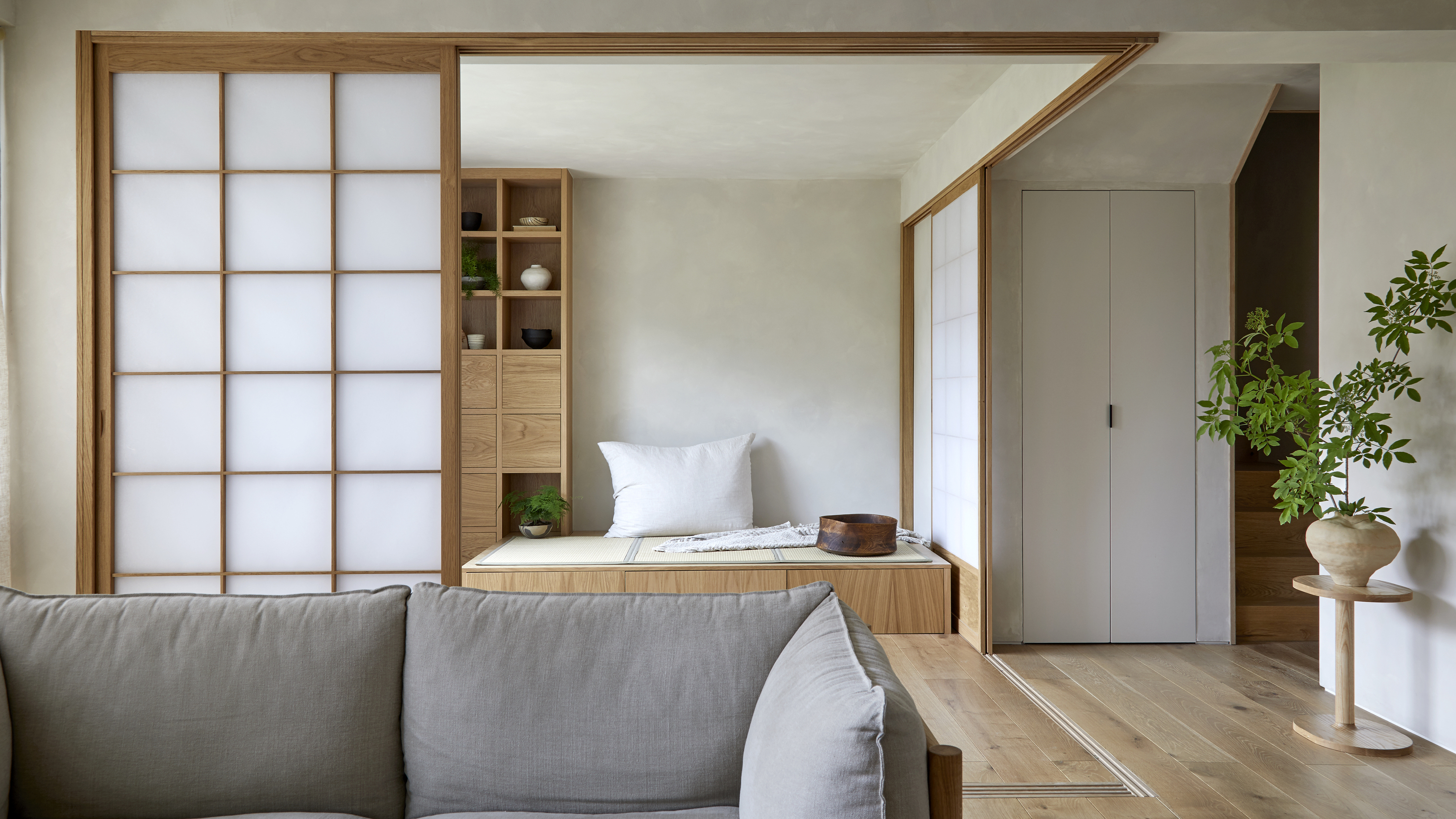 Muji Living Room Ideas — 5 Ways to Harness The Calming Qualities of This Japanese Design Style
Inspired by Japanese "zen" principles, Muji living rooms are all about cultivating a calming, tranquil space that nourishes the soul
By Lilith Hudson