'This is Why Your Home's Color Scheme Just Isn't Working' — How to Spot and Fix an Off-Balance Palette
Sometimes the colors in a space just don’t feel right. Leading designers share how to figure out what’s not working, and what to do about it
Understanding color palettes and how to successfully combine different shades can get technical. But when it comes to spotting an out-of-balance color palette, often our instincts take over.
‘When colors clash or dominate in an inharmonious way, it creates visual discordance, making the space feel chaotic and disjointed,’ says interior designer and home stager Francesca Grace. ‘This can lead to feelings of discomfort, restlessness, or even irritation, ultimately detracting from the overall ambiance and functionality of the room.’
According to Grace, you’ll likely ‘feel’ that something isn’t working when you step into a space with an out-of-balance color palette. But some telltale interior design signs are:
1. Clashing colors that lack cohesion within the space
2. Uneven distribution of color throughout the room, leading to areas that feel visually heavy or sparse
3. Lack of contrast or variation in hues, resulting in a flat, uninspiring atmosphere
Keep reading to learn how to sharpen your instincts and, most importantly, how to fix a color palette that’s out of whack.
1. Add a complimentary color
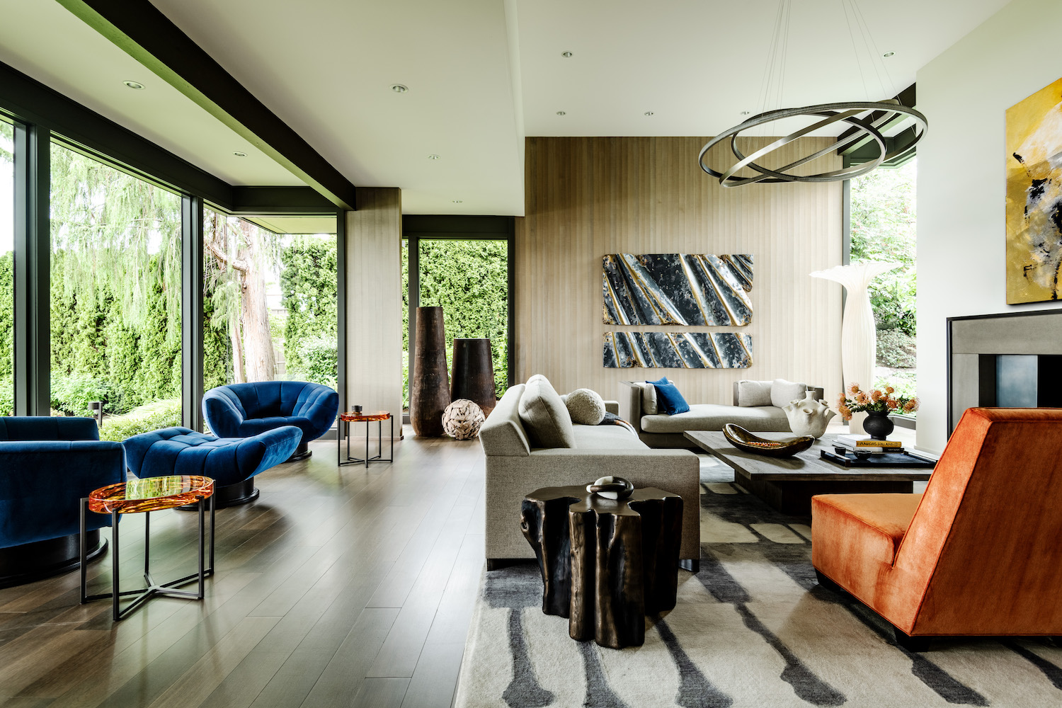
When something isn’t working with your palette, color theory can help you understand why. For example, in the living room above, Danielle Krieg at Studio AM used a complementary color scheme to create visual harmony. She says: ‘Blue was used on one side to draw your eye out to the view. Orange is an empowering color selected as a direct reference to our joyful and sociable clients and was used to draw your attention back into the home.’
Blue and orange are complementary colors because they sit opposite each other on the color wheel. Hannah Yeo, a color specialist at paint brand Benjamin Moore explains: ‘Complementary colors juxtapose warm and cool tones. Incorporating this scheme can bring visual balance to the space. When combining two or more colors, use color relationships as your guide. Monochromatic, analogous and complementary color schemes are valuable tools.’
2. Vary the shades in a monochromatic scheme
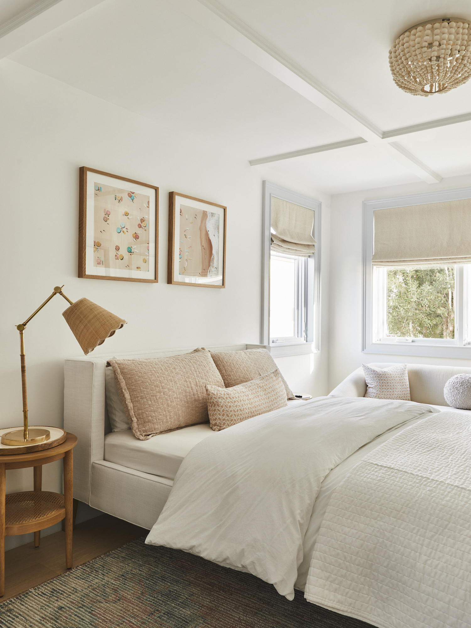
Monochromatic color schemes layer up different shades in the same color family. When kept in balance, these types of schemes can create spaces that feel particularly soothing. Benjamin Moore’s Yeo explains how to balance this scheme: ‘Try to pair different values, the lightness and darkness of a color, and saturation to create subtle yet striking contrast. For instance, if blue is your focal color, combine a light sky blue with a deep navy and a neutral gray-blue.’
In the room above by Christine Vroom Interiors, designer Christine Vroom used different tones of sand to create a bedroom that feels cohesive and calm. ‘If you are doing a monochromatic look, experiment and play with shades and tints, and while you are doing this, be sure to add in texture to give some extra depth,’ says Christine.
3. Combine adjacent colors
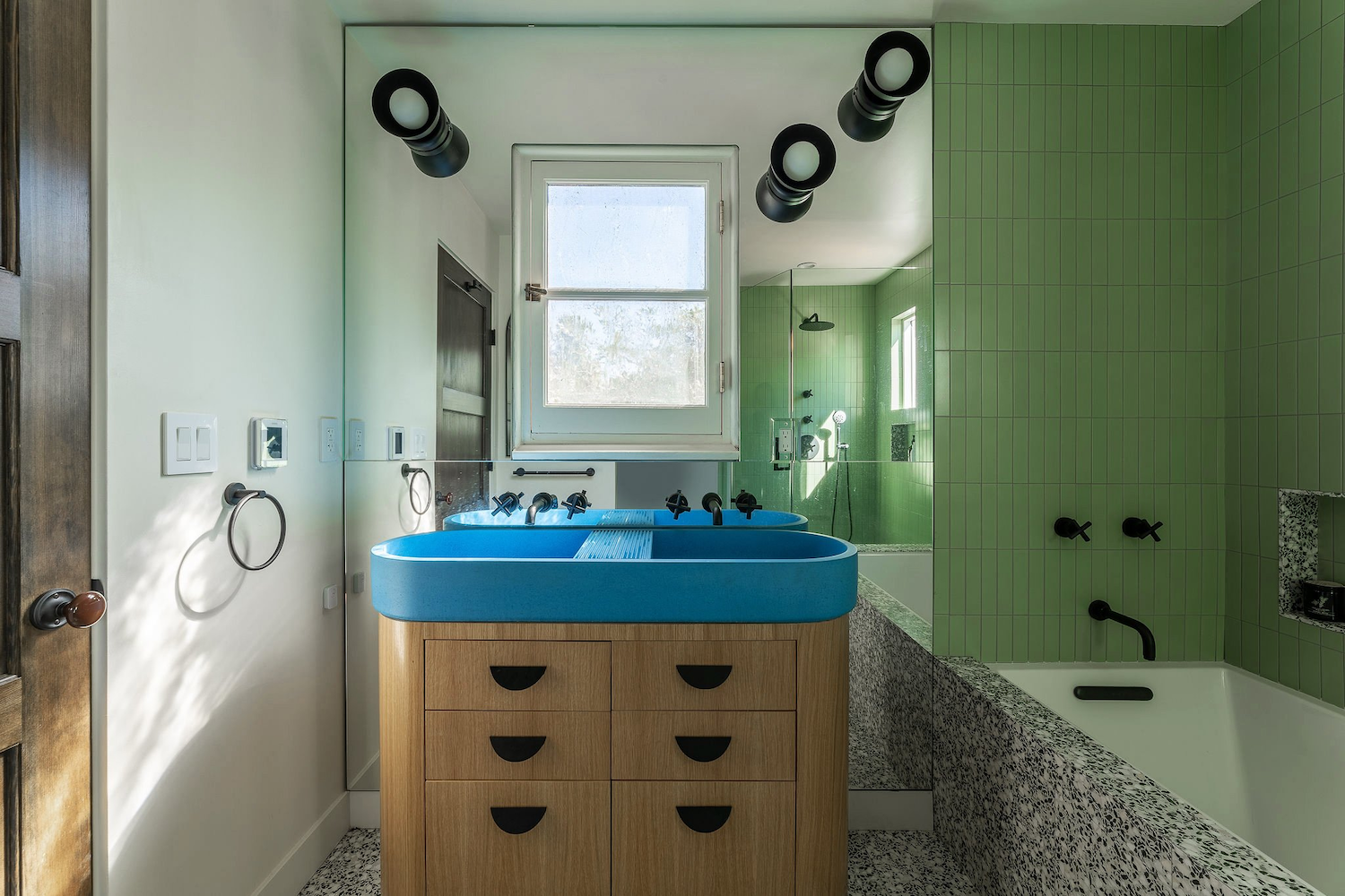
Following an analogous color scheme is another way to ensure a sense of balance. Unlike complementary color schemes, which bring together opposites on the color wheel, these schemes use colors that are next to each other.
For example, in the bathroom above by Arterberry Cooke, the designers used an analogous palette of blue, green and yellow. Meanwhile, in the living room color scheme below by Benjamin Moore, the designers used an analogous palette of blue and purple.
‘In order to balance the boldness of this azure cement sink (above), we chose an analogous color scheme,’ says Barrett Cooke, Principal Architect at Arterberry Cooke. ‘We selected a soft green wall tile and grounded it the shades of bright and dark green that appear in the terrazzo tile on the flooring and tub surround. The yellow undertone of the custom white oak vanity further rounds out this analogous color scheme.’
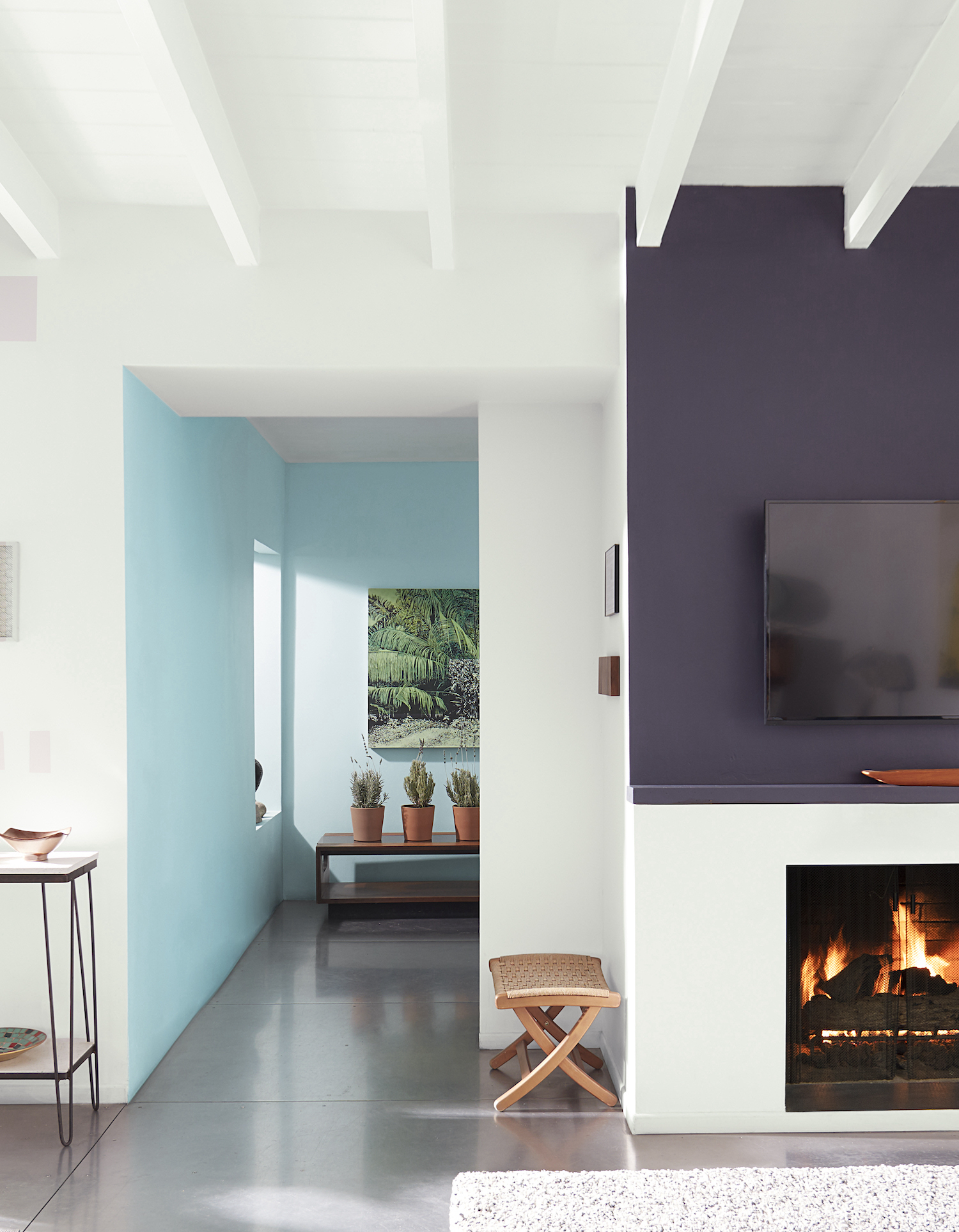
‘Although the individual elements are all bold choices, by selecting a color palette with shades adjacent to one another on the color wheel, we were able to maintain visual harmony,' Barrett continues. 'When colors are balanced, it creates a visual tension that makes a space feel both comfortable and vibrant.’
4. Play with contrast
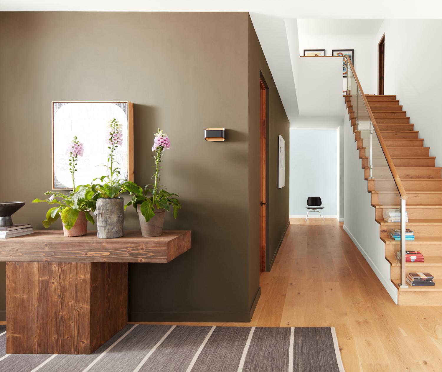
Once you’ve chosen the shades of your scheme, using contrast within the palette will help create balance. ‘The key ingredient is color contrast,’ says Christine Vroom. ‘This may mean using colors within your palette that are lighter, darker, warmer or brighter.’
For example, the room above by Benjamin Moore uses dark and light to create a sense of balance. ‘If there’s a particular room or area of the home you’d like to highlight, use the strongest color there and blend the rest with softer neutrals,’ says Benjamin Moore's Yeo. ‘This is a great way to create a color flow within a home.’
5. Disperse colors evenly across the room

Sometimes a color palette will feel off because a particular shade has become too dominating. ‘Color can draw excessive attention, disrupting the intended flow of the composition and causing a distraction,’ says Alina Wolhardt of Wolf in Sheep Design.
When a color scheme works, it should move your eye around the room. This can be achieved by repeating a color across the space. ‘You want to tie-in colors from across the room to each other,’ says Wolhardt. ‘That could be colors that share the same tonality or warmth, or it could be subtle accent colors. You want to make sure there’s cohesion in the color palette and that you disperse color tones throughout the room to create balance.’
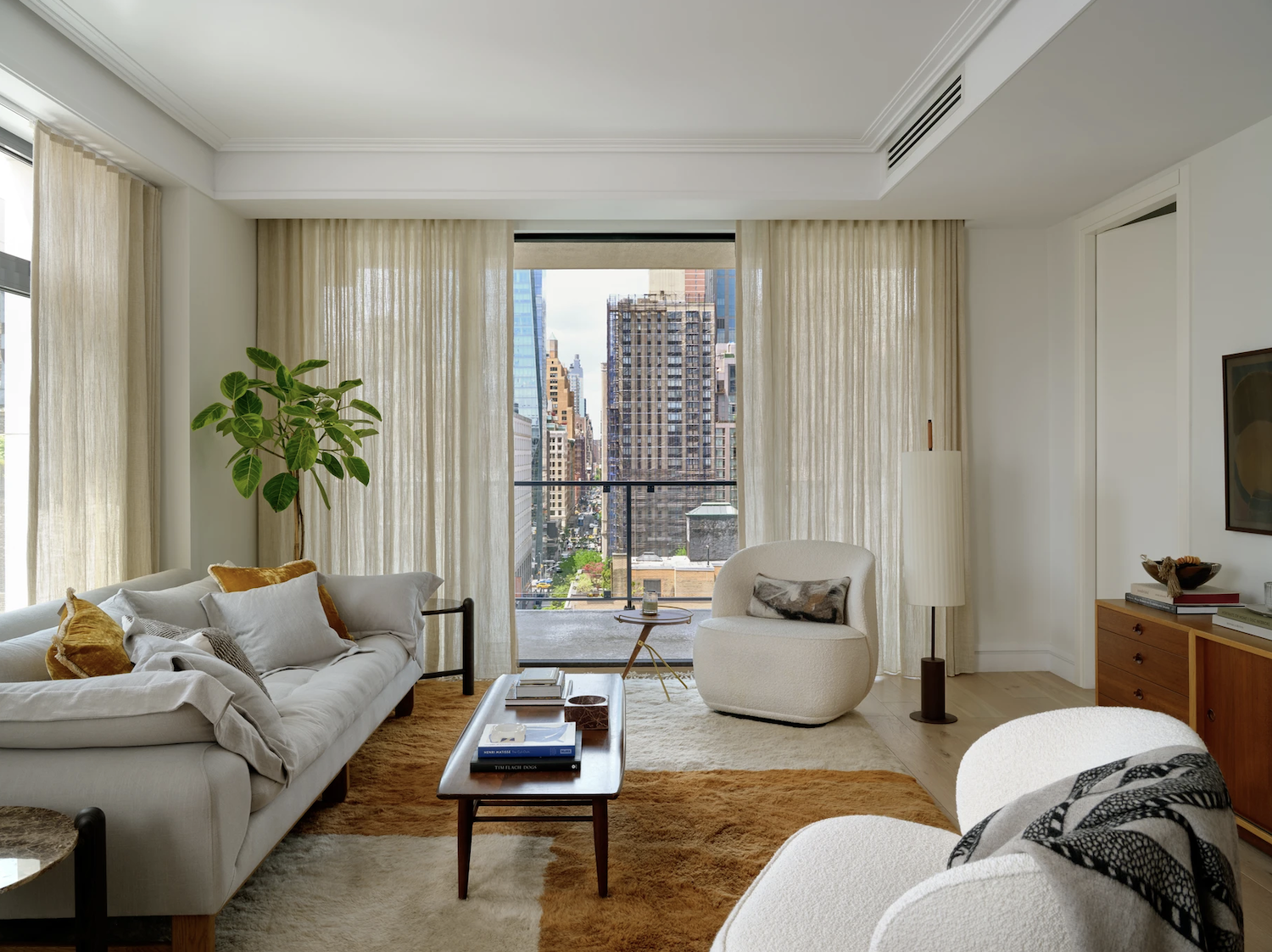
For example, see Wolhardt’s use of orange in the design above. ‘The orange pillows on the light sofa bring balance from across the room to the warm wood tone credenza,’ says Wolhardt. ‘And everything else has similar tonality so that it feels cohesive.’
6. Consider the color of natural materials
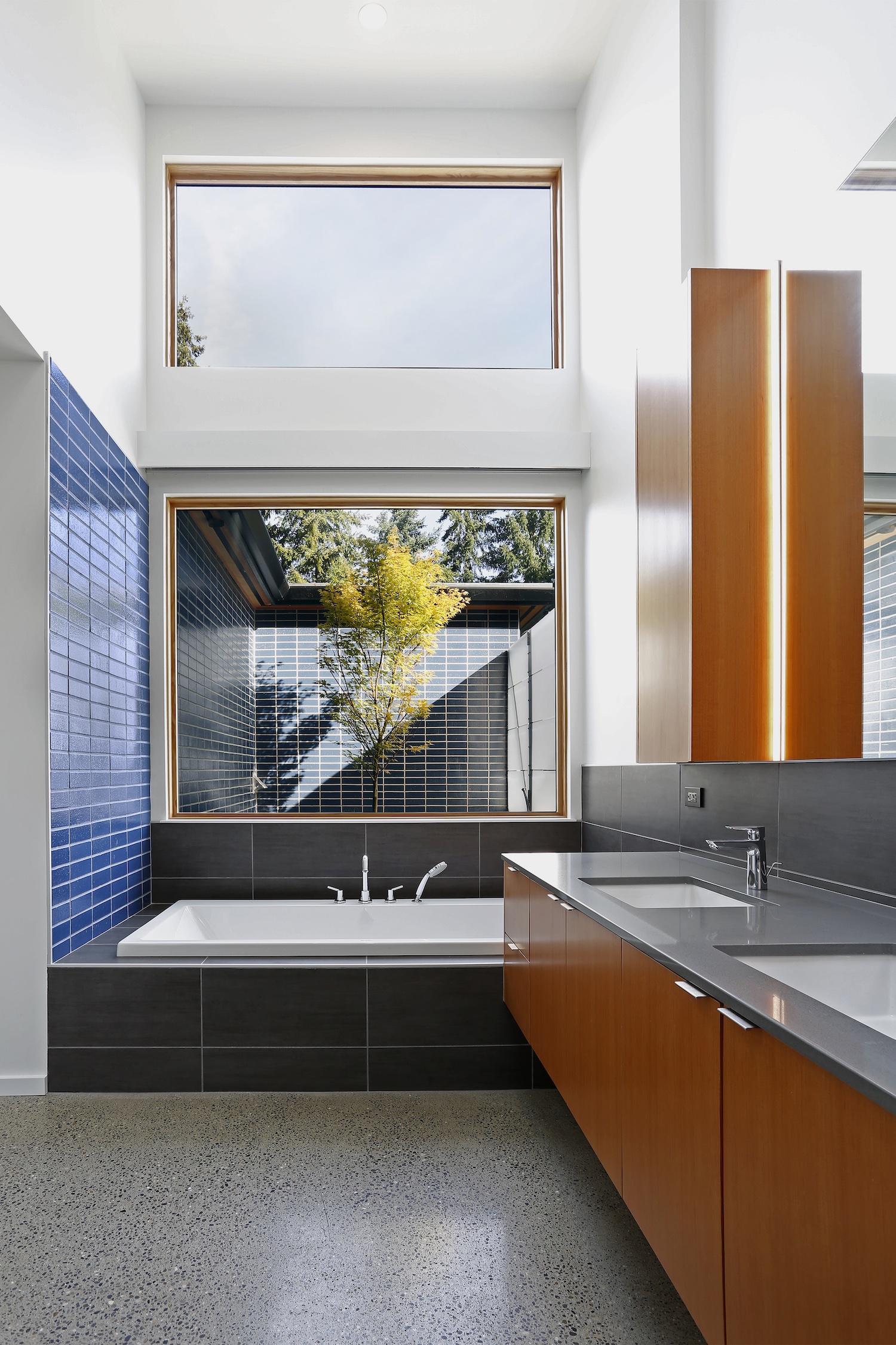
Don’t fall into the trap of thinking that paint ideas for walls and textiles are the sole components of your color scheme. Natural materials like wood and stone can have a huge influence on your color palette and should be considered as part of it.
In the bathroom above by Paul Michael Davis Architects (PDMA), the blue tiles create a complementary color scheme with the orange-toned wood. ‘We love to work with local natural materials like vertical grain fir,’ says Paul Michael Davis of PDMA. ‘It adds warmth, texture, and a connection to our local natural environment, where fir trees are native and renewable. But this wood turns a deep red-orange after years of exposure to UV light, so it’s essential to create a color balance with other materials. In our Clyde Hill house, we paired vertical grain fir with a complementary blue tile, a blue front door, and other cool materials to create equilibrium.’
‘I keep a color wheel at my desk and use it often,' Paul continues. 'If a palette of materials feels strange, usually, the offending mix of hues is breaking the color theory rules. Of course, occasionally, we’ll go our own way. Color theory be damned, if something just feels right.’
Be The First To Know
The Livingetc newsletters are your inside source for what’s shaping interiors now - and what’s next. Discover trend forecasts, smart style ideas, and curated shopping inspiration that brings design to life. Subscribe today and stay ahead of the curve.
Kate Hollowood is a freelance journalist who writes about a range of topics for Marie Claire UK, from current affairs to features on health, careers and relationships. She is a regular contributor to Livingetc, specializing in reporting on American designers and global interiors trends. Based in London, Kate has also written for titles like the i paper, Refinery29, Cosmopolitan and It’s Nice That.
-
 These Are the Flower Crowns I’m Wearing This Spring (Spoiler: They’re Actually for My Door)
Coachella confirmed the comeback of flower crowns. At home, they just go by another name: the spring wreath
By Julia Demer
-
 Bunny Ears, Be Gone — 7 Easter Table Styling Mistakes That Will Take Your Setting from Tawdry to Tasteful
From fussy floral displays that disrupt conversation to over-relying on tacky tropes, don't fall victim to these errors when decorating your Easter table
By Lilith Hudson
