How do you make a duvet look good? 5 tricks that interior designers use to elevate dressed beds
You've made your bed – now it's time to dress it. Experts show us how to make the duvet look like a million dollars
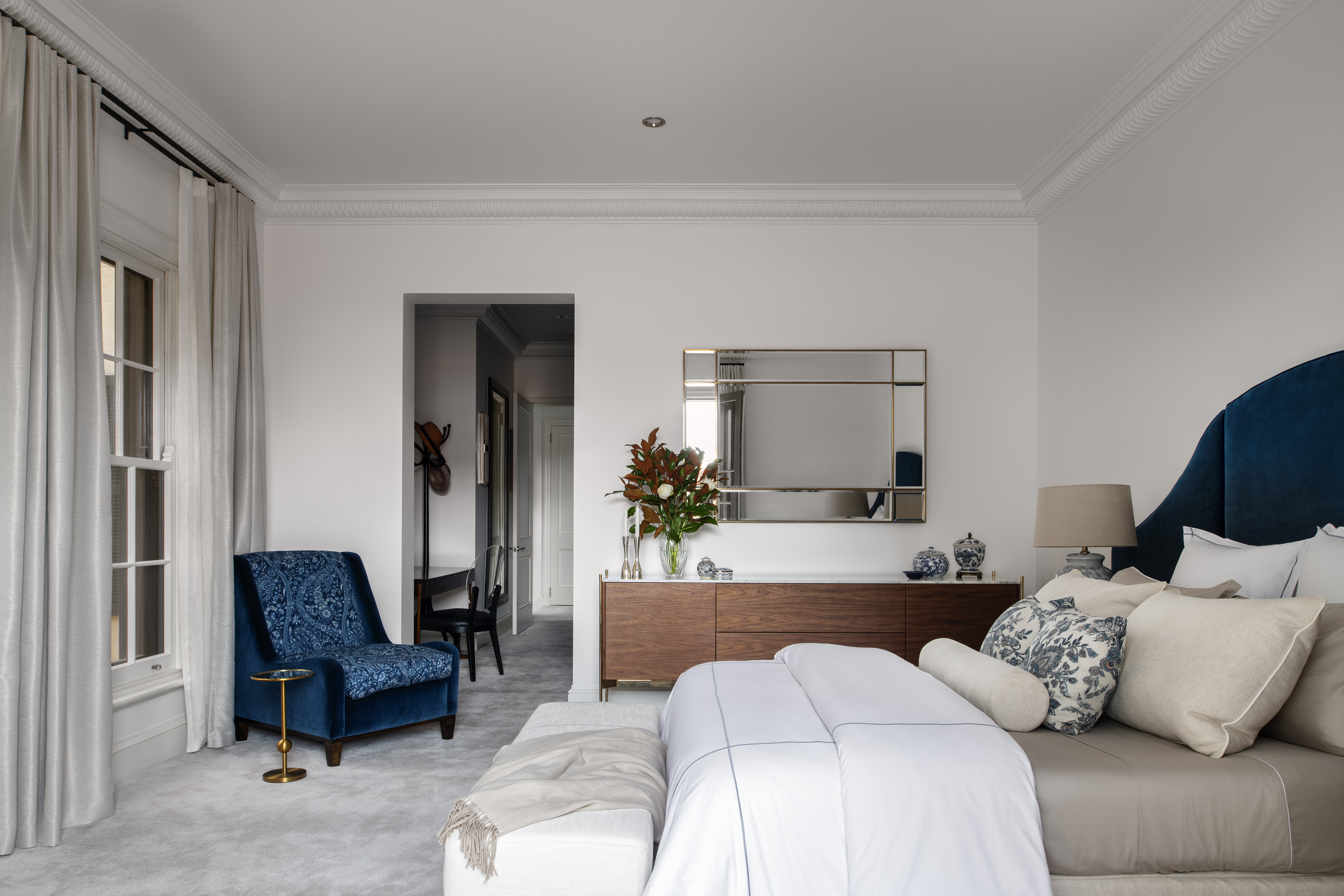

Making a bed might seem easy but making it the most comfortable and eye-catching element of the bedroom takes some time.
When you consider the bed, the duvet takes up maximum visual space and contributes heavily to the room's color and print scheme. Plus, a fluffy and full duvet coaxes you to into a slumber, promising long hours of rest. It's important to get its styling right.
From the right ways to match pillows with duvets, to the ideal colors and prints, we have all the answers from experts, that add to bedroom ideas. Take a look.
1. Make your duvet look fuller
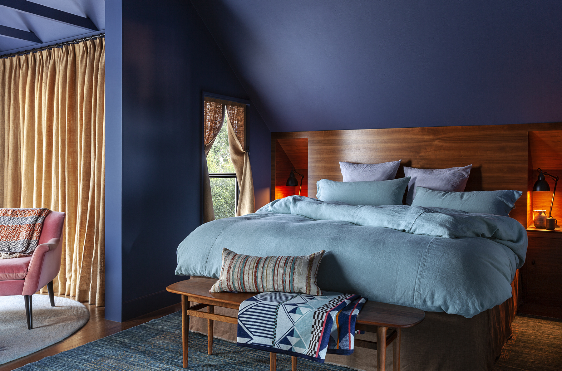
If you're wondering how to get a good night's sleep, you may want to consider a good, solid, and fluffy duvet that covers you well and insulates you for a restful night. While finding a super thick duvet might not work for all climates and weathers, you could consider styling it in such a way that it looks lump some and gives a cozy feel to the bed.
'You could consider stuffing a cover with two duvets to get a fuller look,' says San Francisco-based Kevin Sawyers, founder of Sawyers Design. 'I would also recommend a down alternative fill for the duvet as down tends to pack down and look flat more readily. If you prefer a more tailored bedding make the bed with a spread then fold a duvet in thirds and lay it across the bed as you would with a throw or blanket as an accent piece. It looks very full, folded and unfurls easily for a chilly night.'
2. Pick the right scale for patterns
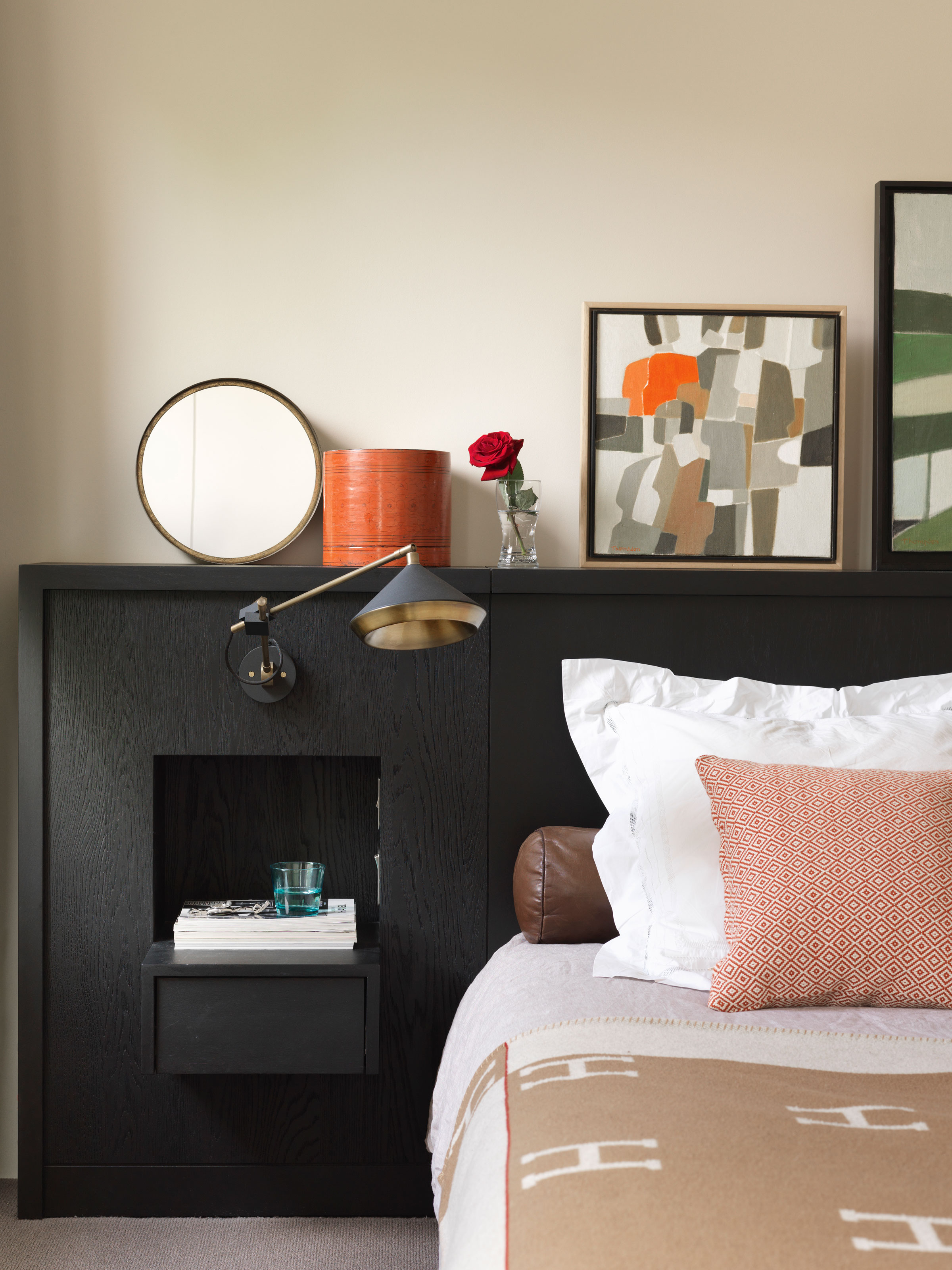
Want to have the most well-curated, and designed master bedroom? Consider the look of your duvet. Not only does it set the stage for a good night's sleep, but it also affects the look and vibe of the room.
'When it comes to choosing the size of prints on duvets, it depends on the look you are trying to achieve,' says Arun Garg, founder of Maishaa. 'Large prints can make a bold statement and work well in spacious rooms with ample natural lighting, while small prints add subtle interest to a room without overpowering it and can even make a small room appear more spacious. Abstract or geometric prints in bold colors or unique designs work better when incorporating prints into a contemporary home. A duvet with small prints matching the wall paint for a classic or traditional aesthetic can give the room a cozy feel. Mixing and matching prints within the same color family can add interest without being overly busy while coordinating prints with the room's design elements can create a designer look.'
'Large prints make a bold statement and can be a focal point in the room,' says Janavi Javeri, interior stylist and founder of Walls and Things. 'Small prints, on the other hand, add subtle texture and can create a more delicate and refined look. Consider the scale of the room and other patterns in the space to determine which option suits you best.'
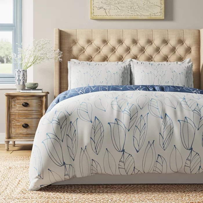
Material: Microfiber / Polyester
Price: $26
Choose this duvet cover designed with abstract leaf patterns, that can easily match an interior of any style.
3. Try the two duvet trick

If you are interested in going that extra mile to make your bed more comfortable, then doubling up on duvets will certainly do the trick.
'The two duvet trick helps enhance its appearance,' says Janavi. 'Layering a duvet with a lightweight quilt or blanket adds depth and dimension to the bed. It creates a cozy and inviting look while adding extra warmth during colder months. Also, instead of tucking the duvet completely under the mattress, fold the top edge of the duvet down to create a visible border or reveal a complementary pattern or color. This simple technique adds a touch of style and makes the duvet visually appealing.'
'Consider the roll trick,' says Arun. 'This trick is achieved by folding the duvet in thirds and neatly rolling it down to the foot of the bed, creating a clean and contemporary look. The duvet roll should be roughly the same width as the pillows on the bed, giving the appearance of a seamless line from the cushions to the foot of the bed. In the tuck trick, tuck the duvet underneath the mattress. It is an excellent way to keep the duvet in place and give the bed a more tailored look. Depending on your preference, the tuck can be done at the bottom of the bed or on the sides.'
If you are using more than one duvet or adding in quilts, you want to ensure you keep these always clean and aired out. Consider placing the duvet out in the sun, as suggested by sleep experts on airing duvets. This tradition started in Scandinavia and is all about utilizing fresh air and sunlight to get rid of moisture, odors, and bacteria that build up in the bedding.
4. Color match the walls
Another point you might be wondering about is the bedroom colors, and whether they should be matched with the duvet. While there is no hard and fast rule on this, and you could consider contrasting the color of the duvet to the walls, interior designer Kevin throws light on a current trend.
'Color and pattern matching different elements in a room, especially in bedrooms have had a bit of a comeback,' says Kevin. 'Take it to the level you feel comfortable with – from the duvet, a few items to everything in the room drenched in the same color and pattern down to your slippers. Why not be bold?'
5. Mix up the styling
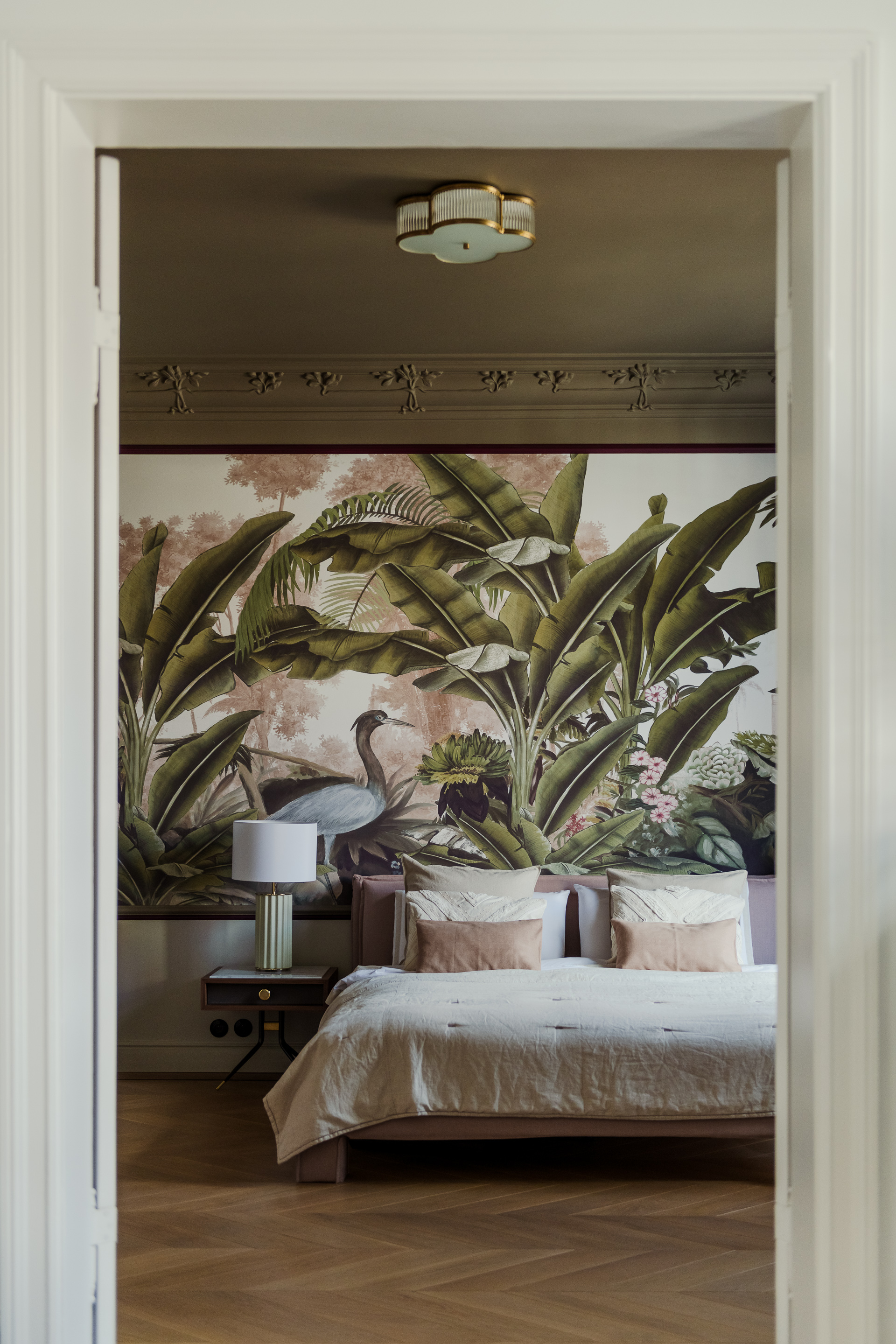
For the coziest bedroom that's also amply stylish, consider pairing the duvet with lots of pillows in varied tones, prints, and even shapes.
'I like to have at least two items on the bed from the same set,' says Kevin. 'Two pillowcases and a duvet cover from a set with a different set of sheets work well. Or a set of sheets and all pillowcases the same with a different pattern or colored duvet cover. Having a few items from the same set makes it look considered.'
'Start by layering different textured pillows for depth and interest,' says Arun. 'If you want to make your duvet stand out, use pillows in contrasting colors or even patterns. A neutral or monochromatic color scheme can give your bed a minimalist touch, but it can still look cohesive, especially with different shades of the same color. Consider mixing and matching patterns, but remember to stick to the same color family. To add a touch of luxury, try using decorative accents like tassels or beading, but keep it simple with one or two complementary color pillows. Experiment with odd numbers of pillows for different arrangements.'
'Place larger pillows against the headboard as a backdrop, then layer smaller pillows in front,' says Janavi. 'Experiment with different shapes and patterns to add visual interest and create a luxurious look.'
Be The First To Know
The Livingetc newsletters are your inside source for what’s shaping interiors now - and what’s next. Discover trend forecasts, smart style ideas, and curated shopping inspiration that brings design to life. Subscribe today and stay ahead of the curve.

Aditi Sharma Maheshwari started her career at The Address (The Times of India), a tabloid on interiors and art. She wrote profiles of Indian artists, designers, and architects, and covered inspiring houses and commercial properties. After four years, she moved to ELLE DECOR as a senior features writer, where she contributed to the magazine and website, and also worked alongside the events team on India Design ID — the brand’s 10-day, annual design show. She wrote across topics: from designer interviews, and house tours, to new product launches, shopping pages, and reviews. After three years, she was hired as the senior editor at Houzz. The website content focused on practical advice on decorating the home and making design feel more approachable. She created fresh series on budget buys, design hacks, and DIYs, all backed with expert advice. Equipped with sizable knowledge of the industry and with a good network, she moved to Architectural Digest (Conde Nast) as the digital editor. The publication's focus was on high-end design, and her content highlighted A-listers, starchitects, and high-concept products, all customized for an audience that loves and invests in luxury. After a two-year stint, she moved to the UK and was hired at Livingetc as a design editor. She now freelances for a variety of interiors publications.
-
 Sateen vs Percale Sheets — What's the Difference, and Which Are Better?
Who would have thought a simple weave pattern could make all the difference to your sleep
By Devin Toolen
-
 I Asked Interior Designers to Share the Worst Design Trends They've Seen on Social Media — And What They Want to See Instead
Just because something is trending, doesn't mean it's tasteful — from dupe-culture to OTT lighting, here's what designers hate seeing in homes
By Devin Toolen
