8 hacks the best designers use to make a kitchen more ergonomic – from the right layout to raising your appliances
For a kitchen that flows better and is more comfortable to use, consider these design hacks that will ensure your space's functionality lives up to its good looks
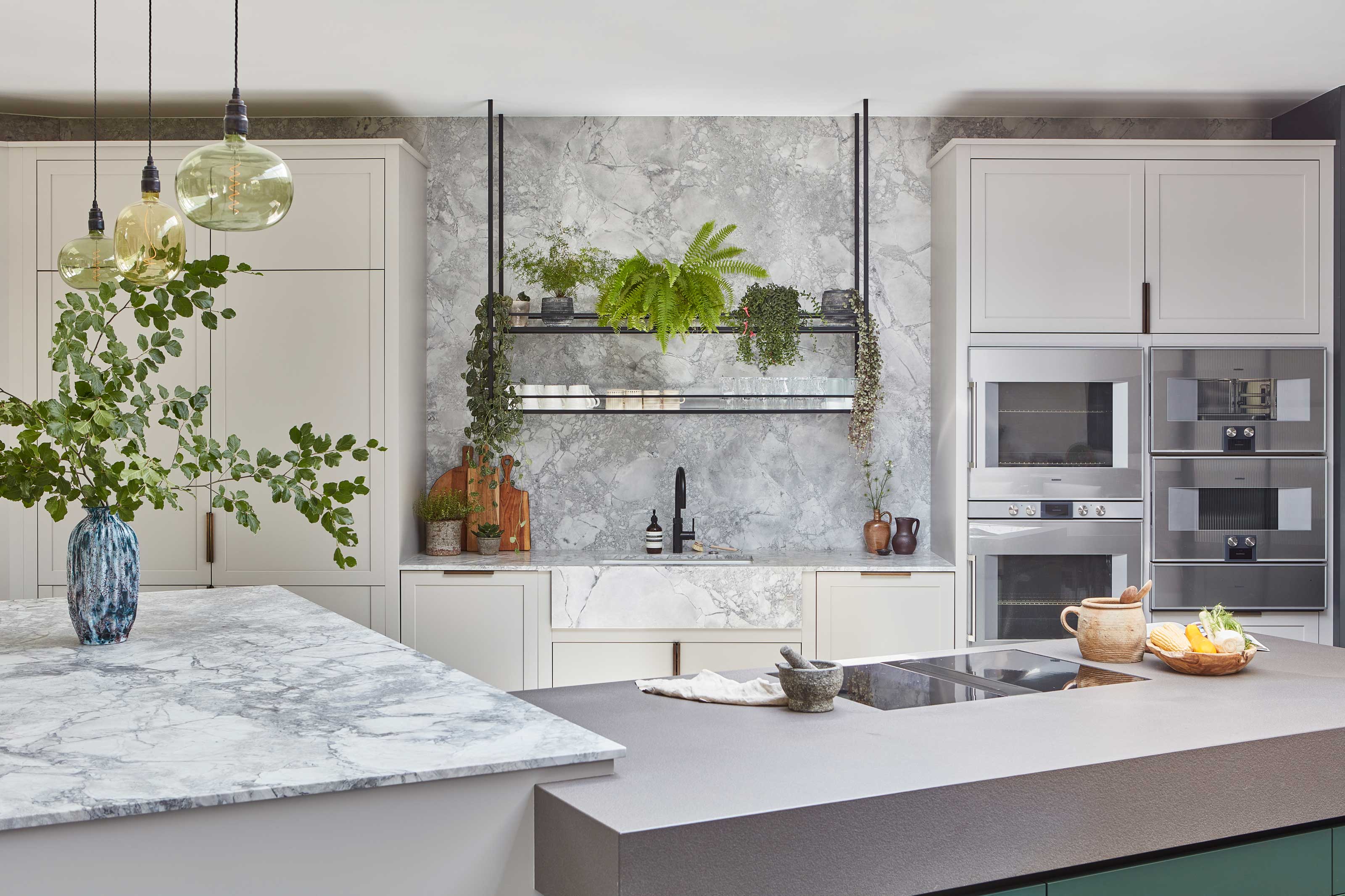

It’s easy to sign off a kitchen design on good looks alone, but it won’t be until you actually cook or clean up in your new kitchen that you might come to discover it isn’t the most practical of spaces.
Of course, with a good kitchen designer on your team that won’t happen, but if you’re going it alone, or you just want a steering hand in creating your new space, there are a few tricks to good kitchen design that are helpful to know.
We asked kitchen designers for the best tricks to make a modern kitchen more ergonomic, and therefore more comfortable to use.
1. Ask "who's using the kitchen?"
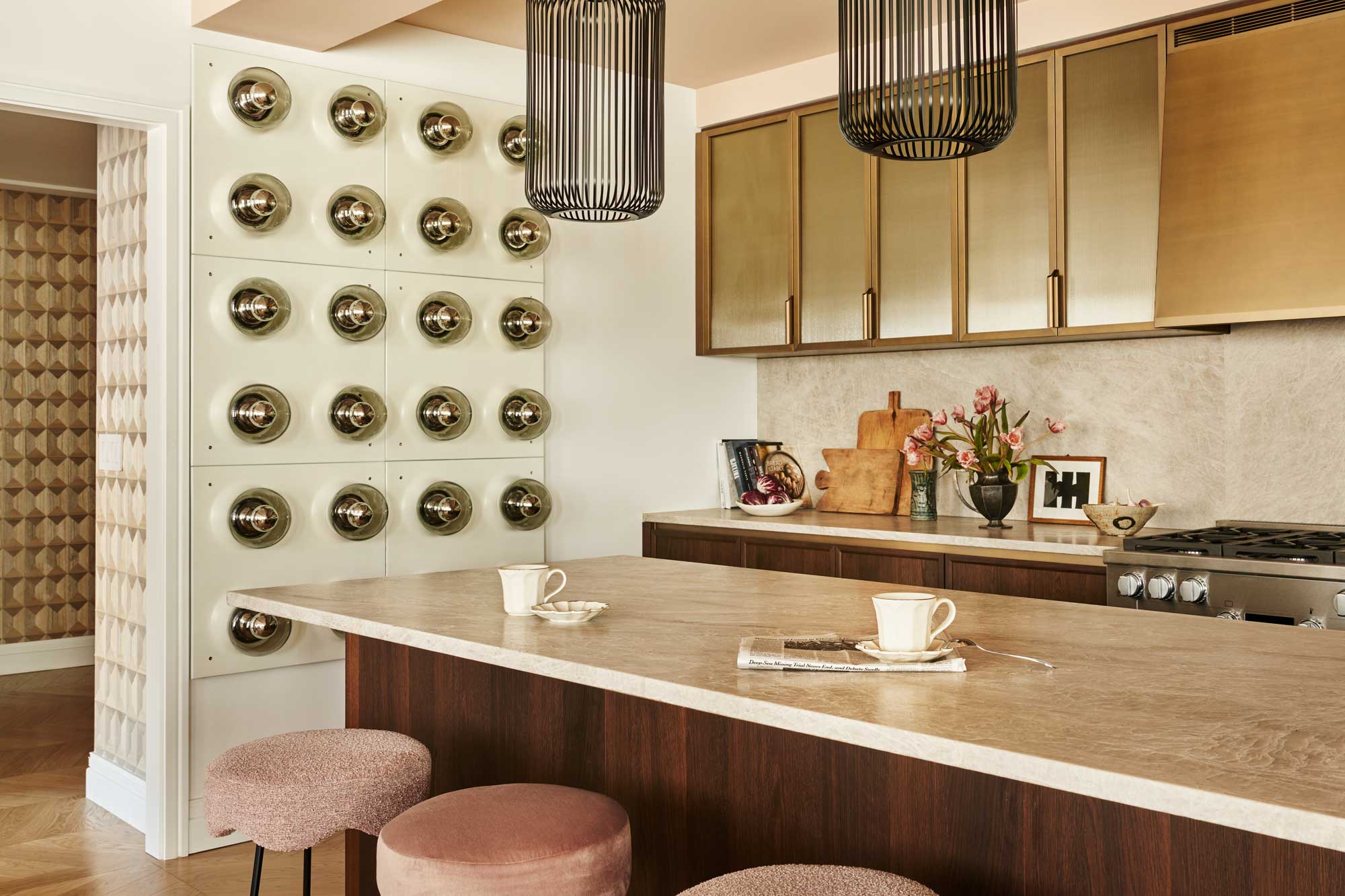
First of all, it’s worth interrogating your kitchen’s layout - after all, there’s not much you can do to change this after your new kitchen cabinets have been installed. While there are certain ‘rules’ many designers follow, you’ll come to find that it’s not a one-size-fits-all approach.
'The perfect kitchen layout depends on a number of factors, but the first thing I ask is how many people are likely to be cooking and using the kitchen at the same time?' interior designer Bethany Adams, of Bethany Adams Interiors. explains. 'An ergonomic kitchen for one cook often means a smaller ‘work zone’ where everything is within reach and the distance between work surfaces is as small as 35 inches. For a multi-cook household (or one where kids may be helping themselves), I'll spread things out a bit more to avoid a cook standing at the range bumping into a spouse at the sink, for example.'
2. Fall back on the 'working triangle'
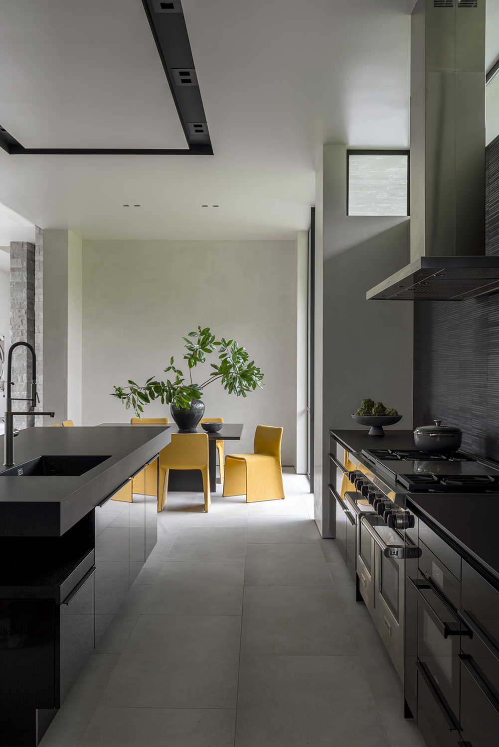
You may have heard of the ‘working triangle’ before - an ergonomic kitchen layout that positions the stove, fridge and sink in a triangle, which makes it easy to bounce around the kitchen as you cook in, and clean, the space.
It's a tried-and-trusted method, that can be applied to most kitchen layouts, from U-shape and galley kitchens to larger kitchens with islands.
However, there are other ideas that can inform your layout, too. 'The old "working triangle" is a helpful jumping off point, but by no means the rule,' Bethany says.
3. Or try the 'five zone kitchen' approach
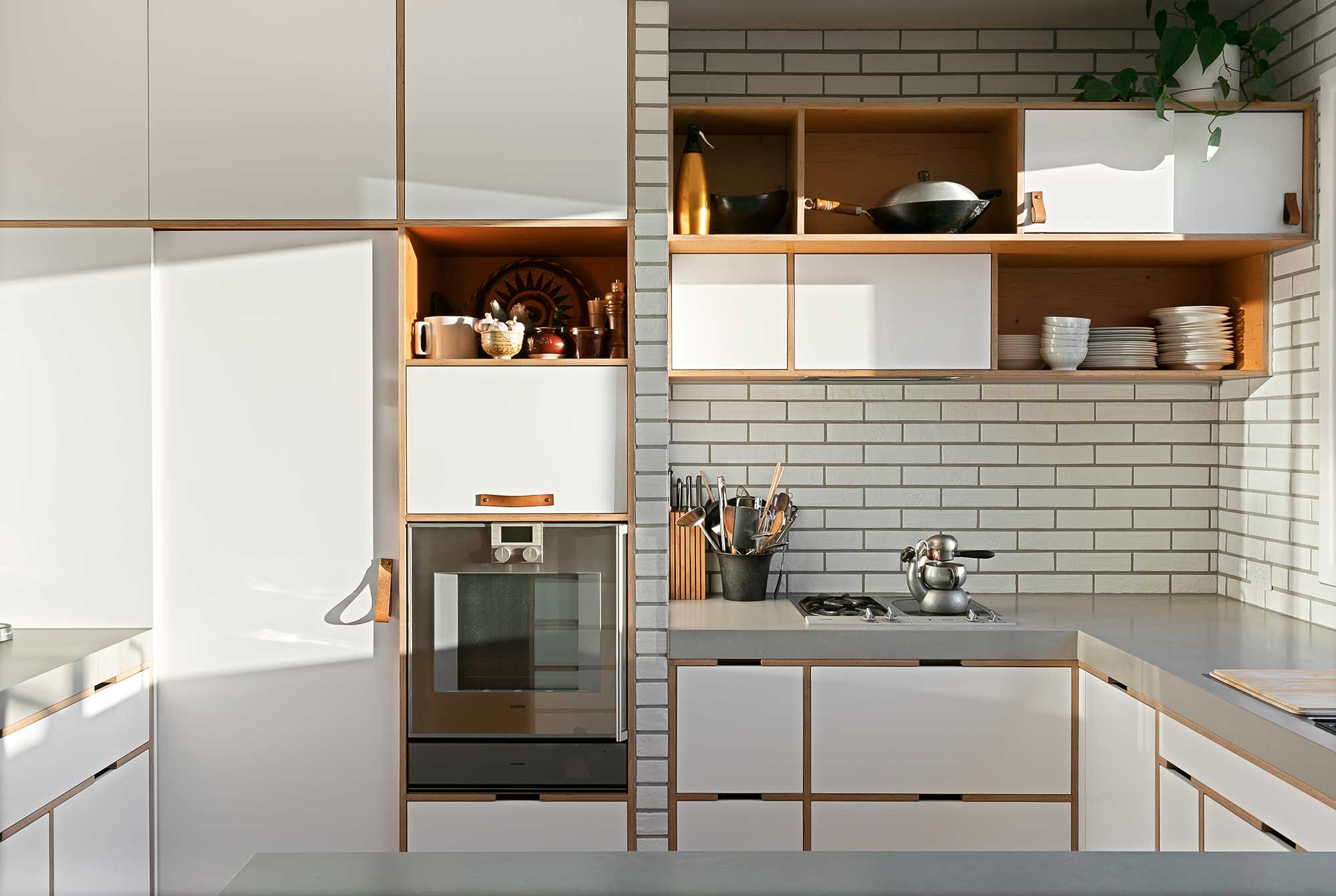
As an alternative to the classic working triangle, some designers look to the "five zone kitchen" to ensure they get the most from their layout. While it doesn't necessarily preclude a working triangle being created in the kitchen, it's focused more on grouping tasks together for a kitchen that's better to cook in.
'The five zone kitchen generally consists of perishable food storage, dry food storage, prepping, cooking and the wet zone for cleaning up,” explains Richard Atkins, director at DesignSpace London. Take food storage, for example, where it makes sense for your fridge and pantry to be side-by-side so that all your ingredients are in one space. When it comes to prep, incorporating storage for spices, knives, mixing bowls and more all makes sense where you have the largest expanse of work surface where you’ll undoubtedly be naturally drawn to prepping food. Taking this approach zone by zone will ensure you’re not darting back and forth across the kitchen continuously.
4. Create access points where it matters
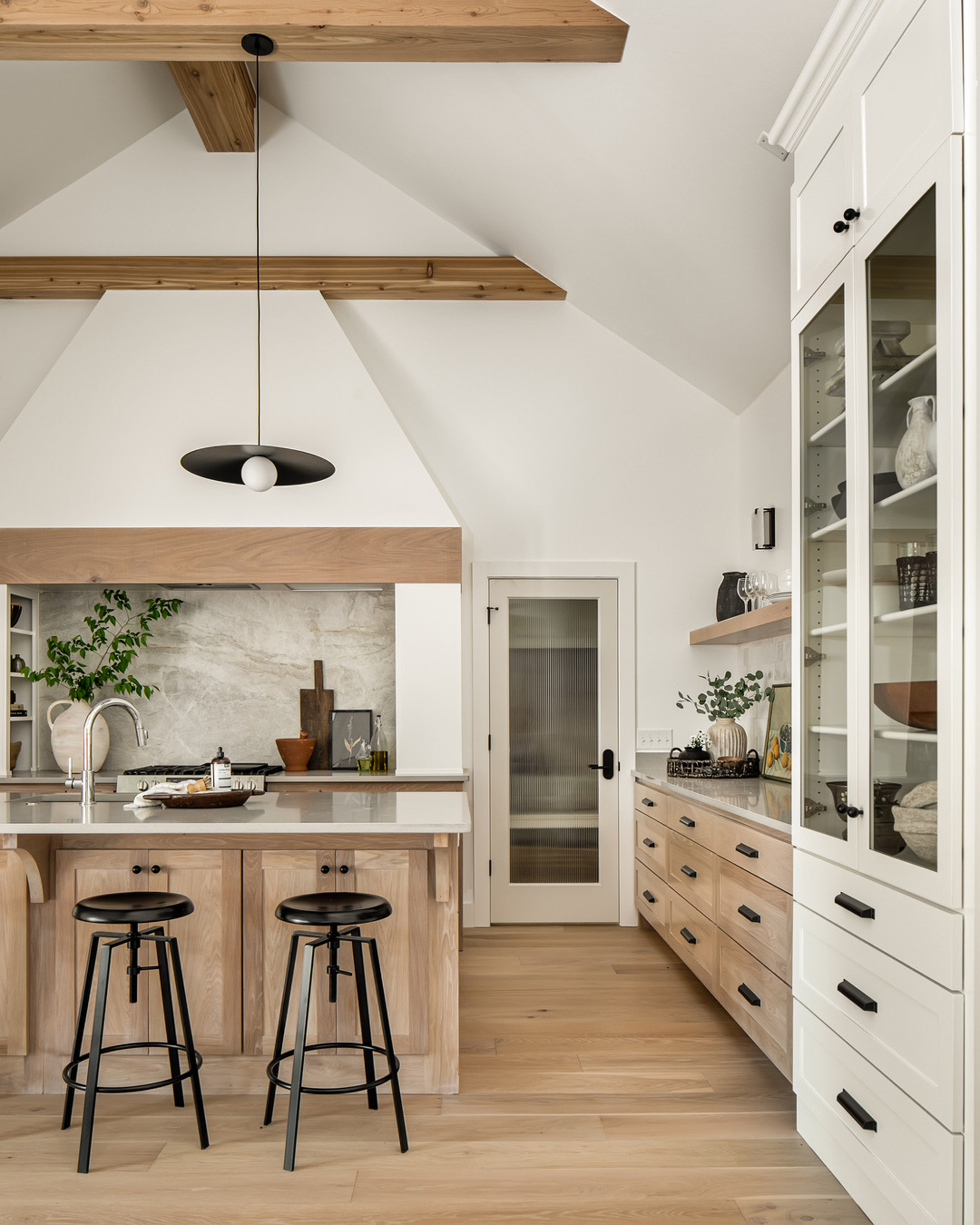
Also factor in those who need to use the kitchen, but not to cook, helping keep them out of the way while the chef works their magic. 'We are constantly thinking about access points into kitchens, and do our best to place refrigerators and prep sinks as close to them as possible,' says interior designer Ashley Macuga of Collected Interiors. 'This ensures that little snack monsters with grubby hands get to their destinations quickly without causing havoc in the main space. We want to get those hands washed, snacks sourced and on to other things!'
5. Choose a less traditional layout
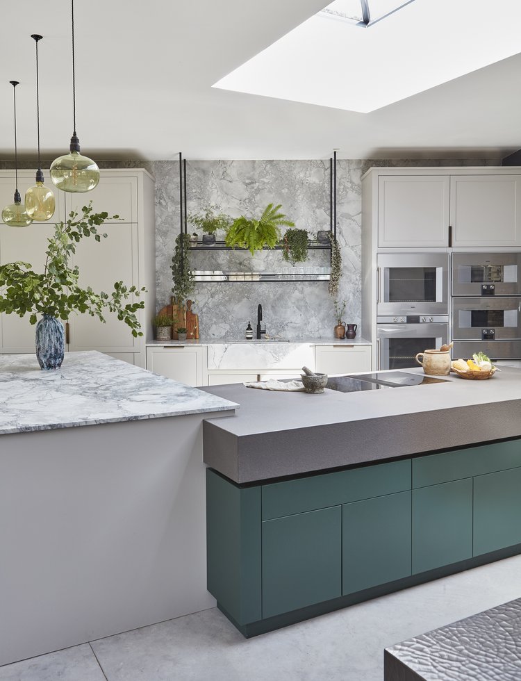
All these ideas play a part in this London kitchen designed by Blakes London, but in an interesting way. While kitchens are traditionally linear spaces, made up by the perpendicular lines of cabinetry, this design has been created with a dual kitchen island floating at an angle to the main run of cabinetry - an unusual set-up, but one that creates a layout that creates incredible flow.
'The homeowners often both cook at the same time, and their older children also come and go as well as being a family that entertains often,’ explains Magnus Nilsson, lead designer at Blakes London, who created this space. 'They wanted a large kitchen where multiple people could be using the space and working efficiently and independently in an informal and social way. This kitchen works especially well for this as the key zones, of sink, pantry, fridge and hob are all within proximity but have enough space around them that multiple people can move around the space without being impeded. There is no one central feature within the kitchen to congregate around, rather a number of different key zones which makes the space very convenient and easy to use.'
Of course, not every room can afford such a layout, but if you’re planning a new extension, for example, it’s a unique approach. 'The triangular layout offers the extra flow space as well as the ability to keep the focus of the room on the large dining table and those seated at it,' Magnus adds.
6. Go bespoke with countertop heights
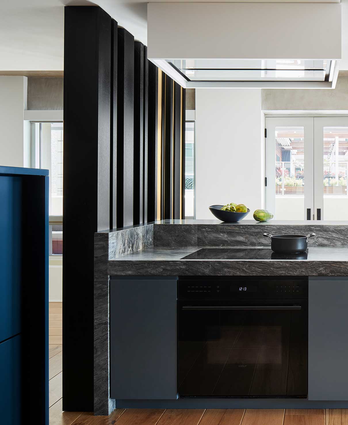
Going bespoke is something to really explore with your kitchen designer, even as far as the countertop height. After all, the kitchen countertop standard height might be 35", but people come in anything but standard sizes. 'I've had husbands who are over 6' tall and wives who are a full foot shorter,' Bethany Adams explains, ‘and it's important to consider who is doing the cooking and designate areas where everyone can be comfortable chopping vegetables or reaching dishes.'
Multiple worktop heights are an option, especially across separate areas like a kitchen island and laundry room. Opting for standard only means countertop heights that might not really work for anyone.
7. Incorporate a toe kick
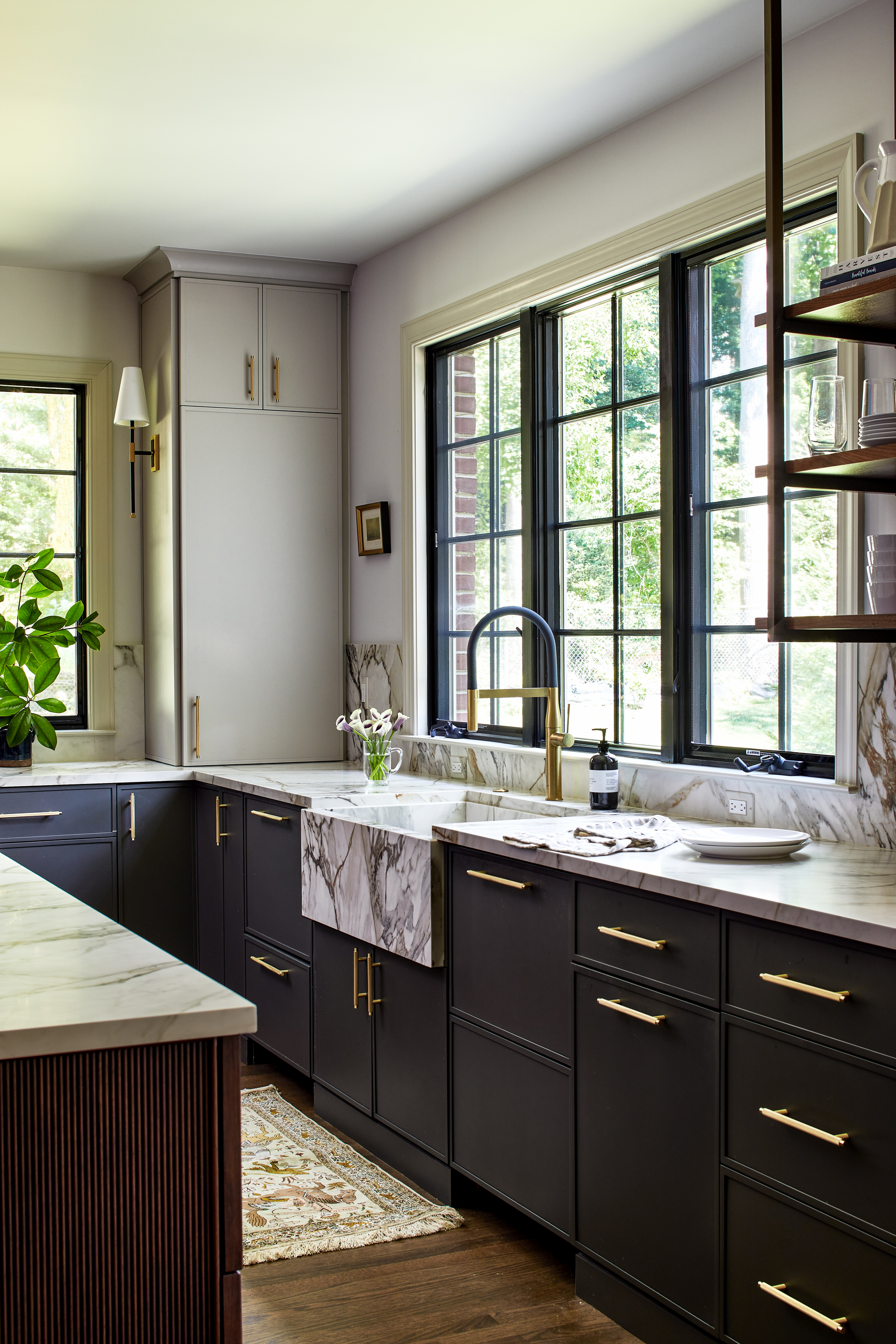
For extra comfort when stood at the worktop, consider you may also need space for your feet to go - this will allow you to stand closer to the worksurface which means less leaning and strain on your back. Table-like islands offer the perfect spot for food prep for this reason, but you could also look to include toe kicks in key areas.
But what is a toe kick? 'A toe kick is the recessed space at the bottom of a base cabinet that offers room for your toes,' explains Tanya Smith-Shiflett of Unique Kitchens and Baths. 'Historically, much of the work done in a kitchen would happen at a table, but with advancements in cabinetry, countertops became the heavily used workspace. They were incorporated in a kitchen space so that users could get as close to the countertop as possible without hitting their feet against the cabinet or having to potentially lean over.'
While they’re not a detail you may want to include across your kitchen, there are certain areas they work best in. 'Toe kicks are nice to have in preparation or cleaning areas,' Tanya explains, 'or wherever a homeowner will be standing for longer periods of time.'
8. Raise your appliances
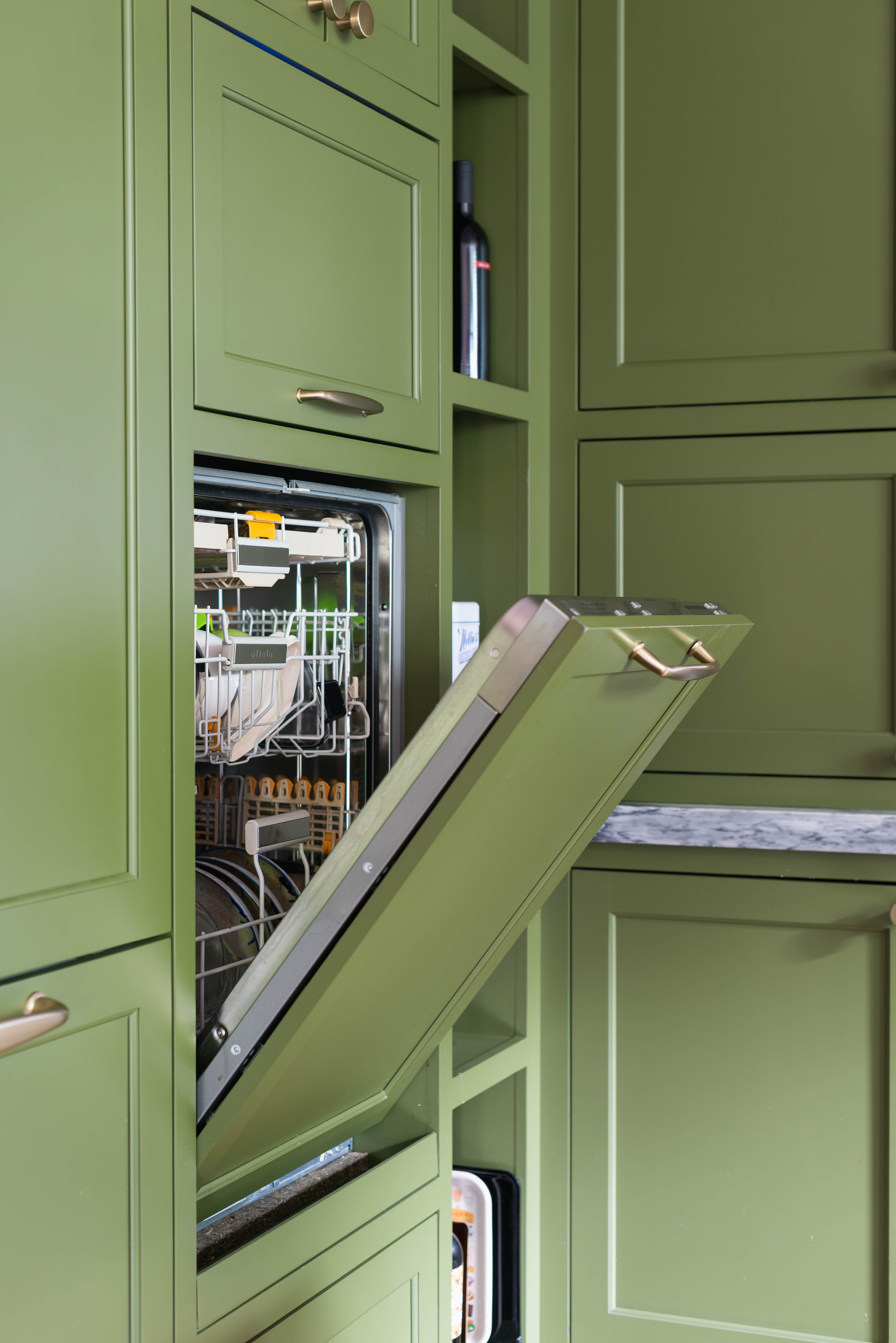
Many appliances are installed as standard at floor level, but in reality, it can be more comfortable to use appliances like dishwashers and washer dryers when they're raised to a higher level on a plinth or within your cabinetry, just like an integrated oven compared to a traditional range.
'The plinth allows for the appliances to be at a more appropriate height, so you’re not uncomfortably bending down,' says interior designer Whittney Parkinson. 'It's personal preference.'
In this practical green kitchen, interior designer Dawn Cook of BLDC Design specified a dishwasher at countertop level, meaning you don't have to bend to load and unload.
Be The First To Know
The Livingetc newsletters are your inside source for what’s shaping interiors now - and what’s next. Discover trend forecasts, smart style ideas, and curated shopping inspiration that brings design to life. Subscribe today and stay ahead of the curve.

Hugh is Livingetc.com’s editor. With 8 years in the interiors industry under his belt, he has the nose for what people want to know about re-decorating their homes. He prides himself as an expert trend forecaster, visiting design fairs, showrooms and keeping an eye out for emerging designers to hone his eye. He joined Livingetc back in 2022 as a content editor, as a long-time reader of the print magazine, before becoming its online editor. Hugh has previously spent time as an editor for a kitchen and bathroom magazine, and has written for “hands-on” home brands such as Homebuilding & Renovating and Grand Designs magazine, so his knowledge of what it takes to create a home goes beyond the surface, too. Though not a trained interior designer, Hugh has cut his design teeth by managing several major interior design projects to date, each for private clients. He's also a keen DIYer — he's done everything from laying his own patio and building an integrated cooker hood from scratch, to undertaking plenty of creative IKEA hacks to help achieve the luxurious look he loves in design, when his budget doesn't always stretch that far.
-
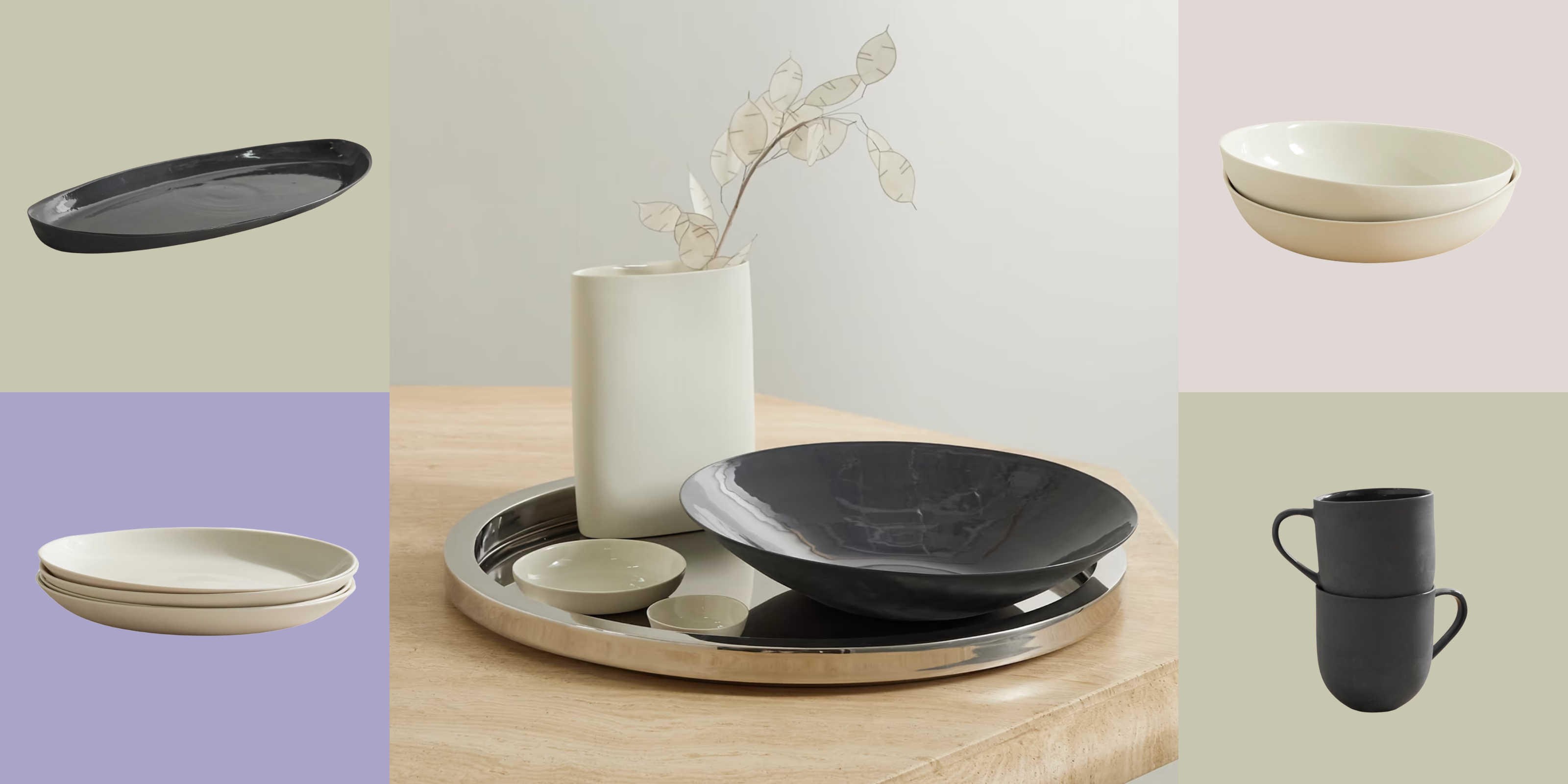 Turns Out, Sustainable Design Can Be Chic, and Net-a-Porter's 'Net Sustain' Curation Is Proof — Here's What I'm Shopping
From the Net Sustain collection, Mud Australia's homeware is not only design-oriented, but eco-focused, too
By Devin Toolen
-
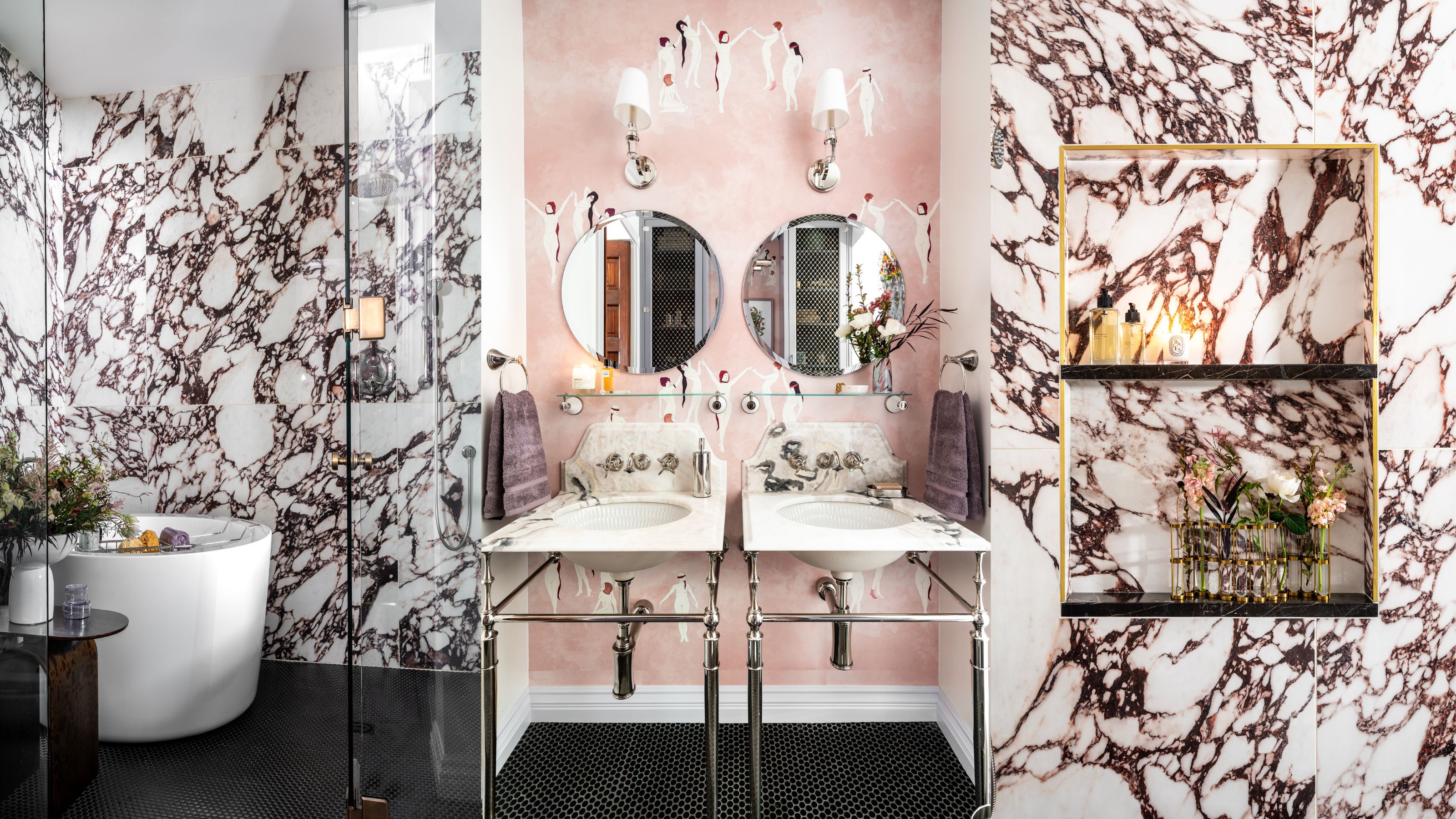 Before and After — How This Jewel-Box Bathroom Made the Most of Its Proportions With Maximalist Design and a 'Soaking Tub'
This design offers a masterclass on creating a luxurious bathroom that is equally playful and elegant.
By Maya Glantz