How to make a white kitchen look warm, interesting and full of life
Decor tricks for how to make a white kitchen look warm from an expert in home design
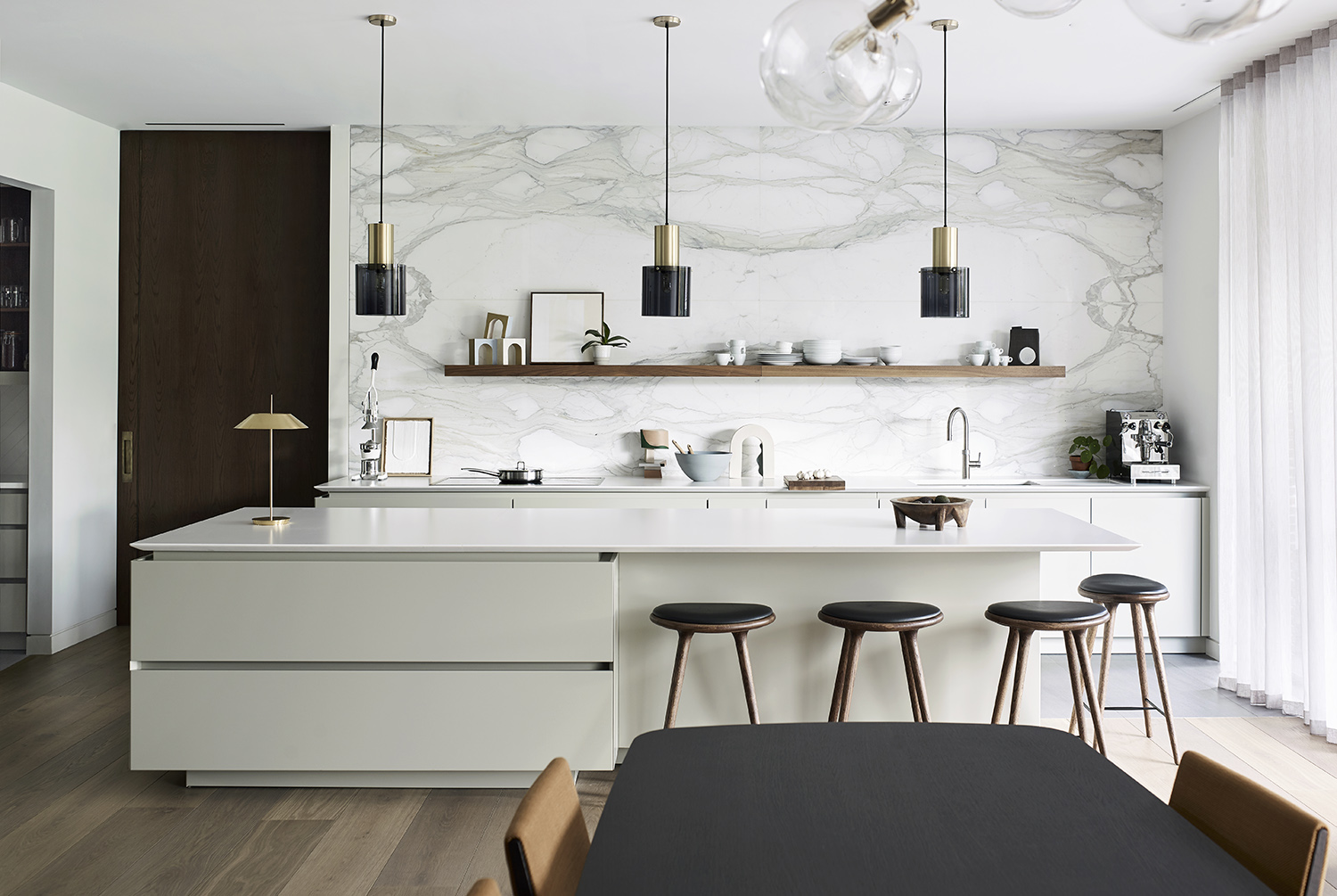
Every minimalist needs to know how to make a white kitchen look warm. For even if the palette you're playing with is sparing, there are still plenty of design tricks you can have up your sleeves to inject a bit of personality, charm and depth to a neutral scheme. Making that kitchen pale and interesting, as it were.
Kitchen color ideas often revolve as much around texture and finish as they do the actual hues. And this is never more true than with white kitchens, which require a bit of extra work to stop them seeming flat and dull. Thankfully, there are pletny of tricks for achieving a layered look with a pared-back palette, and Roundhouse Design’s Ben Hawkswell knows just how to do so. 'While I can appreciate the modern, architectural simplicity of a totally neutral palette, pairing a white kitchen with warmer materials is far more liveable,' Ben says.
How to make a white kitchen look warm
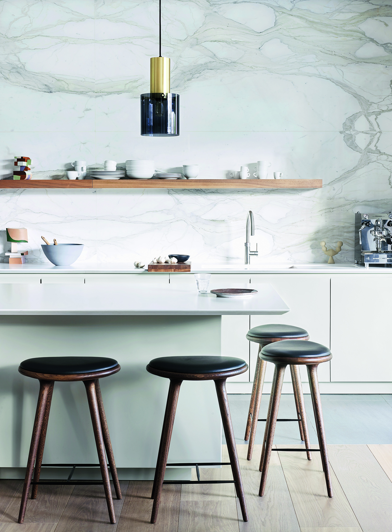
Kitchen designed by Roundhouse
1. Choose just the right shade of white
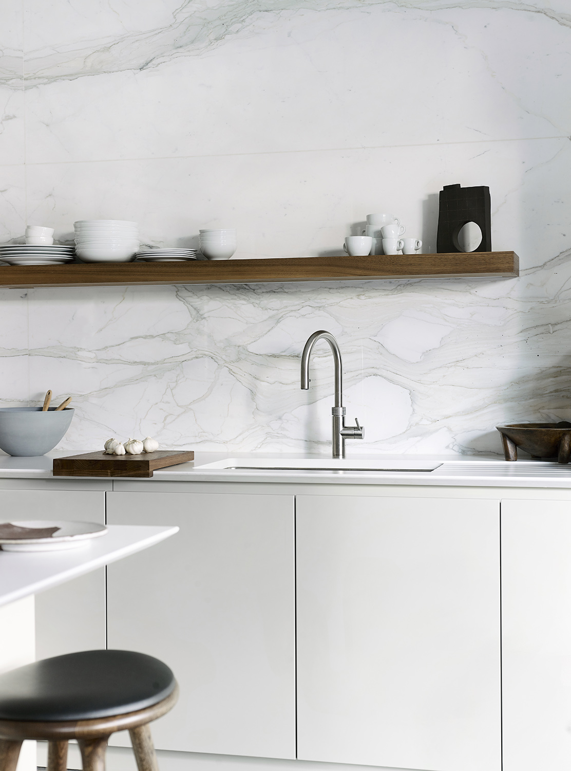
Kitchen designed by Roundhouse
For this kitchen project, Ben knew the owners wanted a neutral space which celebrated the home's architecture and views, but that didn't mean he didn't want to think hard about his white kitchen ideas. 'Located centrally in the house, near the main entrance and with full-width garden views, the kitchen needed to be a striking focal point but also work in harmony with the natural colours outside,' Ben says.
'We started by selecting our core neutral, Hardwick White by Farrow & Ball. This clean off-white can look like a traditional grey in some lights, but it has chalky undertones that, in a sun-filled room, appears much brighter and more contemporary,' he adds. 'Most homeowners understand the benefits of testing paint colours in location but, with whites, it is crucial as they can be altered beyond recognition by light and shadow.'
2. Blend the countertop and cabinetry
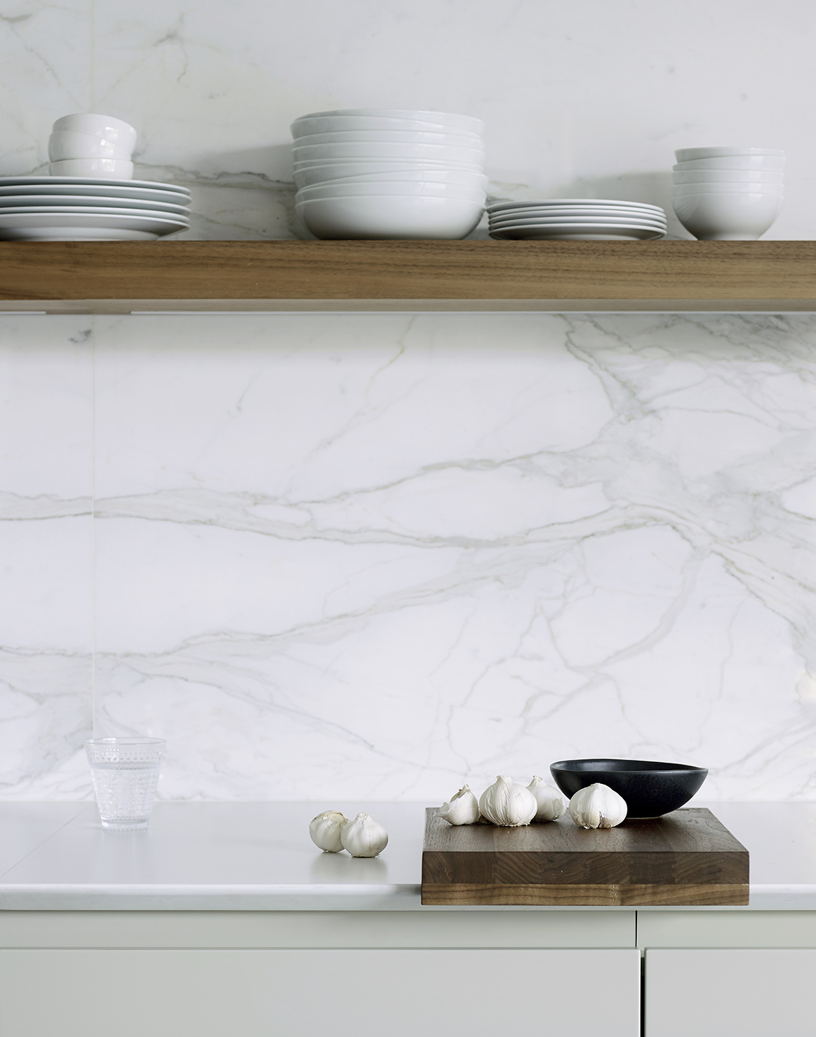
Kitchen designed by Roundhouse
Unlike when it comes to two tone kitchen ideas, the trick with using white is to make the eye feel rested, like it can glide seamlessly over the room. This means picking complementary tones for fixtures and fittings alike. 'Using similar tones for the countertops and cabinetry provides a modern, modular look that’s particularly effective with a handleless design,' Ben says.
On closer inspection, you’ll notice the countertops are actually a few degrees whiter than the cabinetry, which was a deliberate move to create subtle contrast. 'Tonal variation is key when developing a neutral palette,' Ben says. 'A total white-out will look flat and bland.'
3. Play around with textures
Kitchen designed by Roundhouse
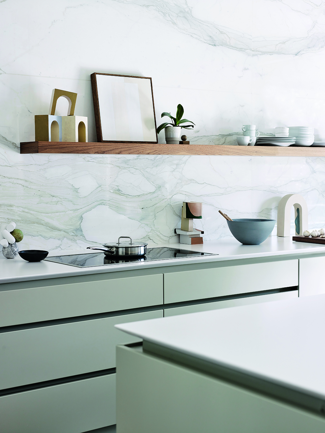
The finish is just as important as the tones, and this is a factor to include in your modern kitchen backsplash ideas. 'Switching textures can also help enliven a white kitchen,' Ben says. 'Here we used matt lacquer on the cabinets and the quartz worktops are honed, which is also matt, while the backsplash is polished. Again, it’s a subtle change, on a tactile level, but it can really add an extra layer of interest to a neutral scheme.'
4. Add details to edging
The chamfered worktop edge, sometimes called Shark’s Nose, is a contemporary detail that makes the surface look thinner without impacting structural integrity. It also adds a deep shadowline that matches the line of the recessed handles while making them easier to access.
5. Include some subtle patterns
The star of the show in this kitchen is undoubtedly the backsplash, proof that marble kitchen ideas are not going out of fashion. 'Early on in the project the owners knew they wanted an amazing stone feature and chose the striking Calacatta marble from a quarry in Italy,' Ben says. 'The base stone is a very crisp white, similar to the worktops, with veining that complements colour tones in the pale grey cabinetry. We worked with a specialist marble fabricator to achieve the amazing four-piece book-matching pattern that’s centred perfectly on the wall.'
6. Use wood to add warmth

Lastly, if you can stomach the idea of not having a totally all-white kitchen - and here at Livingetc we think it's the details that make a difference - then the odd flash of wood will truly lift the scheme.
Here, the shelf adds just a dash of warmth which truly lifts the whole scheme. 'Together with the walnut display shelf and rich timber flooring, the natural stone adds warmth to an otherwise neutral scheme,' Ben says. 'Which, overall makes it feel more homely yet still undeniably modern.'
Be The First To Know
The Livingetc newsletters are your inside source for what’s shaping interiors now - and what’s next. Discover trend forecasts, smart style ideas, and curated shopping inspiration that brings design to life. Subscribe today and stay ahead of the curve.
Linda is a freelance journalist who has specialized in homes and interiors for more than two decades, and now writes full-time for titles like Homes & Gardens, Livingetc, Ideal Home, and Homebuilding & Renovating. She lives in Devon with her cabinetmaker husband, two daughters, and far too many pets, and is currently honing her DIY and decorating skills on their fourth (and hopefully final) major home renovation.
-
 Burl Wood Decor Is 2025’s Most Coveted Comeback — Here’s How to Get the Storied Swirls for Less
Irregularity is the ultimate luxury, but you don’t need an antiques dealer to find it
By Julia Demer Published
-
 5 Garden Features That Instantly Add Value to Your Home — While Making Your Outdoor Space More Practical, too
Get to know all the expert tips and tricks for making your backyard a standout selling point for your home.
By Maya Glantz Published