4 ways interior designers match paint colors to prints – for more cohesive schemes using wallpapers or fabrics
If you've got a statement pattern you want to include in your decorating scheme, you’ll need to find out how is best to pair colors and create the perfect surrounding palette
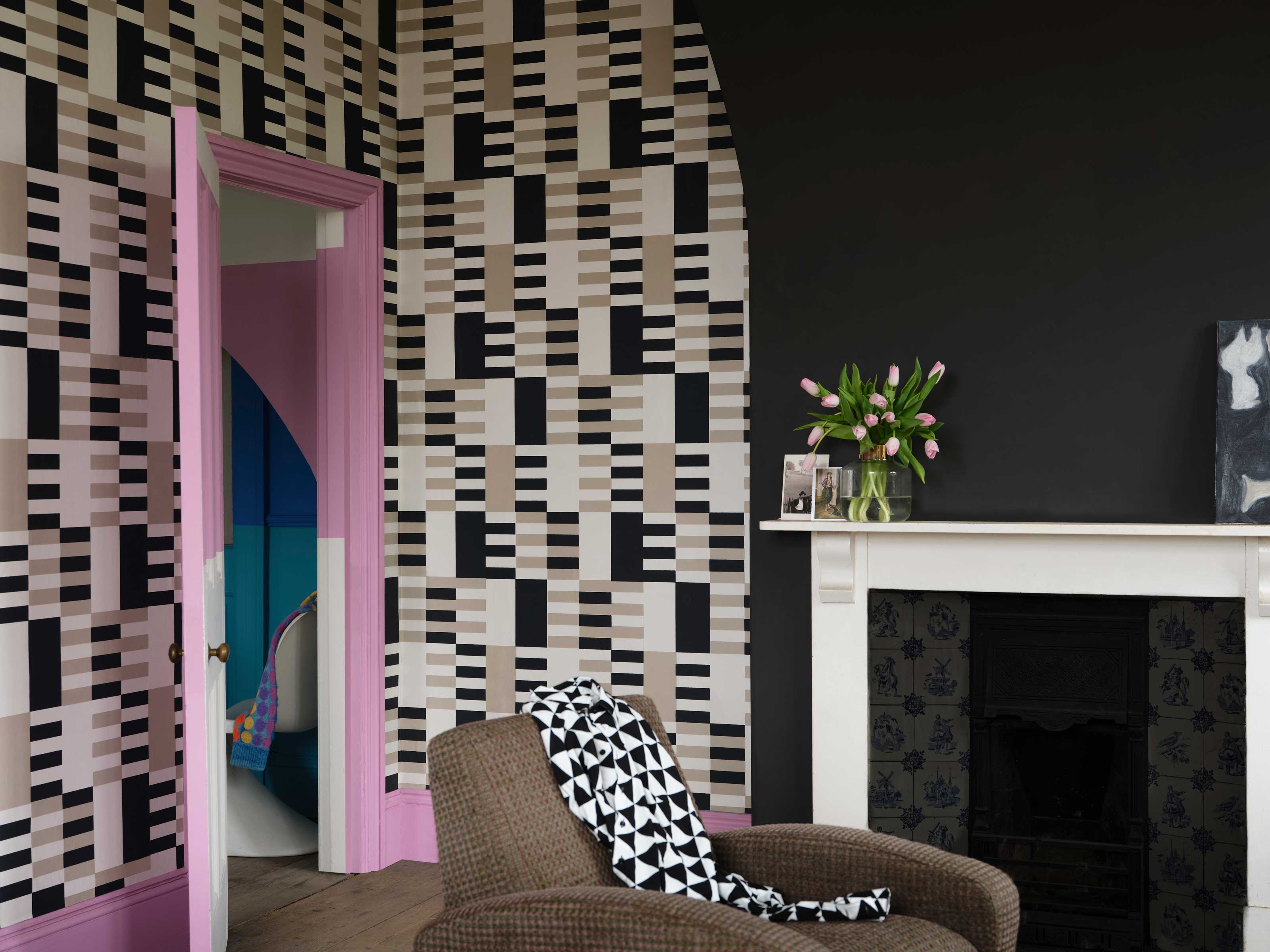

So you’ve found a non-negotiable piece you cannot wait to introduce to a specific room, perhaps a one of a kind wallpaper or a particular textile of some sort, now what? Whether your print doesn’t quite fit into the space the way you had in mind, or you’re planning a complete room makeover based on this wallpaper or textile, changing the color of the space; painting walls, ceilings, doors, skirting and architraves, will instantly create a fresh feel while complementing the new addition.
Creating a harmonious flow between pattern and color is the goal, and this can be done by pulling a few paint ideas from within the print for an immediate color match to include throughout the space, enhancing that key piece, or by carefully pairing it with a complementary shade.
Here’s how the experts approach it.
1. Color match exactly
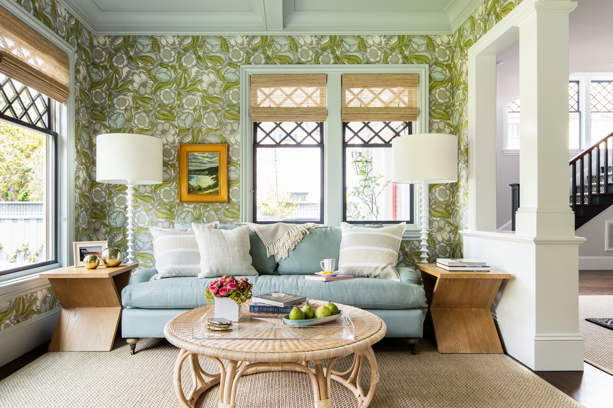
Color matching services at DIY stores can often be used to color match paint to patterns perfectly, or you may find that decorating brands often have paint shades that directly match their wallpaper and textile offering. If not, Ashley McCollum, paint brand Glidden’s color expert suggests using a online color visualizer to color match a pattern. ‘You can match paint colors directly from the colors within a photo,’ Ashley says.
It’s a good idea for some technical precision and could show hues that you may not have considered - there is even a chance the color you’re after is so subtle you hadn’t realized it was within the print in the first place. You can try Glidden's color visualizer here.
2. Choose a complementary shade
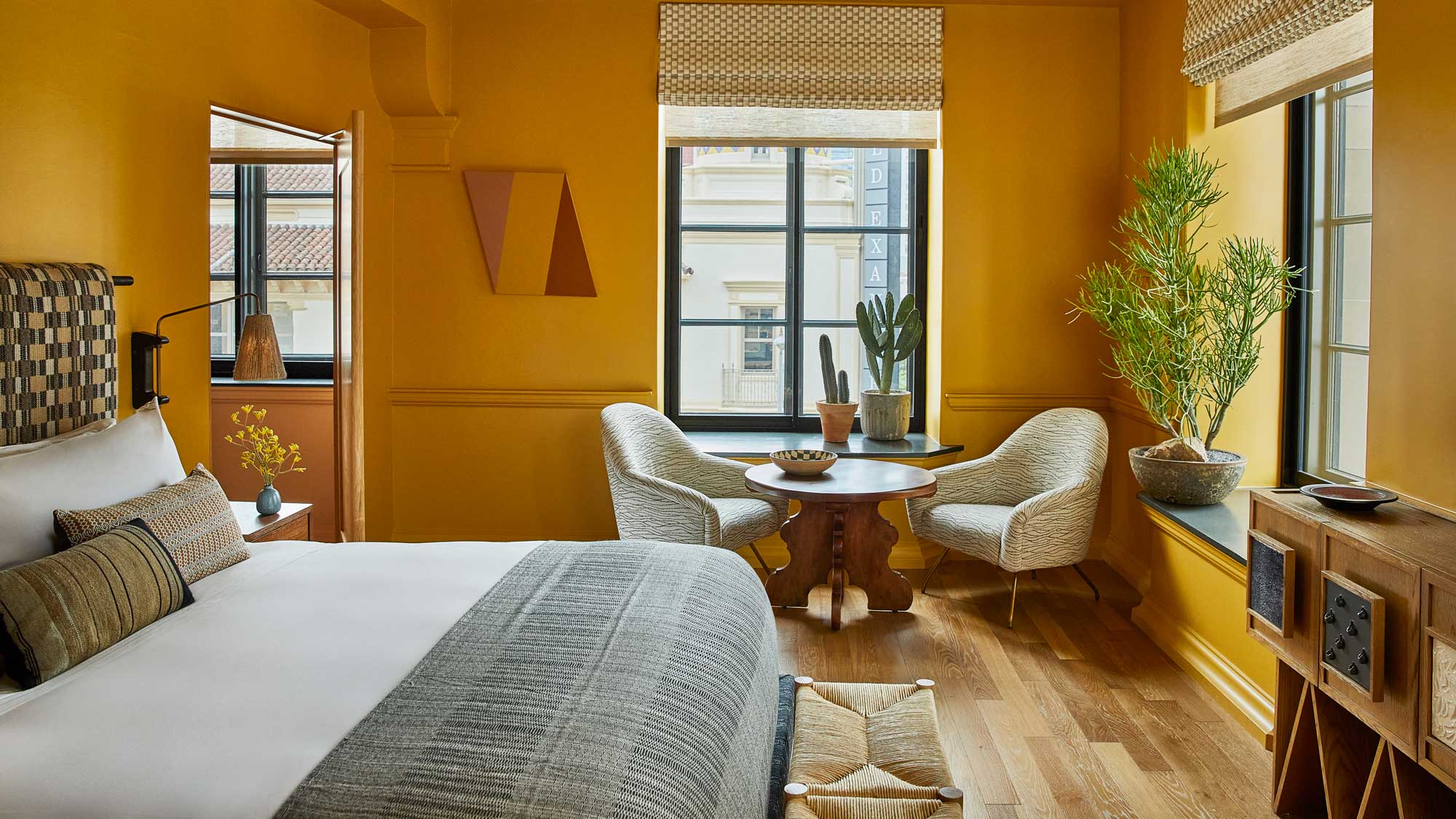
Accurate as these color matching services can be, there are of course, other ways of finding that perfect fit to collaborate with the pattern you’re working with, thanks to color theory. ‘Use a color wheel to pick out an analogous or complementary color,’ suggests Helen Shaw, color expert at Benjamin Moore. Complementary colors are found directly opposite each other on the color wheel, an interesting method to pairing colors in high contrast to give new energy, while analogous color schemes sit alongside your main color on the wheel, offering a softer contrast.
Interior designer Charles Cohen recommends this approach: ‘When painting the walls based off of textiles, I lean towards using complementary colors for the space based off of the feeling that I aim to evoke’, he says, injecting individuality to the design.
3. Use more than one shade
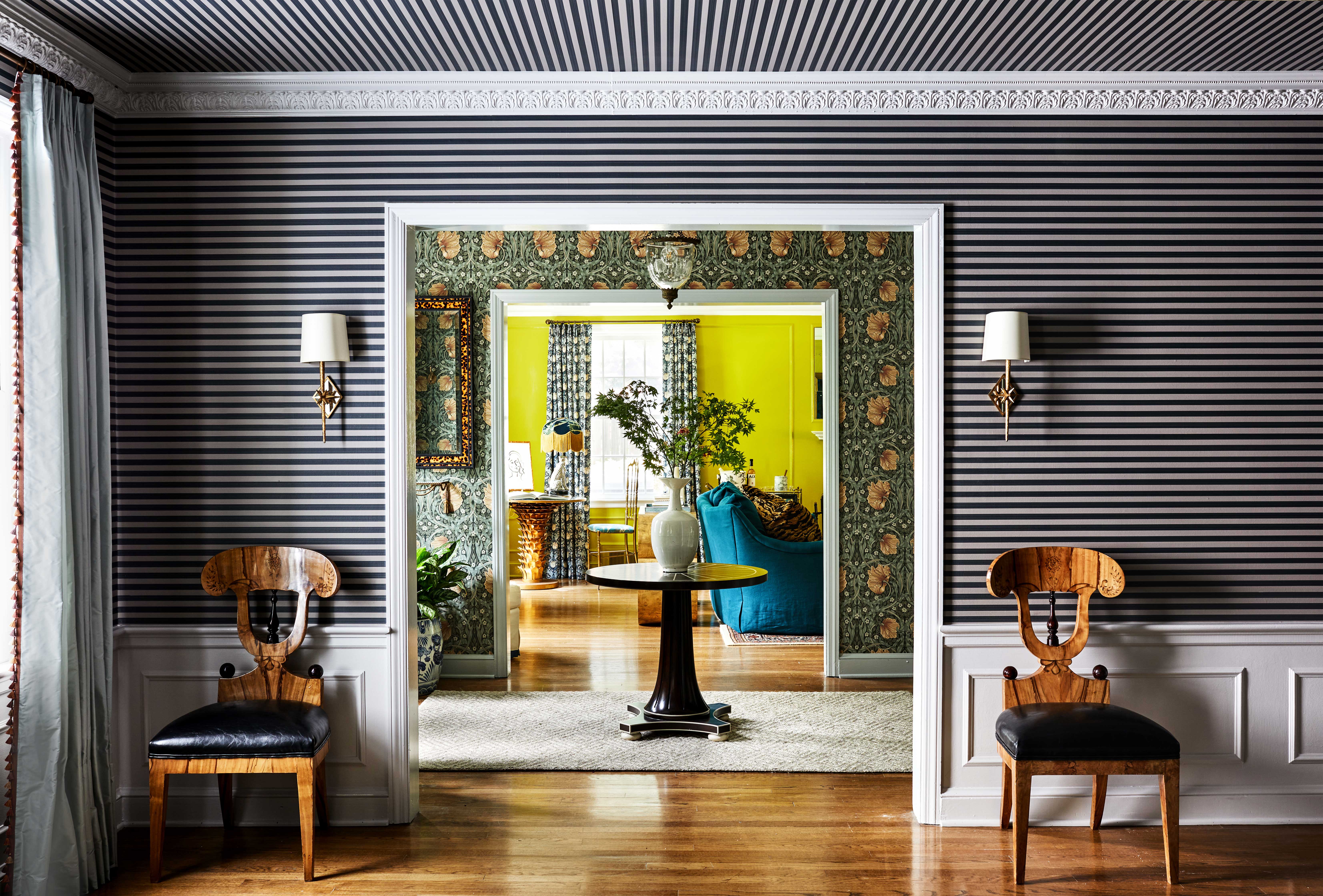
Going bold with an accent color will pack more of a punch, potentially resulting in a uniquely striking statement. However, you could be playful and include more than one color from your print. ‘For wallpapers, if my goal is to create a bright room, I'll select one of the lighter colors from the paper's pattern to paint trims, doors and accents. If my goal is to create a moody space, I will take one of the darker tones from the pattern and either match it, or choose a darker color in the same family,’ says Charles.
Consider guidance like the 60-30-10 rule for color to balance out the colors you chose, and while it may seem obvious, it usually works well to choose accent colors that you like away from the key piece as well. It's about finding the right balance to avoid overpowering the print you are working with.
4. Experiment in real life
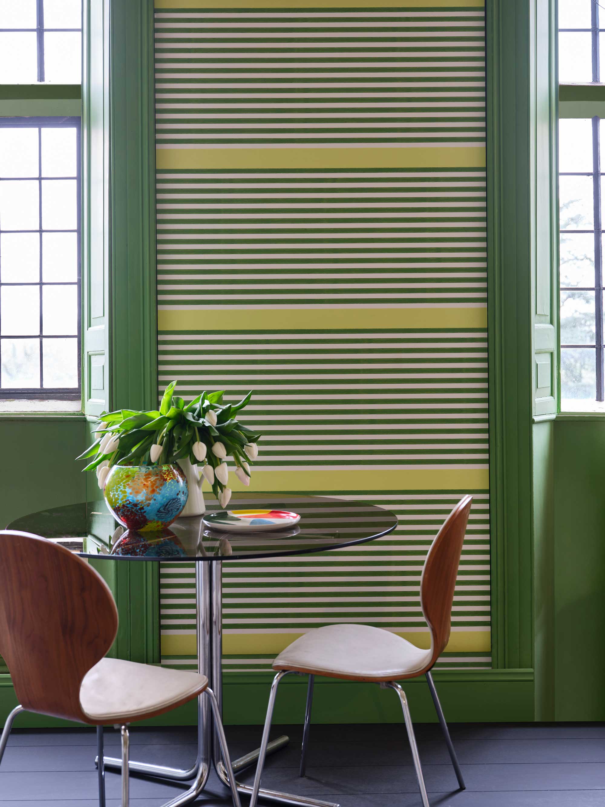
‘I’d also encourage you to visit paint showrooms with your materials and explore your perfect colors in person,’ says Ashley from Glidden. ‘You can also create yourself a moodboard with all of your desired colors, patterns, textures and inspiration.’ Helen Shaw, color expert at Benjamin Moore agrees: ‘Start by laying out samples of your chosen colors and materials. In order to create a cohesive scheme, ensure that each of the materials share a common color and link this to the paint shades that you choose. Whether you are creating a concise palette or a maximalist design this methodology will ensure that the final design feels connected.’
Seeing fabrics and colors in the flesh and how they contrast against one another, as well as against different types of lighting, can often determine your final decision and trying samples of paint and color in the actual space you are working with at all different times of day will give you the most realistic representation.
Ultimately, use a method that feels most comfortable for you and you will soon have created a distinctive space like no other. You may be pleasantly surprised with the outcome.
Be The First To Know
The Livingetc newsletters are your inside source for what’s shaping interiors now - and what’s next. Discover trend forecasts, smart style ideas, and curated shopping inspiration that brings design to life. Subscribe today and stay ahead of the curve.

Portia Carroll is an interior stylist, writer, and design consultant. With a background in interior architecture and design, she has a plethora of creative experience in the industry working with high end interior brands to capture beautiful spaces and products and enhance their qualities.
-
 This Outdoor Lounger Is the Color of the Season for Garden Furniture — And It's on Sale This Weekend
This year, it's all about the contrast, and this bright, sunny hue is the perfect foil to your green outdoor spaces
By Hugh Metcalf
-
 Kelly Wearstler Designed an Animal Hospital Where "Anxiety Just Melts Away", and I'm Taking Notes for My Own Home
The renowned designer's foray into healthcare demonstrates have even the most functional of spaces can still be design-forward
By Devin Toolen
