How to pair neutral colors harmoniously - our paint expert on the secrets to soothing scheme
Ruth Mottershead explains how to achieve a minimalist decor which is rich, warm, inviting and elevated

Decorating with neutrals is not as easy as just putting a load of pale things into a room and hoping for the best. Done well it can be warming, rich, nuanced, inviting and visually intriguing. Get just the right tone of beige and match it with just the right shade of cream and you've got a palette that is so much bolder than the sum of its parts.
In fact, subtle honeyed tones are a big interior design trend in 2023. And so we asked our color expert Ruth Mottershead, Little Greene's creative director, to decode exactly how to work them.
How to pair neutrals harmoniously
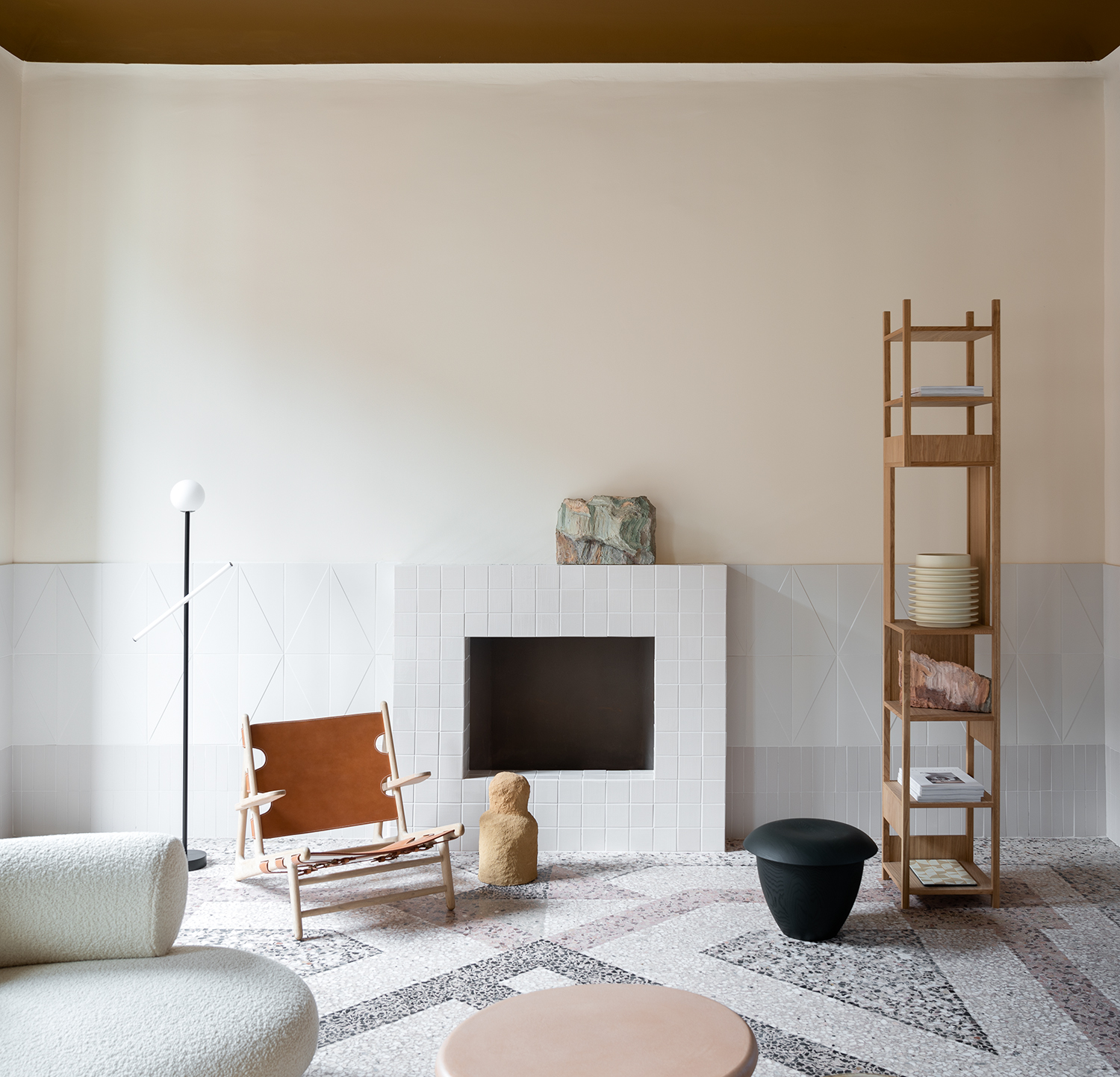
This brown works particularly well as it balances the scheme – it provides harmony due to the strength of color, and its undertones are directly represented in other elements.
Ruth Mottershead

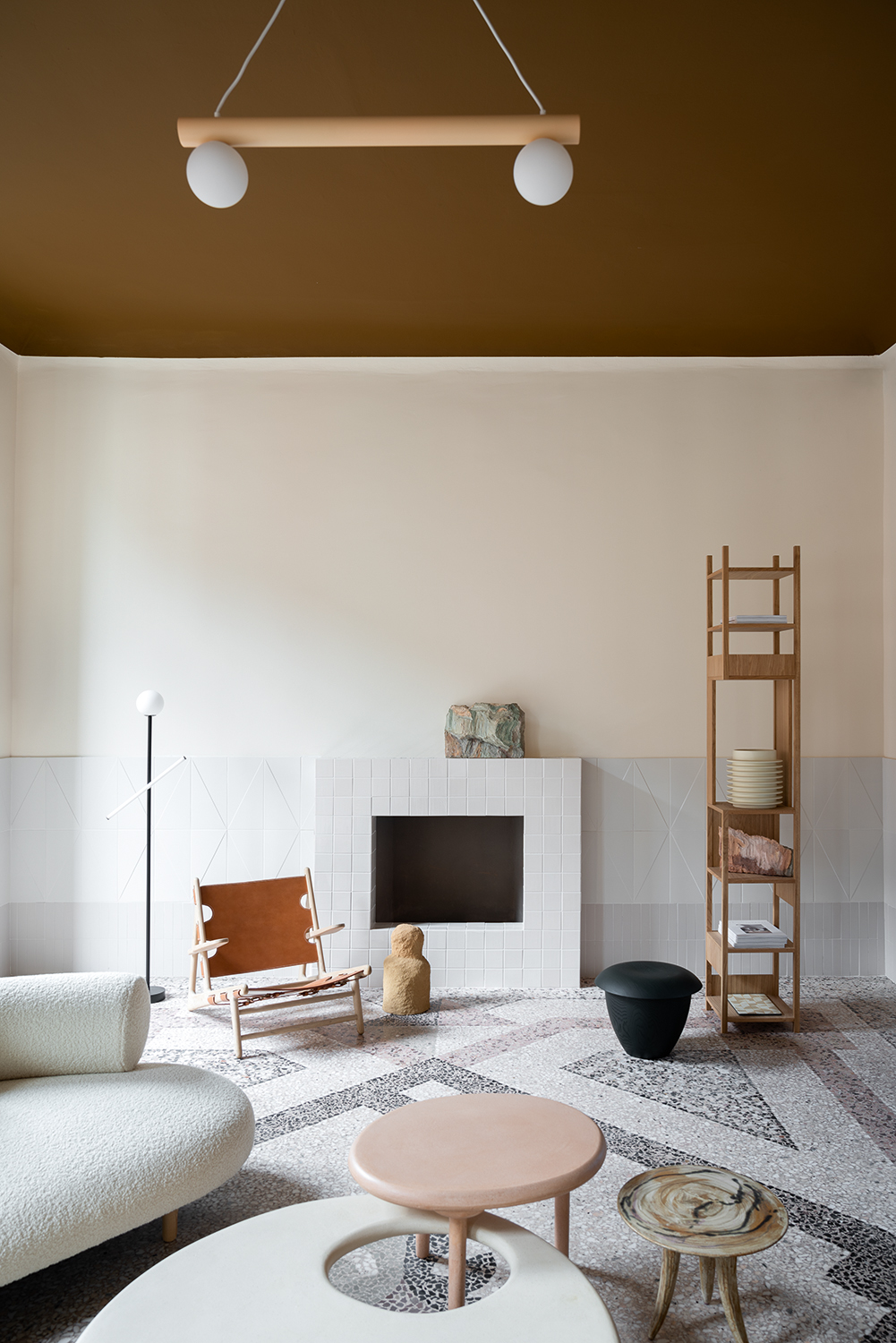
Each of the tones used within this scheme are based on natural pigments. The overarching brown on the ceiling contains umber, the off white on the walls contains a pink hue representative of red oxide and a touch of muted ochre. All of these pigments have an inherent warmth to them, and the use of these tones in combination naturally creates a gentle and inviting atmosphere. The wall tiles are slightly cooler in that they have a more stoney, grey tone to them, and the sofa contains a little yellow.
The variety of neutral tones within the scheme adds depth to the space and the arrangement of these colors alongside the natural materials provides softness and tranquillity. It is a completely harmonious scheme brought about by the subtle complexity of these natural pigments.

Honey tones, browns and stones are all set to be strong color trends for 2023. We have found ourselves torn between beige and yellow in the search for gentle colour and the desire to bring earthier tones into our homes. In recent years, there has been a steady transition from cool to warm greys – and this year, a clear move to neutrals with much warmer undertones. Stone tones based on pinks, yellows and browns have become popular thanks to the human desire for warmth, and this natural transition has led to the popularity of chocolately tones and cosy browns.
Painting the ceiling a bold color creates a canopy over a space. In this case, the brown ceiling pulls all the elements within the room together, providing definition and a clear perimeter to the scheme. This is a contemporary way of decorating and the treatment of the same room in the opposite way would create a much more traditional result. Using the brown on the walls and a neutral color on the ceiling would create a space that feels much darker and more enclosed. This brown works particularly well as it balances the scheme – it provides harmony due to the strength of colour, and its undertones are directly represented in other elements.

The wall color – a soft neutral with yellow and pink undertones – acts as a related color, bridging the gap between the warm, bold brown on the ceiling and the cooler tones within the soft grey tiles. This off white provides light, warmth and spaciousness to the scheme, softening the hard floor and creating a gentle, harmonious finish. The yellow and pink undertones ensure the flooring and tiles don’t appear too harsh or cold. Combining this colour with natural materials, on-trend brown, gentle neutrals and soft pinks creates a contemporary interior space. Any more yellow and the room may begin to feel a little more traditional; the hard materials in the scheme keep it contemporary.
The curved sofa and large table also provide softness within the scheme. The table reflects the colour of the grey in the tiles but its curvaceous form brings a more gentle approach to the colour. In a similar way, the textural sofa reflects the colour of the white tiles, providing a softer representation.
The lower part of the tile has a grey undertone, which softens the black, white and grey flooring. The upper part of the tiling is a warmer white, which acts as a related color to both the grey tile and the off-white wall. The ombre provides a smooth transition between the flooring and wall colours as well as more dynamism: without the tiling, the scheme would be much flatter.
The brown chair helps to ground the scheme, ensuring that the ceiling is tied to the rest of the space. Without the chair, the ceiling would feel disconnected, standing out on its own and drawing too much attention. The circular pale brown coffee table contrasts with the geometry of the flooring. The palette of colors within the table reflects those in the shelving and wall color, as well as the fireplace and the ceiling. The table acts as a common denominator, bringing single colors within the scheme together to provide harmony and balance.
Be The First To Know
The Livingetc newsletters are your inside source for what’s shaping interiors now - and what’s next. Discover trend forecasts, smart style ideas, and curated shopping inspiration that brings design to life. Subscribe today and stay ahead of the curve.
Ruth Mottershead is the Creative Director of Little Greene, and one of the most renowned experts on exactly how to use color now. At Little Greene she has pioneered the way the brand thinks about color and pattern, creating new palettes, new pigments, and becoming the force behind sustainable paint offshoot Re:mix. She is also a regular contributor to Livingetc, as someone we turn to when we want to decode exactly how to put colors together.
-
 Turns Out, Sustainable Design Can Be Chic, and Net-a-Porter's 'Net Sustain' Curation Is Proof — Here's What I'm Shopping
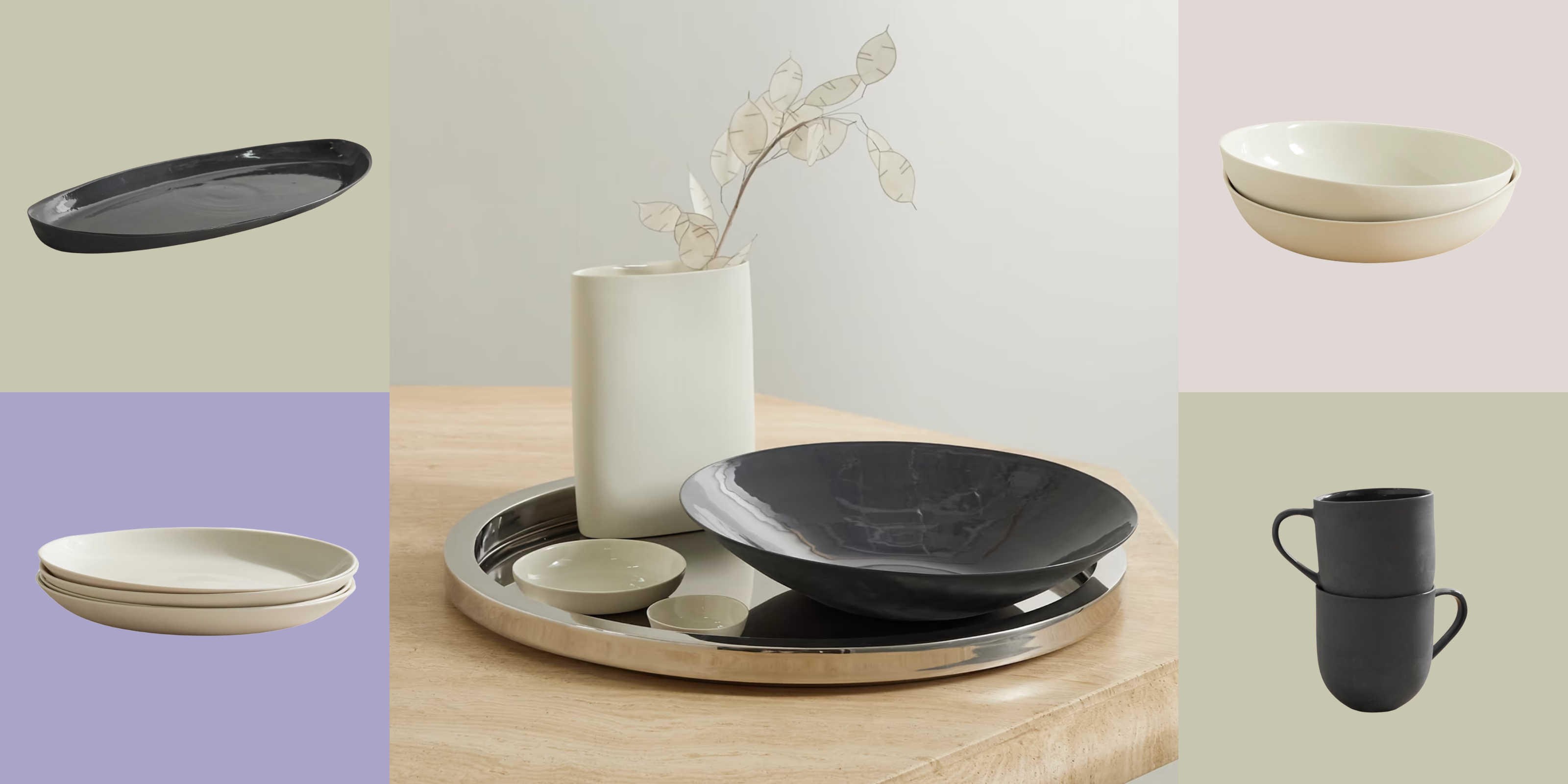
From the Net Sustain collection, Mud Australia's homeware is not only design-oriented, but eco-focused, too
By Devin Toolen
-
 Before and After — How This Jewel-Box Bathroom Made the Most of Its Proportions With Maximalist Design and a 'Soaking Tub'
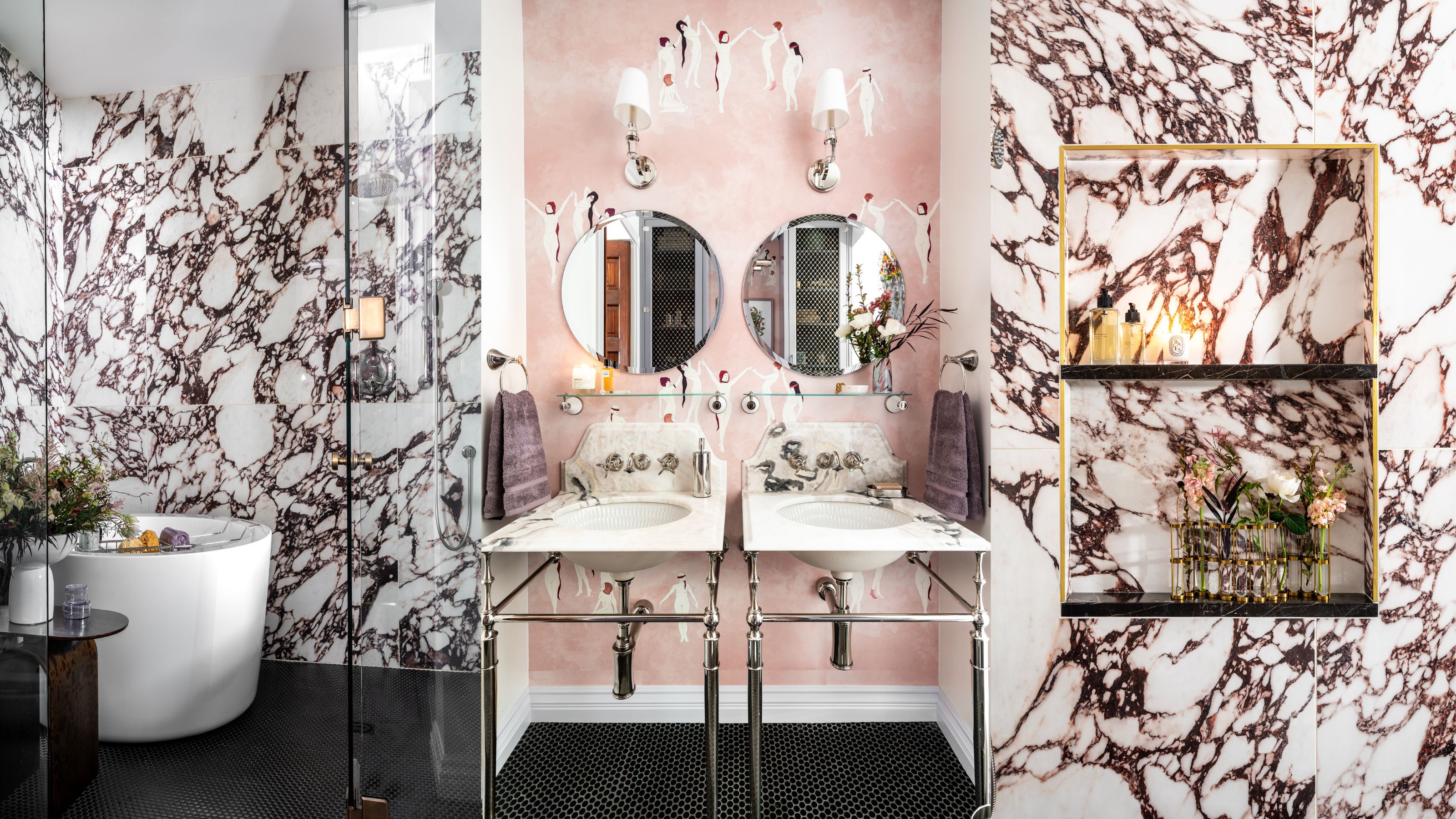
This design offers a masterclass on creating a luxurious bathroom that is equally playful and elegant.
By Maya Glantz