How to Style Your Rectangular Coffee Table Like an Interior Designer
Designers share their formula for an eye-catching and characterful display that puts rectangular coffee tables center stage

Styling a coffee table of any shape or size can be weirdly intimidating — we spend a lot of time looking down at them while sitting on the couch, and when guests come over, they're often even more of a gathering point than the dining table.
Creating an artful arrangement is harder than it looks, but rather than crumbling under the pressure of making a coffee table look good, let's view it as a chance to make a beautiful styling moment that reveals something about who we are.
Right now, lots of curved, organically-shaped coffee tables are dominating our Instagram feeds, but angular, monobloc forms in marble, concrete, and stone are among the coffee table trends gathering momentum, and we love how they make your coffee table books look like they are being displayed on a plinth in a museum.
Styling a rectangular coffee table
Having some kind of formula and styling rules to follow will take the brainwork out of decorating this key item of living room furniture — here are four fresh ways to style your rectangular coffee table like a designer. Get your best coffee table books and plenty of coffee table decor at the ready.
1. Make a grid of contrasting shapes and textures
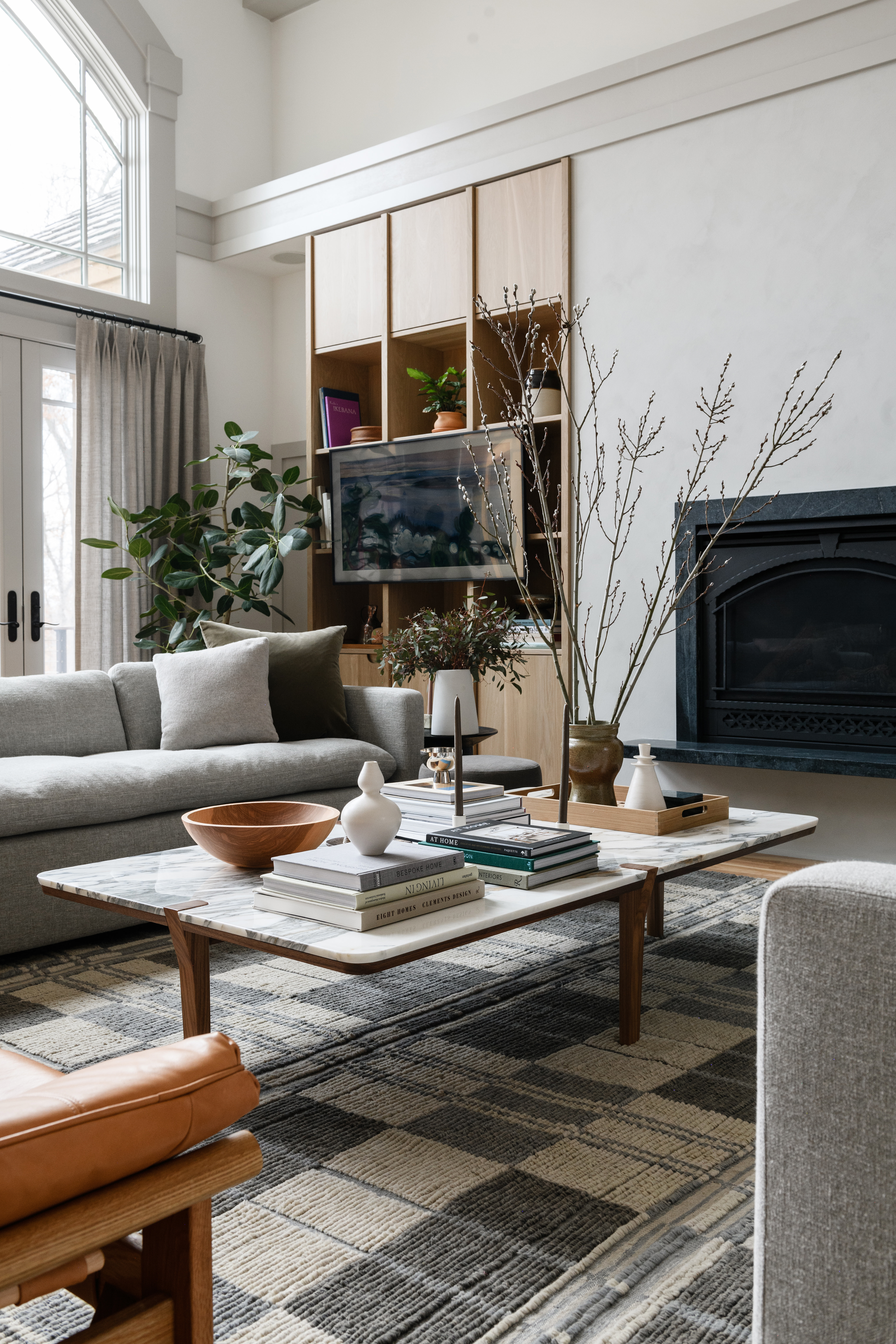
If your coffee table size allows, start by creating a square grid of four (so it looks a bit like a window) with coffee table books and decor at diagonals to each other. So you might have two stacks of books on opposite corners, then a round vase of fresh flowers and a circular tray in the other corners.
The key is to mix shapes and textures as this will create a coffee table that sparks intrigue. 'I like to play with geometry and asymmetry when styling coffee tables,' says interior designer and founder of Field Theory design studio, Leah Harmatz. 'For a rectangular coffee table, I'd include something circular in the styling as contrast — maybe a ceramic bowl, or a candle on top of a stack of coffee table books.'
When it comes to texture, arrange items with contrasting textures close to each other, be it croc-effect leather box on a silver-plated tray, or a malachite ornament on a textural book cover. By placing a glass vase next to a wicker tray, you make the textures sing, bringing out the glass's shiny surface and the wicker's rough and woven texture more than if they were at opposite ends of the table.
2. Layer, layer, layer

You are already on to a winner when styling a rectangular coffee table because a rectangle gives you more surface space to work with compared to something more circular (decorating a round coffee table provides a little less flexibility). But it can still be hard to know where to start.
If your first attempt doesn't look quite right or it feels like it's missing a mysterious something, try adding more layers, such as a decorative brass tray, a leather or ceramic catchall, or stacked coffee table books of the same color. Then place items on top. Catchalls, bowls, and trays will corral loose items and make the display look more intentional and curated — one thing to avoid is having items hanging out on the coffee table looking a little lost. An acrylic coffee table book stand, at Amazon, is another great way to elevate a book, or your latest copy of Livingetc, and play with height.
It's such a simple technique but whether putting an outfit together in the morning or styling a coffee table, it really is all about layers.
3. Group items in threes
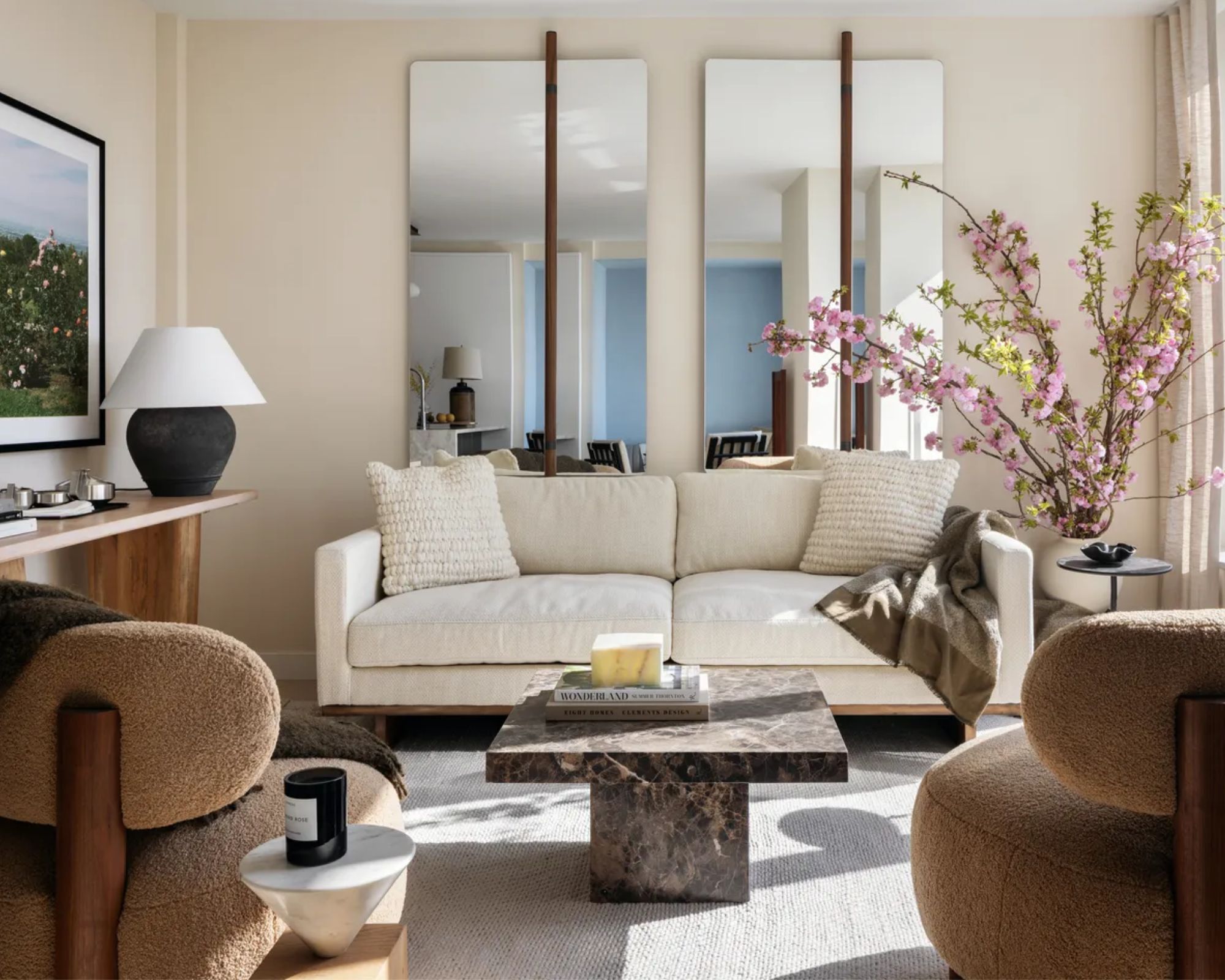
Items arranged in odd numbers always look more visually pleasing, so follow the rule of three. 'I love arranging items in groups of three,' begins interior designer Breegan Jane. 'Rectangular coffee tables tend to be narrower than square or round ones, so positioning things in groups of three will maximize the space you have on the table lengthwise.'
When creating your clusters of three, you might like to follow interior designer Kathy Kuo's coffee table styling rule of thumb — have one vertical item, one horizontal item, and one sculptural item. This is a truly foolproof way to make a beautifully styled vignette. Kathy suggests using a vase of flowers for your vertical item, a stack of coffee table books for your horizontal item, and a sculpture, oversized seashell, or artsy decorative box for your sculptural item.
'I also suggest considering scale,' adds Breegan. 'Think: small, medium, large. If you have an oversized vase, pick a smaller picture frame or stack of books to accompany it.'
4. Keep experimenting
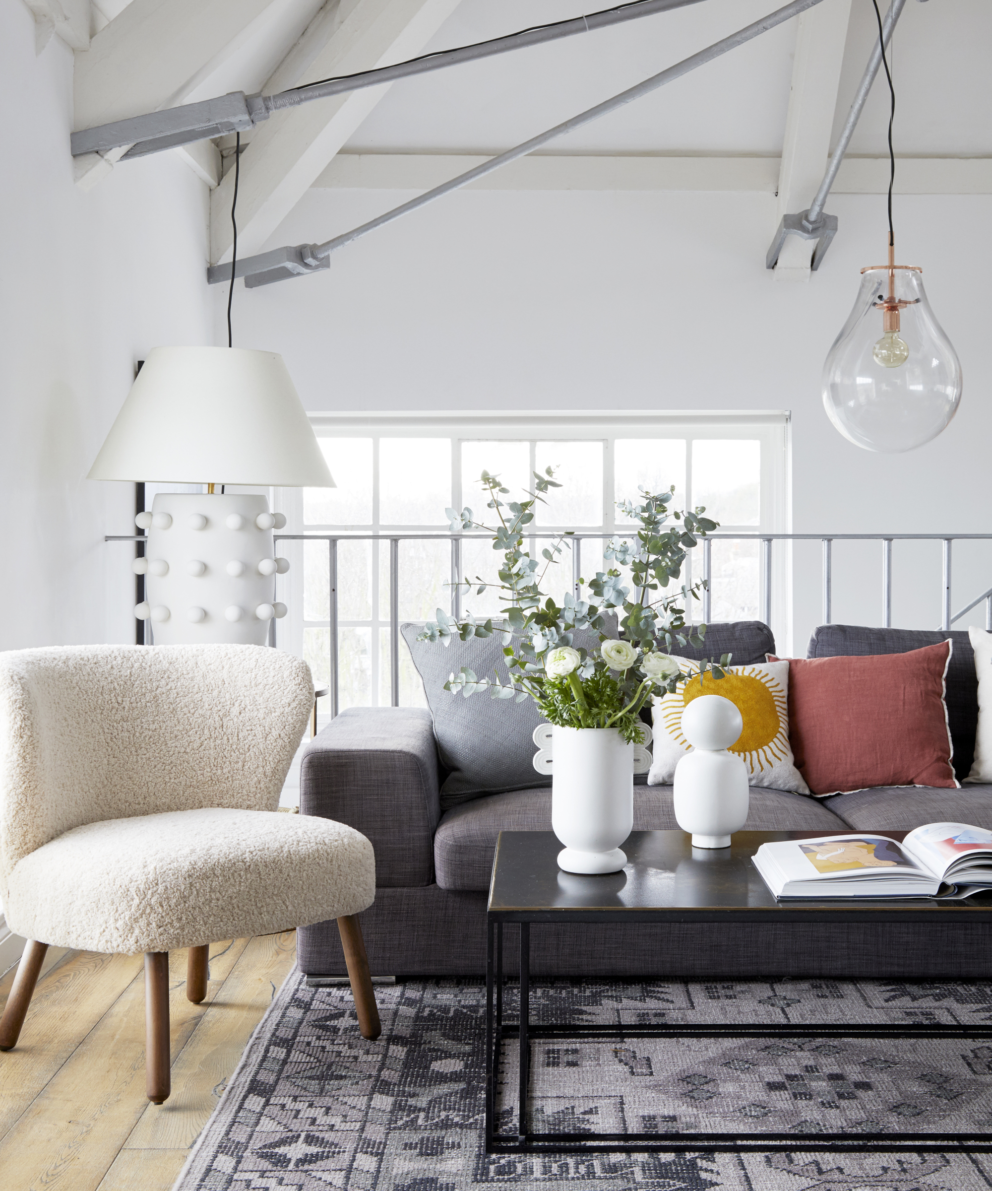
Whether we are rearranging our mantel decor or finessing our rectangular coffee tables, interior styling is a process of adding and taking away. Keep editing and experimenting over and over until the magic happens. To make this easier, gather books, houseplants, small sculptures, vases, houseplants, driftwood, chess sets, and packs of cards — you name it. Bring all sorts of objects from other areas of the house together, so that you have more than you need, and then see what sits well together.
Coffee tables can quickly look cluttered, though, so keep some negative space for items to breathe. This will also make your coffee table easier to clean. You may find you end up with a theme for your coffee table: books, games, curiosities, artwork or a mixture of all four. Shopping your home will mean your coffee table never looks the same as everybody else's.
Be The First To Know
The Livingetc newsletters are your inside source for what’s shaping interiors now - and what’s next. Discover trend forecasts, smart style ideas, and curated shopping inspiration that brings design to life. Subscribe today and stay ahead of the curve.
Millie is a homes writer and journalist renting in North London. She contributes regularly to Livingetc, Ideal Home and Real Homes. As well as covering shopping trends online, she loves vintage furniture, candles, Interior Design Masters and a Facebook Marketplace bargain. She has previously written for Fabulous, Stylist and Marie Claire.
-
 Sateen vs Percale Sheets — What's the Difference, and Which Are Better?
Who would have thought a simple weave pattern could make all the difference to your sleep
By Devin Toolen
-
 I Asked Interior Designers to Share the Worst Design Trends They've Seen on Social Media — And What They Want to See Instead
Just because something is trending, doesn't mean it's tasteful — from dupe-culture to OTT lighting, here's what designers hate seeing in homes
By Devin Toolen
