Kids bedroom advice - 10 expert design tips for making them look cool
Expert ideas for kids bedroom ideas, from decoration to storage this is more than just child's play
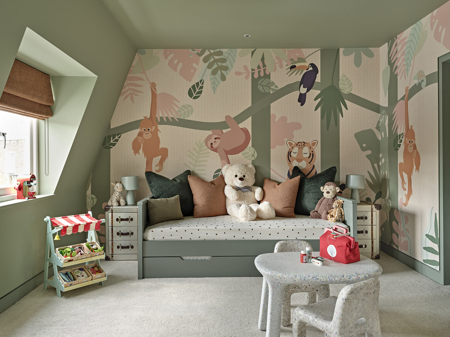
The keys to a successful kids room design? Keep the basics simple, plan in plenty of storage and don’t be afraid to have a bit of fun. Children change at a rate of knots, but that shouldn’t mean holding off adding personality to their room for fear they’ll grow out of it – that just results in a meh, functional area, when what you want to create is a comfortable, welcoming space where they’ll enjoy spending time.
It can feel outdated to think of splitting this into girls or boys themes, and of course any of these can be unisex. Follow these expert tips to getting it right.
1. Make sure it's a bedroom to grow into
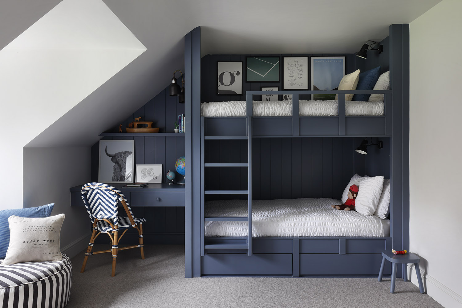
The brief for eight-year-old Tom’s room was, ‘a bedroom he could grow into with space for a desk, an extra bed for sleepovers, but also a sense of fun,’ says Fiona Parke, Director of Johnstone Parke Interiors, who designed it. Hence the bunk beds painted in Paint & Paper Library’s statement Blue Blood which works both now and looking forward: ‘I don't like kids’ rooms to be too childish, they grow out of them too quickly,’ says Parke. ‘But there should always be something they’ve chosen, whether a colour or their bed, so they are excited about the new room.’
2. Try a simple mural
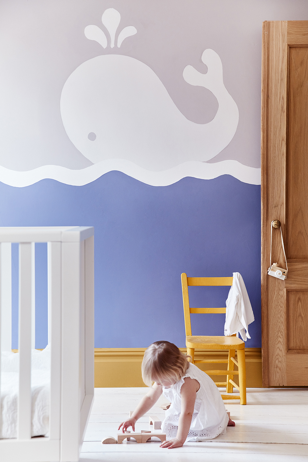
Paint is the most affordable way to transform a room, but, advises Ruth Mottershead, Creative Director of Little Greene, do have a quick think before you start. ‘Consider the mood you want to create, whether that’s calm and cocooning or energetic and vibrant. Paint is also a fantastic tool for zoning spaces: marking out a play area, a calming homework area, or a relaxing space for sleep.’ And, if you’re feeling creative, try a simple mural: ‘It doesn’t need to be complex to add that wow factor,’ she says. ‘This whale design brings a playful quality to this space.’
3. Use a tonal palette
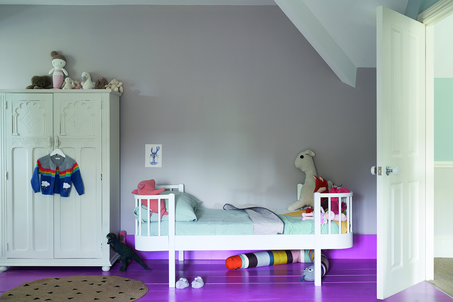
This pared-back, peaceful nursery has been created using different tonal paints from the same colour family – in this case, modish pinks. ‘Even if you choose to keep the walls fairly neutral, as here, some extra energy can be added by painting the floor or ceiling in a playful colour,’ says Joa Studholme, Colour Curator at Farrow & Ball. ‘Using a tonal palette plays to the architectural features of this room and feels graphic and modern. To add depth, a vibrant floor paint has been used; it’s not only practical but also gives that element of surprise.’
4. Think about practicality
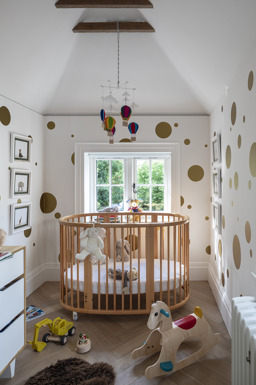
Interior designer Irene Gunter created this nursery for her two-year-old son, Oscar, and it's full of boy bedroom ideas: ‘The room is triple-aspect, so we fully insulated it to ensure it wasn’t cold, but at the same time made sure it was still just wide enough to fit in a double bed, allowing it to grow in time into a teenager's space with an area for a desk, as well as built-in wardrobes,’ she says. ‘The wood flooring has already proved invaluable in terms of practicality, while the wall stickers, which mimic wallpaper, create a flexible backdrop which we can transform as he grows up.’
5. Think about how colour can affect mood
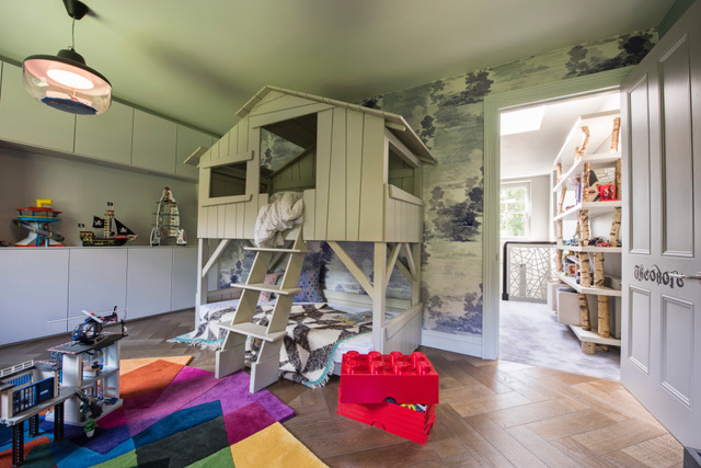
This room was created by interior designer Brian Woulfe for twin boys – who are currently sharing a bedroom and using this space as their playroom, with a view to it being swopped back into a bedroom when the twins get older. ‘It was important for us to get the colours right for this playroom and homework area,’ says Woulfe. ‘Green is found to improve a child's reading speed and comprehension, as well as helping to reduce anxiety. The space currently works for playtime, reading and homework, while the trundle bed makes it perfect for playdates and sleepovers.’

6. Plan for storage
When interior designer Jo Berryman came up with the concept for this nine-year-old boy’s bedroom, she wanted to embrace his love of colour and make-believe, but also make the space work hard and have longevity – hence the entire wall of built-in bedroom storage to house everything from LEGO to books. Once you have those kinds of practical elements sorted, Berryman believes you can then have some fun: ‘Children thrive in vivid, playful environments, not a sea of greige,’ she says. ‘Weave in humour, accent boldly and don’t shy away from colour.’
7. Make use of every corner
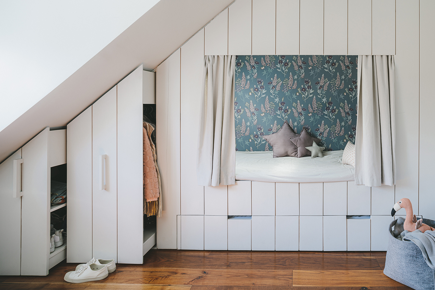
Seven-year-old Natalia’s room is a tricky shape: ‘It’s long and relatively narrow with a tall sloping ceiling,’ explains Ursula Wesselingh, owner of children’s interiors specialists, Room to Bloom. By building a cabin bed across one end, she improved the room’s proportions, making the most of every centimetre: ‘There are pull-out wardrobes, plus a sleepover bed in the drawer underneath. On the inside of the bed, we made use of every nook and cranny, adding shelves for books and knick-knacks.’ The added benefit is the rest of the room now feels airier, with plenty of space for play.
8. Don't be afraid of 'grown up' colours
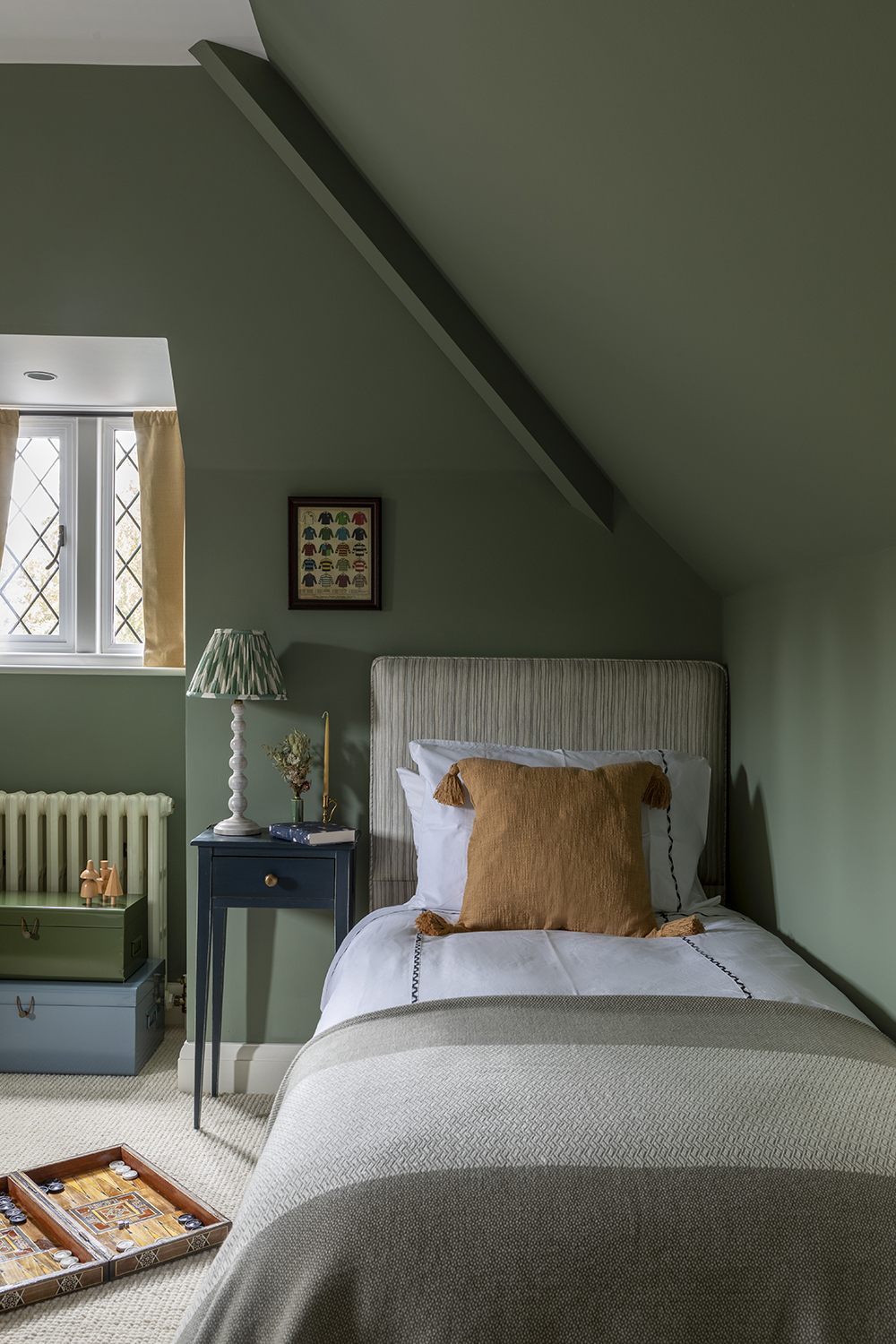
This sophisticated older child’s bedroom, by design studio Kitesgrove, features a colour palette deliberately chosen to have longevity. ‘Introducing colours found within a key fabric – such as this headboard – into other elements of the room results in a more balanced and considered look,’ says Clara Ewart, Head of Design. She’s also a believer in trying out antiques in a child’s room: ‘Although considered more appropriate for a ‘grown up’ interior, there are some design styles and eras which lend themselves to children’s spaces. Scandinavian furniture, for example, can have light and playful elements.’
9. Get creative when thinking about how the bed looks
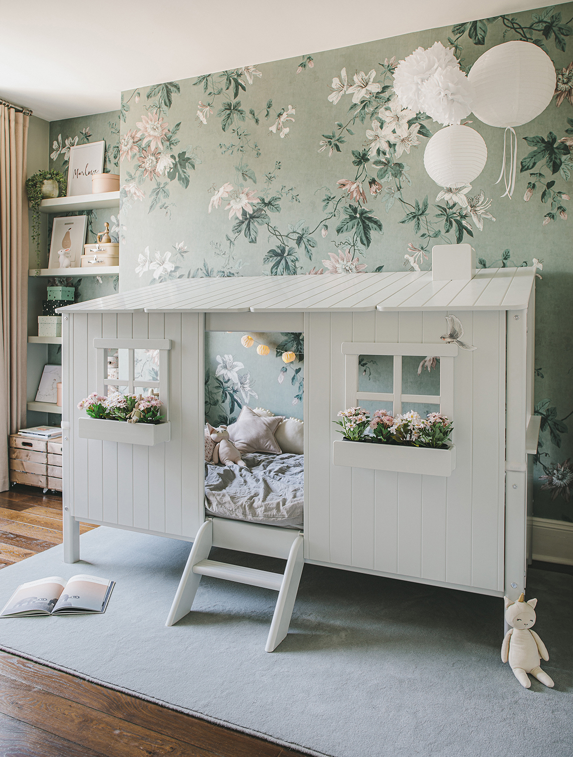
Marlowe, age four, desperately wanted a den in her room, says Ursula Wesselingh, children’s interior designer at Room to Bloom, the only problem was the space wasn’t very big. The solution? This house-shaped bed. ‘We painted it to fit the tonal scheme of bluish-greens, which make the room feel spacious and calm, even with the floral wallpaper as a backdrop,’ says Wesselingh. ‘I love using wallpaper in children’s rooms, it adds instant charm and somehow draws the attention away from the inevitable clutter at times. I’m a big fan of florals – they bring a bit of magic and whimsy.’
10. Allow kids an extra space as a den
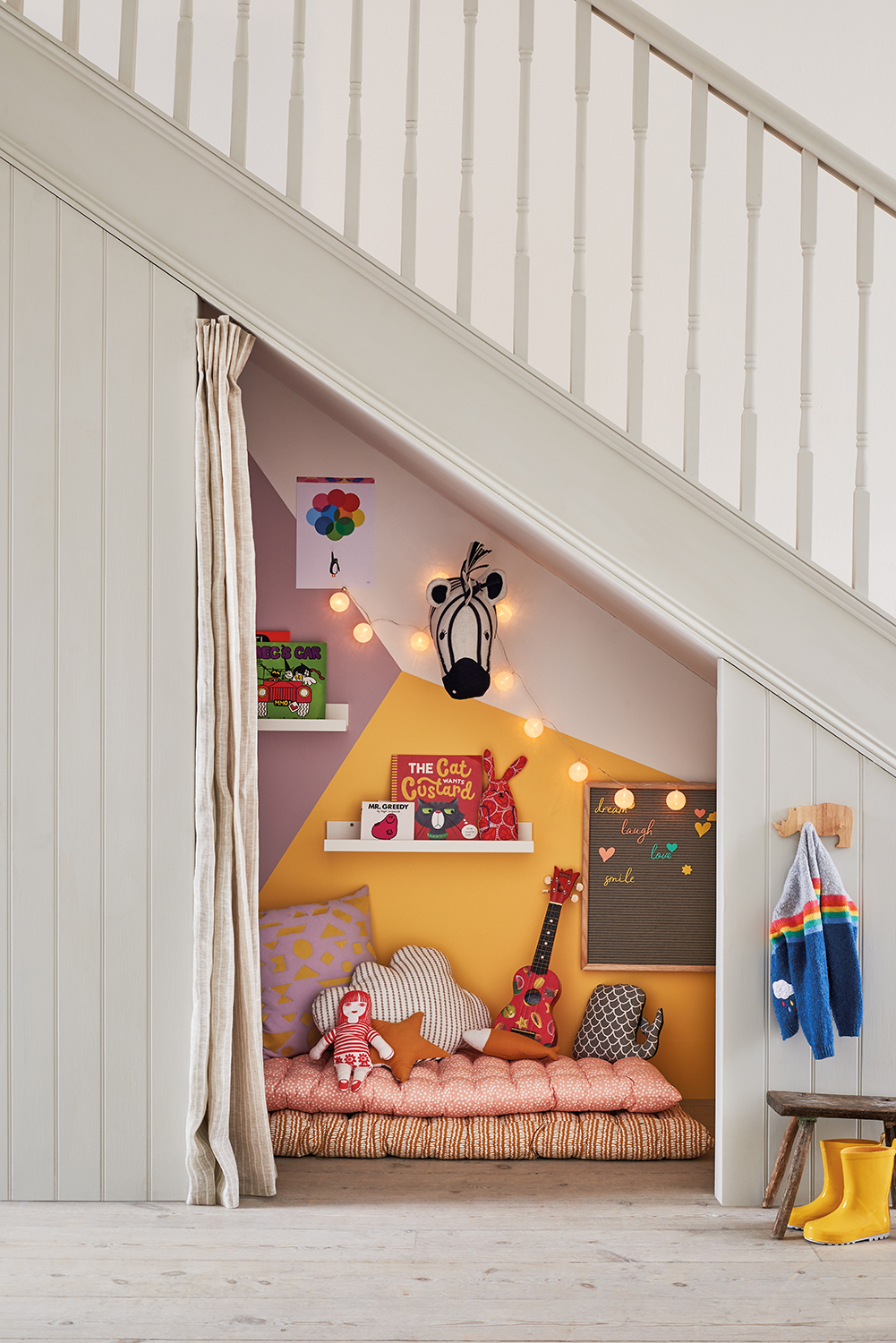
This cute understairs den makes the most of an oft-overlooked space and, as Marianne Shillingford, Creative Director at Dulux, explains, it’s surprisingly simple to do: ‘It’s so easy to create a graphic kids’ mural with a bit of masking tape and a few colours. The effect on a room rewards you with so much more than the effort it takes and it’s also one of those rare decorating projects that you can get kids involved in. With simple straight lines you can create hundreds of shapes, from mountain ranges to city skylines or just blocks and geometric shapes.’
Be The First To Know
The Livingetc newsletters are your inside source for what’s shaping interiors now - and what’s next. Discover trend forecasts, smart style ideas, and curated shopping inspiration that brings design to life. Subscribe today and stay ahead of the curve.
As journalist with over 25 years experience, Kara has held staff positions at ELLE Decoration, Sunday Times Style and The Express. She has been a longtime contributor to Livingetc, and also been a regular writer for titles such as House Beautiful. She has always focussed on design and interiors, and her first book, At Home with Plants, was written with florist Ian Drummond and published in 2017.
-
 These 'Scenting Droplets' Might Be the Coolest (and Most Stylish) Way to Make Your Home Smell Amazing
If you're looking to switch out your incense sticks for something more fun, then you should know about Ripple+'s incense droplets. Let me introduce you.
By Amiya Baratan Published
-
 Lone Fox's Drew Michael Scott Drops a Vintage Capsule with Joon Loloi (And Some Seriously Good Tips For Thrifting Antiques)
Sourced straight from one of the world's biggest antique shows, Drew shares how to stay sane, cut through the noise, and score what you actually want
By Julia Demer Published