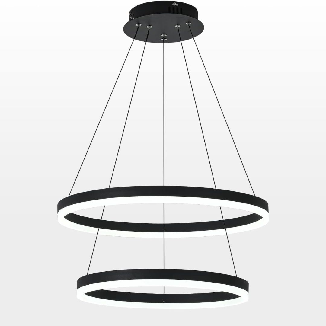
Every Mistake I Made While Designing My Kitchen Lighting Scheme — The 5 Errors I Strongly Advise Against
My kitchen project has been a saga, and the biggest learning has been its lighting design — take a look at the errors I made, so you're not doomed to repeat them
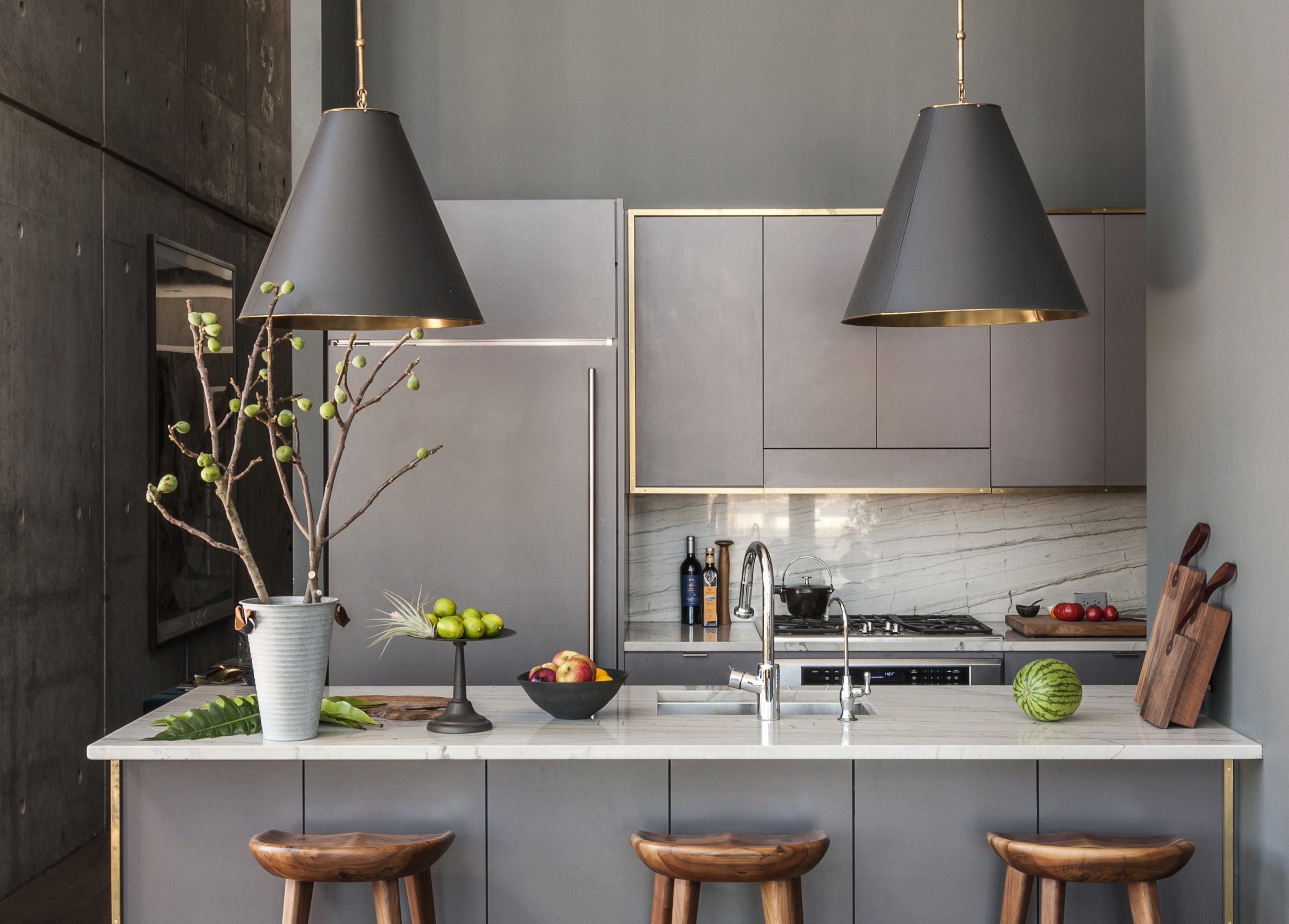

My biggest takeaway from my kitchen remodel: the lighting scheme is as important as the counters, cabinets and the storage, so don't let it be a second thought. Lighting makes the kitchen comfortable to use and ensures a stress-free experience. It also improves the functionality and aesthetics of the room and in fact, makes it more ergonomic.
While redesigning this space last year, I decided to spend considerable budget, time and resources on the 'larger' elements of the kitchen and I figured that a single pendant above the counter and a few spotlights would do the job. Without mood boarding or consulting any professionals, I went ahead and bought the lights (the cheaper ones too!). But over time I realized that my lighting scheme wasn't supporting my new kitchen's design — the counters didn't look as beautiful, you couldn't see the true colors of the walls, and a dull vibe just overtook the space.
So, consider this a PSA. Take a look at these kitchen lighting mistakes I made and make sure you steer clear of them!
1. Choosing only one source of light
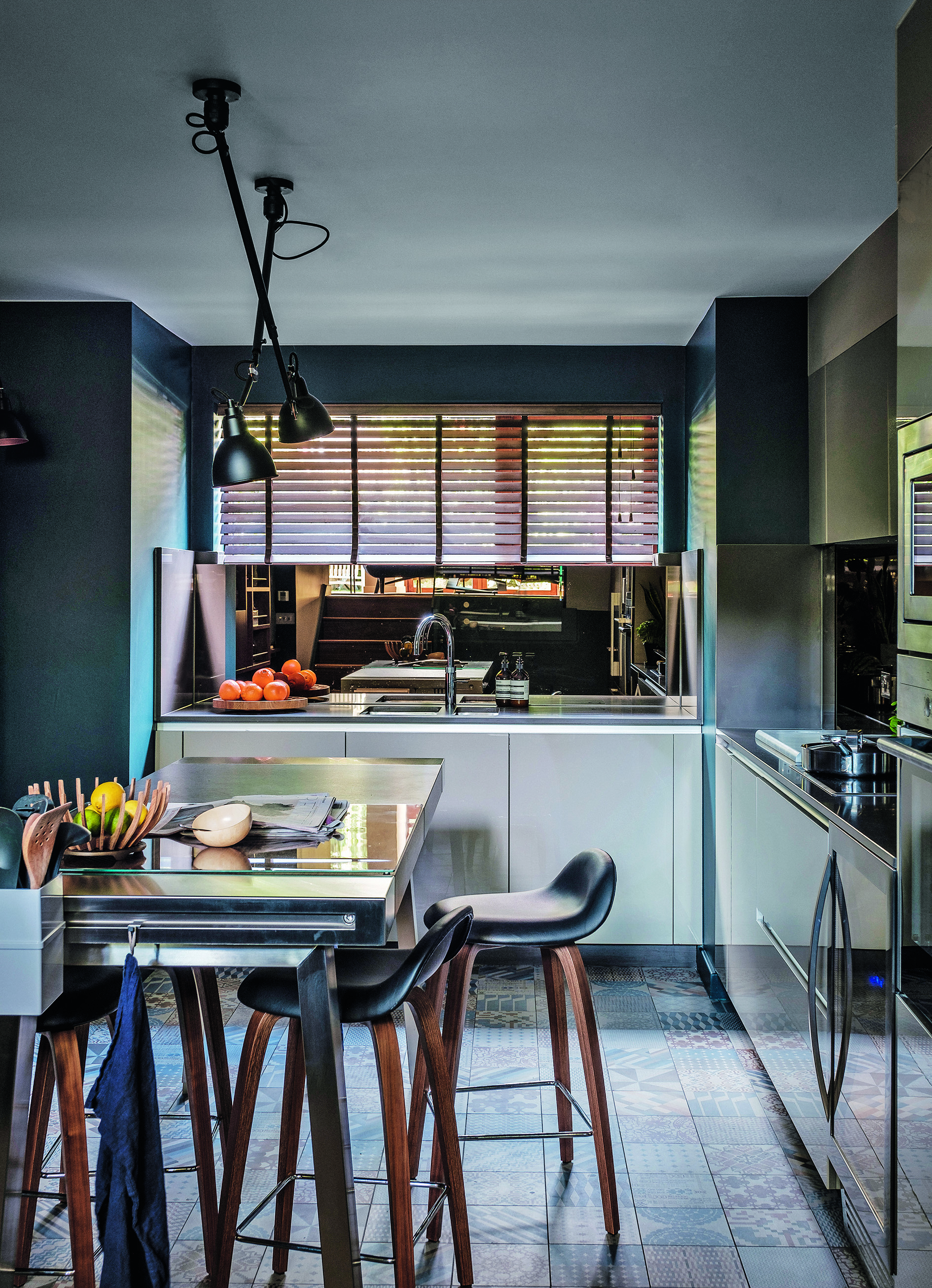
Even if your kitchen receives a lot of natural light, I'd still say that choosing only one kitchen pendant or chandelier is a mistake. When I hung just one, long robust light above the counter, I realized that in the evenings that single source of light created a lot of shadows and dark patches in the kitchen. After consulting with a designer friend I realized that for a modern kitchen scheme, the lighting needs to be layered, and should have a combination of ambient lighting, task lighting and accent lighting.
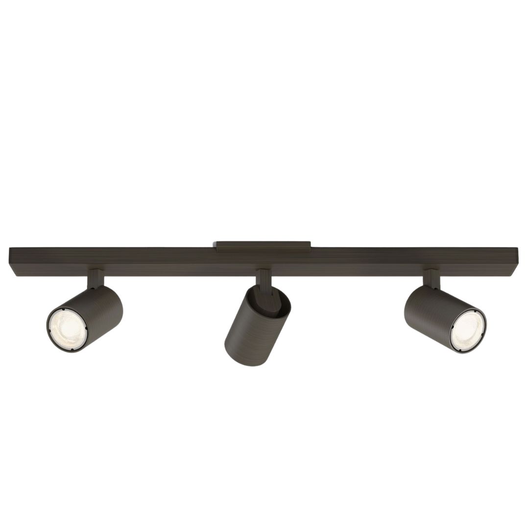
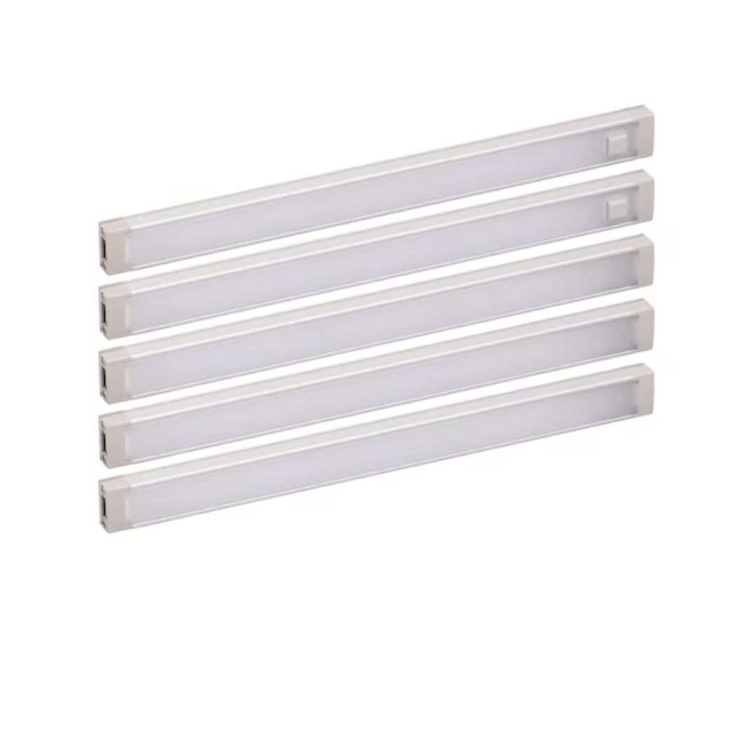
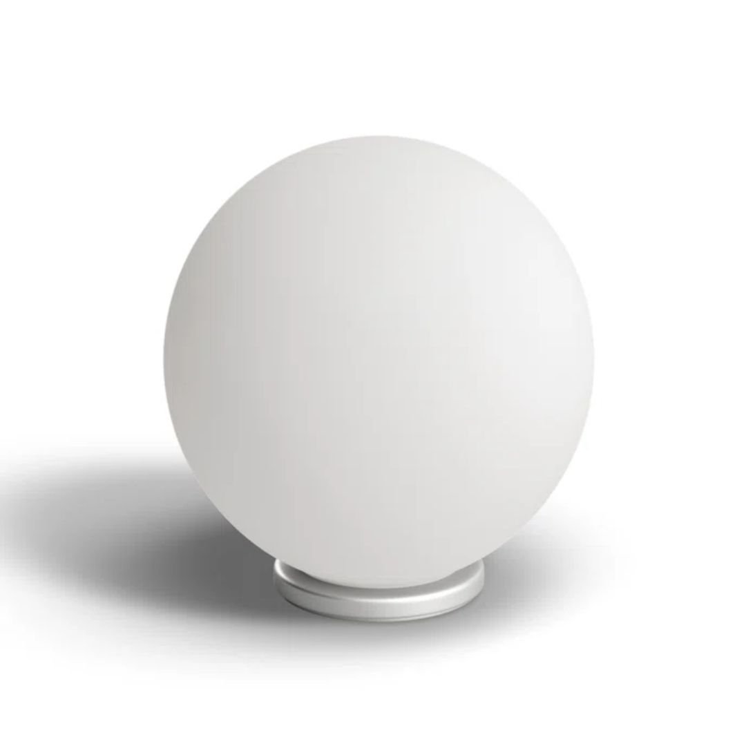
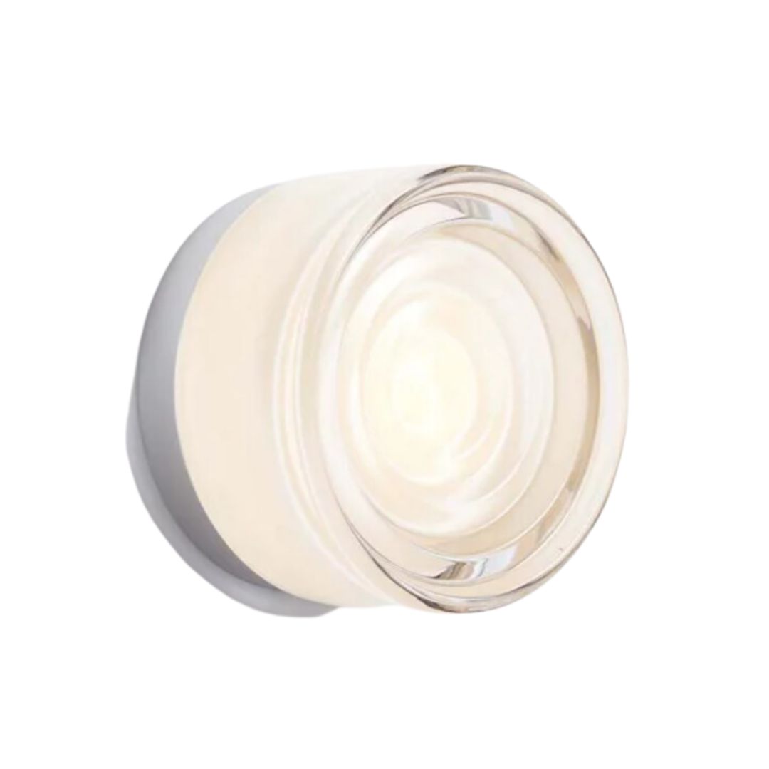
A few months down the line, I decided to install wall-mounted ceiling spots from Home Depot (cheap yet super durable), undercabinet lighting, and I also placed an Oyster table lamp from Urban Outfitters on my counter to give the space a curated, decorated look.
2. Buying poor quality lights

My mood board was all about materiality, and the 'aesthetics' and so, much of my focus was on choosing the right kitchen flooring and durable yet pretty kitchen backsplash. I did indulge quite a bit on those and kept the budget for the lights pretty low. I chose lights from unknown retailers and sure enough, two of them started malfunctioning in a few week's time.
Save yourself the money and the trouble, and choose high-quality fixtures from known brands. These days, you can find affordable options from a long list of retailers such as Target, Walmart and Crate & Barrel that have great options that'll last long and won’t fail prematurely.
3. Forgetting to install task lights
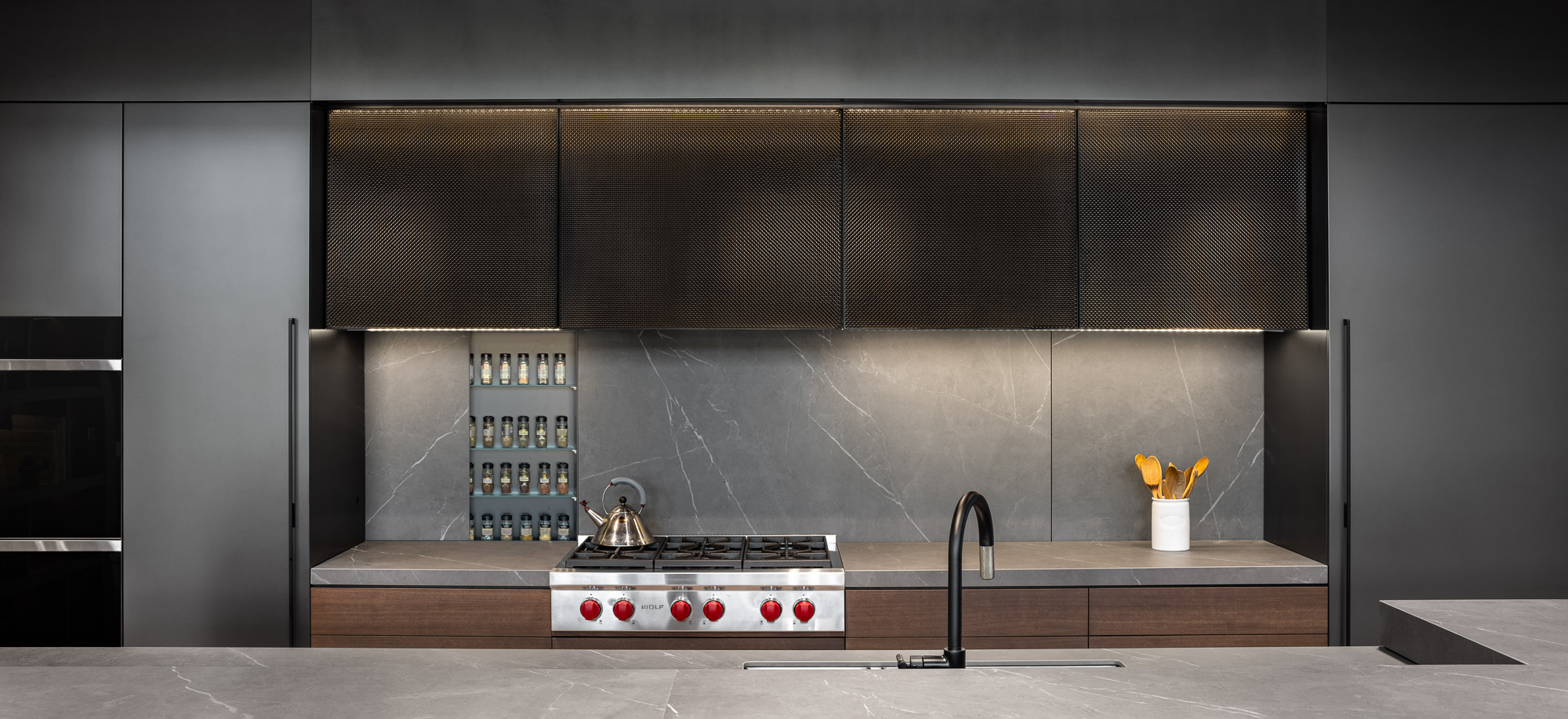
Like I mentioned before, the choice to install just one light in the kitchen meant there were no effective task lights in my kitchen. Adding several low voltage kitchen island lighting can help in the distribution of illumination and make chopping and cooking much easier. I love this linear light bar from Dazuma as it has a nice, minimalistic look to it. Similarly, under cabinet lights can do the same, making the counter space easier to work on and even clean.
Also, do keep in mind that you do not over-illuminate your kitchen so it has a strong glare. Ideally, try sticking to two or three light sources instead of more. This will restrict the room from becoming too bright, even if you keep all your lights on at once.
4. Buying fixtures that don't match

While I started reworking the lighting scheme a few months after the reno, I realized that choosing effective fixtures aside, it's also important to go in for ones that match the decor. Yes, if you have a kitchen with contemporary fixtures, do not go in for lights that have a vintage design. The mismatched look will hurt the aesthetics and eventually you will end up changing the lights all over again.
A good way to choose fixtures is to do a little research on the kitchen lighting trends. There's definitely a trend for brushed chrome fixtures at the moment that not only look smart but also have a timeless quality. Even natural finishes like concrete and plaster are taking over kitchen lights.
5. Going in for only practical lights instead of decorative
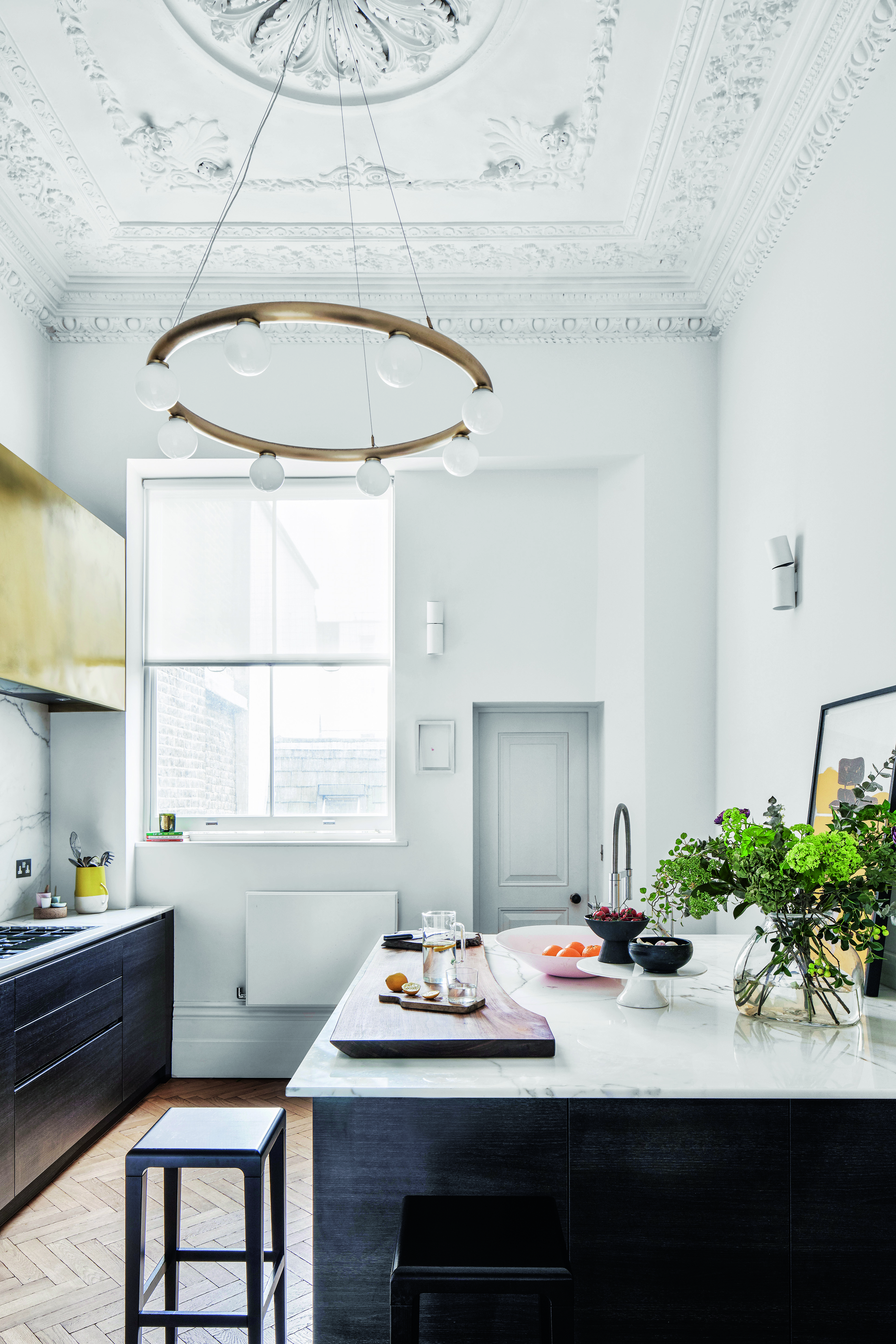
There's no harm in choosing the most beautiful, sculptural lights for the kitchen because this doesn't have to be a purely practical space. I found out the hard way. Mine is an open plan kitchen and after the renovation, I realized that it naturally became a more social area, as friends and family would casually walk over while I was cooking or plating up. And that that point, my plain kitchen lamps and drab pendants weren't adding to the aesthetics of the place. And the decorated dining and the connected kitchen started looking like two very different spaces.
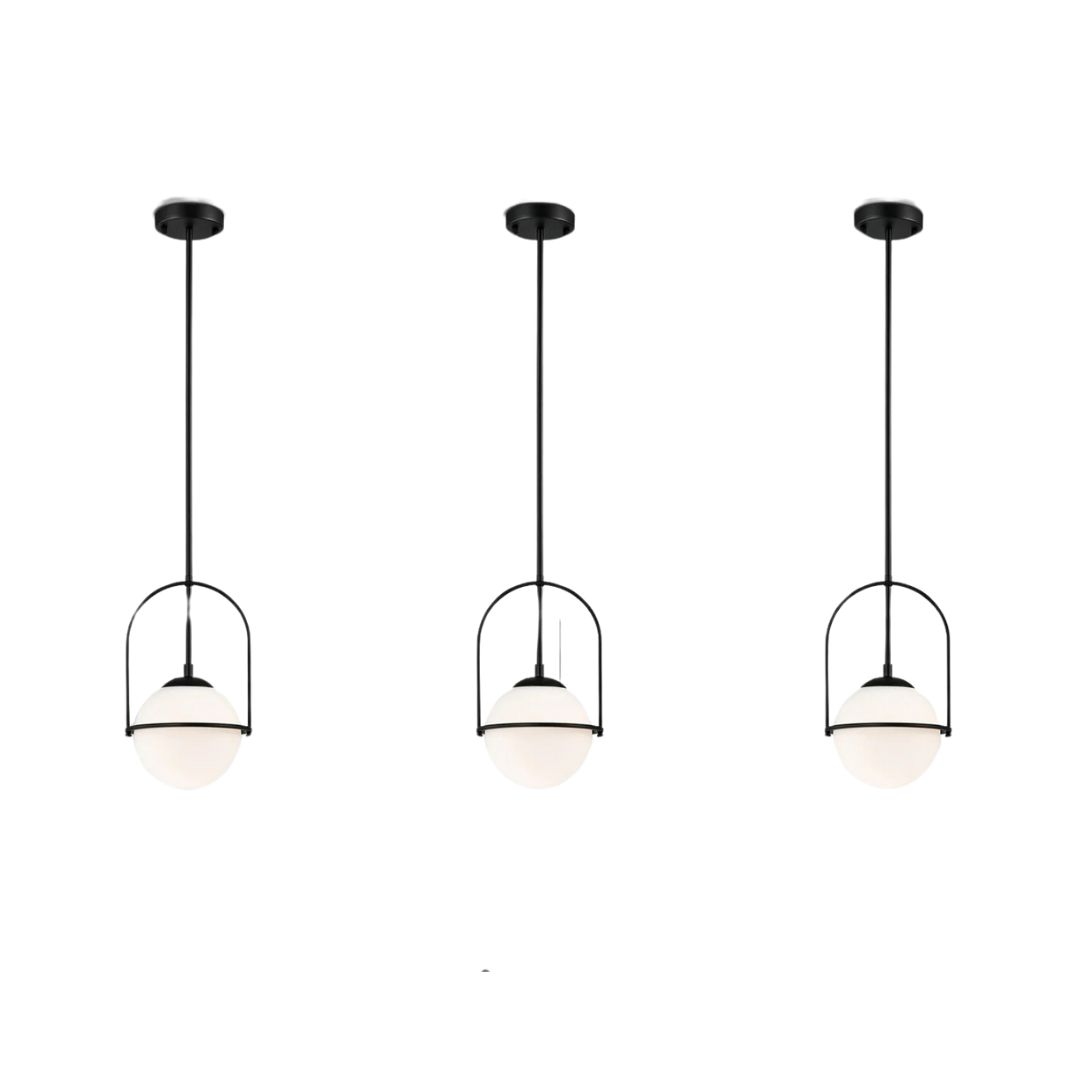
I decided to add the Shoshanna metal chandelier from Birch Lane to give the small kitchen a grand look. Go in for beautiful island lights, invest in pretty kitchen ceiling lights and bulbs. You will notice that these touches will encourage you to spend more time here, and soon this room will become a lovely 'lounge' extension in the home.
What is the most common mistake when it comes to the number of lights used in the kitchen?
The kitchen needs to be properly lit but that doesn't mean you go overboard in adding fixtures to this room. Ideally this space requires one or two pendants over the island, a few spotlights on the ceiling and undercabinet lights. If you want to make this room even more comfortable, consider adding accent lighting. These could be wall sconces on a dimmer that can be left on during the night as they can provide nightlight.
Should you have warm or cool light in kitchen?
The answer is both. Since this room serves many purposes, you will need cool-toned and warm-toned lighting. It's best to go in for cooler lighting underneath kitchen cabinets and above the island as these will help you focus better at the cooking tasks. Choose warm lighting for the ceiling spots that can help create a welcoming ambience.
Be The First To Know
The Livingetc newsletters are your inside source for what’s shaping interiors now - and what’s next. Discover trend forecasts, smart style ideas, and curated shopping inspiration that brings design to life. Subscribe today and stay ahead of the curve.

Aditi Sharma Maheshwari started her career at The Address (The Times of India), a tabloid on interiors and art. She wrote profiles of Indian artists, designers, and architects, and covered inspiring houses and commercial properties. After four years, she moved to ELLE DECOR as a senior features writer, where she contributed to the magazine and website, and also worked alongside the events team on India Design ID — the brand’s 10-day, annual design show. She wrote across topics: from designer interviews, and house tours, to new product launches, shopping pages, and reviews. After three years, she was hired as the senior editor at Houzz. The website content focused on practical advice on decorating the home and making design feel more approachable. She created fresh series on budget buys, design hacks, and DIYs, all backed with expert advice. Equipped with sizable knowledge of the industry and with a good network, she moved to Architectural Digest (Conde Nast) as the digital editor. The publication's focus was on high-end design, and her content highlighted A-listers, starchitects, and high-concept products, all customized for an audience that loves and invests in luxury. After a two-year stint, she moved to the UK and was hired at Livingetc as a design editor. She now freelances for a variety of interiors publications.
-
 These Are the Flower Crowns I’m Wearing This Spring (Spoiler: They’re Actually for My Door)
Coachella confirmed the comeback of flower crowns. At home, they just go by another name: the spring wreath
By Julia Demer
-
 Bunny Ears, Be Gone — 7 Easter Table Styling Mistakes That Will Take Your Setting from Tawdry to Tasteful
From fussy floral displays that disrupt conversation to over-relying on tacky tropes, don't fall victim to these errors when decorating your Easter table
By Lilith Hudson
