This kitchen blends the most on-trend colors into one palette perfectly - our expert explains how
Terracotta and pistachio come together to make a perfect palette in this modern kitchen. Ruth Mottershead explains how to get it right

Green and terracotta have both been two of the most huge interior design trends of the last few years. Green, it seems, is a favorite of everyone, beloved for being calming, soothing and its obvious links to nature. Terracotta is warming, welcoming, enriching and evokes the sunshine feel of a holiday in the Med. So perhaps it's no surprise they've finally been put together in such a perfect way.
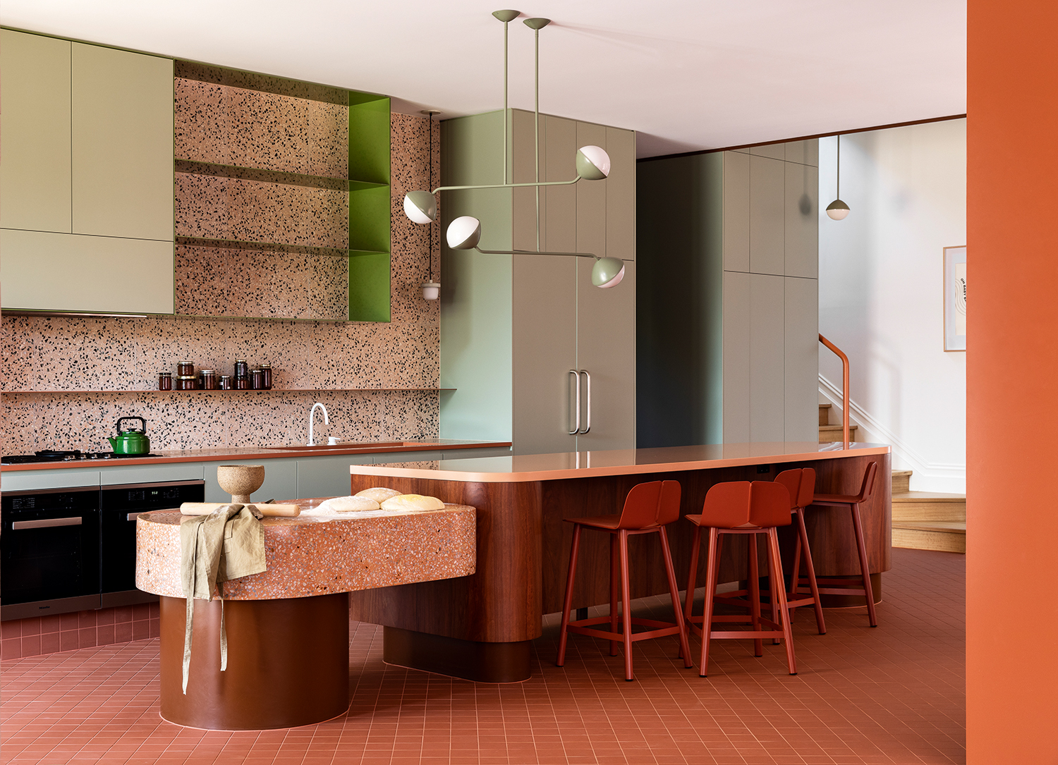
For this modern kitchen by Australian design studio WOWOWA the vacation vibes are real - the smooth curves of the split-level island highlighted by the oranges, pistachios and terrazzo. But getting all these strong shades to sit together is no mean feat, and so we asked Ruth Mottershead, Livingetc's color expert and creative director of Little Greene, to explain how it's done.
The roots of these colors are complementary, stemming from red and green – they are opposites on the color wheel, meaning they can naturally sit well together.
Ruth Mottershead
The pastel sage green and terracotta work together in this kitchen to create a mid-century ambience. These revolutionary post-war color combinations continue to provide a sense of optimism and modernism that are still relevant today. Both the texture and form within the space reinforce this retro style and the tones of brown, pink and terracotta all have an inherent warm, orange undertones, providing comfort to the scheme whilst acting as the complementary hue to the muted green.
The natural combination of green, brown and red is perhaps a slightly unexpected, unique colour choice for an interior space, but one we have a real affinity for within our external environment. The roots of these colors are complementary, stemming from red and green – they are opposites on the color wheel, meaning they can naturally sit well together. Anything tinted red is going to be a color that goes with green. The soft pastel green provides a gentle backdrop to the stronger tones of terracotta and brown, ensuring the scheme has contrast as well as harmony, without being too jarring.

We have seen a movement to green within recent years. Dark green has been the star of the show, but a further transition to softer, gentle greens like pistachio, with warmer undertones, will be the next evolution of this color trend. Pistachio provides soft sophistication – it contains complex pigmentation, significantly more than just blue and yellow, adding to its allure and versatility.
The sculptural shape of the ceiling light bridges the gap between the clean, hard linearity of the kitchen cabinetry and the soft, curvaceous form of the island. Matching the color ensures harmony and that the light fitting demands no extraordinary attention. The darker, unexpected green in the inside of the wall shelves and on the kettle is a more concentrated version of pistachio. This serves as an accent within the space whilst being very closely related to the key color.

The use of natural materials is as old as the hills, and the search for beautiful combinations that incorporate them is key to the success of many interior design projects. In this case, the linking of wood with the base colors on the island units has been deliberately executed to create an ambiguity between the painted and textured surfaces. This prompts us to inspect these relatively unimportant aspects of the space with an open and enquiring mind.
The terrazzo on the smaller kitchen island unit relates to the terracotta flooring due to its warm, orange undertones. The lighter, sweeter pink on the back wall has a more complex role, in that it has similar undertones to the sandstone wall as well as linking with the appliances including the tap, hob and oven unit through its inclusion of black and white stone elements.

The addition of white within the light, the taps and the terrazzo provide a connection with the white ceiling. Without these elements, the ceiling would stand out and the transition from room to stairwell would not be quite so easy. The white also acts as the lightest tone as part of a light, medium, dark transition from ceiling to floor.
The warm tones throughout the scheme are all closely related through their common use of the same pigmentation. As they are also relatively muted tones, harmony follows without clashing or jarring. Like the accent green within the cabinetry, the brick red bar stools act as a faux accent. They are a strong extension of the terracotta tiles, adding a completeness to the scheme with a burnt orange. The lighter pink countertop completes the orange/pink axis and bridges the two warm terrazzo surfaces, containing both orange and pink. This ensures the scheme balances.
Be The First To Know
The Livingetc newsletters are your inside source for what’s shaping interiors now - and what’s next. Discover trend forecasts, smart style ideas, and curated shopping inspiration that brings design to life. Subscribe today and stay ahead of the curve.
Ruth Mottershead is the Creative Director of Little Greene, and one of the most renowned experts on exactly how to use color now. At Little Greene she has pioneered the way the brand thinks about color and pattern, creating new palettes, new pigments, and becoming the force behind sustainable paint offshoot Re:mix. She is also a regular contributor to Livingetc, as someone we turn to when we want to decode exactly how to put colors together.
-
 String Lights Are Over — This Outdoor Lighting Collab Is What Comes Next (And Fixes Your Backyard’s Biggest Issue)
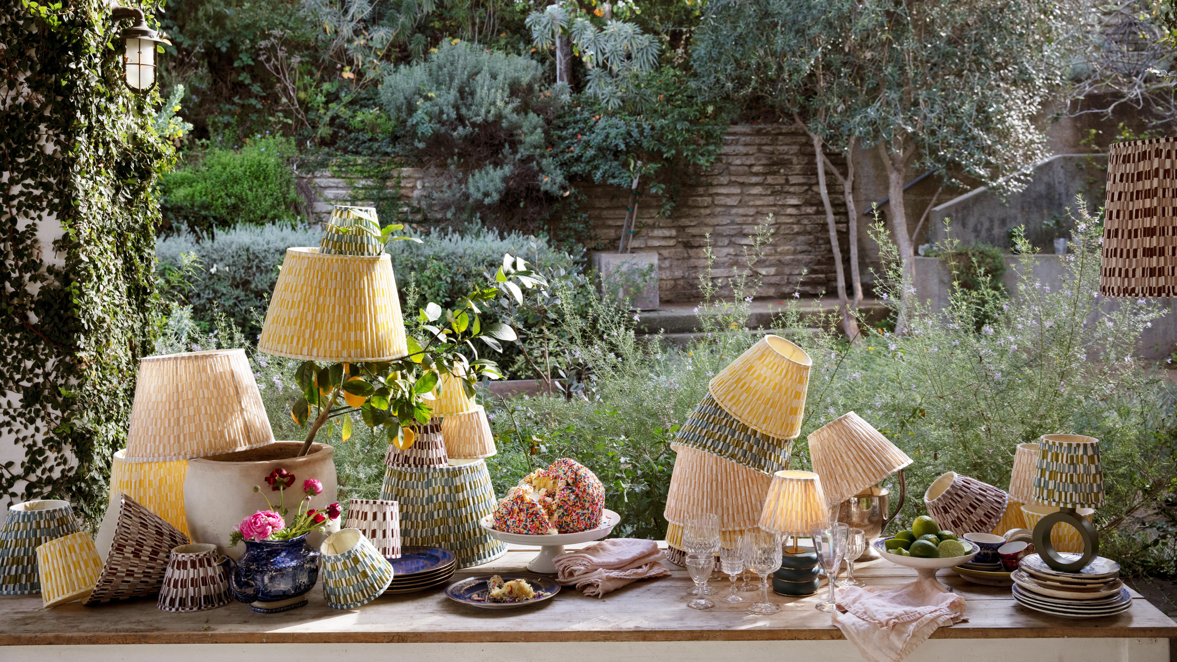
No plugs, no problem. Pooky x The Novogratz makes a compelling case to ditch your string lights for good
-
 The Deep Dive — Why Architect and Designer Alvar Aalto Has a Last Legacy in Design
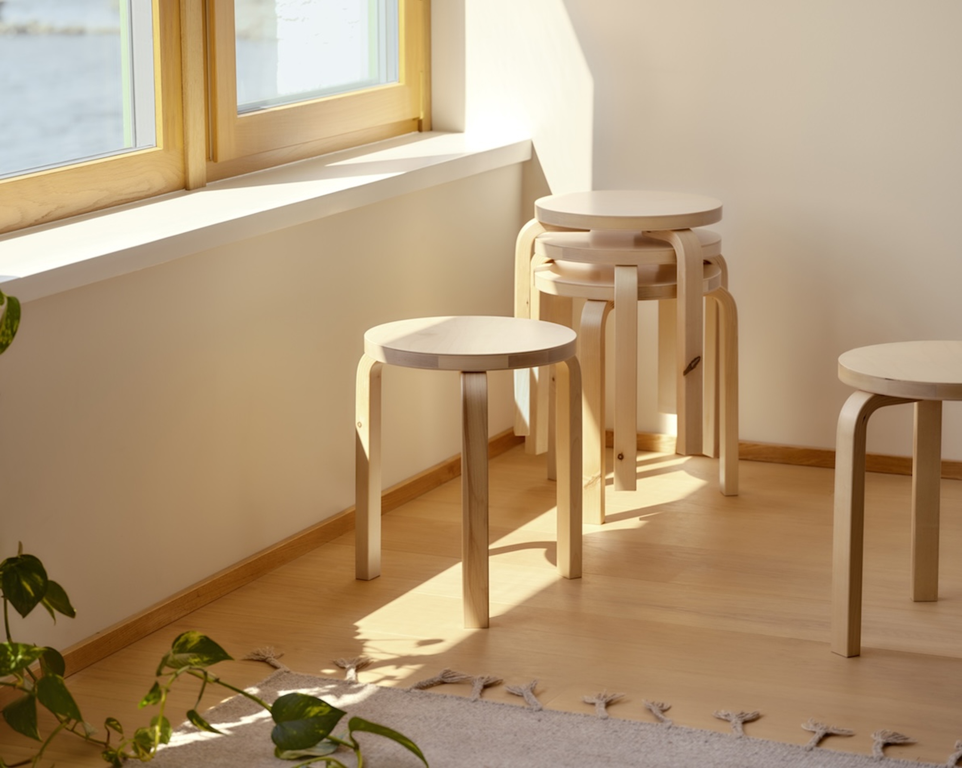
Alvar Aalto remains so significant to Finnish design — from how they approach the seasonal light to inspiring the mediums, designers, and brands that prove important to the country’s buoyant creative scene