5 Kitchen Window Mistakes to Avoid, According to an Architect — Some May Seriously Surprise You
Whether it's how you dress your kitchen window, its shape and style, or where you decide to position it, these are the things to avoid at all costs

The Livingetc newsletters are your inside source for what’s shaping interiors now - and what’s next. Discover trend forecasts, smart style ideas, and curated shopping inspiration that brings design to life. Subscribe today and stay ahead of the curve.
You are now subscribed
Your newsletter sign-up was successful
When it comes to kitchen window mistakes, such erroneous decisions can quickly become incredibly costly. In some cases, they're so permanent you simply have to learn to live with them. In between choosing your countertop, backsplash, fittings and fixtures, windows are rarely considered more than where to put them — and the results can be dire.
But coming up with clever kitchen window ideas isn't always as easy as you'd think. Georgina Wilson, an Australian architect and the founder and principal at Georgina Wilson Associates, has earned a reputation for her practical and pragmatic approach to design. Her series of no-nonsense social posts have been seen (and likely saved) by millions of people around the world, and educate on how to avoid making some of the biggest errors when it comes to your home.
So who better to ask about the most commonly made kitchen window mistakes to avoid, and more importantly — what you should do instead. From treatments and dressings, to window styles and their placement, below, we've shared five faux pas Georgina warns against making when it comes to your windows. Take note; and don't say we didn't warn you.
Article continues below1. FABRIC WINDOW TREATMENTS
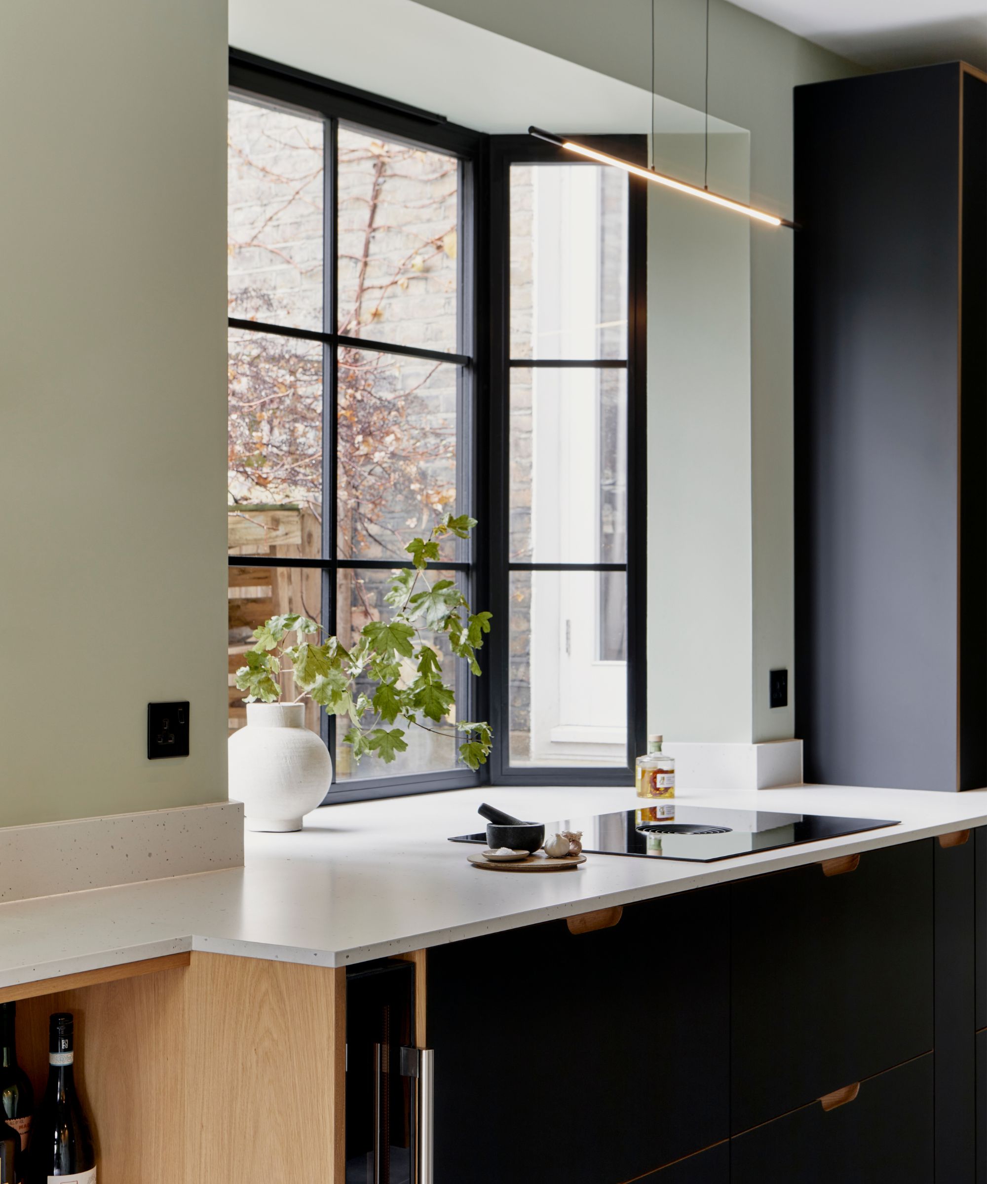
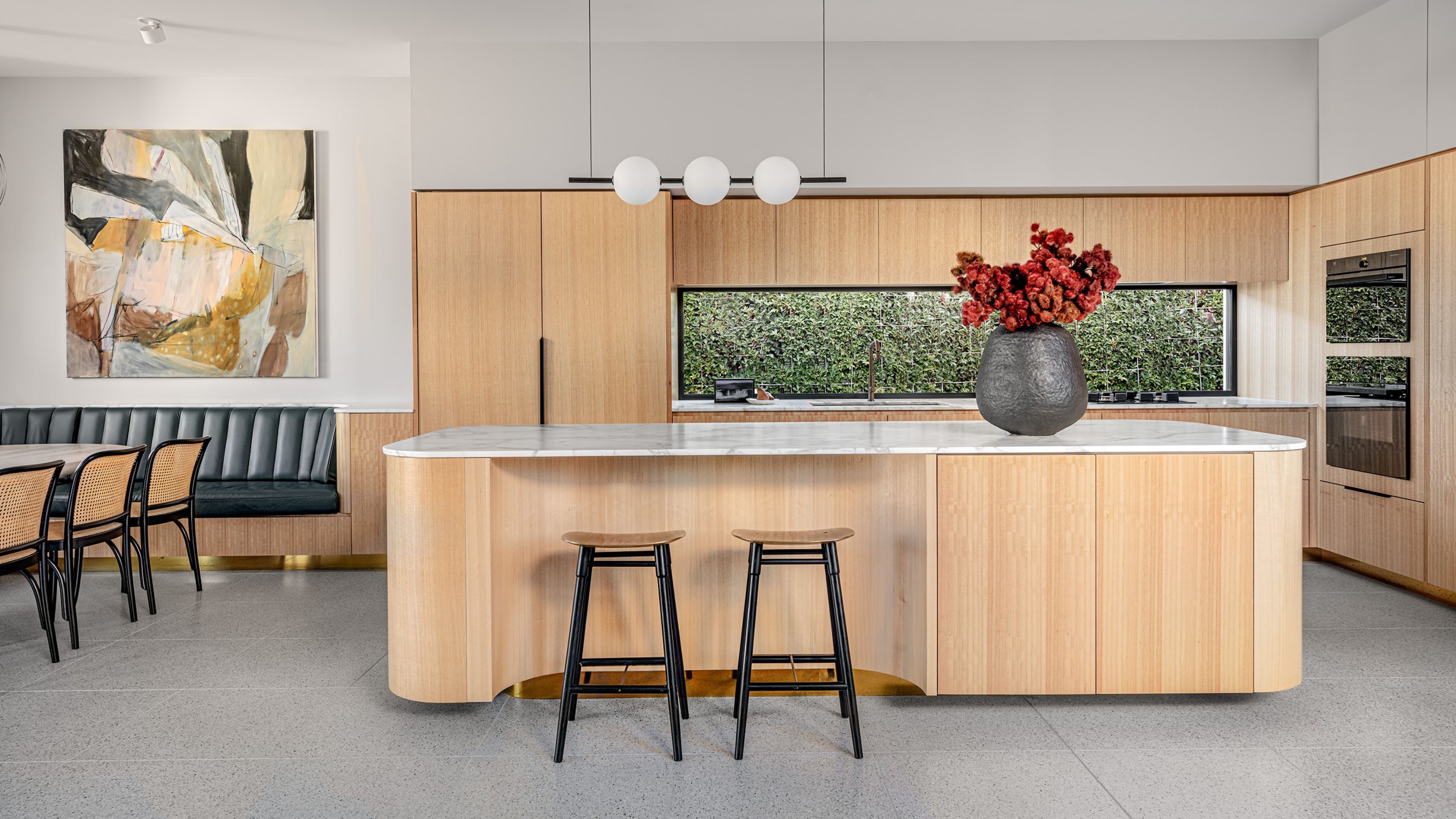
DO INSTEAD: Leave your windows without any treatment, and focus instead on beautifying the view outside.
To put it simply, fabric kitchen window treatments are unhygienic. "Fabric window treatments are not suitable for key functional zones of the kitchen, especially the 'work zone' where the sink and cooktop are located," explains Georgina. "These areas are prone to frequent water splashes, oil sprays, and cooking smells, making fabric a poor choice due to its tendency to absorb and retain these elements."
When designing kitchens, Georgina's approach prioritizes functionality. "Surfaces need to be hygienic and easy to clean," she says. "Fabric window treatments, being fussy and difficult to maintain in such an environment, are the antithesis of this approach."
So, how do you avoid making this common kitchen window mistake? Well, it all depends on your goal. For heat control control, Georgina suggests Venetian blinds or external louvered shutters. "These treatments are installed outside the glass, preventing the sun from directly hitting it," she says. "This approach is commonly and successfully used in European cities like Milan."
For added privacy, internal timber shutters work. "My favorite solution for privacy or obscuring a less-than-ideal view is using textured glass in the window," adds Georgina. "Textured glass can also be aesthetically pleasing, with options like fluted, hammered or bubbly glass available."
The Livingetc newsletters are your inside source for what’s shaping interiors now - and what’s next. Discover trend forecasts, smart style ideas, and curated shopping inspiration that brings design to life. Subscribe today and stay ahead of the curve.
You could also consider improving the view outside the window, making that the focus instead. "Planting greenery outside the window will help to create a more pleasant outlook," says Georgina. "It’s a shame to cover up a lovely window, so make the most of it by focusing on the view."
Alternatively, you can opt for a good-quality window frame to enhance its appearance. "You can achieve different styles within the window frame itself, such as colored glazed highlights, timber panelling, textured glass, and stylish brass hardware," she adds.
2. A SERVERY WINDOW
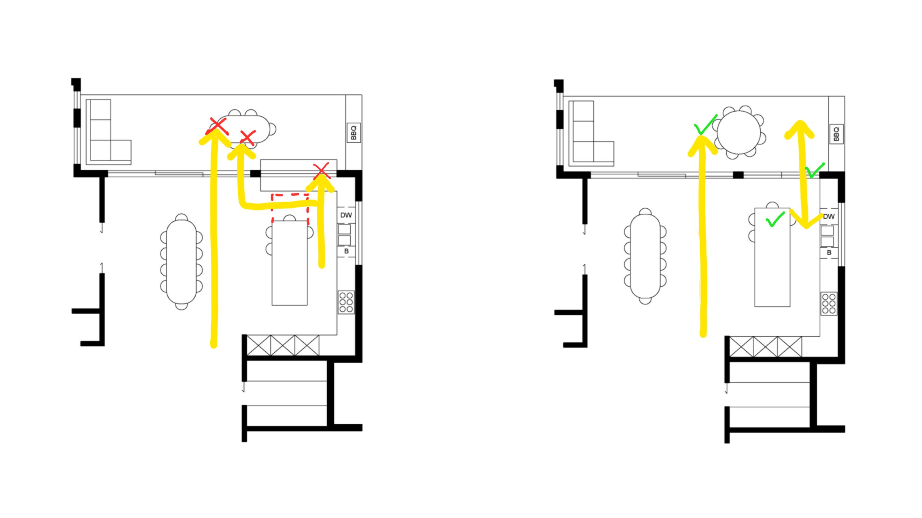
DO INSTEAD: Prioritize a seamless flow with your outdoor areas with walkways and doors, rather than a servery window.
This one may be contentious, but Georgina says, more often than not, servery windows (also known as serving hatches or kitchen pass-through windows) are not worth it and end up being a kitchen window mistake. "On average, I review around 50 plans per month, often including proposals for servery windows, but I rarely believe they are a good design solution," she says.
That's mainly because of the counter space you often have to relinquish in order to fit them into the kitchen layout. "Servery windows often block primary access to the outside and can shorten an island bench, creating inefficient and unnecessary corners," adds Georgina, who drew the floor plan shown above to articulate her point.
But, yes, there are some situations in which a kitchen servery window works. "If you have a larger kitchen in a home that is 'in the round' (with open space all around it), you may be able to incorporate an openable kitchen window on one side without compromising primary access to the outside," says Georgina. But she errs you to very carefully consider the decision to include one in your design.
3. PUTTING A WINDOW BEHIND YOUR COOKTOP
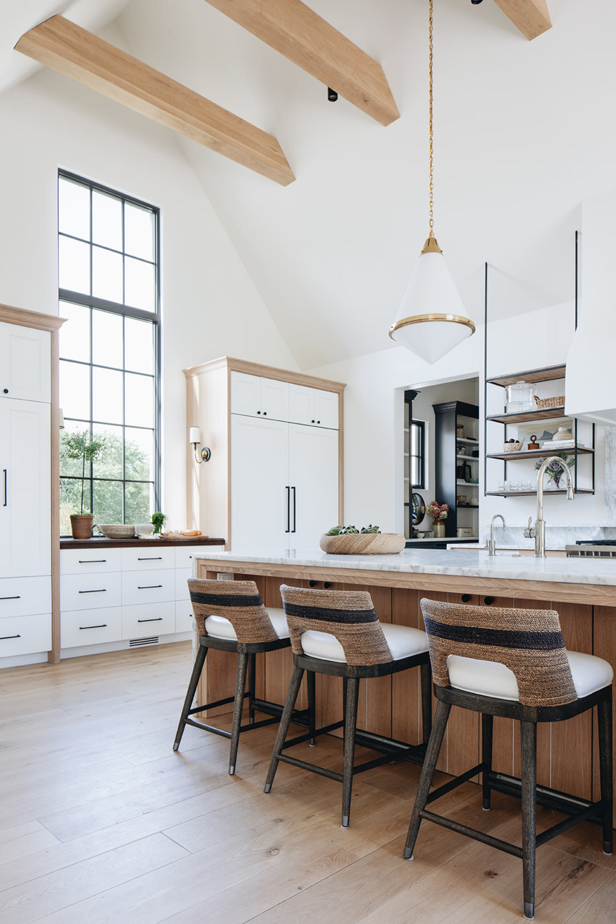
DO INSTEAD: Georgina recommends trying to position any kitchen windows at 90-degrees to the kitchen island if possible, leaving plenty of space for the 'work triangle' behind the bench.
In a similar vein to fabric window treatments, Georgina warns against choosing to position a kitchen window behind your cooktop: "You don't want to cleaning oil stains off the glass for the rest of your life," she says.
That's not to say that positioning one behind the rest of your kitchen 'work triangle' is a guaranteed kitchen window mistake, though. "The ideal place to position a kitchen window is to the side of your kitchen, at 90-degrees to the kitchen island," she says. "The work zone should be located behind the kitchen island."
Simple, right? Though in reality, it should be noted that people aren't often afforded the luxury of choice when it comes to where their kitchen windows can be positioned, so just try and work with what you've got.
4. AWNING WINDOWS
DO INSTEAD: A classic double-hung window will let in plenty of fresh air, while providing a subtle architectural detail that won't date.
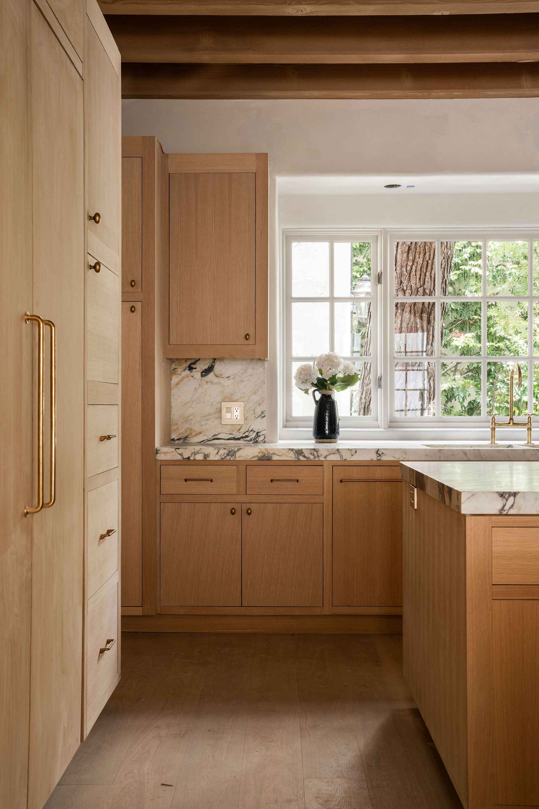
When it comes to the style of window you select for your kitchen, this choice too can be fraught with danger, and can often end in making a regrettable kitchen window mistake. While awning windows provide added protection from rain and snow in cooler climates — they hinge from the top and open from the bottom — Georgina says they don't often offer enough air flow or kitchen ventilation, making them another common kitchen window mistake.
As for what style of window is best, Georgina says it depends on the overall style of your home and kitchen (which means it could still be an awning window). "Personally, I love large, classic double-hung windows in a kitchen," says Georgina. "They provide excellent airflow and can look very appealing, especially with colored glazing panels."
5. FORCING A WINDOW ABOVE THE SINK
DO INSTEAD: Prioritize other ways to make a connection with your outdoors areas — preferably walkways over windows.
Putting kitchen windows over sinks seems to be a layout that many people are wedded to. Perhaps there something romantic about being able to look wistfully out of the window while you wash the dishes.
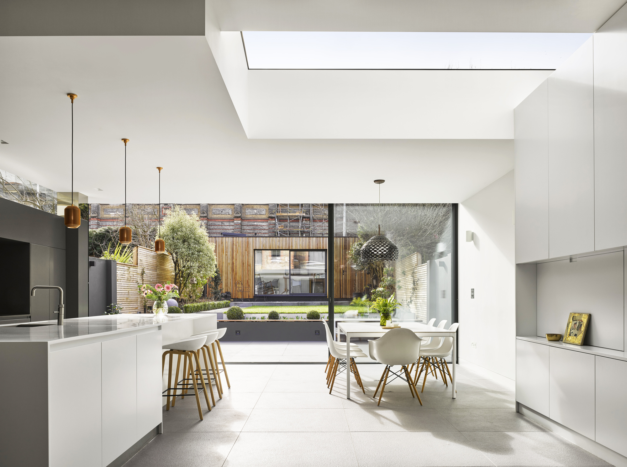
"The idea of hanging a kitchen window above the sink likely stems from mid-20th-century homes, where the kitchen was typically located at the back of the house with a small window above the sink look out to the backyard," explains Georgina. "However, modern kitchens are much larger and often open-plan, sharing space with dining and living areas."
So, is this sink-bound outlook still really needed? "In redesigning older homes today, we would probably opt for larger doors opening onto the garden instead of a small kitchen window above the sink," says Georgina. "While it can be lovely, in a big, free-standing house, it's not a key priority."
For smaller homes with a less seamless connection with their outdoors — think homes that are connected on one or both sides, like terraces or semis — the priority should also be to include a door that will help the indoor-outdoor transition, rather than a window over the sink.
When renovating or building from scratch, there are a lot of things to consider. To avoid committing any serious kitchen window mistakes (and presuming you have the luxury of choice and flexibility), the main things to consider are:
- How are you going to clean it? Avoid fabric treatments that will collect dust, dirt and grime; and positioning windows behind things that will make it hard to reach or more likely to get dirty, like sinks and cooktops.
- Will it provide enough ventilation to the space? More architectural styles, including kitchen pass-throughs and awning windows, are certainly nice, but at the end of the day they're there to serve a purpose, so make sure they do.
- Would it be better as a door? Yes, windows are a wonderful way to connect our interiors to the outdoors, but if it's possible, a door would be better for both flow and function of the space.
Still not confident? Georgina is hosting a virtual design masterclass on how to design the best kitchen layout for your space. The next session starts on August 8, is self-paced and will be available worldwide. If you're interested, you can enrol now and discover how to design your perfect kitchen with Georgina.

Emma is the Interiors Editor at Livingetc. She formerly worked on Homes To Love, writing about all things design for some of Australia’s top interior publications, including Australian House & Garden and Belle. Before that, she produced content for CULTIVER, where she found an appreciation for filling your home with high-quality, beautiful things. At Livingetc, Emma explores the big design questions — from styling to colors, interior trends, and home tours. She’s travelled to Copenhagen for 3daysofdesign, to Paris for Déco Off and Maison&Objet, and has attended design events in London, including WOW!house and Clerkenwell Design Week. Outside of work, you’ll find her elbow-deep at an antique store, moving her sofa for the 70th time, or mentally renovating every room she walks into.