

Agonizing over paint colors is a universal experience. But above any other room in the home, finding the perfect shade for your living room can be the biggest challenge of all. It has to feel equal parts comforting, convivial, and full of character, all while working with your surrounding scheme and — crucially — avoiding living room color mistakes that create an uncomfortable sense of confinement.
If you've successfully set the mood with your chosen color then kudos to you, but it's something that's most commonly overlooked. Choose the wrong living room color idea and you risk making your space feel smaller (even if your square footage is on the more ample side). How many times have you walked into a living room that felt cluttered, closed-in, and constricted? Beyond the limits of floorplans, color is almost always to blame.
If you want to avoid making similar living room color mistakes, you've come to the right place. Before you even begin browsing paints or placing swatches on your wall, you'll want to know which shades to steer completely clear of. Here are six that designers and paint experts urge you avoid, alongside some guidance on what to use instead for living roomsthat feels capacious rather than cramped.
1. Bright White

DO INSTEAD: Choose shades with warmer tones like a subtle pink.
Although we've been embracing more colorful paint ideas in recent years, white walls are the default when you don't know where else to turn. You might think classic white is a safe bet, especially if you want to make your room feel airy and spacious, but a stark white can in fact have the opposite effect.
"Stark white can make walls feel harsh and actually emphasize shadows, making a space look more compact," explains interior designer Ginger Curtis of Urbanology. "For a better alternative, choose a warm off-white or ivory to soften the edges and make the room feel seamless and open."
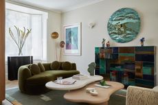
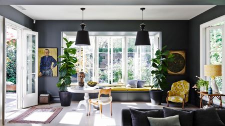
Fred Horlock, design director at Neptune, agrees that colors with slightly warmer undertones work better than white in living rooms. "If you're drawn to fresh, light tones, try a subtle pink like our Potters Pink," he suggests, which is pictured in the living space shown above. "This soft hue acts like a neutral but creates a softer, more natural glow compared to white."

Price: £5.95/sample pot
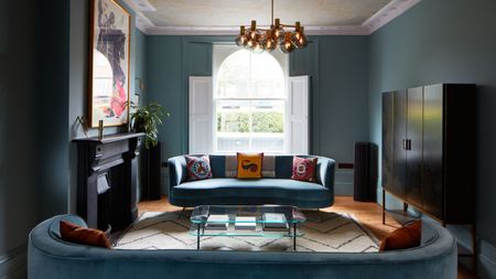
2. Saturated Red

DO INSTEAD: Opt for a deeper red, or a small accent as a 'pop' in the space.
Fiery, energetic reds have been enjoying a moment in the design spotlight lately — especially primary iterations of the shade — but saturated reds should be avoided in large doses, especially in the living room. "That's because red can be visually overwhelming and make a space feel more enclosed," says Ginger.
That doesn't mean living room color trends in 2025 aren't embracing reds, though. There's been a huge move toward rich burgundy and oxblood shades recently, although these deeper shades do come with a high risk of that confined feeling. "Instead, a warm terracotta or cinnamon shade still brings energy but in a softer, more expansive way," suggests Ginger.
If you really want to introduce a pop of true red into your scheme, consider embracing the "unexpected red theory" by peppering a few splashes of this bright shade into your space to elevate your look. "For a pop of color, a great option is to go for a warm neutral on the walls then bring in a bright red in accents like woodwork," says Dominic Myland, CEO of London paint brand Mylands (an interpretation of which is seen above using Myland's shade FTT-009 Red).

Price: £5.50/sample pot
3. Bright Yellow

DO INSTEAD: Go for a lighter, softer, and less saturated shade of yellow.
"The trick to choosing the right color for your living room and avoiding making the space feel smaller is choosing tones with the right balance of warmth and depth," says Dominic. That might steer you towards a butter yellow or a sunny saffron to bring a jubilant feel to your living space. But while these truer shades of yellow might work in a kitchen or bathroom, they're actually 'advancing colors'. This means they're usually a step too far in a lounge area (especially where small living rooms are in question).
"Vibrant yellows can feel overwhelming and visually constricting," says Ginger, who recommends a buttercream or warm beige in their place. Fred at Neptune agrees. "If your plan is to paint the entire room in a colorful shade, a deep mustard might feel too intense, but the lighter, desaturated yellow tone of Polenta brings that same warmth in a gentler, more timeless way," he says.

Price: £5.50/sample pot
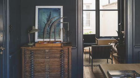
4. Cool Gray

DO INSTEAD: Try a warmer taupe, or mushroom gray to prevent the space from closing in.
Millennial gray has well and truly left the conversation, but you might still be tempted to use this neutral shade on your walls to make a chic, contemporary statement. If you're looking for colors that make your living room look bigger, however, cool gray tones should be avoided.
"There are a few shades we would recommend homeowners steer clear of when choosing how to paint their living rooms," says Sue Wadden, director of color marketing at Sherwin-Williams. "The first that comes to mind is something like a shipyard gray — a gray that’s in the middle and kind of looks like a garage floor. It’s not a very inspiring color for a room where homeowners host their guests, and we would recommend going either lighter or darker in the neutral family and focusing on colors that have more energy like Grounded SW 6089 or Snowbound SW 7004."
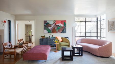
Beyond the lack of warmth and character that result from decorating with cooler grays, they contribute to that dreaded sense of confinement in living rooms. "Overly cool grays can make a space feel flat and boxed in, especially in low-light rooms," Ginger notes. "Instead, try a warm gray or mushroom tone that has depth without feeling cold, creating a more expansive and inviting atmosphere."
The space above shows taupe walls that bring warmth to the room while still feeling chic and "cool". Or, similarly, you can try a smoky lavender for a better balance of warmth and coolness.

Price: £5.50/sample pot
5. Black

DO INSTEAD: A charcoal or deep greige will help with light, and gives the space movement.
You'd have to be pretty brave to consider painting your entire walls black, but even where accents or woodwork are concerned, consider giving black a miss. "Black absorbs light and can make walls feel like they’re closing in," says Ginger, nodding to the rules of color theory. "Instead, a deep greige or charcoal keeps the moody sophistication but reflects enough light to prevent the space from feeling small."

Price: £5.50/sample pot
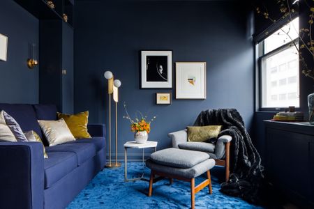
6. Navy Blue

DO INSTEAD: Try airier blues to brighten smaller spaces, or completely lean into the enveloping nature of navy.
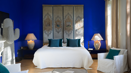
An inky blue might be classed as one of the most timeless living room colors, but it's also considered to be one of the biggest living room color mistakes since its darker, moody properties can make spaces feel smaller.
"For something similarly colorful, incorporate airy blues like Long Acre No.102 which is great for color-drenching," recommends Dominic at Mylands. A similar shade can be seen on the wainscoting in the space above, where it introduces a tonal element to the scheme.
If you do decide to use navy in your living room, you could likewise consider color-drenching, wrapping the walls, ceiling, and woodwork in the same tone. This will lean into the enveloping qualities of the rich shade, rather than having a contrasting color that works against it.

Price: £5.95/sample pot
Don't fall victim to the common living room color mistakes that make your space look smaller. By avoiding the shades above, brushing up on your understanding of colors, and giving some thought to your application, you'll have a colorful living room that feels harmonious and well-proportioned. Choose shades that let your walls breathe, and pick furniture and decor that complements those foundations for a cohesive, thoughtfully curated home.
The designers' dos and don'ts for living room colors might seem like a minefield at first, but once you have the basics under your belt you can color your whole home with confidence. Next step? Learning the colors to avoid in the kitchen

-
 Florals *Can* be Groundbreaking, and This Unlikely Collaboration Proves How
Italian fashion house, Moschino, tapped Sanderson’s iconic floral archive for its latest show in Milan
-
 The "One Amazing Thing" Theory Could Just Be the Secret to Making Your Decorating Budget Go Further (While Making More Impact)
What if we told you designers had found a way to control a project's spend even while elevating the final result? This new trend does just that


-
 What Actually Is Yves Klein Blue? A Short History of This Iconic Color, and How to Decorate With It
Explore “the most perfect expression of blue” and how to free this pigment in your home
-
 Do Pink and Green Go Together in Interiors? A Professional Color Consultant's Verdict
How to make pink and green color combinations work for more contemporary interior schemes
-
 The 'Grown-Up' Way to Decorate With Light Blue — This Shade Shouldn't Just "Be Resigned to the Baby's Room"
We explore how to bring the lighter intonations of blue into your home in a contemporary and thoughtful way
-
 How to Decorate With Farrow and Ball's 'Railings' — The Secret to Making This Classic Paint Color Work in Your Home
Not quite black, not quite blue, the beauty of this paint shade lies in a refined middle ground. But how should you use it in your rooms?
-
 3 Times You Should Never Paint a Room Blue, According to a Designer — "Sometimes, It's Harder to Work Around"
Though widely beloved, blue is not always best when it comes to your walls. Here's when not to choose it for a room
-
 Using the Color Wheel in Interior Design Might Seem Like Extra Fuss, But as a Color Expert, I Promise It’s Foolproof
Understanding how to properly clash, complement, and categorize colors is the secret to unlocking the unexpected in interior design
-
 Forget Coastal Themes and Feature Walls — This Is How to Decorate With Blue in the Freshest, Most Exciting Ways
We've been underestimating the power of blue when it comes to our interiors. Here, we break down how to do it well
-
 4 Times Designers Say You Definitely Shouldn't Paint Your Walls and Ceiling in the Same Color
Though spaces washed all in one color are certainly popular right now, it could be throwing off your entire room's aesthetic


