Minimalism vs maximalism – which style is better? These designers say the answer lies in the search for a middle ground
Trying to fit the extremes of maximalism and minimalism might not be as fruitful for your home's design as meeting in the middle, explains interiors expert Sophie Flaxman
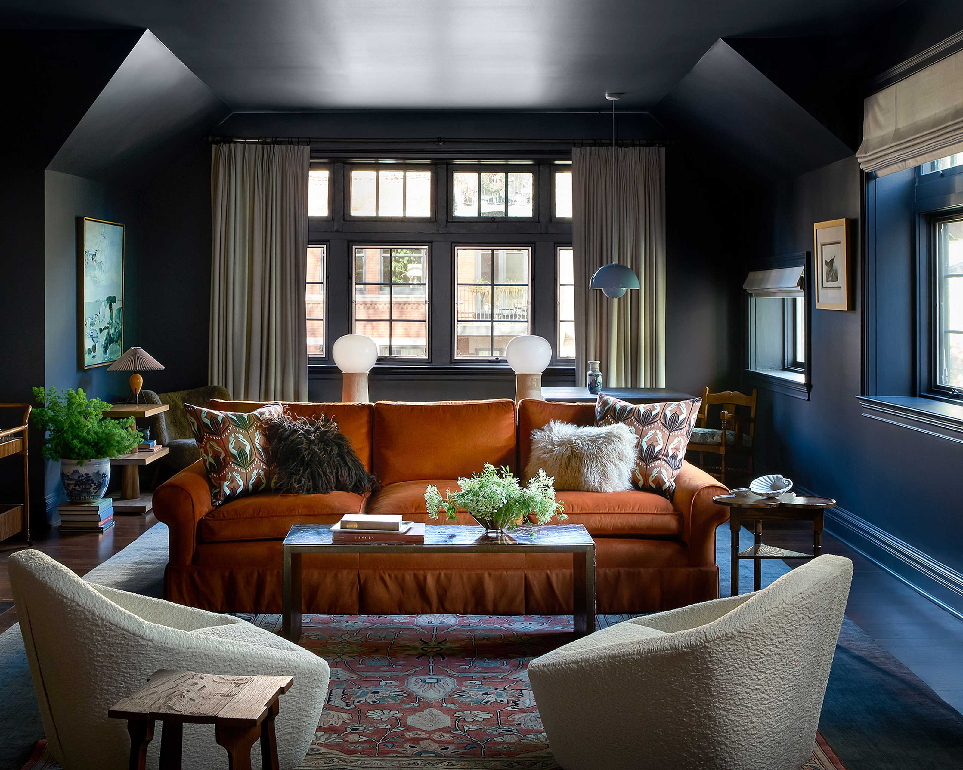

The tendency to classify, label, and categorize things is deeply ingrained in our human psyche. While this helps us make sense of the world, labels and categories can also result in limited identities and limitations in how we think about things. Minimalism and Maximalism are two big labels in the world of art, architecture, and design that define overarching sets of principles and characteristics to help us distinguish one style from the other.
But do these labels also limit the way we think about and interpret the styles in our homes? In an industry powered by creativity, are things as black and white as being ‘Minimalist’ or ‘Maximalist’? Or should we use our understanding of each style to create new variations that address what each lacks?
As the popular phrase goes, you have to ‘learn the rules like a pro, so you can break them like an artist.’ With that in mind, let’s start by deepening our understanding of maximalism and minimalism in interior design.
What is maximalism?
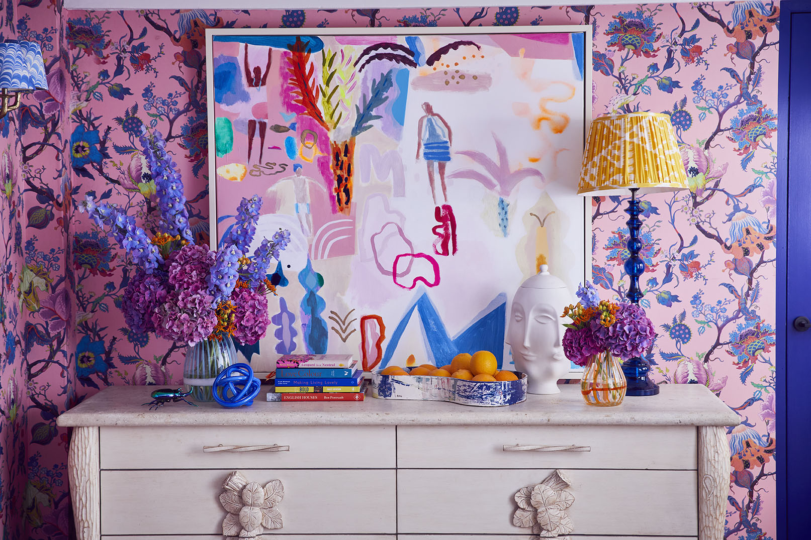
Maximalism in interior design is an aesthetic rooted in excess with a ‘more is more’ philosophy. It is interior design in its maximal expression, a celebration of color, pattern, texture, furniture, decorative objects, and craftsmanship. ‘Maximalism is the antithesis of the quiet, subdued interior; it's about people who want to throw a party,’ says British interior designer Sophie Robinson, admired globally for her bold use of color and pattern. The flamboyant style challenges the status quo and advocates freedom of expression, indulgence, exuberance, fearlessness, and a taste for overstimulation. ‘Maximalism is about surrounding yourself with the things you love and not being a slave to trends or star genres,’ she adds.
Unlike minimalism, maximalism is far from a modern-day phenomenon. The style has reared its head a number of times over the centuries, each time carrying a different disguise to suit contemporary attitudes, tastes, and technological advancements. One of the earliest examples of maximalism is the Baroque style that flourished throughout Europe in the 17th century. The extravagant and theatrical style was limited to the elite and employed as an exhibit of wealth and stature. ‘Maximalism, then, was all about celebrating craftsmanship and furniture; only the elite could afford to have all those things. Gilt ceilings, hand-painted murals, and beautifully veneered furniture was a statement of whether you had made it in life,’ explains Sophie. ‘It’s funny how, now, some of the most wealthy live in a sort of monastic minimalism; it has completely reversed.’
The ebb and flow of maximalism through the centuries have culminated in the version we know today. No longer limited to the wealthy elite, maximalism has become less about exhibiting personal wealth and more about showcasing personal taste and celebrating life. ‘Maximalism is definitely about having fun and a devil-may-care attitude, though it is still a bit peacocky,’ admits Sophie. ‘It's not a trend that can be bought into. You either like it, or you don’t; it's a very heartfelt thing,’ she says. ‘If you love collecting beautiful things and hate getting rid of anything, you're probably a maximalist.’
Though, she emphasizes maximalism is not about filling your space with stuff for stuff’s sake. It’s about creating a curated collection of beautiful things and a cohesive design pulled together by thoughtful application of color, scale, and print. ‘The style really took off in lockdown as people searched for new ways to fill their space with life, joy, and inspiration,’ says Sophie, who also credits social media for the maximalist revival. Platforms like Instagram have increased exposure to the aesthetic, empowering people to understand the style and how to pull it together and giving them the confidence to be more experimental.
What is minimalism?
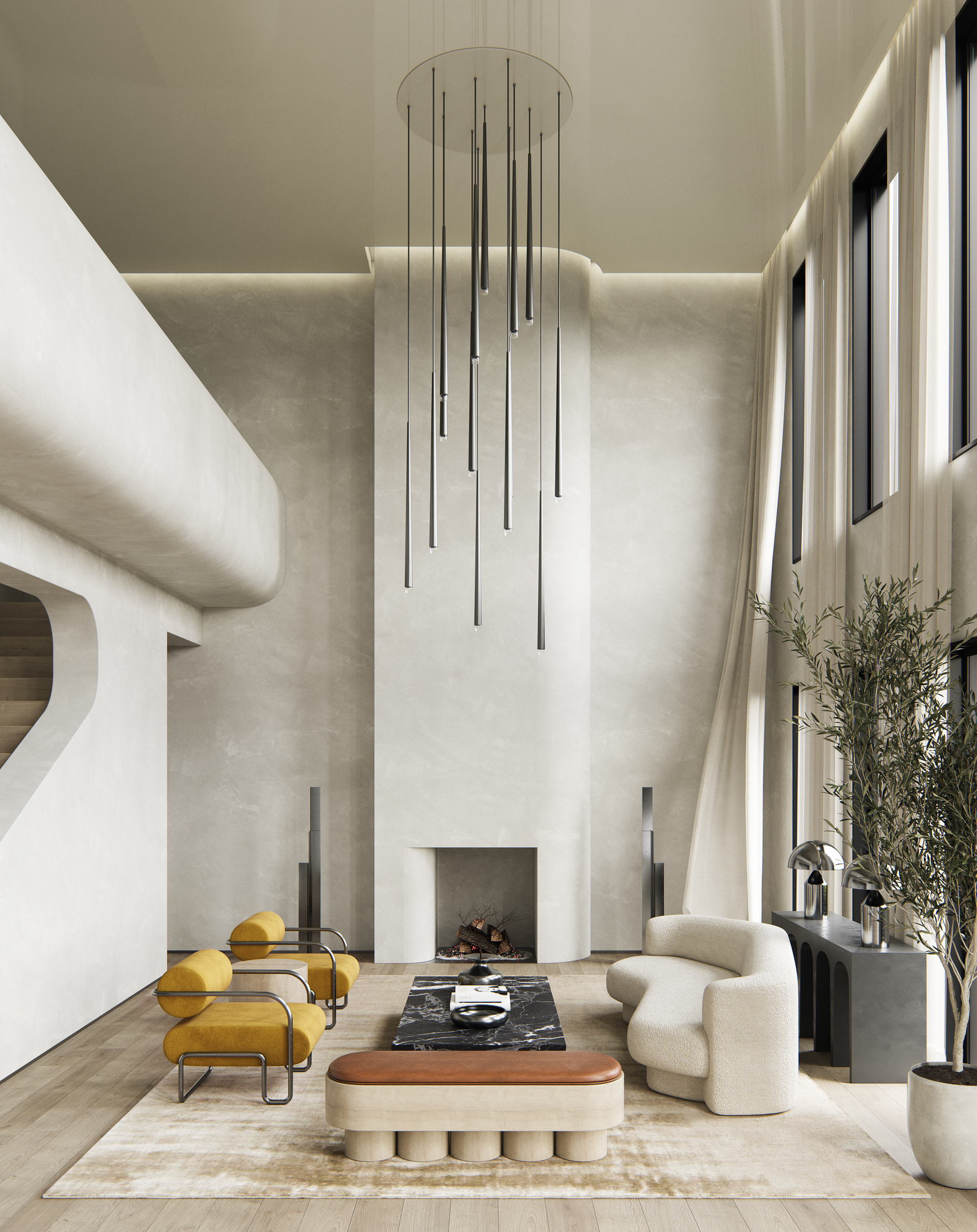
Minimalism is often described as an uncluttered look featuring clean lines, minimal ornamentation, and a monochromatic or neutral color palette. Though that’s not incorrect, there is more to the style than meets the eye. For Rob Mills, lead architect and founder of Rob Mills Architecture & Interiors (RMA), the only way to truly understand minimalism is to revisit its roots. With that, he takes us on a journey back to 1920 Germany to a studio where architect Mies Van Der Rohe first began to develop the style we know today as ‘Minimalism,’ and where Mies first uttered his famous aphorism ‘less is more.’ ‘Mies’ 1930 Barcelona Pavilion is the forefather of Minimalism,’ explains Rob. ‘That building, built for the Barcelona exposition, influenced all architects interested in the modern style.’ Mies built the pavilion as a piece of architecture and nothing more. Void of art, sculpture, or other visual distractions, it was intended as a quiet, tranquil retreat from the rest of the exposition, pinpointing the connection between ‘nothingness’ and clarity of thought and meditative practice.
It wasn’t until the mid-century that minimalism really took off. Rob credits John Pawson as ‘the father of modern minimalism, who has led architects in the style for the past few decades.’ Inspired by Japanese values of simple living, John championed the beauty of nothingness. ‘Minimalism is distilling things down to the minimum you need to live by. It’s about living more frugally and sustainably,’ explains Rob. ‘Life is unadorned. You’re left with nothing but the bare essentials, your mind, and the people you share the space with.’ For minimalists, a simple, uncluttered environment is essential to a calm, considered, and refined life.
So, what is minimalism today? Rob seeks inspiration from Pawson and other such protagonists in his own work, though he acknowledges extreme manifestations of minimalism as being uncomfortable and impractical for everyday modern life. ‘On the other side of the spectrum, you have maximalism which is about layering the environment with riches. In its most extreme expression, it is too much for most people to live with,’ he observes. ‘Something that meets in the middle is more accurate; it isn’t just a matter of one or the other.’
In search of the middle ground
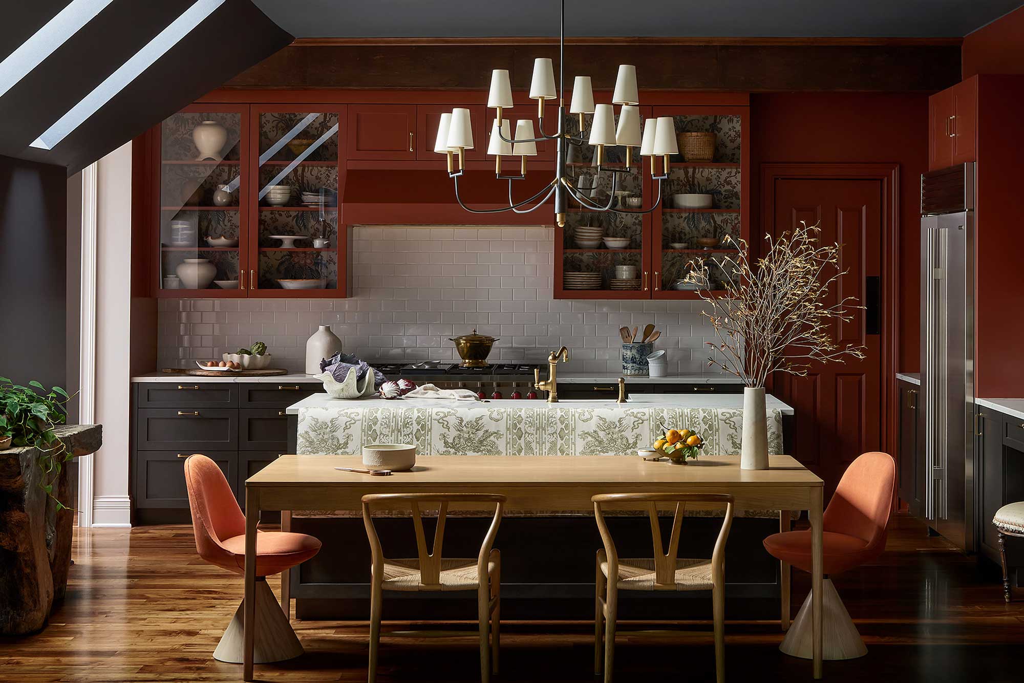
Susannah Holmberg, owner and creative director of Susannah Holmberg Studios, discovered a middle ground when asked by a couple to design their newly renovated historic carriage house in Buena Park, Chicago. ‘Her taste was maximal, with a preference for pattern on pattern, chinoiserie, and embracing the ceiling as a fifth wall, whereas he gravitated towards cleaner lines and simple, mid-century profiles,’ tells Susannah. ‘Our challenge was to combine the two styles in a layered, opulent design that remained fresh through clean, modern pieces,’ she says. ‘Ultimately, it was the marriage of the two styles that allowed me to create a sophisticated design.’
By plucking key elements from each aesthetic, Susannah created a middle ground that helped her solve several design conundrums. ‘The biggest challenge was the lack of natural light in the space. By embracing color and texture, we achieved a much cozier and richer experience,’ explains Susannah. ‘A minimal style would have felt too cold,’ but the intentional and functional selection of modern furniture prevents the design from becoming overly fussy or stuck in the past.
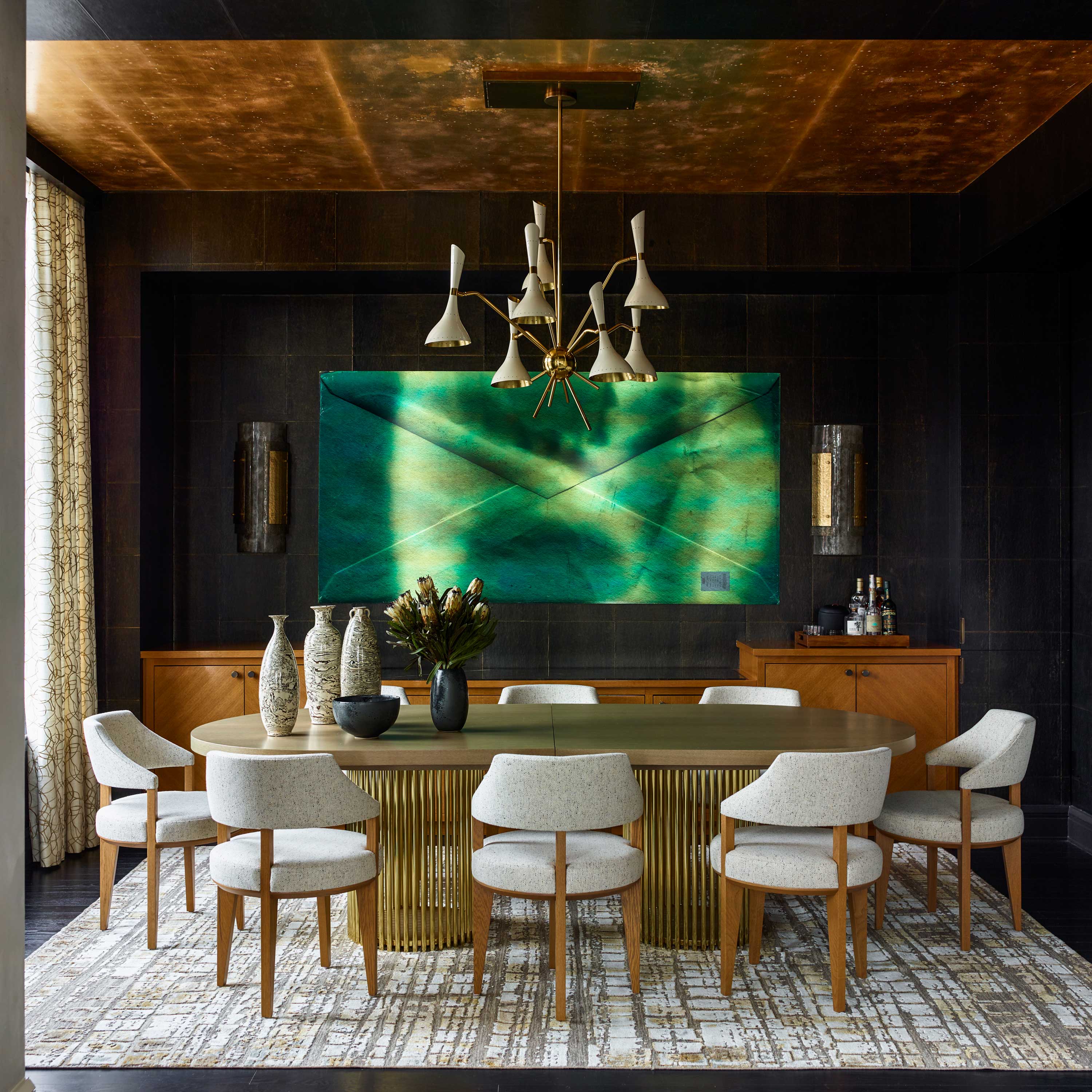
Gideon Mendelson, founder and creative director of Mendelson Group, took a different route to finding a middle ground. His interiors are subdued, refined, and elegant, with playful, unexpected bursts of Maximalism. ‘Bold spaces and design decisions make a house feel like your home - they make the space feel unique and personal,’ says Gideon. ‘I think it’s important to mix things up. When you move from one room to the next, and they share the same energy or vibe, it’s less interesting. I like the idea of leaving a relaxed-looking space and entering something with a little more drama.’
Gideon uses a unifying color palette to prevent the space from feeling disjointed and clumsy. ‘Each room has its own personality, but they dialogue with one another to keep things cohesive.’ He recommends being daring in spaces you don’t spend a huge amount of time in, like a downstairs loo, guest bedroom, or dining room that inspires lively conversation and debate. ‘This is where we tend to find the most success. For most people, this type of middle ground is digestible. A maximalist décor throughout the entire home, in my experience, isn’t timeless or comfortable to live in and doesn’t work for most people,’ he says.
Be The First To Know
The Livingetc newsletters are your inside source for what’s shaping interiors now - and what’s next. Discover trend forecasts, smart style ideas, and curated shopping inspiration that brings design to life. Subscribe today and stay ahead of the curve.

Sophie is a home interiors writer and all-around design aficionado. With a degree in History of Art and Spanish, she has a keen interest in the influence of art, history, and culture in design. Having lived in Buenos Aires for five years, Sophie is an experienced communicator in both English and Spanish with a professional background in public relations and marketing. Sophie is also an interior design student at KLC, paving the way to tell stories through interiors that inspire, serve and create experiences worth remembering. Sophie currently writes for Livingetc, Better Homes & Gardens, and Foter Magazine.
-
 Turns Out the Coolest New Café is Actually In Your Kitchen — Here's How to Steal the Style of TikTok's Latest Trend
Goodbye, over-priced lattes. Hello, home-brewed coffee with friends. TikTok's 'Home Cafe' trend brings stylish cafe culture into the comfort of your own home
By Devin Toolen Published
-
 5 Bathroom Layouts That Look Dated in 2025 — Plus the Alternatives Designers Use Instead for a More Contemporary Space
For a bathroom that feels in line with the times, avoid these layouts and be more intentional with the placement and positioning of your features and fixtures
By Lilith Hudson Published