5 Things to Avoid if You Want a Bedroom That Feels Minimalist, but Not Stark
There are minimalist bedroom mistakes to avoid if you want a styled and comforting space that is cloud-like and not cold, here is what designers recommend

The Livingetc newsletters are your inside source for what’s shaping interiors now - and what’s next. Discover trend forecasts, smart style ideas, and curated shopping inspiration that brings design to life. Subscribe today and stay ahead of the curve.
You are now subscribed
Your newsletter sign-up was successful
When you're working with the aesthetic where less is more means everything, it's hard to admit that we can take it too far. The bones of bedroom design are fundamentally cool, but that is not to say that they should feel cold – far from it. As curated as a minimal bedroom should be, it should still be the place you go to unwind and rest in.
From color choices, to decorative detail that could look a little different, we caught up with a handful of designers that know exactly what a minimalist bedroom mistake looks like. Thankfully, they know how to get around them too for a comforting minimalist bedroom. Here are the main culprits to avoid in your sleeping space for design-led yet welcoming quarters:
1. Neutrals that are all too cold
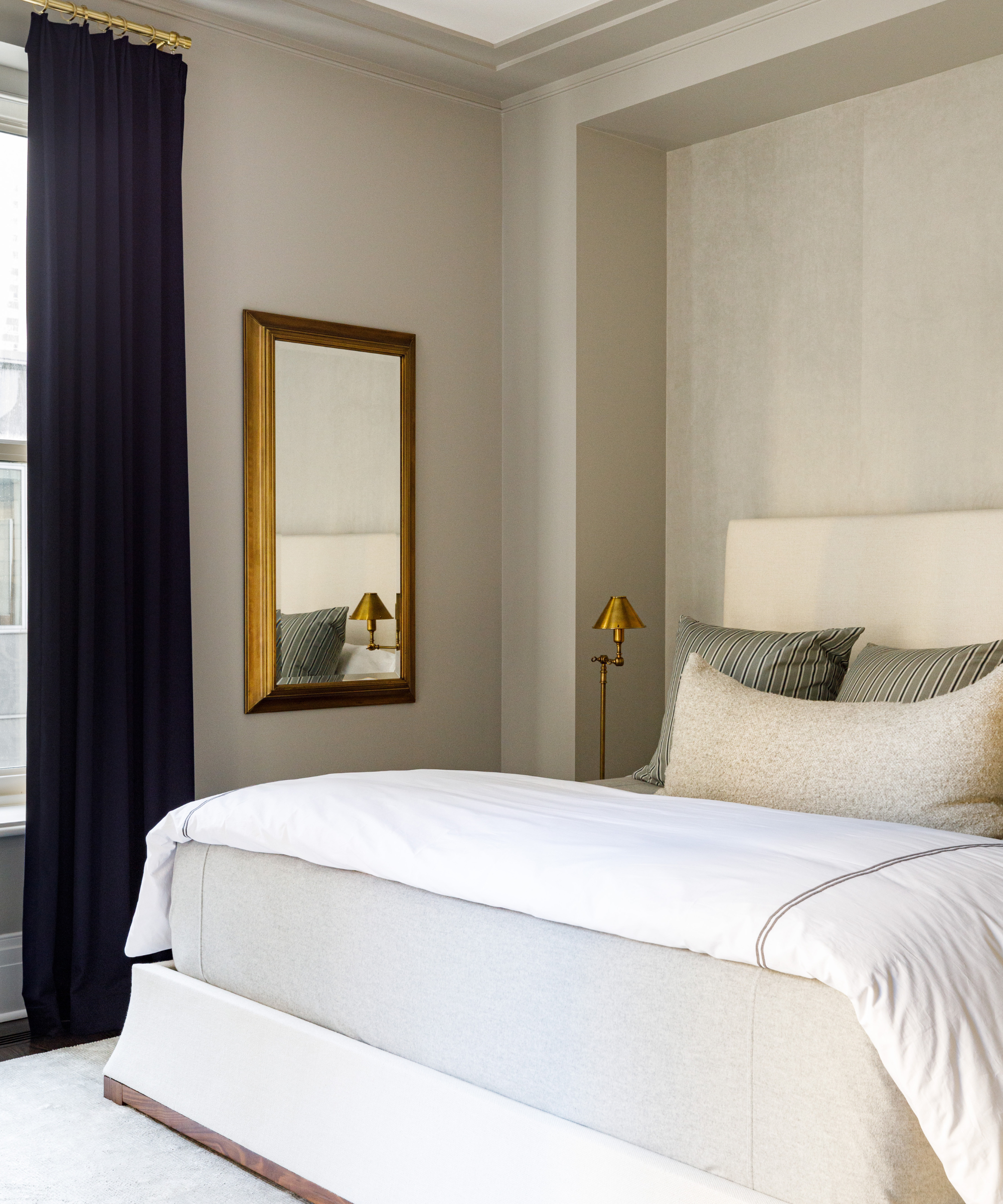
Design by: Kate Taylor Interiors Photo credit: Aimee Mazzenga
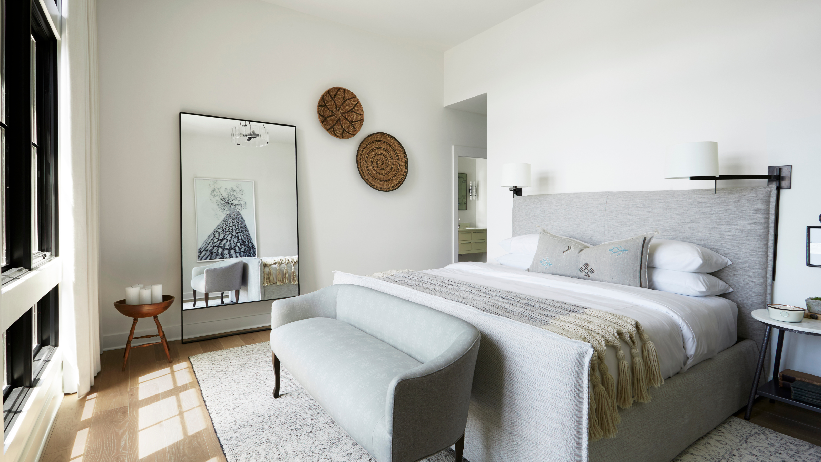
A minimal bedroom can often be associated with a white bedroom. This is fine, however, they tones shouldn't all be cool as this will come across as stark. Instead, choose ivories and warm them up with other neutral bedroom hues to make a minimal space still feel grounding. 'Just because a bedroom is minimalist doesn't mean it has to be cold and uninviting,' says interior designer Kate Taylor. 'We suggest warm neutral tones (not bright whites), layers of texture including cashmere, linen, warm woods and metals, as well as multiple light sources at different levels.'
Build on cozy tones by layering warm lighting like table lamps with sconces, as well as decroative ceiling pendants. The design detail will go a long way.
2. Not putting pigment on the moodboard
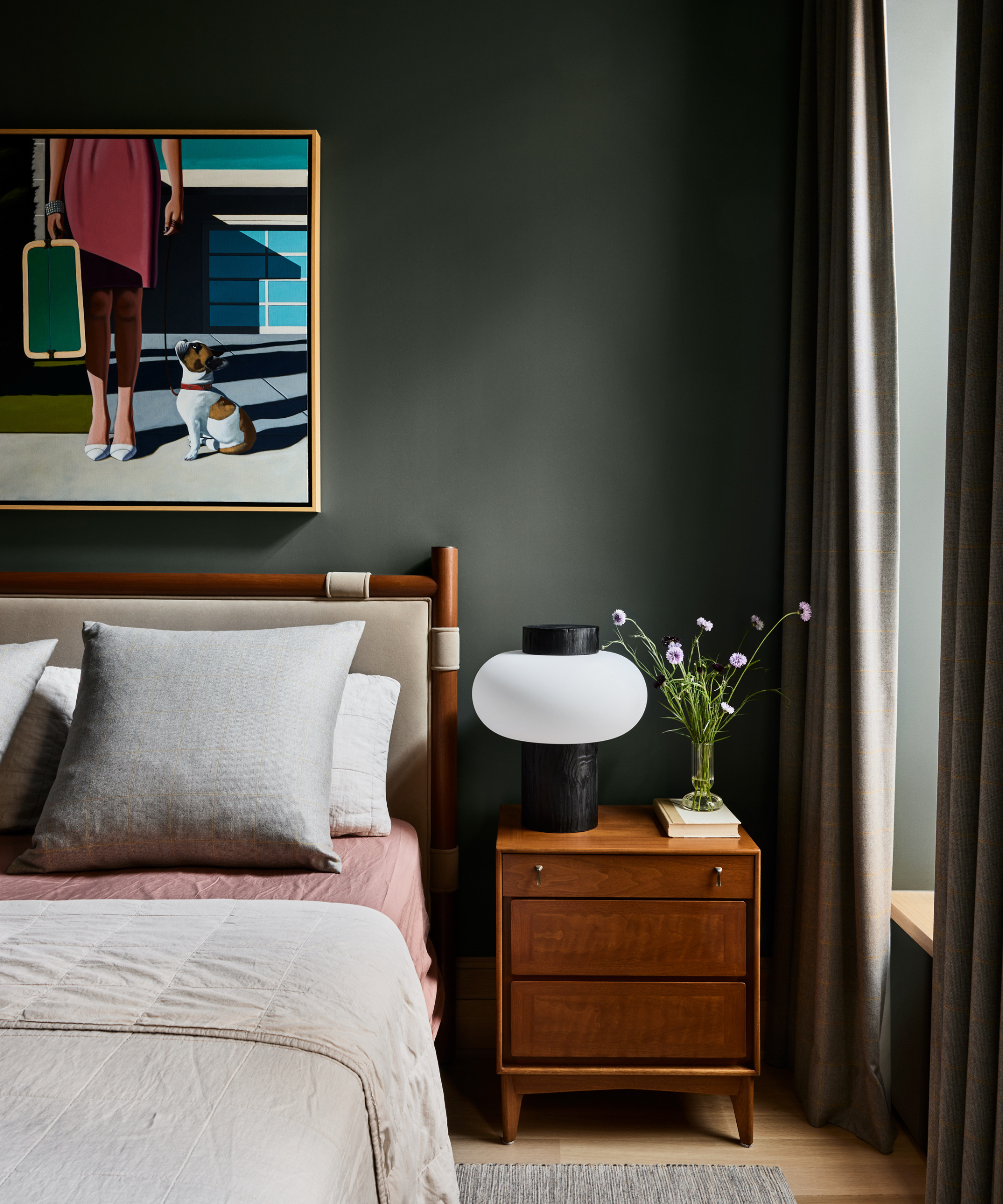
Design by: Kate Taylor Interiors Photo credit: Aimee Mazzenga
Speaking of design detail, color is not out of bounds in a minimal bedroom, but it needs to be used in the right way. A monotone scheme can be a good look, especially in a small bedroom that you want to feel cozy and comforting. Interior designer Cara Woodhouse told me about an all-navy bedroom design: 'It was dark and moody,' and even though you might not see a see a blue bedroom color scheme as particularly minimal, all over it actually brings a sense of calm, nodding to the theory of minimalism in interior design. Similarly, a green bedroom brings a sense of peace, which we can see in the space above by Kate Taylor Interiors.
Even a brighter hue in artwork or an accessory can be enough to bring warmth, without overwhelming the space. Consider bright upholstery or bedding to break a cold snap.
3. Ignoring texture altogether
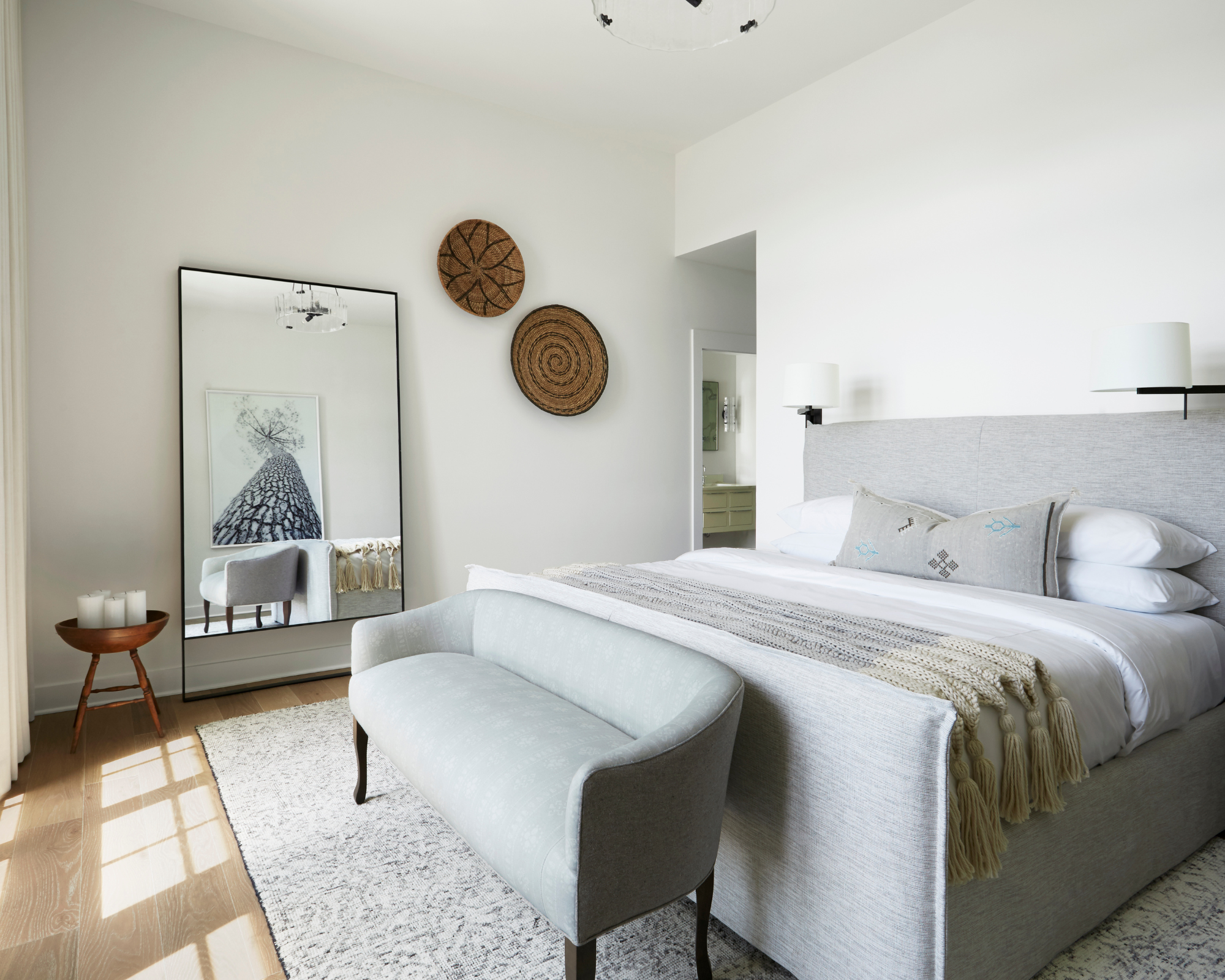
Design by Brad Ramsey Interiors / Photography by Zeke Ruelas McKeehan
Cozy and texture go hand in hand, even in minimalist bedrooms, which might surprise you. While an overload of mismatched and colorful throw pillows, high-pile rugs, and heavy drapes might not fit a minimal bedroom aesthetic, not including any texture at all could make the space feel cold and unappealing. You need to be clever with how you include texture. It is about being subtle and unique with your approach. Include throws that have that fringed edge, a rug that is a dream to step onto in the AM, or just a select few of the trendiest throw pillows to elevate sateen sheets.
The Livingetc newsletters are your inside source for what’s shaping interiors now - and what’s next. Discover trend forecasts, smart style ideas, and curated shopping inspiration that brings design to life. Subscribe today and stay ahead of the curve.
Cara Woodhouse reminds us to use every canvas available. Even artwork and your walls can be an opportunity to add depth and intrigue. 'Put a texture on the wall of some sort, whether it's a Venetian plaster or wallpaper that maybe has a texture,' shares Cara. 'Especially for something that when you want it to feel minimal, just so it doesn't feel sterile.'
4. The space isn't designed for decompressing in
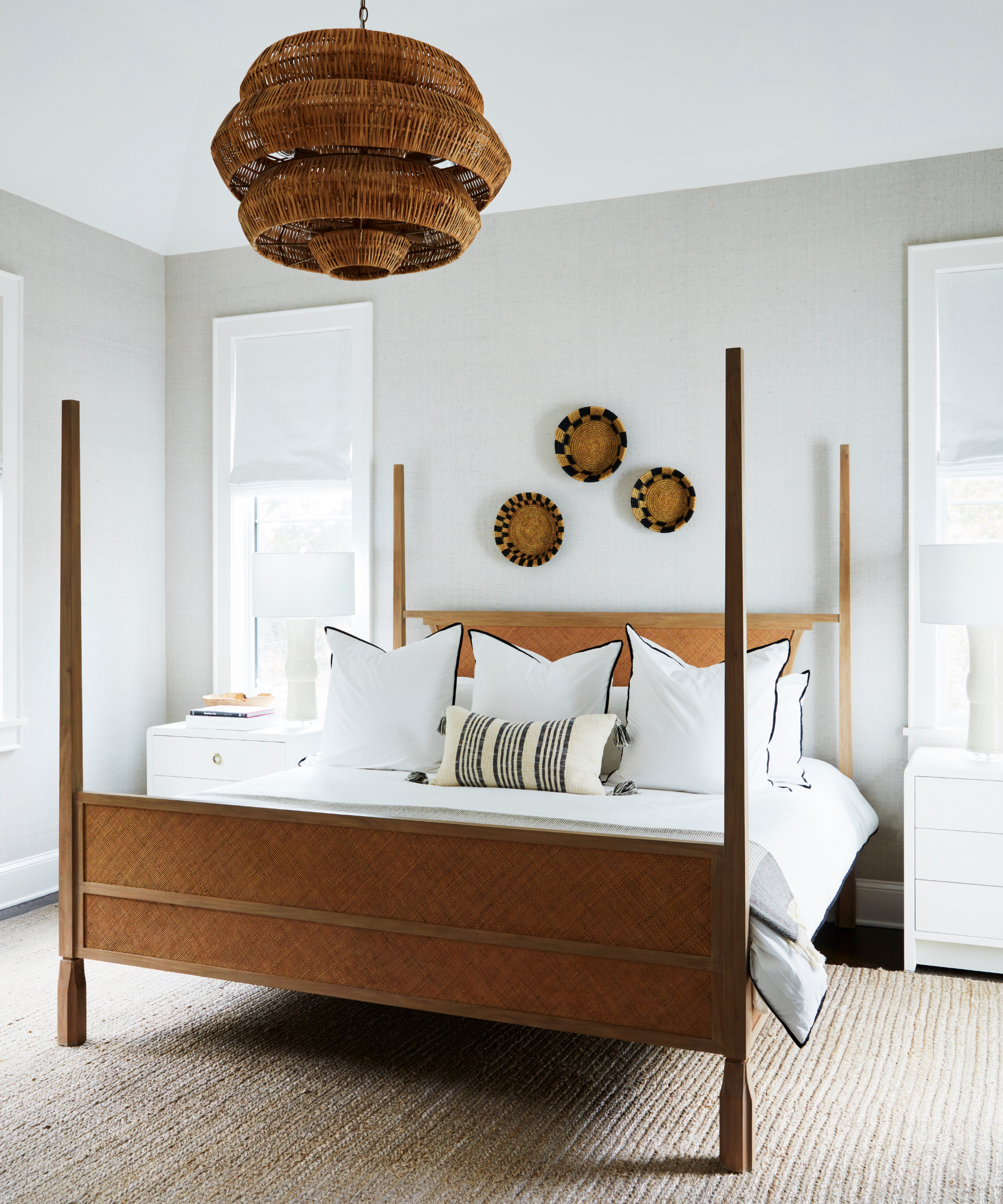
There is crossover in the design stages, of course, but the intent of the rooms remains unique. The bedroom as we know, is predominantly reserved for rest and recharge. Often, letting minimalism fuel the design more than the actual purpose and reason that you're redesigning the space in the first place can land you with lackluster results.
'A prime culprit of any austere or stark space is a lack of purpose,' says Barrett Oswald, Principal designer and founder of Barrett Oswald Designs. 'Every room should feel thoughtfully designed from its initial layout to the final stage of accessories.'
Cara agrees, telling me that bedrooms should always be designed as your space to decompress: 'You want to be in your sanctuary every night. That's where you spend half of your life.' Returning to the intent of your project through the design process will help keep basic and more particular design choices in check. From the color and style of a headboard, to the bulb in your bedside lamp (make it warm white, please.) So long as it is calming, you are on the right track. 'You want to feel like you're stepping into this ethereal-like cloud,' adds Cara.
5. It is too harsh in structure
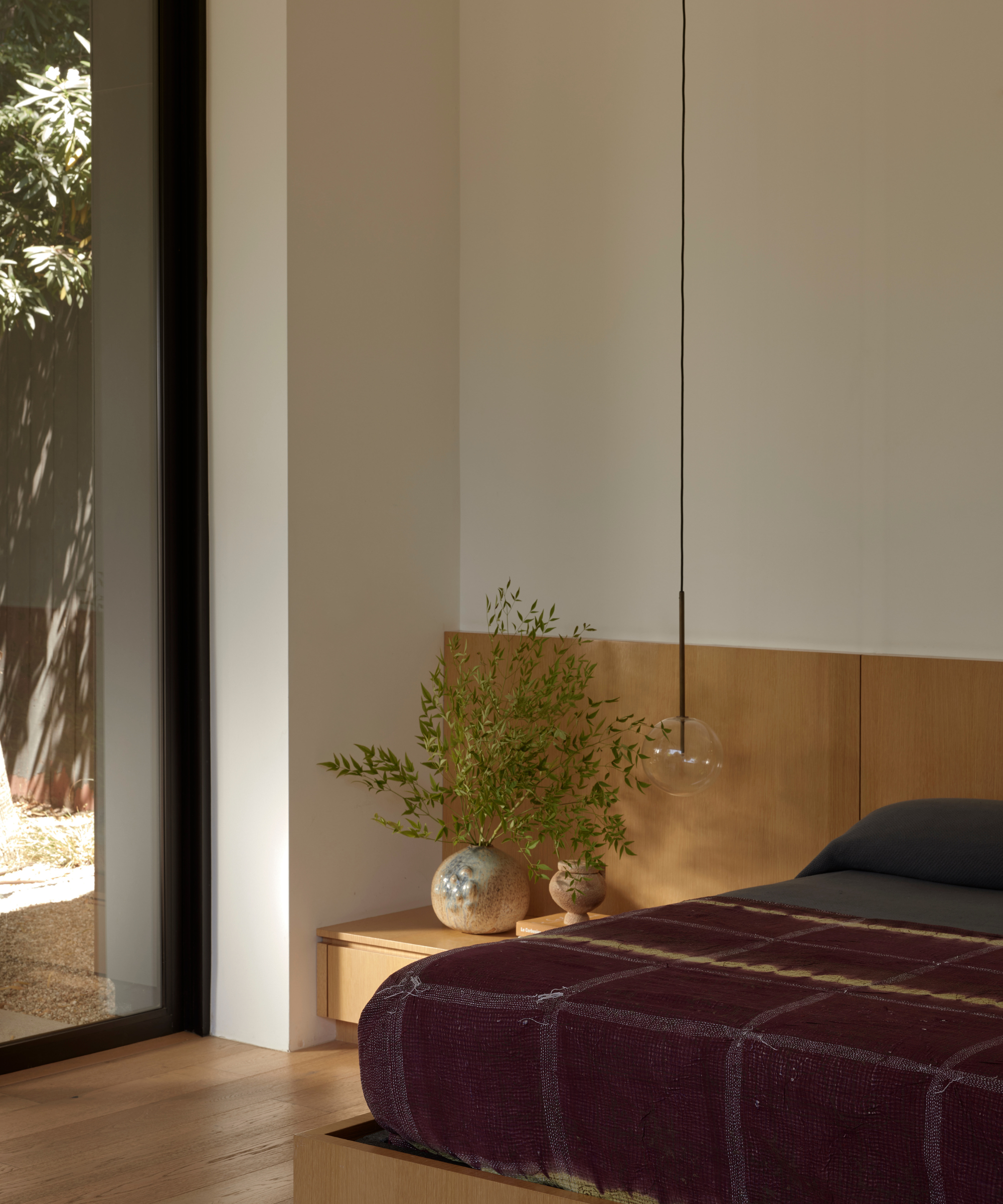
Strong lines are a prominent feature in classic minimalist design, but softer detail has been back on trend for a while now, especially in a bedroom that wants a relaxed vibe. 'When a minimalist bedroom is too structured, it can end up feeling unwelcoming,' says David Thompson, Principal and Founder of Assembledge+.
Curves and designs that nod to nature will help achieve a sound minimal yet comforting aesthetic. 'Introducing organic shapes and textures and layering these elements can create a space that feels like the cozy retreat you need at the end of a long day,' David says. Consider softening the scheme with houseplants, globe pendants, and rich hues in bedding.
How can I make my bedroom feel cozier?
'To create a cozy atmosphere, ensure a balance between simplicity and warmth, incorporate soft textures, comfortable bedding, and personalized elements reflective of your personality and interests,' says Lauren Lerner of Living with Lolo. Here are some key cozy items to keep a minimal bedroom inviting and interesting:
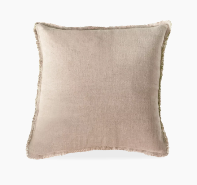
Price: $56.25 / $63.75
Was: $75 / $85
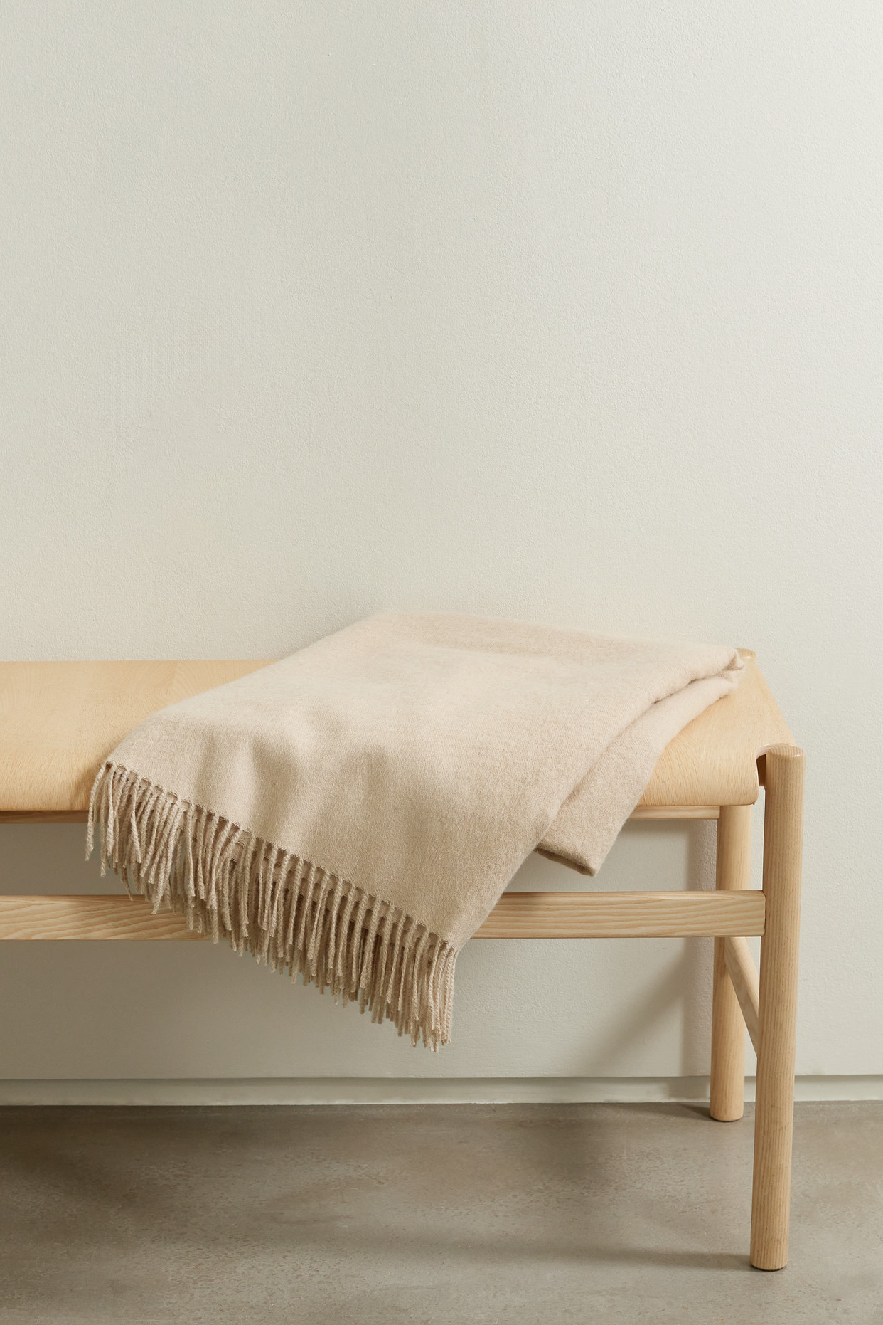
Price: $295
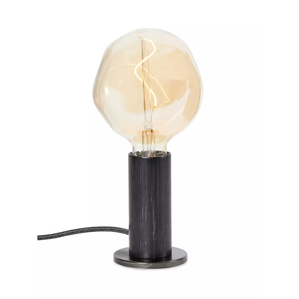
Price: $170

Camille is a freelance interiors writer and the former deputy editor of Real Homes where she covered a broad range of topics, including DIY, small space design, and gardens. She studied English language and Italian at the University of Manchester and it was during her year abroad studying in Bologna that she started documenting her adventures and observations in a blog. Camille has a passion for art and beautiful spaces. When not writing or refreshing her home, you will find her gallery hopping, taking photos, painting, and traveling to seek out interiors inspiration.