"I’m a Landscape Designer — These Are the Biggest Mistakes in Gardens I See People Making"
Landscape designer Katherine Aul Cervoni digs up all the worst mistakes she's seen time and time again

The Livingetc newsletters are your inside source for what’s shaping interiors now - and what’s next. Discover trend forecasts, smart style ideas, and curated shopping inspiration that brings design to life. Subscribe today and stay ahead of the curve.
You are now subscribed
Your newsletter sign-up was successful
What are the summer months without a beautiful garden to wile away the days in? Somewhere to sit back and sip a chilled glass of wine, or invite friends over for an early evening barbecue. Your garden holds the key to you living out your summertime fantasies. But, for those of us who were not lucky enough to be given the gift of green fingers, achieving this dream can often feel like an insurmountable task. How can you know what you need to do when you can't even figure out the garden mistakes you're making?
With over a decade of experience at her own landscape design firm, as well as a lifelong appreciation for the wonders of the natural world, Katherine Aul Cervoni is more than equipped to steer us in the right direction when it comes to landscaping ideas. Informed by both her formal education in landscape design at Columbia University, and a two-year stint in Japan, where she acquainted herself with Kyoto's moss gardens and delved deeper into the philosophy of wabi sabi, Kat has brought this expertise to backyards across the state of New York, transforming them with her holistic approach to landscape design.
Armed with Kat's advice, along with all the necessary gardening tools, we're finally ready to right our wrongs and reverse all our previous gardening mistakes.
Article continues belowKatherine "Kat" Aul Cervoni is the founder and principal of Staghorn as well as the blog, The Cultivation. Her passion for all things outdoor living is driven by her desire to help people reconnect to nature wherever they can. She believes that outside spaces should exist as natural extensions of the interiors, and brings this ethos to all her design projects
1. Planting Too Close for Comfort
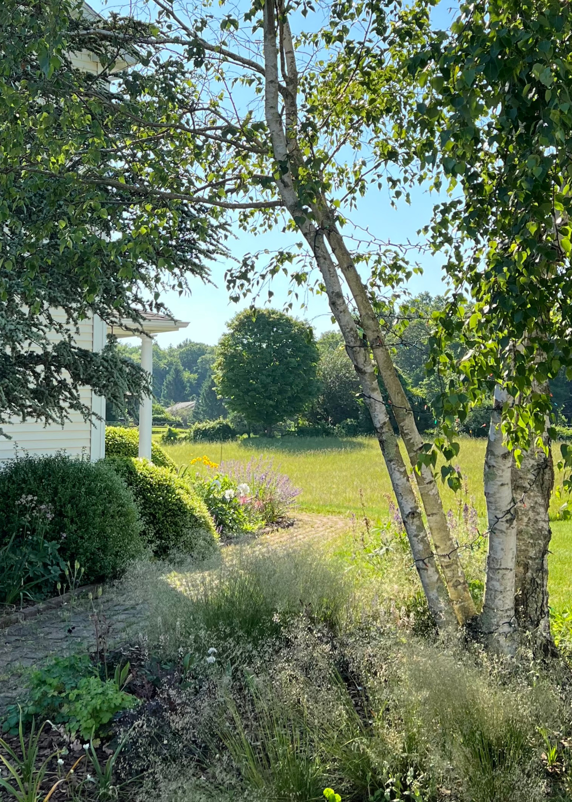
While some plants are safe to be planted directly next to your home, others can cause major issues.
So many of us fall for the same trap, set up by our short-term thinking minds. We may see a plant and immediately fall in love, your mind struck with an exact vision of how that petite spot of shrubbery would perfectly complement your home. However, skip forward 6 months, and that sweet, small flowering shrub is now a sprawling mess, taking over your backyard, one branch at a time.
While this can sometimes be no more than a minor inconvenience, it can also lead to serious structural issues.
As Kat says, "Planting large shrubs or trees too close to the house is an easy mistake when you purchase things when they’re small, but a big problem as the plant matures."
Once your plants have reached their full size, a whole variety of issues may arise. While the best trees to plant near your house may cause no problems, others can completely derail your home. Oversized trees may block views or even worsen the effects of any potential fires. Worse still, rapid root growth can destabilize the foundations of your home and pose a risk to your drainage system.
The Livingetc newsletters are your inside source for what’s shaping interiors now - and what’s next. Discover trend forecasts, smart style ideas, and curated shopping inspiration that brings design to life. Subscribe today and stay ahead of the curve.
To prevent this, Kat suggests, "Pay attention to how large plantings will get at maturity and plan accordingly." Spending some extra time researching each breed you intend to bring into your home and implementing adjustments based on their individual needs and specifications will help you build a more successful garden in the long run.
"The tags on the plants will provide this information - so if for example a small weeping tree is eventually going to reach a width of 15’, make sure you’re at least 10’ off the side of your house to account for the 7.5’ radius plus some extra clearance," Kat explains.
She continues, saying, "Same goes for shrubs in front of windows - if it’s eventually going to be an 8’ shrub, maybe that’s not the best choice unless you’re prepared to prune heavily each year or are ok with it blocking the view out the window."
Knowing what the future holds for your garden and adopting a long-term mindset will help you steer clear of any more gardening mistakes.
2. Not Finding the Flow
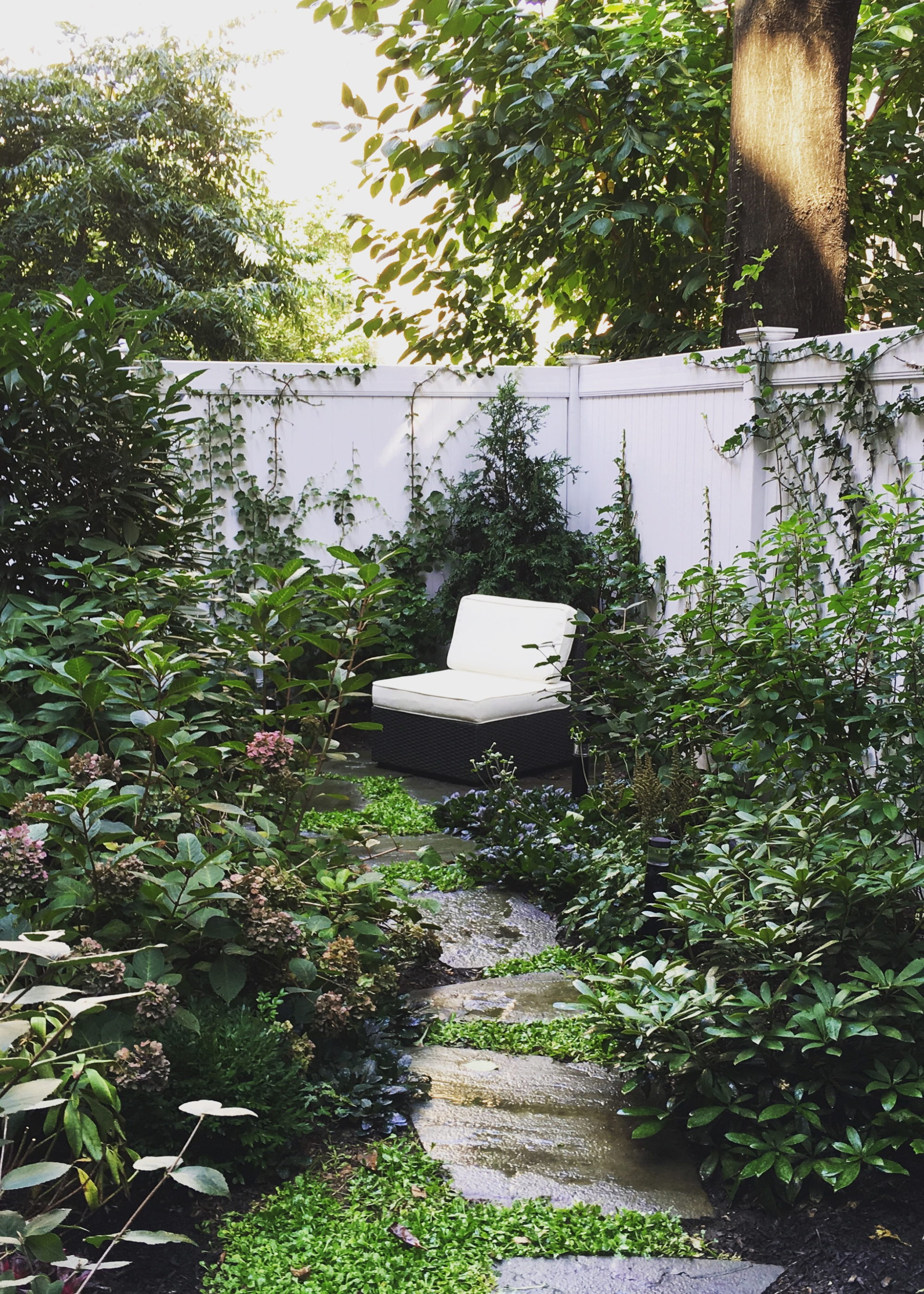
Different heights and textures in this garden makes it feel more interesting, while the constancy of color maintains a sense of flow.
Much like when decorating your home, some elements of continuity are crucial for creating a cohesive and beautiful garden, as opposed to the awkward, disjointed designs that many of us put up with.
This can feel much less intuitive in the outdoors than it does with interior design. Without a set design aesthetic to guide us, we're left to choose from various styles that appeal to us, with little consideration for how these plantings will look together. "Too many different planting choices without any repetition or rhythm throughout can end up looking a bit muddy and dissonant," comments Kat.
It can be tempting to cram all your favorite plants into one space, but despite how gorgeous they may look individually, they won't have the space to shine when grouped together.
For plants, go in with a plan, Kat urges.
While you may love maximalism in interior design, in the garden, sometimes simplicity is best. "Many gardens look fantastic with just 5-6 different plant types repeated in masses over and over throughout," she says.
However, she continues, "If you’re opting for more, make sure you consider repetition and rhythm in color and quantity. I like doing groupings of plants or swathes so that they have more of an impact."
Playing around with your design can help you determine the best groupings for your space.
"If you don’t currently have any groupings, try moving plants around — spring is a good time for moving/transplanting things, as long as they are right about to bloom — save moving those until after they’ve finished," Kat explains.
3. Seasonal Ignorance
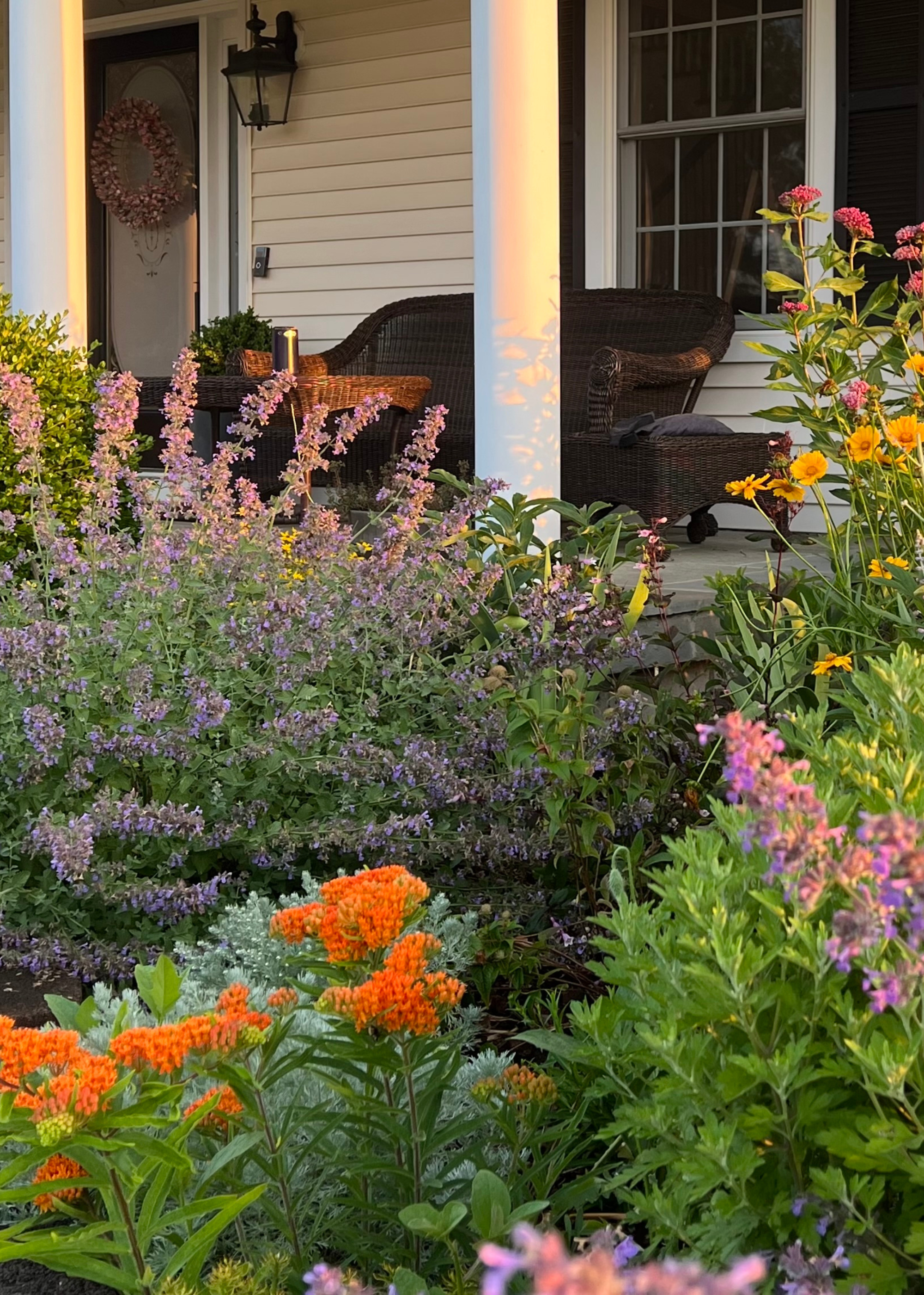
Combining spring flowers with evergreens will help your garden look beautiful year-round.
It's only natural to approach your garden design with the vision of a summertime sanctuary, after all, those are the months when you'll get the most use out of the space.
However, it's essential to remember that your garden is a year-round feature of your home and should be designed accordingly. Try looking out for plants that can withstand heat and cold for a low-maintenance all-season garden.
"Not planning for four seasons of interest and only focusing on spring or summer flowers is one of the most common mistakes," shares Kat.
There are so many ways to make your garden look beautiful throughout the year, while still saving space for those spring-time blooms that we all love.
Kat recommends, "Be sure to plant for successional planting so that there are blooms throughout the entire growing season, and don't forget something evergreen!"
4. Neglecting the Need for Respite
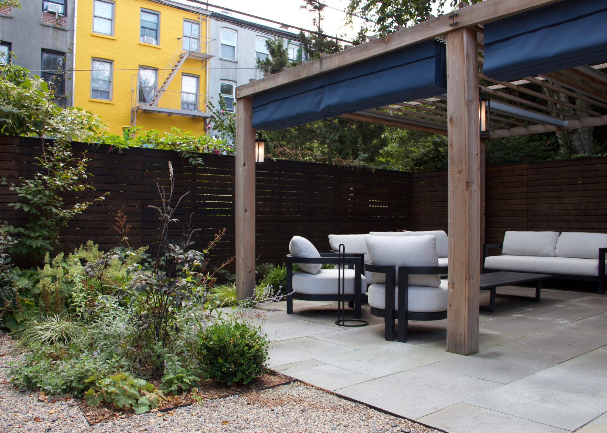
Comfortable seating helps maximize the amount of time spent outside.
As much as the plants and foliage should always be the star of the garden, this shouldn't mean every other feature gets kicked to the curb.
To properly enjoy your outdoor space, you need to provide places where you can sit, as opposed to filling the garden with so many plants that there's hardly any space for you to move through it.
"Not including an appealing destination within the space, such as a patio or some seating, or at least a garden path in which to go out and enjoy the garden, is a mistake you'll quickly regret," says Kat.
Remember, your garden should serve you, just as you serve it. The reason to go through the effort of creating a thoughtful, beautiful garden is so you can go outside and enjoy it. Make sure your design reflects this.
"Even putting a garden bench out into the garden can create a destination and help draw you out into the space to enjoy," Kat suggests.
Some stylish outdoor seating ideas can help elevate the entire feel of your garden.
5. A Lack of Layers
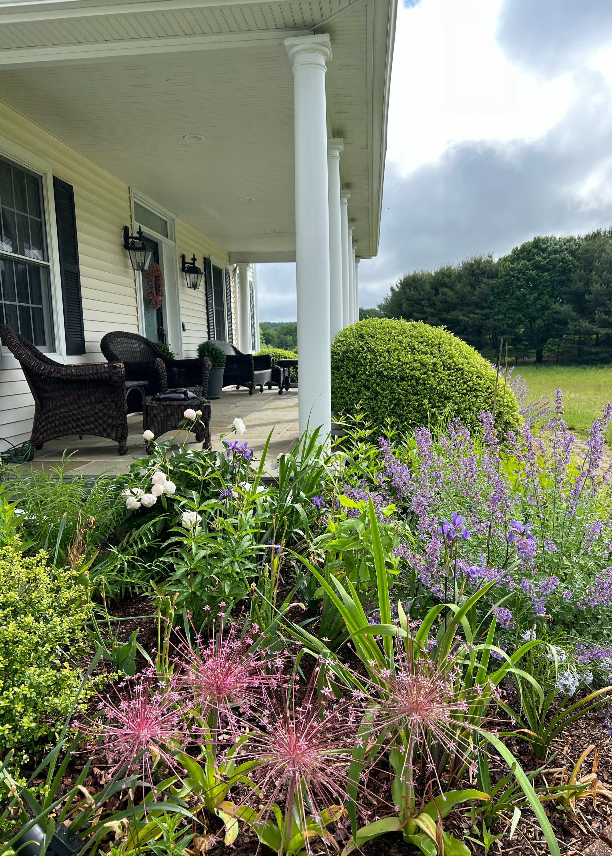
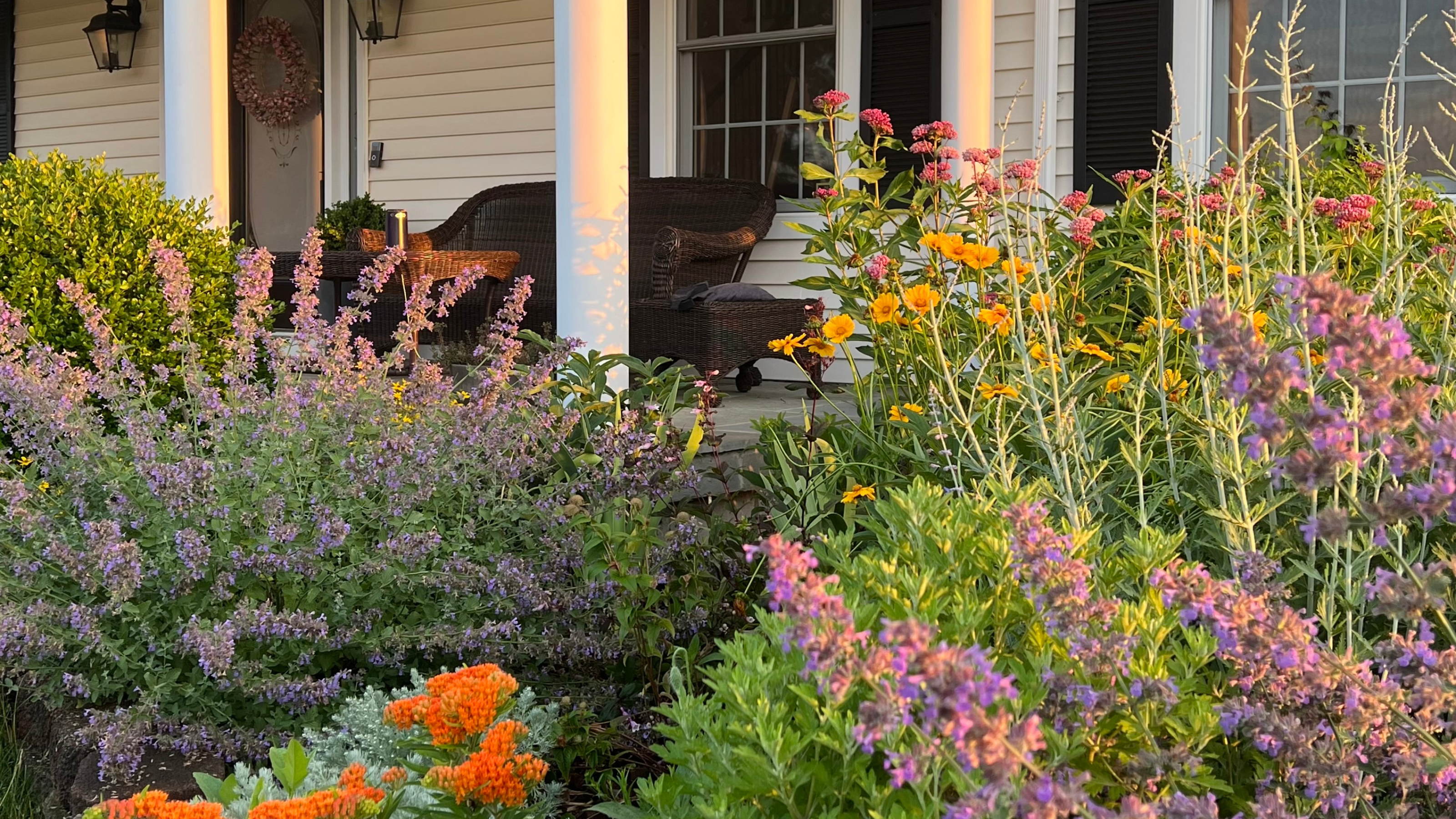
Bringing in some colorful blooms to your garden borders helps add life to your home.
"A lack of layers within a garden border can sometimes make a garden border feel flat and diminutive," notes Kat.
Adding dimension to your garden design will help create a more appealing, visually rich space. Although the border is there to create boundaries, that doesn't mean they have to be boring. Move beyond a purely functional view of these features and approach them as you would the rest of your home, considering how to combine textures and colors to create a more exciting look.
"I aim for at least two layers of plants if possible," says Kat, "Even in the smallest spaces, I would rather have 1 wider border than 2 narrow borders. Layers offer a MUCH more interesting and dynamic garden."
This sense of layering can be applied throughout your garden. Steering away from a one-dimensional look will always help bring more intrigue to your space.
"Plants - especially perennials - that are almost all the same height can feel very flat and boring," Kat says.
Instead, combine visually contrasting plants by layering smaller shrubs with more dramatic, tall ones, and pairing rich greens with vibrant floral tones.
Even in small gardens, where you may feel you don't have adequate space to build several layers in your borders, there are other ideas you can bring in to create dimension. "Other easy ideas include adding stepping stones or pavers along the edge of a border or as a pathway through a garden," says Kat, "For small spaces with narrow borders on the outsides, try adding some curves or undulations to the border to make it feel more dynamic and able to accommodate more layers or plants. Don’t be afraid to sacrifice a bit more of that lawn. Trust me, you’ll enjoy the flowers much more than the grass!"
"Take the time to plan ahead for the space and the plantings. Going in with a plan will ensure that it’s a much more enjoyable and intentional-looking space rather than a random collection of plants," Kat explains.
Adopting this mindset of intentionality when designing your home is the first step in creating a garden you feel proud of. The next step? Making sure you've got the right hosting setup, so everyone else can enjoy it as much as you. That means beautiful garden furniture, a new outdoor barbecue, maybe even adding a water garden.

Maya Glantz is a Design Writer at Livingetc, covering all things bathrooms and kitchens. Her background in Art History informed her love of the aesthetic world, and she believes in the importance of finding beauty in the everyday. She recently graduated from City University with a Masters Degree in Magazine Journalism, during which she gained experience writing for various publications, including the Evening Standard. A lover of mid-century style, she can be found endlessly adding to her dream home Pinterest board.
