Should you mix tile colors in a bathroom? Designers weigh in on how to make this bold look work
Opting for colorful bathroom tiles doesn’t mean you’re limited to just one shade – here’s how to make multiple colors work in your space

If you're thinking of adding color to your bathroom, chances are you're already a confident decorator – most people prefer to go neutral in what's often the smallest room in the house. But what if we told you the boldest way to finish your bathroom now is to mix up your tile colors?
Tiles are, of course, a great way to invite creativity into your bathroom if you're not keen on paint – you can control the amount of color, limiting it to a shower cubicle, backsplash or storage nook. It follows, then, that mixing up your tile colors is the modern bathroom idea that will lead you to a bolder, more dynamic space.
If you're picturing some sort of multicolored horror, fear not: the designers pulling off this look are keeping things chic – and we've got some great tips from them on exactly how to do this look well.

Ellen is Livingetc's print editor and an experienced interiors journalist. She spoke to interiors designers for this piece to find out how exactly to nail the mixed-color tile trend for bathrooms – and share the very best ideas to inspire your own space.
Should you mix tile colors in a bathroom?
As far as bathroom tile ideas go, there's no reason to shy away from mixing colors: in fact, it's a great shortcut to adding layers to your scheme. ‘Just like you would mix a patterned piece of upholstery with a coordinating color in a living space, you can mix tiles in your bathroom in a similar way to give depth to your design,’ says Susan Klimala, principal interior designer and owner of TKS Design Group. ‘Keep in mind that a bathroom is typically a smaller space so a little bit goes a long way. Design is all about scale, so if you are choosing a tiny hexagon pattern on your floor, you will want to keep the wall tile in a coordinating color but also of a different shape and size – otherwise it will likely read as too “busy”.’
A bathroom's smaller footprint can even lend itself to this look. ‘My favorite thing about designing bathrooms is that they are self-contained spaces within a home, which means that they are great places to go bold and take risks with your design choices,’ says Kirsten Blazek, founder of interior design studio A1000XBetter. ‘In particular, I like mixed colored floor tiles, which provide a nice anchoring point of interest as soon as you walk into the space.’
How to mix different colorful bathroom tiles

While Kirsten Blazek believes bathrooms can be a great place to go bold as a great small bathroom tile idea, she advises considering the rest of your home's scheme before you commit. 'I still like to make sure there is some color cohesion,' she says. ‘For example, if you have an earth-toned color palette throughout your home then it would feel out of alignment to walk into a bathroom with tiles in primary colors.’
The key to nailing your color choice, of course, is to get all the samples you can find. 'There are many shades of every color and making sure the saturations of these colors work well together is key,' adds Kirsten. 'Yellow and pink can look lovely together, but a pastel pink and an ochre, for example, probably won't because they are saturated so differently.'
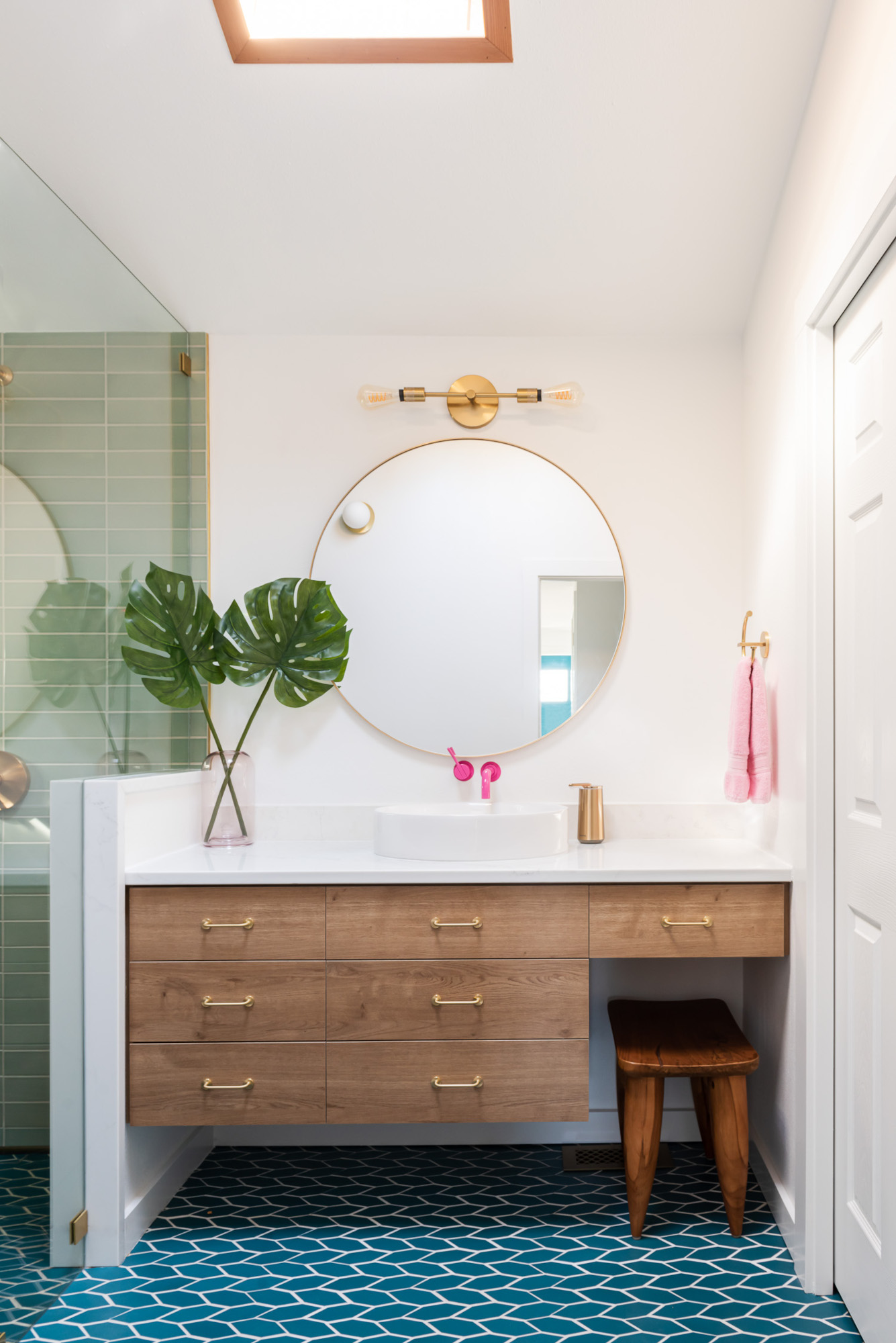
Kirsten advises choosing two or three colors at the most to avoid the scheme feeling too busy – something Cassie Fox, architect at Atelier Drome, put into practise when designing the bathroom above. 'After getting to know the client and her creative, outgoing personality we knew we could push the colors in the bathroom and some other elements around her house,' she says. 'She knew she wanted pink and was really drawn to the deep teal tile, so we got to play with what color could bridge the two. The seafoam felt like a calming addition but was still unique with the broad variation in the tile coloring.'
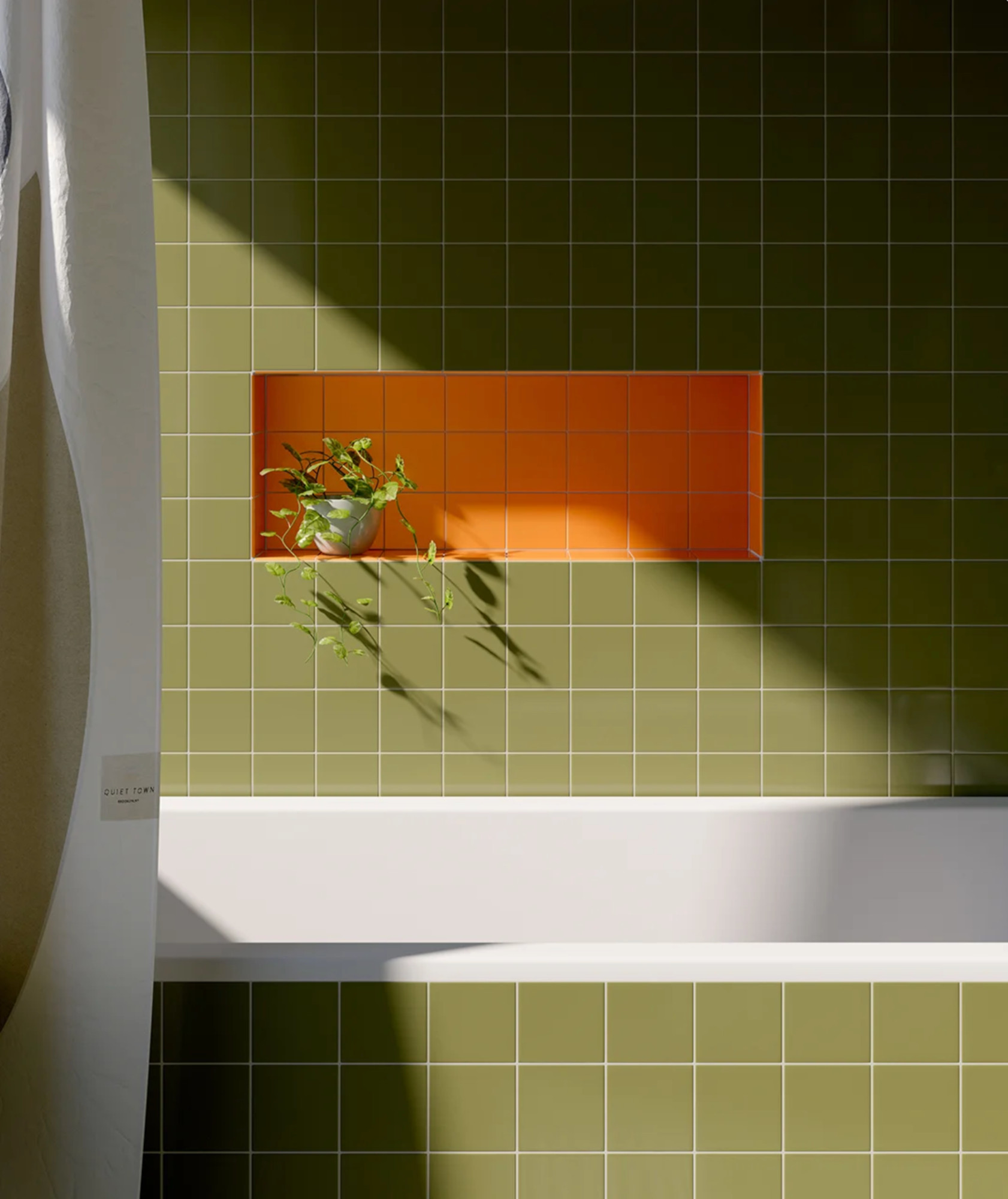
How you choose to bring color through in your tiles depends on how bold you want to go. Many designers opt for contrasting wall and floor tiles, like in Atelier Drome's project – but you can also use multiple colored tiles to accentuate an architectural feature, like the storage shelf designed by bathroom accessories brand Quiet Town for Block Renovation above.
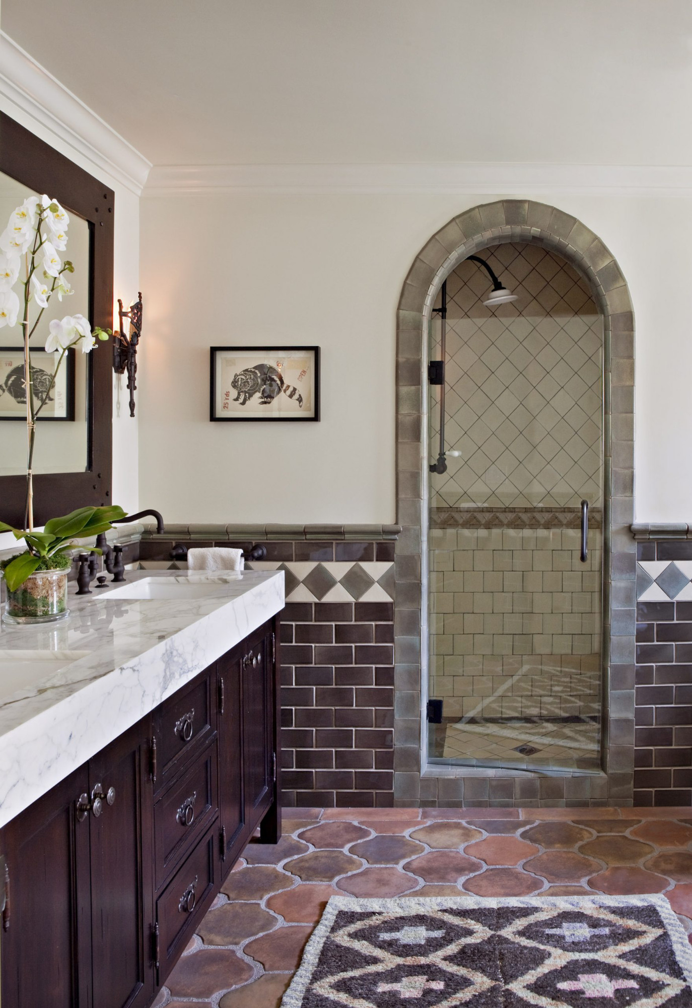
Brown Design Group used different purple-toned tiles in their Orange Street project (pictured further up the page), creating a tiled frame around an arched shower door that stands out from the dado-height wall tiles. Terracotta bathroom floor tiles complete the look, and the overall scheme has a calming tonal quality that feels dynamic and sophisticated.
‘I love mixing colors in tiles to create a pattern,’ says Leslie Murchie Cascino of Bonni Wu Design. ‘My favorite is a beachy stripe because there are endless possibilities. You can use two, three or four colors and it can be lively or a sophisticated pinstripe. Just make sure that the pattern you're creating is the appropriate scale for the surface area you're covering. If you can't get any more than three repeats, then the effect will be lost. So keep in mind both tile size and pattern repeat size.’
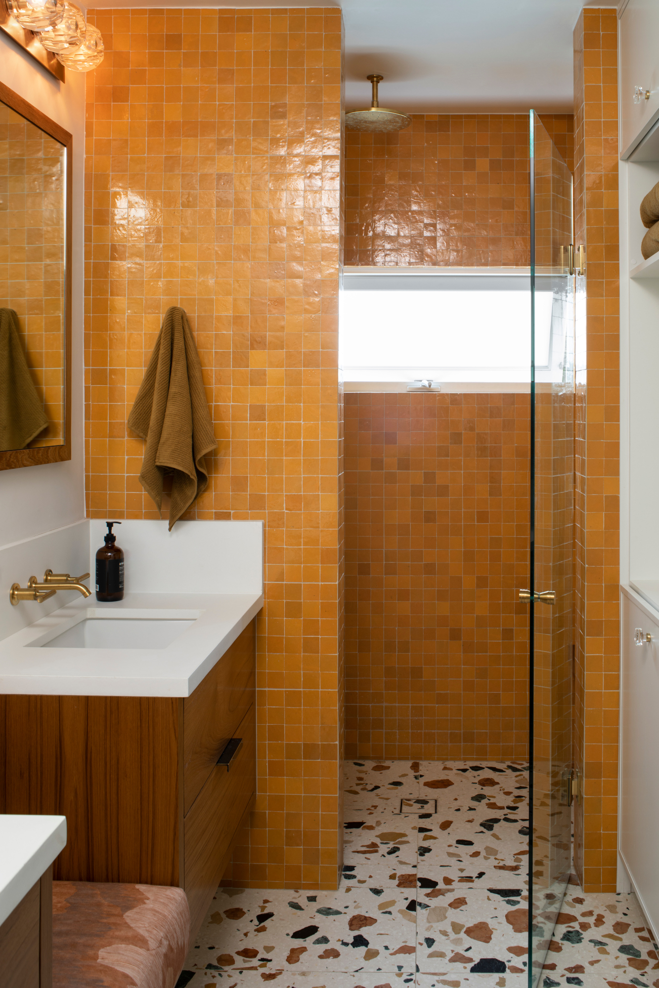
For those less confident in their use of color, consider terrazzo: the colors within the tile can help define your scheme and make the introduction of other shades less scary. ‘Terrazzo inherently has a variety of tones,’ says Karen Harautuneian, founder of Hub of the House Studio, who designed the colorful bathroom above. ‘I favor terrazzo that balances warm and cool tones. This allows me to easily steer the room's palette in either a warm or a cool direction by layering the room with complimentary toned tiles.’
Which colors work best together in a bathroom?
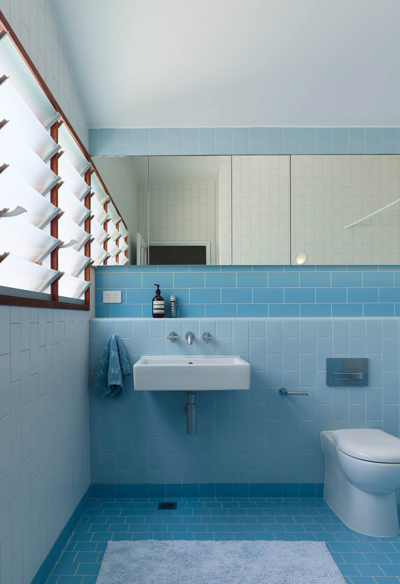
‘Since tile is a somewhat permanent material, a bit of conservatism is not a bad thing for a bathroom,’ says Susan Klimala. ‘Tile colors that are more lasting and not so trendy will likely serve you well over time. Shades of green and blue, metallics, creams and whites are timeless. That said, edgy color combinations like burgundy and mint green can work if that’s your jam, but try to avoid super trendy tiles in loud colors unless you are prepared to swap them out or live with a dated look for a bit.’
Many of the designers we spoke to recommended blues and greens, thanks to their restful qualities – and Australian architectural studio Arcke chose to highlight the former with their two-tone design above. ‘We prefer cool blues and greens in our bathrooms to bring a sense of calm and serenity,' says Kate Kennedy. 'In this project we’ve paired blue bathrooms with timbers and other natural materials to provide cohesion throughout.’
‘We love using really earthy tones to give a bathroom that quintessential spa-like feel,’ says Samantha Struck of StruckSured Interiors. ‘You can’t go wrong with color combinations found in nature – they’re grounding and restful. I don’t tend to design a lot with reds or oranges: from a Feng Shui perspective, they are hot and evoke anger. We really want to avoid that in a bathroom where we are trying to achieve peace and serenity.’
Ultimately, the colors you choose are personal, and as long as you try samples together, as Kirsten Blazek advised, you can't go too far wrong. ‘Every home is different and every bathroom deserves its own personality, but my favorite color combinations are olive green and rust colors,’ Kirsten says. ‘Depending on the tones in the particular tiles, this combination can work well in Spanish, ranch, craftsman and midcentury-style homes.’
Should you mix pattern and color?
Of course, the more colors you use, the busier your bathroom will be – so the idea of introducing pattern into the mix is a tricky one. ‘We all find rest with very different sets of color and pattern,’ says Samantha Struck. ‘That being said, I would stick with either pattern or color and not try to play with both those at the same time unless you know that you will love it beyond a short term lifecycle.’
‘Like in any space, the interplay of pattern, color and scale needs to be thoughtful and intentional,’ says Susan Klimala. ‘If you’re going for a more playful or whimsical space – like a tropical paradise, for example – then having fun with multiple colors and themed patterns will work well. If your aim is for a “spa” feel, then limit yourself to subtle changes in color and texture so that the space doesn’t feel too jarring.’
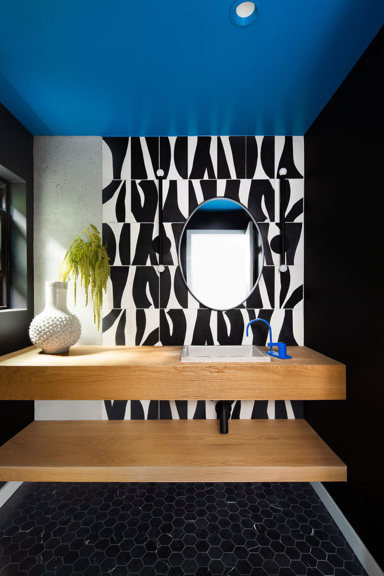
However, pattern can still play a positive role if you use it in balance. In the bathroom above, by Seattle-based designer Allison Lind, the black and white patterned wall tiles sit comfortably with grey concrete and black floor tiles. ‘The goal for this space was to be bold and illicit a “wow” when guests enter,’ says Allison. ‘We opted for a mix of materials and styles – the organic (concrete accent wall and wood) with the high-contrast contemporary (Popham tiles) and the classic (marble hex), but kept a monochromatic palette among the walls/floors so that the playful mix wouldn’t feel quite as overpowering. That’s what the blue faucet and ceiling detail were for, after all.’
How can texture and shape help with mixing colored tiles?
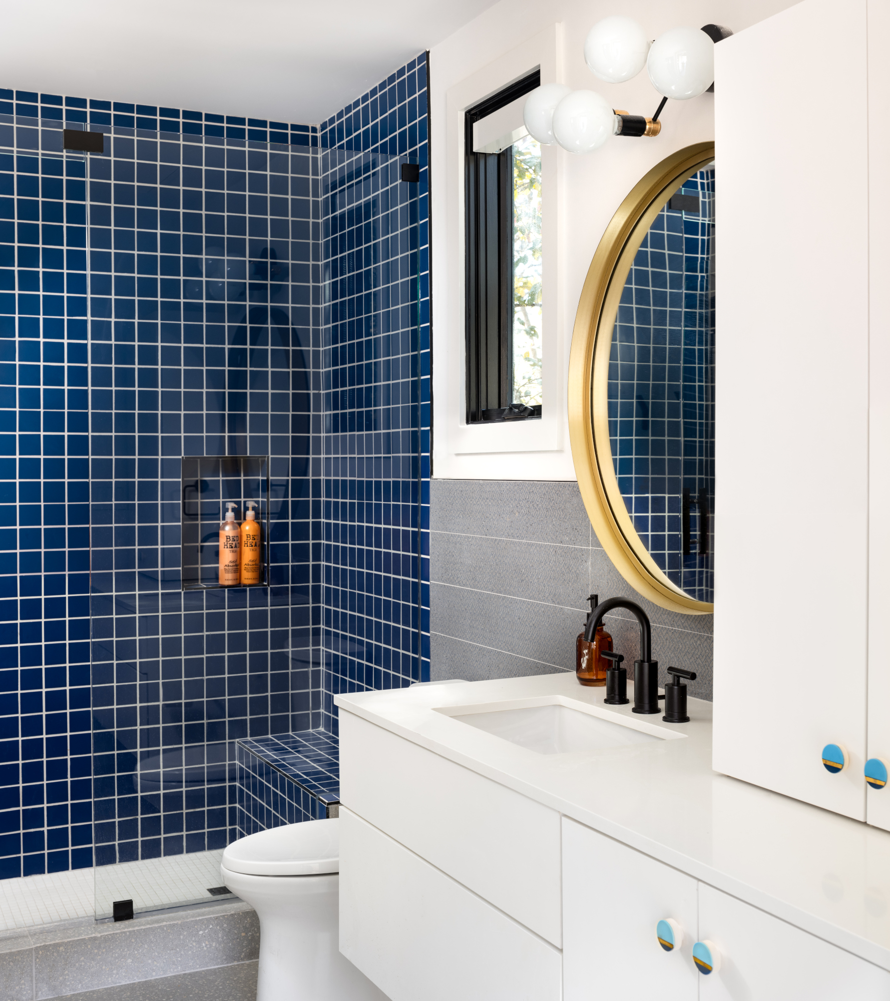
Thanks to the versatile nature of tiles, they're often a subtler way of mixing colors compared to paint. In this scheme by Maestri Studio, small-format, glossy blue tiles in the shower nook contrast with larger, textured grey tiles around the sink and on the floor.
Varying the texture and shape of tiles works particularly well in a more subtle scheme, as Kirsten Blazek explains. ‘If you are selecting two tiles that are tonally similar in color, then another great way to add interest and dimension is to select either different shaped tiles or have one tile that has more texture than the other,’ she says. ‘Always be cognizant of not adding too much, especially since bathrooms are typically smaller spaces. Every room should have moments where the eye can settle and not be overwhelmed by too much busyness.’
Be The First To Know
The Livingetc newsletters are your inside source for what’s shaping interiors now - and what’s next. Discover trend forecasts, smart style ideas, and curated shopping inspiration that brings design to life. Subscribe today and stay ahead of the curve.

Ellen is deputy editor of Livingetc magazine. She works with our fabulous art and production teams to publish the monthly print title, which features the most inspiring homes around the globe, interviews with leading designers, reporting on the hottest trends, and shopping edits of the best new pieces to refresh your space. Before Livingetc she was deputy editor at Real Homes, and has also written for titles including Homes & Gardens and Gardeningetc. Being surrounded by so much inspiration makes it tricky to decide what to do first in her own flat – a pretty nice problem to have, really. In her spare time, Ellen can be found pottering around in her balcony garden, reading her way through her overstacked bookshelf or planning her next holiday.
-
 My 10 Favorite Designs at Milan Design Week 2025 — Out of the Hundreds of Pieces I Saw
There is a new elegance, color, and shape being shown in Milan this week, and these are the pieces that caught my eye
By Pip Rich
-
 Iridescence Is Chrome’s More Playful, Hard-to-Define Cousin — And You're About to See It Everywhere
This kinetic finish signals a broader shift toward surfaces that move, shimmer, and surprise. Here's where to find it now
By Julia Demer