

The long history behind the color blue means, these days, it is synonymous with many things — royalty, divinity, authority, melancholy — but more generally speaking, there is a unanimous feeling towards this primary hue: it's a favorite.
Be it clear skies on a summer's day, velvety shorelines, or play, blue in all its different shades is one of the most powerful and most evocative colors. And there's no sugar coating the fact that, hidden amongst its many associations, comes a quiet 'wealth' aesthetic.
But which shade of blue is the most expensive-looking when it comes to our homes? Should you decorate with navy blue, indigo, cobalt, or Prussian? I took a look back at its history, speaking with art, design, and color experts to find out. Here's what I learned.
The Prestige of Blue Throughout History

The history of blue explains why certain shades have connotations with wealth, authority, and even divinity.
There are many colors that can make a house look expensive, and blue is certainly one of them. Though it might surprise you to learn that blue was not always so popular, and certainly wasn't as commonly used or understood as it is in interior design trends today. It owes its popular status to centuries of social and cultural evolutions, discoveries, and many feuds (as you’d expect in any good history story). In the Palaeolithic period, blue simply did not feature, (nor did green or white). The color wheel as we know it today looked very different, cave paintings were made up of reds, blacks, browns, and ochres, Michel Pastoureau, a French professor, explains in his book, Blue: The History of a Color (available on Amazon). The Romans thought blue was barbaric, and the Greeks were also fairly unimpressed by it. In fact, in Medieval times, blue was considered a warm color, with bodies of water depicted in green up until the fifteenth century.
Fast forward and dyeing began, using woad and later indigo, as did painting in blue — the latter which came at quite a cost before synthetic pigments to interpret semi-precious stone "Lapis lazuli" were concocted. It was only in the twelfth century that the color blue started to bloom in society, taking on symbolic value. The Renaissance period was adorned with blue, spotted in frescoes, depicting only the most grand elements like the Virgin Mary's robes, explains color expert Kassia St Clair in her book, The Secret Lives of Colours (available on Amazon). Notable royal figures like the King of France gave azure blue pride of place on his coat of arms, a canvas for yellow fleur de lis. The west followed suit, and suddenly, blue gained noble status.
"The Ancient Egyptians first brought popularity using Blue stones in jewels and introducing it into make-up," explains Paula Taylor, stylist and color expert at Graham & Brown. "Skip to the Renaissance period and ultramarine blues became popular with artists, as supply was limited and it was less accessible. Deep blues really took off during the industrial revolution when pigments became more accessible, firstly used in textile products and then home trends swiftly following."
From indigo, that dates back to 2400 BC when it was used in ancient Egypt for dying mummy cloths and dressing Tutankhamun, to brighter, factitious Prussian blue, concocted in the early eighteenth century, decorating with blue has always been somewhere in our midst, but that begs an interesting question...
Which Shade of Blue Looks the Most Expensive?

A bright dining room with layers of warm blues in the rug and accent ceiling.
To quote Michel Pastoureau, “For a color to be considered beautiful, and thus expensive and valuable, it must be luminous and lush.” And this stands today with interior designers agreeing that the most expensive-looking blues are those that are the rich, pigmented, and bold in their stance: namely navy blue.
“Blue has earned its revered status through its deep, timeless presence across history, constantly shifting, refracting, and deepening in meaning," interior designer Mary Lambrakos tells me. "From its origins as the first artificial pigment, Egyptian blue, created around 2,200 B.C., to its evolution through indigo, Prussian blue, and ultramarine, each iteration has opened new realms of expression. Artists have long been drawn to its depths, from Picasso’s Blue Period to Yves Klein’s iconic Klein Blue, creating an almost spiritual connection to the color.”
With design notes (and a dash of history for good measure), below, I've broken down some of the most expensive-looking shades of blue to decorate with in your home.
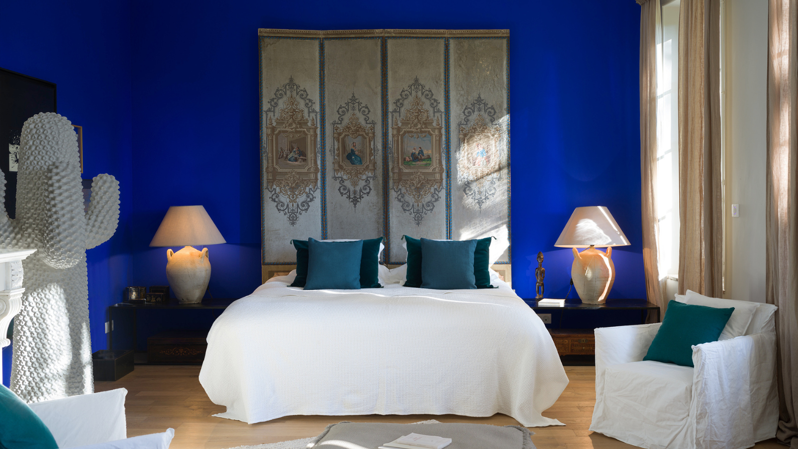
1. Navy Blue

Part of Lucinda Loya Interiors' Bluebonnet project, this elegant kitchen features deep painted cabinets in Inkwell by Sherwin Williams which gives a dark navy blue.
Many colors go with navy blue — it is rich and pigmented, and generally considered to be the most sophisticated and wealthy-looking shade. Hailey Widrig, founder of Art Partners Advisory, agrees, adding, "I think we are still in this period of 'old money aesthetic', quiet luxury, minimalism; this whole trend, which is very modest."
And interior designers applaud the deep shade's elegance and sense of timelessness, too. "Navy blue is a classic that never goes out of style and always feels elevated, whether it’s in fashion or interiors," says interior designer, Lauren Lerner of Living with Lolo. Navy interiors serve a regal atmosphere. It's an unfussy, reliable color, too; one you can't often go wrong with. "It's a shade of blue that became a stand-in for black," adds Hailey, noting how in European culture, black is considered the most modest color.
This speaks to its roots and rise to popularity, too. Black was the color of the moment in the nineteenth century, but as Michel Pastoureau tells us, this soon evolved and by the 1920s, navy blue was the fashion. Navy blue suits, uniforms, and not forgetting the pivotal moment when Levi's "blue jeans" (dyed using indigo) took off, too.
"Navy blue exudes seriousness, depth, and history, often linked to royalty and stately interiors," adds interior designer, Lucinda Loya. "It anchors a space with timeless sophistication. It also creates contrast as black would which is a powerful statement in any space."
For more dramatic effect, take inspiration from Lucinda's project shown above — a modern navy blue kitchen that leans into a true dark, midnight blue. Contrasted with gold, it channels the past effortlessly.

Lucinda Loya is an internationally recognized, award-winning luxury interior designer. Lucinda Loya Interiors’ trademark is crafting the most thoughtful and visionary interiors, which have been described as ‘eclectic high-end style’. Known for delivering an artistic edge, LLI uses dramatic contradictions of texture, pattern, and color. Finished spaces often include art, curated accessories, and antiques in rooms that exude character and take on a personality of their own, resulting in unique, couture interiors that above all, stand the test of time.

Price: £1.50/peel-and-stick sample
2. Indigo

This blue bedroom features walls in Little Greene's Royal Navy™ and a ceiling in Dock Blue™, a deep intriguing indigo. The window frame is in Smalt ™ with cobalt tones, giving a harmonious blue color palette.
The inky depths of the color indigo are synonymous with luxury, and its use as a dye for fabric and clothing dates back to the Neolithic period where it was mostly imported to the Middle East from Asia and Africa. In Europe, it was rarely used and only on the finest fabrics, as it had to be exported from India and was costly, explains Michel Pastoureau.
It also didn't always have its sought-after status that we (and designers) love it for today. "Its shades, from the rarest deep sapphires to the inky darkness of indigo, evoke something primal, becoming more than a color but a symbol,” explains designer Mary Lambrakos. The dye is found in the leaves of the plant, Indigofera tinctoria, and gives a lively hue, one that gave popular dye woad — often thought of as "blue gold" — a run for its money when it became more readily available. These days, we see indigo as a seductive modern living room paint color, or at ease in a bedroom. Layered with other rich blues it brings warmth and elegance.

Price: £1.50/peel-and-stick sample
3. Egyptian blue

Egyptian blue tones in this area rug bring a lively finish to the living room corner, with layers of lighter blue tones still giving luxe appeal.
Though deep blues are the most expensive-looking, lighter hues can still give a luxury aesthetic. This is none the more clear than shown in this corner with lashings of lighter blue shades, including a nod to Egyptian blue, a synthetic manufactured around 2500 BC that was used to adorn walls and for decoration.
Contrary to the West (who didn't initially have the vocabulary for blue), the Egyptians had always been fond of it, using blue to paint the sky and showcase divinity. Since their go-to blues both came at a cost — turquoise was rare and azurite, expensive — they created this innovative pigment, one that took on symbolic, regal status which has naturally filtered down through the ages, explains color expert Kassia St Clair.
“Blue is the richest of colors, and historically the most expensive to produce. In art, blue paint was reserved for depicting royalty, dignitaries, and religious figures and still, to this day, holds the same luxurious appeal and hypnotic allure," explains Ruth Mottershead, creative director of paint company, Little Greene. "Working equally effectively in a classic or contemporary setting, and as flat color or in pattern, the blue spectrum is vast," she continues, noting that blue is a "particularly sought-after hue in the northern hemisphere where natural light enhances its rich pigment." From inky tones to lighter "linen" hues, it is timeless and chic.

Price: £5.50/sample
4. Cobalt Blue

Striking and pigmented, decorating with cobalt blue adds instant boldness to a space.
Cobalt is a cool, bright, clean blue, and another synthetic hue that was brought to life in a bid to make the grandeur of Ultramarine's Lapis Lazuli blue pigment more accessible. It was French alchemist Louis Jacques Thénard's doing in 1802.
It was once described as "the modern improved blue," and today, it is a peppy and liveable color that like navy, lends itself well to luxurious settings. "Cobalt blue was once a rare and expensive pigment in painting, valued for its vibrancy and stability," shares Kerith Flynn, principal and founder of Margali & Flynn Designs. "The color carries an air of timeless elegance."
Consider decorating with cobalt in upholstery, on an accent wall, or in smaller home decor pieces. Though it has an eclectic side, this shade of blue screams luxury in the right settings. "Cobalt blue has that bold, vibrant energy but still comes across as refined and high-end," adds Lauren Lerner.

Price: £5.95/sample
5. Prussian blue

A bedroom decorated with baby blue and gilded wallpaper is brought to life with a pop of Prussian blue in the vibrant artwork and on a bolster pillow.
Prussian blue serves a cool color story, one that is associated with advancement and modernity. This happy accident is an artificial blue that was first created in Berlin between 1704 and 1707, and paved the way for new looks in blue throughout the industrial revolution and beyond.
"As Europeans began to explore the world in the 15th and 16th centuries, they encountered new sources of blue pigments," explains Kerith Flynn. "One significant discovery was Prussian blue in the early 18th century, followed by the development of cerulean and cobalt blue. These new pigments were more affordable than ultramarine, allowing blue to become more accessible to artists and designers. This democratization of blue made it more widely used in art, fashion, and design, while still retaining an air of elegance and sophistication."
You'll find similar translucent tones of Prussian blue in some of the most iconic pieces of artwork produced in the eighteenth and early 19th century. Notably Picasso's Blue Period (1901 and 1904), which Hailey Widrig highlights as one of the key moments in history that is pivotal to our perception of blue today. Any piece of artwork from this period speaks bounds and is rich in all senses of the word. "Picasso’s Blue Period is one of the most expensive periods of art," she adds. Find artwork or another wallcovering in this enigmatic shade of blue and your home will feel like a museum — in the best way; expensive.

Price: £140/roll
6. Pure and French Ultramarine

This living room gives Mediterranean warmth with true blue walls in Little Greene's Mazarine, a ceiling in Wood Ash, and stripe in Cool Arbour,.
Vibrant ultramarine is inviting, all enveloping, and it is easy to see why this shade of blue exudes wealth. Kassia writes how until the eighteenth century, Lapis lazuli (a mixture of minerals) came solely from the Sar-e-Sang mines in Afganistan. The extraction of blue lazurite to create a usable pigment for this true blue was complex, and a lengthy journey from the mines meant this intense pigment did not come cheap, causing ruckus in the art world. No wonder a lick of paint or pop of ultramarine hue in a lampshade injects an elevated feel to all spaces.
"Blue’s status as a timeless, luxe color comes from its history of rarity and symbolism," explains designer Lauren Lerner. "Back in the day, shades like ultramarine — made from lapis lazuli — were reserved for royalty and religious art, signaling wealth and importance.

Price: £5.50/sample
7. Yves Klein Blue

Yves Klein Blue is arguably one of the most recognizable recent 'blue' moments in design history, shown on this kitchen cabinetry.
A development of ultramarine is none other that Yves Klein Blue. Through inspiration from the French Riviera skies, French artist, Yves Klein, began working in this monochrome expression in 1957. It was patented in 1960 as International Klein Blue (I.K.B.), and if you like to use color as a talking point in your home, this is one that will draw attention from discerning guests.
"Yves Klein blue is the most recent major blue moment in our history," explains Hailey Widrig. "It is so iconic." Whether in an accent wall color or bold piece of furniture, this hue comes with confidence and few shades of blues resonate so much. "With this blue it is instantly recognizable and I think for a certain type of collector, there is an appeal with that," continues Hailey. "When you see that color, you're like 'Oh, is that an Yves Klein?'"

Hailey Widrig, founder of Art Partners Advisory, is a seasoned art advisor and accredited appraiser specializing in 20th-21st Century Art and Photography. With 15+ years of experience, she helps collectors, corporations and institutions build and maintain significant art collections. During this time, Hailey has analysed thousands of artworks from galleries, artists and auction houses. A member of APAA and AAA, she provides USPAP-compliant art appraisals for insurance, donations and estates.

Price: £6.25/sample
FAQs
How Should You Decorate With Luxurious Shades of Blue?
Through the years, our perception of the color blue has clearly changed and naturally, how we decorate with it, too. "Blue usually comes into a design brief when someone wants a look that’s timeless, versatile, and just feels elevated," says Lauren Lerner. Especially when you want a luxurious finish, keep colors saturated and rich, evoking warmth and adding theatre into your space.
"I love designing with blue — it’s a versatile, grounding color that brings depth and character to a space," adds interior designer Kara Childress. "Whether setting a serene, tranquil tone or using it as a neutral foundation for a sophisticated, layered design, blue always creates a calm and inviting atmosphere."
"Brighter blues are bolder and add energy to a space, making it idea for a game room or an eclectic dining or bar space," says Lucinda Loya. Not forgetting that color psychology in interior design tells that there are technically 'joyful colors', it's important to also consider your personal associations towards the shade.
"I love Prada's navy blue," says Hailey. "If I think of a joyful blue, the first thing that comes to mind is the Kodachrome photography." So if you want a regal-looking space that still feels upbeat, keep this in mind when finalizing your color palette and opt for rich, primary blue shades if they bring the right vibe.
Can Light Blue Look Expensive in Interior Design?
Especially when you want a luxurious look that still feels soothing, using lighter shades like Egyptian blue that still has depth, or a Prussian tone, and combining this with deeper shades can give a layered finish that looks expensive.
"Deep shades like navy or midnight bring in drama and richness, while softer tones like slate or powder blue keep things calm and relaxed," says Lauren Lerner. "It works across so many styles, like coastal, modern classic, and even industrial. Light blue walls pairs perfectly with different textures and metals for that fresh, high-end vibe," she adds. "Blue’s super versatile and can totally shift the vibe depending on what you pair it with. Crisp whites or soft taupes give it that fresh, timeless look that never gets old."
So, to answer the question clearly: "The most expensive-looking shades of blue tend to be deeper, richer, and more complex in tone," says Kerith Flynn. "These hues convey luxury and sophistication, often due to their historical associations with royalty, wealth, and rarity. Royal Blue is a vibrant yet deep blue that has royal associations, historically tied to aristocracy and the elite, thanks to its rarity and the cost of producing the pigments."

-
 12 Essentials Every Cool, Collected Spring Host Needs — And You’ll Never Guess Where They’re From
Guests will think you thought of everything, you just knew where to shop
-
 Smeg Says Teal, and We’re Listening — The Kitchen Shade of the Year Is Here
Designers are already using the soft, sea-glass green everywhere from cabinetry to countertops


-
 5 Problems With Painting Your Walls White That No-One Ever Talks About (Until Now)
White is the easiest neutral to work with...right? Interior designers explain why this shade is actually more complex than it may seem
-
 5 Mistakes That Are Making the Blue Details in Your Room Feel Old-Fashioned — And How to Rectify Them
Blue is a timeless shade, no doubt, but use it in the wrong space or in the wrong way, and it can make a space feel, well... a bit blue
-
 5 of the Best Navy Blue Paint Colors That Designers Love — And How to Use Them
Navy blue has timeless appeal and can feel both modern yet classic, but what are the designers' favorite paints?
-
 Should Your Carpet Be A Darker Color Than Your Walls? How to Make This Bold Look Work
Not every room can get away with a carpet that is darker than the walls; Designers share when and where this combination works best
-
 What Actually Is Yves Klein Blue? A Short History of This Iconic Color, and How to Decorate With It
Explore “the most perfect expression of blue” and how to free this pigment in your home
-
 Do Pink and Green Go Together in Interiors? A Professional Color Consultant's Verdict
How to make pink and green color combinations work for more contemporary interior schemes
-
 The 'Grown-Up' Way to Decorate With Light Blue — This Shade Shouldn't Just "Be Resigned to the Baby's Room"
We explore how to bring the lighter intonations of blue into your home in a contemporary and thoughtful way
-
 How to Decorate With Farrow and Ball's 'Railings' — The Secret to Making This Classic Paint Color Work in Your Home
Not quite black, not quite blue, the beauty of this paint shade lies in a refined middle ground. But how should you use it in your rooms?


