
Sherwin-Williams is one of the best paint brands on the market. For high pigment paint, excellent adhesion, and long-lasting color, they're top of their game, but choosing a shade from their dense catalog is a challenge. With so many hues on offer, you really are spoilt for choice.
A great place to start is by looking at the most popular colors among designers and homeowners. Best-sellers are just that for a reason. They promise to bring an on-trend aesthetic, but one that's timeless enough to endure on your walls for years to come. And with so many versatile paint applications and endless color pairings, the resulting decorating scheme will always be unique to you.
Don't underestimate the importance of choosing the perfect paint color idea for your space, either. 'Picking the right paint color can completely change a room. It sets the mood and boosts the overall look,' explains Isy Jackson, interior designer and owner of Cheltenham Interiors. 'Sherwin-Williams has a wide range of colors to suit every taste and style. The key to successful design is finding one that matches your tastes and complements your space.'
From classic neutrals and cool grays to uplifting blues and fiery reds, we've put together a list of the most popular Sherwin-Williams colors guaranteed to inspire your next paint project. Instead of falling victim to overwhelm, let these shades be your guiding light on your next decorating journey. Your walls will thank you for it.
1. Pure White

When the most popular colors are in question, there's no avoiding white. This classic neutral is - of course - the bread and butter of decorating. It offers the perfect foundation for a neutral aesthetic, and it pairs with every other color under the sun to help you build a dynamic palette for your home.
As a top-selling color year after year, Pure White SW 7005 is undoubtedly one of the most popular Sherwin-Williams shades. 'The versatile, bright white hue has the slightest yellow undertone that keeps it from appearing too stark,' says Emily Kantz, Color Marketing Manager at Sherwin-Williams. 'It's a timeless white that doesn't lean too cool or creamy, so it acts as the perfect neutral backdrop for any interior space.'
Whether you want to use this classic color all over, or to paint your woodwork to contrast with a brighter tone on your walls, it's a stalwart among Sherwin-Williams' catalog of colors. And as one of the paint colors designers have in their own homes, you know you can trust it.

Price: $54.98
Size: 1-Gallon
2. Accessible Beige

In a similar vein, if you're looking for neutral paint colors that designers use, look no further than Sherwin-Williams' shade Accessible Beige SW 7036. Warm, welcoming, and versatile, Emily calls this the 'perfect light shade of beige'. 'It can serve as a complement to just about anything and unlike many beiges, this color has undertones of gray that can give your space a warm, snug feel,' she says.
This sandy tone feels so grounding, and it works just as well in minimalist schemes as it does in bolder decorating ideas. 'Its soft, neutral tone adds a cozy touch to living rooms, bedrooms, and kitchens, making it a versatile option for any home,' explains Isy Jackson of Cheltenham Interiors. 'Whether your style is traditional or contemporary, this shade will provide a soft and inviting backdrop, adding to the comfort and charm of your space.'

Price: $54.98
Size: 1-Gallon
3. Dragon Fruit

The Barbiecore craze that proved so popular a few summers back left a permanent mark on the world of color trends. We've seen more subdued iterations grace designers' walls with light pinks being used like neutrals to inject warmth into spaces, but if you want to embrace this color in a bolder, more bodacious way, look to Dragon Fruit SW 6855 by Sherwin-Williams.
'This bright and bold pink is very similar to Barbie pink, which definitely has been having its moment thanks to pop culture in the past year,' says Emily. This zesty hue will work brilliantly in smaller spaces, like a powder room, where it offers a playful and unexpected burst of color, or use it in small doses as an accent alongside neutrals, greens, or blues. We wouldn't suggest using this saturated hue all over your walls unless you want to make a seriously bold statement.

Price: From $48.99
Size: 1-Gallon
4. Naval

Blues are the mood of the moment right now, and there are few colors as timeless or versatile as navy. If you want to embrace a nautical feel, or you want to try your hand at some moody color drenching, Naval SW 6244 is one of the most popular Sherwin-Williams colors out there. 'This rich color creates a calm and grounding environment infused with quiet confidence,' Emily says, and it certainly tops our list when we want to go for an elegant and sophisticated look.
Isy notes that this luxurious blue adds richness and depth to any room. 'This bold and sophisticated color is perfect for creating accent walls, updating cabinetry, or making a dramatic statement,' she says. 'Pair with crisp whites or metallic accents for a striking contrast that will elevate your space.' This deep, sumptuous color also works well on kitchen cabinetry or woodwork with white walls for a balanced feel.

Price: From $65.98
Size: 1-Gallon
5. Upward

Upward SW 6239 was announced as Sherwin-Williams' color of the year 2024. And as kings of the color forecast, it's hardly surprising that the shade has proved to be a hit. This light and breezy blue is so calming and uplifting, and pairs especially well with natural materials like bamboo and rattan for a truly airy, clean, and Scandi-inspired feel.
'This light and airy blue has a little bit of gray, some lightness, and a touch of periwinkle that makes it ethereal,' says Emily. 'It is a really peaceful color that evokes happiness and positivity, creating a calm environment in any room.' For a pastel theme, pair it alongside lilacs and sages, or for a more refreshing feel use it with crips whites - like pure white. The latter of these, especially, can make a room feel much larger thanks to the receding properties of blue.

Price: From $65.98
Size: 1-Gallon
6. Evergreen Fog

Before light blues came sage green, and the desire for this calming, restorative tone has never truly gone away. Sage green is one of the most calming hues out there, and Evergreen Fog SW 9130 by Sherwin-Williams is the perfect example. This earthy green-gray was the brand's color of the year for 2022, and it's been a popular paint color ever since.
Emily explains that the shade has a hint of blue that provides a nature-like feel in any space. 'The green is a standout but does not overpower a room when painting all four walls,' she says. There are so many colors that go with sage green, too. Try pairing Evergreen Fog with rich browns through soft textures, like the wooden beams and leather sofas seen above. Or use it with taupes and beiges for a neutral palette with a splash of color.

Price: From $65.98
Size: 1-Gallon
7. Sea Salt

For something even lighter and breezier, Sea Salt SW 6204 is an ultra-calming, barely-there blue that's consistently proved one of the most popular Sherwin-Williams paint colors. And as a light blue paint color that designers love using, it has a trustworthy seal of approval.
We think it's perfect for bathrooms and kitchens, where it feels clean and refreshing, but this cool, versatile shade is so subtle, it can pretty much be used like a neutral thanks to the gray undertones. 'Imagine dipping your toes into a tranquil lagoon surrounded by soft blue-green waters. That's the essence of Sea Salt,' says Isy. 'This calming color is like a breath of fresh air for your home, ideal for turning your living spaces into a peaceful sanctuary. Whether it's your bathroom or bedroom, Sea Salt brings a touch of coastal serenity, ensuring your space feels like a relaxing getaway.'

Price: From $65.98
Size: 1-Gallon
8. Tricorn Black

Dark color trends are all the rage right now and, contrary to opinion, dramatic tonal schemes don't need to be reserved for huge entryways or palatial buildings. They actually work just as well in a standard-sized living room.
For a black that still brings dimension to your walls, try the popular Sherwin-Williams paint shade, Tricorn Black SW 6258. 'This dark shade is the ideal trendy, never-boring black that transforms any space into a sophisticated one,' Emily notes. 'It pairs well with any undertone, given its true black nature, but my favorite shade to pair it with is a classic white for the best contrast.'
You don't need to be brave to embrace this true black, either. There are plenty of ways to use it that are more livable than you're probably envisioning. 'This bold color makes a statement whether for a striking accent wall, sleek doors, or stylish cabinetry,' says Isy. 'Paired with lighter hues, Tricorn Black also creates a stunning and modern contrast that adds a touch of elegance and refinement to your space.'

Price: From $65.98
Size: 1-Gallon
9. Fireweed

Earthy reds are part of the color canon. Grounding but fiery, these reds elevate rooms when used all over walls thanks to their heritage feel, which makes them perfect for period properties. The soaring popularity of the unexpected red theory trend means more of us are embracing bright, primary reds in our homes right now, too - albeit in small doses.
Fireweed SW 6328 from Sherwin-Williams caters well to either of those decorating ideas. 'This rust-and brown-toned red brings a pleasing kind of warmth to any space with its earthiness,' Emily explains. We love furniture painted in this fiery tone, and it also works brilliantly on trim as a contrasting color - especially when used in tandem with traditionally 'clashing' shades like light blue or pink.

Price: From $65.98
Size: 1-Gallon
10. Urbane Bronze

For a sumptuous feel, Urbane Bronze SW 7048 simply exudes elegance and luxury when used in a living room, 'This is a stunning, earthy brown with subtle gray undertones that radiate warmth,' Isy says. 'This color is ideal for bringing a sense of intimacy and coziness to living spaces and home offices.'
If you want an idea of what this color feels like in situ, imagine an aged bronze statue. The subtle variations in the metal translate to this paint, which is wonderfully dimension despite its darkness. 'Pairing beautifully with natural textures and materials, Urbane Bronze lends a touch of sophistication and grounding to any room,' Isy adds.
Use with other luxurious elements like worn leathers, cashmere throws, and brass accents for an expensive feel. Refer to color theory ideas to find a perfect pairing, but this versatile tone can be used with almost anything.
If you're itching to redecorate with trendy colors that will see you through for years to come, these popular paint colors from Sherwin-Williams are sure to deliver. Use them to create more complex palettes, or go for a classic all-over paint idea on your walls to breathe new life into your space. However you choose to use them, these colors have got your back.

Price: From $65.98
Size: 1-Gallon

-
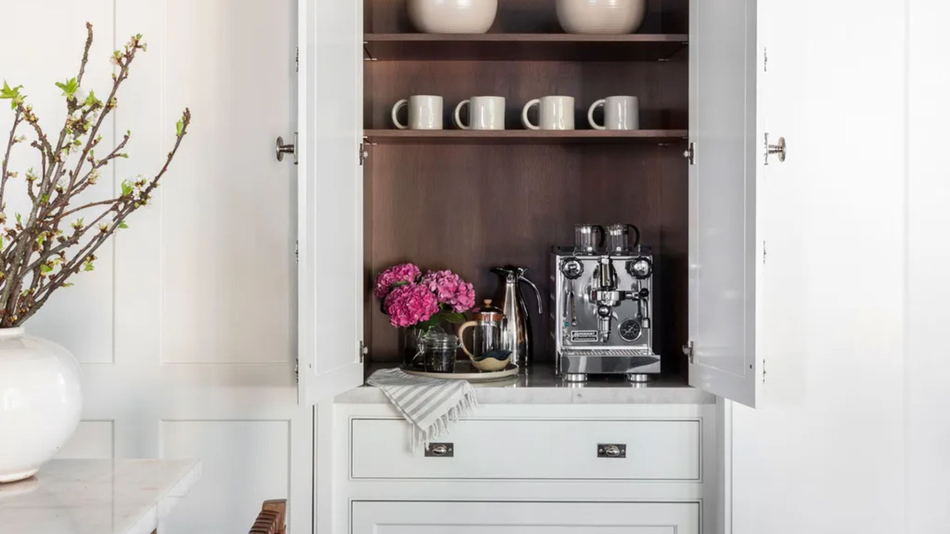 Turns Out the Coolest New Café is Actually In Your Kitchen — Here's How to Steal the Style of TikTok's Latest Trend
Goodbye, over-priced lattes. Hello, home-brewed coffee with friends. TikTok's 'Home Cafe' trend brings stylish cafe culture into the comfort of your own home
-
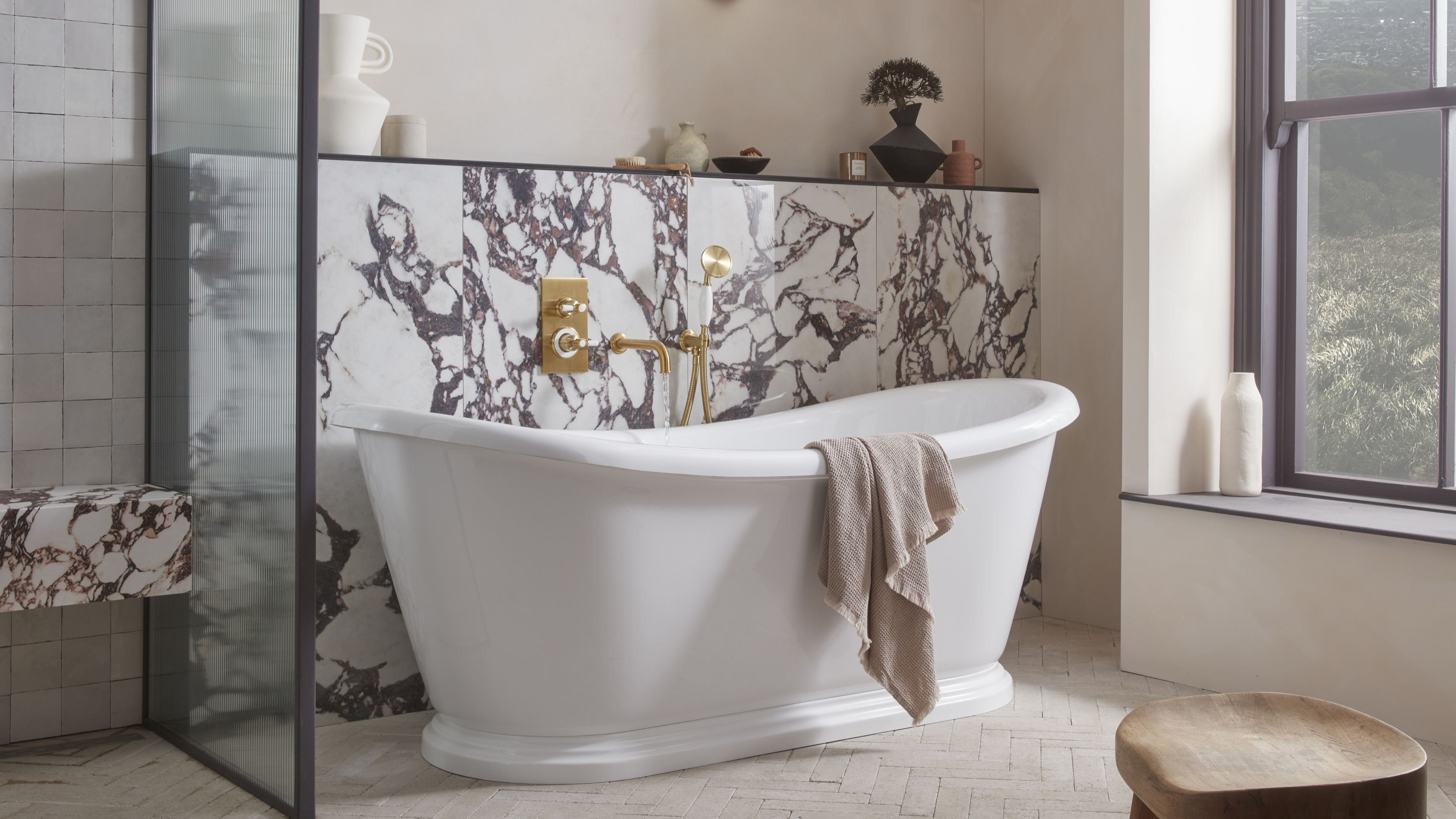 5 Bathroom Layouts That Look Dated in 2025 — Plus the Alternatives Designers Use Instead for a More Contemporary Space
For a bathroom that feels in line with the times, avoid these layouts and be more intentional with the placement and positioning of your features and fixtures

