Muted colors – how to decorate with these subtle shades successfully
Choosing muted colors will open up a whole new spectrum for painting your walls, while ensuring your room stays feeling peaceful
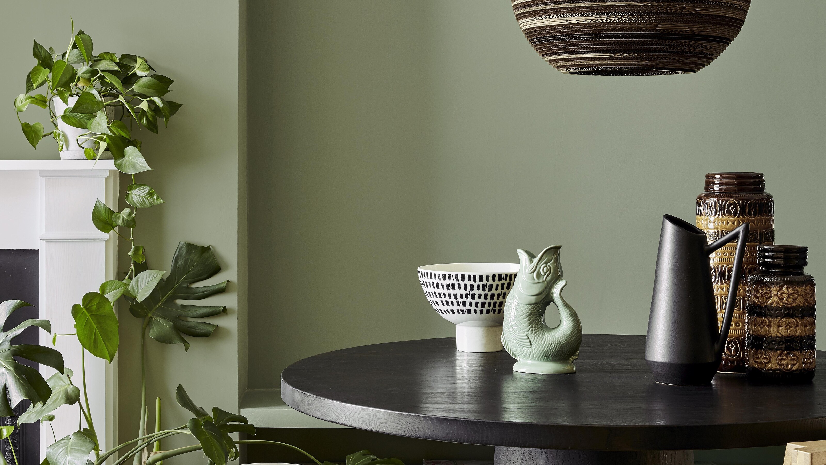

Opting for muted colors in your home is an easy way to add color in a pared-back and low-key way. Muted colors can be defined as the opposite of vivid colors. They're created by taking a bold color and making them greyed and dulled by adding a substantial amount of white, brown or black. The result? Colors that are really desaturated and toned down.
Color theory has a part to play, too, as you can also make a muted tone by mixing the color with its complementing color – for example, you can desaturate red by mixing it with green. 'These subdued muted colors are perfect for evoking calm in tranquil spaces in the home,' explains Ruth Mottershead, creative director of Little Greene.
Helen Shaw, director at Benjamin Moore puts the growing trend and appreciation for muted colors down to a wider trend for Scandi-inspired interiors. 'As the popularity of Scandi interiors continues to grow, so too does the use of soothing, atmospheric colors associated with the trend, such as muted green, blue and grey tones.'
Here's how to decorate with muted colors, and some of our favorite tones for a modern, stylish space.
How to use muted colors in the home
Muted shades make for great paint color ideas to use on your walls because they are ever-changing throughout the day. In morning light, the color might disappear altogether, while at a darker point of the day, when the room is thrown into shadow, the color might strengthen and appear more saturated. This means that muted colors are great if you want a bit of flexibility in your scheme and a different feeling at different times of day.
Muted colors can also bring a real comfort to a space. 'We love to use muted colors in our projects, as it adds a softness and warmth to any space,' says Celine Erlam of Indie and Co.
Muted tones such as pale yellows, pinks, greens and blues look great painted on the walls, replacing the use of neutrals as wall paint with something a bit more interesting. When paired with a complementary color taken from color theory, it can really help to make the secondary accent color pop. You can also take the paint all the way onto the ceiling for a cozy and enveloping feel.
Dusky pink
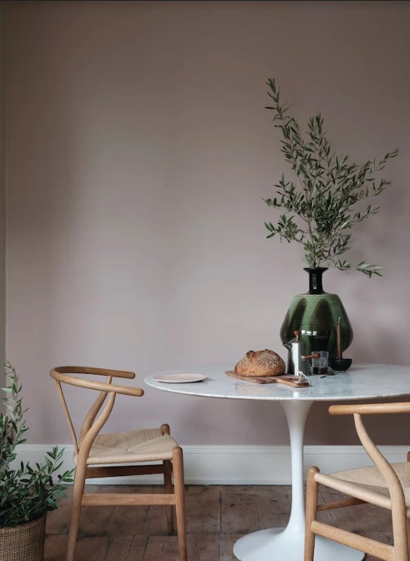
A light pink is a muted version of a bolder pink or red, and has been desaturated with glimmers of grey in it which give it moody and earthy qualities. It also can make for a warm color scheme, brought out by its red undertones.
This shade really reflects and plays with the light, casting more shadow in the evening times, and feeling lighter and airy when filled with natural light during the day.
A muted pink is a great replacement for a grey. 'For a more pared back choice, we have gradually seen neutrals with pink and red undertones taking over from our traditionally cooler grey tones in kitchens over the last few seasons,' says Helen Shaw, director at Benjamin Moore.
Muted green
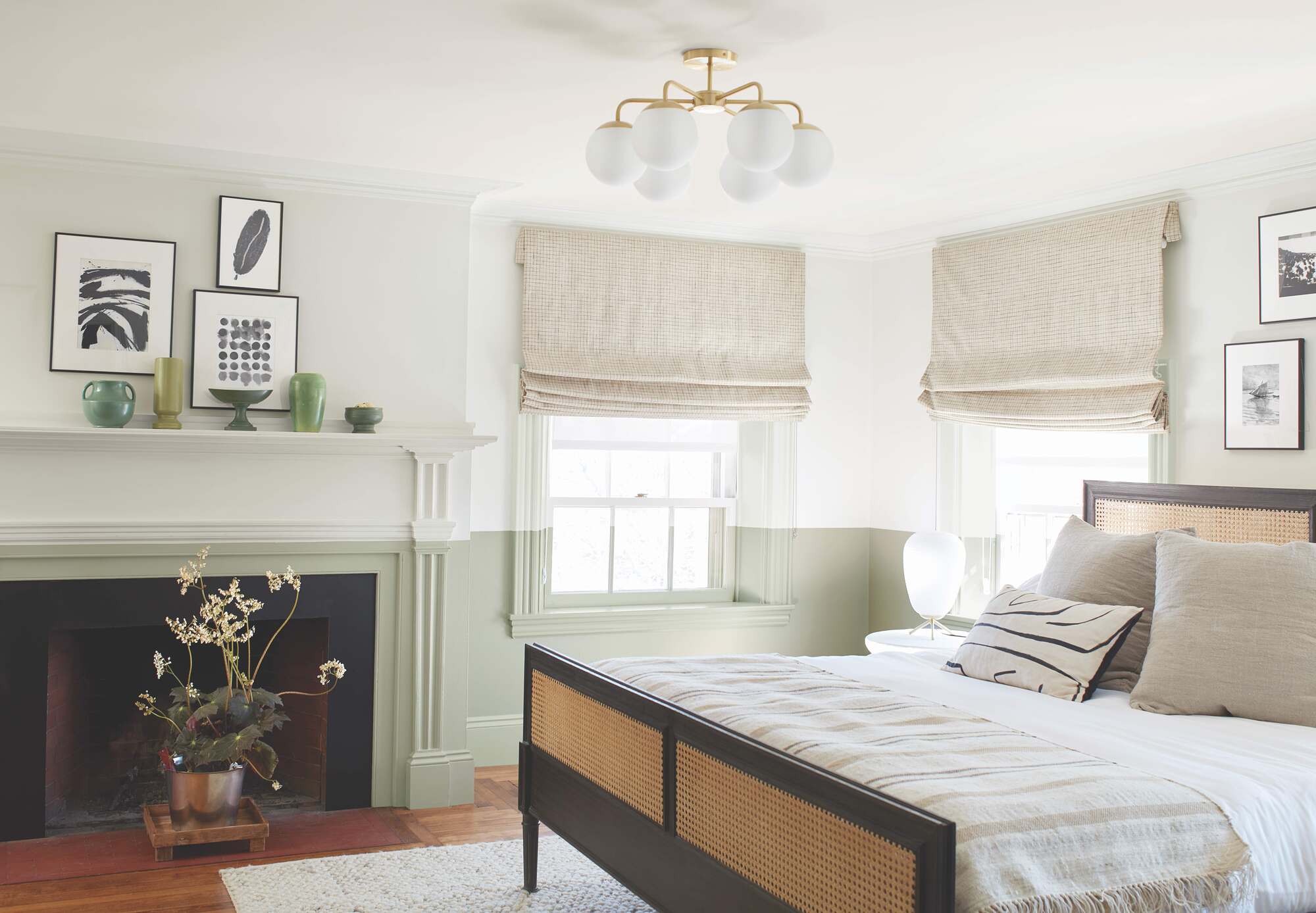
A pale and desaturated green makes for a beautifully muted palette. Opting for this shade alludes to nature, without having to use too garish a version of green.
In this example, a bedroom has been painted in Benjamin Moore shade Mist. The room is serene as this sage-y shade is the perfect calming color for a bedroom. 'Soft, muted shades of green create a relaxing, sanctuary feel to the room and can bring a healing energy, so are perfect for using in a bedroom,' says Helen Shaw, director at Benjamin Moore.
Light blue
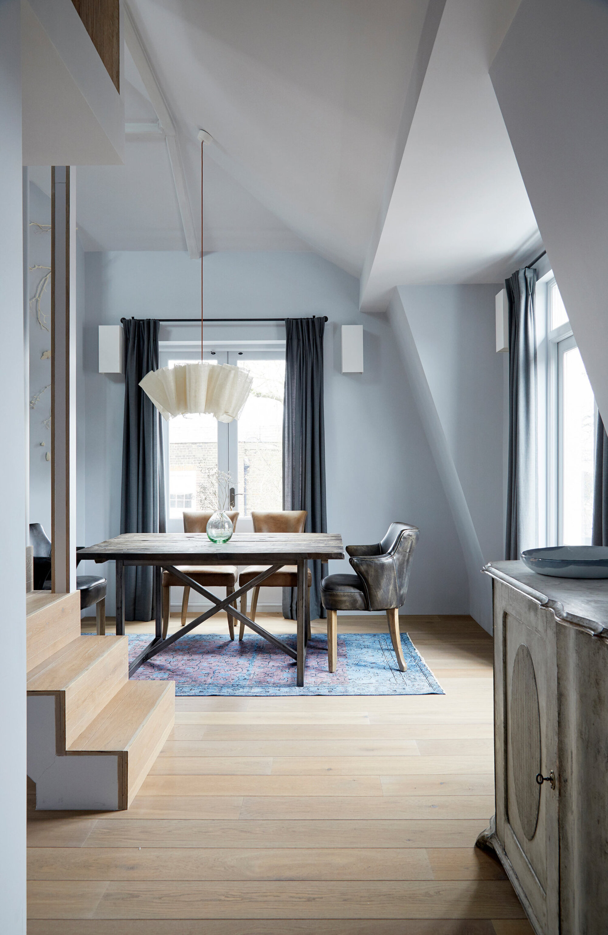
Light blue is another muted color that is taking over as a new neutral. 'If you're looking to add a splash of color, soft pastel hues such as pale blues lend a relaxing, sanctuary feel to the room and evoke a healing energy,' explains Celine Erlam of Indie and Co, who designed this soft blue scheme that has a greyish tinge to it. 'These colors are tranquil in nature whilst also having a connection to nature, and help relax our brains and entice creative thinking.'
Light blue is also versatile in that it can be paired with lots of different complementing colors, so pick out and highlight your favorite pieces of furniture in colors that go with light blue.
'Pure whites can feel cool and gallery-like, adding some colour adds a touch of personality and warmth.'
Fawn
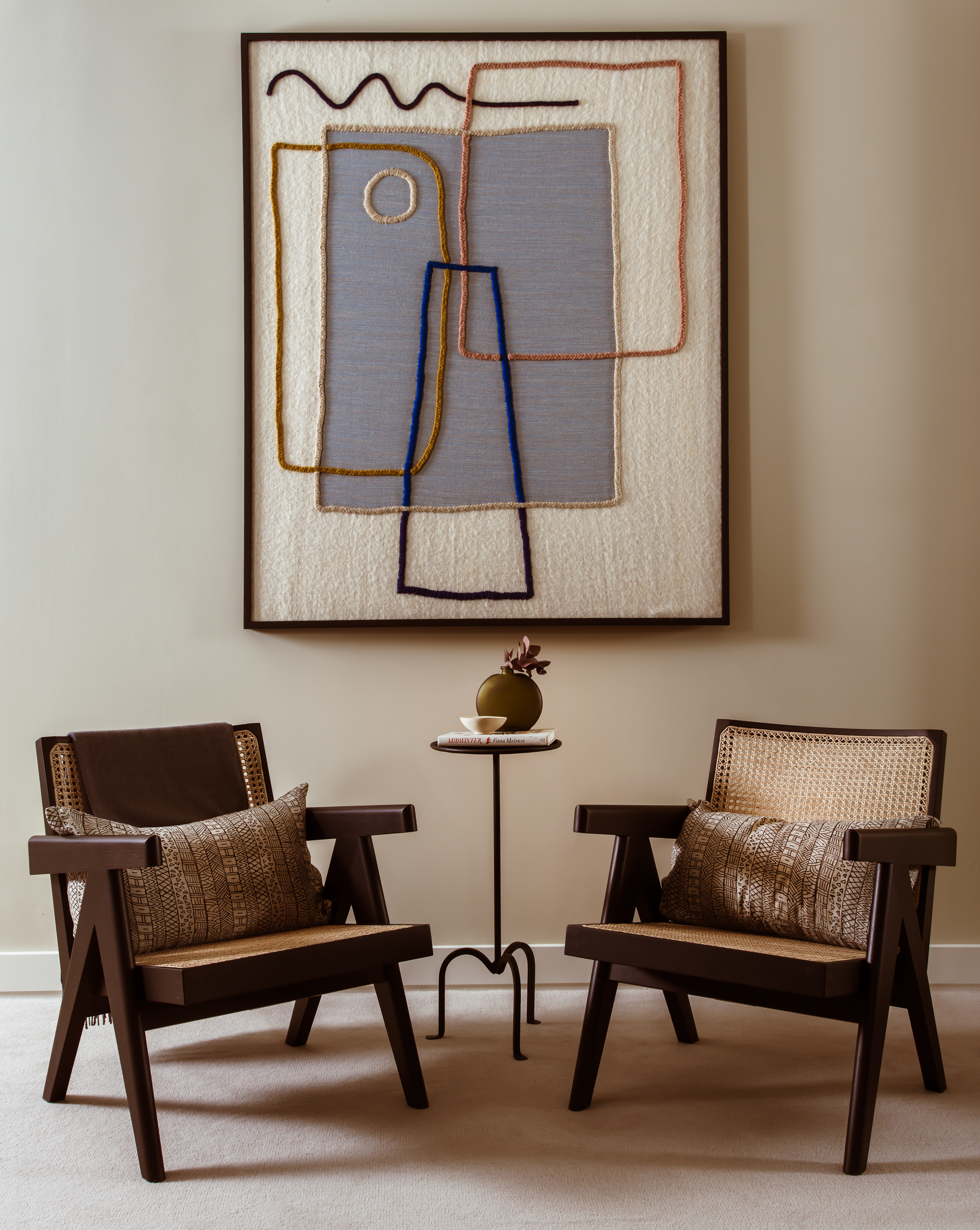
A fawn is a lighter, more muted version of brown which creates a beautiful neutral scheme when used on the walls, and is less intense than brown in its base form. It's a great color to help emphasize specific bits of furniture, finds Camilla Clarke, creative director at Albion Nord. 'It's about creating that contrast. Furniture and art should stand out from its backdrop to help create interest,' she explains.
This scheme has used this muted tone on the walls of this project. 'Fawn is a great neutral color that can create real warmth in a room but allows you to layer and contrast in front with colors, textures and tones,' says Camilla.
'In this example, the fawn color behind the rich brown timber chair softens the tones of the room without the contrast being too stark.'
Soft terracotta
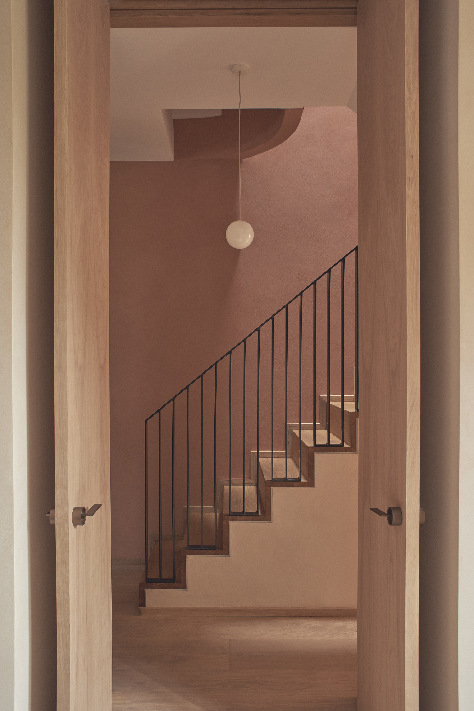
A muted and toned-down orange is a nice way to use this often overwhelmingly bright shade, but in a softer, muted and more accessible way.
In this space, designed by Mitchell + Corti Architects, the staircase has been decorated in this muted version of orange. 'We wanted the overall feel of the house to be muted and serene, with moments of moodier bold dark colors,' explains Ester Corti of the firm.
Decorating with terracotta paint, a clay-colored wall runs from ground to top floor and sets the scene for the home. It is a warm and inviting color and sits on the opposite side of the spectrum to the blue and greens used elsewhere in the home. 'To tie in the muted base tones and oak joinery with the dark green and dark blue found in the entrance hall and bathrooms we chose to add tones of light terracotta as the main accent color throughout the house.'
'The home is dominated by earthy, warm and inviting tones, which we believe is highly important to wellbeing, particularly in a residential space,' adds Ester.
Pale yellow
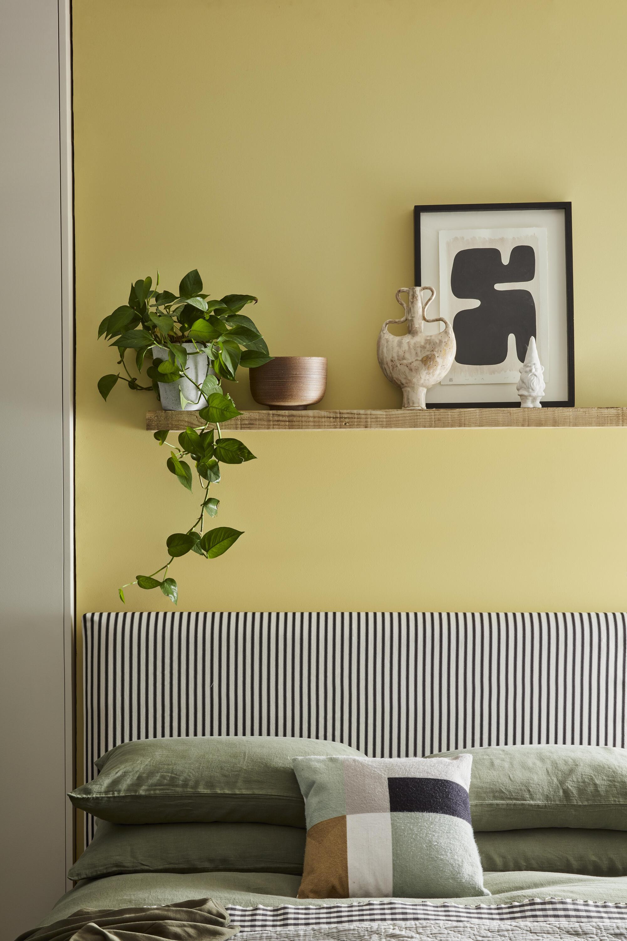
A pale yellow is a softer version of a bright sunshine yellow, and can be a nice paint color for your walls for when you want to add a touch of this optimistic shade without it being too garish. A muted yellow can work nicely as an accent to cheer up a greyish toned wall, can look bright and sunny as the main wall paint, and like in this example, can evoke feelings of nature when paired with various tones of green. Other colors that go with yellow of this tone according to color theory would be a light blue.
What rooms work best for a muted color scheme
Muted colors create soft and warming spaces, so think about what kind of mood you are trying to replicate in your room and plan your color scheme accordingly. Rooms where you're looking to seek sanctuary, yet still express a bit of personality through color, like a bedroom are good places to start. Pick your favorite bright color that reflects your character and desaturate it to create the right muted look for you.
'We love using muted colours in kids bedrooms,' says Celine. 'They tend to want colors in their rooms but we keep them muted so that the space still feels like a room for sleeping and reading mostly.'
Be The First To Know
The Livingetc newsletters are your inside source for what’s shaping interiors now - and what’s next. Discover trend forecasts, smart style ideas, and curated shopping inspiration that brings design to life. Subscribe today and stay ahead of the curve.

Former content editor at Livingetc.com, Oonagh is an expert at spotting the interior trends that are making waves in the design world. She has written a mix of everything from home tours to news, long-form features to design idea pieces, as well as having frequently been featured in the monthly print magazine. She is the go-to for design advice in the home. Previously, she worked on a London property title, producing long-read interiors features, style pages and conducting interviews with a range of famous faces from the UK interiors scene, from Kit Kemp to Robert Kime. In doing so, she has developed a keen interest in London's historical architecture and the city's distinct tastemakers paving the way in the world of interiors.
-
 The Easiest Way to Turn Your Designer Scarf Into Wall Art — No Frame, No Fuss, No Regrets
Because silk this pretty should never stay in a drawer
By Julia Demer Published
-
 Italian Kitchen Trends — 5 Emerging Ideas From the Chicest Italian Designers That I Predict Will Go Global in 2025
Fresh from Milan Design Week, these are the exciting finishes, styles, and innovative materials I can't wait to see in more kitchens this year
By Faiza Saqib Published