Neutral color schemes – interior designers share palette inspiration for decorating with muted shades
Interior designers suggest their favorite neutral color schemes, and explain how best to decorate with neutrals in the home
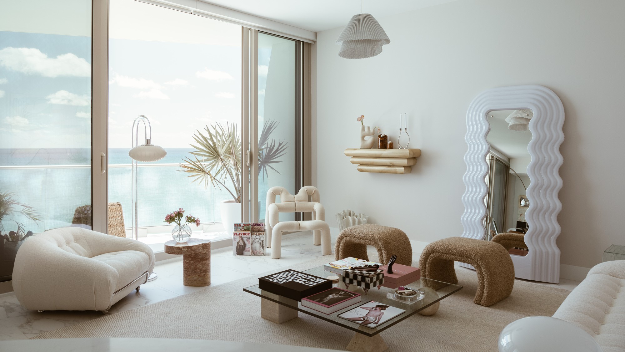

Neutral color schemes can work to create a calming mood in your interiors. Typically made up of beige tones, shades of white, brown, grey and black, the result of a neutral scheme is pared back and serene in the absence of primary pops of color that can often overwhelm a space.
According to color theory, a neutral is a hue that lacks color – a silent background color that doesn't compete with other bold shades. The pure neutral colors are black, brown, grey and white. They are pure in that they don't have any hue undertones or underlying colors.
Near-neutrals are close to pure neutrals but are not pure, carrying weight in undertones of other colors, created by mixing a primary color with a pure neutral, toning down the color with a glimmer of the primary in a subtle way. In this way, any color can have a neutral when stripped back. Here, we look at the interior designer's favorite ways to dial down your color to create nurturing and beautiful spaces with neutral paint color ideas.
How to define neutral color schemes
While we typically associate neutrals with muted, taupes, beiges and light browns, neutrals can appear all across the color wheel, points out designer, Ellen Hamilton. 'I have a very broad description of neutral. I could call the likes of chartreuse a neutral for example, because there are so many iterations of it and imbalances with other colors that it becomes a neutral in the sense that it can be a base of a scheme.
'There are other colors that can be neutral, you just use a different color in a way that makes it a neutral. All neutrals have colors in them. You can have a white that's crisp, another that has a hint of purple and another that has a bit of blue.
'I would define neutral as anything that is value on the color wheel between one and three - a pale form of color,' adds Ellen. Read on for the designers' tips for using neutrals at home.
1. Try pale pinks as a neutral tone
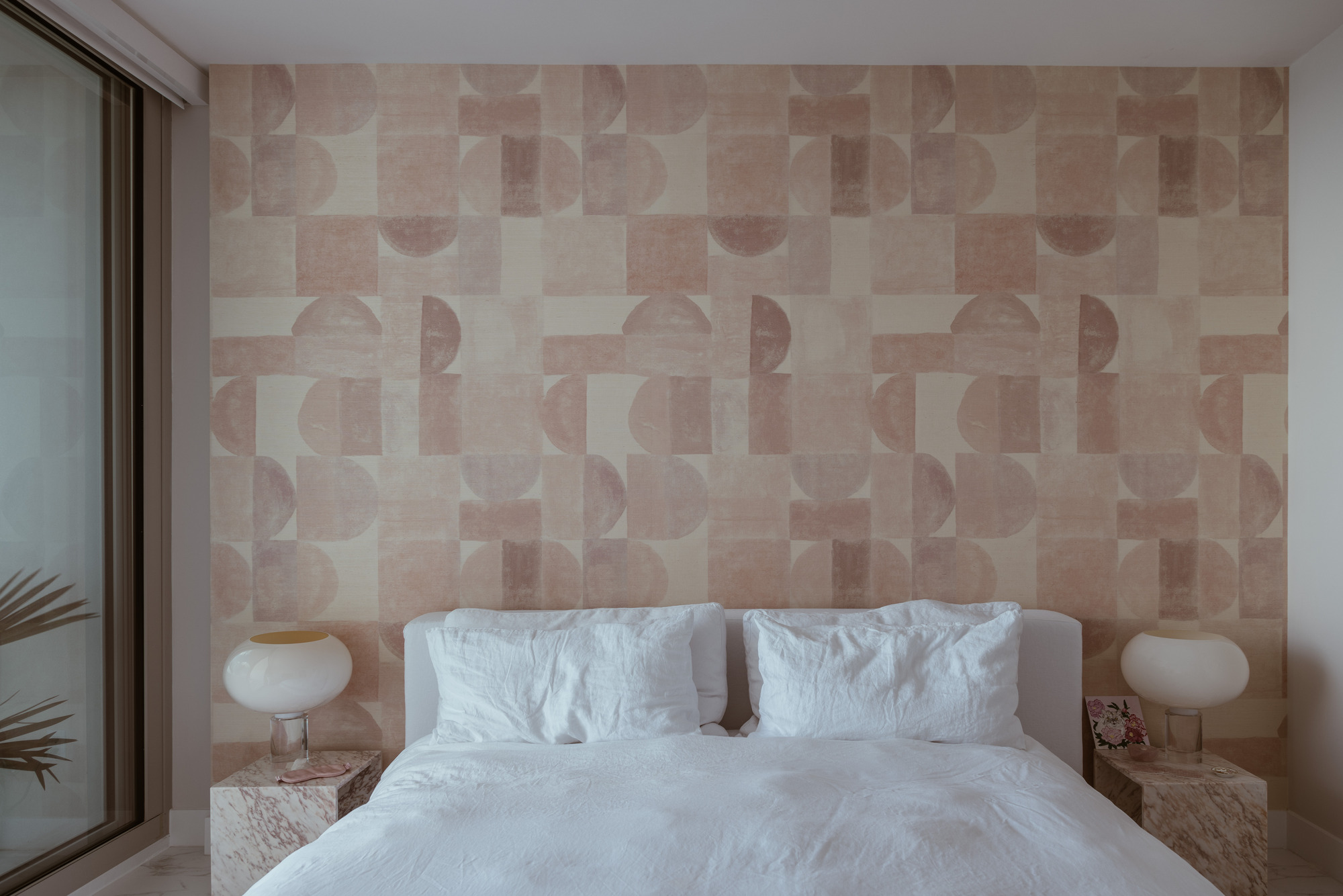
It might not be your first thought for a neutral color scheme, but dialing down your pink to its neutral base can work as a calming paint color for a bedroom.
There are various shades of pink and peach used throughout this Miami condo, designed by Tiffany Howell of Los Angeles-based interior design house, Night Palm, to mirror the beach-side location. 'I leaned into a neutral color scheme throughout this apartment, focusing on sandy creams, whites and pops of dusty pink,' explains Tiffany. Here, the bedroom wallpaper, Candy, was created by Laine + Alliage, a New York-based boutique design atelier creating luxury pillows, printed fabrics and wallpapers.
'I think a lot of people do coastal design in a rather literal sense, but I wanted the palette to be a bit more subdued inside so that the outside, looking at the ocean, was like a framed art piece. When brought together, these colors create a sense of living in a seashell.'
2. Pair white walls with natural materials
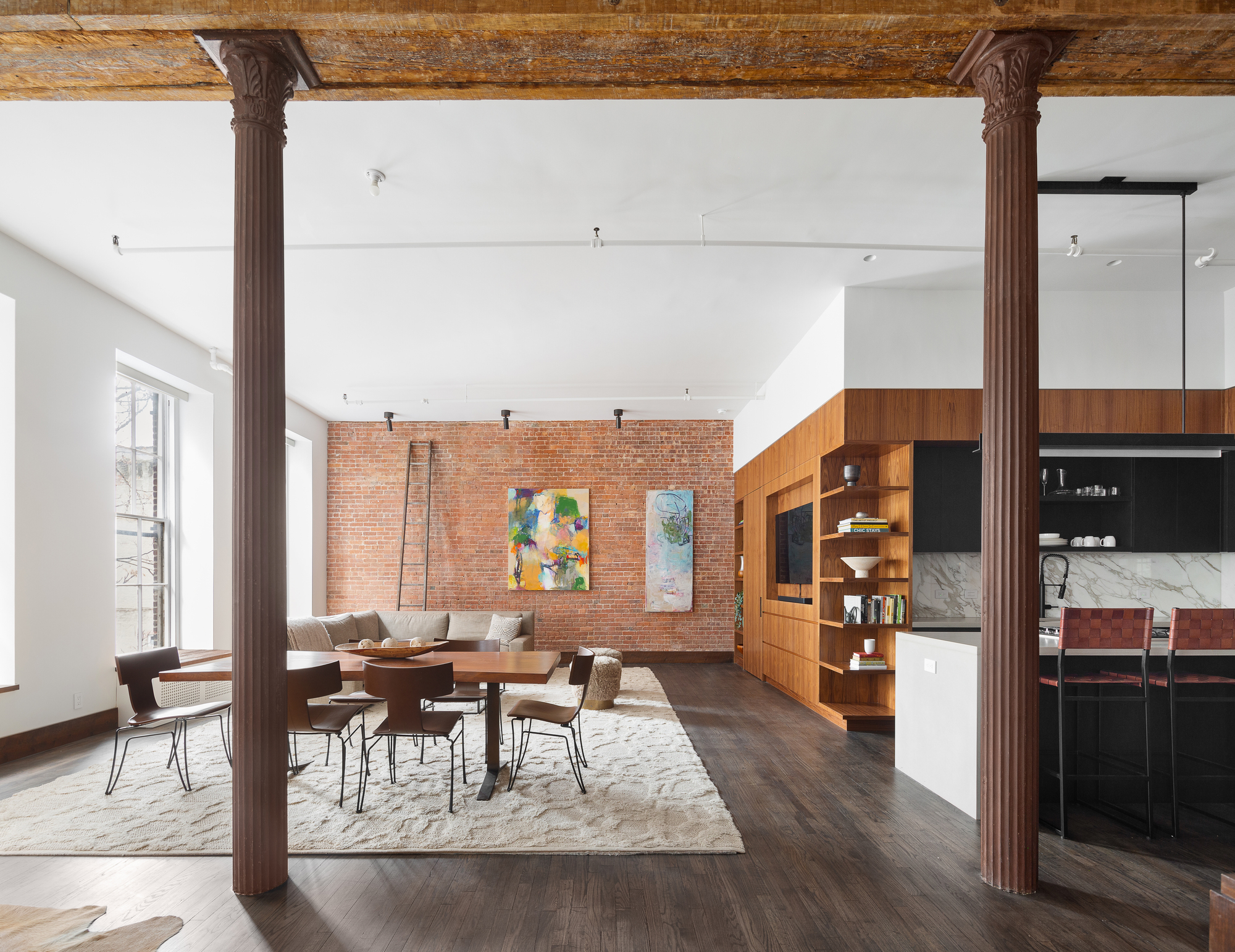
Another way of decorating with neutrals is to simply embrace natural materials used in your home. Think brickwork and wooden panels that introduce color through natural textures.
In this home, designed by Kimberley Peck Architect, the aim was a complete facelift of a quintessential SoHo loft. The design left these loft features and made a statement piece out of the bones of the building. Mainly, the space was opened and the central timber beam and cast iron columns were exposed, all paint was removed and the materiality emphasized. The timber beam informed the trim throughout the rest of the apartment. Reclaimed wood in a similar color was used as baseboards, casings and window sills throughout the space.
'Given this was a large loft, the use of a neutral palette throughout was selected in order to unify and make the entire space cohesive,' says Kimberley Peck.
'The lofts structural timbers and original brick were exposed and then emphasized by adding details such as baseboards and door casings in a matching neutral wood. a complimentary walnut kitchen was addedm' she adds. 'The client's furnishings are all a tone-on-tone neutral palette of beiges and creams.'
Overall, the materials make for a soothing palette which works to add cohesion in this large open space.
3. Mix shades of brown with white
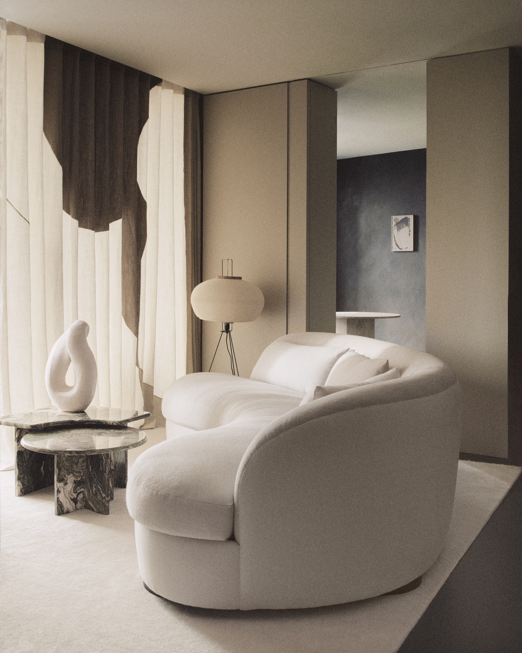
Layered tones of brown work well with white for a traditional neutral color palette, as seen in this example from interior design house, House of Grey. In this project, a Kings Cross residential project, the neutral interior was designed with salutogenic principles at its heart. Salutogenic principles are the simple aim to build structures that make people healthier. The calming nature of the neutral scheme works well with the intention of the project.
On the walls, custom-matched Grafclean shade by Graphenstone is ecological and free from VOC emissions. In the further room, the shade is Nurture, from the Visual Silence Collection by House of Grey x Bauwerk - a natural lime-based paint collection which is free from toxins. The shade is a dark brown/earth green that has been created to evoke deep relaxation. At the center of the room, a curved sofa, sculpture and light fixture are united in white.
Underfoot, the Armadillo x House of Grey Perilune rug in Quartz has a pearlescent sheen thanks to wool spun with silk.
4. Dark neutrals
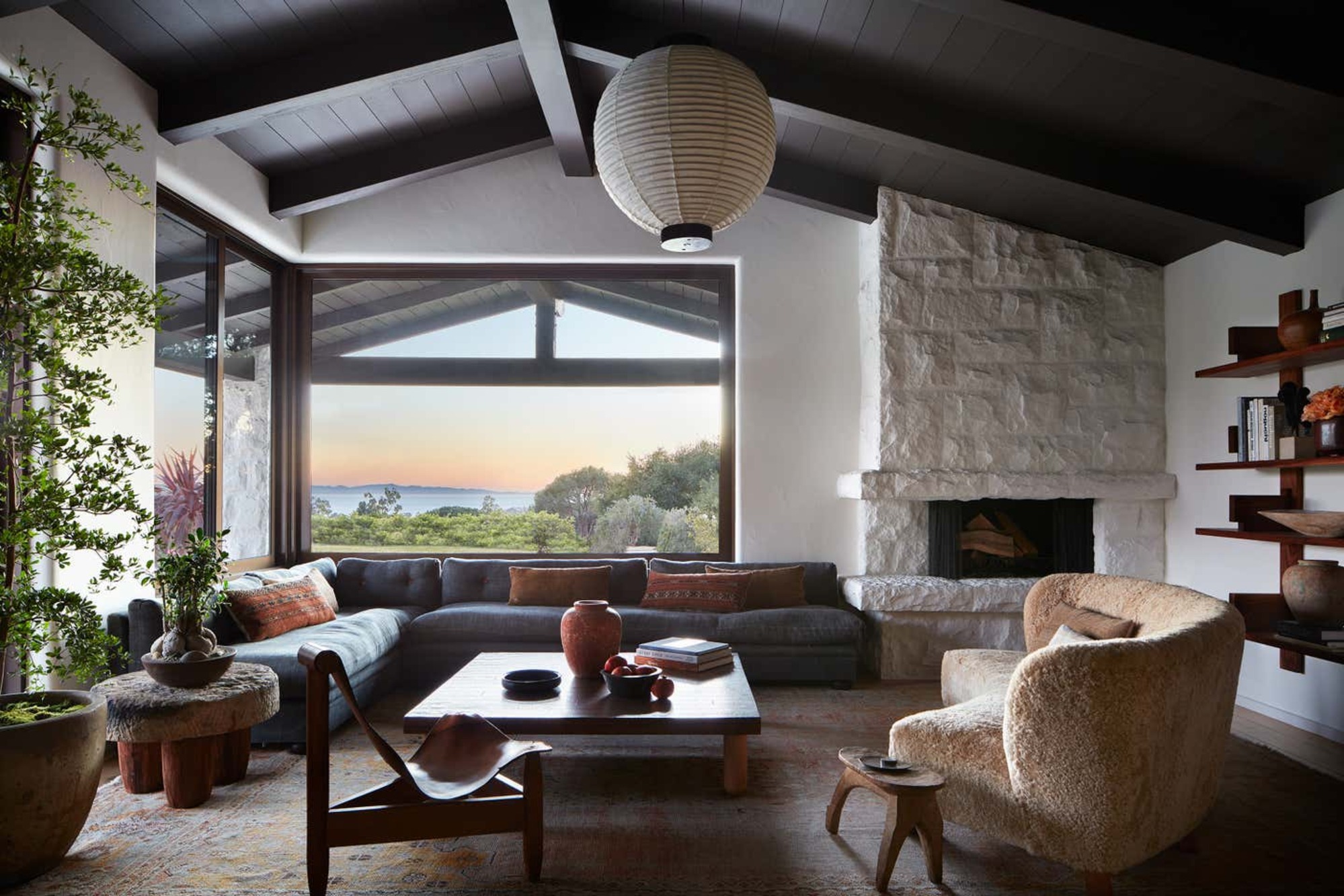
A neutral color scheme isn't all about the light colors, and dark neutrals like charcoal shades, dark browns, deep, murky blues are also be considered neutral. They can be used in a neutral scheme to anchor a room in the form of furnishings, an accent wall, a rug, sofa, or in this case, a painted ceiling.
This ranch house was created by Pamela and Ramin Shamshiri, who founded Los Angeles-based Studio Shamshiri. The use of dark neutrals works to frame and highlight the main aspect of this room, the view.
5. Build a palette from off-whites
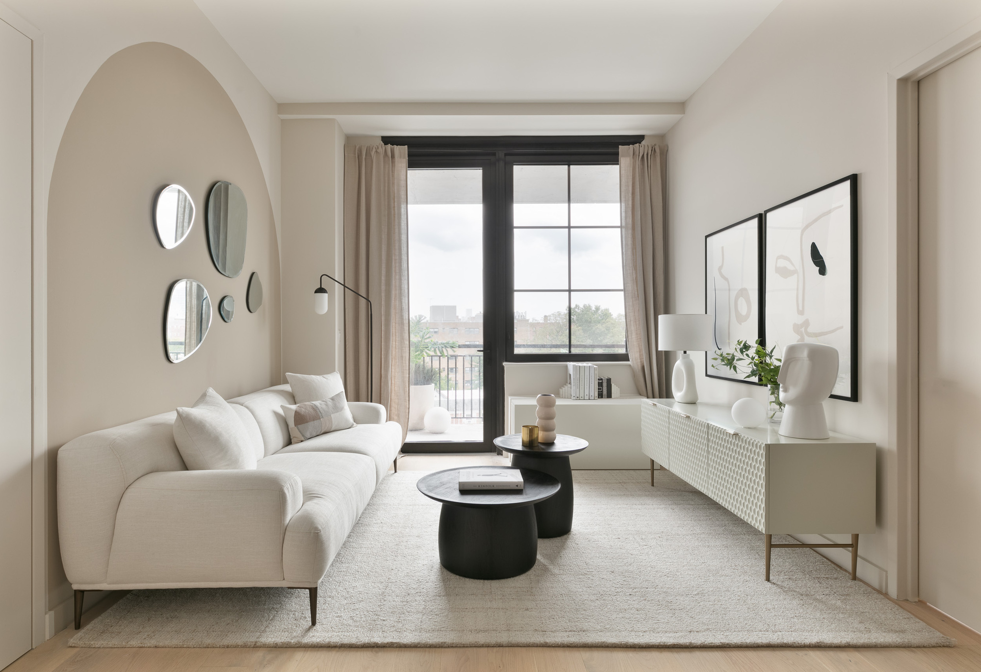
To add interest to an all-white scheme, avoid using a stark white and instead adopt a palette of whites with undertones to build layers on top of each other. 'In this white living room, we paired Benjamin Moore Baby Fawn with Rocky Road as an accent with a similar drape color to achieve a sense of calm and add some understated architectural interest,' says creative director and founder, Fanny Abbes from the NYC-based design firm, The New Design Project.
'When working on a neutral scheme, you need to add depth and objects of character to bring life to the room.' In this instance, the custom brass plinth coffee table, the darker shade drapes, and the print add luxury, depth and asymmetrical interest to the room and break up the white.
6. Use neutral tones with texture
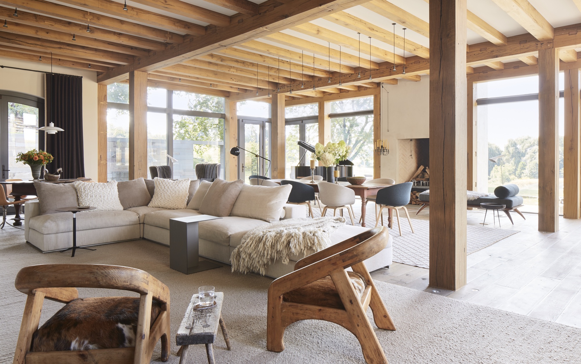
When designing a neutral scheme that is pared back in terms of color, the overall look can appear flat. This is where texture comes in to add interest and depth to the scheme. Ellen Hamilton is a designer who deals intimately with color, studying theory and the wheel to arrive at the perfect balance of tone in her interior. When dealing with traditional neutrals, like in this farmhouse living room her Philadelphia Horse Farm project, soft furnishings is what makes this neutral scheme typical of her style.
'Texture is important for a neutral color scheme,' says Ellen. 'If you look at our Philly Horse Farm design, that's about as neutral as it gets in terms of the colors used being taupe and ivory. The use of texture makes it a neutral house.'
7. Embrace shades of grey
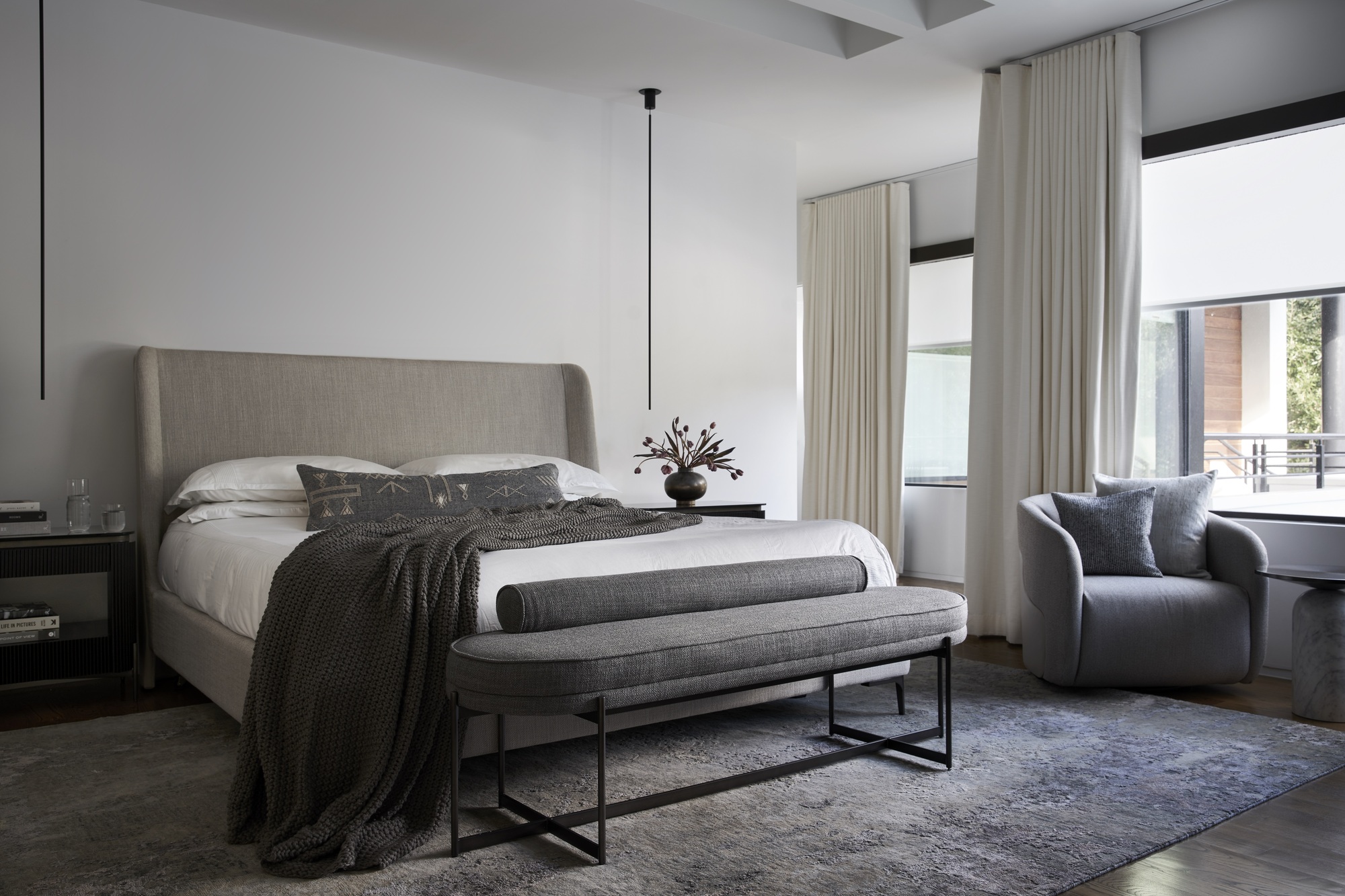
Grey is a pure neutral color and can make for a cool color combination when built and layered in the right way - the result being a calming and contemporary neutral scheme.
'Here, the clients were looking for a very modern home, filled with natural light,' explains interior designer, Nina Magon, who designed this scheme. The bedroom features grey soft furnishings in differing tones.'
'Open spaces throughout, where they can interact as a family, but at the same time be able to close off spaces for privacy and entertainment, this residence was meticulously designed to host the perfect merge of natural light and refined interiors,' Nina says. 'The selection of natural stone tones conceives this property to be perceived as a retreat experience.'
8. Use neutrals as a base for color to pop
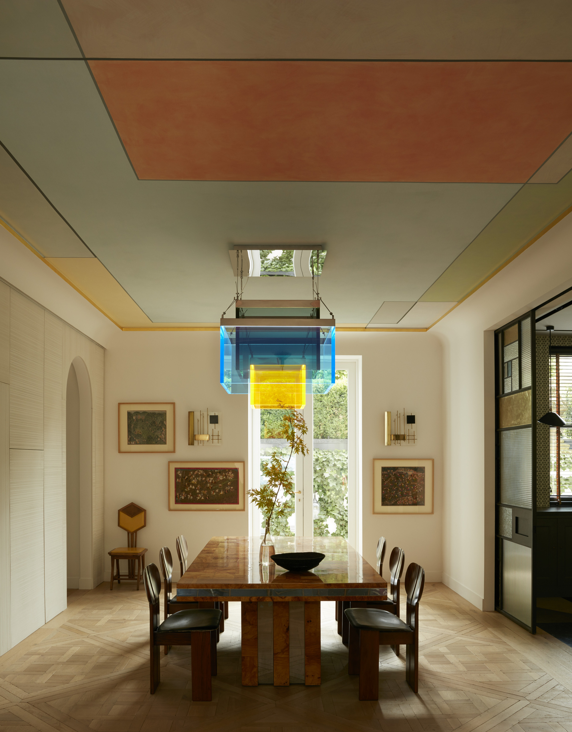
Neutrals can be used for a blank canvas for colors to really come to the fore. In this design, by Maddux Creative, the scheme of the home was overwhelmingly neutral. Rooms are light cream and dusky pink, designed so that a dramatic use of color can take center stage. In this room, the neutral walls lead the eye up towards the ceiling.
'The envelope was deliberately kept neutral to allow for the introduction of new pieces of art and objects, keeping it flexible for a rotating collection. Neutral in colour, but strong in texture, character and interest,' says Jo le Gleud of Maddux Creative.
'Ceilings are the forgotten plane,' adds Scott Maddux. 'You can be bold with ceiling decorating ideas as you won’t tire of looking directly at it every day. It can unify the space in a way you are not conscious of.'
What rooms work best for a neutral color scheme?
When considering going neutral in your interior design, think specifically about the room's purpose and intent. 'I would say neutrals are relaxing, so would use in bedrooms or adjacent to somewhere with a busy scheme,' says Jo le Gleud at Maddux Creative. Neutral living rooms can also bring a relaxed and cozy feel to your home.
Plan your neutral scheme by layering different hues of the same color. Choose your main neutral shade to work with then look to the family of color, picking trimming, materials, soft furnishings in layers of the same color. The walls should be the lightest part of your neutral scheme, then it's about building on color from there.
Be The First To Know
The Livingetc newsletters are your inside source for what’s shaping interiors now - and what’s next. Discover trend forecasts, smart style ideas, and curated shopping inspiration that brings design to life. Subscribe today and stay ahead of the curve.

Former content editor at Livingetc.com, Oonagh is an expert at spotting the interior trends that are making waves in the design world. She has written a mix of everything from home tours to news, long-form features to design idea pieces, as well as having frequently been featured in the monthly print magazine. She is the go-to for design advice in the home. Previously, she worked on a London property title, producing long-read interiors features, style pages and conducting interviews with a range of famous faces from the UK interiors scene, from Kit Kemp to Robert Kime. In doing so, she has developed a keen interest in London's historical architecture and the city's distinct tastemakers paving the way in the world of interiors.
-
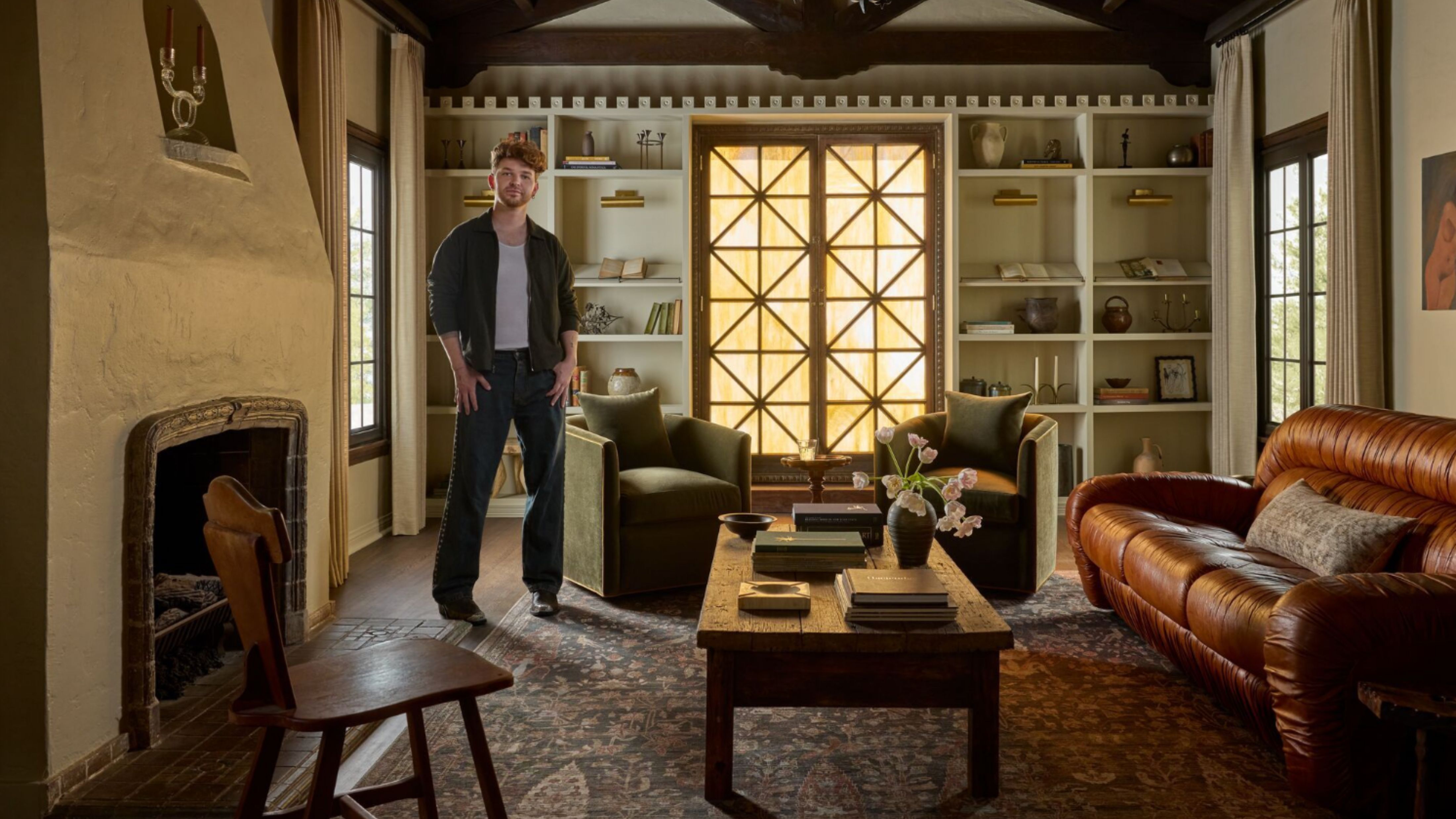 Lone Fox's Drew Michael Scott Drops a Vintage Capsule with Joon Loloi (And Some Seriously Good Tips For Thrifting Antiques)
Sourced straight from one of the world's biggest antique shows, Drew shares how to stay sane, cut through the noise, and score what you actually want
By Julia Demer Published
-
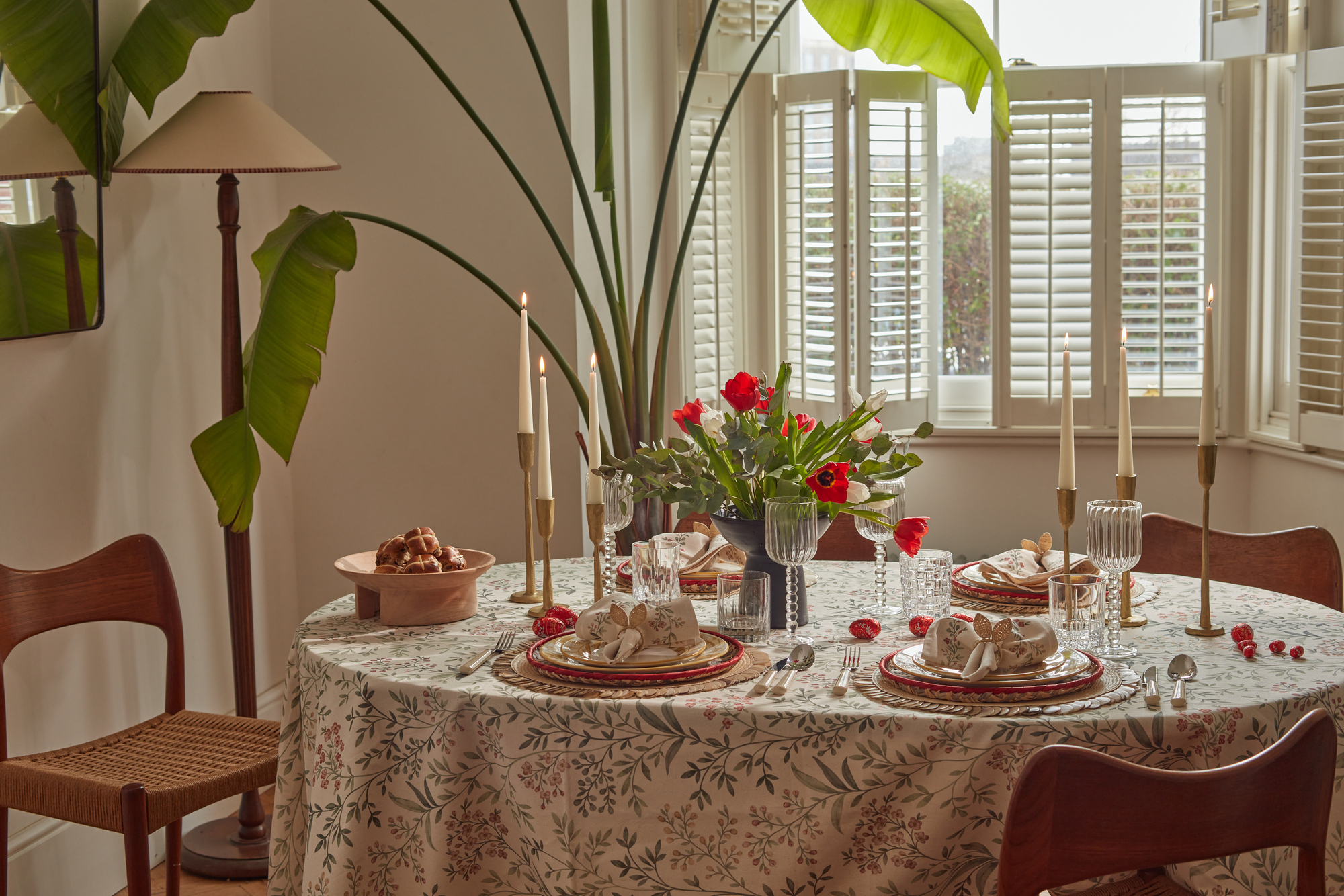 9 Easter Table Decor Ideas to Plan Now for Perfect Tablescapes This Season
From centerpieces and color schemes to tablecloths and seasonal themes, let these designer-approved ideas inspire your table styling this Easter
By Lilith Hudson Published