5 Obscure Colors You Can Decorate With That Might Sound Strange at First, But Will Make Your Home Feel So Much More Interesting
Looking for a burst of color to make your home more unique? Design experts share their favorite unexpected shades
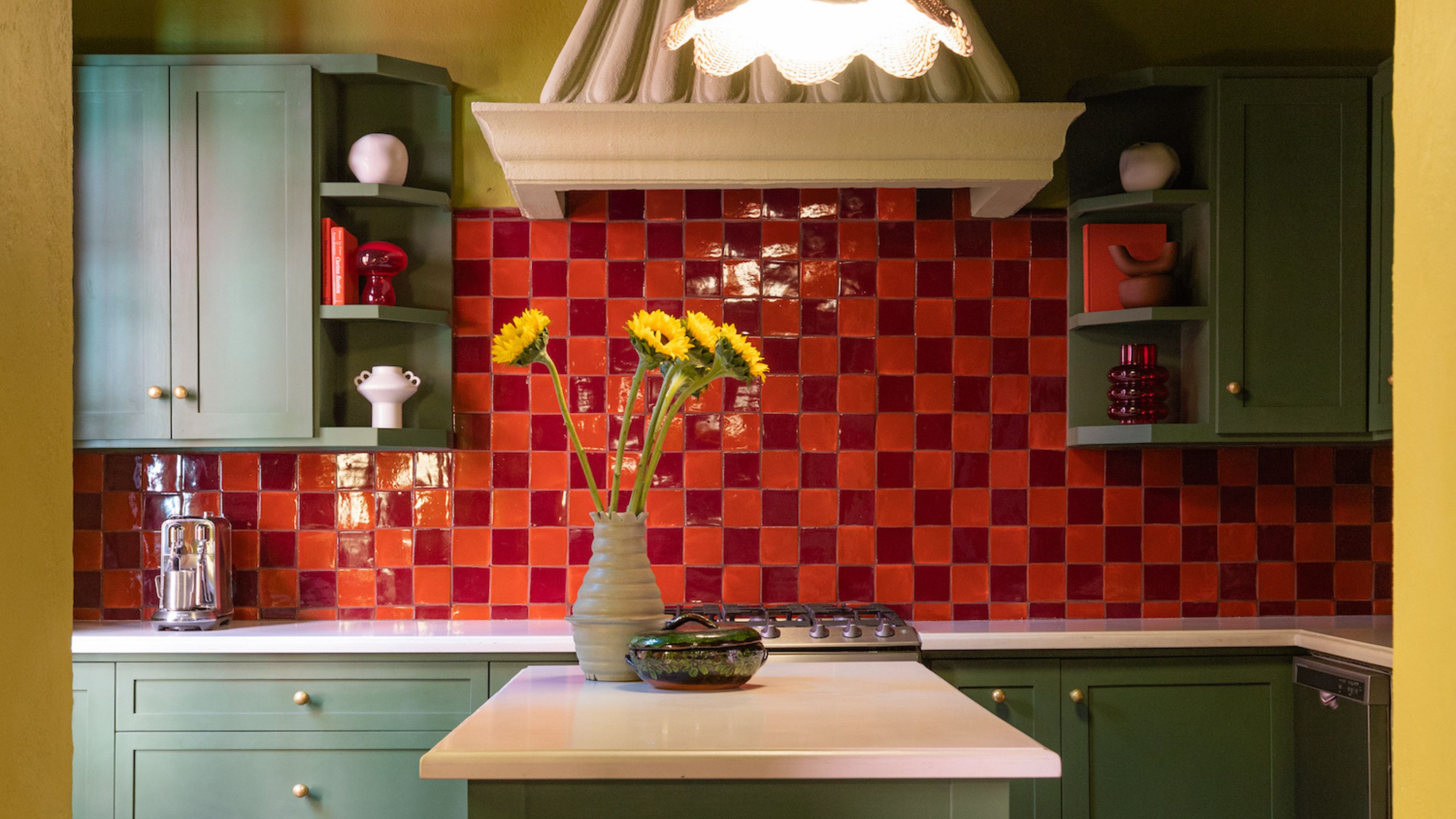
Most of us want our homes to feel personal and individual to us in some way, but it can be hard to break away from the status quo. When it comes to choosing palettes, we typically try to steer clear of obscure colors, but could they actually be the answer to curating a space that won't end up feeling unoriginal and uninspiring?
Designers say 'yes'. Choosing obscure colors is a fast-track way to elevate your home above the ordinary, but that's not to say it's an easy thing to do: it takes guts to go off-piste when it comes to color. And it's not just about considering interesting complements, either. It's also worth factoring in the effects of color psychology in interior design — there may be a deeper reason why we steer clear of a certain hue in our homes.
So, to help you on your way, we've rounded up the unexpected and obscure colors that design experts recommend you try to curate a unique interior that feels fresh and truly yours.
1. Lime Green
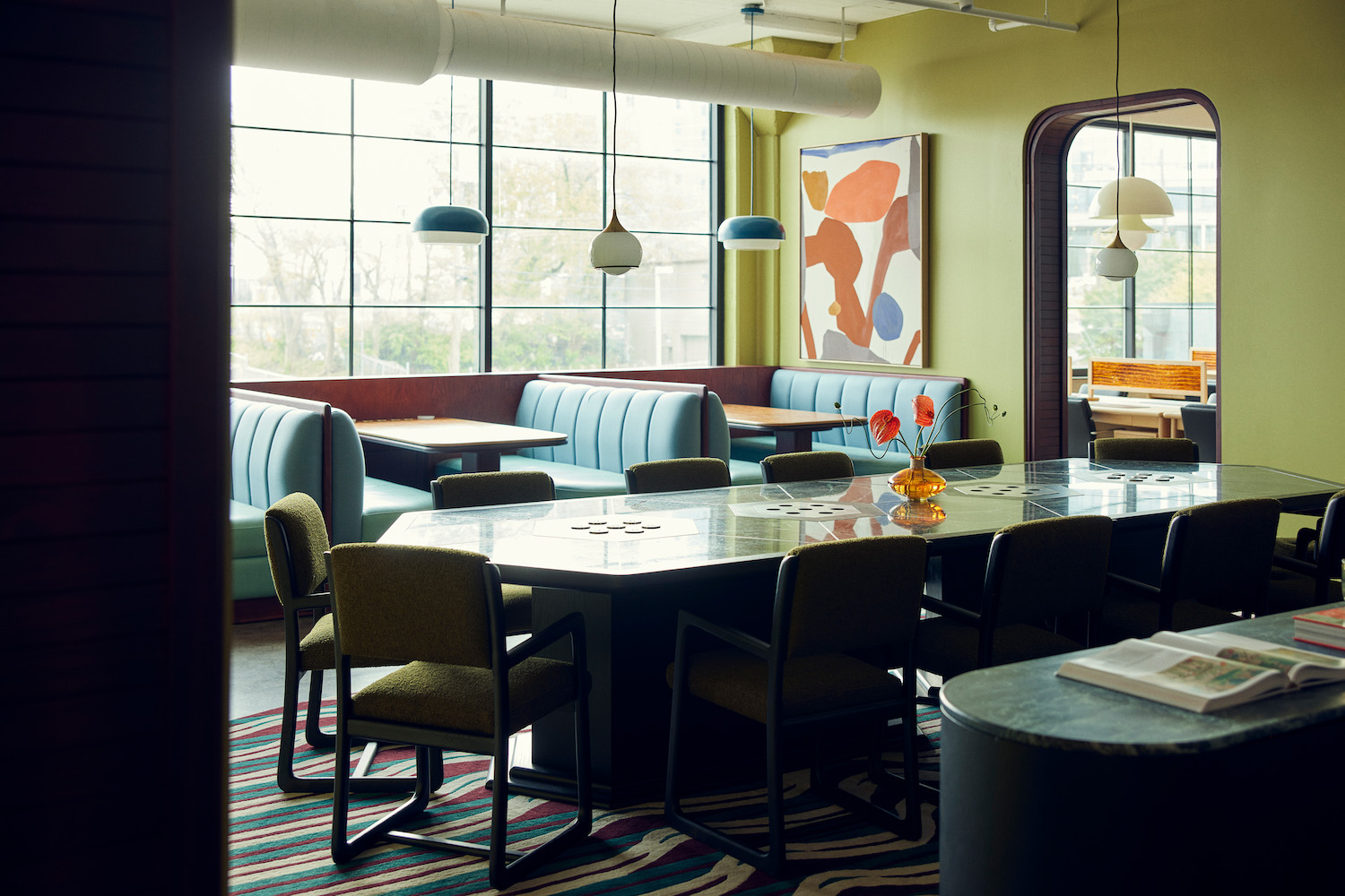
Bright lime green may make you recoil at first, but when paired well and used as an accent, it can actually be quite sophisticated shade.
Lime green everything might be one of our favorite 90s throwbacks, but the color needn’t be reminiscent of fluffy toilet seats and inflatable furniture (or the more recent Brat green phenomenon) if you take a more considered approach. As illustrated in the above design by interior designer Róisín Lafferty, the obscure color can be clean and modern green room idea when combined with soft blues.
Róisín explains that bold colors like lime green, orange, or even black are ideal for creating an unexpected look. “Used as an accent, these colors can bring a sense of drama and elegance without feeling heavy or intense,” she says. “When paired with contrasting colors or soft neutrals, it can create a unique, modern look that feels both edgy and refined, and can transform a room into something truly unique, creating a visually striking yet balanced environment.”
Take a look through Róisín Lafferty's projects and you'll be in awe of the way the designer deftly works with colors — the brighter, bolder, and more obscure the better. Working across residential, hotels, members clubs, and restaurants, she knows how to create experiences and emotional responses through interior design.
2. Tangerine
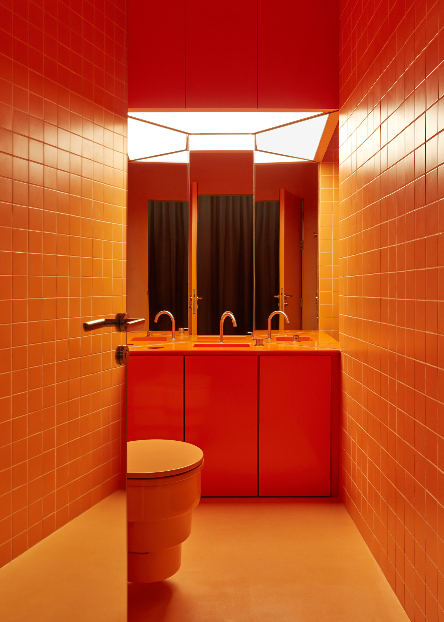
Looking for an obscure yet energizing color? You can't go past a zesty tangerine.
Dusky oranges, like terracotta and rust, are popular paint color ideas thanks to their warming, earthy qualities. But brighter oranges can feel just as welcoming, and make more of an impact.
Another lively citrus hue is tangerine, a bright shade of orange that many decorators typically shy away from. “Orange is a color people don't often use but it can have a great effect, creating a warm cocooning feeling,” says Garrow Kedigian.
For something truly unique, consider color drenching tangerine across your walls, ceiling and floor, as per the design by Róisín Lafferty, shown above. The result will feel both enveloping and energizing.
3. Magenta
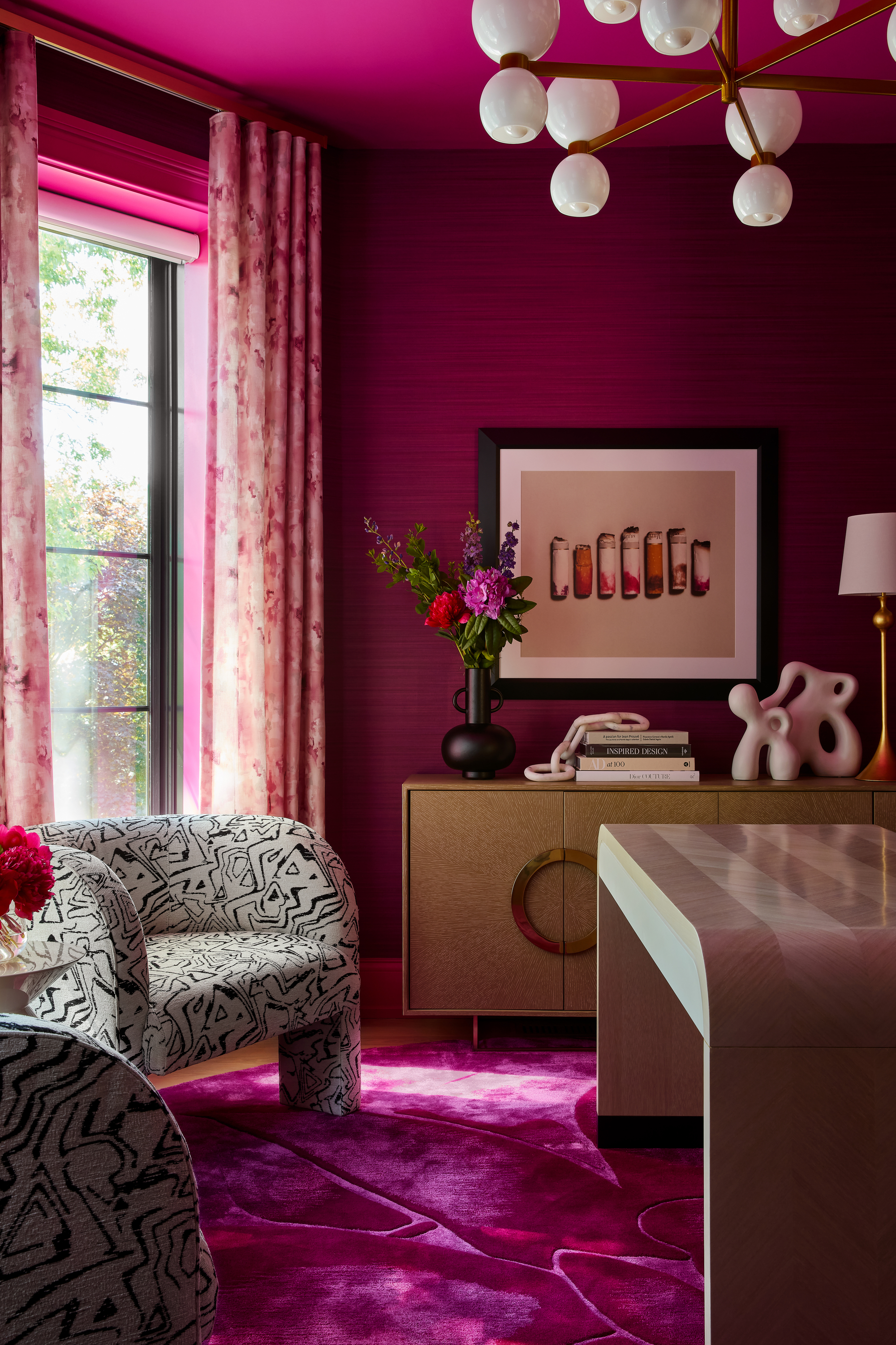
Definitely considered an obscure color when it comes to decorating, it's surprising how elegant magenta can actually be.
Not long ago, the color magenta had a moment in the spotlight thanks to Greta Gerwig’s 2022 film Barbie. But now that's been and gone, this cool, vibrant shade of pink could make an unexpected statement in your home.
For a more sophisticated look, you could even pair magenta with another bold and obscure color, like tangerine. “Think about the atmosphere and the feeling you want to create in a space,” says Ruth Mottershead, the creative director at Little Greene. “For a bold and beautiful bedroom exploding with color, abandon tranquil schemes and go for it with pops of ‘Marigold’.
Ruth Mottershead is one of the most respected and renowned experts when it comes to using color in the home. She has pioneered new approaches to pattern and color at Little Greene, and to her, no color is too obscure to find a way to work with.
4. Chartreuse
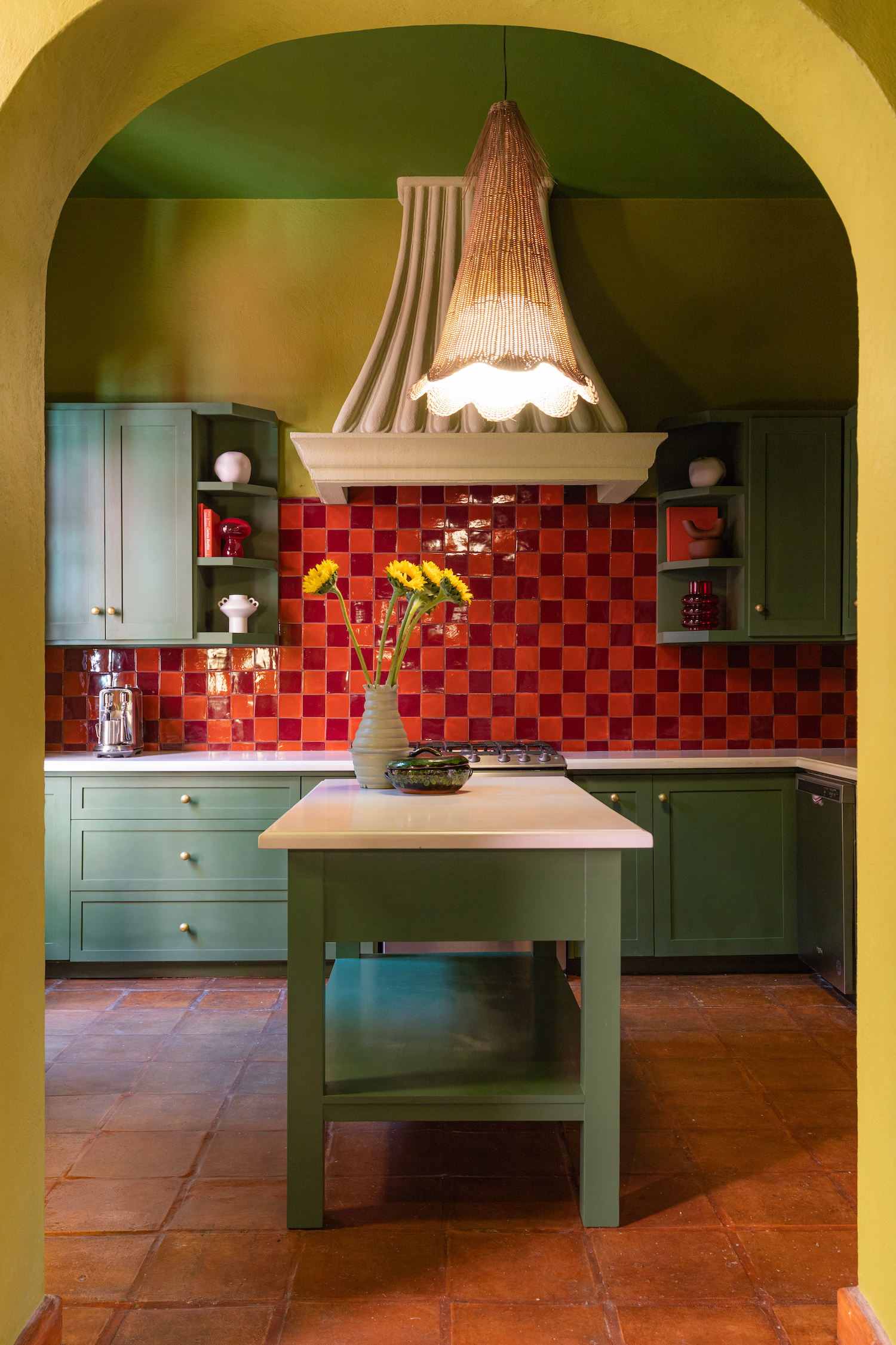
When layered against more typical shades, Chartreuse has the power to elevate an entire scheme.
Not quite yellow and not quite green, chartreuse is an obscure color that's been far too neglected in interior design (most likely because people don't really know what color chartreuse is).
But "bright chartreuse has been a truly eye-opening discovery," says Maye Ruiz, founder of Maye Interiors, who designed the unique space shown above. "While selecting green tones for Casa Coa, we found that many shades dulled the rooms. However, the moment we introduced Bright Chartreuse, everything changed. Although it’s a green, its strong yellow undertone injected an incredible burst of energy into the space."
She adds that the obscure color has the power to elevate any environment, striking the perfect balance between playfulness and sophistication. "Its bold intensity makes it an unexpected accent that revitalizes a color palette without disrupting harmony," Maye says. "Undoubtedly, it’s a daring color that deserves a more prominent place in interior design."
5. Deep Aubergine
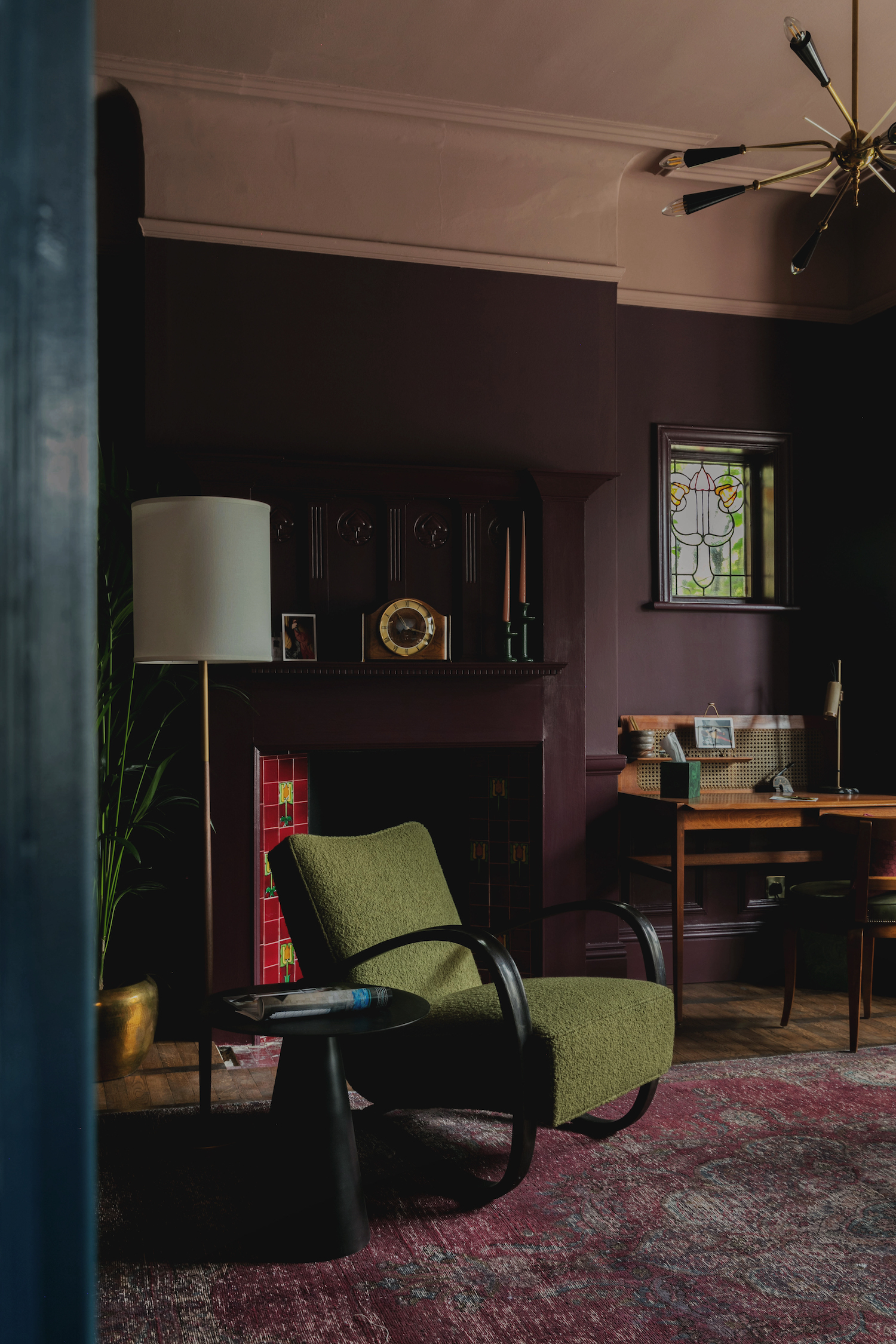
An all-over aubergine scheme might not be your first choice, but it's a quick way to a cozy, enveloping space.
Just as bright colors can feel obscure and unexpected, so too can very dark tones. Take the deep purple in the design above by Studio Duggan for example, where a tonal scheme of purples and reds results in a relaxed and cozy vibe.
"A tonal color palette can really help a small space feel larger and more cohesive," says Tiffany Duggan, founder of Studio Duggan. "It can evoke moody, cosseting vibes in a deeper palette, or feel light and fresh in a paler palette. It also lends a real feeling of calm and is an excellent backdrop for a peppering of color and interest with art and accessories."
So choosing obscure colors doesn’t have to mean going bright and bold — although the citrus tones shared above can help create a look that’s electric. More subdued shades of brown or deep aubergines can also feel unique and unexpected. However bold you want to go, there’s an out-there obscure color to suit any decorator looking to add some flair.
Be The First To Know
The Livingetc newsletters are your inside source for what’s shaping interiors now - and what’s next. Discover trend forecasts, smart style ideas, and curated shopping inspiration that brings design to life. Subscribe today and stay ahead of the curve.
Kate Hollowood is a freelance journalist who writes about a range of topics for Marie Claire UK, from current affairs to features on health, careers and relationships. She is a regular contributor to Livingetc, specializing in reporting on American designers and global interiors trends. Based in London, Kate has also written for titles like the i paper, Refinery29, Cosmopolitan and It’s Nice That.
-
 Turns Out the Coolest New Café is Actually In Your Kitchen — Here's How to Steal the Style of TikTok's Latest Trend
Goodbye, over-priced lattes. Hello, home-brewed coffee with friends. TikTok's 'Home Cafe' trend brings stylish cafe culture into the comfort of your own home
By Devin Toolen Published
-
 5 Bathroom Layouts That Look Dated in 2025 — Plus the Alternatives Designers Use Instead for a More Contemporary Space
For a bathroom that feels in line with the times, avoid these layouts and be more intentional with the placement and positioning of your features and fixtures
By Lilith Hudson Published
-
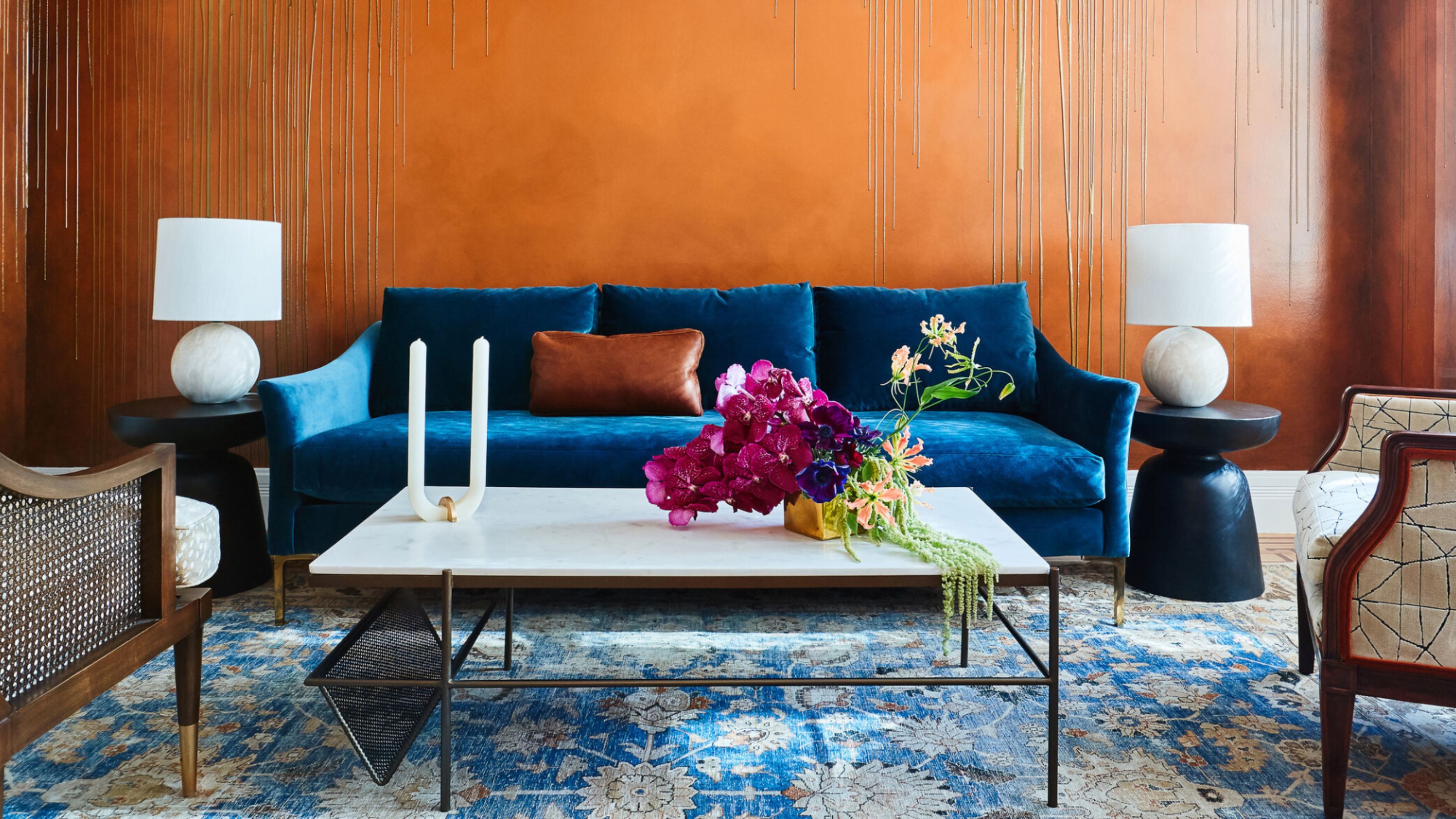 The Combination You Weren't Expecting to Love — 8 Blue And Orange Living Room Ideas That Feel Surprisingly Elevated
A blue and orange scheme for living rooms may sound jarring, but these spaces prove they're striking, vibrant, and certainly unforgettable
By Camille Dubuis-Welch Published
-
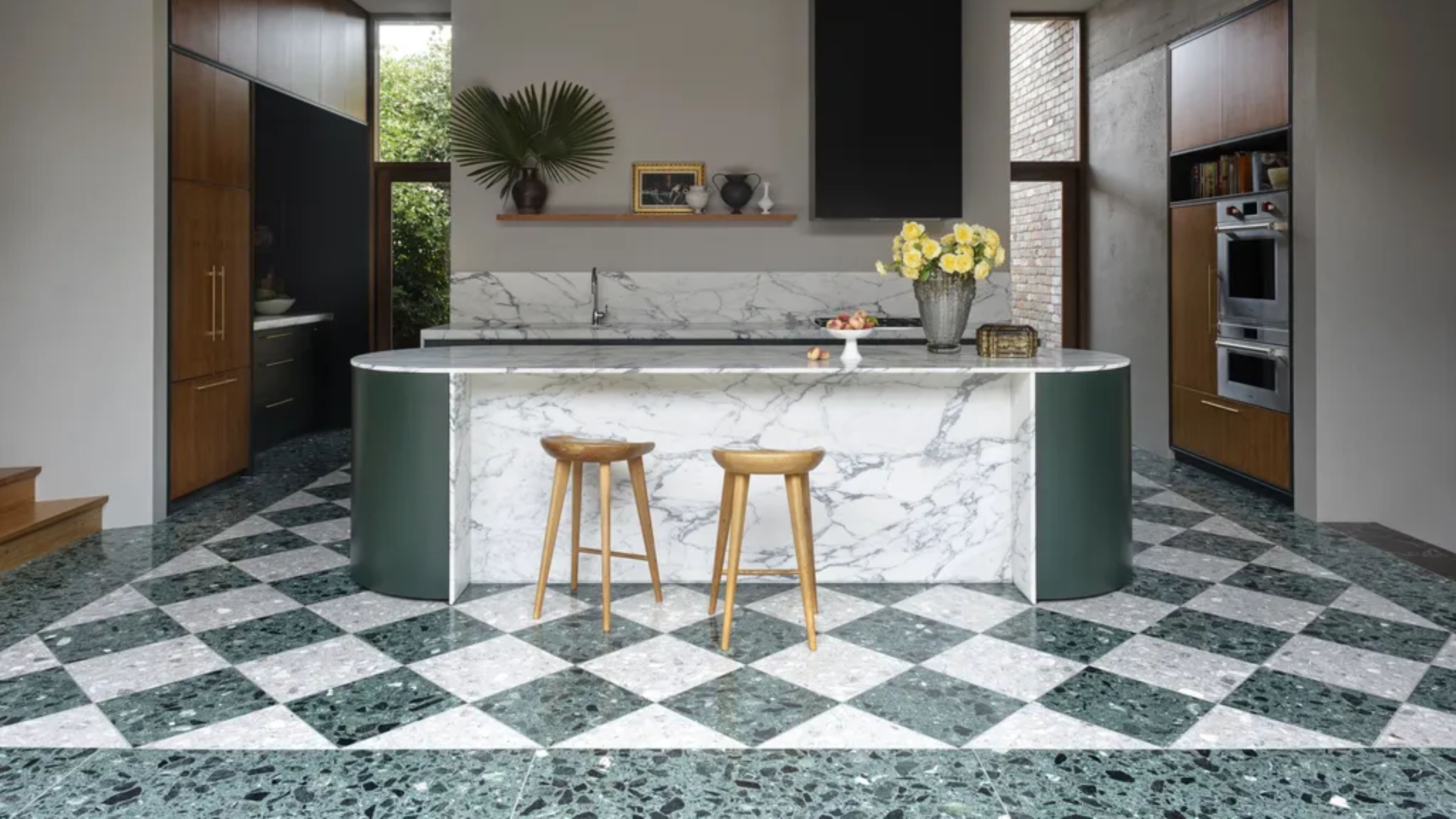 Smeg Says Teal, and We’re Listening — The Kitchen Shade of the Year Is Here
Designers are already using the soft, sea-glass green everywhere from cabinetry to countertops
By Julia Demer Published
-
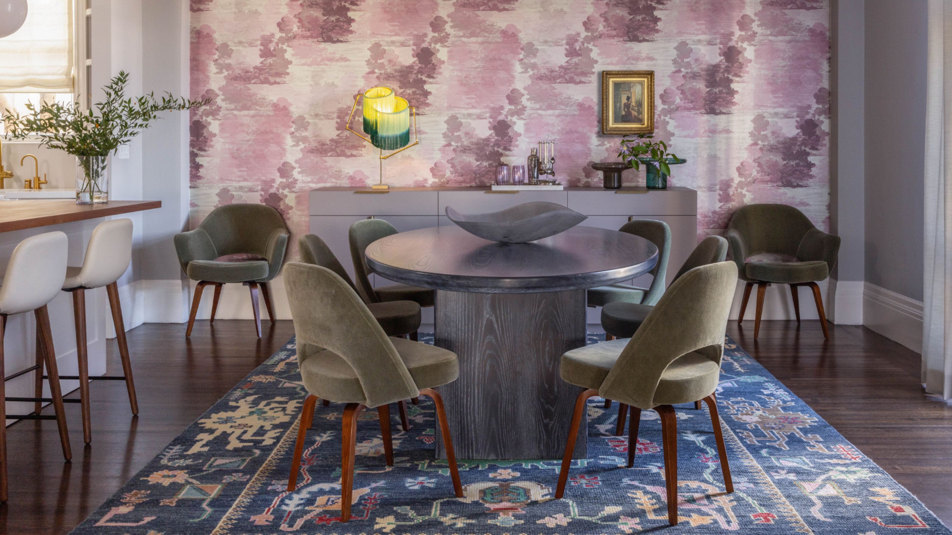 Do Yellow and Purple Go Together? Designers Reveal How to Make This Unexpected Pairing Feel "Totally Intentional"
In an era where unexpected combinations have become cool, we've done a deep-dive to discover how to pair yellow and purple in a space
By Camille Dubuis-Welch Published
-
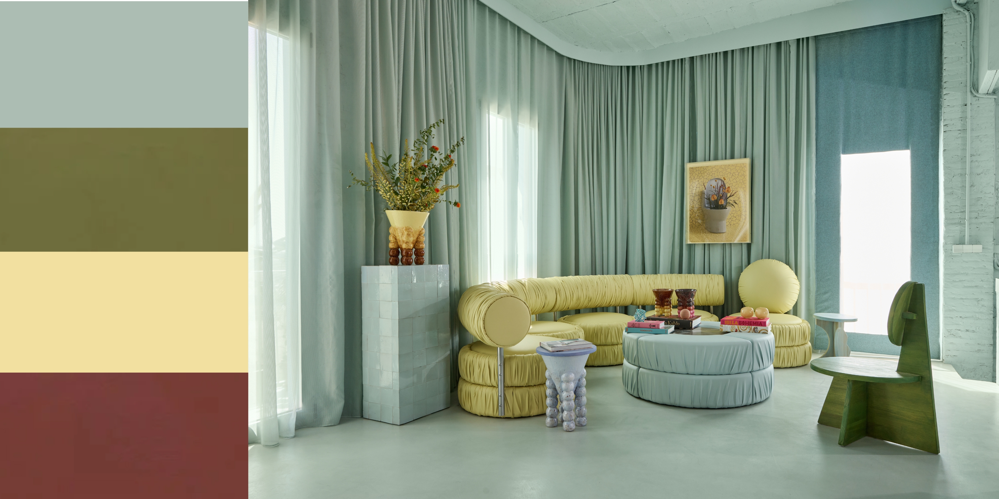 5 Unexpected but Seriously Stylish Spring Color Palettes to Shake Up the Season — "It's Pastel, but Punchy"
Spring color palettes are notorious for their use of pretty pastels, but that doesn't mean they have to lack variation
By Olivia Wolfe Published
-
 The 'Red Table Trick' Is the Easiest and Most Expensive-Looking Trend to Hit 2025 So Far
A red dining table makes a seriously stylish statement; the beloved pop of red trend just got an bold and expensive-looking upgrade
By Olivia Wolfe Published
-
 Everyone's Going Crazy for This One New Shade From Farrow & Ball Online — So What's the Big Deal With 'Scallop'?
It's a classic beige, but with a hint of blush — and it's the shade we're expecting to see in every minimalist's home this year
By Olivia Wolfe Published
-
 4 Bathroom Colors That Are Going Out of Style in 2025 — Don't Say We Didn't Warn You
If you're redecorating your bathroom this year, our design experts suggest you avoid these outdated colors
By Maya Glantz Published
-
 70s Color Palettes That Work for 2025 — 4 Designer-Approved Color 'Recipes' That Feel Modern Enough for Homes Today
It's time to bring out your paisley print and disco shoes — the golden yellows, olive greens, and deep purples of 70s color palettes are making a comeback
By Olivia Wolfe Published
