Open plan kitchen extensions – ideas and design advice from the experts to get them right
Open plan kitchen extensions can be a joy to behold, transforming your space. Follow this expert advice to make sure yours is a success
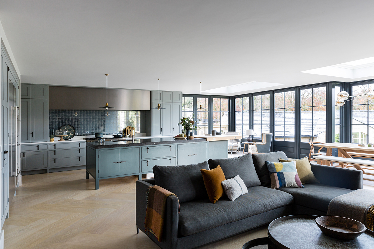

When people think of open plan extensions, they often think of a living, dining, entertaining, family space where everyone can gather and interact. They have become the must-have when it comes to the best kitchen extensions in recent years for lots of reasons – space, light and the ability to design a space with few restrictions. However, to make it feel comfortable and not too stark, zoning is so important, to identify different areas to cook, eat, entertain and relax. Think about how you and your family live before committing to a layout.
“After your zones have been identified, it's time to connect them again," says Barbara Cortesi of Barbara Cortesi Interiors. "Create elements that will carry throughout the space. Use wall treatments, joinery, furniture, bookcases, rugs, lighting, color and art to join all the pieces of puzzle."
A beautiful large, garden-facing island seems to be the go-to solution for large kitchen extensions, but remember that is not the only one. A U shape kitchen or a peninsula can serve the same purpose while giving you more cabinetry space. The peninsula itself can serve the same purpose as an island, acting as a breakfast bar while connecting the kitchen to your dining area.
"In a large extension/addition there will likely be roof lights," Barbara says. "The sun will shine through during the day, but it is important to think about the evenings too. Task lighting is important for cooking and we always need to plan for it. So make sure that there is enough ceiling space to allocate it. If not, then clever lighting can be the solution, such as flexible angled spotlights or bars fitted across your skylights.”
"My goal is always the same with kitchen remodels: to design a kitchen that will be a lasting success," says Michael Howells of Howells Architecture + Design. "It's easy to design something that looks good and works well now, but can it also look good and function well for 50 years? I suggest choosing a simple palette, connect the dining spaces to the kitchen and go for style and practicality. When working in the kitchen it’s great to be in easy dialogue and eye contact with someone sitting at the breakfast table or dining table. Choosing the same flooring throughout gives a cohesive look and direct access to the outdoors brings you in touch with nature.”
1 OUTSIDE IN
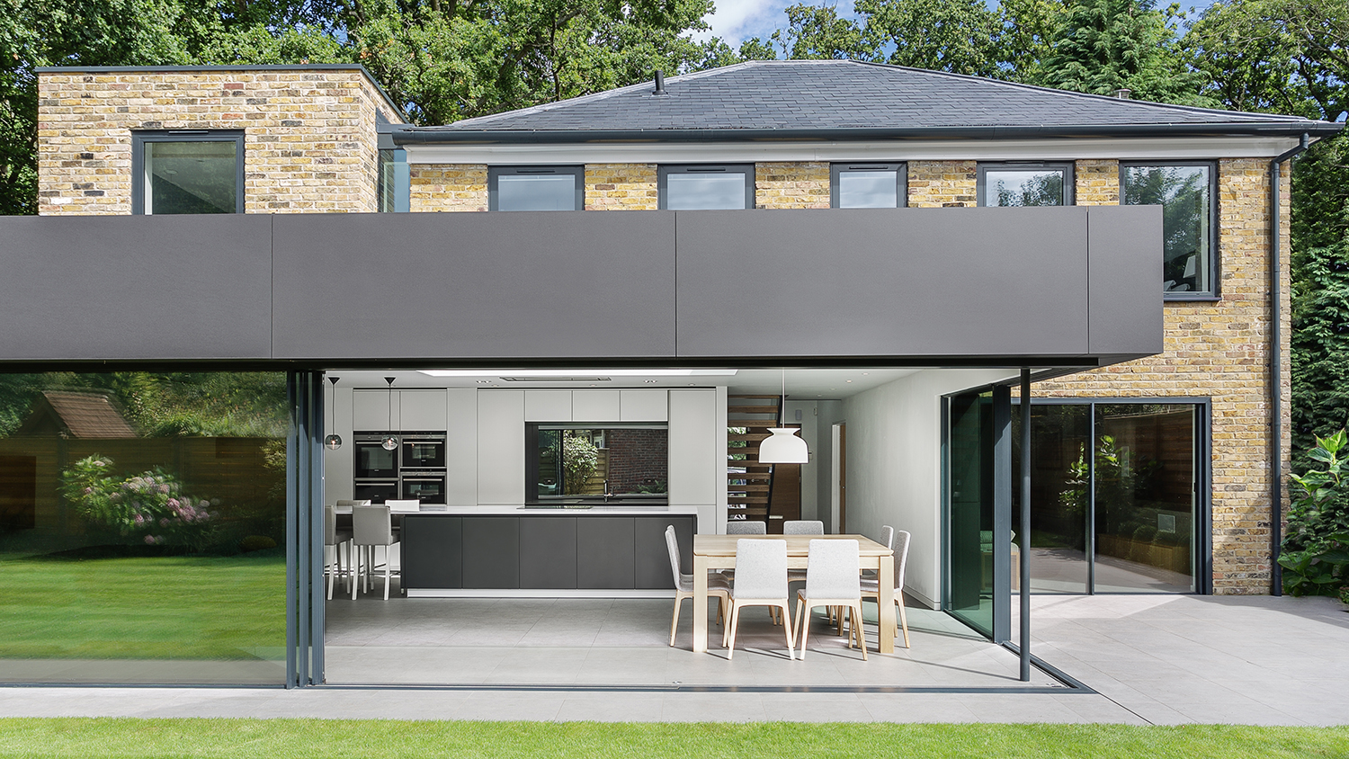
Extension by AR Design, kitchen by The Myers Touch.
The epitome of glass kitchen extension ideas, this property was re-designed with a single storey extension to create a one of the best modern open plan kitchen extensions, with plenty of storage, a dining and living area. The doors open fully to bring the outside in, with the same flooring used in both areas for a seamless look
“This design works hard to maximise the relationship between the home and garden," says architect Paul Bulkeley, Design Director of Snug Architects. "The kitchen is located within an L-shaped rear extension that extends the kitchen out into the garden, serving to both connect the kitchen back to home, out to the terrace and into the garden. Importantly, the kitchen encloses the paved courtyard which is set lower than the garden, further enclosing the space. As a result the kitchen sits at the centre of the whole home, both inside and out.”
2 MIXED MATERIALS
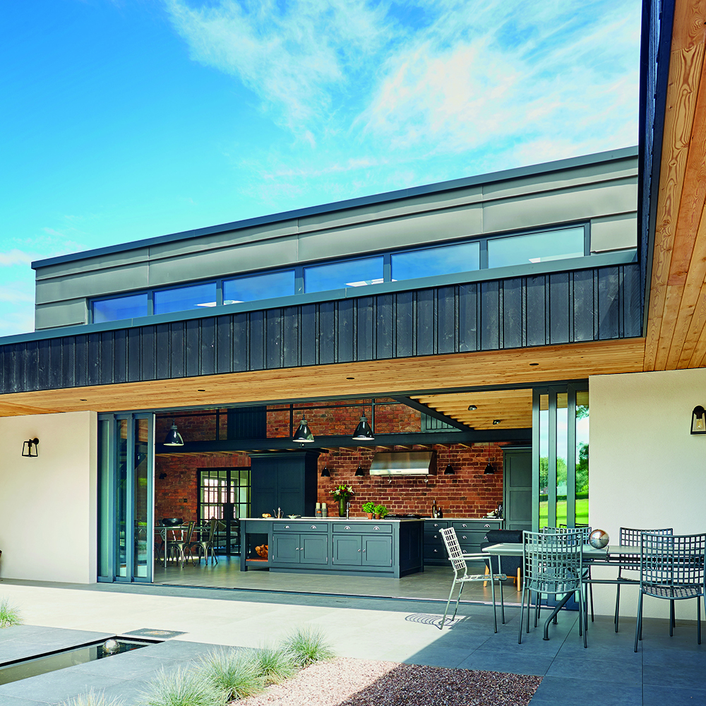
Hartford kitchen in Nightingale from £20,000, Tom Howley
This stunning open plan kitchen extension shows how well modern materials mix with traditional ones, and is good inspiration for when you're wondering how to plan a kitchen extension.
The building has a warehouse feel with the exposed mezzanine floor, black girders and exposed brick walls. The dark gray kitchen cabinets sit perfectly in the middle of the space. The charcoal sliding doors open up the whole front so the garden becomes part of the space, doubling the usable area. Wood has been added in the ceiling inside and out to further enhance the warm colour scheme and link the two spaces.
3. CALM NEUTRALS
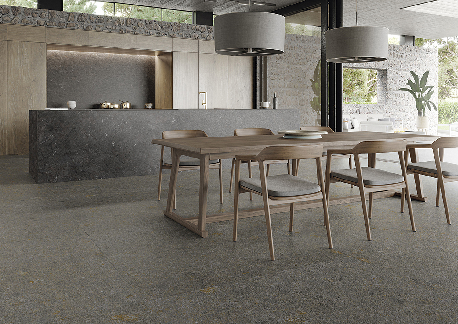
Another example of linking the inside and out, this time using stone. The rustic stone runs along the back wall with wooden kitchen cabinets in front of it. The wall follows the same line outside to create part of a covered terrace. Honed Umbria stone effect Ceralsio ceramic surface has been used to create the island and splashback, with a similar stone – CRL Quartz Meteora Gris quartz on the floor. A beige/taupe colour scheme is used throughout for an elegant overall look, and this is a style that can work equally well when considering small kitchen extension ideas.
4. LIGHT AND SPACE
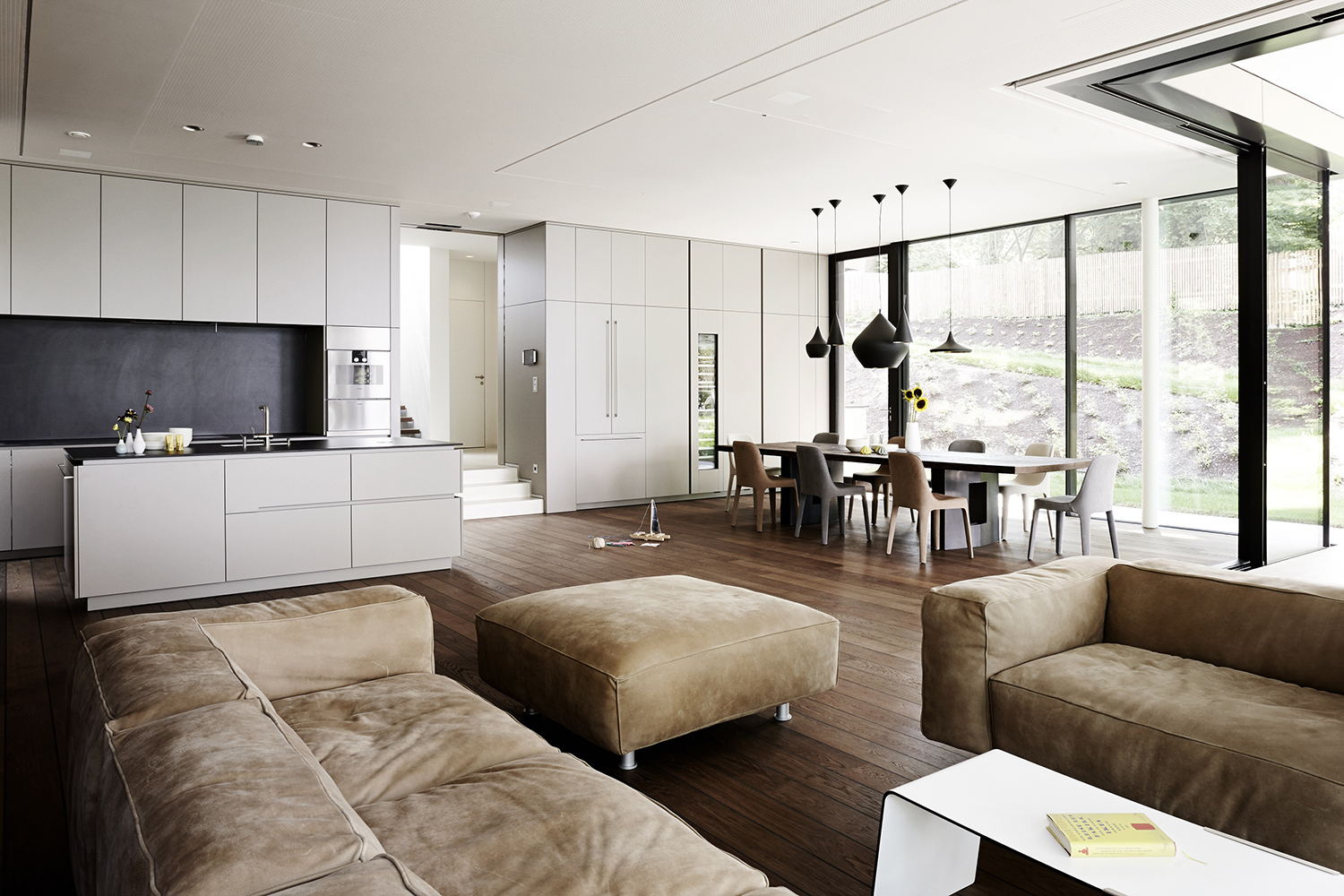
Eggersmann island and cabinetry in E3.0 in KARAT from £40,000
When thinking about open plan kitchen extensions, consider the shape. A square is a good space for communal living, and expert design tips for your kitchen extension tend to revolve around this. as everyone can see each other whether they are relaxing, cooking, or working at the table.
Big comfortable sofas are enticing and the colour scheme uses a combination of similar tones so that nothing jars. Having different coloured dining chairs is a nice touch, with different shaped pendants zoning the space.
"Open-plan kitchens don’t just provide a more sociable area for families to spend time together, they’re also more versatile and can be adapted to suit changing needs," says Helena Myers, Interiors and Colours Specialist at Luxury Kitchen Design Studio, The Myers Touch. "The layout is a major factor in an open-plan space; you need to think carefully about the aesthetics, lighting and atmosphere because your kitchen will always be on show."
5. DOUBLE ASPECT
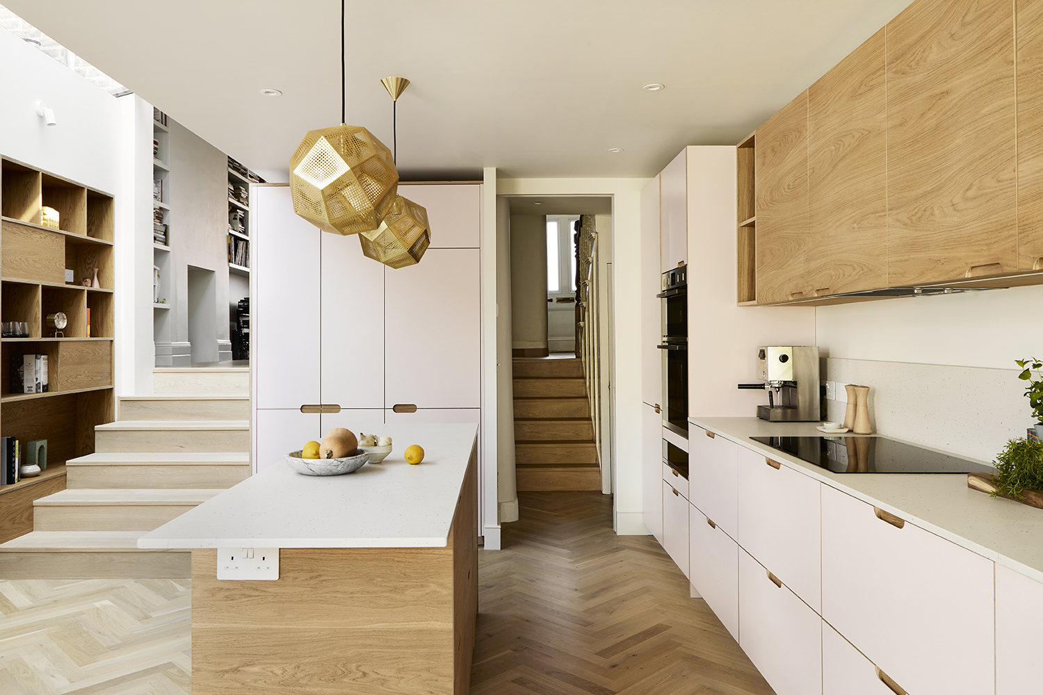
Design by Holte
This Victorian house is typical of its type, long and thin from back to front. But it is possible to open up a house like this with a bit of clever design. An open plan kitchen extension has been added at the back which is accessed from both sides, from the hallway and also from the sitting room. The hallway stairs are original but opening up the sitting room and extending into the side return creates extra space and light, and means there is room for display storage. The wider stairs on the left are in a pale wood as is the floor and adds to the airy feel.
6 FOR ALL THE FAMILY
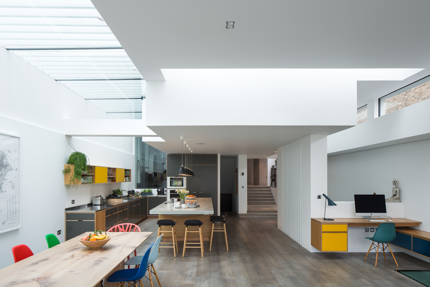
Design by Uncommon Projects
This is a large open plan kitchen extension, and is the perfect family space. The kitchen takes up a large chunk of the area with glazing above for brightness, then to one side a small home office with clever storage and colors that tie in with the rest of the room. Opposite is a dining space. Looking through, you can see the stairs and hallway and also down to the basement.
7. COHESIVE DESIGN
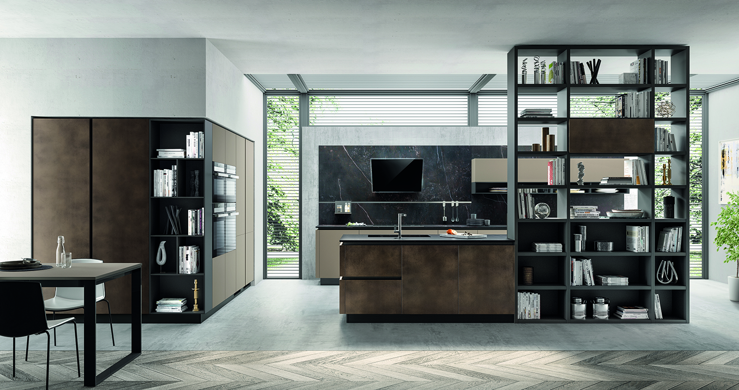
Design by Scavolini
This open plan kitchen extension is set at a slightly lower level than the rest of the room and is glazed all around the kitchen zone, including the ceiling to bring light in. The sink is in a modern kitchen island that looks out into the room and butts up to a tall display unit, dressed with accessories to make it feel part of the living room, with some of the cubes open to allow light through. To further integrate it, the ovens are recessed into a wrap around unit on the left hand side and butt up against another display unit for a neat, ingenious look.
“A harmonious palette of colours and materials is typically used in an open-plan space to unify the different functional areas," says Fabiana Scavolini of Scavolini Design. "For customers doing a complete refit, choosing the same finish for kitchen cabinets and living/dining storage creates a cohesive look and a sense of visual flow."
Fabiana has some notes on color choices, too. “When cooking, eating and lounging all take place in the same open-plan space, it’s important to zone the different areas within it," she says. "A change in paint color or flooring is a subtle way to achieve this without sacrificing harmony and flow.”
8. SYMPATHETICALLY DONE
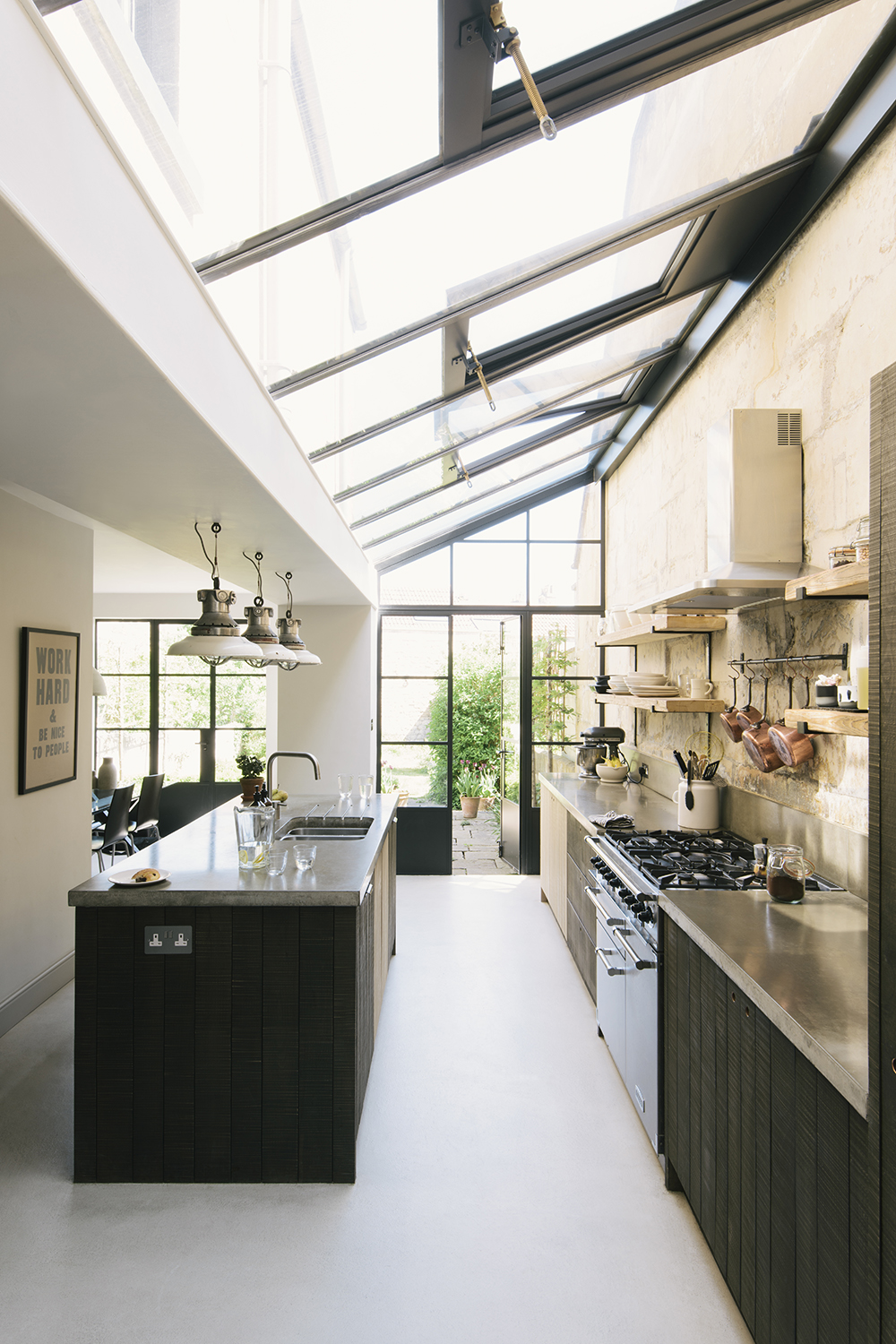
Kitchen designed by Sebastian Cox for deVOL
The owners of this traditional stone house in Bath added a glass section to the side and as an infill between two sections of their home to create a beautiful space for a kitchen and dining room that leads out into the garden. It’s an ingenious use of space that works really well. They left the warm honey-coloured stone exposed which complements the rough-sawn kitchen cabinets by Sebastian Cox for deVOL. The Crittall-style windows and doors are by Fabco and add to the traditional feel.
9 BIG SQUARE
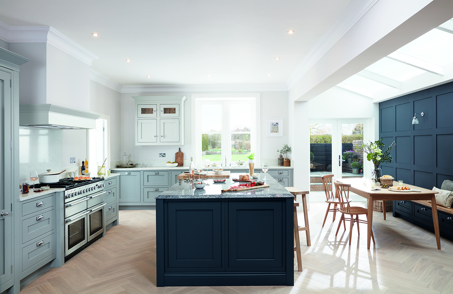
Kitchen by Life Kitchens
A large extension was created to take in a side return, allowing a dining area with dark grey panelling behind with bench seating and glazing above. There are two sets of doors leading out into the garden, one near the dining table and another set next to the oven, making the room really light. A complementary color scheme works well to define the different areas with wooden furniture to add warmth.
10. CALMING VIBE

Kitchen by Mowlem and Co
This tonal scheme works beautifully with everything you could need in one space. It’s on the ground floor with windows all around for views over the courtyard in a ‘modern orangery’ style. All the materials used are tactile, from a mix of Shaker and flat doors in a hand-painted finish, with mixed metals - from the black steel of the Buster & Punch door handles to the brass touches of the pendant lights and the steel panel concealing the extractor. Vintage glass has been used for the splashback, linen on the sofa and pale natural wood all blend together to create a unified whole.
Be The First To Know
The Livingetc newsletters are your inside source for what’s shaping interiors now - and what’s next. Discover trend forecasts, smart style ideas, and curated shopping inspiration that brings design to life. Subscribe today and stay ahead of the curve.

Alison Davidson is well-respected British interiors journalist, who has been the Homes Editor of Woman and Home magazine, and the Interiors Editor for House Beautiful. She regularly contributes to Livingetc, and many other titles, and often writes about kitchens, extensions, and decor ideas. She is the go-to for information about green energy, sustainable home improvement and eco design ideas.
-
 The 'New British' Style? This Victorian London Home Embraces Its Owners' Global Background
Warm timber details, confident color pops, and an uninterrupted connection to the garden are the hallmarks of this relaxed yet design-forward family home
By Emma J Page
-
 Muji Living Room Ideas — 5 Ways to Harness The Calming Qualities of This Japanese Design Style
Inspired by Japanese "zen" principles, Muji living rooms are all about cultivating a calming, tranquil space that nourishes the soul
By Lilith Hudson