3 Ways Designers Say You Shouldn't Decorate Your Ceiling Anymore — Number 3 Definitely Surprised Us!
The wrong design choices will turn your ceiling from amazing to eyesore, say these experts. These are the outdated ceiling designs to avoid now
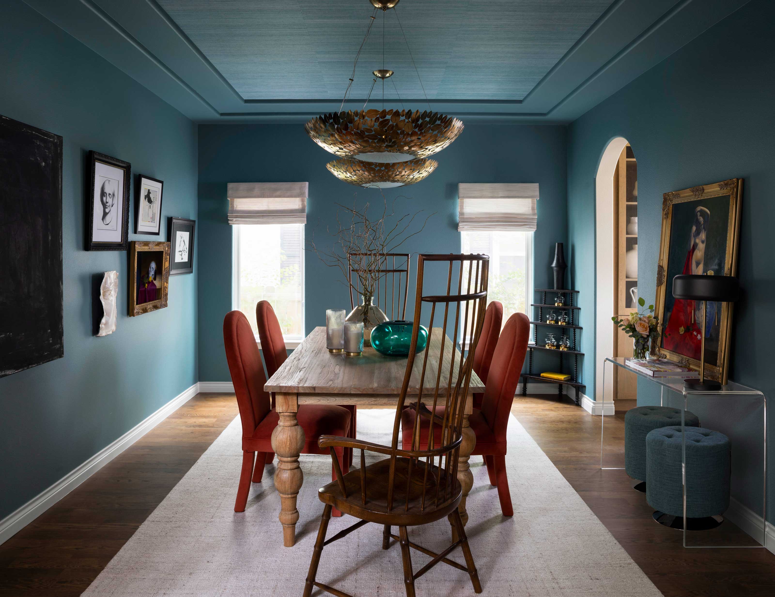

It's the year of the statement ceiling, and we're seeing beautiful, bold approach to decorating them in plenty of designer projects right now. The so-called 'fifth wall' contributes tremendously to an entire room's look and feel, and so choosing the right ideas is important. But with so many ideas floating around right now, it can be hard to know which ones are really a good idea, and which ones aren't.
To help you out, we asked top designers for the ceiling decorating ideas they think are outdated or overdone, and what they'd do instead. Take a look before you start renovating or designing your home.
1. Bulky, wooden coffered ceilings

Try instead: This simple coffer adds detail without overwhelming the space.
Paneled ceilings are incredibly popular right now, even when they're not original. They add texture and drama to a ceiling where paint and even wallpaper can fall flat. However, when it comes to adding a sense of depth overhead, there's limits to how ornate you should go.
'Overdone and multi-layered coffered ceilings are passe,' says Sarah Brady, founder & principal designer of Salt Design Company. 'This design approach often involves adding excessive architectural elements, such as multiple tiers and intricate detailing, to create a sense of grandeur. However, this can result in a cluttered and overly ornate look that feels out of place in most homes.'
But if you do like the paneled look, a good alternative, as suggested by experts is a more simplistic, clean design 'that enhances the space without overwhelming it, focusing on clean lines and subtle embellishments for a timeless and elegant aesthetic,' says Sarah. Finer criss-cross moldings (as pictured above), thin wooden slats across the ceiling, and more could look crisp in double-height spaces. You could also paint the slats to match the palette of the room, for a more eclectic feel.
2. Popcorn ceilings
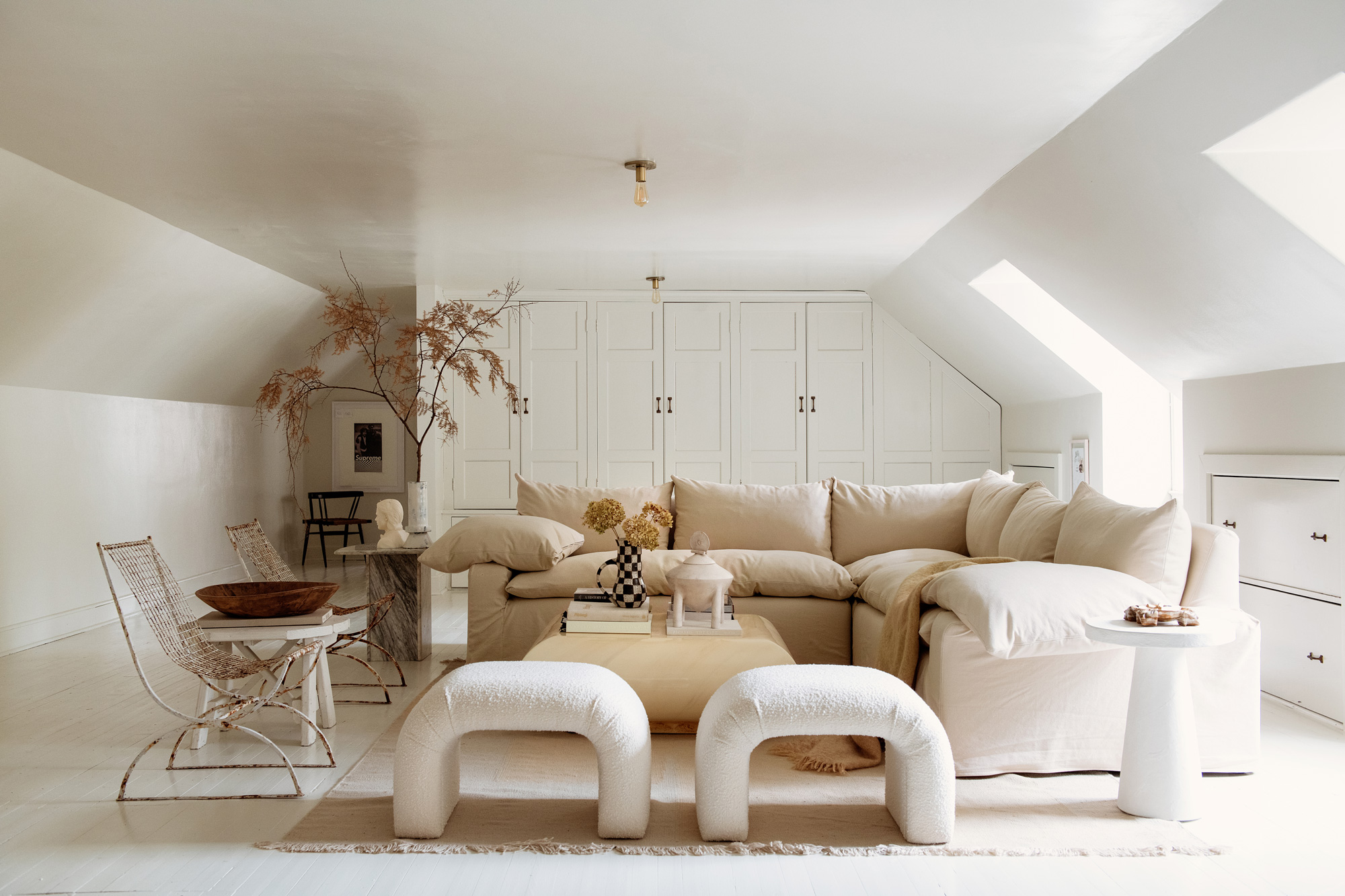
Try instead: If you're looking for variety, a different paint finish can be a less distracting texture for a ceiling.
'The heavy, textured "popcorn" ceiling has seen its days,' says Seattle-based interior designer Nishtha Vashist. 'Initially favored in the mid-20th century, these ceilings were popular for their ability to conceal imperfections and for their sound-dampening qualities. However, their disadvantages have rendered them obsolete in contemporary design. Popcorn ceilings are prone to accumulating dust and cobwebs and present challenges in repairs and repainting. Additionally, they'd historically often contained asbestos, which poses significant health risks during the removal process.'
If you don't have the time or budget to completely transform your ceiling, you could paint a popcorn ceiling to give it a smoother, even look. 'At the moment, modern design preferences lean towards smoother ceilings, which offer a sleek appearance and are easier to maintain, aligning with today’s aesthetic and practical demands,' says Nishtha.
And if you do want a complete makeover, consider painted ceiling ideas in subtle sheens. A semi-gloss or satin finish looks great on the fifth wall, adding a touch of elegance to the room.
3. Ceilings and walls in equal saturation
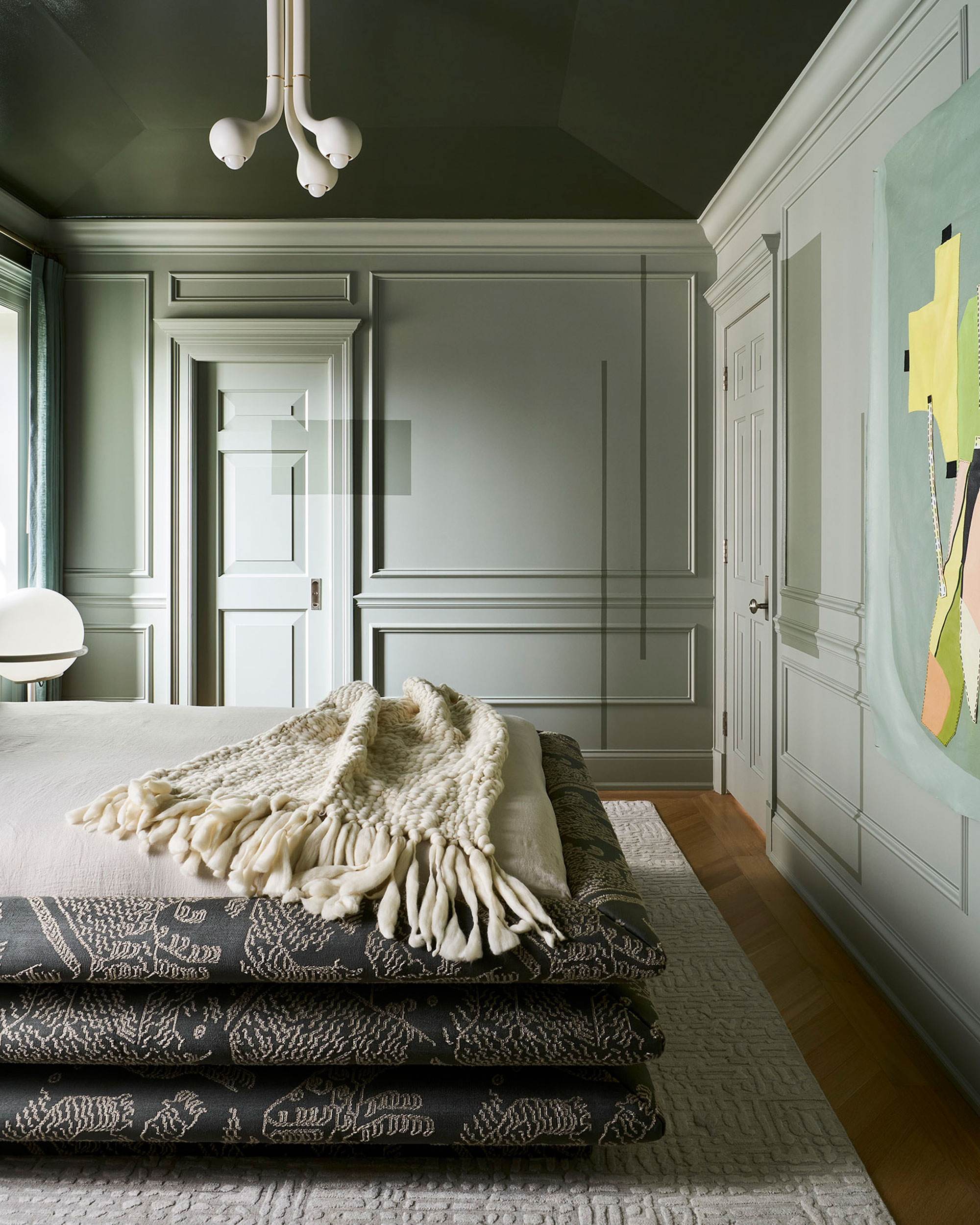
Wait a minute, isn't color drenching a room on trend right now? While yes, a lot of designers are looking to paint ceilings and walls the same color, some believe there's a right and there's a wrong way to do it.
'In most cases, I would avoid painting the walls and ceiling in tones of equal value or saturation,' says Heather Peterson, founder of Heather Peterson Design. 'A strong wall color can wonderfully complement a ceiling color in a softer tone.'
Choosing different saturation or color temperatures for the ceiling and wall paints adds depth to the overall room, and stops the space from feeling too flat.
Of course, there are always exceptions to every rule, and you might find your perfect home design with any of these ceiling ideas, no matter how much designers tell you to avoid them.
'What we're seeing as important in design right now is that the ceiling isn't an afterthought, painted Brilliant White and left at that,' says Hugh Metcalf, editor of Livingetc.com. 'It's got its own weight to pull in how we're decorating now, so whatever you do do with it, make sure its purposeful.'
Be The First To Know
The Livingetc newsletters are your inside source for what’s shaping interiors now - and what’s next. Discover trend forecasts, smart style ideas, and curated shopping inspiration that brings design to life. Subscribe today and stay ahead of the curve.

Aditi Sharma Maheshwari started her career at The Address (The Times of India), a tabloid on interiors and art. She wrote profiles of Indian artists, designers, and architects, and covered inspiring houses and commercial properties. After four years, she moved to ELLE DECOR as a senior features writer, where she contributed to the magazine and website, and also worked alongside the events team on India Design ID — the brand’s 10-day, annual design show. She wrote across topics: from designer interviews, and house tours, to new product launches, shopping pages, and reviews. After three years, she was hired as the senior editor at Houzz. The website content focused on practical advice on decorating the home and making design feel more approachable. She created fresh series on budget buys, design hacks, and DIYs, all backed with expert advice. Equipped with sizable knowledge of the industry and with a good network, she moved to Architectural Digest (Conde Nast) as the digital editor. The publication's focus was on high-end design, and her content highlighted A-listers, starchitects, and high-concept products, all customized for an audience that loves and invests in luxury. After a two-year stint, she moved to the UK and was hired at Livingetc as a design editor. She now freelances for a variety of interiors publications.
-
 I Just Found a Stylish Wireless Pendant Light That Makes Your Garden Look (and Feel) Like a Living Room
This rattan-like pendant light is wireless and rechargeable — making it a functional and stylish choice for your outdoor space
-
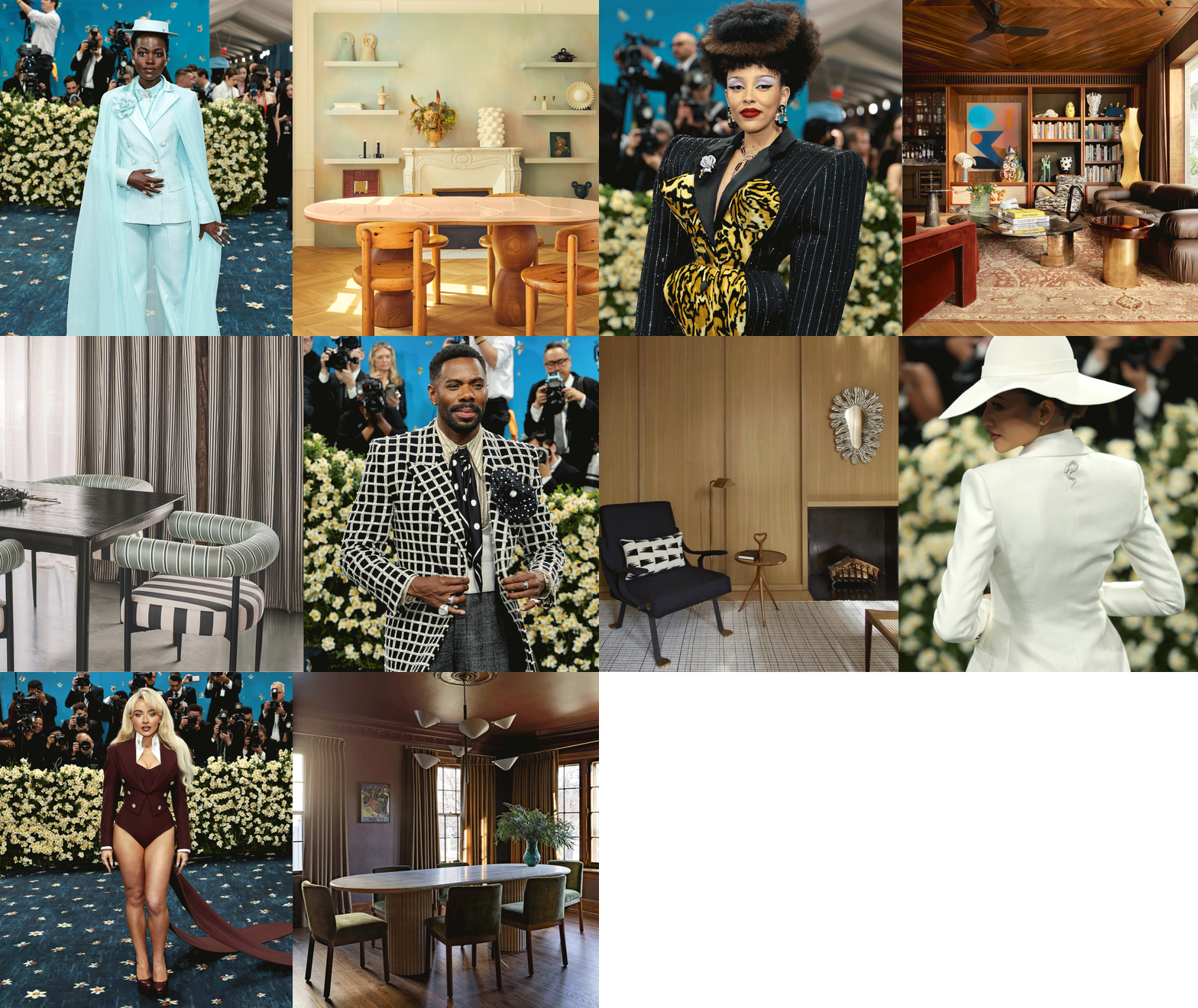 Icy Blue, Stripes, and the Design Equivalent of Shoulder Pads — 2025's Best Met Gala Looks as Interior Trends
The Met Gala carpet was alive with fashion trends that translate into the schemes designers are creating for the most exciting homes right now, too


