Outdated Granite Colors to Avoid for Kitchen Countertops — and What to Pick Instead for a Fresh Look
If you're updating your kitchen, these granite countertop colors are ones you should stay away from

The Livingetc newsletters are your inside source for what’s shaping interiors now - and what’s next. Discover trend forecasts, smart style ideas, and curated shopping inspiration that brings design to life. Subscribe today and stay ahead of the curve.
You are now subscribed
Your newsletter sign-up was successful
Various kitchen trends have come and gone but granite's a material that has some longevity — if you pick the right one. There was a time when this material was such a staple, that people would call the process of choosing countertops “choosing your granite.” While today quartz and other engineered stone have favored materials for counters, there's still a lot to be said about the stain-, scratch-, and heat-resistant granite. People who love it, really love it.
And so, if you plan on using this kitchen countertop material and want to ensure it looks both modern and timeless, then experts suggest you avoid certain colors, and choose others instead. Here's a list of granite tones that have fallen out of favor.
1. Avoid overly speckled granite, choose white instead
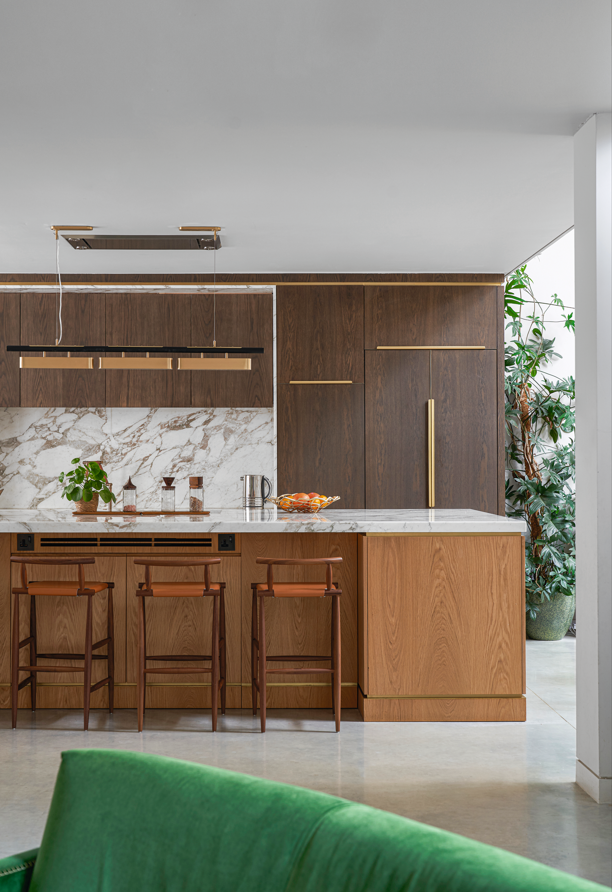
Durable, beautiful, and unique granite has for decades added value to modern kitchens. Since it's a natural stone, it's available in many colors and combinations, and can easily complement any type of kitchen cabinets and other interior details.
But amongst the wide choices, experts suggest the days of overly speckled granite are over.
'Currently, granite colors that tend to be perceived as outdated include overly speckled or heavily patterned varieties, such as busy browns and golds,' says Liv Conlon, CEO of ThePropertyStagers. 'These colors can often make a space feel dated and clash with modern aesthetics.'
'Luckily, there are a wide range of granites out there with some of the best durability in natural stone,' says Kyle Dutton, founder of Kyle Dutton Homes. 'When selecting granite, look for the neutral earth tones with more of a solid color. If you prefer some movement in your stone, there are some great options that can mimic veining that add drama and/or interest to your space. Some of our favorite ones that are still on trend include Stream White, Virginia Mist, and New River White from MSI Surfaces.'
2. Avoid caramel, choose black instead
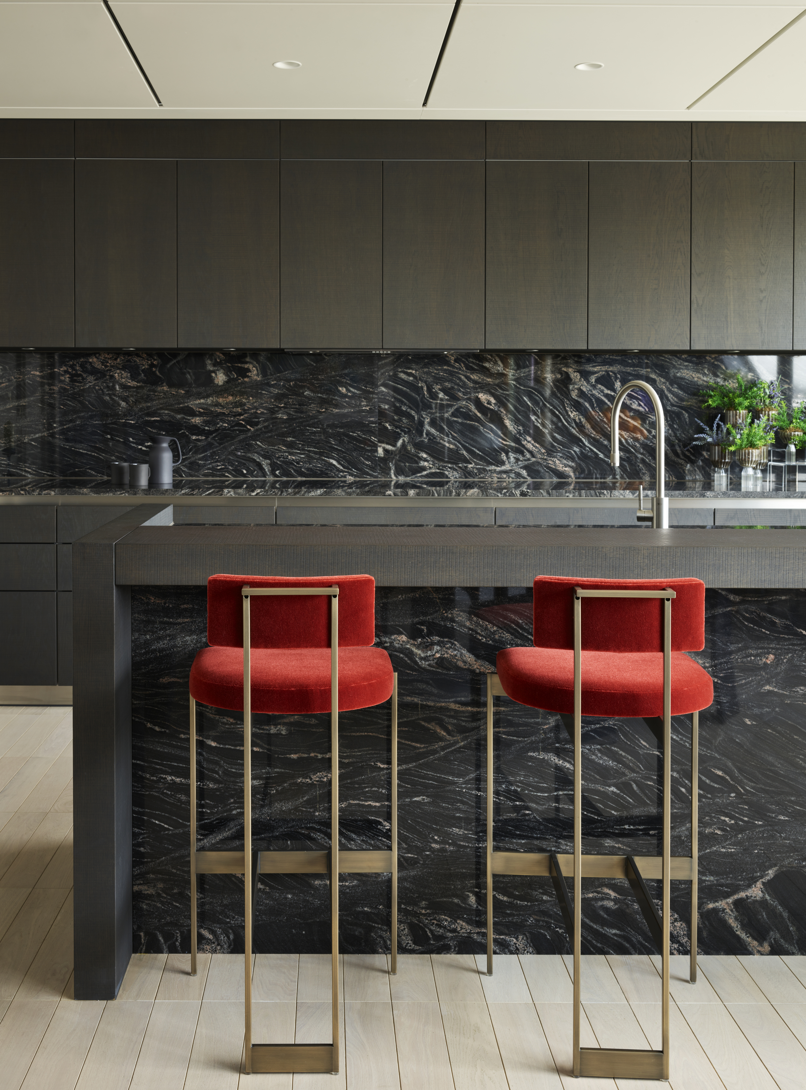
While remodeling a kitchen, another color to steer clear of is the commonly seen caramel, brown tone.
'Granite slabs with uniform speckling of brown are not in trend anymore,' says Kyle. 'They bring back memories of builder-grade countertops that were installed in every home across America at one point in the past. Stay away from anything with splotchy or spotty patterns such as coffee brown or caramel.'
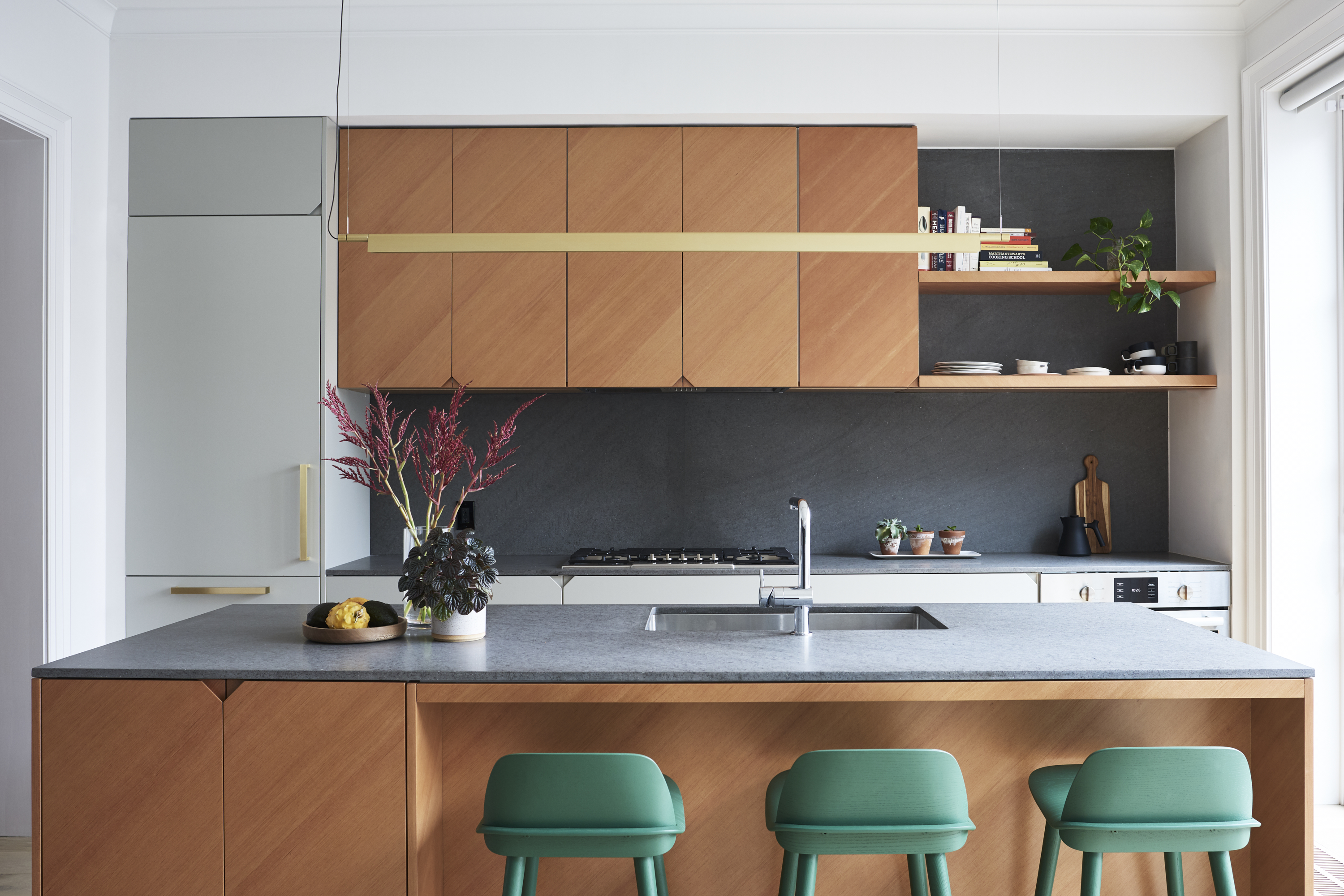
A bold yet highly durable kitchen color to go for is black. In fact, the black kitchen trend has recently been picking up a lot of steam, and a counter in this color is a lovely way to bring in this tone. Plus, black counters easily hide scratches and make the space always feel fresh.
'Sleek and minimalist granite countertop colors are currently on trend,' says Richard. 'This includes shades like gray and various shades of black. These colors offer a timeless elegance that complements modern kitchen designs.'
3. Avoid pink, choose beige instead
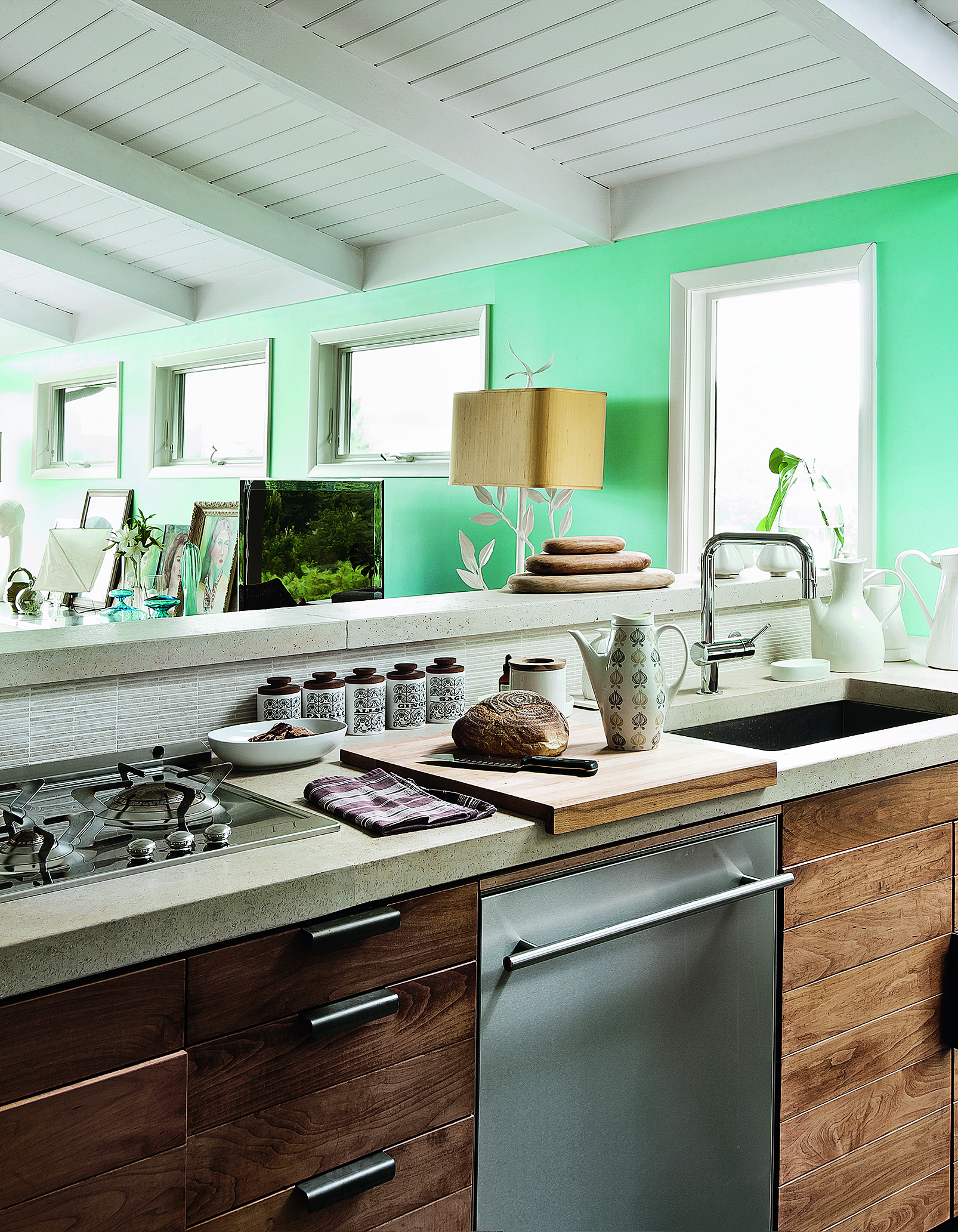
'Generally, our office avoids granite countertops in kitchens,' says Jeff Sherman, co-founder of DELSON OR SHERMAN ARCHITECTS PC. 'This kitchen countertop material performs well, but most patterns and colors are an eyesore. The ones that feel particularly dated are the shiny ones in pink.'
'When it comes to choosing granite for homes or even for resale value, neutrals reign supreme,' says Liv. 'Shades like soft whites and subtle beiges offer a timeless appeal that can complement a wide range of design styles. Neutral granite countertops create a blank canvas for potential buyers, allowing them to envision their own style and decor preferences. Plus, these colors tend to make spaces feel brighter and more spacious, enhancing the overall appeal of the home.'
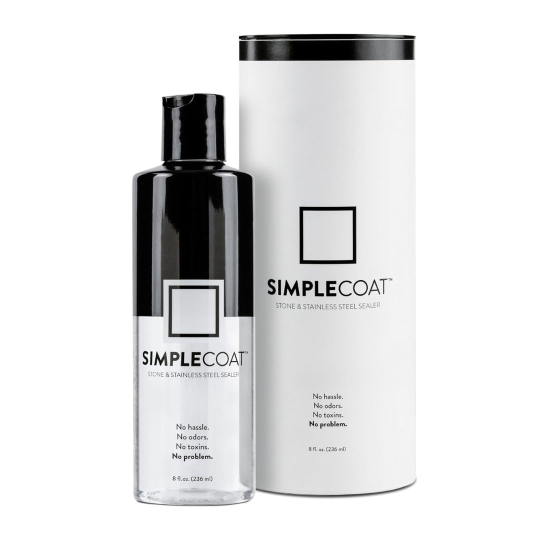
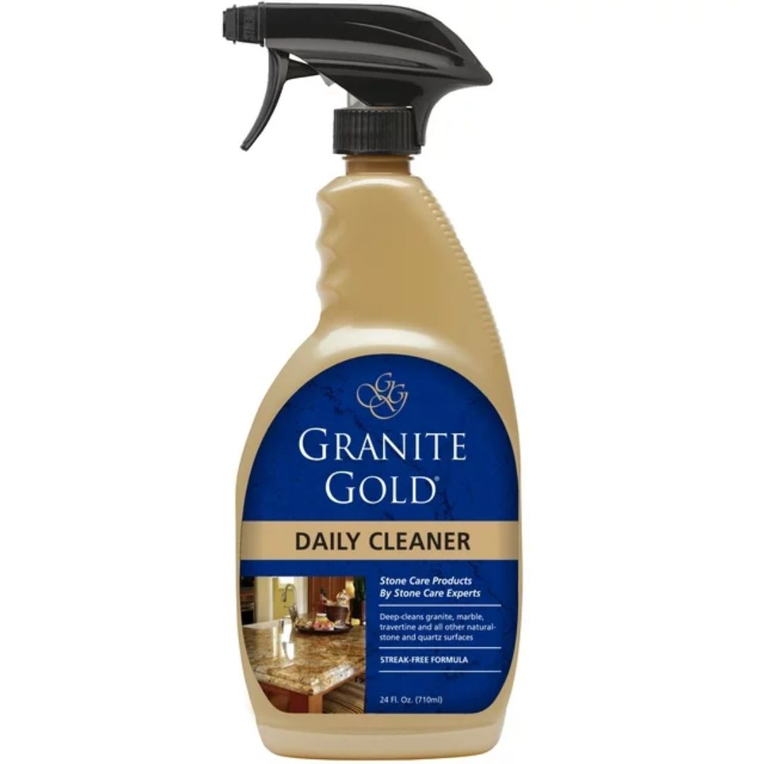
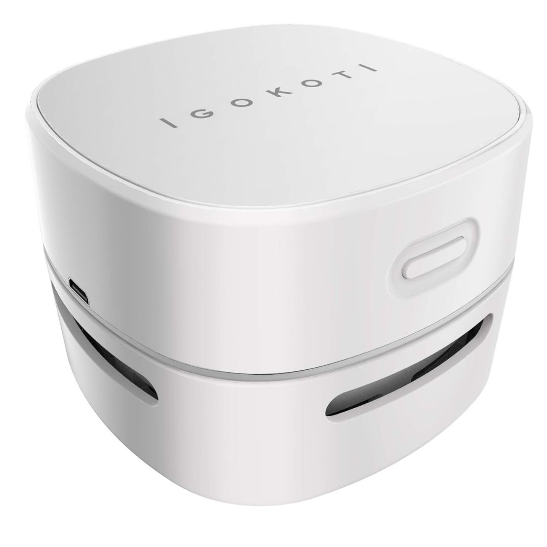
3 products to protect your granite countertop
The Livingetc newsletters are your inside source for what’s shaping interiors now - and what’s next. Discover trend forecasts, smart style ideas, and curated shopping inspiration that brings design to life. Subscribe today and stay ahead of the curve.

Aditi Sharma Maheshwari started her career at The Address (The Times of India), a tabloid on interiors and art. She wrote profiles of Indian artists, designers, and architects, and covered inspiring houses and commercial properties. After four years, she moved to ELLE DECOR as a senior features writer, where she contributed to the magazine and website, and also worked alongside the events team on India Design ID — the brand’s 10-day, annual design show. She wrote across topics: from designer interviews, and house tours, to new product launches, shopping pages, and reviews. After three years, she was hired as the senior editor at Houzz. The website content focused on practical advice on decorating the home and making design feel more approachable. She created fresh series on budget buys, design hacks, and DIYs, all backed with expert advice. Equipped with sizable knowledge of the industry and with a good network, she moved to Architectural Digest (Conde Nast) as the digital editor. The publication's focus was on high-end design, and her content highlighted A-listers, starchitects, and high-concept products, all customized for an audience that loves and invests in luxury. After a two-year stint, she moved to the UK and was hired at Livingetc as a design editor. She now freelances for a variety of interiors publications.
