

Our living rooms are the heart of our home, the most central place of community, comfort, and congregation. So choosing a paint color that reflects your personal style, and that will last you through the seasons is vital to having a well-styled room.
In 2025, we’re moving away from colors that feel overly cold or stark. The interior design world has instead completely embraced palettes that incorporate bold, saturated colors, deep moody hues, and a sense of serene warmth. But how does one shuffle through the constant influx of dos and don'ts?
While it's always good to consider the living room color trends for 2025, I must admit, I'm more interested in what designers are advising to steer clear of. What will feel dated once the year is out? And what colors are better suited to withstand the test of time? Below are the top three living room colors going out of style in 2025, according to these designers.
1. Those Bright, Neon Shades

DO INSTEAD: Find ways to bring in color that feel intentional and timeless while still giving the room that pop of personality.
We saw a surprising number of super vivid living rooms popping up last year, and while bright colors can be fun, their playfulness can easily go overboard. Design director and lead designer at London-based studio, Riccardo Vicarelli Architects, Riccardo Vicarelli, says, "Very bright or neon shades can be fun in small doses, but on walls, they can feel overwhelming and hard to live with."
It's safe to say that the strategic neon interior trend must stay as a decor idea rather than something to put on your walls. While neon color palettes may not be something you would immediately consider for paint ideas, bright, heavily saturated colors should be handled with caution as well.
Florida-based interior designer and founder of Laure Nell design studio, Laetitia Laurent, says, "I am seeing a lot less bright, artificial shades, especially blues, and teals — there’s something about them that feels disconnected from the warmth and character people are craving in their homes now." Laetitia adds, "Anything too sharp or neon tends to date a space quickly."
Alternatively, deeper blues, like indigo, and inky tones can bring meaningful color to a space that feels timeless and elegant. Riccardo also recommends, "Soft terracottas and muted reds. They are perfect for adding warmth and personality without overpowering the room."

Riccardo Vicarelli is the lead architect at Riccardo Vicarelli Architects and has over 20 years of experience in Architecture and Interior Design. He has worked on projects of all different scales across London, Dubai, and Umbria.

Laetitia Laurent is an international award-winning interior designer based in Boca Raton, FL. Her interior design firm "seamlessly blends European design principles with her Parisian heritage to elevate residential interiors." Laetitia travels globally to explore design from around the world and bring influences back home to her work.
2. Muddy Browns

DO INSTEAD: Colors like deep olive greens will bring the same grounding effect that browns do without the same possibility of feeling too 'dated.'
Brown being on the design chopping block may cause some controversy — I get it. As an avid lover of brown, I had to get some clarification before accepting this fate so easily. From Pantone announcing Mocha Mousse as its color of the year, to iconic paint brands predicting brown to dominate design (see Graham & Brown's color of the year for 2025), brown is a beloved shade in the interior world. However, Riccardo says, "Without the right balance in design, muddy browns and dull brown-beiges can feel dated rather than classic."
If you're going to go for a brown living room scheme, the most effective way to achieve a stylish look is to lean into brown's dramatic side. Though muddy, muted brown may come with a warning label, "Rich chocolate tones are making a comeback and add so much depth," says Laetitia. The higher contrast feels more intentional and nuanced than a faded, muddy hue.
On the other hand, earthy greens (like sage green, olive, and moss) are the perfect alternative to brown. "These shades bring that same sense of calm and connection to nature, making a space feel more grounded," says Riccardo.
3. Yellow-Leaning Beiges

DO INSTEAD: Pick a warm beige that leans more neutral and pair it with other colors.
If you've been following current interior design trends, you may have noticed that contemporary design schemes lean in favor of warm-toned palettes. Even further, this year has brought a revived love for yellow. Think vintage-inspired paint colors like ochre yellow, and the recent rise of a softer, butter yellow.
However, Laetitia warns, "The return of warm tones doesn’t mean going back to those Tuscan golds from the 2000s." There's a very fine line between searching for that perfect warm, neutral tone for your living room and accidentally choosing something that feels dated — and yellow-leaning beiges are the trickiest to navigate.
The trick is to find a neutral paint color that brings just enough of those beloved yellow hues, without getting too muddy or dull. Either lean into a yellow living room idea by opting for a bold, ochre yellow, or go for a softer warm beige — the in-between color is what will begin to make your living room feel out of style.
Though it can sometimes feel like the colors of the year are constantly changing, Riccardo reminds us, "At the end of the day, the best color for your living room depends on the space, the light, and, most importantly, how you want it to feel."

-
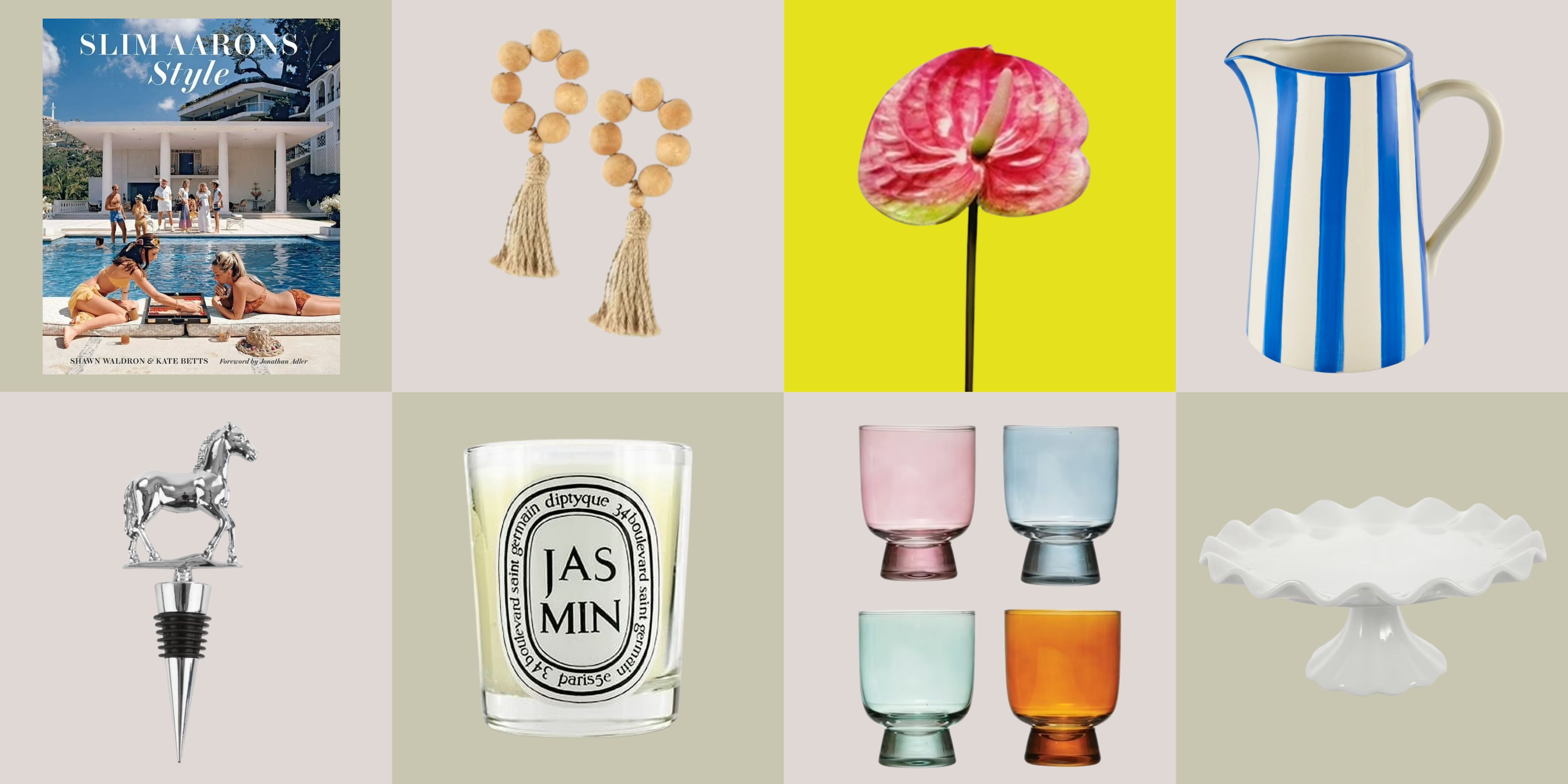 12 Essentials Every Cool, Collected Spring Host Needs — And You’ll Never Guess Where They’re From
Guests will think you thought of everything, you just knew where to shop
-
 Smeg Says Teal, and We’re Listening — The Kitchen Shade of the Year Is Here
Designers are already using the soft, sea-glass green everywhere from cabinetry to countertops


-
Smeg Says Teal, and We’re Listening — The Kitchen Shade of the Year Is Here
Designers are already using the soft, sea-glass green everywhere from cabinetry to countertops
-
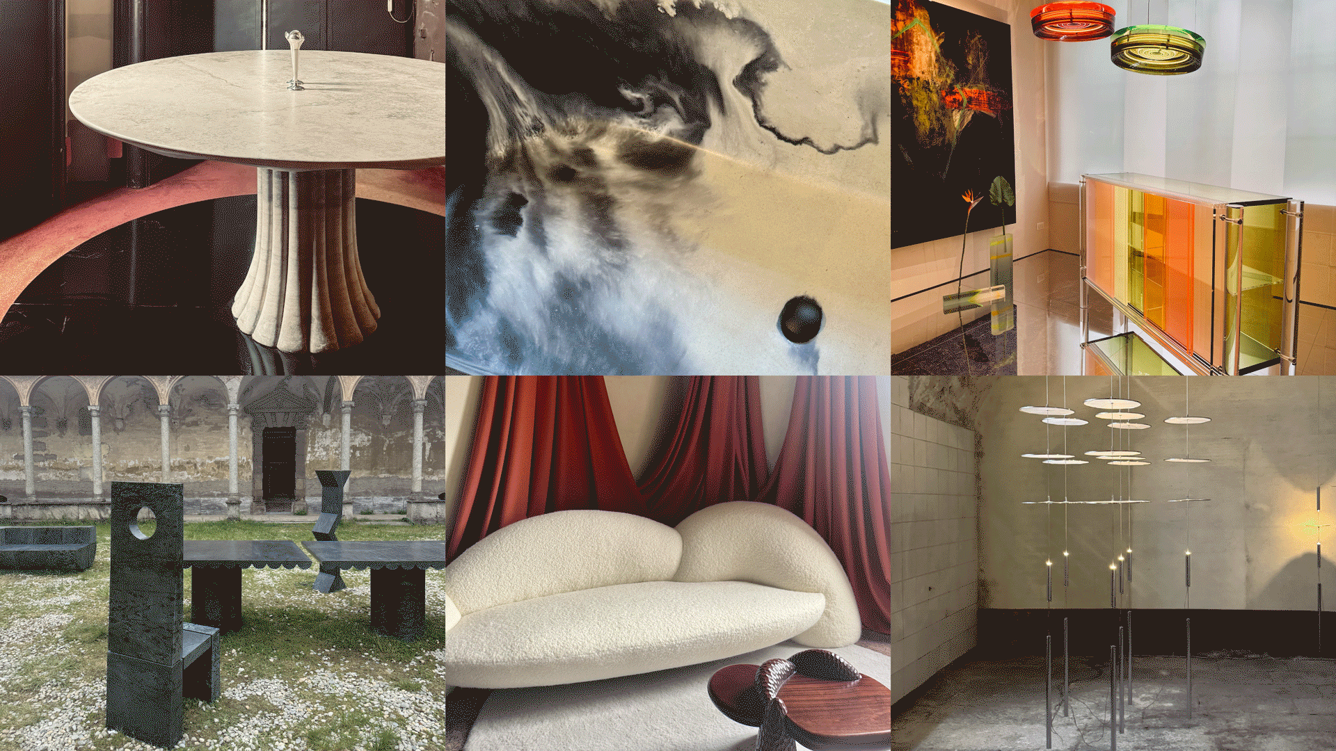 Straight from Salone: 5 Emerging Trends I Found in Milan That'll Shape Interiors For the Year Ahead
From reflective silver to fluidity, here's my perspective on the key themes and new moods coming through from Milan Design Week
-
 Do Yellow and Purple Go Together? Designers Reveal How to Make This Unexpected Pairing Feel "Totally Intentional"
In an era where unexpected combinations have become cool, we've done a deep-dive to discover how to pair yellow and purple in a space
-
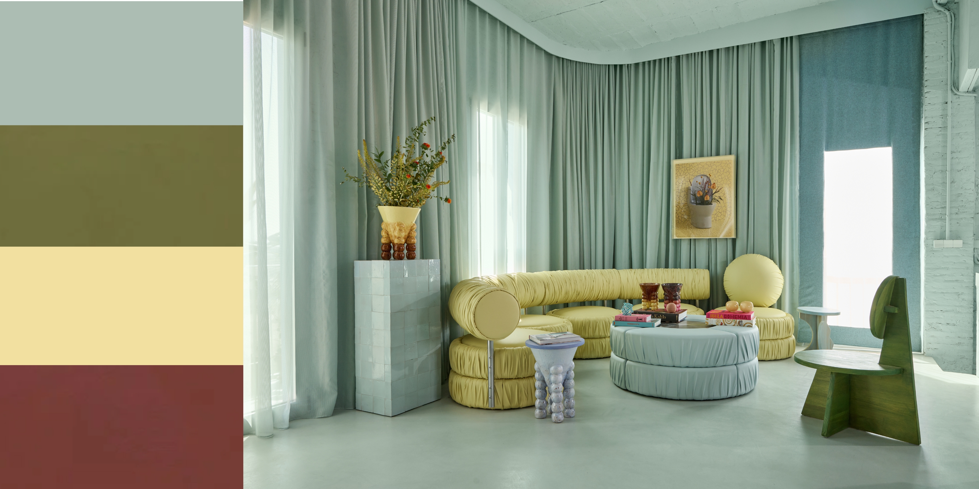 5 Unexpected but Seriously Stylish Spring Color Palettes to Shake Up the Season — "It's Pastel, but Punchy"
Spring color palettes are notorious for their use of pretty pastels, but that doesn't mean they have to lack variation
-
 The 'Red Table Trick' Is the Easiest and Most Expensive-Looking Trend to Hit 2025 So Far
A red dining table makes a seriously stylish statement; the beloved pop of red trend just got an bold and expensive-looking upgrade
-
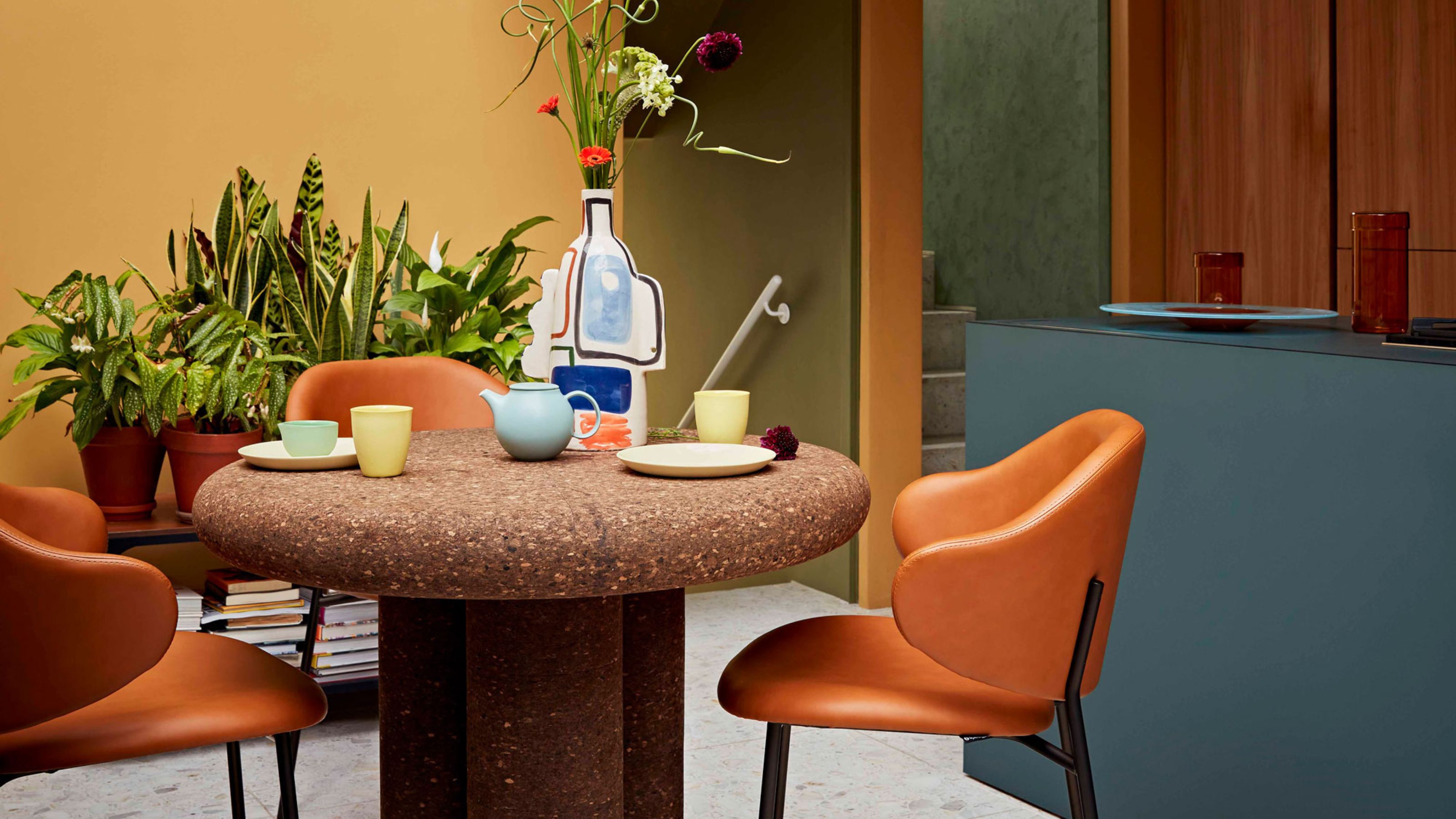 Cork Is the Cool, Sustainable, and Surprisingly Chic Material We Can't Stop Furnishing With Right Now
In honor of Earth Month, we’re toasting to cork... furniture, that is
-
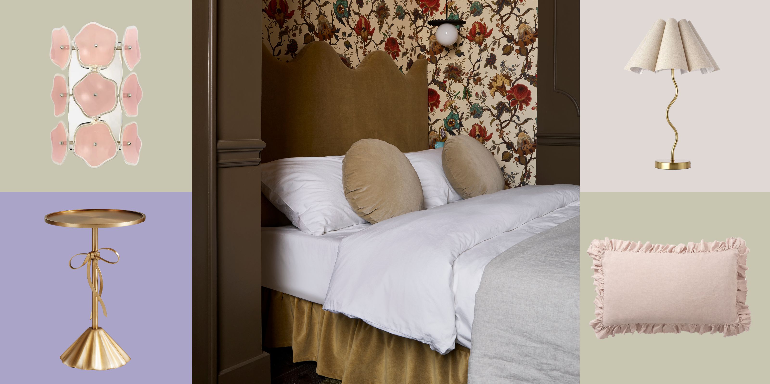 The Coquette Aesthetic Is Still Going Strong in Homes in 2025 — But Now It's Charming, Whimsical, and Has Modern Flair
A designer weighs in on how you can make the classic coquette trend feel modern while still retaining its whimsical elegance
-
 Everyone's Going Crazy for This One New Shade From Farrow & Ball Online — So What's the Big Deal With 'Scallop'?
It's a classic beige, but with a hint of blush — and it's the shade we're expecting to see in every minimalist's home this year


