10 outdated rules you can break when decorating small spaces, according to interior designers
'No more white walls' – designers say these small-space decorating rules are made to be broken

It’s the fear of breaking some unwritten design rule that makes us far less confident when we’re decorating small spaces. When you’re told that less sizeable rooms should be as bright and airy as possible, to maximize light and cheat perceptions of its size, it makes turning to darker colors and even the subtlest of patterns a little daunting.
But of course, many interior design rules are there to be broken – and thankfully, there’s a gold mine of small space ideas from the top interior designers that show us that things can be different. Even the boxiest of box rooms can take a pattern, and you certainly don’t need to adopt a minimalist approach to the fun trimmings like curtains and artwork. Small spaces are as fair game as larger ones – and their limited size can make being a little more creative even more fun.
To help get you started, we’ve spoken to interior designers about the outdated rules you can break when decorating small living rooms, bedrooms, kitchens, bathrooms and more – so from furniture placement to layered lighting, read on for their tips.
1. Avoid dark colors
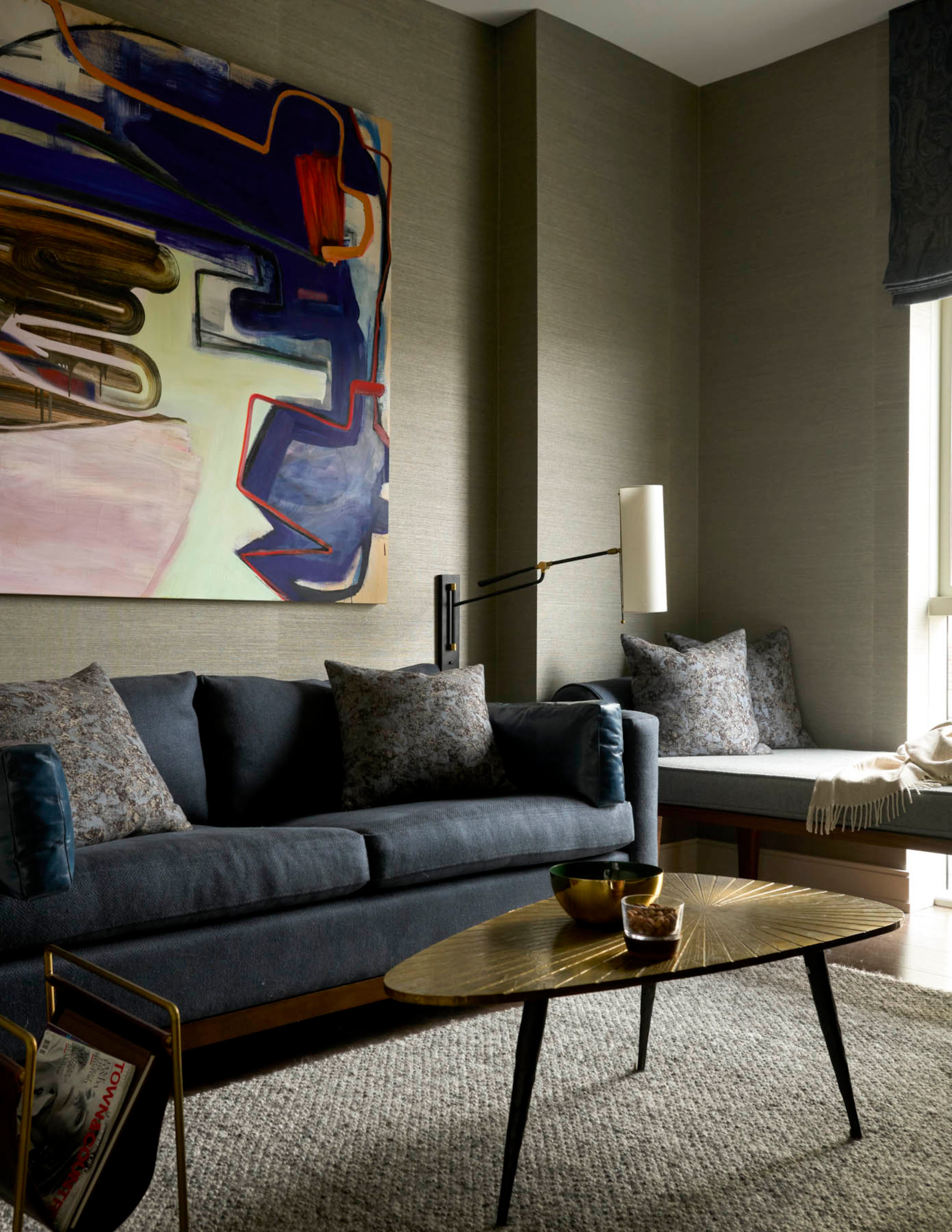
Dark shades are often consider colors to avoid in a small living room, but contrary to popular opinion, dark colors aren’t the space-minimizing, light-sapping shades you think they are – in fact, they can add depth to a small room and, with the right finish, help bounce light around.
‘Dark paint colors in a small space can be cozy, dramatic, and will just envelop you,’ says Megan Paulson, the California-based founder of 22 Design House. ‘Furthermore, it’ll add depth and interest to a room that might not otherwise be there. As long as you balance the dark with a light, I’d say it’s a go. Use an eggshell or satin finish – these sheens will ground the color as a solid backdrop to the space and are a little reflective, which is nice.’
For the walls of this small living room in the Philadelphia pied-a-terre above, Melissa + Miller Interiors embraced a warmer tone for the walls. ‘For our clients, we do not follow trends, nor are we “rule followers”,’ says co-founder Melissa Urdang Bodie. ‘We created this small space as a multi-purpose room: an office, a second living/TV area, as well as a sofa/guest bedroom – all in one. Instead of avoiding these themes, we highlighted the room’s size (or lack thereof) with dark tones, lining the walls with a Phillip Jeffries texture wallpaper to create a real warmth.’
2. Choose small-scale furniture
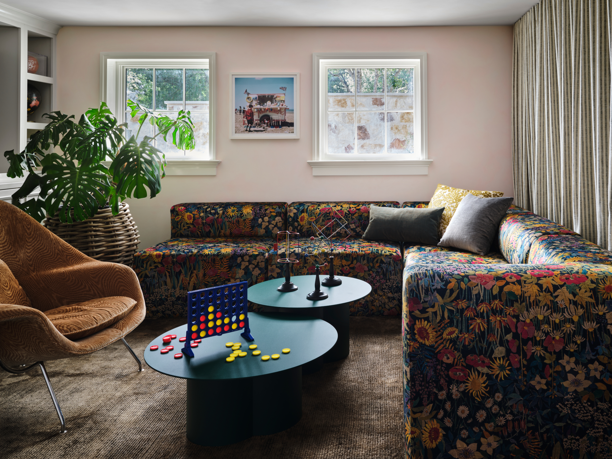
In the right circumstances – for example, if you're looking for small apartment furniture ideas – space-saving furniture can help make a room feel larger, particularly floating furniture that allows the eye to follow the floor underneath. However, that’s not to say that you should limit yourself to small furniture – in fact, quite the opposite.
‘Incorporating oversized furniture in smaller rooms creates a sense of grandeur and drama, elevating the overall aesthetic of the space,’ says Christina Simon of Ashby Collective, who created the playroom above with a large patterned corner sofa. ‘The large scale of the furniture becomes a focal point, drawing attention and adding a touch of luxury to the room especially if you have selected luxe patterns or fabrics. Visually, oversized furniture can provide a striking contrast against the smaller proportions of the room, creating a sense of depth.’
‘Choosing furniture that is small in size can make a compact room seem even smaller and congested,’ adds Artem Kropovinsky, founder of New York interior design studio Arsight. ‘Instead, consider fewer but larger items that complement your room's scale and proportions. A generously sized couch or sectional, for instance, can create a warm and inviting living area, while a sizable bed or dresser can give a bedroom a grander and more spacious feel.’
3. Opt for open shelving over cabinetry
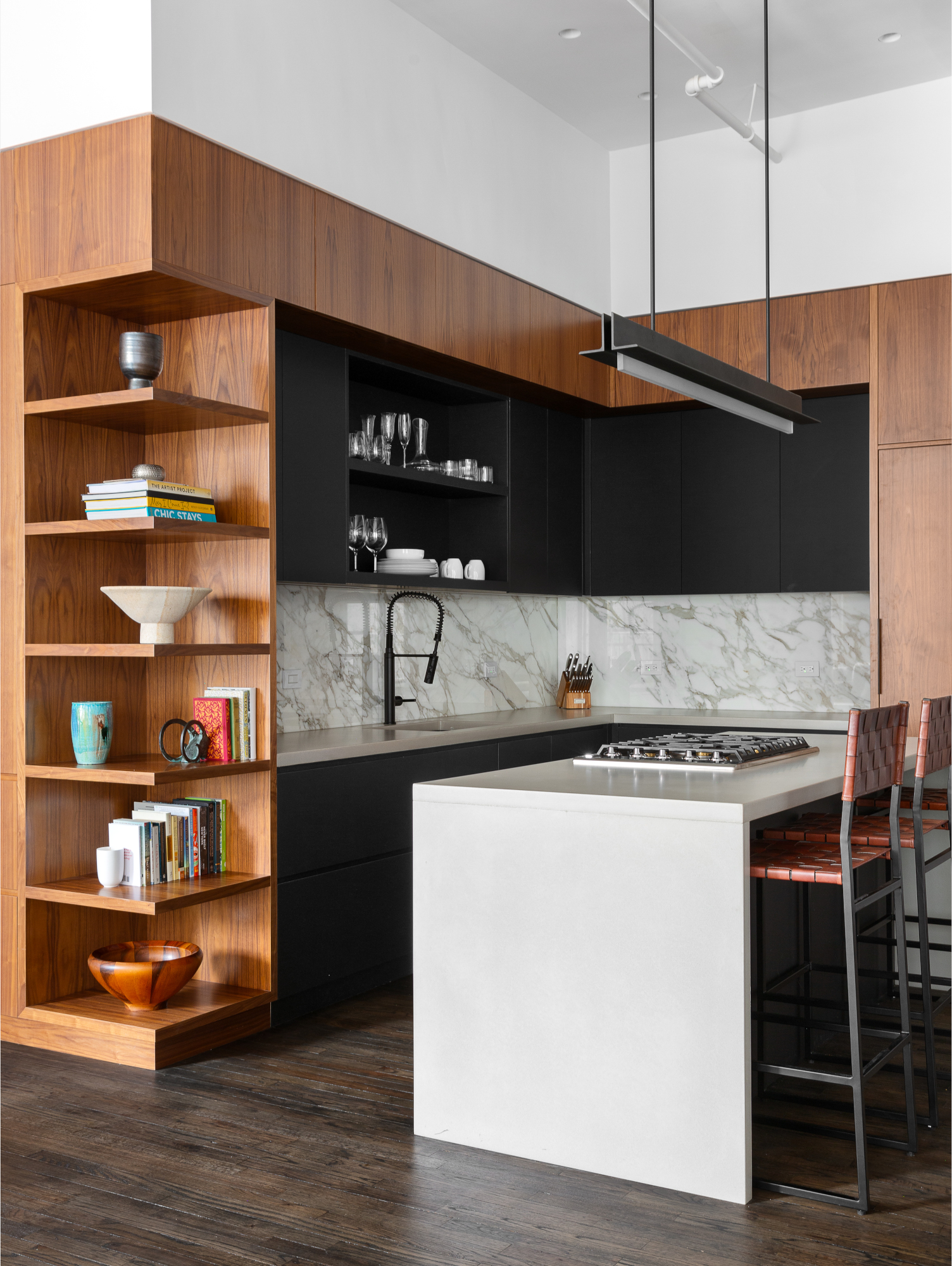
Tiny kitchens with crowded wall units might have put a dampener on the idea of cabinetry in small spaces, but well-built joinery can offer a slimline, less cluttered storage alternative to the open shelving many favor for less sizeable rooms. In this small kitchen by New York architect Kimberly Peck, integrated floor-to-ceiling cabinetry, paired with open corner shelving, offers the best of both without feeling too overwhelming in this small space.
‘Cabinets can give the illusion of a larger space, especially with glass or frosted doors as they reflect natural light,’ says Alice Chiu of San Francisco-based studio Miss Alice Designs. ‘They provide more storage space compared to open shelves and you can hide some of your less attractive items toward the back while bringing your beautiful pieces to the front with glass panel cabinetry.’
‘While open shelves can be an excellent way to showcase your personality and treasured items in a small room, they can contribute to a disorderly look if not kept tidy,’ adds Artem Kropovinsky. ‘On the contrary, cabinets offer ample storage while concealing messes behind closed doors. Moreover, cabinets add visual appeal to your room, especially if you experiment with various colors, finishes, or styles. You could, for instance, blend open and closed cabinets in your kitchen or bathroom, or opt for glass or mirrored cabinet doors to reflect light and foster a sense of spaciousness.’
4. Leave windows bare
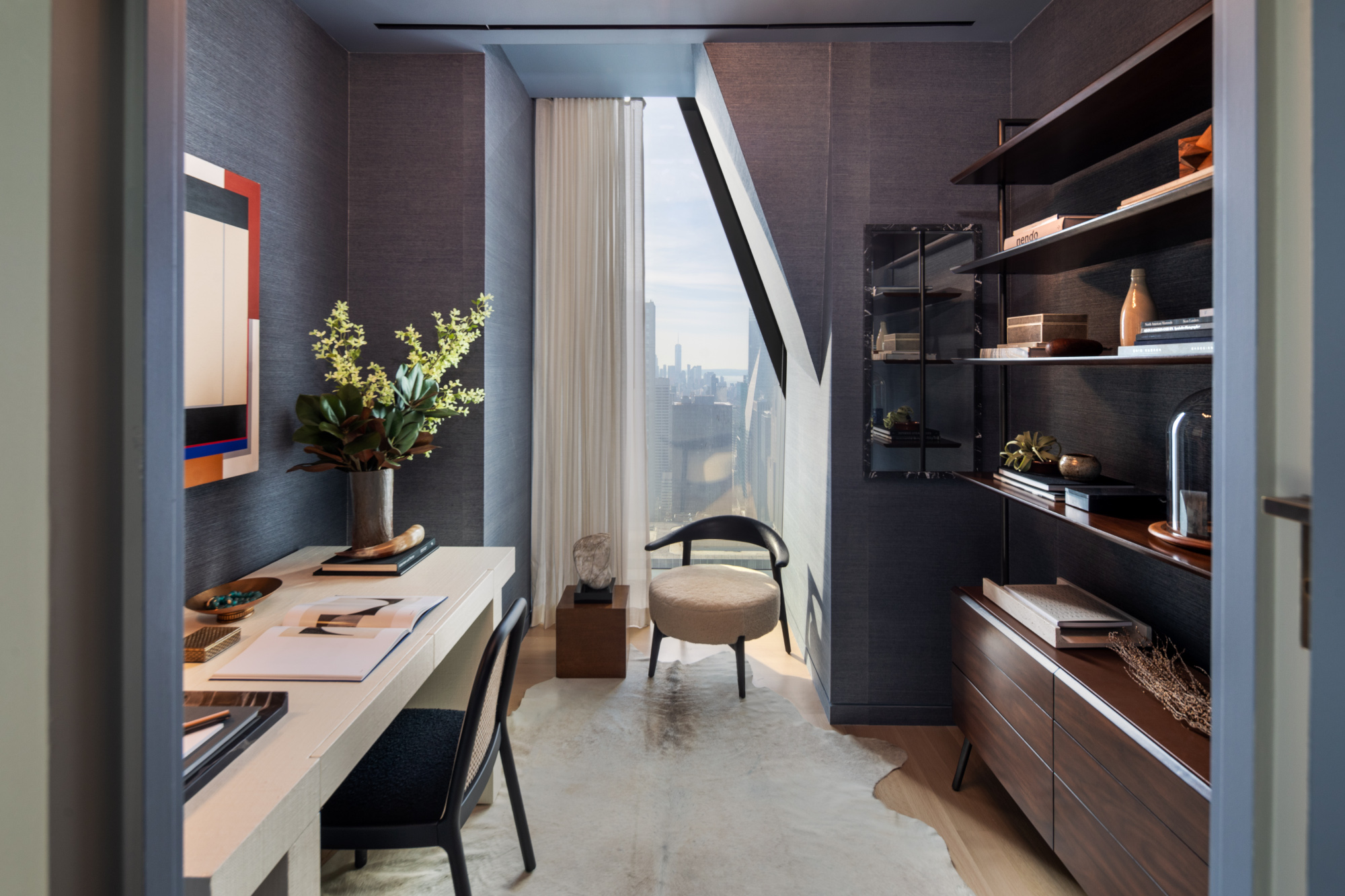
Bare windows in the right space can look stylish and lend themselves to smaller rooms – but an underdressed window, even in a tiny space, isn’t always the way to go. Curtains and other window dressings can be used without having to obscure windows and reduce the amount of sunlight filtering in, as the small home office space – previously a walk-in closet, part of RR Interiors' 53 West 53 project – shows.
‘Leaving windows without coverings can make a room appear stark and unfinished,’ says Artem Kropovinsky. ‘Window coverings introduce color, patterns, and warmth, as well as control the amount of light and privacy you prefer. They also help set the tone of the room, be it relaxed or formal, contemporary or classic. You could use a variety of curtains, blinds, or shutters in various fabrics, colors, or designs to match your room's aesthetic and enhance your space.’
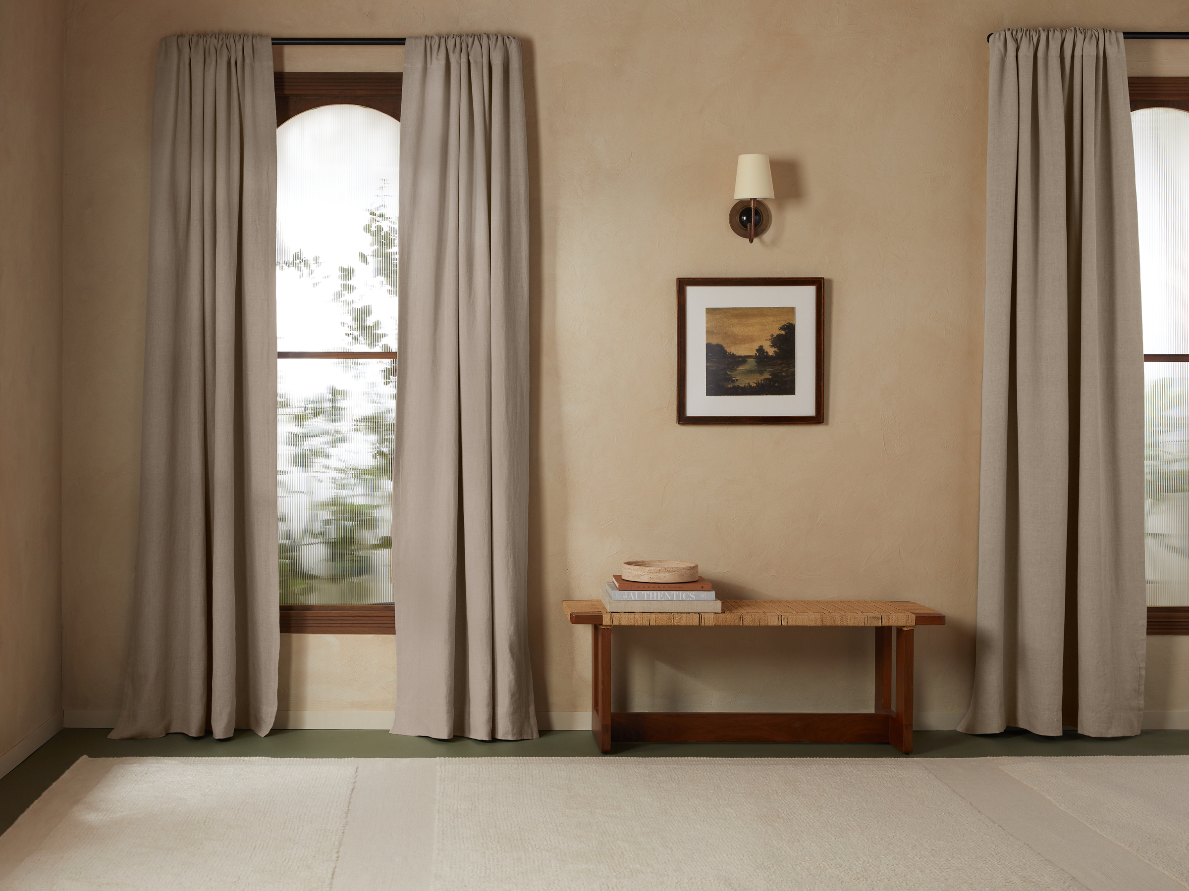
You can also employ some space-enhancing wizardry using curtains, says Jennifer Verruto, founder of Blythe Interiors. ‘By hanging curtains about 2/3 of the distance between the top of the window and the ceiling, you create the illusion of height and can make a standard 8-foot ceiling feel much higher,’ she explains. ‘Another tip is to choose a light, neutral material like cream linen that just adds a little texture and interest to the space without creating too much of a presence.’
5. Keep ceilings white
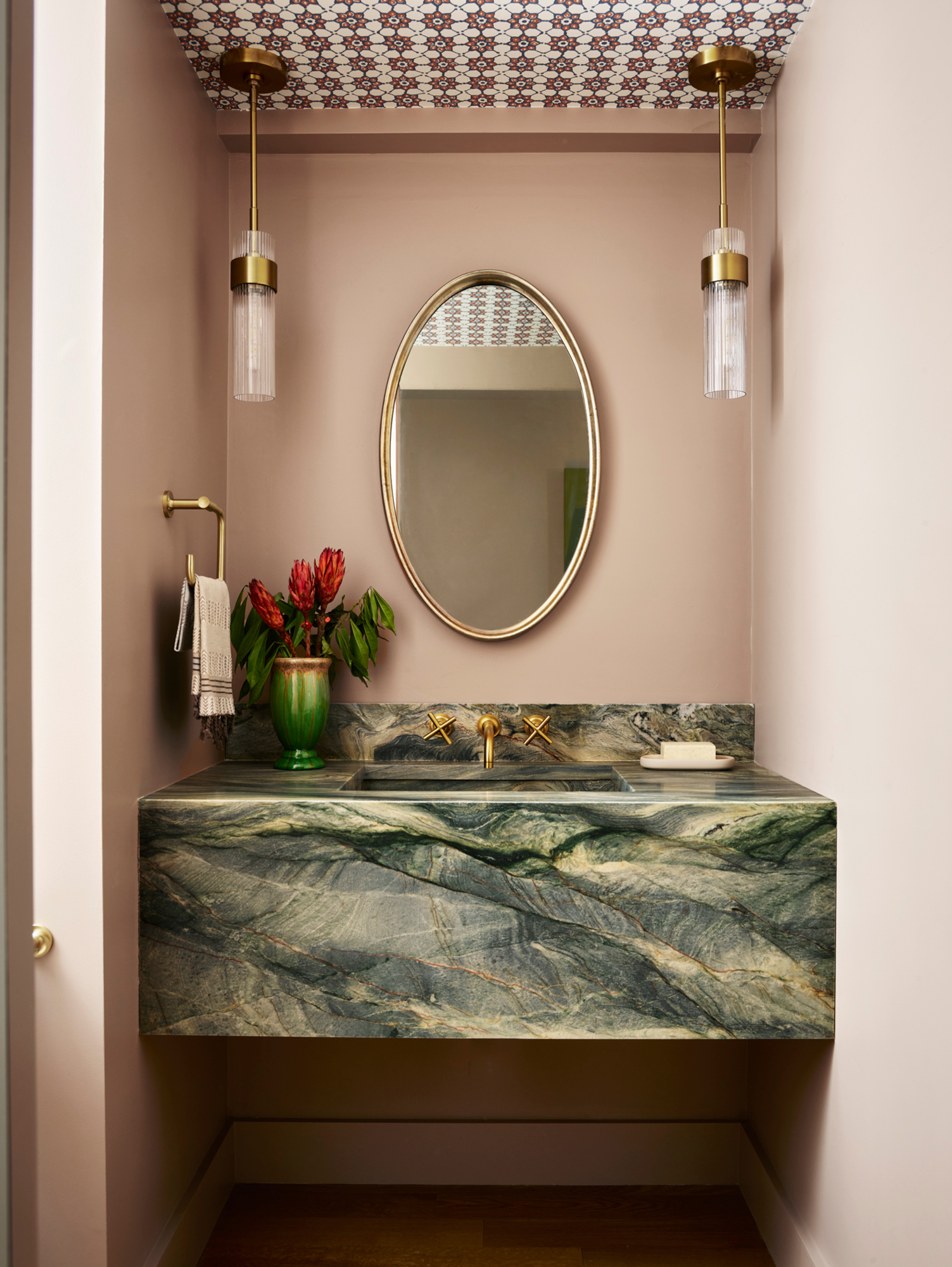
Even in larger rooms, many people struggle to adapt to the idea of painting ceilings in anything other than white – but from color drenching to adorning with patterned wallpaper, the fifth wall is an opportunity to enhance even the smallest of spaces.
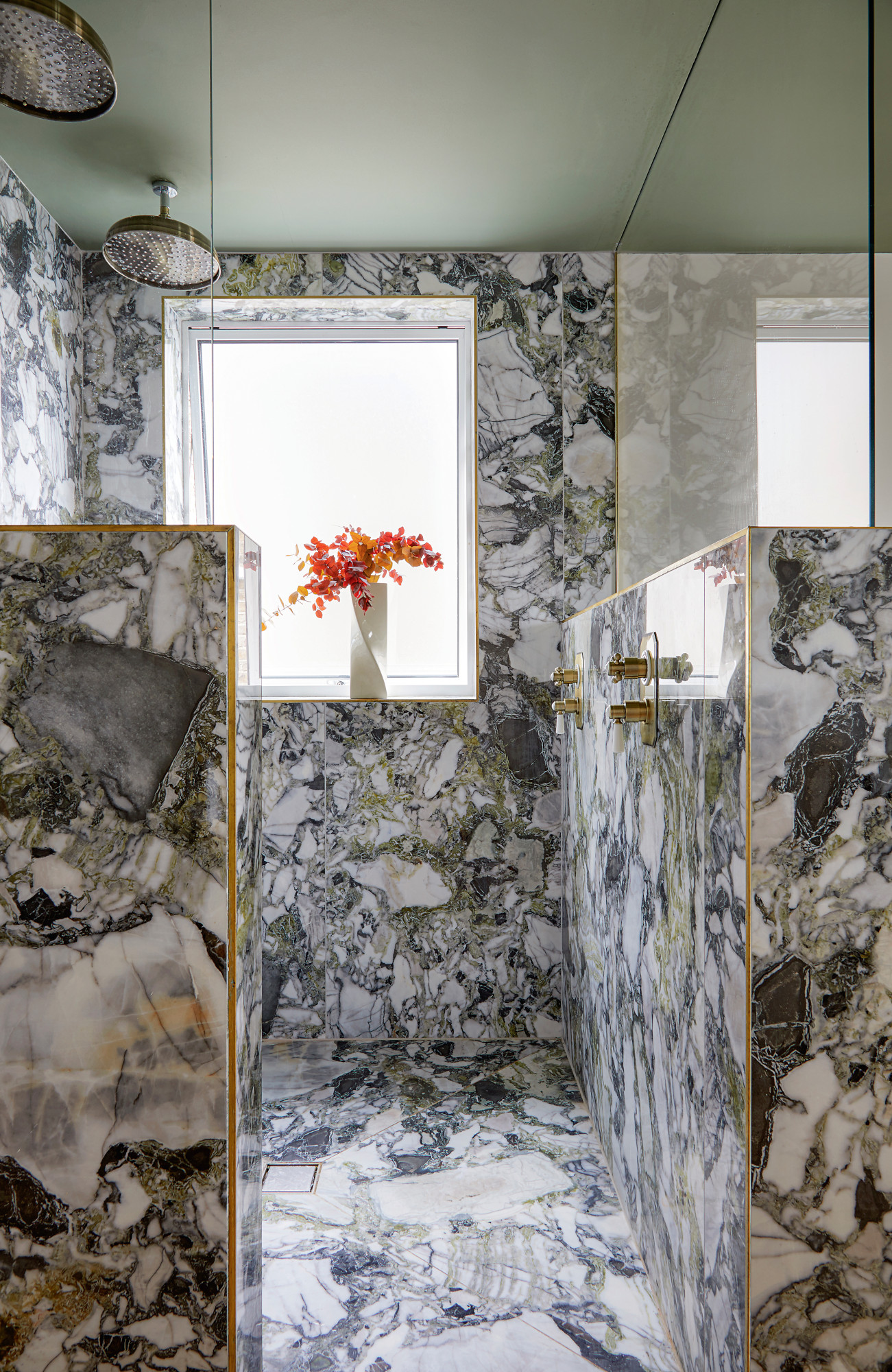
‘Ceilings painted white are often the go-to choice for smaller spaces, as they can create an illusion of height and brightness, but by choosing a different color, you can infuse character and catch the eye,’ says Artem Kropovinsky. ‘Ceiling decorations like wallpaper, wooden panels, tiles, or moldings can transform it into a significant design element.’ The small bathroom by Meghan Shadrick Interiors, above, is the perfect example.
‘Although white ceilings are often recommended to create an illusion of height, adding colour or texture to the ceiling can add visual interest and make the space feel cosier,’ adds London interior designer Rudolph Diesel. ‘You can paint the ceiling a slightly lighter shade than the walls or incorporate wallpaper or decorative moulding to draw attention upward.’
6. Push furniture against the walls
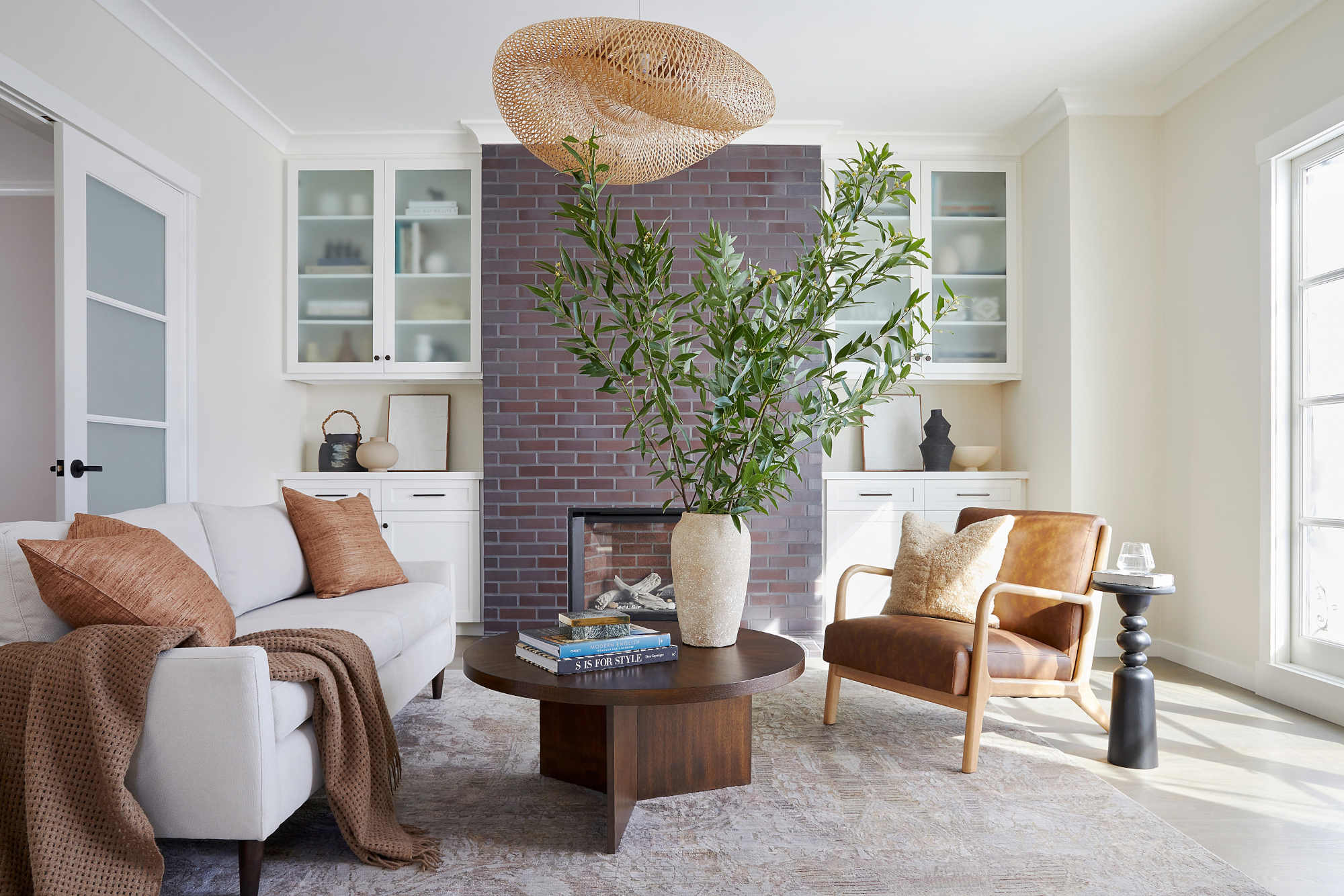
It’s common for large furniture items like sofas to be pushed against the wall in a living room layout – see also beds in bedrooms – to maximize visible floor space, but allowing for a bit of negative space behind these pieces can work wonders. ‘Regardless of room size, furniture placement is all about flow,’ says Jennifer Verruto. ‘It’s rare that all furniture should be pushed against the wall. Go ahead – create that cozy vignette by the window with two floating chairs!’
‘Pulling furniture away from the walls in a small space provides a relaxed and cozy atmosphere that encourages conversation and socializing,’ explains Alice Chiu, who designed the living room above. ‘Gather furniture closer to the center of a room (at least 12” away from the wall) or angle furniture. Floating or angling furniture can make a small space appear larger and allows you to easily move it around, creating different looks with the least amount of effort.’
7. Avoid too much pattern
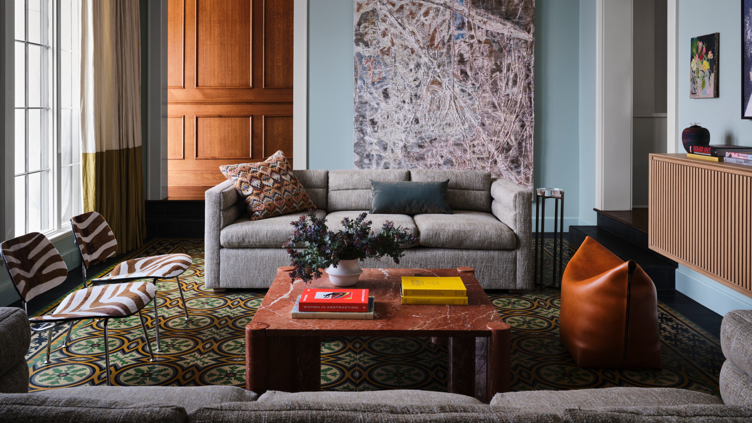
Bold geometrics, small-scale florals, candy stripes – all off-limits in small spaces if you subscribe to this rule. Happily, this is one that’s confidently broken by interior designers all the time. ‘When it comes to mixing patterns and colors in small spaces, strategic choices can create stunning visual impact,’ says Christina Simon. ‘Use the deliberate combination of contrasting patterns, colors, and textures to create a bold statement and point of view that allows the mind and eye to wander freely.’
If you are looking to pattern clash, rather than sticking to one, you’ll need a bit of interior design knowledge, however. ‘This methodology, especially in smaller areas, requires an eye for balance and proportion, as well as an understanding of color theory and pattern mixing to take it slowly and one step at a time,’ adds Christina. ‘Layering helps you find that perfect mix.’
8. Limit the impact of artwork
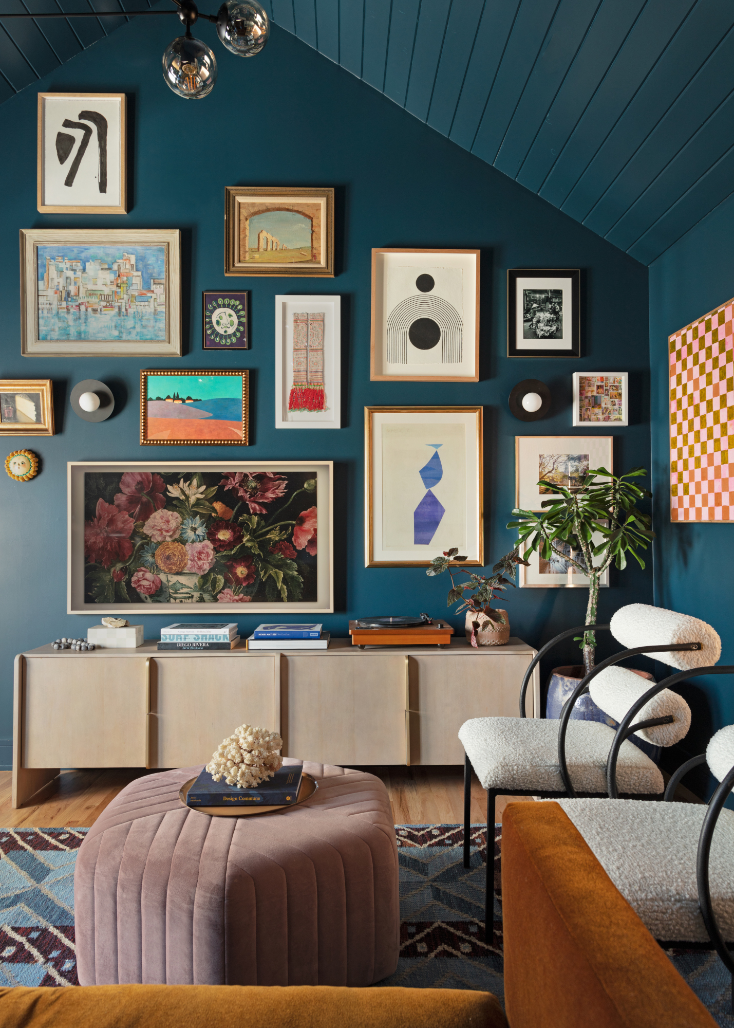
From limiting the number of pieces to choosing only small-scale works, there are plenty of rules around choosing artwork for small spaces – all of which can be disregarded. ‘We love using art in a small space, like a powder room or office, to set a vibe,’ says Whitney Romanoff of Meet West Studio, who designed the above space. ‘Our go-to at the moment is a floor-to-ceiling gallery wall mixing irreverent vintage art with items our clients have collected from travels and newer pieces we acquire. This creates an immersive wallpaper effect, and we like the idea of guests spending time studying the pieces and finding new elements that surprise you, make you laugh, or make you think.’
‘With the right size, positioning, and style, artwork can amplify the sense of space and sophistication in a room,’ says Artem Kropovinsky. ‘Large pieces can become focal points, while a collection of pieces can create a cohesive gallery wall. Artwork also provides additional color, texture, and depth, reflecting your individuality and interests.’
9. Use smaller rugs
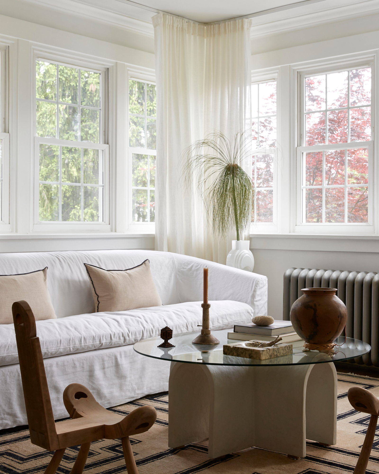
Contrary to popular opinion, a larger area rug will have a greater space-enhancing effect on a small room than a small rug. ‘A small rug that fits just under a coffee table and nothing else looks like it is floating awkwardly in the middle of all the furniture,’ says Alice Chiu. ‘If a rug is too small relative to the surrounding furniture and space, it throws off the balance and cohesiveness of a room.’
Instead, opt for an expansive rug that taps into a current rug trend and that will cover a good proportion of your flooring – like the living room above, by Madeline Interiors. ‘A properly sized rug will enhance the overall aesthetic and scale of the furniture,’ adds Alice. ‘Either all your furniture should be sitting on the rug, or at a minimum, the front 2 legs of your sofa and chairs should be on the rug. Keep the colors and patterns subtle so it is visually appealing and soothing to the eye.’
10. Overcompensate with lighting
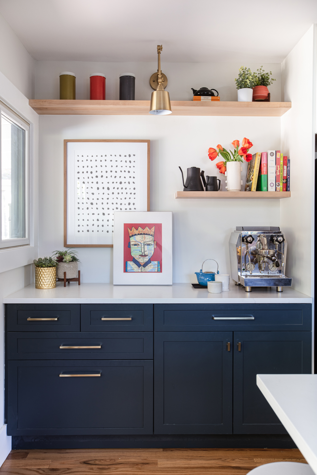
Even if your small room is dark, you don’t need to go overboard with lighting in an attempt to make it feel brighter. ‘Lighting is integral, especially in small rooms where natural light might be scarce,’ says Artem Kropovinsky. ‘However, overdoing it can make the space appear stark and inhospitable, leading to wastage of energy and money.’
Embrace a cozier scheme with intentional lighting layers and experiment with lighting design tips like layering. ‘We believe in layering lighting, even in smaller spaces,’ says Lauren Lerner, principal designer of Arizona-based Living with Lolo. ‘Overhead lighting such as dimmable cans or a chandelier are great options as a main light source. If the ceiling is low, then you can add a pretty flush mount fixture instead of a chandelier for a statement piece. We also like to add a floor lamp or table lamp to the space for comforting lighting options.’
The Livingetc newsletters are your inside source for what’s shaping interiors now - and what’s next. Discover trend forecasts, smart style ideas, and curated shopping inspiration that brings design to life. Subscribe today and stay ahead of the curve.

Ellen is deputy editor of Livingetc magazine. She works with our fabulous art and production teams to publish the monthly print title, which features the most inspiring homes around the globe, interviews with leading designers, reporting on the hottest trends, and shopping edits of the best new pieces to refresh your space. Before Livingetc she was deputy editor at Real Homes, and has also written for titles including Homes & Gardens and Gardeningetc. Being surrounded by so much inspiration makes it tricky to decide what to do first in her own flat – a pretty nice problem to have, really. In her spare time, Ellen can be found pottering around in her balcony garden, reading her way through her overstacked bookshelf or planning her next holiday.
