4 Outdated Ways to Decorate Entryways That Designers Say You Should Stop — And What to Do Instead
Keeping away from these outdated trends will ensure your entryway has timeless appeal
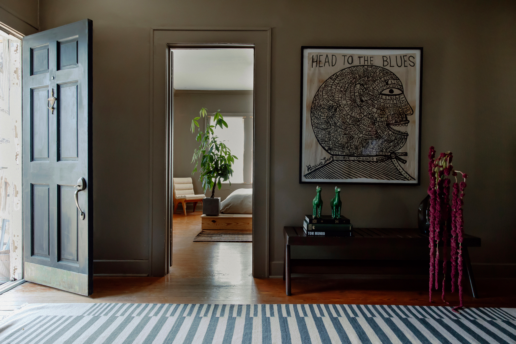

Don’t be fooled into thinking the entryway deserves less design attention than any other room — if anything, it deserves more consideration, as the place that welcomes you inside each and every day.
Even though you may not be hanging around in this area for extensive periods of time, it’s not a corridor or mere walk-through: your entryway should proudly set the tone for your whole home and should be embraced as any other space would.
Nevertheless, go easy with the notion of entryway trends — the aim should be to design a timeless elegance that can evolve over time. Where you're tempted to introduce trending designs, interior designers want you to stay ahead of the curve, so with that in mind, they told us to avoid these 4 outdated entryway ideas.
1. Bold geometrics
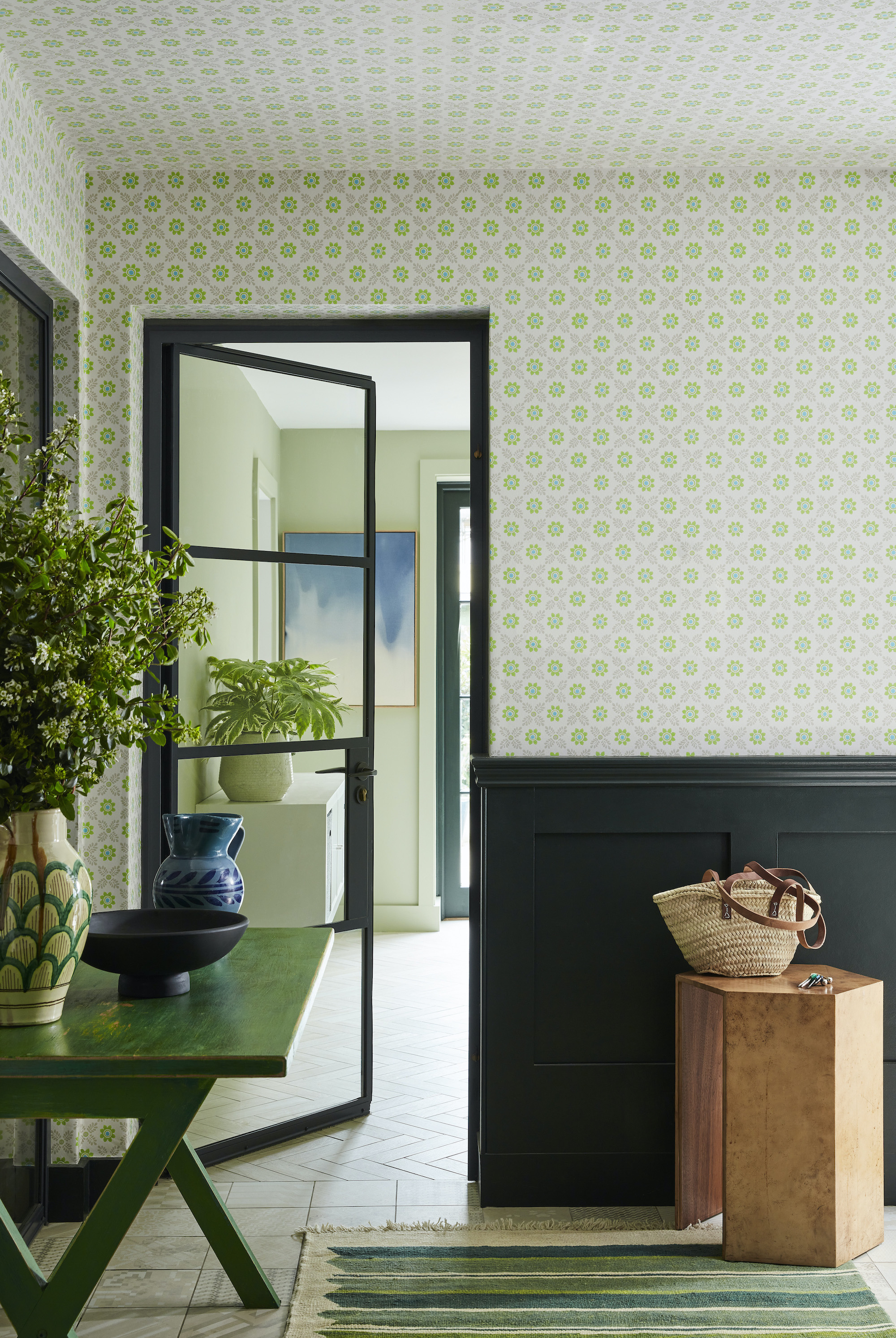
Try instead: A subtler approach to pattern will add interest without being overwhelming.
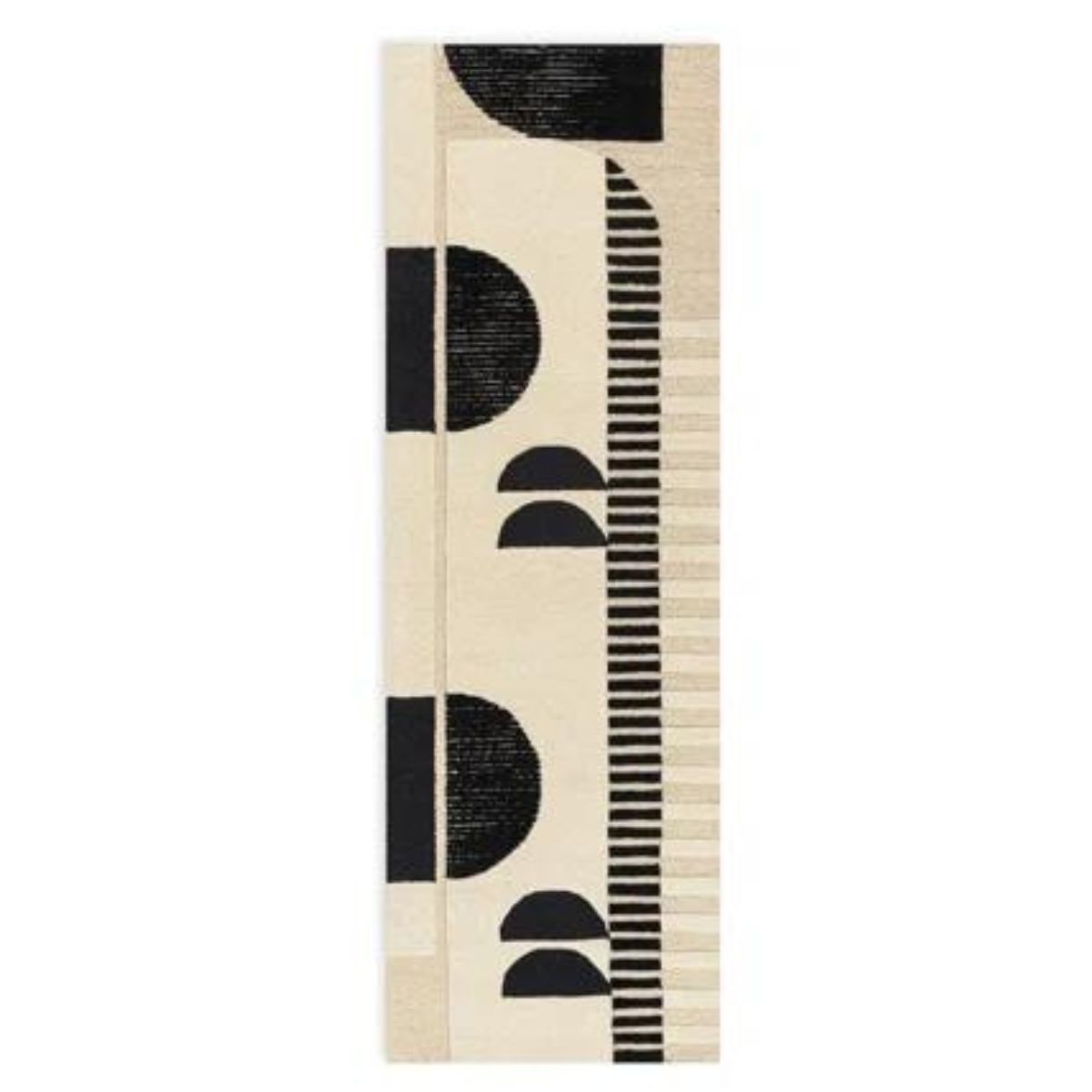
Patterns and prints, such as wallpaper ideas and fabrics are brilliant for introducing color, pattern and texture to a space. But while large, bold prints are an obvious design choice to feature, whereas small patterns often offer a more subtle effect that’s less easy to tire of.
‘Some of the bold geometric patterns can make an entryway feel dated,' says Perry Walter, Founder of Walter Studio Interior Design. 'At times these patterns can overpower a space. Smaller scale prints, solid colors and well-scaled furniture contribute a sense of spaciousness and serenity in an entryway, making it feel more inviting and calming.'
Taking a subtle stance on injecting the space with pattern will prevent it from dating so quickly as well as making it easier to change up the more temporary finishes throughout the seasons.
2. Mass produced furniture
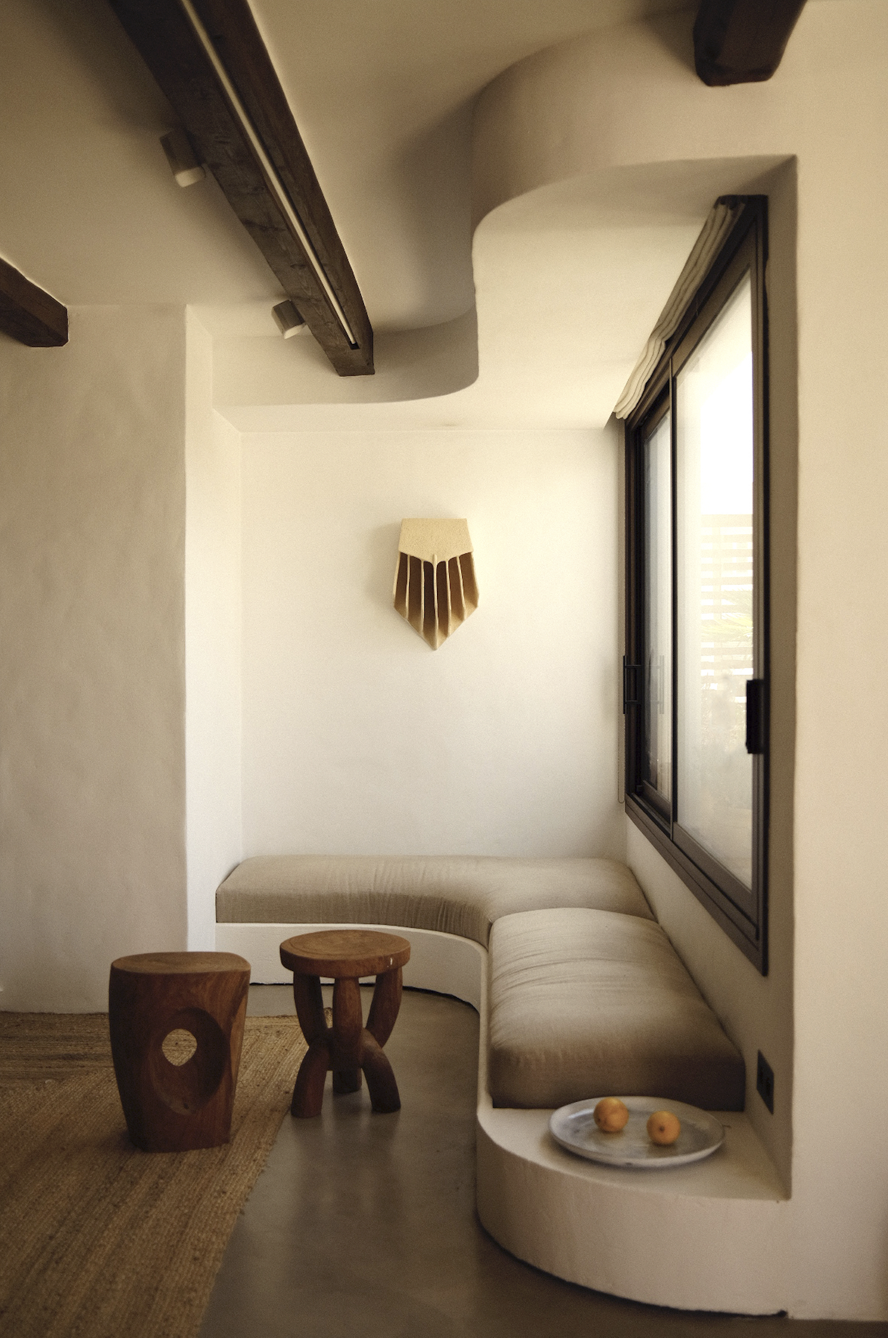
Try instead: Going bespoke with a design that makes sense for your space.
Try to avoid over-produced furniture — it simply cannot be tailored to everybody's needs and can often come across as an impersonal bland feature, unless you’re a total minimalist.
A much better option is to find pieces that suit your lifestyle and everyday needs, ‘Furniture in the same style that fits like a glove isn’t visually exciting. Create a collection of wonderful finds from different eras that look beautiful together,’ advises interior designer, Kim Colwell. If you’ve a penchant for the one-of-a-kind finds, handcrafted pieces or family heirlooms this space is ideal for homing and utilizing them. 'Mix these pieces with modern elements, including a touch of mixed metals, to set the tone for the rest of your home,’ says Perry. You’ll gain character, style and perhaps even a conversation starter or two.
If you're doing an entryway mudroom, built-ins are always preferable, to.
3. Overly matching themes
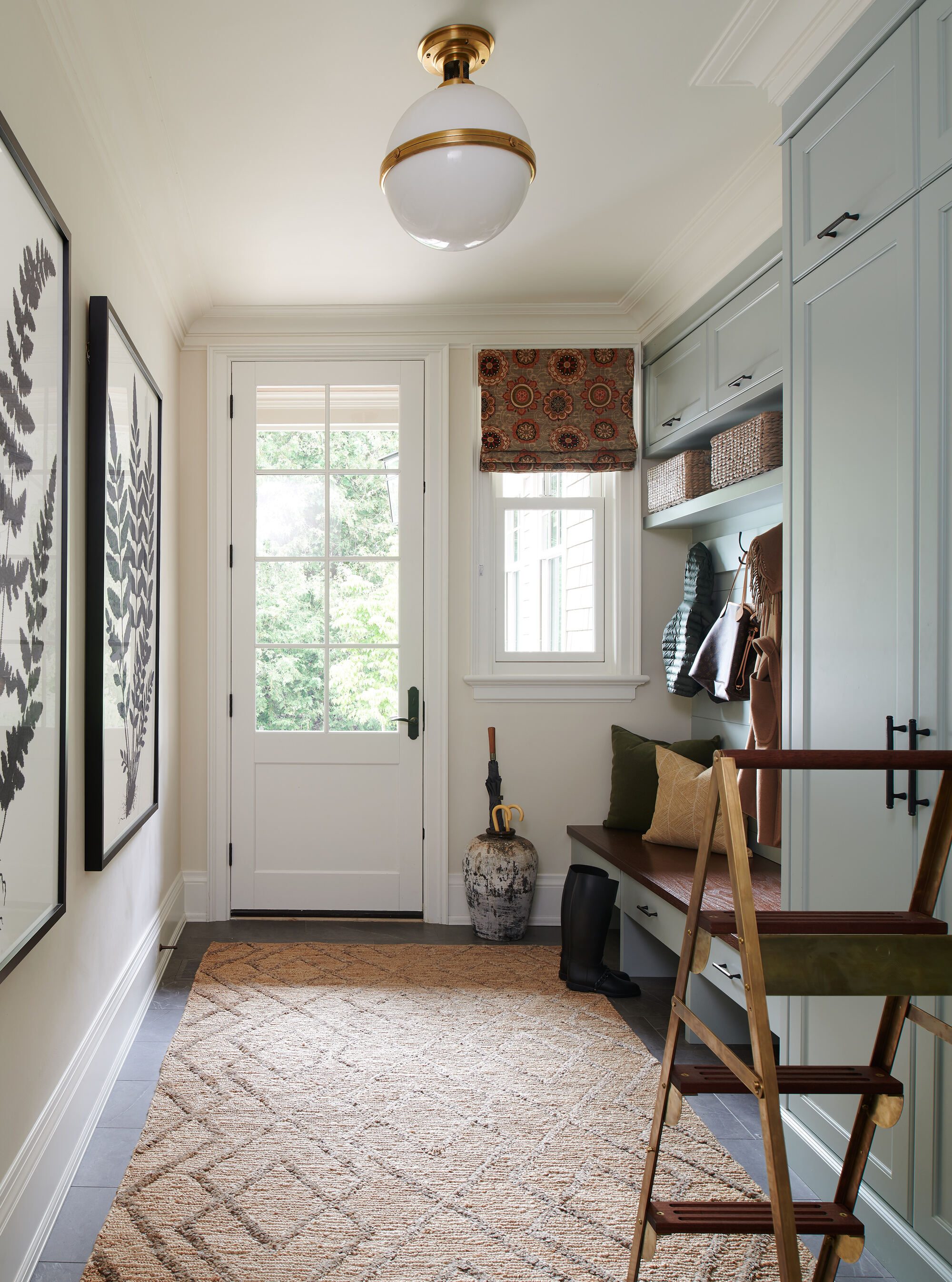
Try instead: Take a more organic approach to decorating an entryway
Forget trying too hard to match your colors and styles. Creating your own theme through choosing pieces and finishes you fall in love with will speak volumes in terms of generating that home feel you love to come back to at the end of the day.
‘Matchy design themes are never a good idea. A colorful throw, rug, a statement light, or unique pieces of art can add visual interest and create a lasting impression on your guests. While a touch of surprise is great for most entryways, a more classic approach with timeless furniture and artwork can also be very successful,’ says Perry.
4. All-White
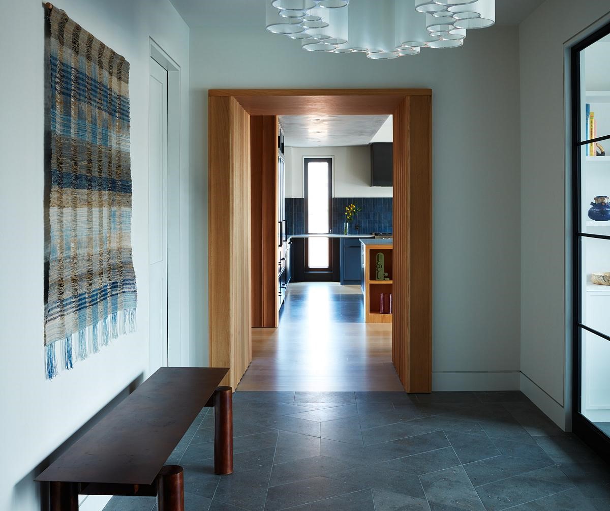
Try instead: Go bolder with color choices — it's your first impression after all
An entryway above all should be a warm welcome as soon as you step inside, so it’s imperative to set the desired tone through your colour choice from the beginning. A neutral tone works great as a base, allowing you to then layer decor and any other finishes upon it, yet neutral doesn’t necessarily mean white.
In fact, nowadays neutrals are often any natural tones inspired by the great outdoors, so even if you choose to go minimalist in design features, the warmth from the base color will without a doubt emanate a warm energy, rather than feeling to clinical.. Off whites with warm undertones are fine, but consider delicate tones of green, brown, or even pink to function as a base and work from there. Even dark tones can be great colors for small entryways, when you want it to feel cozy and welcoming.
After all, this is the first impression you give when opening your front door, so personalize it, reflect your own style and make it a one to remember. You may be surprised with just how striking the outcome is and the pride you feel when opening the door to welcome guests inside.
Be The First To Know
The Livingetc newsletters are your inside source for what’s shaping interiors now - and what’s next. Discover trend forecasts, smart style ideas, and curated shopping inspiration that brings design to life. Subscribe today and stay ahead of the curve.

Portia Carroll is an interior stylist, writer, and design consultant. With a background in interior architecture and design, she has a plethora of creative experience in the industry working with high end interior brands to capture beautiful spaces and products and enhance their qualities.
-
 Pleated Lampshades Are the Silhouette of the Season — I've Found 9 For Well Under $100 (You'll Never Guess Where)
Leave it to Walmart to bless us with a collection of stunning pleated lampshades — proving this old-fashioned feature can look fresh and modern
By Devin Toolen
-
 I Found the "Healthiest” Bedding for Earth Month — Why Ettitude Is the Sustainable Sleep Label to Know
Softer than silk and smarter than cotton, Ettitude’s innovative take on bedding delivers luxury with a conscience
By Julia Demer
