Paint color ideas for every room – experts explain the best choices for different spaces
Choose the right paint color ideas for your room, whether it's north or south-facing, a bright kitchen or a cozy snug
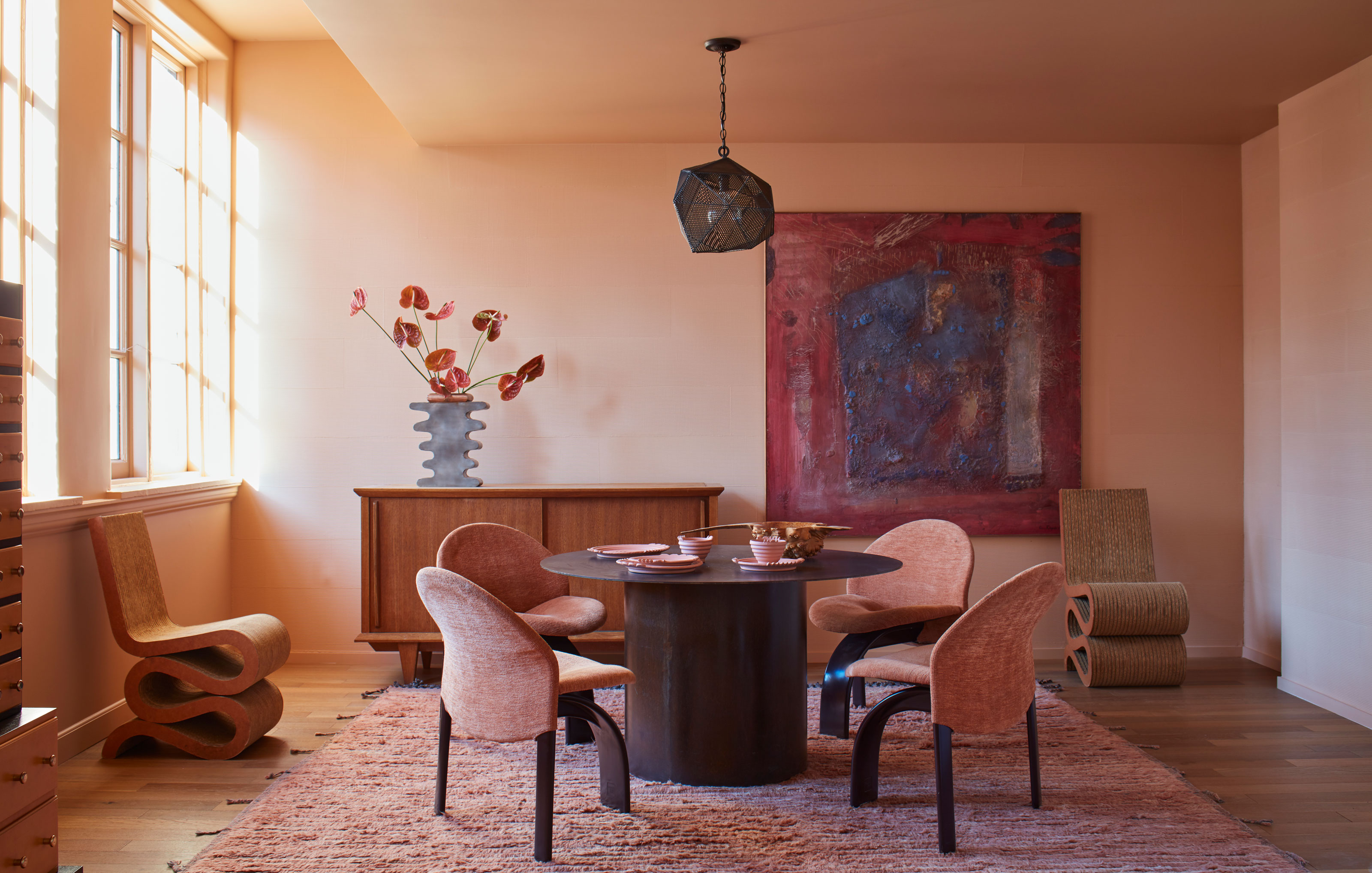
Working out the right paint color ideas to create the perfect decorating scheme for your room can be daunting. Not only are there seemingly limitless options, but there’s also a certain science behind selecting a color for your space that will really make it sing.
Of course, you should primarily be guided by what you love and want to live with every day, and it’ll serve you well to keep this front of mind when embarking on a room revamp.
With an idea of the colors that appeal to you and your style, the next step is to assess exactly which tones and shades will play to the strengths of your room - and who better to advise than a panel of paint experts and interior designers? We’ve collated their advice on how to pick colors for every room, so whatever space you’re faced with, you’re sure to find some inspiration.
How to choose paint color ideas for different types of room
‘Choosing color should be an enjoyable, creative process and you shouldn’t feel restricted,’ says Ruth Mottershead, creative director at Little Greene. ‘When beginning your project, take the time to research schemes that you would like to recreate - browse magazines for inspiration or images on Pinterest and Instagram, and request color cards,’ she says, ‘this will really help to inspire your project.’
Interior designer Nicole Cohen also emphasizes the importance of getting to grips with the characteristics of a room. ‘I like to take time choosing paint ideas based on the size of the space, as well as how it will be used,’ she says. ‘I tend to opt for more neutral, relaxing colors in rooms where people spend more time, and I use bolder colors in lesser-used spaces.’
1. South-facing rooms
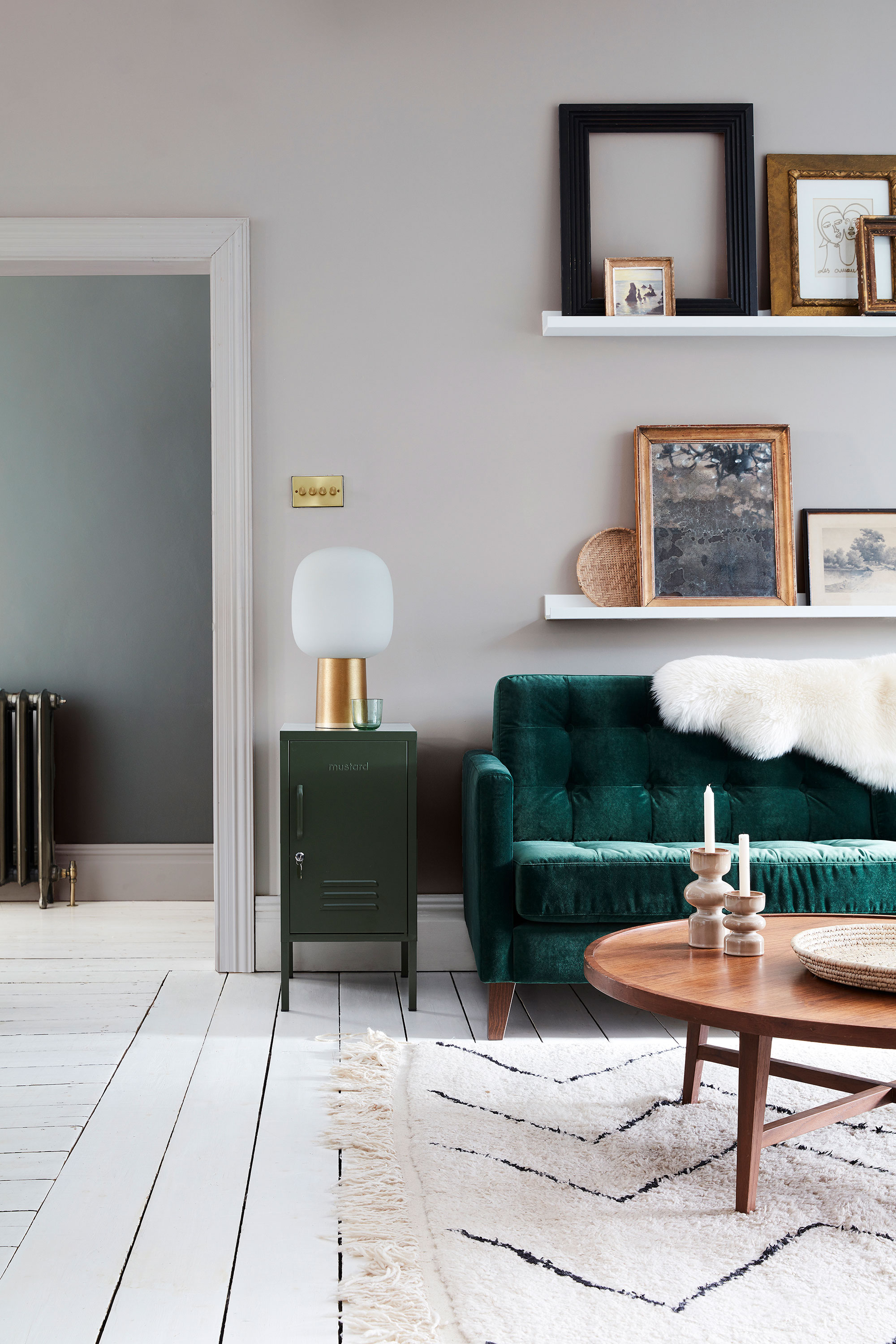
If your room is south facing, lucky you! These are some of the easier rooms to decorate as they receive a lot of natural light and most colors will look great in them. One thing to keep in mind is the temperature of strong natural light - it can be on the warm side. While it’s certainly a great option to lean into the heat of these light-filled rooms and bask in a sunny palette, you may well want to opt for cooler colors, even when decorating with neutrals, to balance the warmth.
‘South-facing rooms are often bathed in warmer light, making colors appear more yellow,’ explains Ruth Mottershead, creative director at Little Greene. ‘This means that warm tones of yellow or orange may be too intense for the space, while cooler shades will read as a more neutral color.’
Sue Wadden, director of color at Sherwin-Williams, recommends some cool-toned options to achieve balance in south-facing spaces; ‘I love the look of a light beige with grey undertones, or a light grey with subtle green undertones,’ she says.
2. North-facing rooms
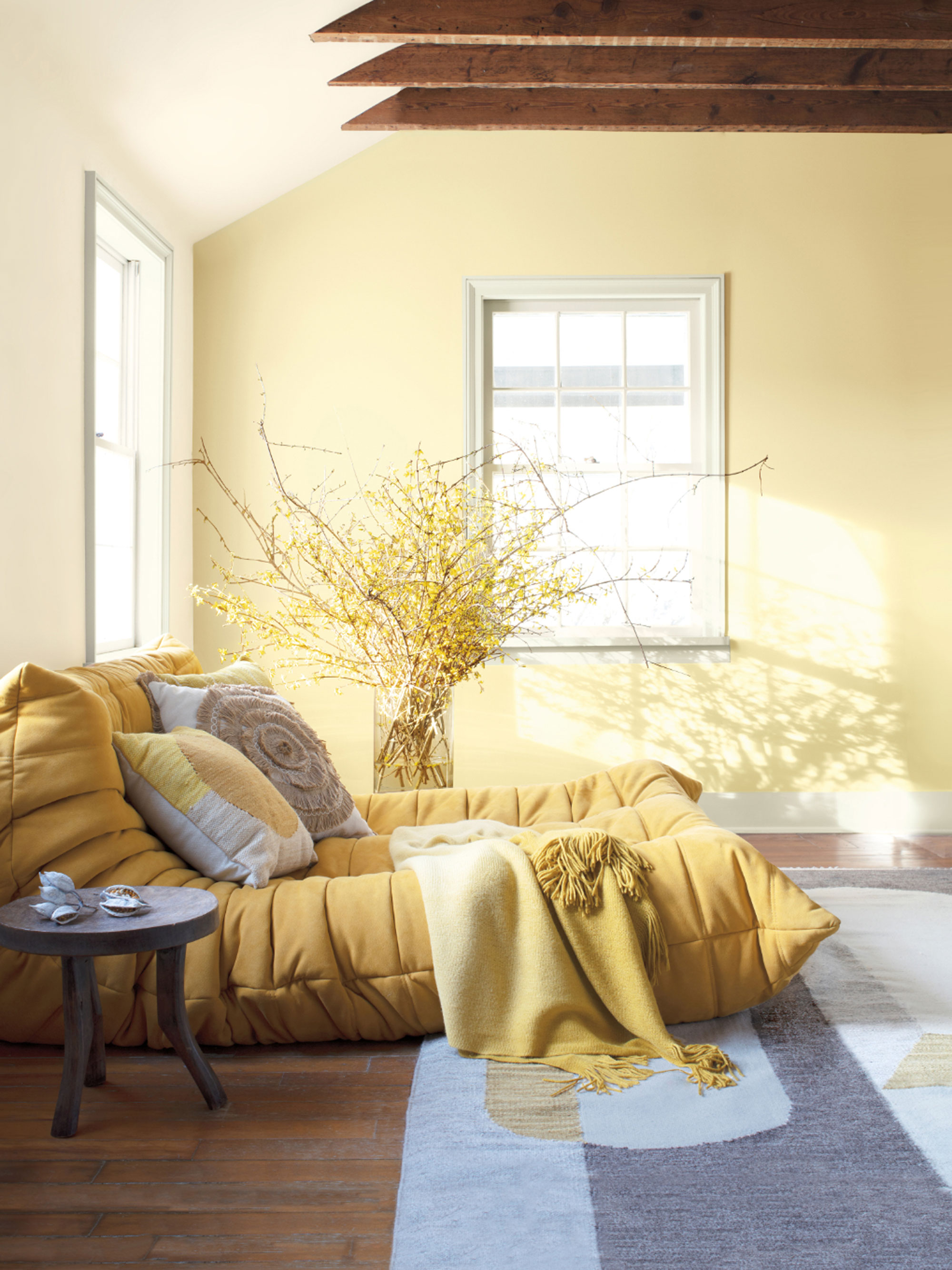
North-facing rooms typically receive the least natural light, so it may take a little more consideration to really help the space reach its full potential. ‘Designing for a north-facing room that is starved for bright, natural light can be a real challenge,’ says Sue at Sherwin-Williams. ‘Your best bet will be to choose light, bright and warm colors to really help reflect light around the space, making the most of any natural light that does come through.’
Summer yellows, baked terracottas and dusky pink paints are all wonderful options, and their warm tones will work wonders in balancing the cool nature of these rooms. And, despite their challenges, north-facing spaces can be a great place to go all out with color, as Helen Shaw, UK Director at Benjamin Moore, explains.
‘North-facing rooms often feel colder, but they can be really warmed up with the right paint color to create cozy snugs, intimate dining rooms or cosseting bedrooms,’ she says. ‘Dousing the rooms from floor to ceiling in rich color can be particularly striking - and a real benefit of a north-facing room is the opportunity to play with different artificial light sources to create extra mood and ambiance in your color palette.’
3. East and west-facing rooms
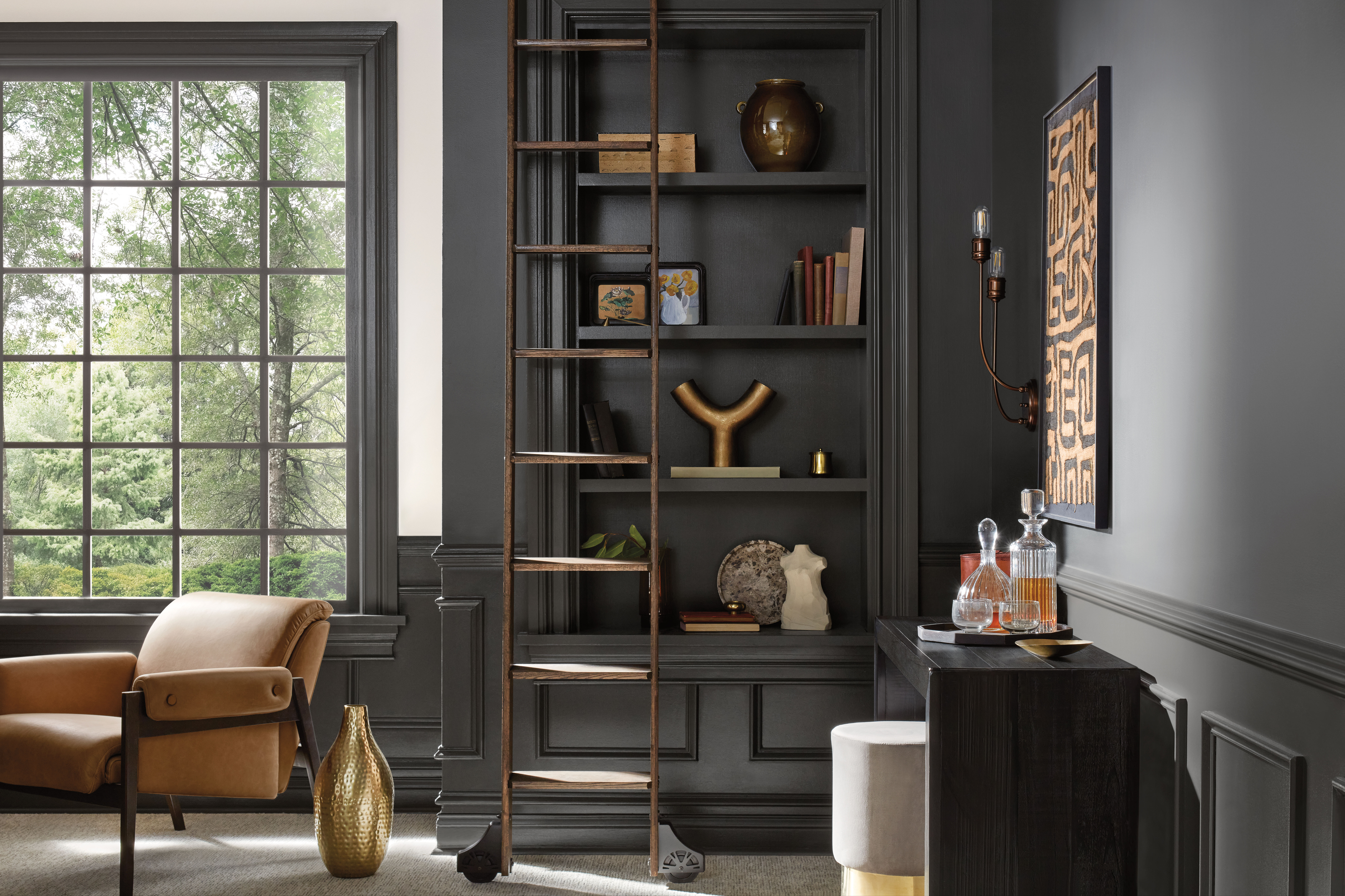
Both east and west-facing rooms experience changeable light throughout the day as the sun moves across the sky, so be prepared for the appearance of the color to alter at different times. ‘With eastern exposure, early morning light will make colors appear luminous and glowing,’ says Sue of Sherwin-Williams, ‘while western exposure will deliver late-day light that is warm as the sun hits the horizon - both of which can drastically change how paint color comes across.’
You may want to consider the time of day you are likely to use the room, as this will impact how you want the light to interpret the color. For example, for an east-facing kitchen idea in a space where you like to eat your breakfast, you might want to take advantage of bright morning light with a fresh green or refreshing blue to help you feel energized for the day ahead. Alternatively, for a west-facing snug or study that benefits from a golden afternoon glow, a deeply rich color such as indigo or charcoal will really come alive as the sun sets - perfect for a final moment of inspiration!
With such variable light levels, it’s especially important to test colors in these rooms, as Sue of Sherwin-Williams explains; ‘Consider also how your chosen colors may appear with indirect lighting for the remainder of the day - before committing to a hue, tape your color chip to the exposed wall and watch the light over the course of a few days to understand how it will look at different times of day.’
4. Decorating for size
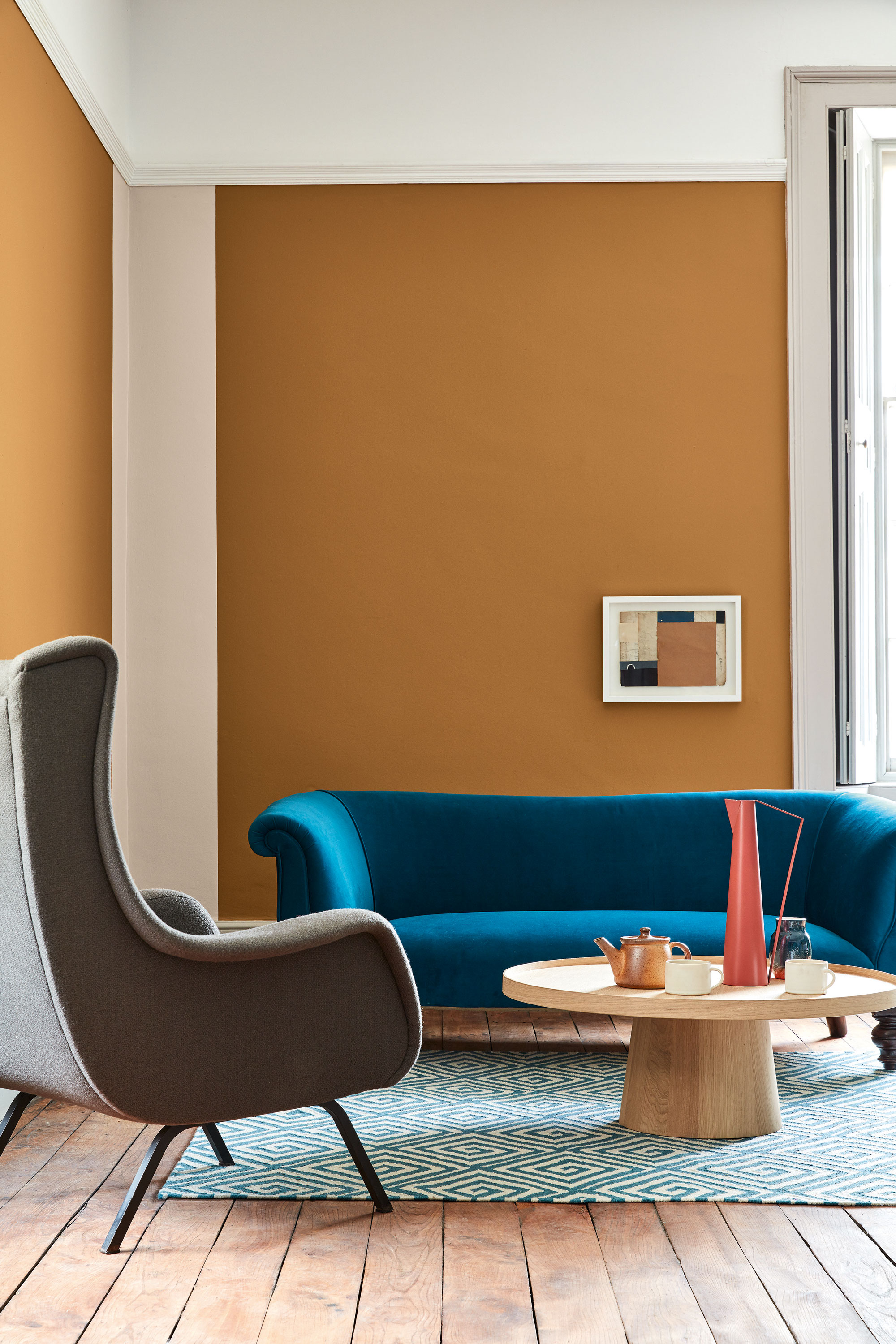
Paint colors can work wonders to alter the feeling of spaciousness in a room, so it’s definitely worth getting to grips with which ones will work best for your project. ‘For small spaces, there are some basic design principles that are usually applied,’ explains Sue of Sherwin Williams. ‘One is that the smaller the space, the lighter the color. The ‘why’ behind this principle is that natural light reflects off of light colors, so in a small space, having a light paint color will create a sense of visual spaciousness.’
Although, as ever, there are exceptions to the rule - and it’s important to be guided by the mood you wish to create. If you’re wanting to open up a small space, then light neutrals are a great way to go, however, an alternative approach is to lean into their size to create a cozy space, as Ruth at Little Greene attests; ‘Light neutrals are not the only option for a small space,’ she says. ‘Embrace a small room and create a cocooning, intimate interior with darker colors such as earthy browns, deep cherry reds or moody greens.’
At the opposite end of the scale, learning how to decorate large walls can present its own set of unique challenges. A vast space can sometimes suffer from feeling cold or unwelcoming, so you’ll want to use color to help make it feel more intimate. ‘Larger spaces can handle darker colors, because there’s such a large visual field,’ says Sue at Sherwin-Williams. ‘Deep, moody hues are perfect for making a large, airy space feel cozy and warm.’
If you’re not a fan of a dramatic color scheme but still want to warm up a large space, neutrals with carefully chosen undertones are the answer. ‘When using neutrals in a large room, try colors with a beige undertone to add warmth,’ says Sue at Sherwin-Williams. ‘A warm white which has a touch of creamy yellow will have the same effect, and acts as an ideal blank canvas for a large space since it pairs well with so many different tones, shades and textures - giving you endless options for décor.’
5. Decorating a kitchen
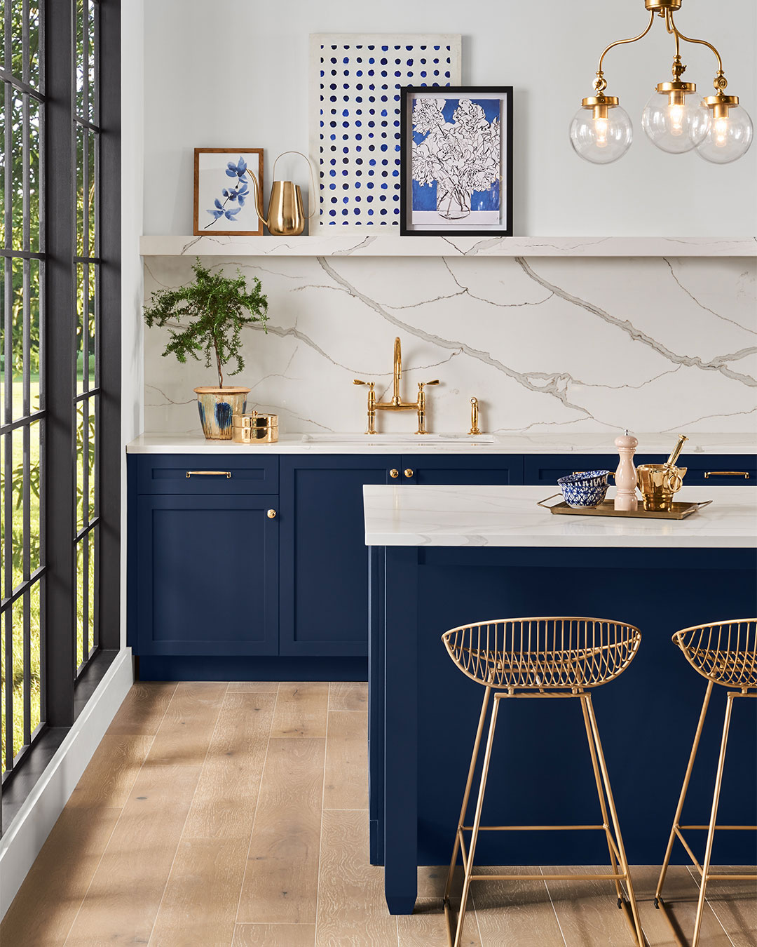
Once you’ve considered the light your room receives and its size, there are also certain palettes that work beautifully in specific rooms due to the way we live in them. Kitchens are often the hub of the home, and as well as being a place we want to feel energized in, a sense of grounding is key.
‘We’re seeing deeper kitchen color ideas like navy and dark green become more and more popular, as well as neutral, nature-inspired hues,’ says Sue at Sherwin-Williams. ‘This is because they provide necessary balance in a space that is both a lively gathering spot, and a respite for those who love to cook and relax in their kitchen nook.’
6. Decorating a living room
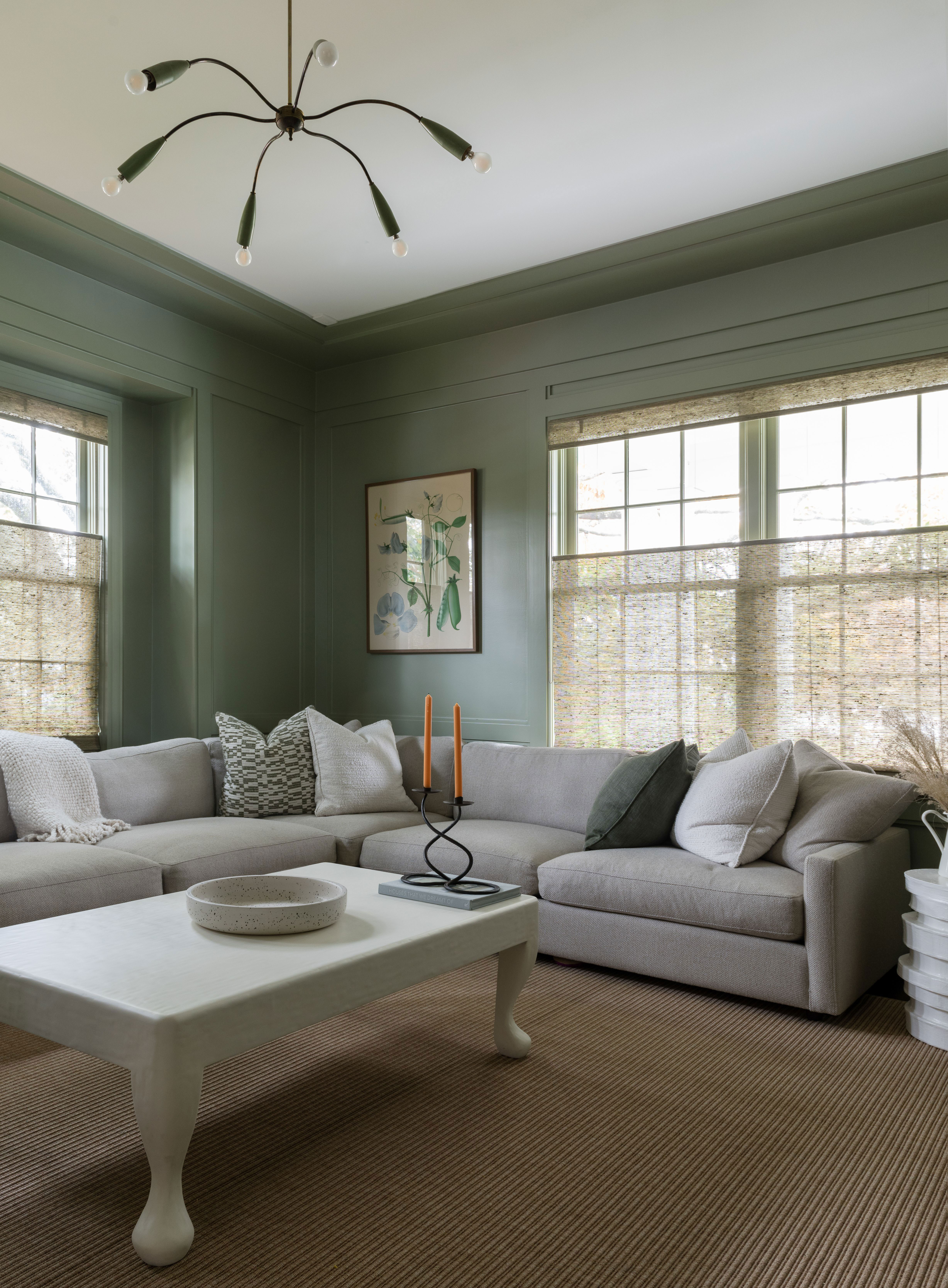
It’s where you go after a long day to unwind and relax, so a living room color scheme should always support whatever a sense of tranquility looks like to you. Green is a universally relaxing color and a great choice - it reminds us innately of nature and all of its beautifully calming qualities. It’s also the perfect hue to encourage you out of the comfort zone of neutrals.
‘Green shades are always a great option for living rooms, because they’re between a neutral and a brighter color,’ says New York-based interior designer Nicole Cohen. ‘The larger the room, the more relaxed the paint color should be. Since people tend to spend more time in living rooms, a muted color like sage green creates a calming atmosphere.’
7. Decorating a hallway
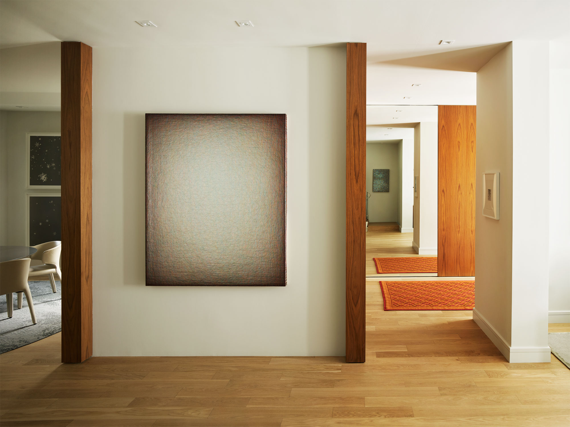
Corridors, hallways and landings are transient spaces - they are places we journey through and they help to connect other more frequently occupied rooms. As a result, you may want to choose a paint color that provides a visual rest and reset.
‘In this San Francisco home, the entry hall is open to the dining and living room which are both bold, colorful rooms,’ says Susan Collins Weir, Co-Founder of Studio Collins Weir. ‘We chose a cool white and warm walnut paneling to evoke a sense of calm between these two spaces.’
These spaces also tend to be lacking a source of natural light, but hallway paint ideas can help to counteract this. ‘This entry hall is void of natural light, which is so often the case as hallways are interstitial spaces,’ explains Susan. ‘We tend to make up for this by using shades of white - as white reflects light and helps to brighten and enlarge spaces.’
8. Decorating a dining room

Whether you have a formal dining room or an open plan dining area, you’ll want to create a space that feels inviting, comfortable and ready for entertaining. It’s also worth considering when you use the space - if you have a lot of dinner parties, the room will mostly be experienced in artificial light.
‘As dining rooms are primarily used in the evening and often for more formal eating, the ambiance is everything,’ explains Patrick O’Donnell, color consultant for Farrow & Ball. ‘For this reason, it’s key to think about how dining room color ideas will respond to artificial lighting - this is where warmer tones come into their own. From rich brick red tones to softer, gentler pinks and terracottas - each will positively glow with empathetic table lamps and candlelight.’
Don’t forget to consider the color of your ceiling - in rooms where you want to create a restful experience, this is especially important. ‘For your ceiling, avoid too clean of a white and choose something softer, either with a yellow or red undertone,’ says Patrick. ‘This makes for a gentler transition, minimizing any sharp horizontal lines where the wall meets the ceiling.’
9. Decorating a bedroom
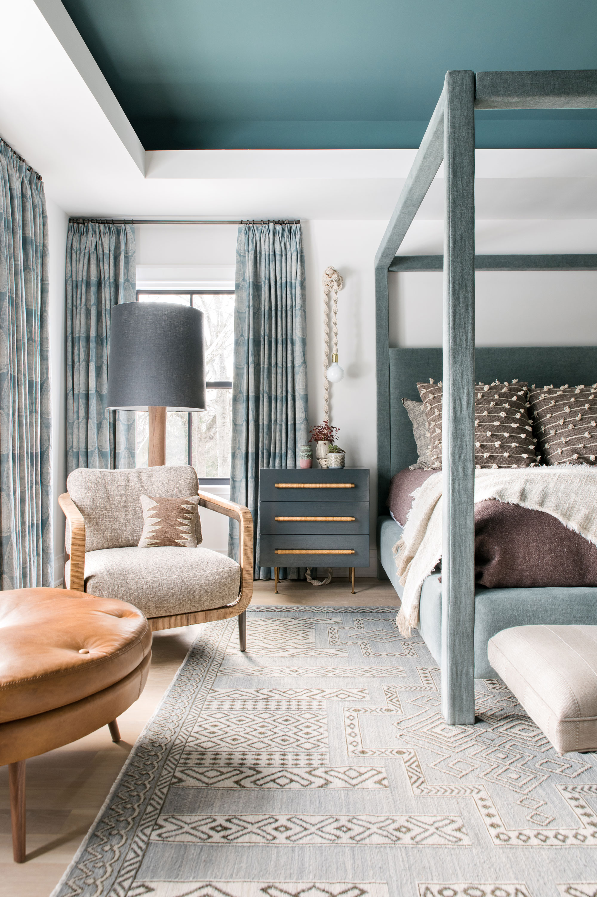
Bedrooms should always feel like a place of sanctuary - and, in addition to tactile textures and comfortable furniture, a serene bedroom color scheme is just what you need to set the tone. Think about what colors you feel emotionally drawn to, as these will create a supportive environment you’ll long to retreat to.
‘Bedrooms are such a personal space that they are the perfect room for following your heart and choosing colors that make you happy and relaxed,’ says Ruth Mottershead from Little Greene. ‘I love a natural muted palette of green and blues to create a comforting, soothing scheme.’
Should all rooms be painted the same color?
Choosing one paint color throughout your house might seem like an easy choice, especially if it's white, but as this guide goes to show, that singular color will read differently in every space. If you choose a paint color because you like it in one space, bear in mind it's going to look different in another room. You might enjoy some paint colors in different facing rooms, but it's better to choose a shade for each room individually where possible.
To bring cohesion to your space, consider creating a through-line to your room schemes, especially in spaces with open concept door openings or glass room dividers. This could be a color that's on the walls in one room, introduced as a smaller accent in another.
Be The First To Know
The Livingetc newsletters are your inside source for what’s shaping interiors now - and what’s next. Discover trend forecasts, smart style ideas, and curated shopping inspiration that brings design to life. Subscribe today and stay ahead of the curve.
Interiors stylist and journalist Amy Neason was the Deputy Style and Interiors editor at House Beautiful for years. She is now a freelance props and set stylist, creating work for a range of national publications and brands such as Imogen Heath. She has previously worked at Established & Sons, and her skills include styling still life and interiors shots for editorial features and sourcing unique products to create inspirational imagery. She is particularly respected for interpreting seasonal trends into feature ideas and style stories.
-
 Do Yellow and Purple Go Together? Designers Reveal How to Make This Unexpected Pairing Feel "Totally Intentional"
In an era where unexpected combinations have become cool, we've done a deep-dive to discover how to pair yellow and purple in a space
By Camille Dubuis-Welch Published
-
 7 Budgeting Mistakes to Avoid When Planning Your Kitchen Extension
Designing a kitchen extension on a strict budget requires you to work smarter, not harder. Avoiding these slip ups is the first step to success.
By Maya Glantz Published