These 3 Paint Colors Are Making Your Home Feel Colder - and This is What to Choose for Rooms That Feel Warm
If your home is giving you the shiver, it might be down to the paint color on your walls. Here's 3 to avoid if your rooms are feeling cold this winter, say experts
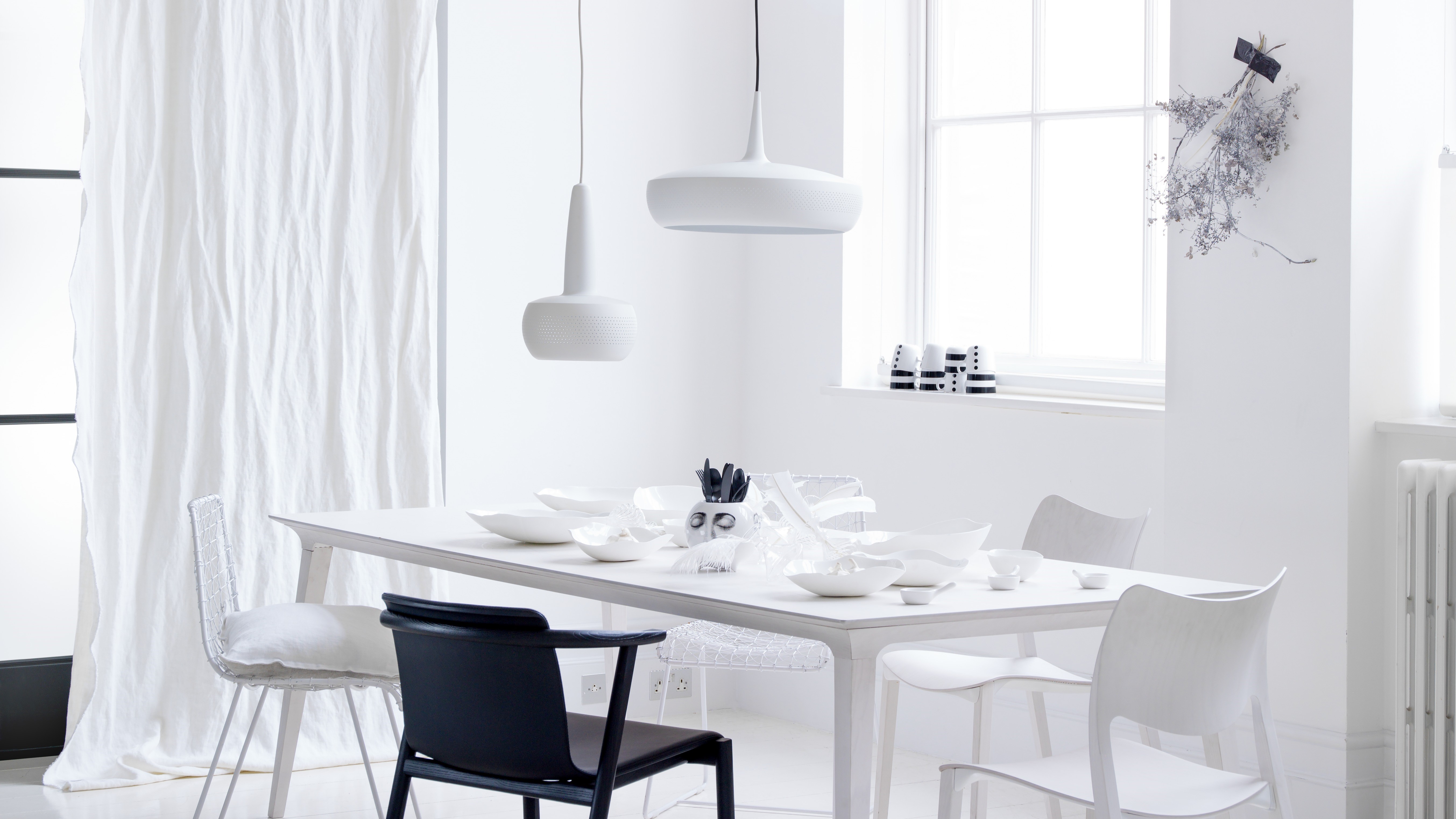

While they might not be able to literally raise the figure on your thermostat, paint colors definitely have an effect on how warm or cold a space feels. At this time of year, where you home may feel dreary or glum, the wrong paint color can make a room feel even colder.
So which paint ideas are giving your living room an arctic outlook? And which colors should you pick instead for rooms that feel warmer and cozier during the colder months? Here's what experts say.
1. A cool white
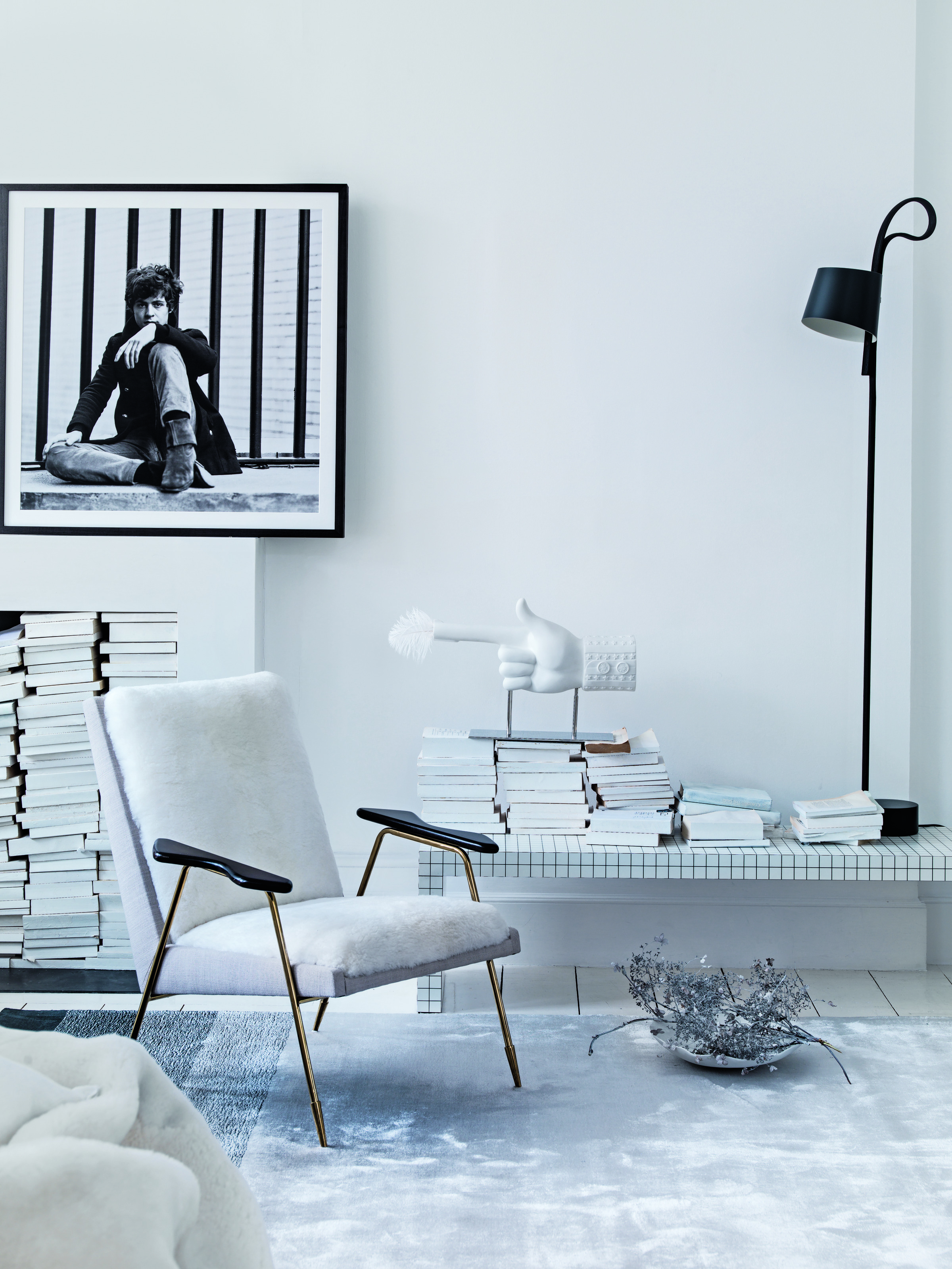
Largely, painting and decorating the home according to the climate has been a practice for decades. Especially in warm climates, many designers advise colors that psychologically and even practically cool or warm the home. To cool down a space, look to the blue side of the spectrum on the color wheel, and consider the red side to warm a room.
'A cool white with blue-grey undertones like Benjamin Moore's Paper White can make your home look and feel cold, especially if not paired with warmer accents and textured furnishings,' says Bethany Adams, founder of Bethany Adams Interiors.
A blue-grey white aside, a pure, brilliant white with no undertones can make a room feel clinical and harsh. This type of white will also be harsh on the eyes.
'But if white is your vibe and you're looking for the best white paints for walls, go for something with warm to neutral undertones like Benjamin Moore's White Dove or Swiss Coffee, both of which have a more creamy, yellowy undertones,' says Bethany.
2. Pale grey
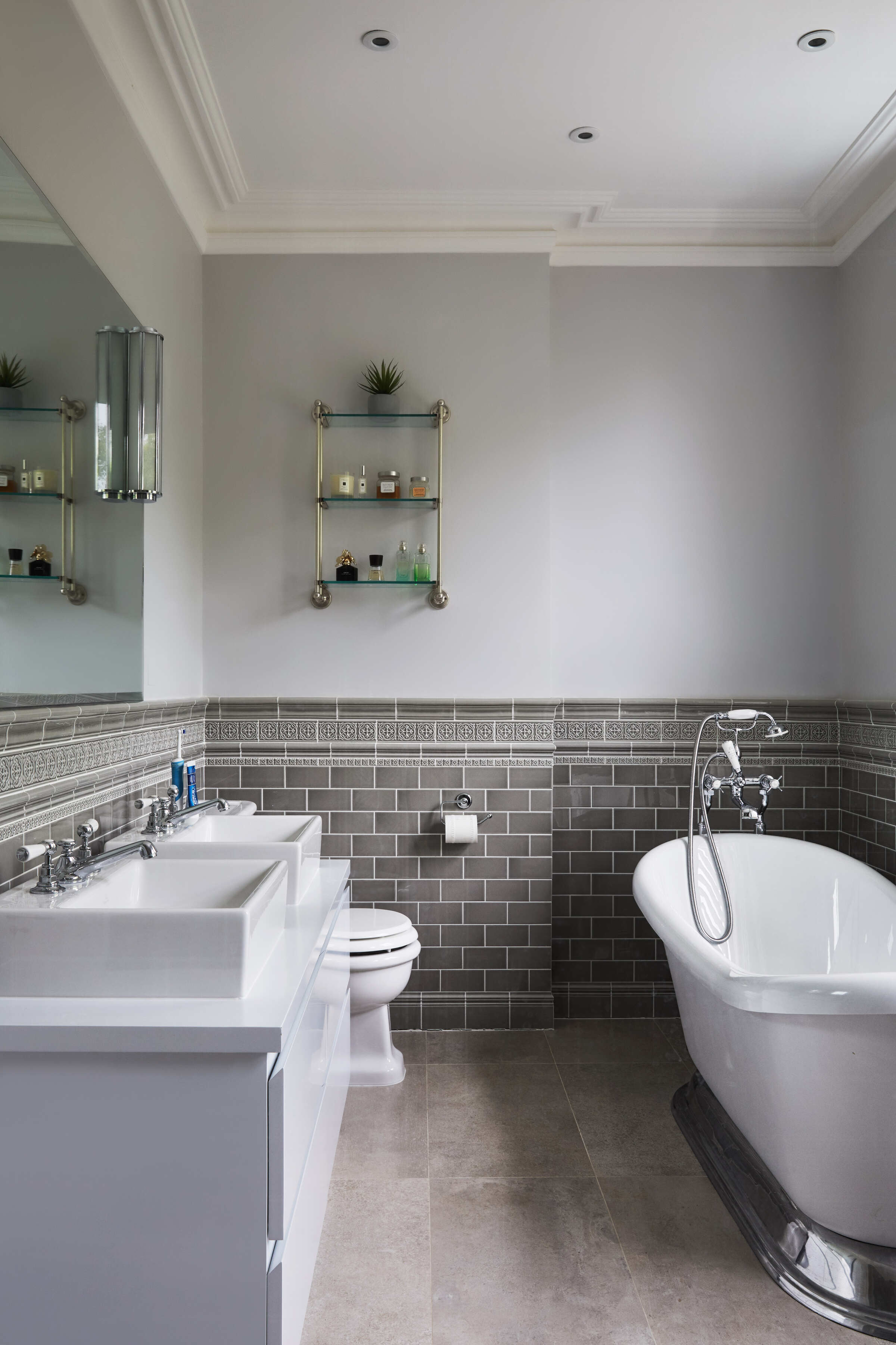
If you love grey and are looking for the best grey paint, you should perhaps steer clear of light to mid-tone greys that could make your home feel cold and dreary.
'A pale to mid-tone grey is often seen as cooler, especially when combined with white ceramic tiles that have a high sheen on them,' says Jane Lockhart, founder of Jane Lockhart Design. 'Higher glosses and harder surfaces all serve to make a space feel less warm, as they bounce light and sound around and offer no color warmth. Pale greys with blue undertones tend to remind people of more clinical spaces, which we don’t often associate with feeling warm or comforting.'
Go instead for darker greys that not only look sophisticated but also create a cocooning feeling.
'We love Sherwin Williams 7069 Iron Ore,' says Brooke Wilbratte, founder of Tribe Design Group. 'Although it's a very dark grey and not a true black, it looks black in most cases. It's the darkest in the black paint shades that we typically use. And it's beautiful in every scenario.'
3. Ice blue
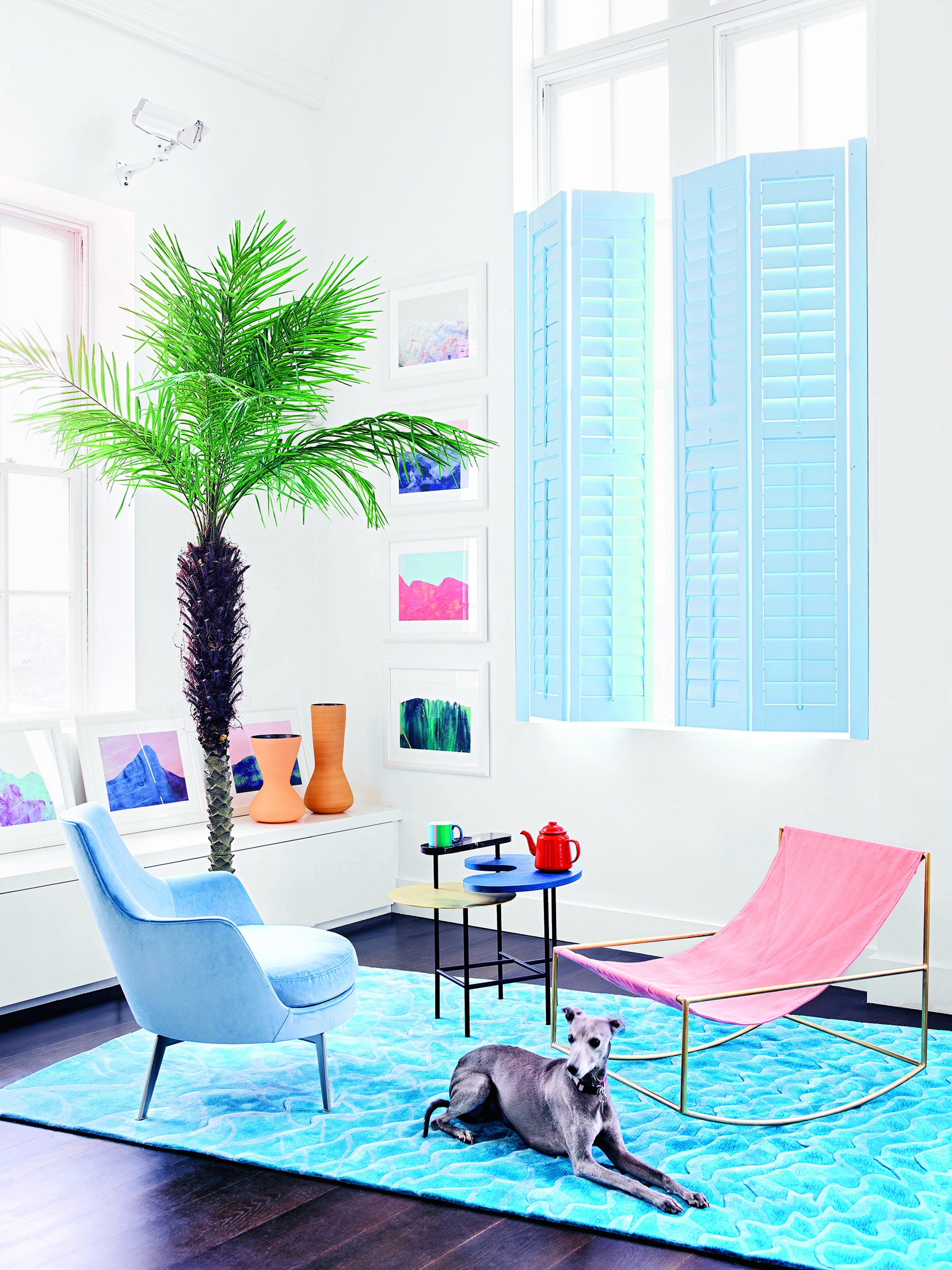
Everyone loves blue and for good reason. The color is inherently calming and reminds us of the sky and blue sea. Plus, several colors go with blue. However, the ice-blue rendition of lacks warmth. It is a pale, pure, blue with an aqua-green undertone, and while it may work for spaces needing a cool feel, in the winter months, this shade can be hard to live with.
A wonderful shade to choose instead is a grounding blue or one that has a red or black undertone.
'My go-to blue paint lately has been Wine Dark by Farrow & Ball,' says Juliette Thomas, founder and director of Juliettes Interiors. 'The color offers a sophisticated yet upbeat hue. It's inspired by midnight skies and works well in most rooms of the home. It is an ideal choice if you’re looking to create a statement, whilst the depth and intensity of the color can make a room feel both intimate and warm.'
Be The First To Know
The Livingetc newsletters are your inside source for what’s shaping interiors now - and what’s next. Discover trend forecasts, smart style ideas, and curated shopping inspiration that brings design to life. Subscribe today and stay ahead of the curve.

Aditi Sharma Maheshwari started her career at The Address (The Times of India), a tabloid on interiors and art. She wrote profiles of Indian artists, designers, and architects, and covered inspiring houses and commercial properties. After four years, she moved to ELLE DECOR as a senior features writer, where she contributed to the magazine and website, and also worked alongside the events team on India Design ID — the brand’s 10-day, annual design show. She wrote across topics: from designer interviews, and house tours, to new product launches, shopping pages, and reviews. After three years, she was hired as the senior editor at Houzz. The website content focused on practical advice on decorating the home and making design feel more approachable. She created fresh series on budget buys, design hacks, and DIYs, all backed with expert advice. Equipped with sizable knowledge of the industry and with a good network, she moved to Architectural Digest (Conde Nast) as the digital editor. The publication's focus was on high-end design, and her content highlighted A-listers, starchitects, and high-concept products, all customized for an audience that loves and invests in luxury. After a two-year stint, she moved to the UK and was hired at Livingetc as a design editor. She now freelances for a variety of interiors publications.
-
 My 10 Favorite Designs at Milan Design Week 2025 — Out of the Hundreds of Pieces I Saw
There is a new elegance, color, and shape being shown in Milan this week, and these are the pieces that caught my eye
By Pip Rich
-
 Iridescence Is Chrome’s More Playful, Hard-to-Define Cousin — And You're About to See It Everywhere
This kinetic finish signals a broader shift toward surfaces that move, shimmer, and surprise. Here's where to find it now
By Julia Demer


