Playroom mistakes to avoid: 7 essential points to keep in mind before designing this sensitive space
Designers swear that these playroom mistakes to avoid would ruin the space, and explain what to do to get them right
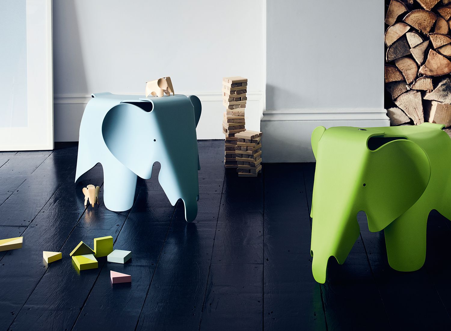

Having a dedicated space for kids is a wonderful thing, but do keep these playroom mistakes to avoid in mind. If you’re going to put in the time and energy to set up a room, space or corner for your little one, make sure it’s rid of any dangers or design errors.
The playroom should not just appeal to the child but also be a safe space, where he/she can play for as long as they want, without you having to constantly supervise. We reached out to a score of experts to help us understand things that either get missed out or are so commonly done that one may not even realize they're mistakes.
Take a look at these playroom ideas and seven things to watch out for.

Aditi is a homes writer and editor with several years of experience. Her articles, backed by expert insights, offer suggestions aimed at helping readers make the best home design choices. Each piece presents latest ideas, information and trends to her readers. For this article, she spoke to top interior designers for their advice on what to avoid while designing this very important space.
The main 7 playroom mistakes to avoid
1. Locating the playroom too far from the main living spaces
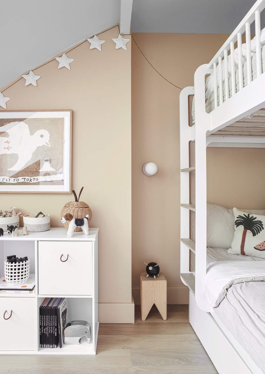
Whether is a large, a small or studio apartment layout, a playroom is usually regaled to a secondary room, a corner or a space that serves several functionalities. And rightly so, since children grow fast and the need for a playroom diminishes very soon.
That being said, it may not be the best idea to move this space into the darkest confines of your home where you do not have a clear eye and earshot. While the child may be playing in the safe confines of your home, accidents can happen any time and anywhere, and it's always good to ensure that their playroom is somewhere close to the main living spaces so you can pop in and out to check on them.
'A playroom should be in an area of the home where children are comfortable playing independently and supervision is convenient,' Reena Sotropa, founder of Reena Sotropa In House Design Group. 'If a playroom is too far away from main living areas, like in the basement for example, younger children will probably avoid using the space without a caregiver present.'
2. Hiding everything away from sight
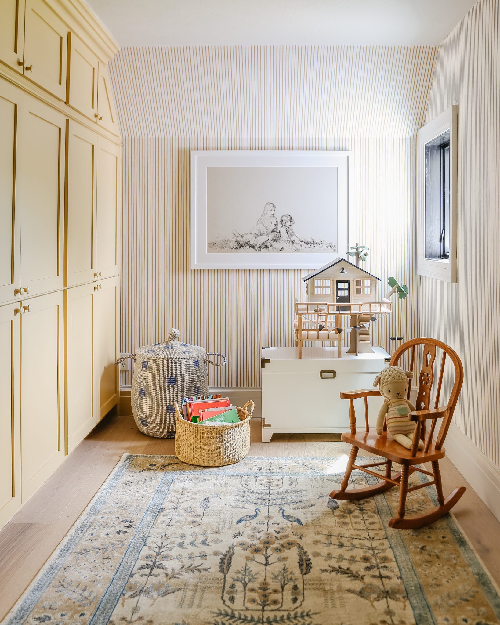
Now this may sound counterintuitive but remember the true purpose of this room before going all Marie Kondo on it. A playroom is essentially a space where the child can let loose and have fun. This is where he/she discovers games that interest them and even pick up hobbies. Don't make it too sterile and cold by hiding away all toys and board games inside playroom storage units.
'The biggest playroom no no is hiding away items,' says Jennifer Morris, founder of JMorris Design. 'Sure, it's a tough dance between being organized and keeping everything in place but tucking all toys and games away leads to these pieces being forgotten. In fact, I don’t install doors in play spaces as I want things clearly seen and discovered, even at the expense of a calm serene space. For the sake of your children too, keep things accessible and within reach.'
Entice your child to spend time here by keeping a few choice figurines, card or board games on tables or open shelves. For all you know, this may encourage you to take a break too and spend some quality time with your little one, building LEGOs and more.
3. Storing all the heavy items and toys on the top shelves
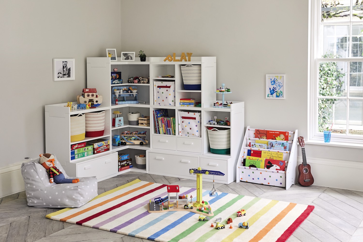
When looking for effective kids toy storage ideas, people are generally of the opinion that keeping things out of reach will be a safe and more organized solution. While the latter may be true, this won't keep your child from harm's way.
'Another mistake parents make is moving all the heavy items in the playroom to the top level,' says Jennifer. 'You don’t want kids tugging down big things that can hurt them. Transfer things to the lower shelves and allow items to move around.'
3. Placing floor lamps
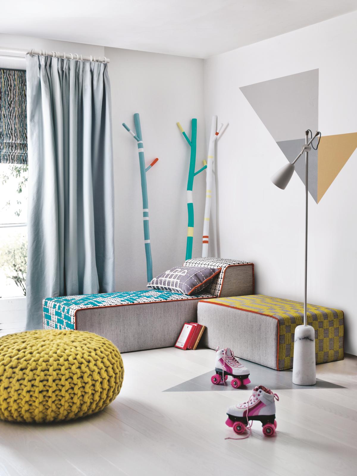
'When lighting a playroom, there are a few important considerations to bear in mind particularly for those looking to make a safe and happy environment for children to play and explore in,' says David Amos, CEO at Amos Lighting. 'While floor lamps look stylish and are a great addition to a room, in a playroom these are not appropriate as they can be a trip hazard for little ones, and can be easily knocked over. Instead, ceiling lighting such as pendants are great, and wall lights positioned higher up the wall provides a warm and ambient charm.'
'The lighting should always be out of reach of children, as bulbs are hot, and if knocked over or broken, it can be dangerous,' says David. 'We also recommend avoiding harsh lighting, as this can be intense for small children. Instead maximize natural daylight during the day and ideally install a dimmer switch, to allow for winding down during evening play.'
4. Having windows without shutters or blinds
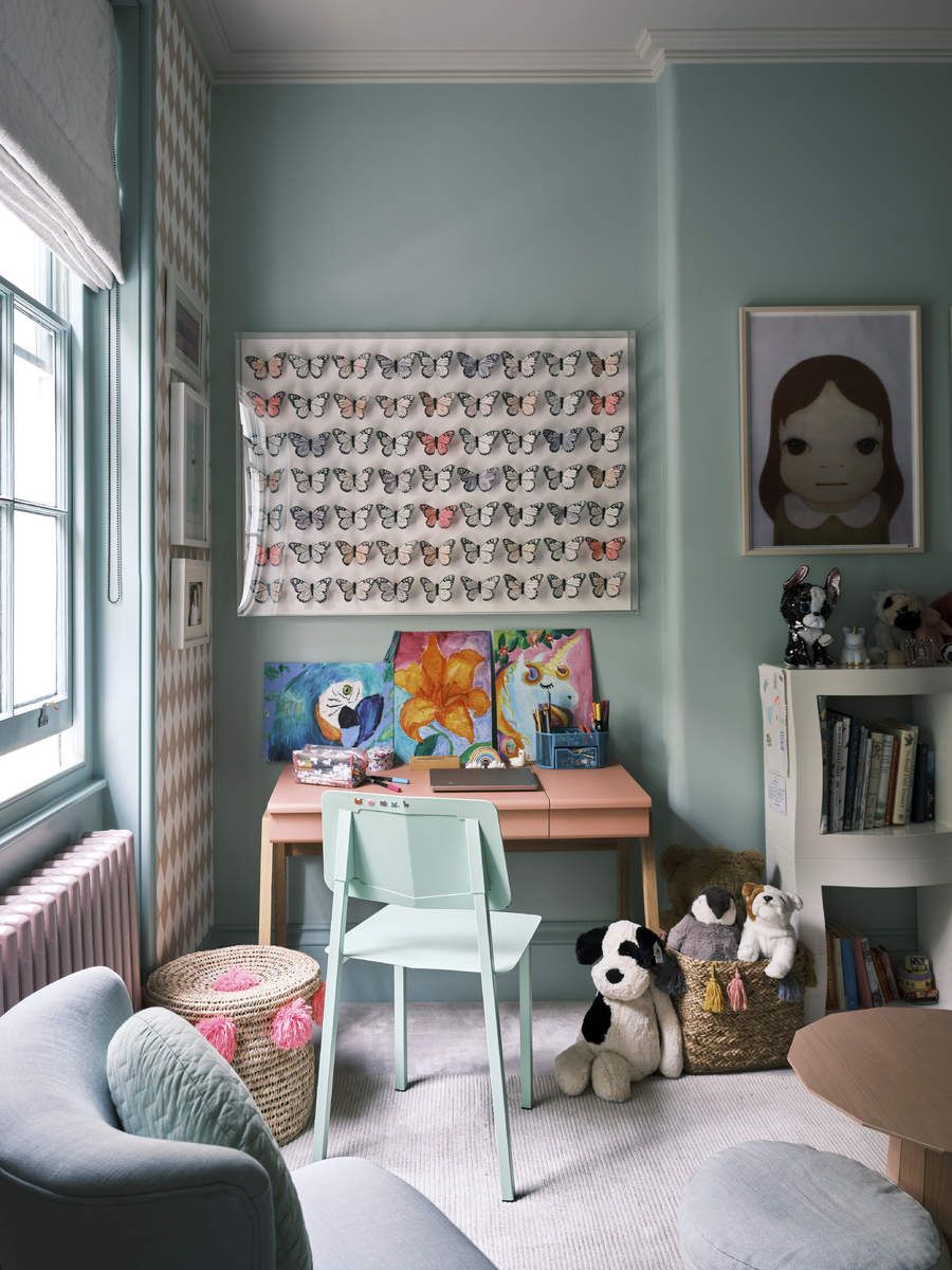
There is no doubt that natural light is the most ideal illumination for any space. This is the best type of lighting to read, draw or color in. However, in many climates, the afternoon summer light can be harsh and even cause more harm than good. In that case, it's best to opt for modern window treatments to block out the sun when the need be.
'Windows can be too bright, and exposing for a playroom,' says Sally Denyer of Shutterly Fabulous. 'Shutters are an important consideration, as they help parents control the light and privacy. Cafe style shutters are a nice option as they allow the light to come in through the top half of the window, whilst giving control over the lower half. Alternatively, solid wood shutters can be closed to create complete darkness, which is perfect for putting children down for daytime naps.'
5. Designing a room that does not grow with the child
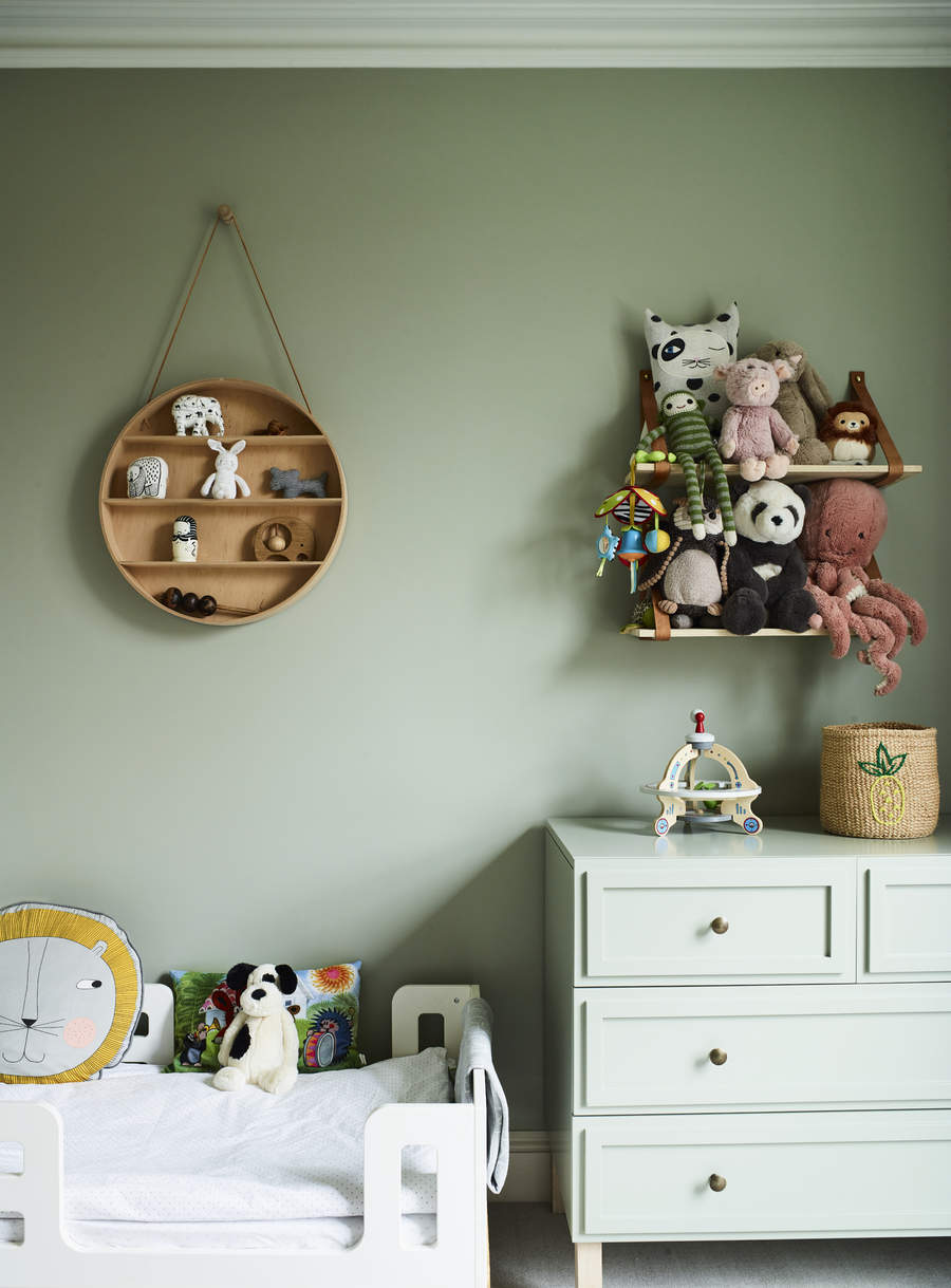
The playroom doesn't have to look like a chaotic kindergarten classroom. More often than not, a play area shares space with another room; be it the living room, dining or basement. Plus, the playroom as a whole is a temporary need that will fade away in a few years. Keeping all these things in mind, try to select furnishings that almost look like an extension of the adult area. Don't stick to a non-flexible theme that will be hard to change over the years.
'Another mistake parents make is designing a playroom that will not easily adapt to the ever-changing needs of growing children,' says Reena. 'Storage should be flexible and one should avoid themed decor that revolves heavily around the child’s obsession du jour.'
6. Bringing in sharp, designer furniture pieces

'Stay clear of pieces that have sharp edges, are overly formal or hard to clean,' says Meagan Whalen, interior designer at JL Design. 'In a space like this, children explore the world with toys and furniture and so it's important keep this space safe. Soft seating, fun pieces like bean bags and ottomans, and colorful furniture are great to incorporate.'
'Also beware of any furniture that is delicate or easily broken,' says Mark Lavender, principal designer at M. Lavender Interiors. 'Sturdy furniture with kid/dog friendly fabrics and finishes is recommended.'
Whether it's designing the playroom or kids bedroom, go for smaller, lightweight pieces of furniture so that children do not hurt themselves if they knock into them. Consider bringing in soft chairs, poufs, stools and small tables. Not only are they safe to use, they can also be rearranged, or even dispersed among other rooms when the day comes that you no longer need a dedicated playroom.
7. Choosing a bright, intense color palette
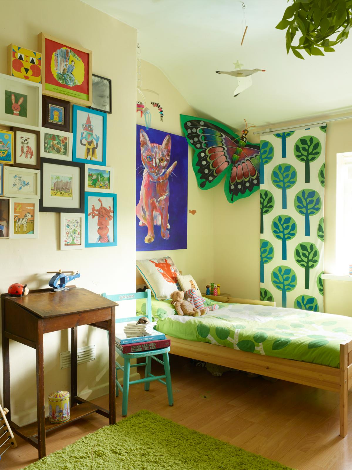
'Playrooms are such a fun and impactful space for children which is why it is so important in these spaces to encourage growth, exploration and learning,' says Meagan. 'Avoid aggressive colors such as bright shades of red and purple. These colors can cause frustration and annoyance because of the over stimulation. In general, very intense or bright colors should be avoided but fun and engaging encouraging colors are blue, green and yellow are encouraged.' Plus, several colors go with blue and green, so creating a decor that is complementary won't be tough.
'Be weary of any light or white/off white colors as they will tend to show marks and dirt more than the vibrant colors,' says Mark.
What makes a good playroom?
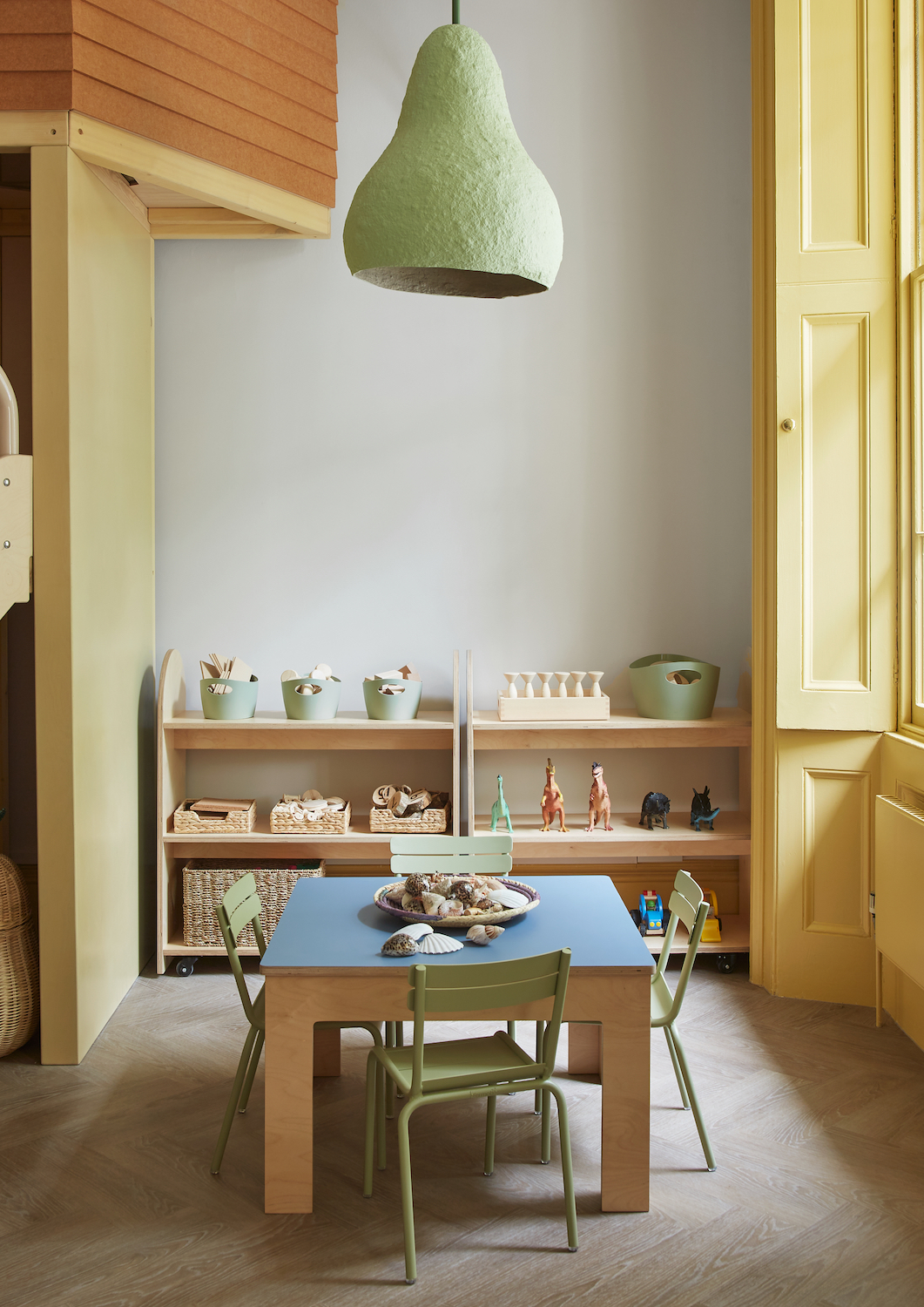
For an ideal playroom design, it's essential to take your child's wishes into consideration. After all, this room will be used by him/her the most. Choose colors that are playful without being jarring. It would be ideal to avoid very soft hues for the walls as they tend to look dirty too soon.
To keep the playroom organized at all times, invest in functional storage options. Bring in cabinets, shelves and even storage baskets that will help curb the mess. Inculcate the habit of cleaning up post play in your children.
Choose furniture that has round edges, is lightweight and non-toxic. Children spend a lot of time on the floor and discover the space, sometimes on their fours. You want to ensure everything in the room is safe and won't cause injury. Soft floor mats or a cushy rug too is an essential, although buy one that can be washed easily.
Be The First To Know
The Livingetc newsletters are your inside source for what’s shaping interiors now - and what’s next. Discover trend forecasts, smart style ideas, and curated shopping inspiration that brings design to life. Subscribe today and stay ahead of the curve.

Aditi Sharma Maheshwari started her career at The Address (The Times of India), a tabloid on interiors and art. She wrote profiles of Indian artists, designers, and architects, and covered inspiring houses and commercial properties. After four years, she moved to ELLE DECOR as a senior features writer, where she contributed to the magazine and website, and also worked alongside the events team on India Design ID — the brand’s 10-day, annual design show. She wrote across topics: from designer interviews, and house tours, to new product launches, shopping pages, and reviews. After three years, she was hired as the senior editor at Houzz. The website content focused on practical advice on decorating the home and making design feel more approachable. She created fresh series on budget buys, design hacks, and DIYs, all backed with expert advice. Equipped with sizable knowledge of the industry and with a good network, she moved to Architectural Digest (Conde Nast) as the digital editor. The publication's focus was on high-end design, and her content highlighted A-listers, starchitects, and high-concept products, all customized for an audience that loves and invests in luxury. After a two-year stint, she moved to the UK and was hired at Livingetc as a design editor. She now freelances for a variety of interiors publications.
-
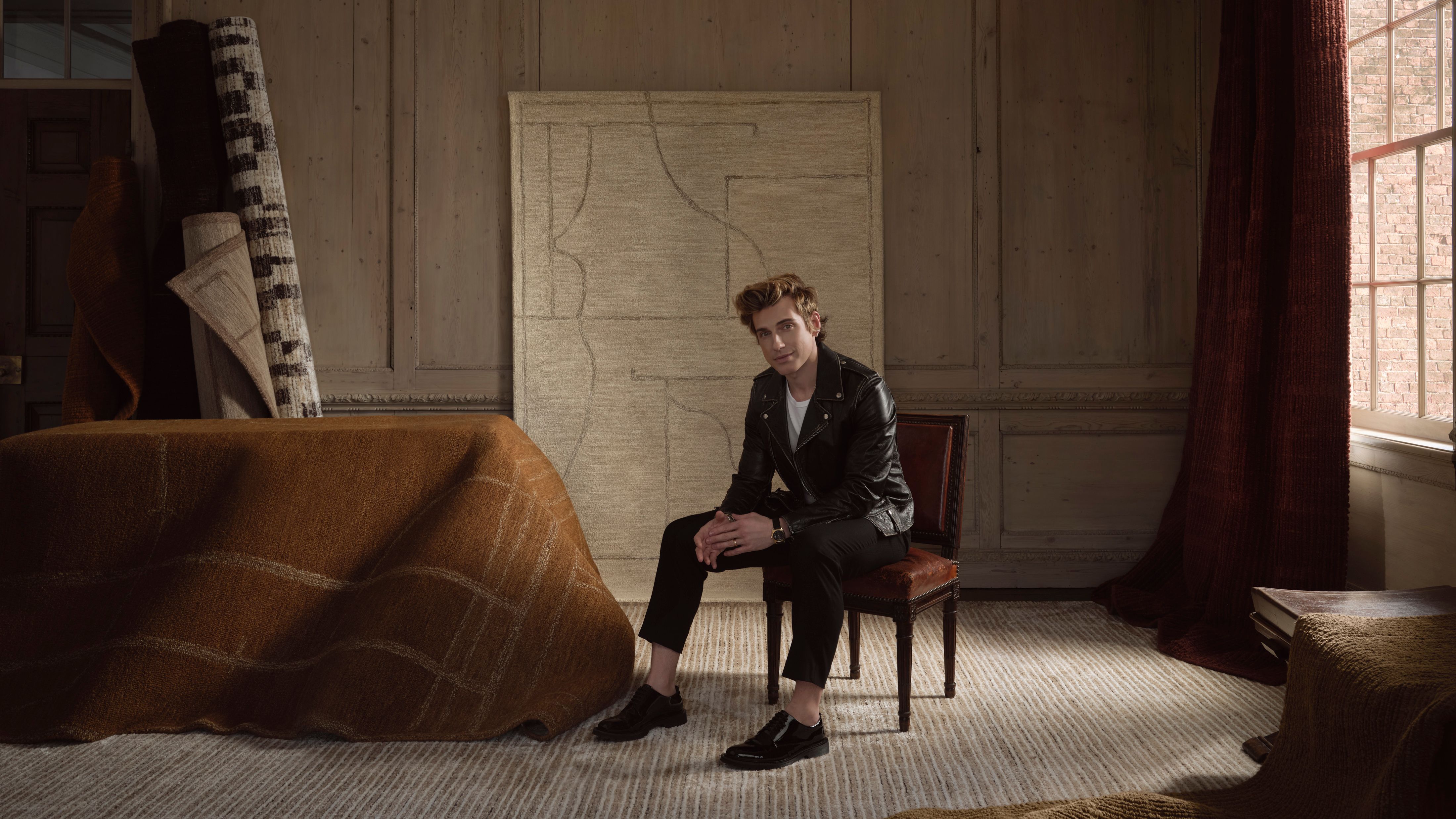 Jeremiah Brent Captures the Grit and Glamour of NYC in His New Loloi Collaboration
The TV-famous interior designer looked out of his own window — and hit the pavement — for a collection that turns city spirit into tactile design
By Julia Demer
-
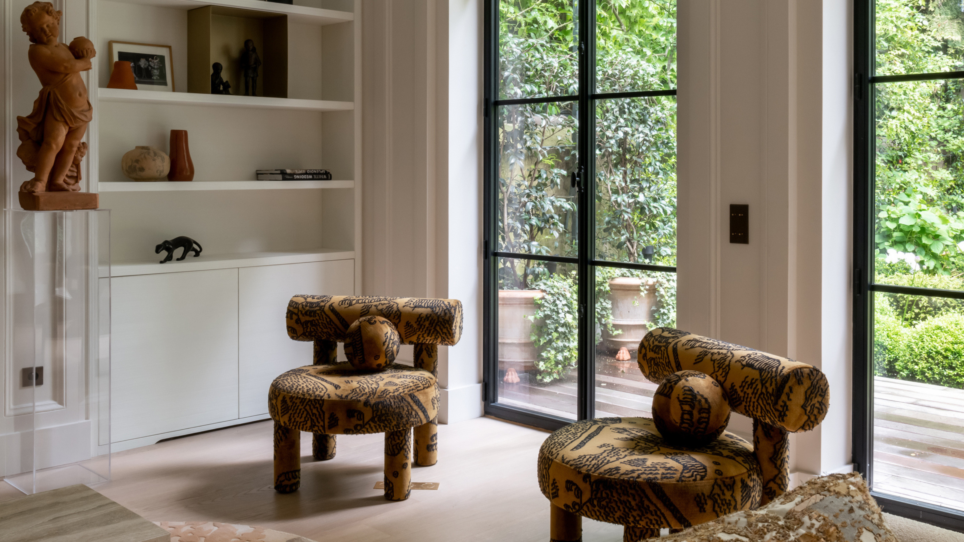 This Specific Fabric Print Is Literally Everywhere Right Now — Here's Why
It's whimsical, artistic, and full of character. We've called it already: Dedar's 'Tiger Mountain' is the fabric that will define 2025
By Devin Toolen