6 popular ideas you should avoid in a small kitchen – especially if you want to make your tiny space seem bigger
These are the things that interior designers always suggest their clients strike off their wishlist when they're designing small kitchens

The Livingetc newsletters are your inside source for what’s shaping interiors now - and what’s next. Discover trend forecasts, smart style ideas, and curated shopping inspiration that brings design to life. Subscribe today and stay ahead of the curve.
You are now subscribed
Your newsletter sign-up was successful
A big sweeping kitchen might be the dream for most of us, but small kitchens are more often the reality. If you live in a city apartment, chances are you could probably do with a few extra feet of floor space in this functional room of the home, but that's easier said than done. Want a simpler approach that doesn't involve knocking down walls? Use design ideas that give your kitchen the illusion of greater space.
There are some much-loved design ideas that make excellent statements in larger kitchens. The problem is, while they might be on-trend, they may not necessarily work in your favor if your kitchen's on the smaller side. In fact, they could make your already limited space feel even more cramped than it is. Decluttering is one route to a remedy - after all, less stuff equals more space - but, a savvier, longer-term solution is to use clever design ideas (and avoid certain others).
Unless you're an established designer or kitchen fitter, though, it's unlikely you'll have the intel on these insider secrets. To help you make sense of what they are and how to use them in your own space, we asked some interior designers for their insights into what to avoid in a small kitchen to make your space seem larger. Here's what they had to say.
Article continues below1. 'Medium'-format floor tiles
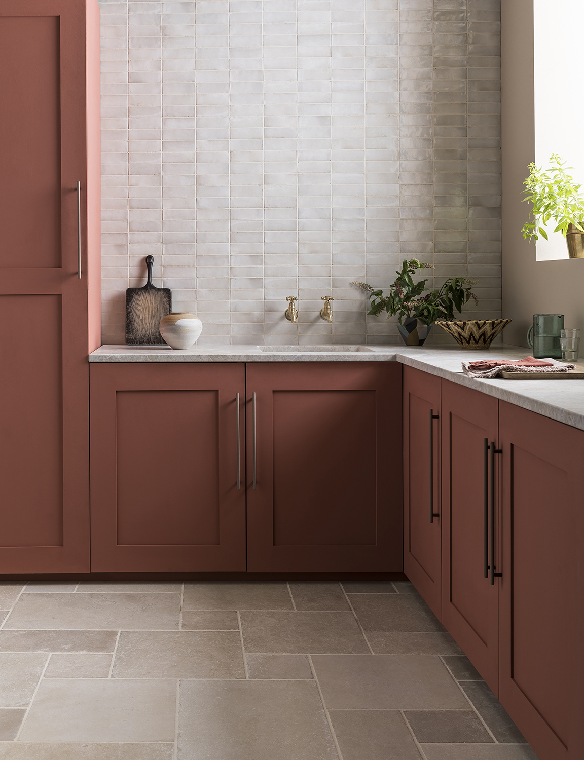
When it comes to kitchen flooring, it might seem intuitive to use small floor tiles in a compact kitchen so they're proportionate to the room itself, but chances are they'll actually work against you (unless they're super small scale). In a small-scale kitchen, using more monolithic floor tiles with finer grout lines will create a more seamless look that doesn't overcrowd your space or make it feel too busy.
When it comes to the tile pattern, interior designer Karen Harautuneian, founder of Hub of the House Studio, says scale is also key. 'Avoid "medium" scaled floor coverings like a 12x12 floor tile in a checkerboard pattern,' she says. 'Instead, scale the floor covering either much smaller or much larger, or consider a random-sized tile pattern or a four-tile printed pattern. These small changes always make a kitchen feel larger.'
Lina Galvao, designer and co-founder of Curated Nest, also suggests a diagonal tile pattern, especially on narrow floors of galley kitchens. 'It's an effective way to give an illusion of wider floor space,' she adds.
2. Upper cabinetry
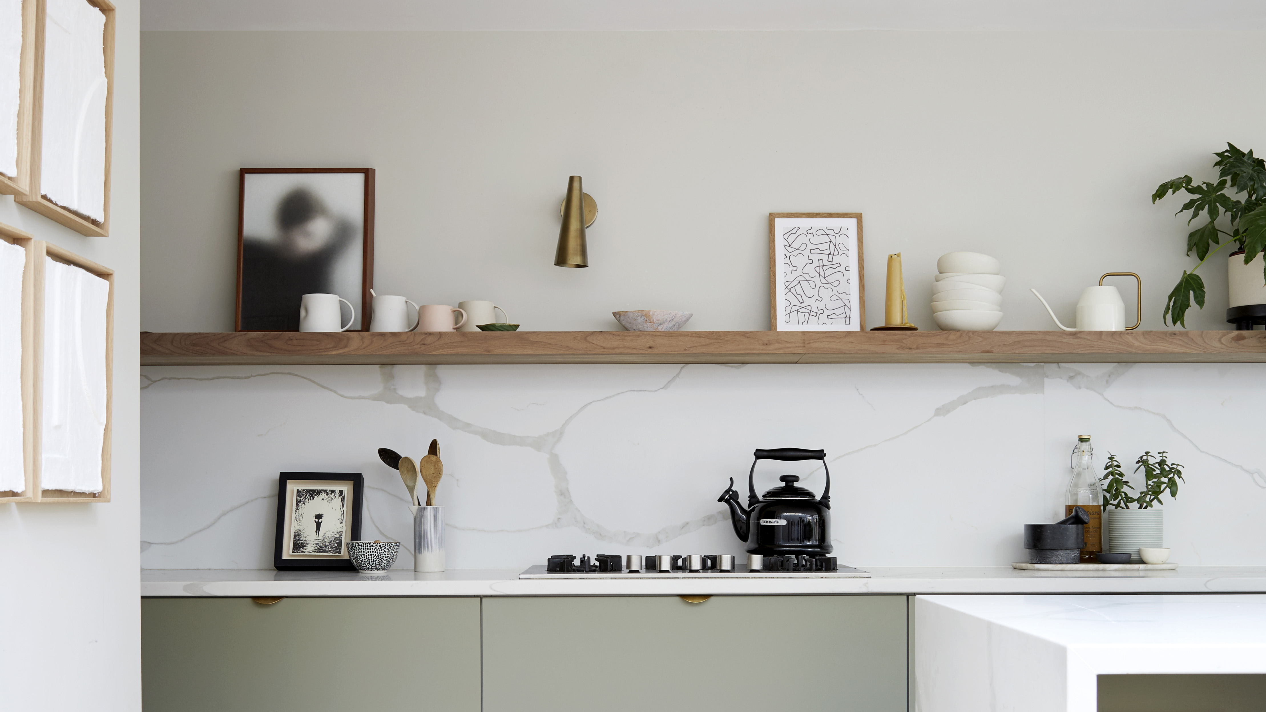
For decades, built-in cabinetry was the norm in most kitchens, no matter the size. Recently though, open kitchen shelving has been favored along the upper portions of walls as an alternative to floor-to-ceiling cabinetry. It sacrifices very little storage space but makes your kitchen look far less bulky and allows more light into the room.
The Livingetc newsletters are your inside source for what’s shaping interiors now - and what’s next. Discover trend forecasts, smart style ideas, and curated shopping inspiration that brings design to life. Subscribe today and stay ahead of the curve.
'If you have a space that's long and narrow, it's best to only have upper or full-height appliances on one side of the room,' explains Gillian Gillies, founder of Gillian Gillies Interiors. 'Having uppers on both sides can make a space feel more like a tunnel than a room.'
Alternatively, if dismantling your upper cabinets sounds like too much effort or you aren't prepared to sacrifice on hidden storage space, try painting them the same colors as your walls instead. This will make them blend seamlessly into the room, especially if they're light in color, helping to maximize the feel of the space.
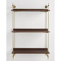
Wall Mounted Shelving Unit, Anthropologie
It's easy to think open shelving in a kitchen could make your space feel more cluttered, but it makes a great alternative to upper wall cabinetry. Just be sure to style your shelves thoughtfully, only displaying the items you want people to see.
3. A large island
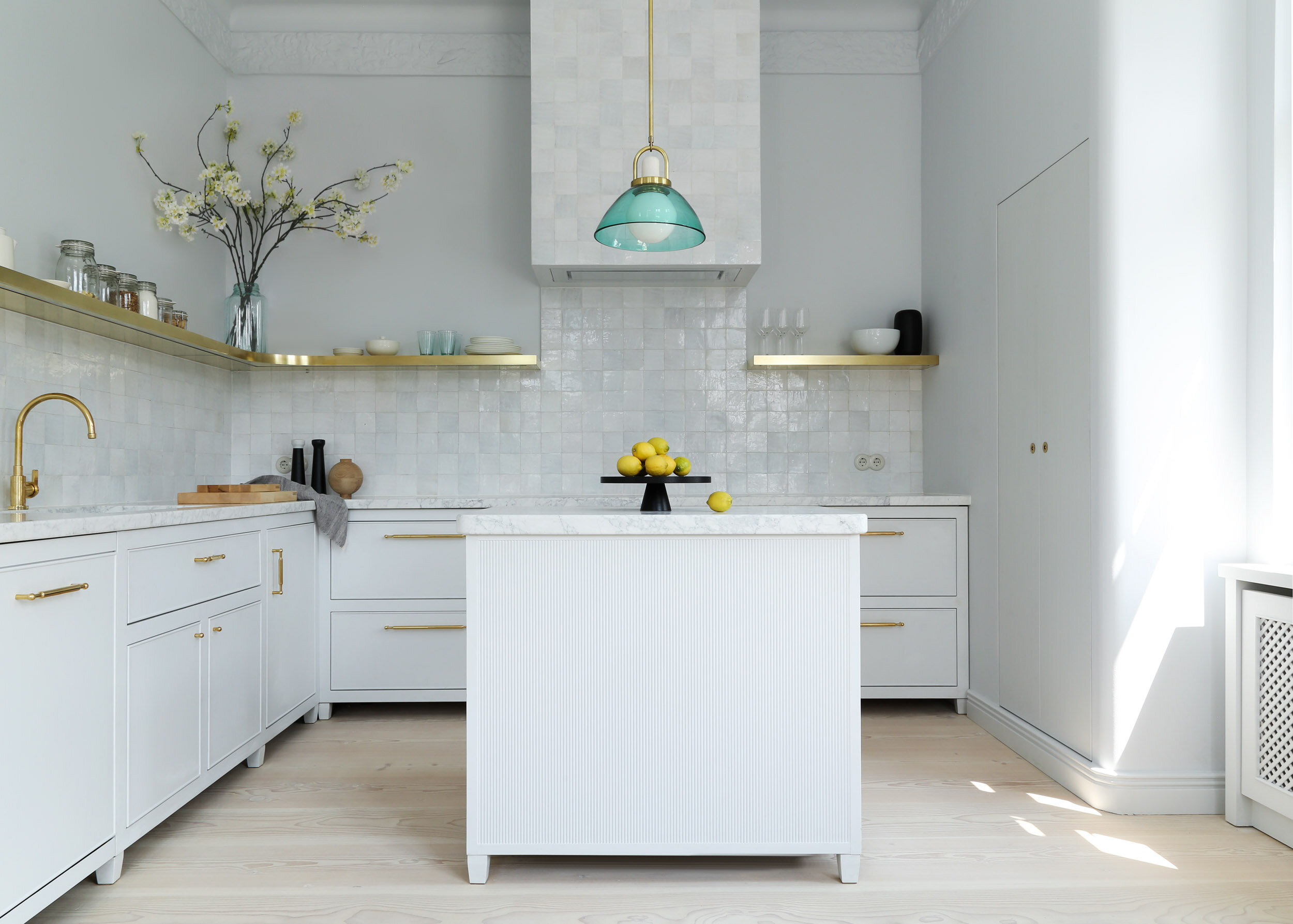
A super-sized kitchen island is the dream, and while they do serve a practical purpose as well as a beautiful one, installing one that's disproportionately sized to your space won't actually be as functional as you'd think. True, a bigger island might give you more countertop space for meal prep, but it will also make a small kitchen look and feel more cramped.
'Instead of trying to cram more in, design the space with fewer components at a larger scale,' suggests Karen. 'Simple is better, and larger scaled components that are properly placed always make a small space feel larger.'
Rather than following the ethos of bigger is better, it's a good idea to consider multifucntionality in a smaller space, too. As Erin Coren, Lina's co-founder at Curated Nest, explains: 'A kitchen island that doubles as a dining or working space can help you cut back on the amount of furniture needed, allowing more free space.'
4. Dark color palettes

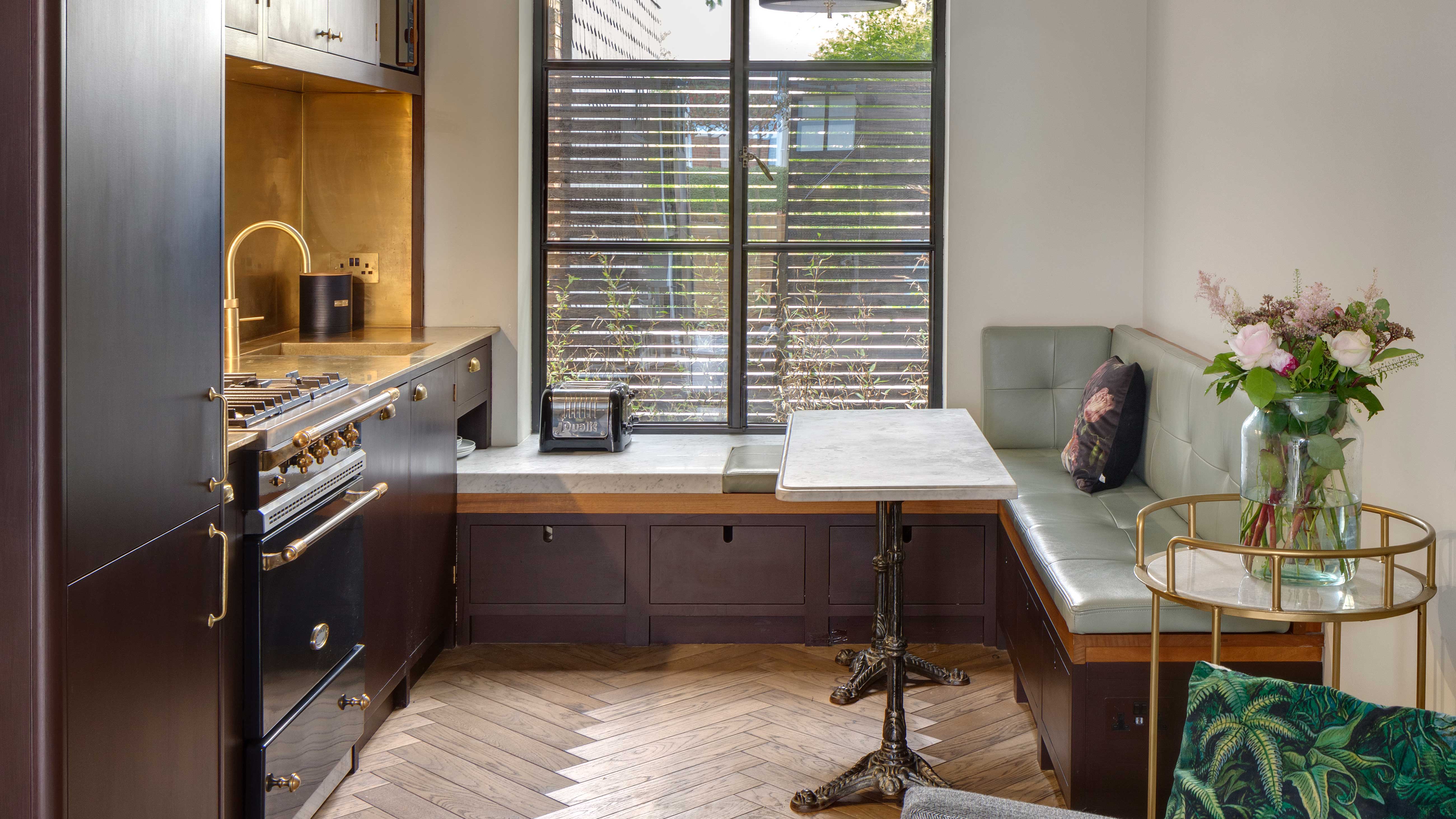
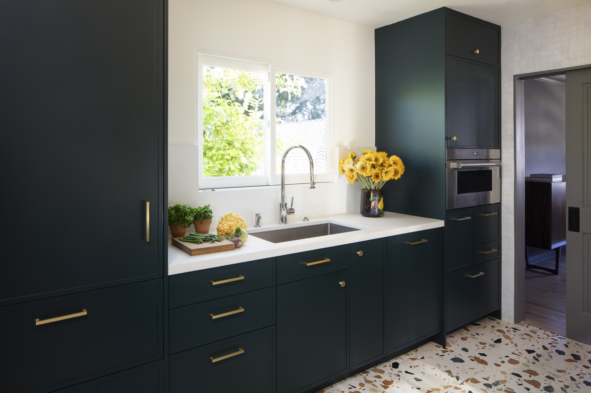
Dark kitchens, including black kitchens, have soared in popularity recently, and while these moody design ideas can give large spaces a more luxe and elevated feel, in smaller spaces they risk feeling too oppressive.
This is because dark schemes can easily feel unbalanced and one-dimensional if not used alongside other tones. If you want to stick with dark colors, it's important to add some variation with some contrasting tones, different sheens, and some clever lighting.
In general though, lighter shades are safer in small kitchens, although a balance of tones should still be considered. 'Use lighter color palettes to reflect light and make the room feel more airy and open,' Lina urges. 'This doesn't have to be monotone but can include a mix of soft tones for variation.'
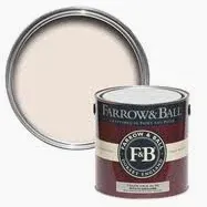
Farrow & Ball's lightest and most delicate pink is a great substitute for white which still offers a bit of color. Full of warmth, it will make your kitchen feel like it's forever flooded in golden hour sunlight.
5. Window treatments
Window dressings are typically somewhat of an afterthought when it comes to kitchens leading many of us to simply opt for uniform curtains or blinds that match the rest of the home. If your kitchen is on the smaller side, however, heavy textures in your windows will make your space feel even more enclosed, so designers recommend you avoid them.
There's also the added fact that you're unlikely to spend much downtime in a small kitchen. Unless you have a dining table or breakfast bar, or your kitchen windows overlook a street, window coverings might not even be essential at all. If you're comfortable doing so, leaving the windows bare can really help invite more light into the space and create a cleaner aesthetic overall.
'If you must cover the window for reasons of privacy, then an opaque film on the glass that will still let in light may be the best option,' says Gillian. 'This will give you what you want without adding any bulk.' Lightweight voile curtains are also a good alternative and they have a certain timeless quality to them.
Voile curtains are perfect for small, dark kitchens. The lightweight, sheer fabric lets enough natural light into the room while still offering a veil of privacy, and they instantly make your space feel more airy and spacious.
6. Too many materials

Avoid default uniformity when it comes to designing your space. It's easy to choose the same materials across the board - wooden floors and cabinetry, for example, or a marble countertop and backsplash - but too much similarity in a small space can easily look too bland. Variation is always an important element of any design, and it can help you curate a kitchen that's more personal to you, too.
That being said, too many materials and textures in one small space can be equally overwhelming, and there are some instances where choosing the same material might actually work best. 'Having the kitchen countertop and the backsplash in the same material can make smaller spaces feel bigger as your eye isn’t drawn to grout lines or tiles that have had to be cut to fit the space,' Gillian says. 'Above all, though, just avoid going bland in a small kitchen.'

Lilith Hudson is a freelance writer and regular contributor to Livingetc. She holds an MA in Magazine Journalism from City, University of London, and has written for various titles including Homes & Gardens, House Beautiful, Advnture, the Saturday Times Magazine, Evening Standard, DJ Mag, Metro, and The Simple Things Magazine.
Prior to going freelance, Lilith was the News and Trends Editor at Livingetc. It was a role that helped her develop a keen eye for spotting all the latest micro-trends, interior hacks, and viral decor must-haves you need in your home. With a constant ear to the ground on the design scene, she's ahead of the curve when it comes to the latest color that's sweeping interiors or the hot new style to decorate our homes.
