

Throughout our homes most of us will have particular rooms earmarked as spaces we go when we want to feel a certain way. It might be that your bedroom soothes an overstimulated mind, your living room energizes you, or your home office gives you a productivity boost. Whether you realize it or not, those feelings may be heavily influenced by the use of positive colors in the space.
And these aren't just colors you'd use in rooms traditionally considered to be energy hotspots, such as home offices and gyms — these shades also work well in bedrooms and bathrooms, helping ensure you start your day out on a good note. In dining rooms, positive colors can spark lively conversations, and in living spaces, they make coming together with friends and family more enjoyable.
But what are these positive colors? To get to the bottom of it, I looked to color psychology in interior design, consulting a number of experts — with backgrounds in both color and psychology — to discover the shades they suggest to help make your home feel more upbeat. Here's what they shared.
Understanding 'Positive Colors' and What That Means
Before delving into which colors in particular help induce a sense of positivity, it is really important to look at the psychology of colors to understand the way individuals react to certain colors can be wildly different. The feelings one person gets from a shade may well be in total contrast to another's.
"Because color is so personal, what resonates with one person might not resonate with someone else, and that's the beautiful thing about color," explains Daniela Araya, principal designer and color consultant at Daniela Araya Color & Design Consultancy. "We can look at color psychology to determine what colors traditionally make us feel, but those feelings can differ depending on our personal stories and preferences."

Daniela Araya is an interior designer and color consultant living and working in New York. She believes that incorporating color in the home is not just about making it look good, but making it feel good. She offers color consultations, workshops, design services, and has written for interiors publications on all things color in the home.
"There are many factors which draw people towards and away from particular colors," adds Amy Krane, an architectural color consultant. "They range from cultural, to colors’ associations, to even biological responses to a color. But the facts that trump them all are one's personal history — their likes and dislikes. So what colors evoke a feeling of positivity is entirely personal and unique to each person."

Amy Krane is an architectural color consultant who was trained by the founder of the International Association of Color Consultants/Designers of North America, Frank Mahnke. She regularly contributes to interior publications on all things color, and is the host of design podcast, Let's Talk Paint Color.
That said, there are certain colors that tend to work better than others when it comes to conjuring up positive feelings, and I've shared those positive colors, below.
1. Yellow

Yellow is the ultimate positive color, even though people are often reluctant to use it in their homes.
Many people can feel a level of trepidation when decorating with yellow in their homes, but there are many benefits that come with incorporating the sunshine shade within your décor scheme.
"Bright and inviting, yellow naturally enhances feelings of optimism, making it a great option for areas where people gather to start their day," says Lisbeth Parada, a color expert and interior designer for both Dutch Boy Paints and Krylon. Depending on the saturation, light yellows can reflect light well, making spaces feel more open and airier."
It's also a natural mood booster. "It's great for areas like an office where you want to feel inspired," says Daniela Araya. "I suggest using a softer shade of butter for yellow living rooms, which pairs beautifully with a high-contrast color like red. Yellow and red are complementary pairings, so they pack a punch and instantly brighten a space."
In fact, when it comes to positive colors, it's often these warmer shades that work best for most people. "Colors that make you feel energetic will also make you feel positive," explains Amy Krane. "In a general sense, uplifting colors tend to be warm ones for many people. These can be orange, red, and yellow — all those in-between and neutrals from those color families with visible warm tones in their make up."

Price: £5.95/sample pot
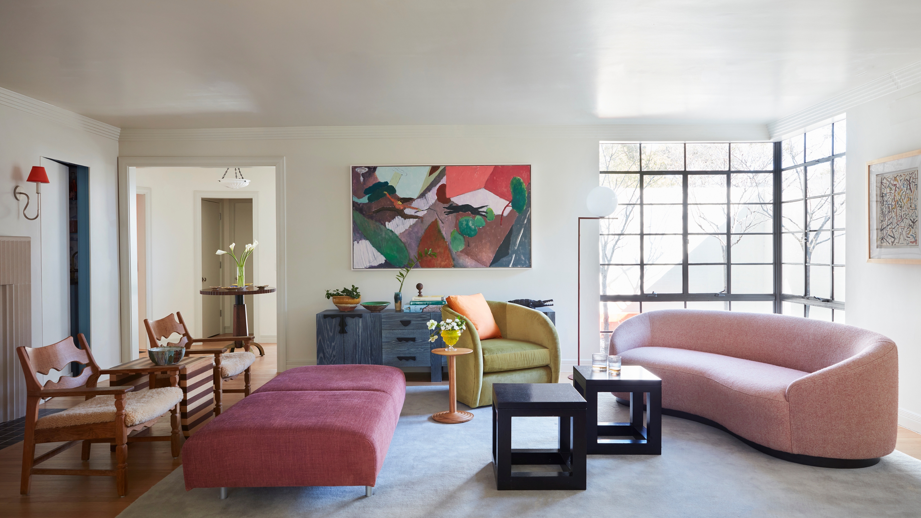
2. Pink

There are a number of shades of pink that work well as positive colors, whether because they're calming, or uplifting — or magically, both.
Pink is such a versatile shade, known for its ability to uplift — but it is also one of the positive colors that can help when it comes to injecting a sense of optimism and confidence into a space. And while hot pink color palettes are certainly one way to go, it's often the softer shades that promote positivity while also creating a sense of calm.
"When people think of 'positive colors' they may first think of bright yellows and oranges, but real positivity isn’t just about being loud so much as it is about creating calm, balance, and expansiveness that invite reflection, relaxation, and emotional depth," explains Dr Logan Jones, a clinical psychologist and the founder of Clarity Therapy NYC.
"Pinks, especially soft blush or muted rose, promote calmness and emotional comfort," adds Ann Monis, a clinical and forensic psychologist. "This color has been shown to reduce aggression and irritability, which is why it is used a lot in therapy spaces."
Pinks with orange or red undertones also tend to be more 'positive'. "Coral — somewhere between pink and orange — feels warm, inviting and playful," explains design expert Angelo Surmelis, the CEO of angelo:HOME. "It’s known for sparking joy. It’s perfect for spaces where you entertain, like a dining room or living room. Even a coral-accented front door can make a positive, welcoming statement."

Price: £2.95/sample pot
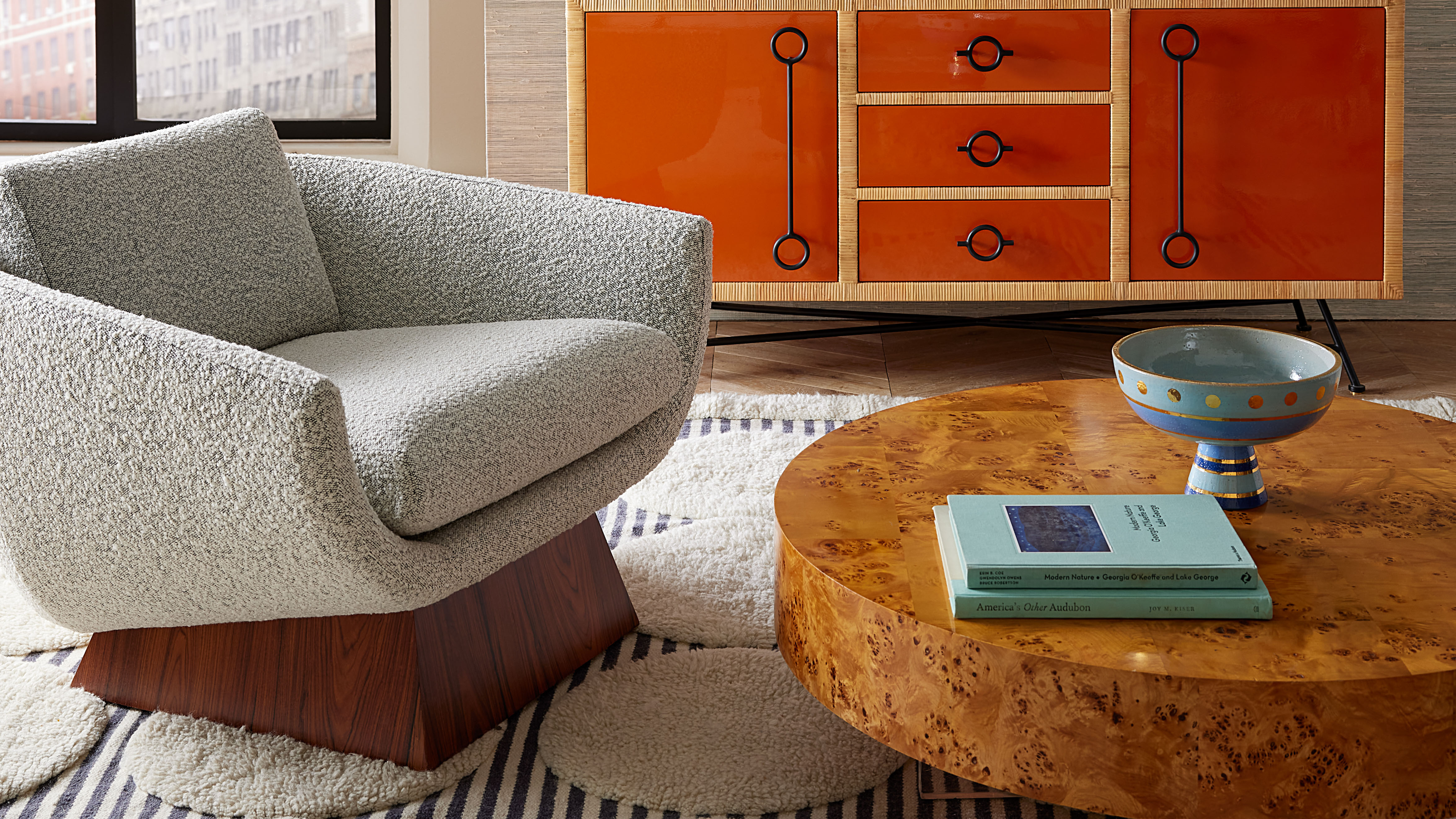
3. Orange

While going all-out with a positive color like orange will have a dramatic impact, it's not the only way.
Orange is another warm shade that packs a positive punch when used within a home décor scheme — and decorating with orange is nowhere near as daunting as you might think. "It radiates warmth, enthusiasm, and creativity," explains Lisbeth Parada. "It’s a great choice for spaces meant to inspire movement, conversation, and productivity."
Daniela Araya thinks it's an underrated living room color idea. "It works well in social areas of the home because it encourages connection and conversation," she says. "My orange living room is always a conversation starter and brings so much joy to others."
But if the thought of color drenching your space in a tangerine orange makes you break into a cold sweat, don't worry — there are plenty of ways to use this zingy hue in smaller measures that will still have a positive impact.
"You don’t need to go all in with bold, colorful walls to bring positivity into your space — especially if you’re still figuring out your color comfort zone," reassures Daniela. "I always suggest starting small: a colorful floral arrangement, a playful thrifted tableware set, or a bright picture frame to showcase your art. As you get more comfortable with color, you might surprise yourself by how much you start craving it in other areas of your home."

Price: £2.95/sample pot
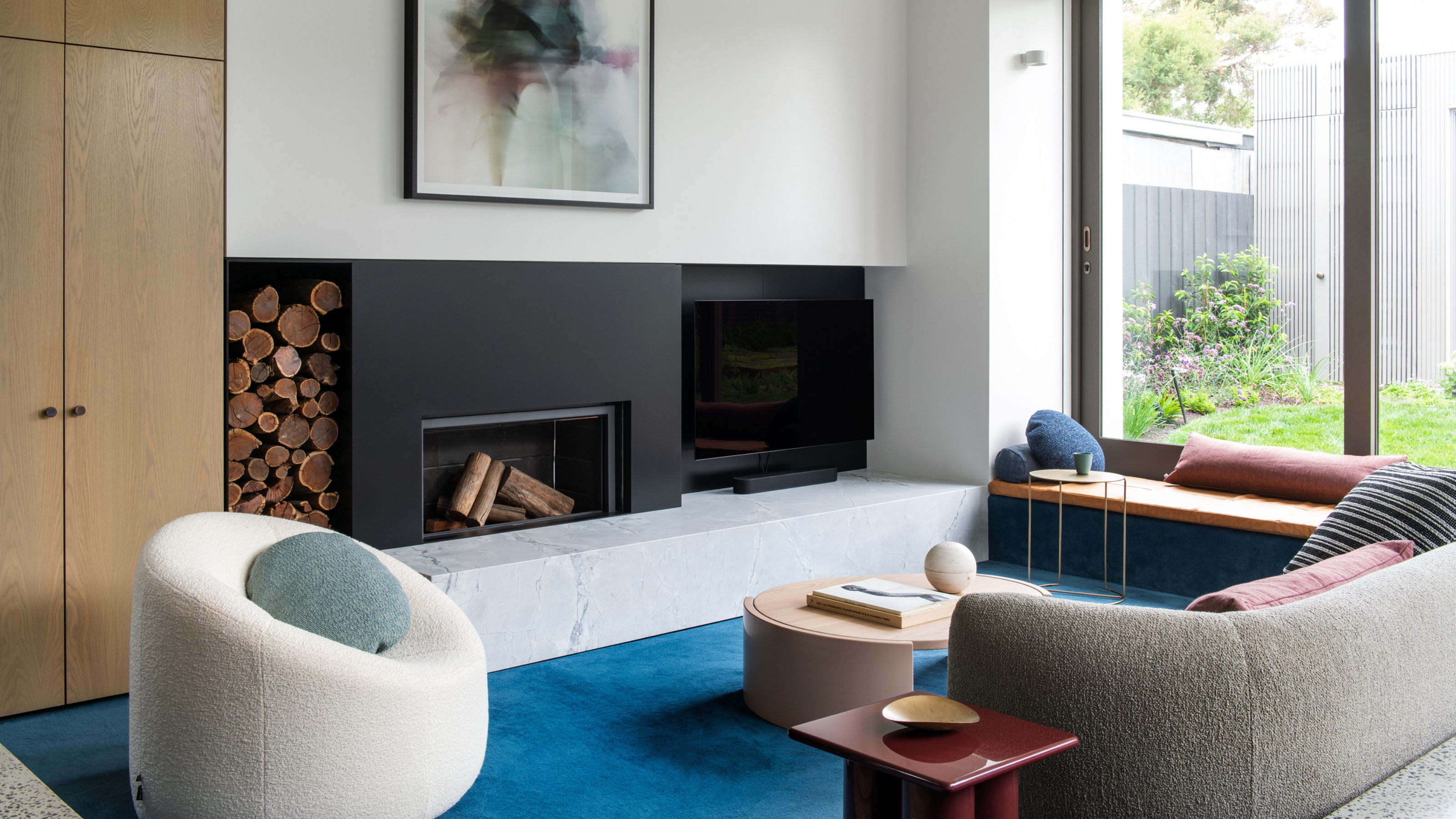
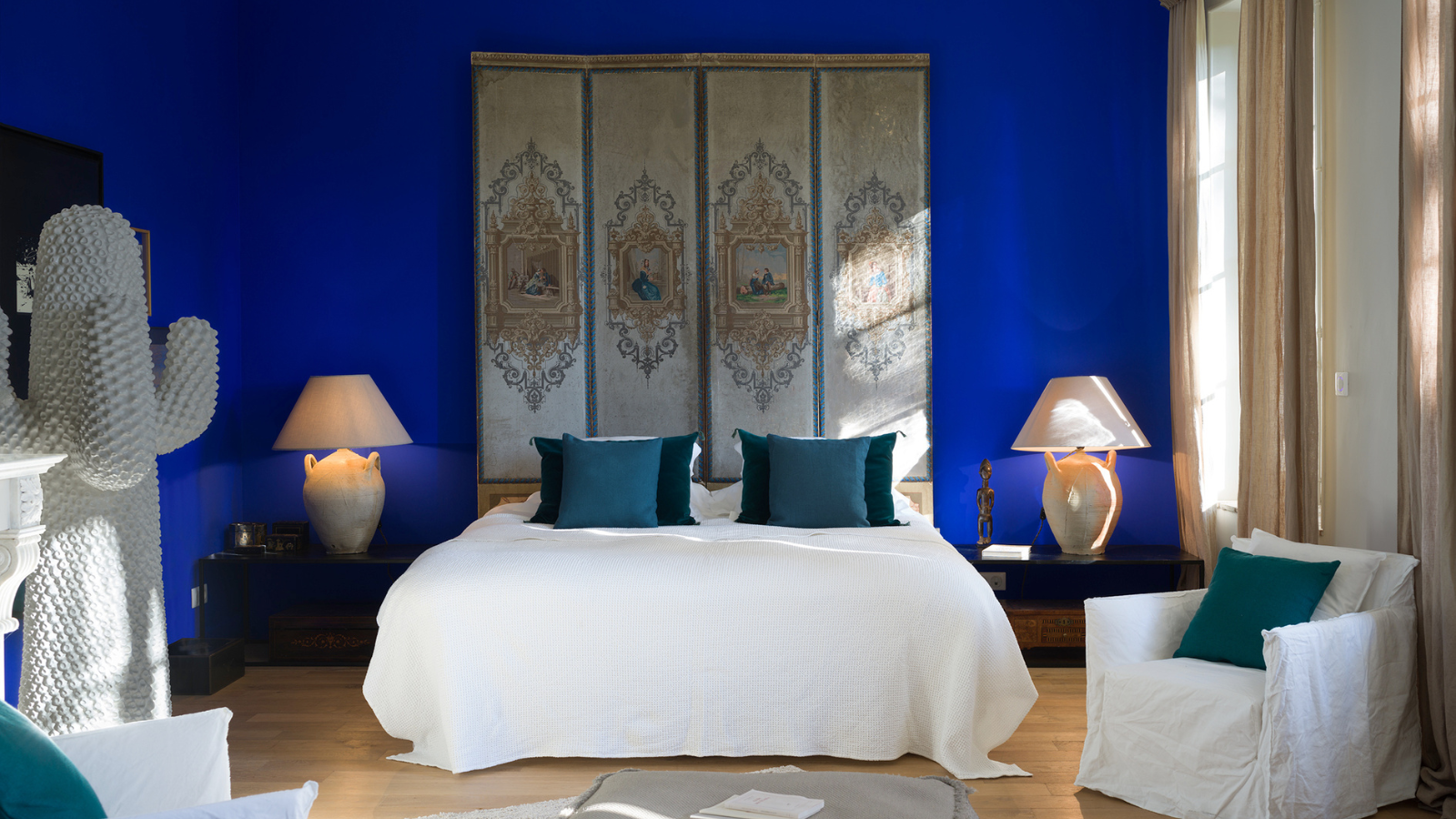
4. Blue

Light blue shades help calm and soothe, and in turn, help make us feel more positive.
Blue is a shade often associated with a sense of calm and relaxation, which is why you might be surprised to learn that it can also work as a positive color — providing you pick the best blue paint color. It's because, as touched on by Dr. Jones already, in order to feel positive, you first need to eliminate, or at the very least lower, things that make you anxious. So, you need to avoid colors that cause stress.
"Blue is the color of emotional depth, of clear skies, of the rhythmic pull of the ocean," explains Dr. Logan Jones. "It reminds the nervous system that it’s safe to exhale. Deep navy, soft coastal blues, warm teals, and airy shades bring a sense of ease, openness, and tranquility. These colors are known to lower stress levels and create a feeling of emotional containment, slow our nervous system, mirroring the effect of looking at the ocean, and encourage introspection."
Angelo Surmelis recommends soft shades of blue — "especially soft sky or Robin's egg tones" — to evoke a sense of clarity, peace, and expansiveness. He adds, "It’s the color of open skies and fresh air — both deeply restorative."

Price: £2.95/sample pot
5. White

While people are leaning into color more and more these days, there's no denying the positive power of an all-white space.
Decorating with white is always going to be a timeless idea for your room, and white rooms can feel like a breath of fresh air.
"Neutrals don’t erase personality but create space for it," says Dr. Logan Jones. "A soft, warm 'designer' white paint color doesn’t have to be sterile when it can create a sense of spacious, quiet, and open. Light colors expand the perception of space, making even intimate rooms feel open, and being enhanced by natural light, they create a more welcoming and uplifting atmosphere."

Price: £5.95/sample pot
FAQs
What Is the Color for Positivity?
When it comes to positive colors, there isn't just one to choose from. While warm, vibrant shades — namely oranges and yellows — are undoubtedly useful, so too are those that work to clear the mind, allowing those uplifting feelings to make their way through. If you are naturally drawn to soft blues and blush pink paint colors, they'll work just as well.
Which Rooms Benefit From Positive Colors?
The better question is what room wouldn't benefit from the power of positive colors, and the answer would be none. "Positive colors can be used in any room of the house," confirms Amy Krane. "Certainly rooms where gatherings take place are good spots for a positive color. This includes kitchens, living rooms, dining rooms, game rooms, and family rooms."
That said, in some spots within the home, it can be useful to focus on shades that induce different emotions — and it's worthwhile taking a look at colors that don't go together, too.
"Other rooms, like offices and bedrooms, function differently and factors like creating focus or serenity might be more important there," says Amy.
Feeling a little flat? Did you know there are also Feng Shui colors for happiness?

-
 Burl Wood Decor Is 2025’s Most Coveted Comeback — Here’s How to Get the Storied Swirls for Less
Irregularity is the ultimate luxury, but you don’t need an antiques dealer to find it
-
 5 Garden Features That Instantly Add Value to Your Home — While Making Your Outdoor Space More Practical, too
Get to know all the expert tips and tricks for making your backyard a standout selling point for your home.


-
 5 Problems With Painting Your Walls White That No-One Ever Talks About (Until Now)
White is the easiest neutral to work with...right? Interior designers explain why this shade is actually more complex than it may seem
-
 5 Mistakes That Are Making the Blue Details in Your Room Feel Old-Fashioned — And How to Rectify Them
Blue is a timeless shade, no doubt, but use it in the wrong space or in the wrong way, and it can make a space feel, well... a bit blue
-
 5 of the Best Navy Blue Paint Colors That Designers Love — And How to Use Them
Navy blue has timeless appeal and can feel both modern yet classic, but what are the designers' favorite paints?
-
 Should Your Carpet Be A Darker Color Than Your Walls? How to Make This Bold Look Work
Not every room can get away with a carpet that is darker than the walls; Designers share when and where this combination works best
-
 What Actually Is Yves Klein Blue? A Short History of This Iconic Color, and How to Decorate With It
Explore “the most perfect expression of blue” and how to free this pigment in your home
-
 Do Pink and Green Go Together in Interiors? A Professional Color Consultant's Verdict
How to make pink and green color combinations work for more contemporary interior schemes
-
 The 'Grown-Up' Way to Decorate With Light Blue — This Shade Shouldn't Just "Be Resigned to the Baby's Room"
We explore how to bring the lighter intonations of blue into your home in a contemporary and thoughtful way
-
 How to Decorate With Farrow and Ball's 'Railings' — The Secret to Making This Classic Paint Color Work in Your Home
Not quite black, not quite blue, the beauty of this paint shade lies in a refined middle ground. But how should you use it in your rooms?


