

The bedroom environment plays an essential part in getting a good night’s sleep. It’s important to make sure it’s somewhere you feel at ease, safe and relaxed, so choosing the right color scheme is imperative for setting the tone for your ultimate sanctuary.
Color has a profound effect on how we feel personally, and with certain colors being associated with moods and memories. When it comes to picking bedroom color ideas, rather than following trends, choose positive colors that speak to you as an individual.
Begin by focussing on spaces you love, what you’re drawn to, and the mood it presents you with. So if you want to create a bedroom that feels positive and uplifting, what should you choose? We asked color experts for their advice.
1. Green

The color of life, green is an undoubtedly positive color for its connection to the natural world. Varying from the tranquility and lightness of a sage green, to the depth of a dark leafy green to cocoon yourself within, this one’s a pretty safe bet for a soothing effect that exudes understated elegance.
We asked Lisa Artis, Deputy CEO of The Sleep Charity what she thought: ‘Pale greens evoke a sense of nature and tranquillity, making them a perfect choice for a bedroom. They can also help reduce anxiety and promote a sense of calmness.’
And if you’re looking for colors that go with green that feel equally positive, she suggests: ‘Green and beige are great earth tones bringing the outdoors inside. Both promoting relaxation and peace.’ What more could you want?

Price: $199.99
Material: Microfiber
Size: Twin, Twin XL, Queen & King

Price: $32.99
Material: Microfiber
Size: Twin/Twin XL, Full/Queen & King/California King

Price: $280
Material: Linen
Size: Twin, Twin XL, Full & Queen
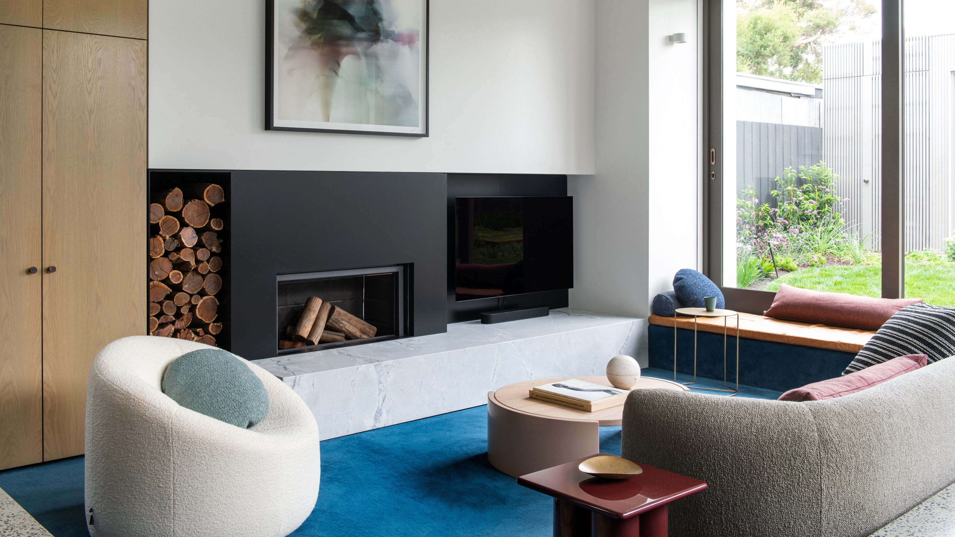
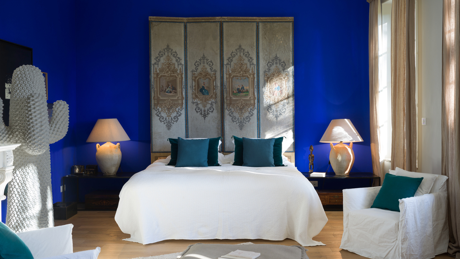
2. Blue
Soft shades of blue often remind us of fresh, airy coastal color palettes. It’s a color in which is known to have a calming effect on the brain and reduce heart rate and blood pressure, according to Lisa. Opting for a lighter tone has a nautical association, but choosing darker tones can also work really well.
‘Don’t be afraid to use darker shades, as when used all over, bolder hues such as our blue-black ‘Basalt’ provide a sumptuous depth which creates that cosy, cocooning quality that’s perfect for a bedroom space,’ recommends Ruth Mottershead, Creative Director Little Greene.

Price: $39.99
Material: Cotton
Size: Full/Queen & King/California King

Price: $260
Material: Cotton
Size: Twin, Queen & King

Price: $54.99
Material: Cotton
Size: King/Queen
3. Neutral Tones

The positive with neutral beige tones is that they are totally timeless and incredibly versatile; overall a great canvas to build upon when styling a bedroom. For a cohesive and settling atmosphere, you can color drench, extending the wall color to the ceiling.
Lisa recommends this as on of the best colors for small bedrooms that feel positive: ‘This seamless look enhances the feeling of space, which is great for smaller/box room bedrooms. Choose a lighter shade to keep it feeling open and airy.’
Ensure there’s a warm undertone too, the last thing you want is a cold gray that give you chills.
4. Pastels

In addition to greens, blues and neutrals, decorating with pastels such as lavender, buttery yellow, blush pink, peach, and teal can evoke feelings of comfort, coziness and warmth being another positive option to consider for the bedroom. You may feel this is more your style if you were originally thinking of a bright color — toning it down to a pastel will offer up that energy you’re looking for while staying subtle and serene.
'We never seem to tire of pinks, and for a good reason,' says Patrick O'Donnell, an international color consultant for paint brand Farrow & Ball. 'They are eminently liveable, flexible and a dream to layer with other colours. Our much-loved Setting Plaster, which is not a sugary, overtly pretty pink, but contains a good dose of earthiness to neutralise it from truer perceived pinks.' On the other hand, lavender has made a comeback over the past year and offers a perfect option for the bedroom, ‘Like the smell, its shade can have a calming effect, making it a good choice for those looking for a touch of colour that promotes relaxation,’ says Lisa.
By pin-pointing your personal feelings towards color associations, explore what makes you feel comforted and calm, you’ll soon be selecting the right colors for your bedroom. Create a space that helps you relax, recharge, and get a good night's sleep. Imagine waking up every morning feeling refreshed and rejuvenated, ready to take on the day — that's the power of a well-designed bedroom.

-
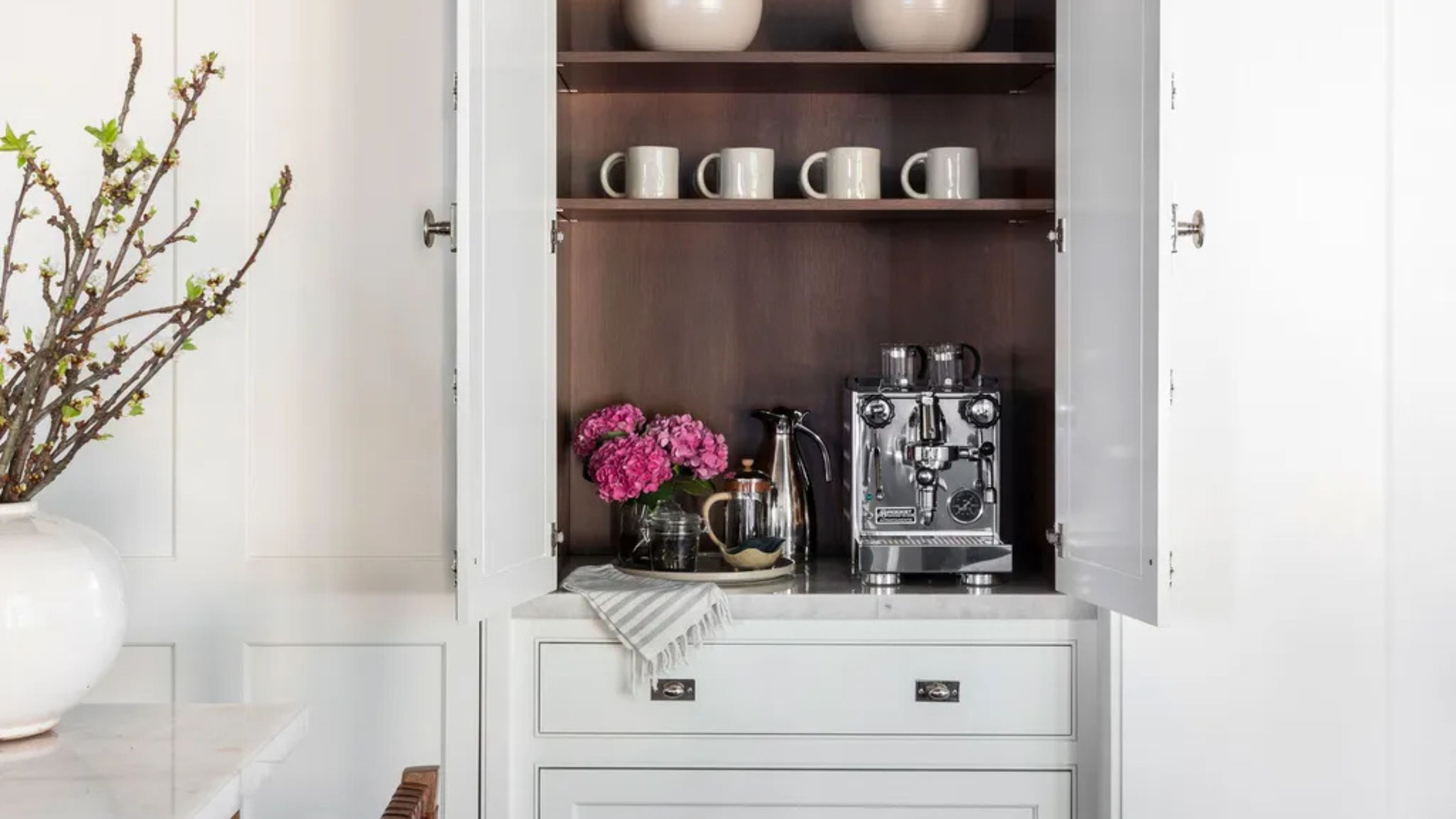 Turns Out the Coolest New Café is Actually In Your Kitchen — Here's How to Steal the Style of TikTok's Latest Trend
Goodbye, over-priced lattes. Hello, home-brewed coffee with friends. TikTok's 'Home Cafe' trend brings stylish cafe culture into the comfort of your own home
-
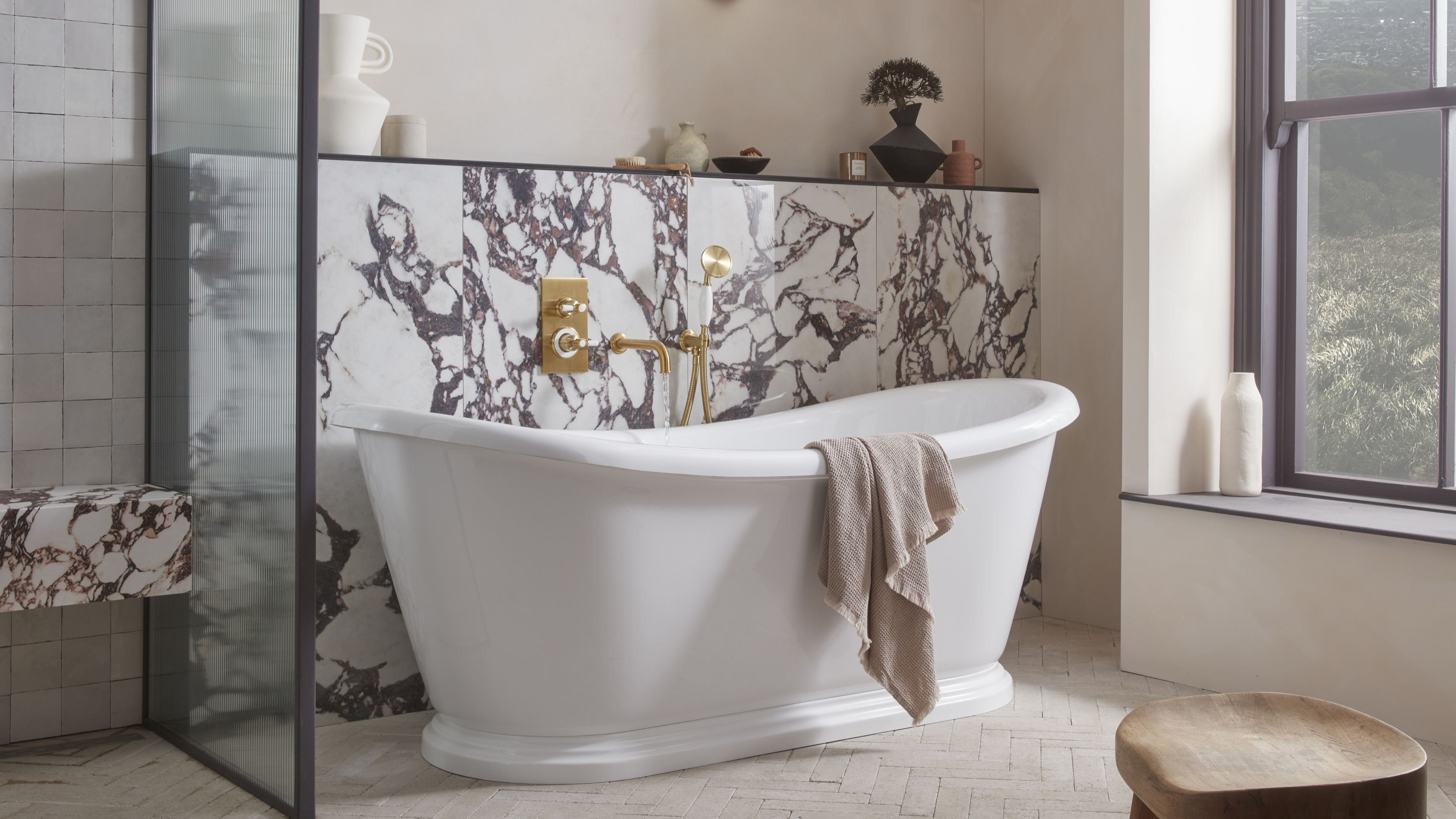 5 Bathroom Layouts That Look Dated in 2025 — Plus the Alternatives Designers Use Instead for a More Contemporary Space
For a bathroom that feels in line with the times, avoid these layouts and be more intentional with the placement and positioning of your features and fixtures


-
 Here's Why Decorating With Mustard Yellow Helps Fill Your Interiors With a Sense of "Confident Calm"
There is so much more to decorating with this turmeric-tinted sauce-wiggled-on-a-hotdog not-quite-yellow shade than meets the eye
-
 5 Problems With Painting Your Walls White That No-One Ever Talks About (Until Now)
White is the easiest neutral to work with...right? Interior designers explain why this shade is actually more complex than it may seem
-
 5 Mistakes That Are Making the Blue Details in Your Room Feel Old-Fashioned — And How to Rectify Them
Blue is a timeless shade, no doubt, but use it in the wrong space or in the wrong way, and it can make a space feel, well... a bit blue
-
 5 of the Best Navy Blue Paint Colors That Designers Love — And How to Use Them
Navy blue has timeless appeal and can feel both modern yet classic, but what are the designers' favorite paints?
-
 Should Your Carpet Be A Darker Color Than Your Walls? How to Make This Bold Look Work
Not every room can get away with a carpet that is darker than the walls; Designers share when and where this combination works best
-
 5 Changes to Make to Your Bedroom Before the Clocks Change to Improve Your Spring-Time Sleep
It's that time of the year when we trade an hour of sleep for an extra hour of daylight, and these simple switches will make the transition that little bit easier
-
 What Actually Is Yves Klein Blue? A Short History of This Iconic Color, and How to Decorate With It
Explore “the most perfect expression of blue” and how to free this pigment in your home
-
 Do Pink and Green Go Together in Interiors? A Professional Color Consultant's Verdict
How to make pink and green color combinations work for more contemporary interior schemes


