

White walls are often considered the holy grail of interior design. They're crisp, timeless, and impossibly versatile. But for all their classic appeal, interior designer, Nina Lichtenstein still says, "Painting your walls white comes with a few surprising challenges that most people don’t discover until the roller’s been cleaned and the room is (seemingly) finished."
Often, going with a pure, bright white paint for your interior walls can make a space feel stark and overly formal. It's a look that works well for retail stores and art galleries, but in a home setting, can feel not quite right. To get a better understanding of decorating with white and the common problems it entails, I talked to interior designers who have used their fair share of the shade.
So, if you've found the classic neutral to be a challenge to style, these are the five tricky problems you need to know about (and how to fix them).
1. White Isn’t Just White and That’s a Problem

This room beautifully displays a multitude of different 'whites'; showcasing how different hues and tones will bring a different aesthetic.
One of the biggest misconceptions is that all white paint is equal. "In reality, white paint has undertones (blue, pink, yellow, green) that can dramatically shift depending on the room’s lighting and surrounding colors," says Nina Lichtenstein .
"A soft, creamy white in one home can read dingy in another," she continues. And if you’re layering different whites (on the ceiling, trim, or cabinetry), "they can unintentionally clash, creating a space that feels off-balance or sterile rather than serene," Nina adds.
When it comes to choosing white paint, it can often feel like an unsurmountable challenge. To help, interior designer Kathy Kuo recommends, "Trying to find an off-white, beige, or taupe that brings in undertones that speak to the most prominent colors in your decor. If you love moody blues, go for a cool off-white with gray or green undertones; if you're in love with a warm and earthy look, try a beige with just the slightest hint of peach."

Kathy Kuo Home is a design studio and company based in Manhattan's Tribeca neighborhood. Specializing in styles like French Country, Coastal Beach, and Modern Classic, Kathy Kuo Home operates with the mission that all of our customers should love where they live!
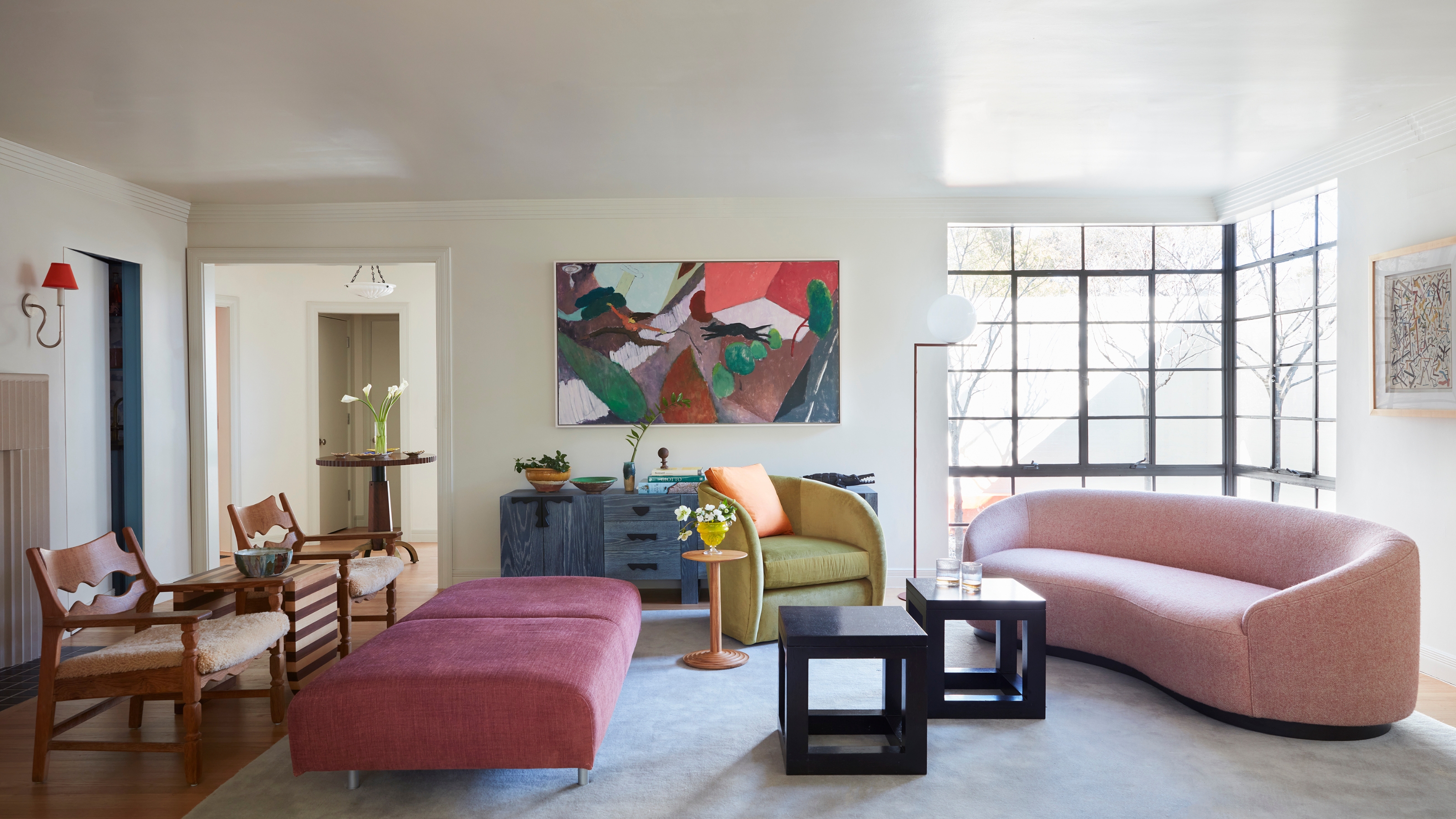
2. Styling White Walls Can Be Surprisingly Tricky

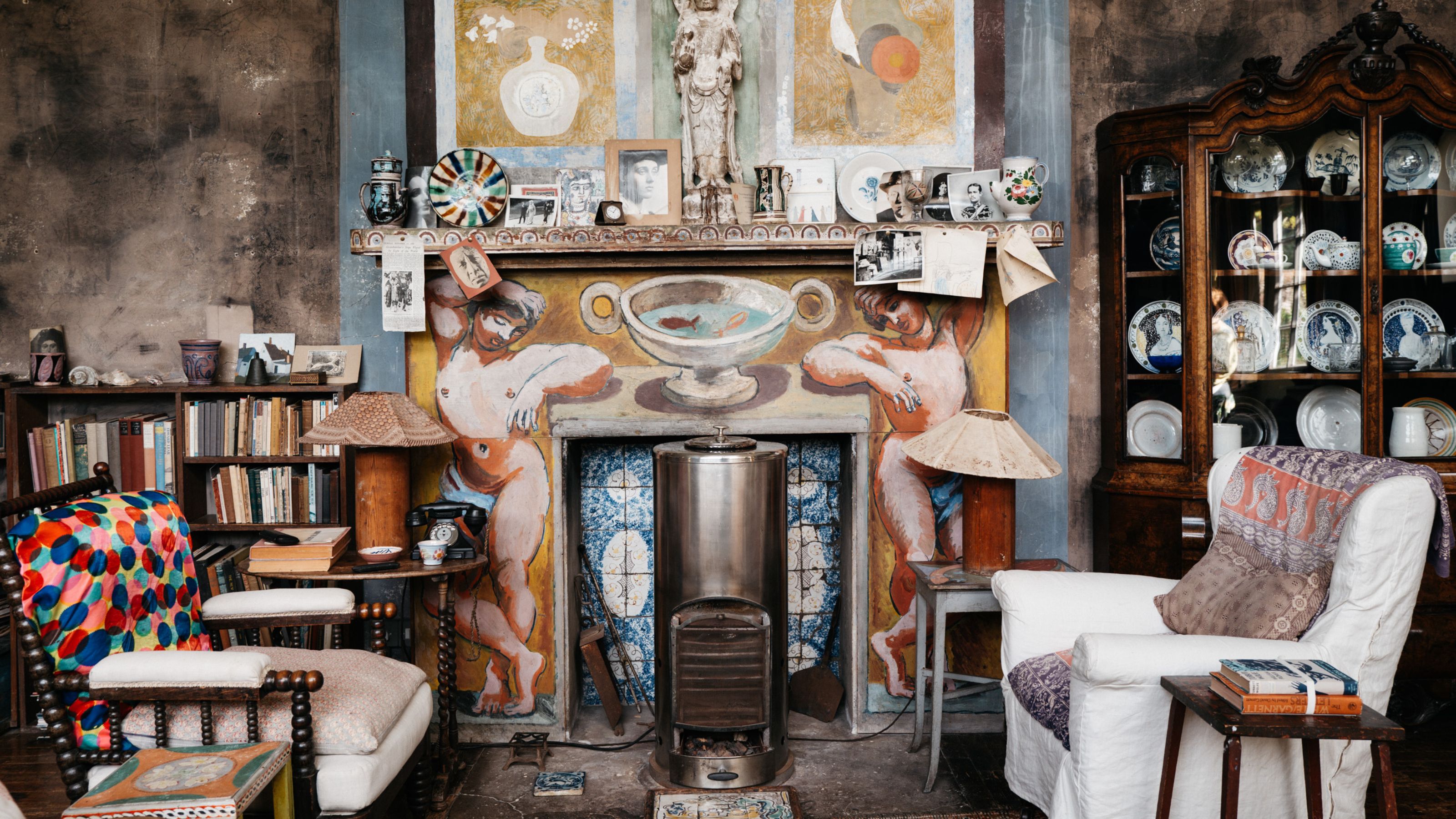
Texture and contrast in design help bring white to life, just like this cozy living room showcases.
"While white is often praised for 'going with everything,' it actually asks more of the objects around it," says Nina.
Without color on the walls to ground a space, everything else, specifically art, furniture, lighting, and textiles, needs to step up. "A room can easily look flat or under-designed if there isn’t enough texture, contrast, or layered tones to give it depth," says Nina.
This makes white walls deceptively high-maintenance when it comes to styling. So when planning your white living room ideas, don't just assume any decor will match. Plan your accents in the initial stages of your room design, and be sure to take note of what colors don't go with white (yes, they exist).

Nina Lichtenstein is a residential interior designer who works with a very warm and elevated neutral palette. Nina believes that home design should capture a homeowner’s uniqueness by how it serves the person. She has been celebrated for designing, renovating, and building elegant living spaces.
3. White Walls Can Clash with Warm Tones

The white walls in this living room have a subtle yellow undertone, making it appear more cream than stark white — the perfect pigment for decorating with earth tones.
In spaces filled with warm wood tones, earthy textiles, or creamy furniture, a bright or stark white wall can feel cold and disconnected.
Nina explains, "The contrast can emphasize the wrong elements and break up the flow of an otherwise cozy space. This is particularly true in older homes or those with vintage decor."
Instead, a warm white or soft neutral might create a more harmonious backdrop in rooms with a warm palette. These subtle undertones, paired with decor that draws out the warm hues, will help make a white room feel cozier.


4. They’re Not as Easy to Maintain

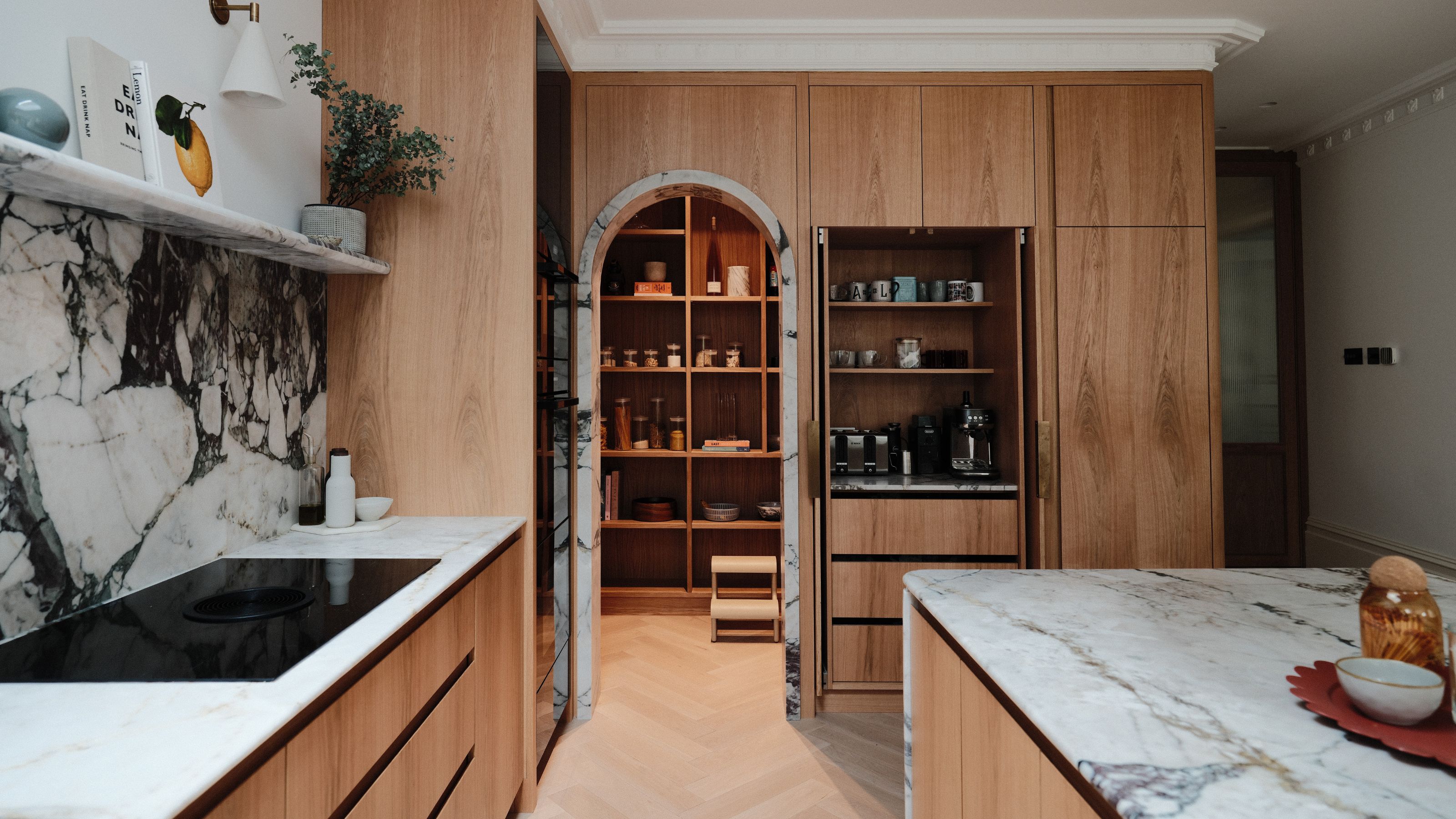
This kitchen has a beautiful white base. However, different materials, like marble and chrome, are added in areas prone to spills and mess.
Despite their clean look, Nina says, "White walls show everything from scuffs, smudges, and fingerprints to shadowing where furniture once sat."
They require regular touch-ups to maintain their pristine appearance, and matte finishes (often used to mask imperfections) are harder to wipe clean. "Families with young children or pets often find this out the hard way," says Nina.
However, you don't have to ditch white in communal, lived-in spaces altogether. There are plenty of reasons to paint your kitchen white, it's just about figuring out the right shade, finish, and placement before you begin painting.
5. White Walls Need Lots of Layers

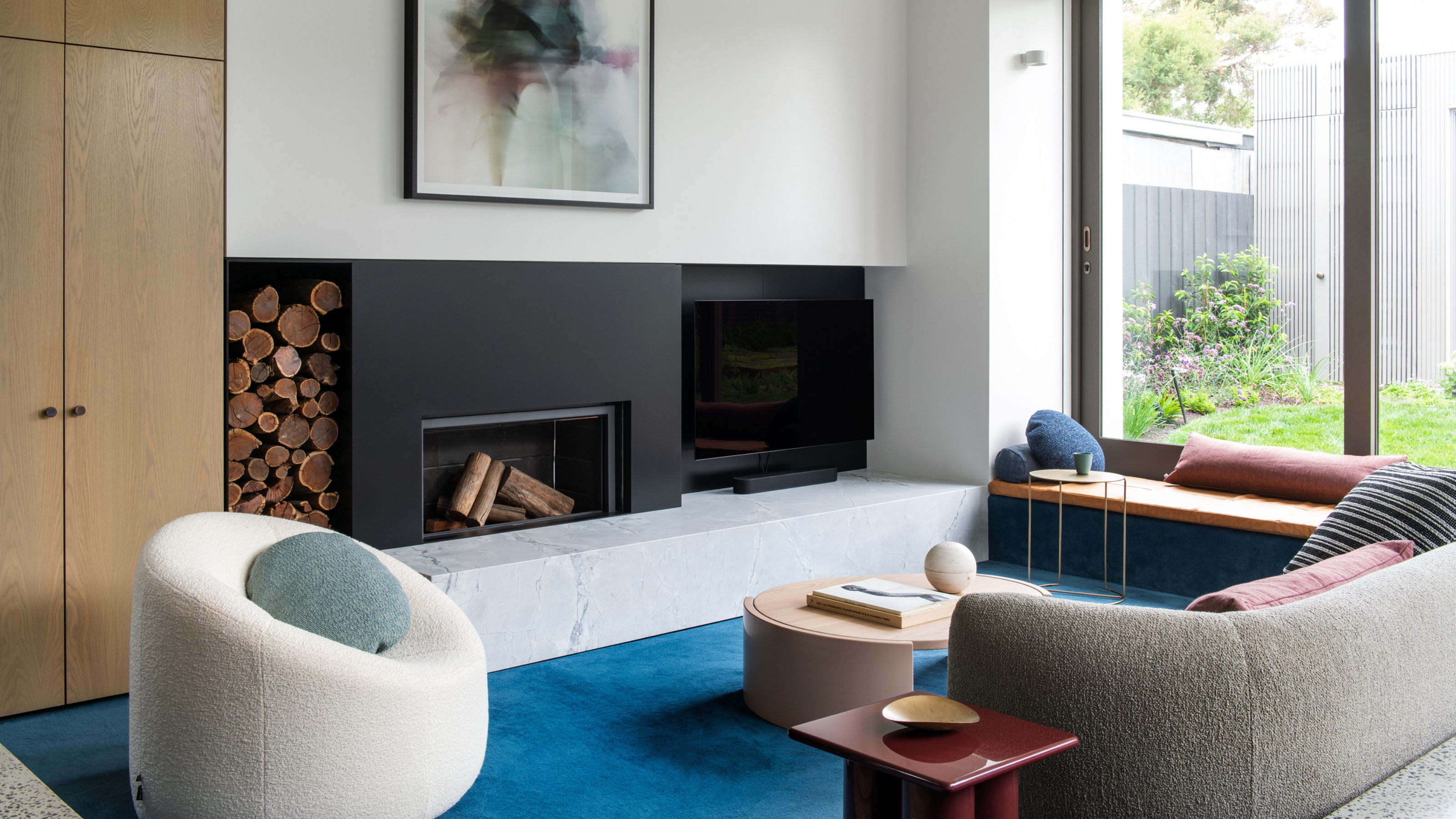
From the stone fireplace and jute rug to the mix of velvet and wooden accent chairs, this white living room is rich with layers.
Want to make white walls easier to style? Start by layering your textures. This will instantly give depth to your space and make the white paint feel less sterile.
Use natural materials like linen, wood, wool, and leather to create visual warmth. "Then add a few high-contrast pieces, like black accents, bold artwork, or rich colors, to anchor the space," says Nina, "A white wall becomes a statement when what’s in front of it tells a compelling design story."
Shop the Look


"White walls aren’t going anywhere, but they aren’t as effortless as they seem," says Nina. "With a thoughtful approach, they can still be a stunning backdrop to your most creative styling ideas."
Then again, some argue there are other neutrals replacing white in interiors these days, so perhaps it shouldn't be considered a default decision anymore.

-
 5 Things You Should Never Buy From a Thrift Store, According to People Who Know About Antiques
It may look like treasure, but it may also just be trash. Here is how to know what to avoid while thrifting, and what to look for instead
-
 7 Pantry Organization Mistakes That Are an Organizer's Worst Nightmare
Get that Pinterest-perfect pantry by avoiding these certified organization faux pas


-
 5 Mistakes That Are Making the Blue Details in Your Room Feel Old-Fashioned — And How to Rectify Them
Blue is a timeless shade, no doubt, but use it in the wrong space or in the wrong way, and it can make a space feel, well... a bit blue
-
 5 of the Best Navy Blue Paint Colors That Designers Love — And How to Use Them
Navy blue has timeless appeal and can feel both modern yet classic, but what are the designers' favorite paints?
-
 Should Your Carpet Be A Darker Color Than Your Walls? How to Make This Bold Look Work
Not every room can get away with a carpet that is darker than the walls; Designers share when and where this combination works best
-
 What Actually Is Yves Klein Blue? A Short History of This Iconic Color, and How to Decorate With It
Explore “the most perfect expression of blue” and how to free this pigment in your home
-
 Do Pink and Green Go Together in Interiors? A Professional Color Consultant's Verdict
How to make pink and green color combinations work for more contemporary interior schemes
-
 The 'Grown-Up' Way to Decorate With Light Blue — This Shade Shouldn't Just "Be Resigned to the Baby's Room"
We explore how to bring the lighter intonations of blue into your home in a contemporary and thoughtful way
-
 How to Decorate With Farrow and Ball's 'Railings' — The Secret to Making This Classic Paint Color Work in Your Home
Not quite black, not quite blue, the beauty of this paint shade lies in a refined middle ground. But how should you use it in your rooms?
-
 3 Times You Should Never Paint a Room Blue, According to a Designer — "Sometimes, It's Harder to Work Around"
Though widely beloved, blue is not always best when it comes to your walls. Here's when not to choose it for a room


