This architect-approved trick for tiny spaces might also help you create your boldest-ever interiors
This hack for small homes, favored by architects, explains one of the biggest decorating trends of the year, too

When you're dealing with a small space, there's a magic in keeping it simple. But even more than not overwhelming a small space with too much texture, pattern or too many contrasting colors, designers and architects are taking an even more drastic approach to simplisticity when decorating an apartment with a micro floorplan.
To give it a name, Melbourne-based architect Douglas Wan calls it 'reduced materiality' – but what does that mean, and what effect does it have on small rooms?
We asked architects, many of whom specialize in designing the tiniest of spaces, to explain the idea behind the trend, and how to use it to best effect.

Hugh is Livingetc.com's deputy editor, and an experienced homes and property journalist. While researching the world's best micro apartments, he spoke to designers and architects about the ideas behind simplicity in design and reducing down materials.
What's the idea behind 'reduced materiality'?
This idea might sound complicated, but in actual fact, it's quite simple. 'This is architect speak for using as little types of materials as we can,' explains architect Douglas Wan of WHDA, 'as well as making them cover more surfaces.'
It's an idea we're seeing being embraced throughout interior design trends at the moment. It works by helping to blur the outlines of your space, creating visual trickery that can help a small room feel bigger. 'Having one material go from floor-to-ceiling or wall-to-wall makes for more unbroken lines the eye has to travel,' Douglas explains.
It's part of the reason that the 'color drenching' trend has become such a phenomenon in recent times. The idea, which sees the ceiling painted the same color as the walls, millwork and more, is being used as a clever paint tricks for small rooms that can help soften the lines and make them feel larger than they actually are.
However, in many of the very small apartments architects use this idea in, paint isn't always the answer. Filled with clever built-in ideas, unifying the entire house with a single color and texture can create a scheme that feels flat, where texture and depth can also enhance the sense of space in a tiny room.
The result? Architects experimenting with textured boards, wall paneling and cladding for a bold, modern look. Here's just a handful of ideas as to how it can be used, in bold, unexpected ways.
1. Opt for an unexpected material

You might better know OSB board as a construction material than as an interior finish. It's a cheap timber sheeting with a recognizable patterning and a generally rough finish, but it can be finished with varnish for a smooth, durable finish.
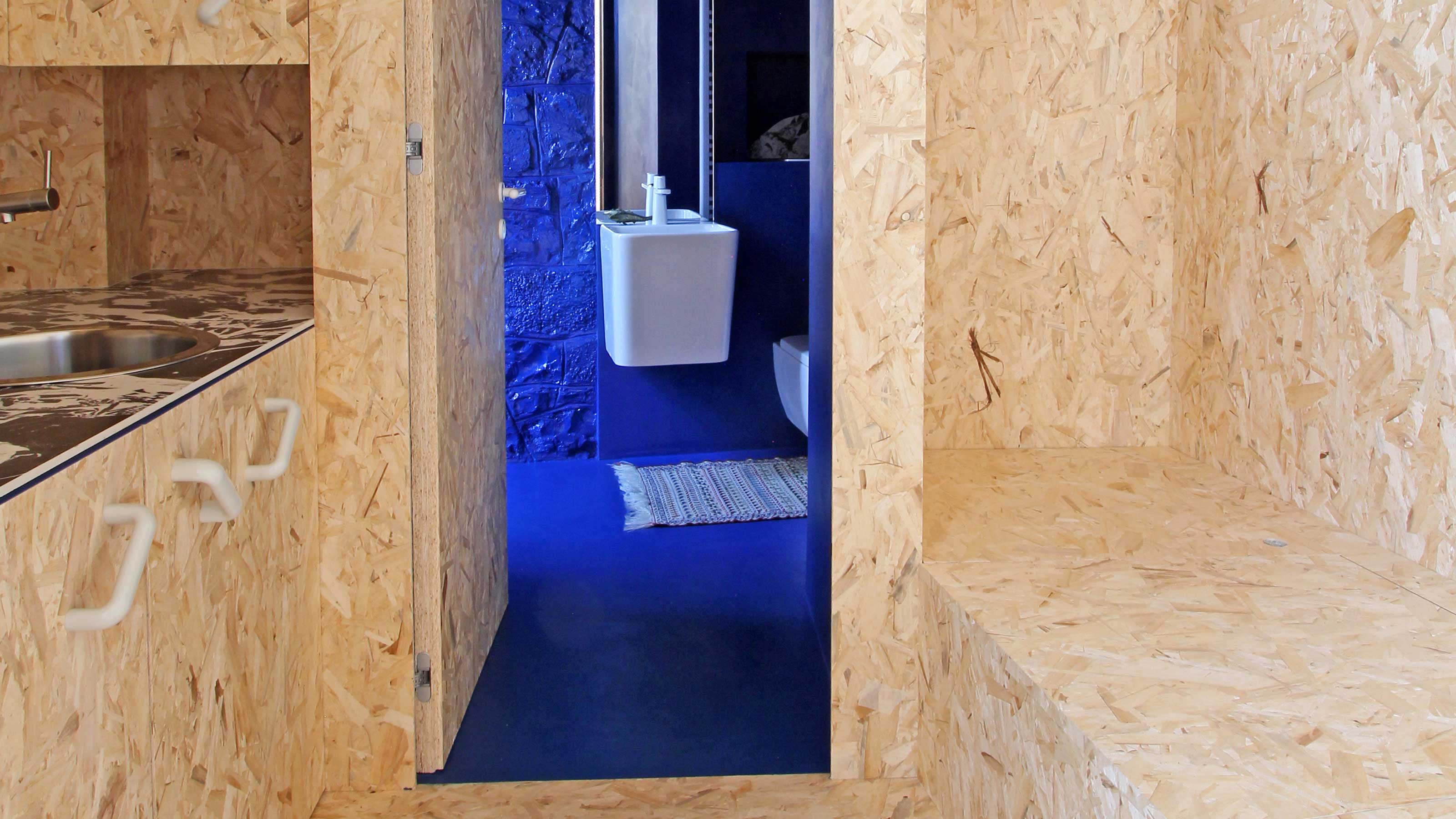
It's what Italian architect and designer Francesca Perani chose to clad the main living space of this small apartment, from the floor to the ceiling, including the walls, kitchen and built-in storage. 'Having to deal with an extremely narrow space, I was looking for an effective-cost material capable of enlarging the living area without showing any additional lines,' Francesca tells us. 'Moreover, OSB panels can add warmth through their mesmerizing and continuous texture and pattern,' the architect adds.
This material has a lofi quality, which undoubtedly means its not for everyone, but as an interesting alternative to ply or other timbers, used for cladding a space, it certainly brings a boldness to the design.
Blue is the Coolest Color, Backdrop Paint
The one contrast Francesca used to this OSB board was a vibrant, cobalt blue. For a similar look, try this invigorating blue shade from Backdrop.
2. Take a more luxurious route
You'll often see cheaper materials like OSB or particularly plywood used in small apartments - and for good reason. Not only are these materials affordable, but they lean into a certain relaxed, unpretentious aesthetic that many people love.
Many, however, view these materials as cheap, but reducing materials in a space can still be done in a luxurious way using more expensive, elegant timbers or materials like stone.
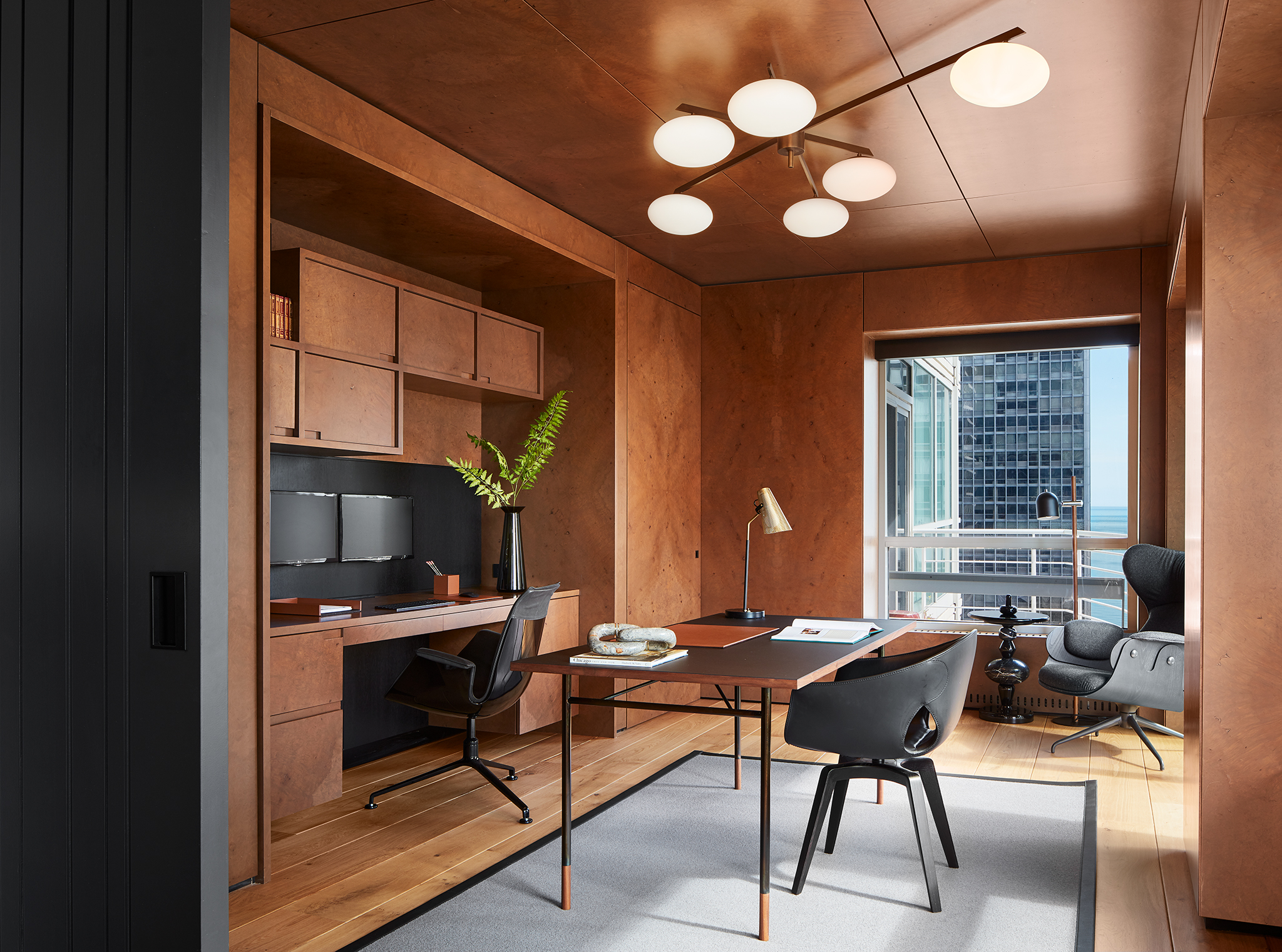
This home office, fitted with beautiful walnut panels, is the perfect elevated example, but also highlights another benefit of reduced materiality - the ability to minimize features and streamline a room by hiding doors, storage and more in plain sight.
'The room conceals a walk-in closet - outfitted to the gils in office supplies - adjacent to the desk behind a hidden door clad in the same burled walnut that wraps the rest of the space,' explains Greg Howe, co-founder of Chicago-based architecture firm Searl Lamaster Howe.
3. Keep the detailing simple, too
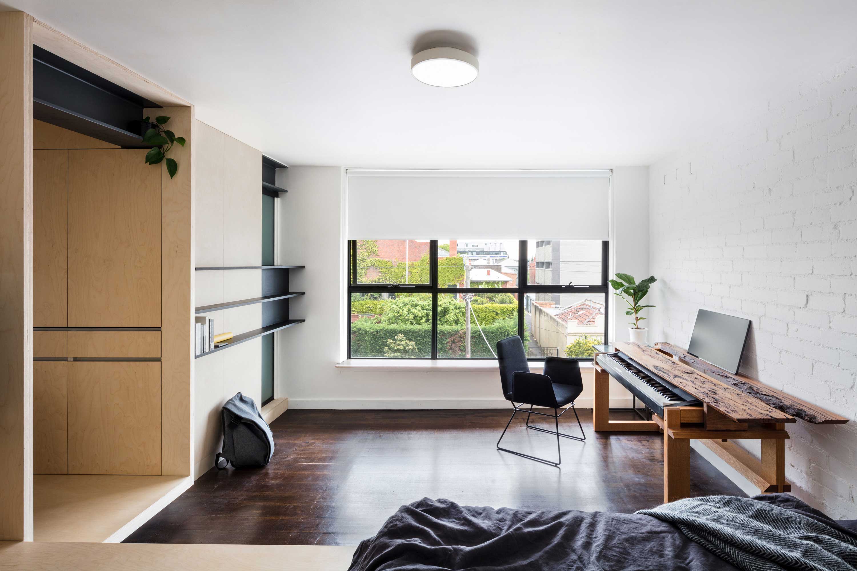
For Douglas Wan's micro apartment, the idea of simplicity didn't just apply to the ply volume as a material that made up the structure of the space, but also in keeping this millwork simpler, too. 'Detailing becomes a little more careful at the joints,' he explains. 'There are no cornices or skirtings, and the builder carved out the ply edges to fit around the existing brick walls.'
In a space like Douglas', it lends itself to a minimalism that goes hand in hand with reduced materiality.
Be The First To Know
The Livingetc newsletters are your inside source for what’s shaping interiors now - and what’s next. Discover trend forecasts, smart style ideas, and curated shopping inspiration that brings design to life. Subscribe today and stay ahead of the curve.

Hugh is Livingetc.com’s editor. With 8 years in the interiors industry under his belt, he has the nose for what people want to know about re-decorating their homes. He prides himself as an expert trend forecaster, visiting design fairs, showrooms and keeping an eye out for emerging designers to hone his eye. He joined Livingetc back in 2022 as a content editor, as a long-time reader of the print magazine, before becoming its online editor. Hugh has previously spent time as an editor for a kitchen and bathroom magazine, and has written for “hands-on” home brands such as Homebuilding & Renovating and Grand Designs magazine, so his knowledge of what it takes to create a home goes beyond the surface, too. Though not a trained interior designer, Hugh has cut his design teeth by managing several major interior design projects to date, each for private clients. He's also a keen DIYer — he's done everything from laying his own patio and building an integrated cooker hood from scratch, to undertaking plenty of creative IKEA hacks to help achieve the luxurious look he loves in design, when his budget doesn't always stretch that far.
-
 My 10 Favorite Designs at Milan Design Week 2025 — Out of the Hundreds of Pieces I Saw
There is a new elegance, color, and shape being shown in Milan this week, and these are the pieces that caught my eye
By Pip Rich
-
 Iridescence Is Chrome’s More Playful, Hard-to-Define Cousin — And You're About to See It Everywhere
This kinetic finish signals a broader shift toward surfaces that move, shimmer, and surprise. Here's where to find it now
By Julia Demer
