8 of the Biggest Rug Mistakes — And How to Avoid Them for a Better-Designed Home
Discover insider advice to avoid rug-buying blunders, as well as top tips for choosing the perfect design to elevate your space
A new rug has the power to completely change the look and feel of a room, but get it wrong, and the whole space can seem ever so slightly off. This can be down to choosing a rug that’s too small or too large, a design that's too bland, or even one that overpowers your scheme with its vintage opulence or graphic patterns.
Impractical rugs are a no-go too: there are few things more sad-looking than a once-beautiful high-pile rug that’s become matted and dirty with too much foot traffic and countless spills. That’s why washable, low-pile rugs are often the safest bet in areas such as kitchens, dining areas, entryways, and corridors. Sometimes, however, a plush and textural rug is just the thing that’s needed in your interior design, such as in industrial or minimalist spaces — just be sure to consider how the room is used, and how easy the rug will be to clean if needed.
‘I always enjoy designing a space that begins with the right rug,’ says interior designer Victoria Sass of Minneapolis-based Prospect Refuge Studio. ‘It can help you space-plan your seating arrangements and set the color palette for the room; and, if you think of it like art for the floor, it can bring add a lot of joy and personality.’
Victoria advises thinking about how you want the floor to function in the space in question. ‘Is it a heavily trafficked area? Will there be large amounts of open space to view and enjoy the rug? How much food and liquid will this rug come in contact with? All of these questions can help guide you to the right material and construction. Then you can just have fun with style!’
For more insider tips and tricks, read our expert guide to the biggest rug mistakes — and most importantly how to avoid them — below.
1. CHOOSING AN IMPRACTICAL RUG FOR A KITCHEN
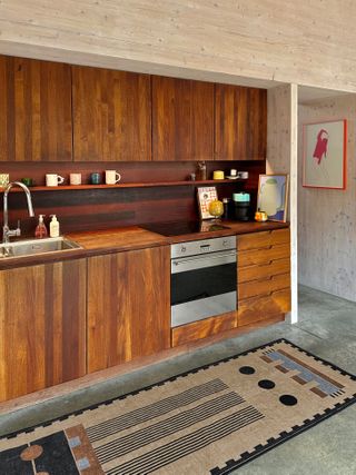
We love how a rug or runner can add character and warmth to a kitchen, which is often made up of a lot of hard surfaces and linear elements. That said, choosing a kitchen rug that’s not fit for purpose is one of the worst mistakes you can make in a high-traffic space such as this.
‘With food spills, grease splatters, and other messes happening regularly, you want your kitchen rug to be durable and easy to clean,’ advises Liza Garrison, director of product at Ruggable, whose non-slip rugs feature a pad with a stain-resistant cover that can be removed and placed in the washing machine. ‘That way, you you don’t have to fuss over that spilled glass of red wine, green smoothie, or marinara sauce.’
2. LAYERING RUGS OF THE WRONG PROPORTIONS
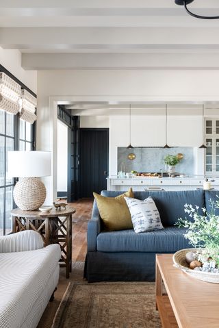
‘We love the look layering rugs create in a space, especially in a living room,’ says W Design Collective’s principal and founder Marianne Brown. ‘We typically choose a sisal or jute rug as the base, making sure it is large enough to ground your sofa or sectional with at least the front two legs sitting over it, and layer a vintage rug over top.’
Marianne recommends this as a great option when you find a rug that you love that isn’t quite large enough for the area. ‘A good rule of thumb for the upper rug is that it should be at least two thirds of the size of the rug underneath. Any less, and the top rug will look too small.’
3. OVERLOOKING PROVENANCE IN FAVOR OF PRICE
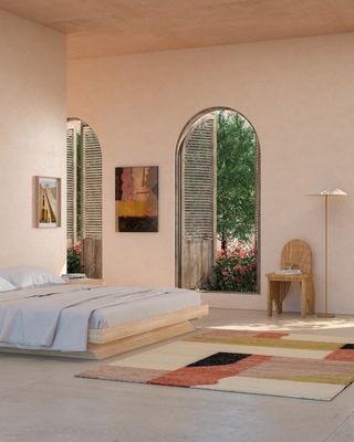
‘There are so many options when buying a rug, I can understand how overwhelming all the choice is, but I think it is important to consider what things cost and who is affected by low-cost goods.’ says Arati Rao of New York-based rug brand Tantuvi. ‘There’s a lot of greenwashing in this industry, and very few companies actually spend the time in the countries where rugs are made by hand,’ she shares.
‘Being of Indian origin, we know the communities we work in and have an understanding of the cultural nuances. Making hand-woven and hand-knotted rugs is hard work and incredibly time consuming; it’s a craft that is important to our collective history. Once these artisans become undervalued to the point where they can not sustain these techniques, the skills will be gone.’
4. SHYING AWAY FROM A STATEMENT DESIGN
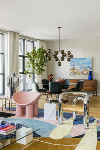
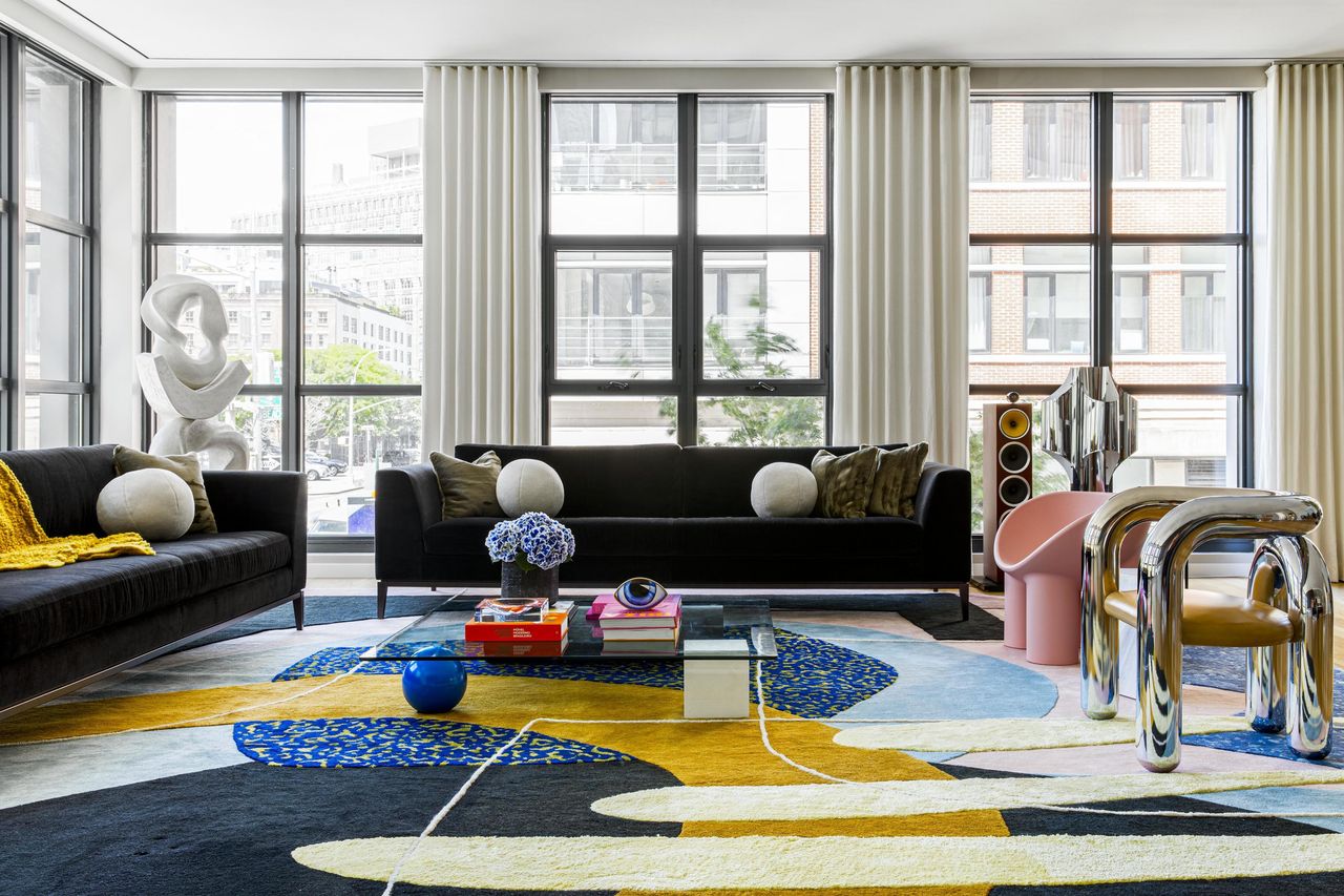
While an understated rug can be the perfect complement to a muted or neutral scheme, certain spaces can really be brought to life with a boldly patterned design, as this New York apartment's living room rug proves. ‘The 18x18-foot rug sets the tone for this Memphis and modernism-infused Tribeca living room,’ says multidisciplinary designer Alex Proba of Studio Proba, who created the custom design.
‘A mix of tufted and flat shapes saturated with a palette of cobalt, mustard, and pink lay the groundwork for iconic pieces, like a pair of Milo Baughman lounge chairs, Faye Toogood's Elemental glass table, and the pink Roly Poly chair, as chosen by interior designer Olivia Stutz.’
5. IGNORING YOUR TRANSITIONAL SPACES
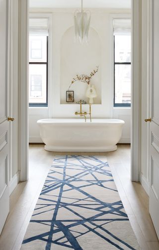
‘Runners are best used in connecting spaces such as modern hallways or foyers when they are designed with intention,’ says Abby Olson, design director at The Rug Company. ‘From bold motifs to subtler patterns, the presence of a runner can provide either a continuation or a transition of color and style,’ she explains.
Abby recommends directional motifs in bright colors and playful prints to help to guide the eye across a surface — as illustrated with this Kelly Wearstler-designed runner above — or quieter patterns to subtly unite a space with texture and tone.
6. CHOOSING LOW PILE WHEN COMFORT IS NEEDED
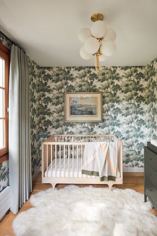
While flat-woven and low-pile rugs are undoubtedly practical, sometimes a thick and textural rug can really make a space that needs an injection of softness. It’s for this reason that Victoria Sass of Prospect Refuge Studio selected a dense wool rug for this Minneapolis nursery.
‘A lot of time is spent on the floor when you have small children, and setting parents up with a comfortable, inviting landing spot is a good idea for any kid's room,’ says Victoria. ‘This flokati-style rug also speaks to the natural, Scandinavian aesthetic of this space, complementing the pale woods and clean organic elements with it's plush texture and bright-white color.’
7. GOING TOO BOLD IN A TONAL INTERIOR
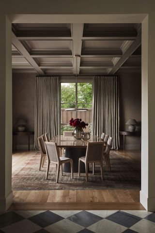
While colorful rugs certainly have their place, sometimes a deliberately unostentatious design is the way to go. In this Dallas home designed by Studio Lifestyle, founder Shannon Wollack created a moody and atmospheric dining room with a harmonious scheme decorating with neutrals.
The studio sourced a muted vintage rug with faded patterns to frame the dining table, completing the soothing interior. ‘Incorporating vintage rugs can really enhance a dining space,’ says Shannon. ‘The intricate patterns and rich colors not only elevate the space but also have the remarkable ability to conceal spills, making it a practical choice for the heart of your home.’
8. NEGLECTING YOUR OUTDOOR SPACE
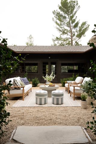
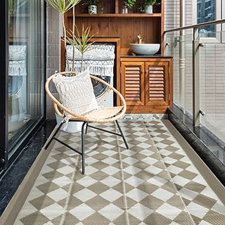
Treating your garden or terrace with the same attention to detail as your interior can effectively create an outdoor room, enhancing your home and encouraging you to spend more time outside. ‘Incorporating some of the same elements we use in an indoor living space instantly brings a more inviting feeling to an outdoor lounge, and the best outdoor rugs are a perfect place to start,’ says Studio McGee co-founder Shea McGee.
‘Layer in an indoor-outdoor rug that is constructed to withstand the elements. It will help set the foundation and ground the space for your furniture layout,’ adds Shea, who added a her thoughts on sizing. ‘We follow the same sizing rules we do indoors here, which means that the design should be large enough for all of the front legs of the furniture to land on the rug.’
Be The First To Know
The Livingetc newsletter is your shortcut to the now and the next in home design. Subscribe today to receive a stunning free 200-page book of the best homes from around the world.
Tessa Pearson is an interiors and architecture journalist, formerly Homes Director at ELLE Decoration and Editor of ELLE Decoration Country. When she's not covering design and decorative trends for Livingetc, Tessa contributes to publications such as The Observer and Table Magazine, and has recently written a book on forest architecture. Based in Sussex, Tessa has a keen interest in rural and coastal life, and spends as much time as possible by the sea.
-
 Your Kitchenware Could Use Some Italian Elegance — Get the Look With Crate & Barrel's Tuscan Kitchen Collection
Complete with products all made from sleek, beige marble, this collection captures the rustic charm of Tuscany through practical kitchenware that's simply stunning
By Devin Toolen Published
-
 Miele Just Made One Tiny Tweak to Its Pans That Makes So Much Sense (and Solves a Big Cooking Bugbear)
These new pots are perfect for open-plan kitchens and here's why
By Maya Glantz Published
