Should kitchen islands be darker than cabinets? There's a simple trick kitchen designers use to answer this question
Planning a kitchen color update? We asked experts to help resolve this common question about your kitchen's palette
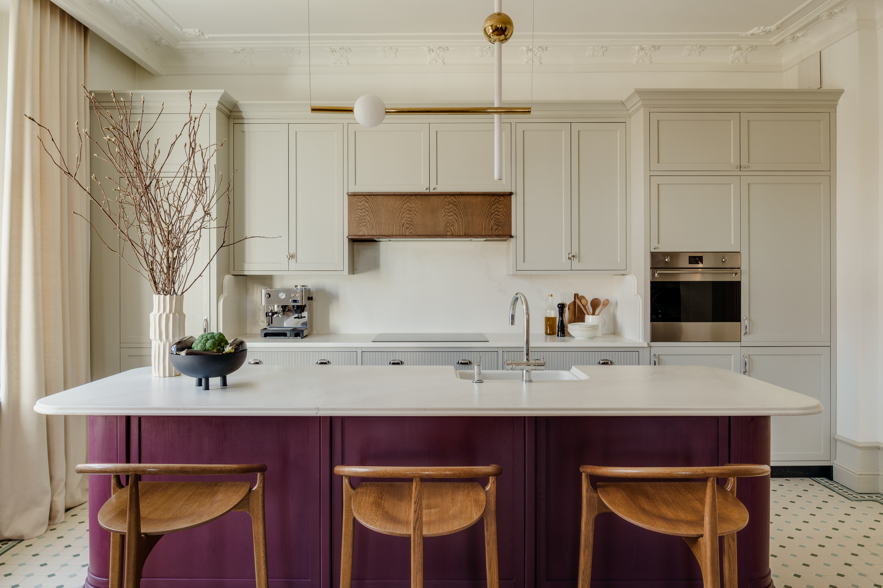

If you're planning, redoing, or repainting your kitchen and are wondering how to tackle the island and the cabinet colors, then you're not alone. This is, quite often, a matter that needs some thought.
You often see kitchens with darker islands, but you need to give what effect this has on the space a little more thought. So should your kitchen island have the same tones as the cabinets? Or should they be different? These experts have the answer to this kitchen color conundrum, and much more.
Should kitchen island be darker than cabinets?
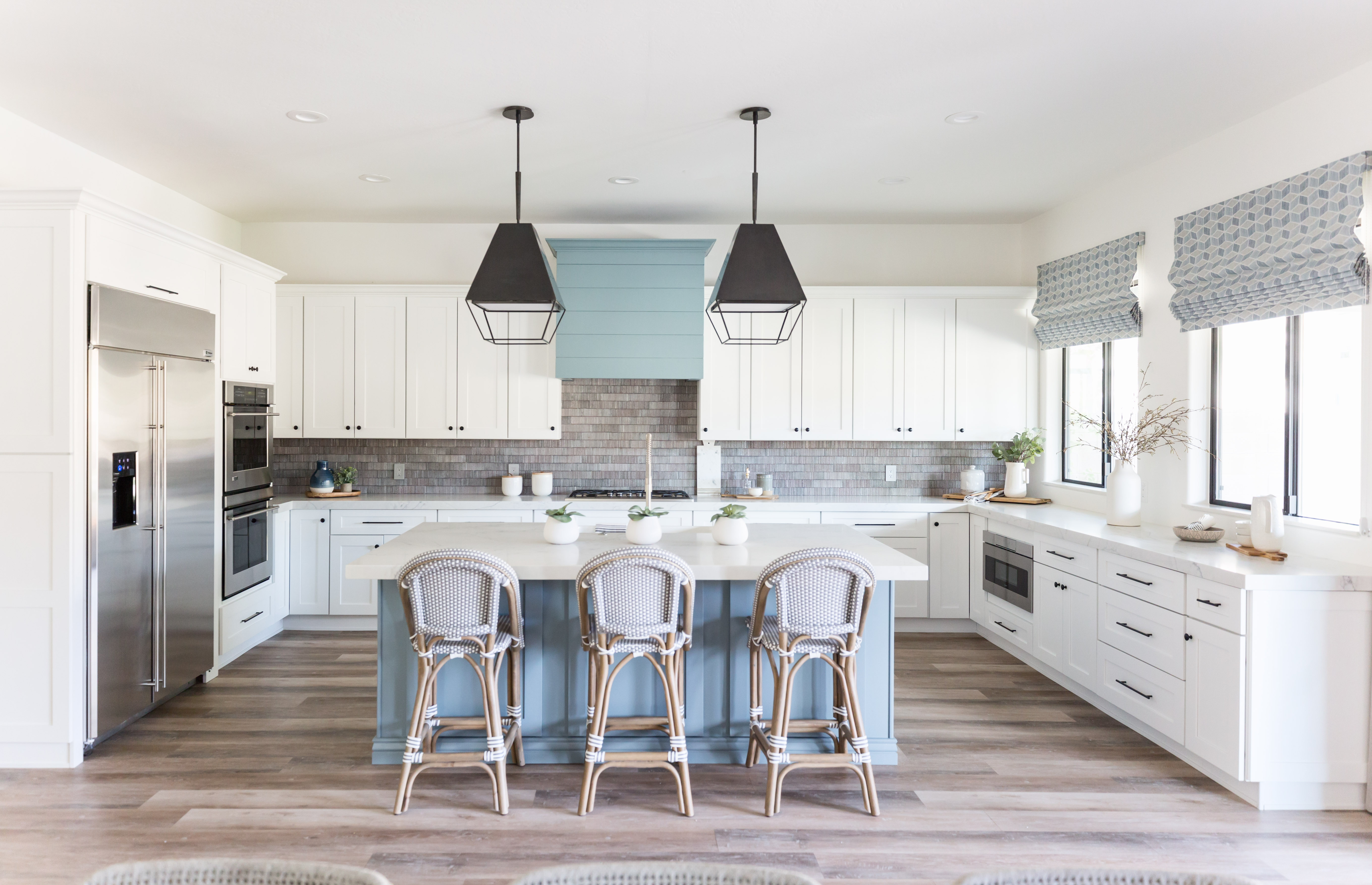
The quick answer is no, the kitchen island doesn't need to be darker than the cabinets; nor does it need to be lighter. It all depends on the style, dimensions, and the amount of light your kitchen receives.
'I think you can play around and have fun here and do what feels best within the entirety of the room,' says interior designer Athina Bluff, founder of Topology. 'I would say it's best to have the darker kitchen cabinet color on your base cabinets and anything lighter, and typically more weightless in appearance, as an upper cabinet. '
'I think a general rule of thumb that you could adhere to when decision-making on the colors in your kitchen, is that if your kitchen is particularly cabinet heavy, i.e. full blocks of upper & lower cabinetry, then breaking up the colors between the island and the main run, is a nice thing to consider doing,' adds Athina. 'It adds an extra focal point and level of depth whilst also providing an opportunity for a more diverse color palette in the space.'
'In larger kitchens, you need to create multiple layers and points of interest to focus on so that the space feels well thought out and planned, or it can run the risk of feeling a little bland,' says Athina. 'Thus, larger spaces are great for exploring the introduction of more colors in a room via the cabinets and island.'
'It's related more to the overall feeling of the space,' agrees Erin Fearins, partner and lead interior designer at Studio SFW. 'Often, islands are treated separately, more like a freestanding piece of furniture so they can have different detailing or finish.'
Consider this fresh, mid-blue that promotes a deep and peaceful mood, and can especially look great on walls and woodwork.
Should your kitchen island match your cabinets?
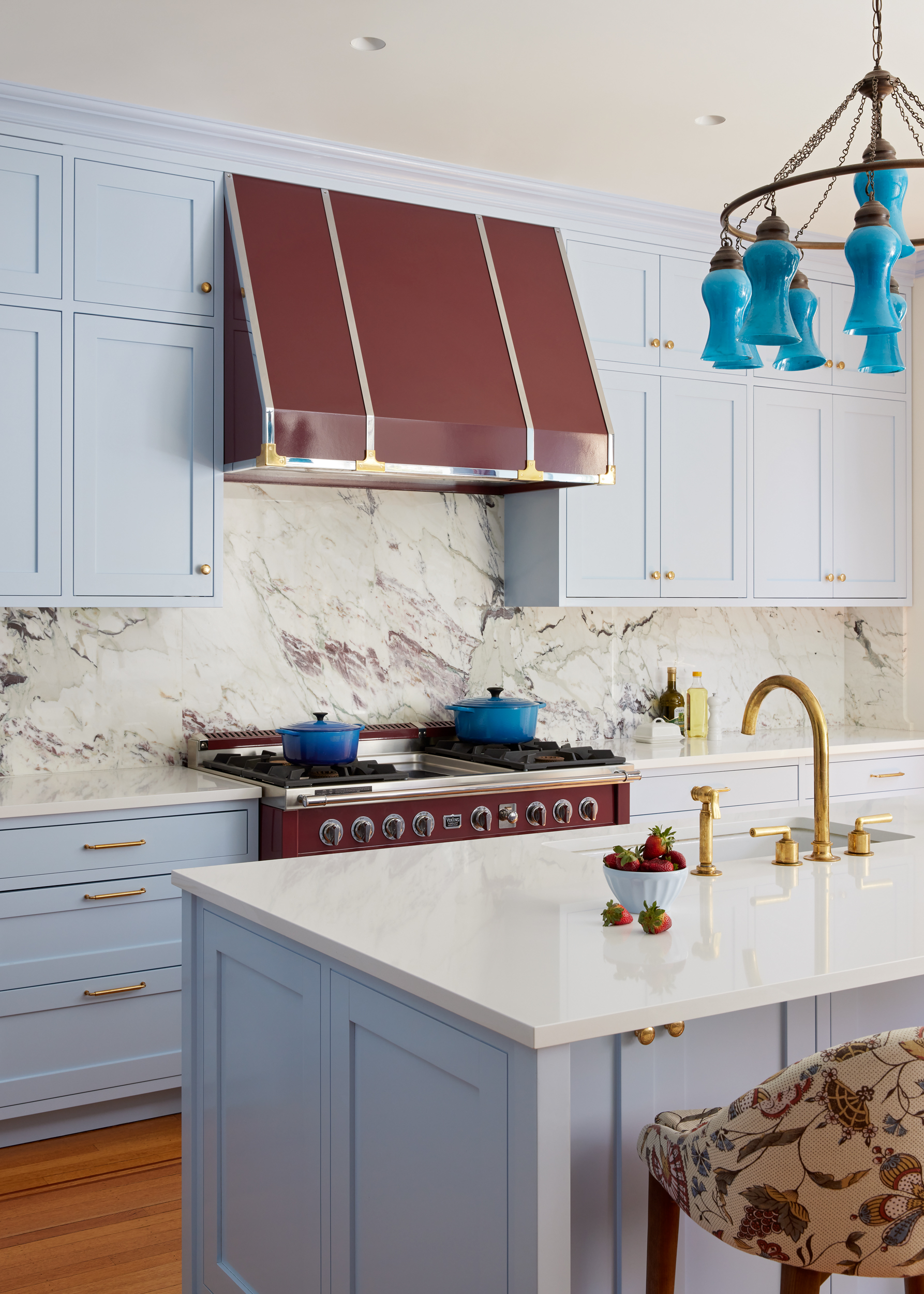
While kitchen cabinets can match the island or even contrast, it's best to make the decision based on the size of the kitchen, and its pre-existing palette.
'In smaller kitchens, you don't want the room to feel cluttered or busy, so keeping everything one color can be a wise decision to create just one focal point and main color of interest,' says Athina.
'In the case of this kitchen, we already had a lot of lovely contrast in the color of the range and hood as well as in the beautiful color of the marble on the backsplash, so we opted to keep the island the same as the surrounding cabinetry for a more harmonious backdrop,' says Erin.
'The pale icy blue color of the kitchen cabinetry allowed us to have some fun with accent colors in the range, chandelier, and fabrics that we used in the room,' says Erin. 'Our client loves color and has a vibrant young family, so we wanted to give her a bright, happy, light-filled kitchen where everyone can gather and spend time together.'
What cabinet color will make the kitchen look bigger?
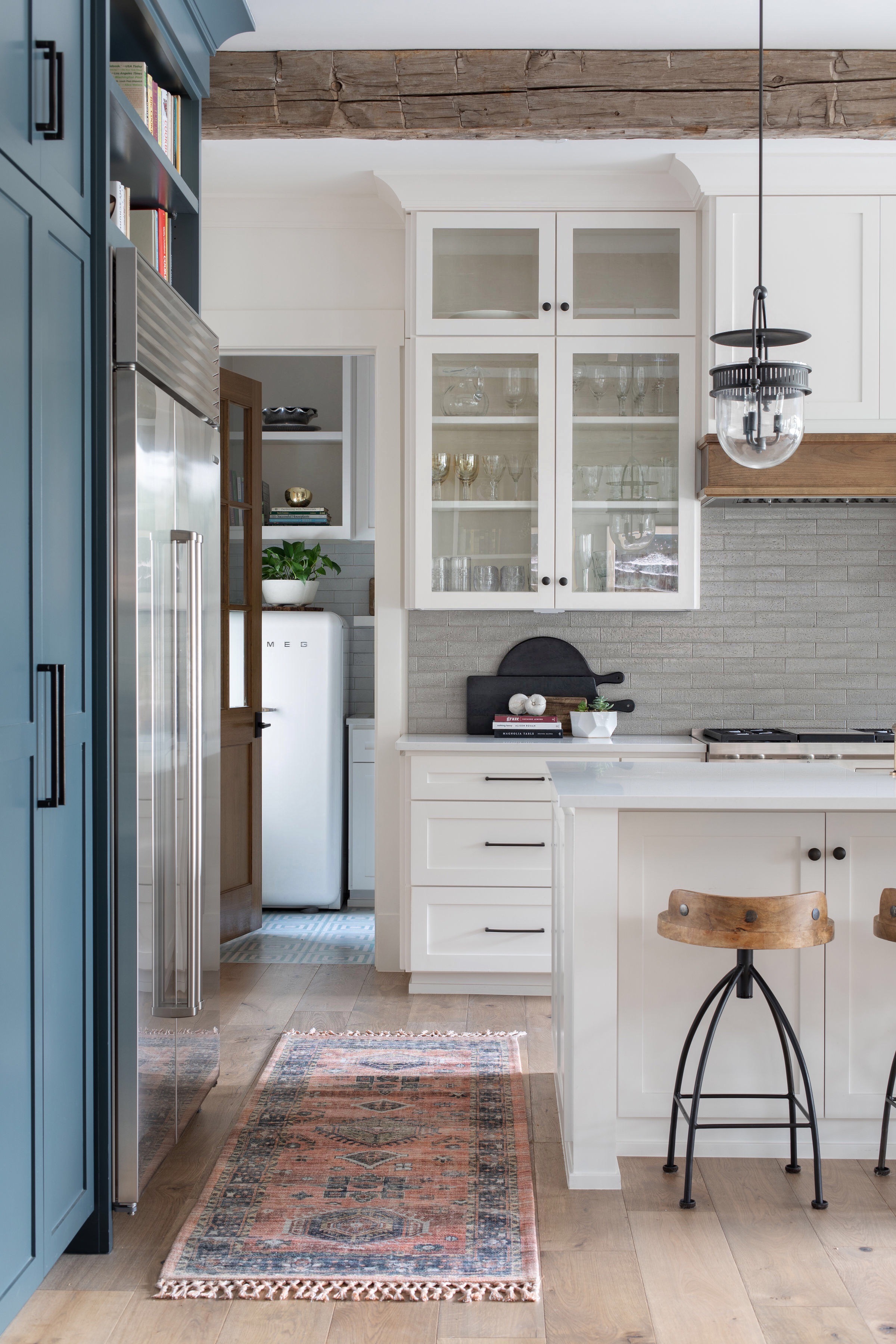
Largely, a grey kitchen or a white kitchen, where the cabinets are painted a lighter tone work well in making the space look bigger. Paler, softer tones reflect more light, thereby making the room feel brighter, airier, and more accommodating. Grey and white apart, you could also consider light blues, greens, or pale yellows on the cabinets.
Paint colors apart, if you want to go that extra mile to open up the kitchen, choose a semi-gloss or full gloss paint finish. These light-reflecting finishes will further add a sparkle to the room and make it seem bigger than it is. Add glass-paneled cabinetry to expand visuals. Minimize the clutter and ensure the countertops are always clean and organized.
Paint your kitchen cabinets a soft, nurturing neutral like a warm white and open up the visuals of the room.
Be The First To Know
The Livingetc newsletters are your inside source for what’s shaping interiors now - and what’s next. Discover trend forecasts, smart style ideas, and curated shopping inspiration that brings design to life. Subscribe today and stay ahead of the curve.

Aditi Sharma Maheshwari started her career at The Address (The Times of India), a tabloid on interiors and art. She wrote profiles of Indian artists, designers, and architects, and covered inspiring houses and commercial properties. After four years, she moved to ELLE DECOR as a senior features writer, where she contributed to the magazine and website, and also worked alongside the events team on India Design ID — the brand’s 10-day, annual design show. She wrote across topics: from designer interviews, and house tours, to new product launches, shopping pages, and reviews. After three years, she was hired as the senior editor at Houzz. The website content focused on practical advice on decorating the home and making design feel more approachable. She created fresh series on budget buys, design hacks, and DIYs, all backed with expert advice. Equipped with sizable knowledge of the industry and with a good network, she moved to Architectural Digest (Conde Nast) as the digital editor. The publication's focus was on high-end design, and her content highlighted A-listers, starchitects, and high-concept products, all customized for an audience that loves and invests in luxury. After a two-year stint, she moved to the UK and was hired at Livingetc as a design editor. She now freelances for a variety of interiors publications.
-
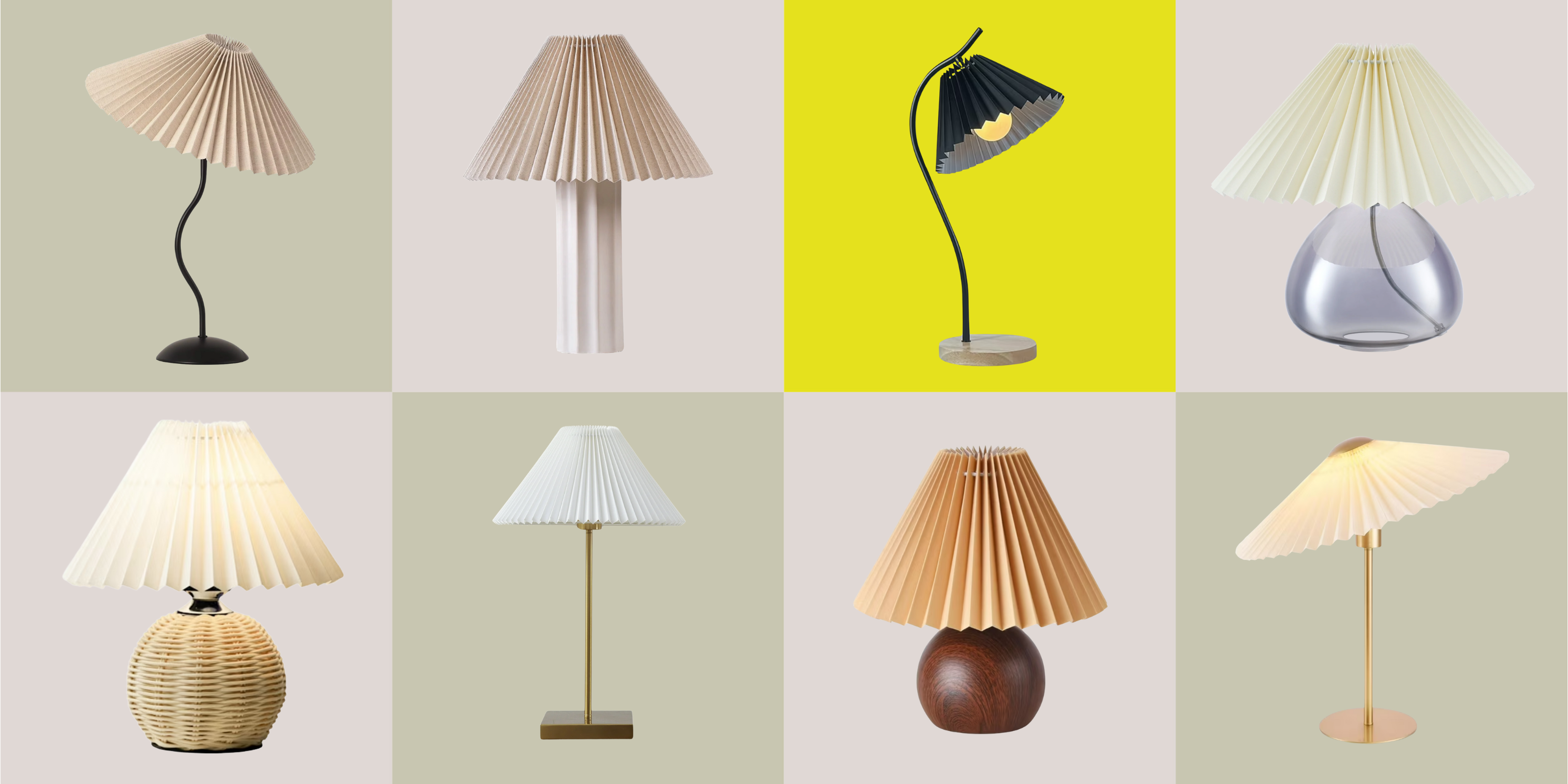 Pleated Lampshades Are the Silhouette of the Season — I've Found 9 For Well Under $100 (You'll Never Guess Where)
Leave it to Walmart to bless us with a collection of stunning pleated lampshades — proving this old-fashioned feature can look fresh and modern
By Devin Toolen
-
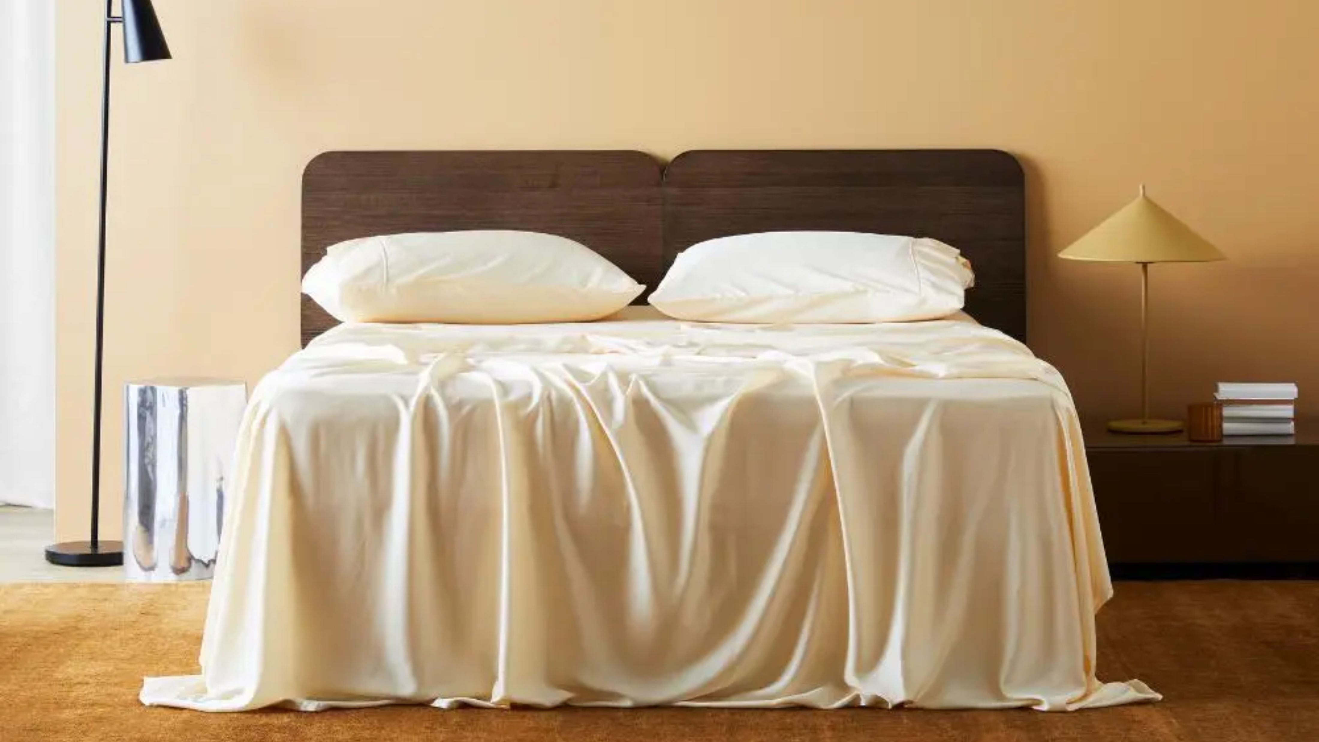 I Found the "Healthiest” Bedding for Earth Month — Why Ettitude Is the Sustainable Sleep Label to Know
Softer than silk and smarter than cotton, Ettitude’s innovative take on bedding delivers luxury with a conscience
By Julia Demer

